Inforiver

Upcoming webinar on 'Inforiver Charts : The fastest way to deliver stories in Power BI', Aug 29th , Monday, 10.30 AM CST.    Register Now

Box and whisker plot in Power BI

Download PBIX File

The Box Plot Chart in Inforiver Analytics+ helps visualize data distribution, variability, and outliers across categories. It supports overlapped and forecast box plots, variance bars, and small multiples for detailed comparison. 

You can apply conditional formatting, enable auto sorting, and use IBCS-compliant themes for standardized reporting. Advanced analytics like deviation lines, reference bands, and trend indicators make it easier to analyze patterns and insights quickly. 

For complete details, demos, and pricing, visit: Explore the Box Plot Chart on Inforiver Analytics+ 


iframe preview
View interactive content

Box and whisker plot in Power BI

The Box Plot Chart in Inforiver Analytics+ helps visualize data distribution, variability, and outliers across categories. It supports overlapped and forecast box plots, variance bars, and small multiples for detailed comparison.  You can apply conditional formatting, enable auto sorting, and use IBCS-compliant themes for standardized reporting. Advanced analytics like deviation lines, reference bands, and trend indicators make it easier to analyze patterns and insights quickly.  For complete details, demos, and pricing, visit: Explore the Box Plot Chart on Inforiver Analytics+ 
iframe preview
View interactive content

Download Report for Free

to try advance features

[demo_download_modal title="Box and whisker plot in Power BI" link="https://inforiver.com/wp-content/uploads/boxplot-in-analytics-plus-demos.zip"]

Other Demos

Consumer Product Analytics Dashboard: Unlocking Insights in Mobile & Electronics

Drive growth in mobile & electronics with our Power BI Consumer Product Analytics Dashboard. Experience advanced data storytelling with Inforiver.

Gauge Chart

Track KPI progress against targets using Linear and Angular Gauge Charts in Power BI. Get instant visibility into performance status for executive dashboards

Funnel and Pyramid Chart

Analyze conversions across stages with Funnel, Pyramid, and Executive Funnel Charts in Power BI. See progression and drop-offs clearly for pipeline and journey analysis.

Hierarchy Family Chart

Visualize categories, subcategories, and relationships in Power BI with the Inforiver Hierarchy Chart Family. Get Treemap, Sunburst, Packed Bubble, Decomposition Tree, and Network Graph to support deep drill down and insight rich reporting.

Scatter and Bubble Chart

View how metrics relate, how big their impact is, and where they stand using Scatter, Bubble, and Quadrant charts in Power BI.

Decomposition Tree

Break KPIs into root causes with the Decomposition Tree in Power BI. Easily explore contributors, compare branches, and format the view for clear insight.

Download Box and whisker plot in Power BI

By clicking on Download PBIX File you agree to our terms and conditions and you acknowledge having read our EULAThe PBIX file is available only for limited duration

Get Inforiver brochure

Maximize your business potential with Inforiver's paginated reporting, data entry, planning & budgeting capabilities
Download now
Inforiver

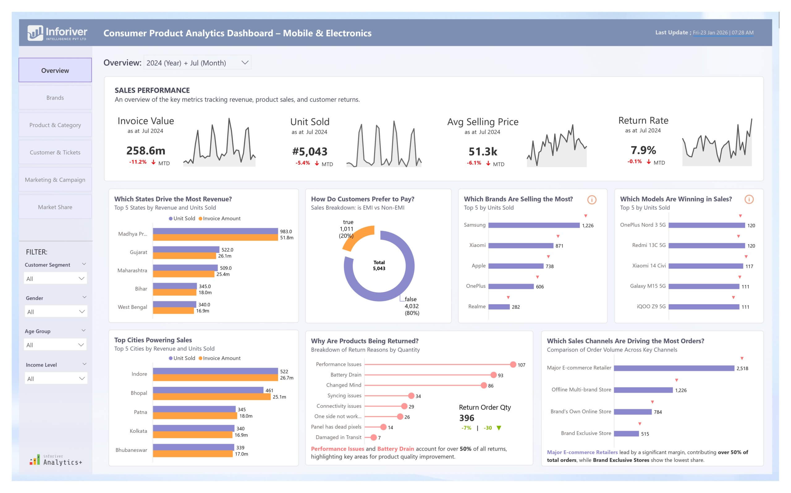
Inforiver helps enterprises consolidate planning, reporting & analytics on a single platform (Power BI). The no-code, self-service award-winning platform has been recognized as the industry’s best and is adopted by many Fortune 100 firms.

Inforiver is a product of Lumel, the #1 Power BI AppSource Partner. The firm serves over 3,000 customers worldwide through its portfolio of products offered under the brands Inforiver, EDITable, ValQ, and xViz.

homemagnifiercross linkedin facebook pinterest youtube rss twitter instagram facebook-blank rss-blank linkedin-blank pinterest youtube twitter instagram