Upcoming webinar on 'Inforiver Charts : The fastest way to deliver stories in Power BI', Aug 29th , Monday, 10.30 AM CST. Register Now
Upcoming webinar on 'Inforiver Charts : The fastest way to deliver stories in Power BI', Aug 29th , Monday, 10.30 AM CST. Register Now
Experience smarter insights and advanced analytics in the newest release of Inforiver Analytics+ that is available now.
The Analytics+ Gantt chart is fully loaded with features like the Gantt resource for tracking and allocation; support for web URLs for giving direct access to supporting links; and a wider range of timeline customizations providing better flexibility. Other highlights in this release include enhancements to multi-axis charts, KPI cards, and expanded conditional formatting options, giving you more control over your data visualizations.
Discover our latest range of planning, and analytics features that make Inforiver Analytics+ the best data visualization solution in BI:
2.1. Multi-axis chart enhancements
2.2. Negative axis for tornado charts
3.1. Conditional formatting for relative time periods
3.2. Conditional formatting for insight charts
3.3. Conditional formatting based on grand average
4.1. Invert variance color for individual panels
4.2. Multi-chart selector for KPI cards
4.3. Data labels for insight charts
Please refer to our release notes for a comprehensive list of requirements, features, and bug fixes.
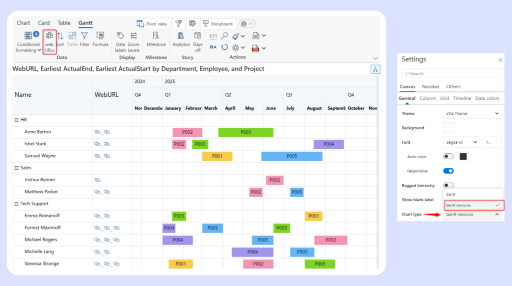
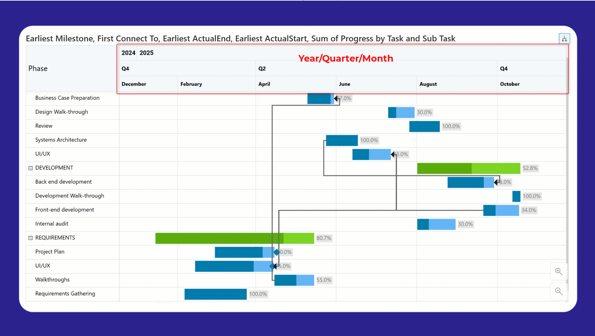
Gantt resource charts visually represent which resources are assigned to a particular project and the allocation duration, making it easier to ensure a balanced workload and efficient resource utilization. Switch to resource allocation mode in Analytics+ by selecting Gantt resource from the chart type dropdown.
Access to planning documents or resources is now at your fingertips with support for web URLs. You can embed links to shared workspaces or ticketing systems like Jira directly in your Gantt. Remember to map the field containing URLs to the Gantt visual parameter. In the pivot data window, the URL field must be assigned to the Display Category bucket.
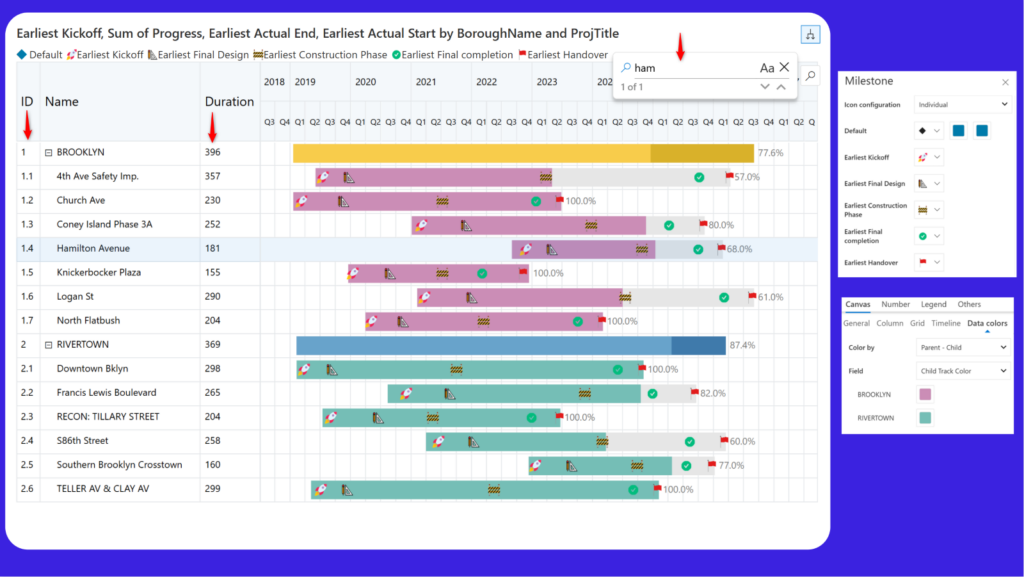
Underscore the milestones achieved in your project with custom icons. Navigate to milestone settings and click the Upload Icon option from the icon selection window.
The new search option simplifies individual status tracking by helping you quickly locate specific tasks or subtasks. You can also display row numbers and the duration (in years/months/quarters/weeks/hours) against each task.
We’ve added color customizations for the bars. You can set uniform fill/track colors for all the parent and child bars or set individual colors for child tasks under each parent task.
The Analytics+ Gantt supports detailed planning and tracking with the Zoom option. You can even customize the degree of zoom and tailor it to your data.
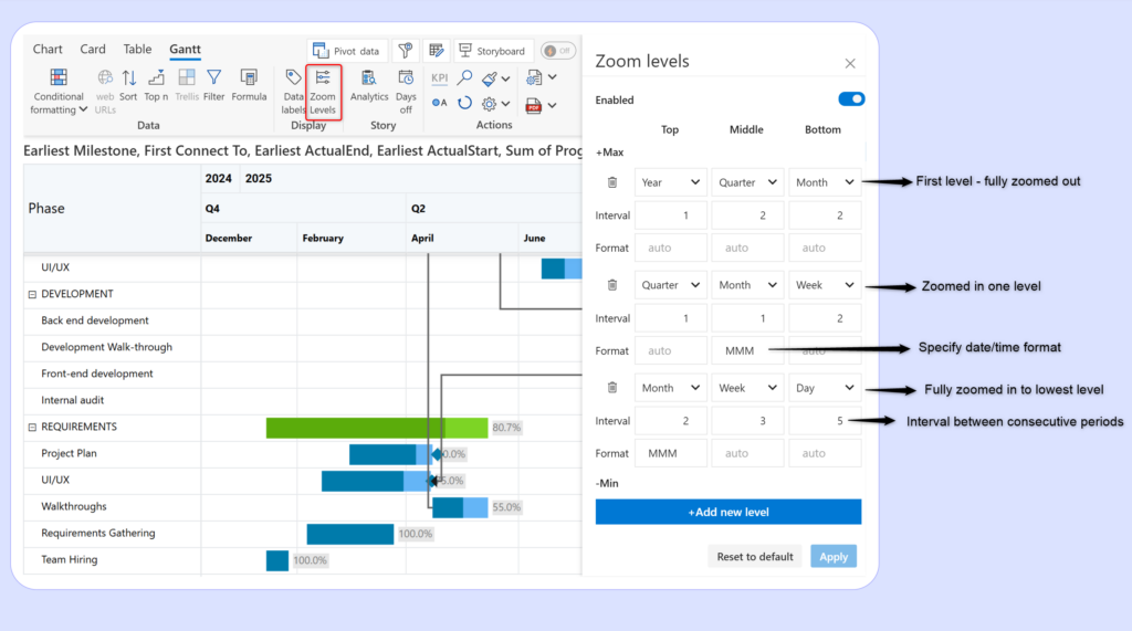
Notice how the timeline changes as we zoom in.
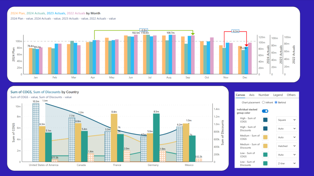
Accurately analyse data of different magnitudes with additional options for the multi-axis chart, like individual stacked groups and data label customizations. Analytics and deviation are also supported. You can plot reference lines, reference bands, error bars, and trend lines.
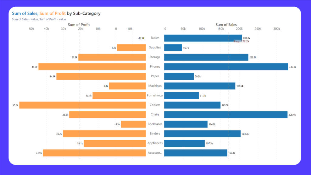
Negative axes are important to visualize the impact of dimension categories on the actuals. The example shows how the sales for the Tables product is high, but the product still has negative profitability.
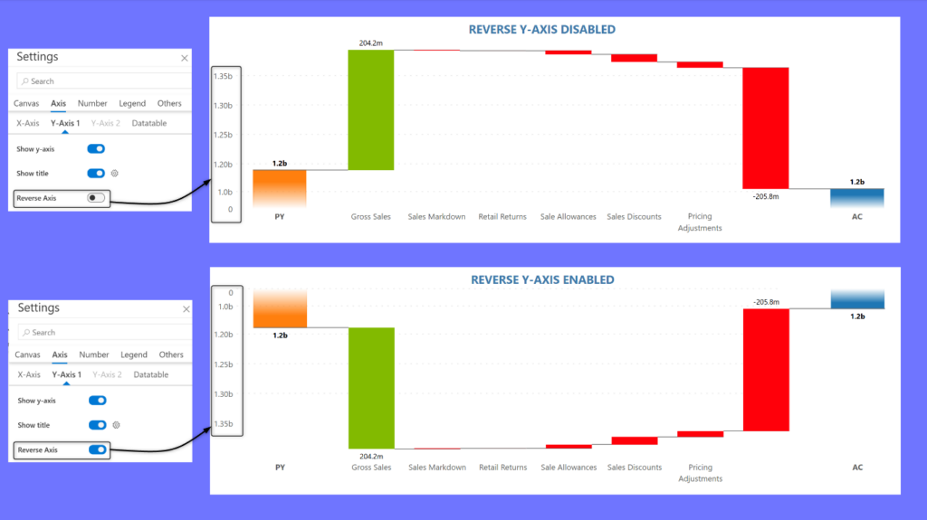
Enable the Reverse y-axis toggle to change the order in which y-axis labels are displayed. This feature is available for line, area, waterfall, combo, and bullet charts. When it comes to financial charts, reversing the Y-axis can emphasize losses more clearly, making it easier to analyze profits and losses.
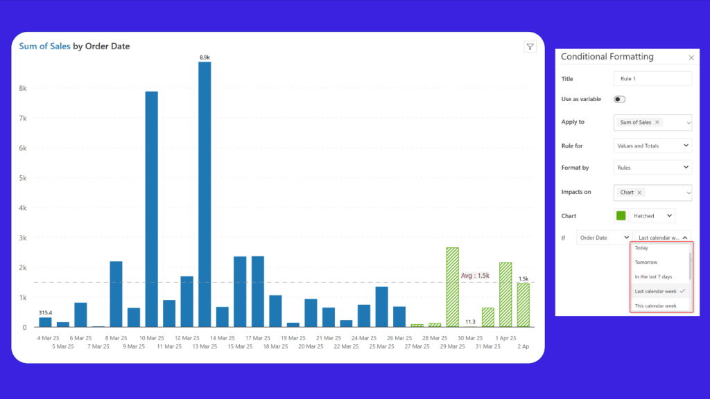
For date-based reports, apply conditional formatting to highlight data for specific time periods - like the past week, past month, next week, or previous day. This helps direct users' focus to recent activity. In the example, we've highlighted the sales measure for the past week with a hatched fill and a different color.
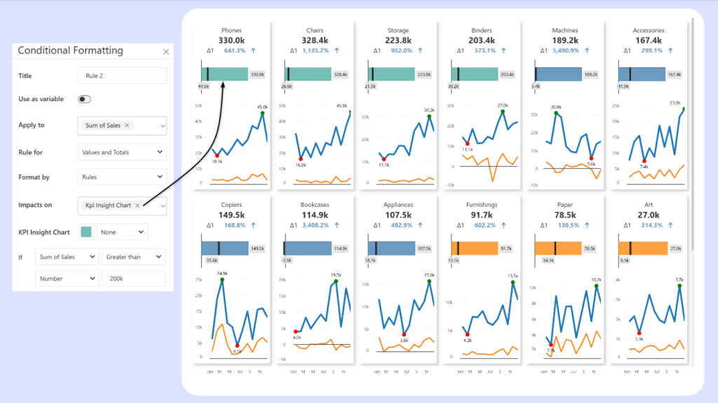
Highlight trends by applying conditional formatting rules to insight charts. Choose the "Kpi Insight Chart" for the Impacts on option to apply formatting to the insight chart.
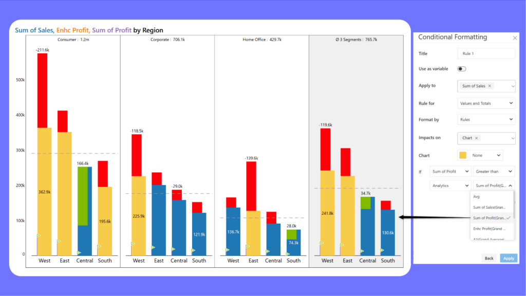
Gain deeper insights in small multiples mode with the grand average option in conditional formatting. You can apply formatting based on the average values across all panels and highlight categories greater or less than the overall average. As a practical example, we've highlighted regions with profits greater than the grand average across segments.
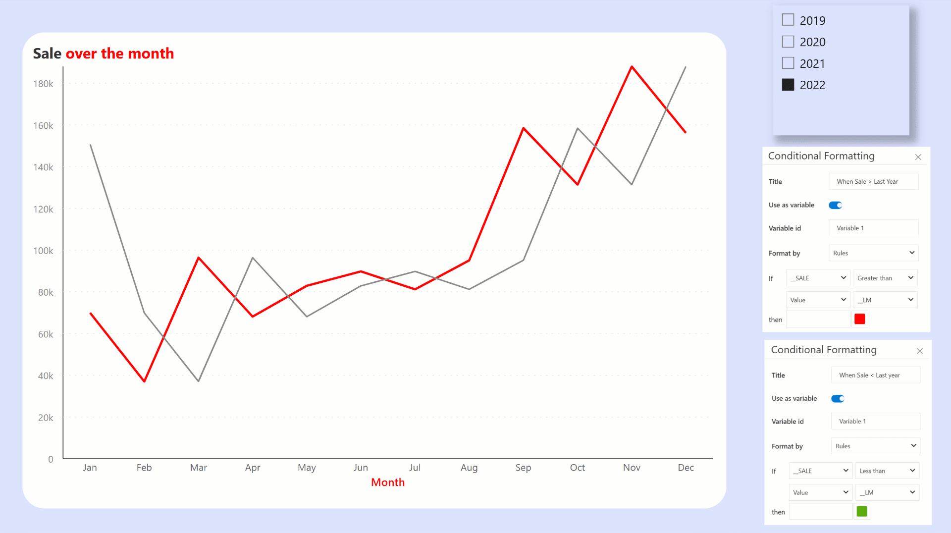
Variable conditional formatting allows you to apply formatting rules to elements that are not directly linked to specific data points. This can include altering the line color, specific parts of your title, x-axis, and y-axis titles. By using variables, you can combine multiple rules and apply them together, enabling more advanced formatting on non-data elements.
A new “CF rules” tab has been added to the color picker for elements like the x-axis title or the line color. You can select the defined conditional formatting variable rule to automatically set the color based on the data.
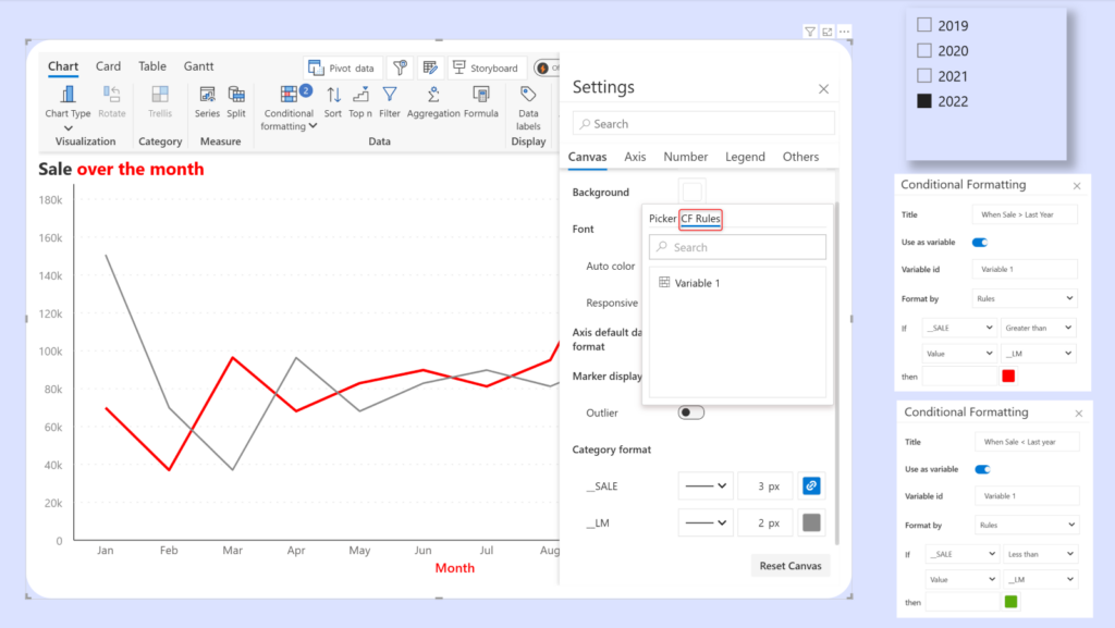
Notice how the title, x-axis title and line color changes based on the conditional formatting variable rules.
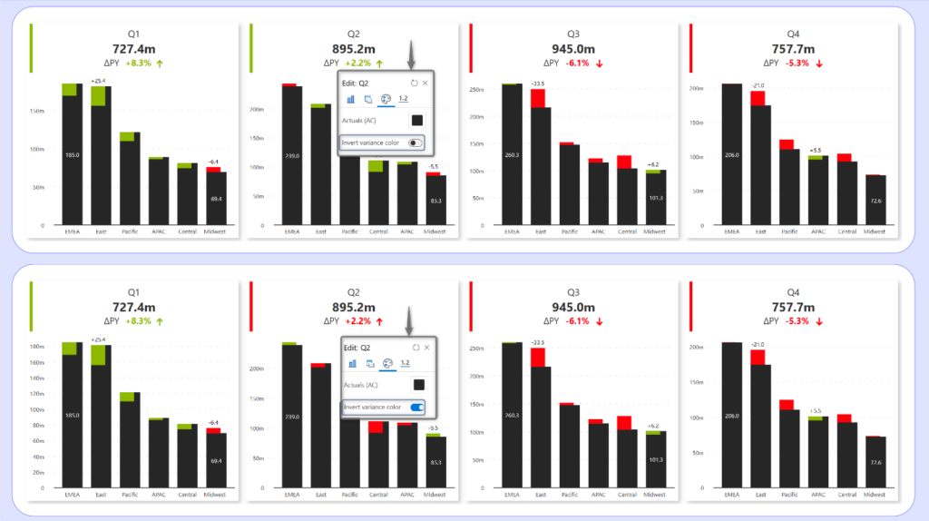
In some cases, like when the budget exceeds the expenses, a negative variance can have a positive implication. You can now use the on-object interaction menu to invert the variance for individual panels. For instance, if red implied a negative variance and green implied positive - you could interchange them. This will impact the sparkline, variance border, accent bar, and KPI metrics as shown in the images.
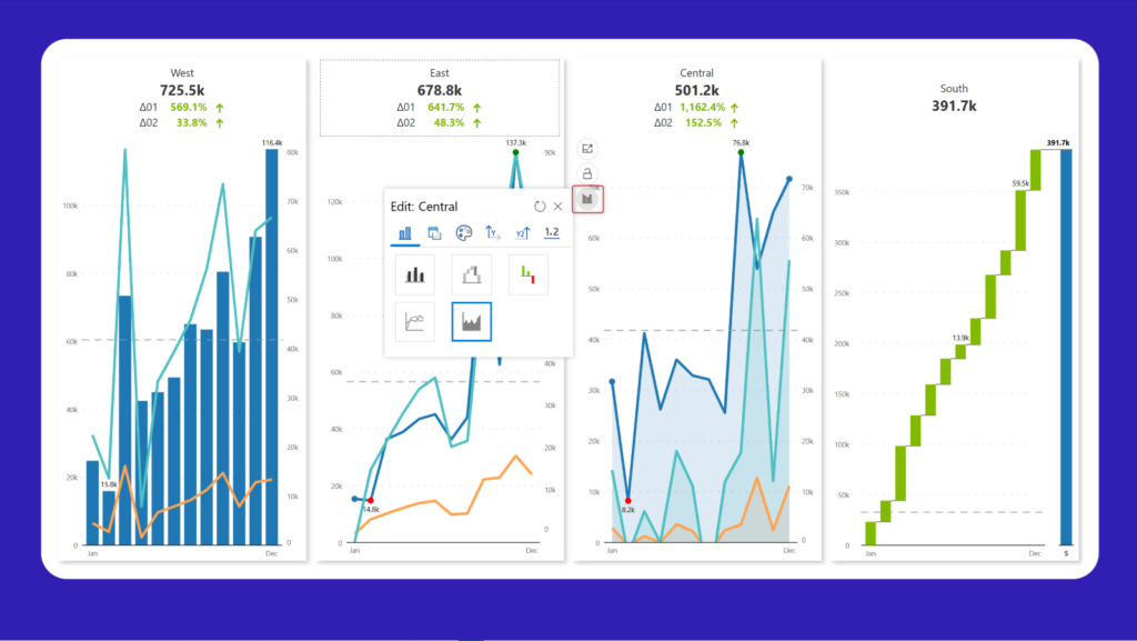
Browse through all the charts belonging to a particular chart family and select the one best suited for each trellis panel.
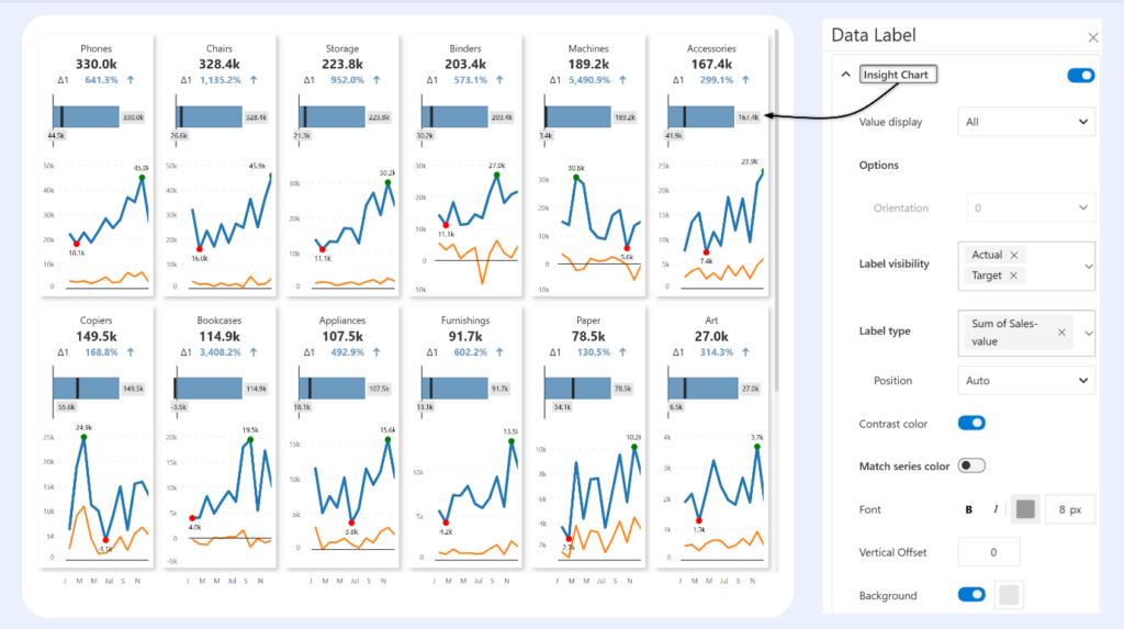
Insight charts tell users whether the KPI is declining or improving at a glance. You can now customize the data labels for insight charts with dedicated data label settings.
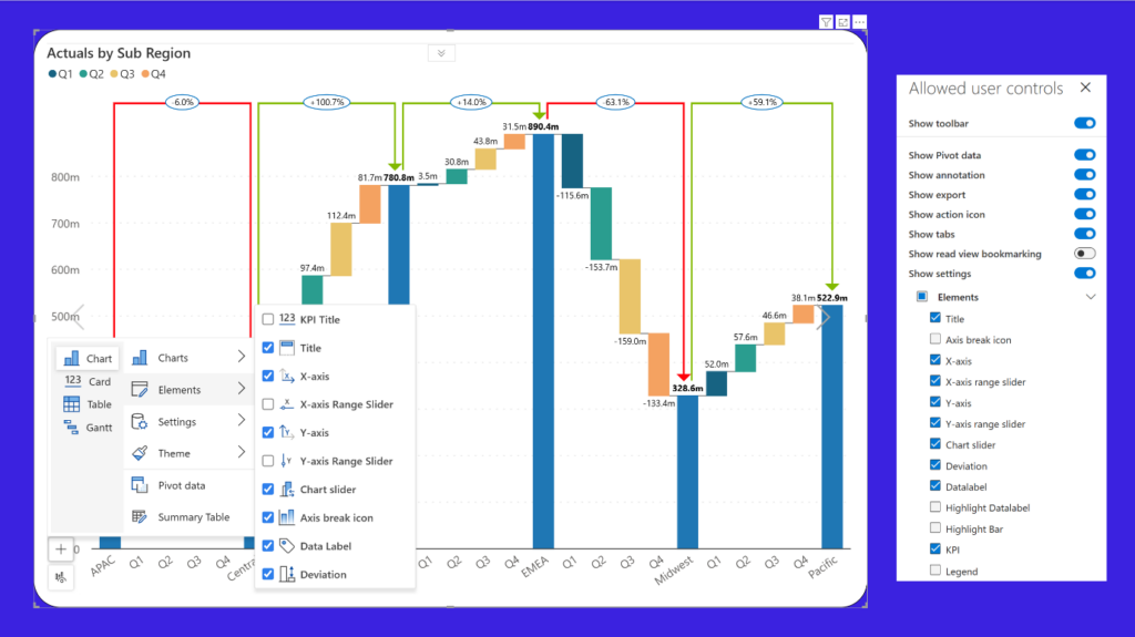
Users in reading view can use the chart slider and switch between chart types to visualize the data from different perspectives. This can be enabled from the Allowed User Controls menu.
Users in reading view can interactively plot deviations in just a few clicks. Click on the first bar and as you drag the mouse pointer, you'll notice the deviation being plotted dynamically. Click on the target bar to render the deviation line.

Analytics+ 4.6 version is supported from Power BI Report Server Desktop September 2024 - Version: 2.136.1202.0
To learn more about the latest from Inforiver and why we are garnering recognition from industry experts, check out our newest brochure.
Inforiver and all our planning and analytics products continue to be updated to provide a diverse range of users with optimal performance. With continual improvements and innovations planned, we welcome your feedback.
If you’re ready to level up your planning, reporting, and analytics, try our products for free today.

Inforiver helps enterprises consolidate planning, reporting & analytics on a single platform (Power BI). The no-code, self-service award-winning platform has been recognized as the industry’s best and is adopted by many Fortune 100 firms.
Inforiver is a product of Lumel, the #1 Power BI AppSource Partner. The firm serves over 3,000 customers worldwide through its portfolio of products offered under the brands Inforiver, EDITable, ValQ, and xViz.