Upcoming webinar on 'Inforiver Charts : The fastest way to deliver stories in Power BI', Aug 29th , Monday, 10.30 AM CST. Register Now
Upcoming webinar on 'Inforiver Charts : The fastest way to deliver stories in Power BI', Aug 29th , Monday, 10.30 AM CST. Register Now
Creating an effective Power BI hierarchical visualization can be challenging with default chart types. Bar and pie charts are often inadequate for displaying nested categories, making it difficult to compare proportions or identify key contributors across levels. These limitations can slow down analysis and obscure the insights needed for informed decision-making. For developers and data visualization experts working with layered datasets, finding the right approach to visualize hierarchies is essential to building clear, scalable reports in Power BI.
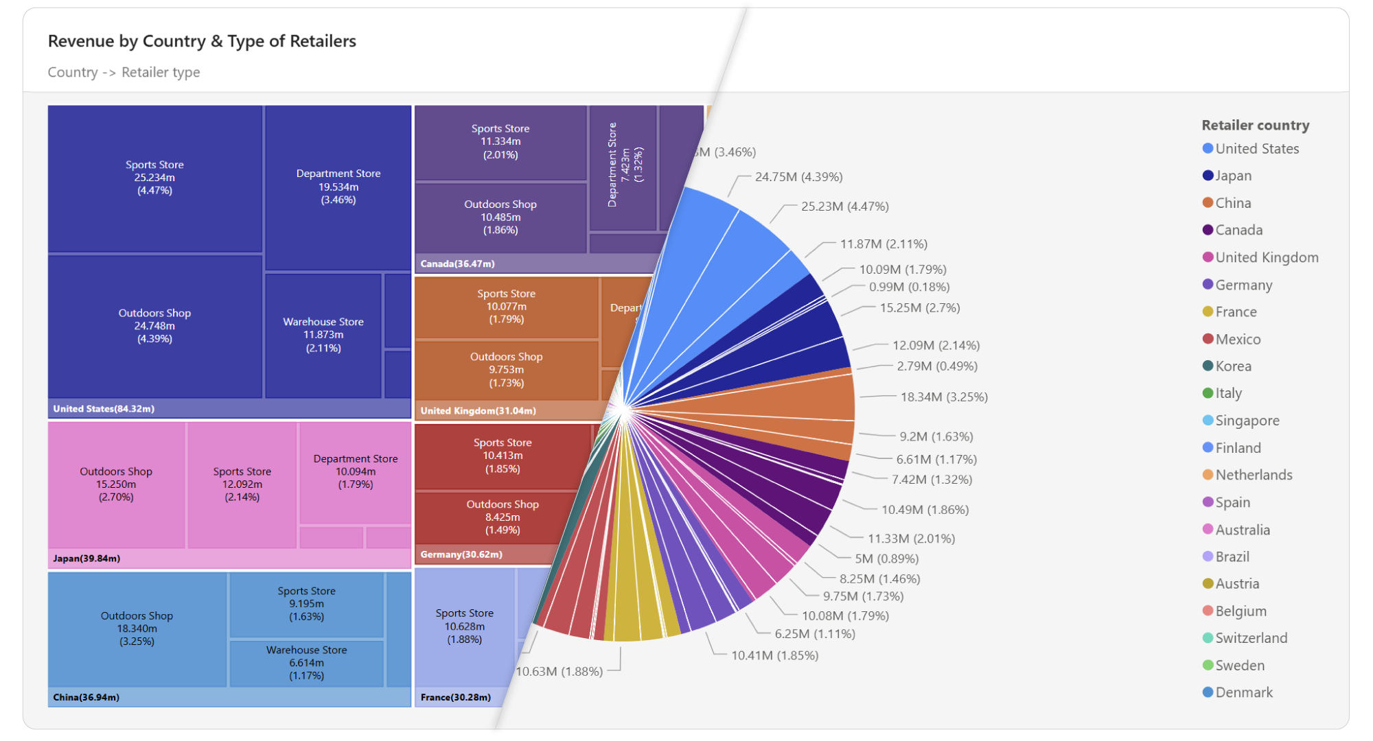
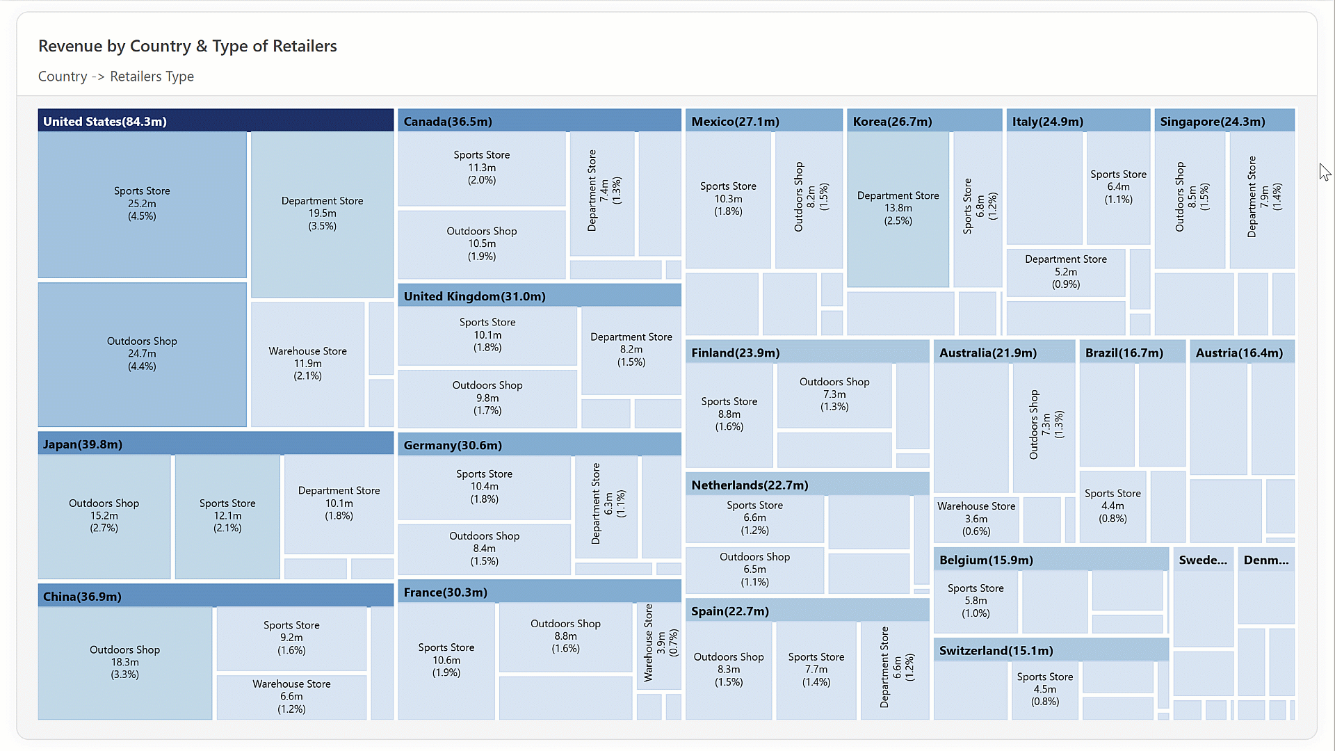
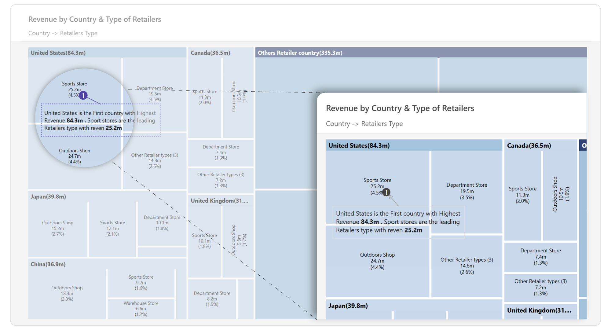
Inforiver Analytics+ Treemap brings advanced hierarchy visualization to Power BI, allowing users to clearly display and explore complex, multi-level datasets. Using a nested rectangle layout where each segment’s size corresponds to its value, the visual makes part-to-whole relationships easy to interpret within a single view.
Its support for recursive nesting enables multiple hierarchical levels to be displayed at once, helping users move seamlessly from high-level summaries to detailed insights—all without leaving the Power BI environment. Whether you're analyzing sales structures, organizational models, or financial data, this visual offers a scalable and intuitive solution for hierarchical reporting.
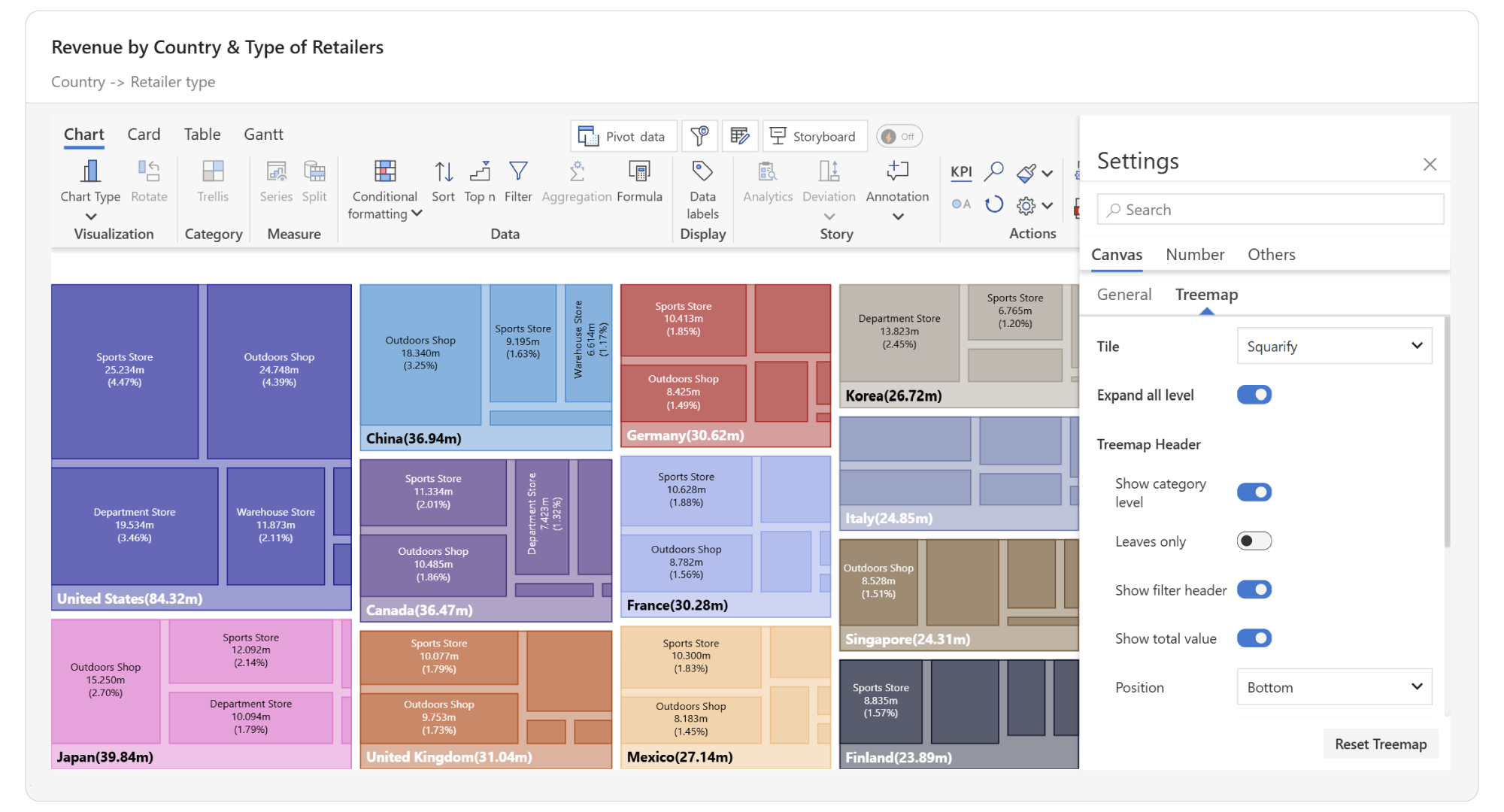
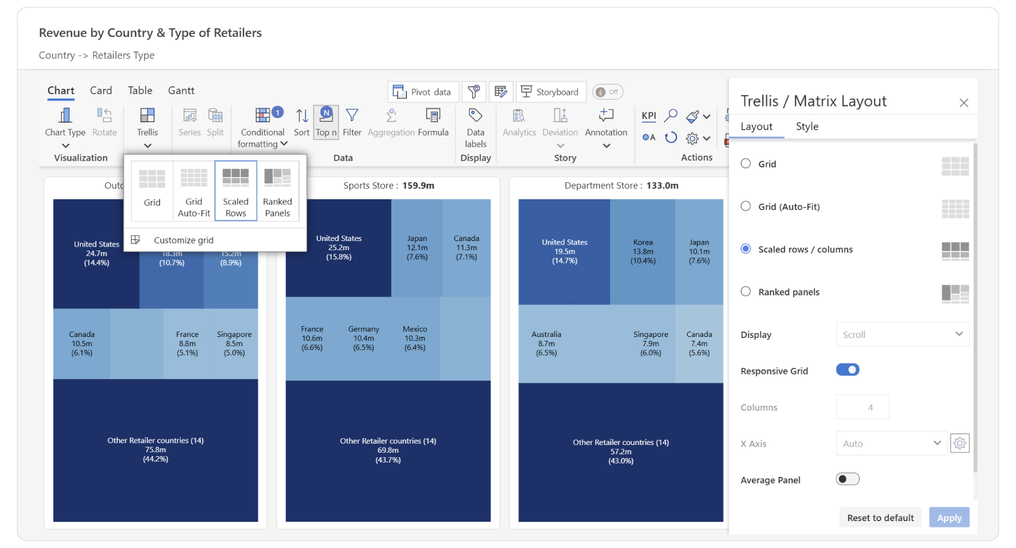
Inforiver Analytics+ Treemap is built with the needs of Power BI developers and data visualizers in mind, offering advanced features to enhance your reporting capabilities for visual hierarchy in Power BI:
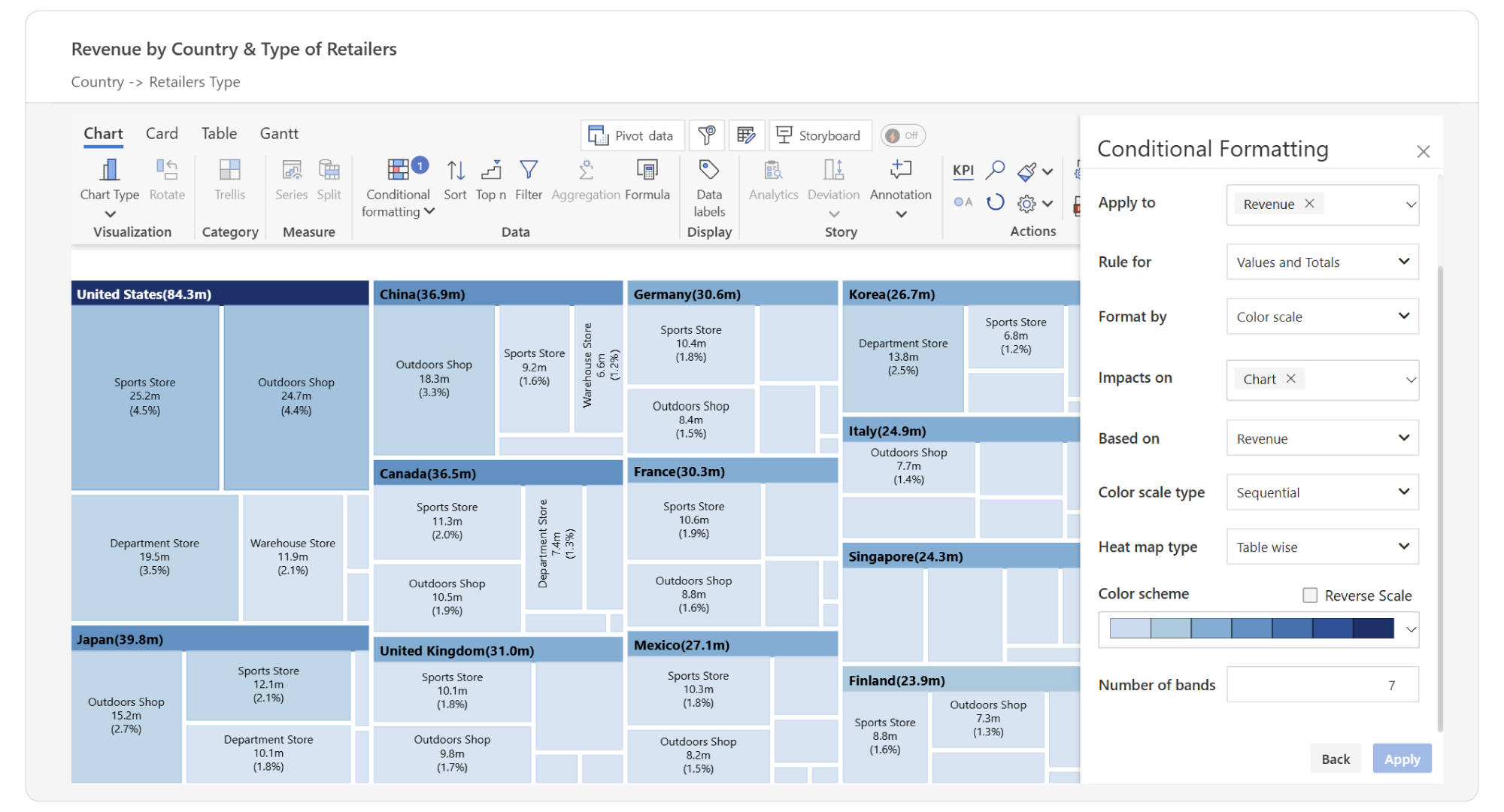
For step-by-step instructions on how to implement and configure this functionality—using a no-code approach—refer to the Inforiver Analytics+ Treemap documentation.
Inforiver Analytics+ Treemap within Power BI, provides a number of benefits:

Standard Power BI visuals can make it difficult to interpret complex hierarchies, limiting the value of your reports. Inforiver Analytics+ Treemap offers a purpose-built solution designed to simplify multi-level data analysis and highlight what matters most.
Get started today and see the impact a dedicated hierarchical visual can bring to your Power BI environment.

Inforiver helps enterprises consolidate planning, reporting & analytics on a single platform (Power BI). The no-code, self-service award-winning platform has been recognized as the industry’s best and is adopted by many Fortune 100 firms.
Inforiver is a product of Lumel, the #1 Power BI AppSource Partner. The firm serves over 3,000 customers worldwide through its portfolio of products offered under the brands Inforiver, EDITable, ValQ, and xViz.