Upcoming webinar on 'Inforiver Charts : The fastest way to deliver stories in Power BI', Aug 29th , Monday, 10.30 AM CST. Register Now
Upcoming webinar on 'Inforiver Charts : The fastest way to deliver stories in Power BI', Aug 29th , Monday, 10.30 AM CST. Register Now
A ribbon chart is a visualization that highlights how category rankings change over time. It is an effective analysis tool for uncovering patterns in competitive standings, monitoring KPIs across periods, and communicating changes in rank to decision-makers. By emphasizing the movement between categories rather than just absolute values, ribbon charts provide a clear view of relative performance and emerging trends.
In this post, we’ll cover how to interpret and apply ribbon charts effectively, along with best practices that make them more impactful in your reporting. We’ll also explore how advanced features in Inforiver Analytics+ extend their value for deeper analysis.
A ribbon chart is a visualization that illustrates how category rankings and contributions shift over time. Each ribbon represents a category, with its position showing rank and its width showing relative value at each point in time. This combination makes it possible to track not just totals, but also the competitive movement between categories across periods.
They are an improvement over traditional stacked column charts because they effectively show both proportions and ranking shifts.
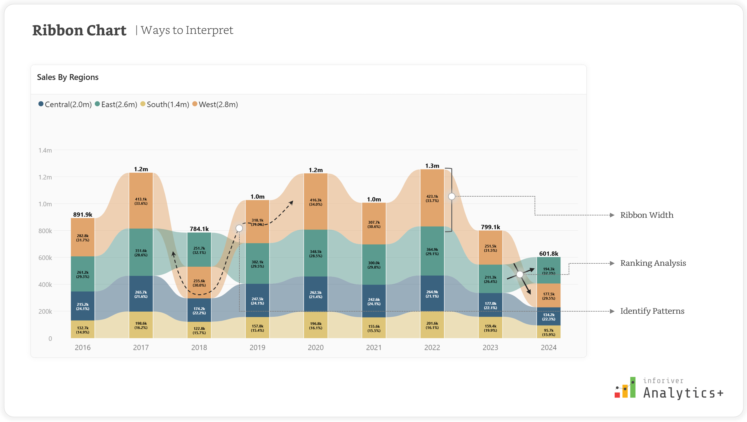
Reading insights from a rRibbon chart involves focusing on the trends and patterns displayed by the ribbons. Here are key points to interpret them effectively:
To ensure your rRibbon charts are not just visually appealing but also clear, insightful, and easy to understand, adhering to certain best practices is crucial. These guidelines will help you unlock the full potential of this dynamic visualization.
The effectiveness of any chart hinges on the clarity of its data. For rRibbon charts, this begins with meaningful categories.
What it means: Each "ribbon" in your chart represents a distinct category (e.g., product lines, sales regions, customer segments). These categories should be logically grouped and easily identifiable by your audience. Avoid using vague or overly granular categories that might confuse the viewer.
Why it's important: If categories are not clearly defined or are too similar, the viewer will struggle to differentiate them and interpret the trends. For instance, using "Product A," "Product B," and "Product C" is clear, whereas "Item 101," "Item 102," "Item 103" without further context might not be. For example, instead of listing every single SKU (Stock Keeping Unit) like "SKU-Pants-Blue-Size32", "SKU-Shirt-Red-Large", and "SKU-Dress-Green-Small" as individual categories, it would be more meaningful to group them into broader categories such as "Pants," "Shirts," and "Dresses." This simplifies the visualization and makes it easier to track the performance of clothing types rather than individual inventory items.
Actionable advice: Before building your chart, take time to define your categories. Consider your audience and what information they need to extract. If necessary, group sub-categories into broader, more digestible groups. For example, instead of individual car models, you might group them by "Sedans," "SUVs," and "Trucks."
While rRibbon charts are great for showing rank changes, too much information can quickly turn a powerful visualization into an unreadable mess. This is why it's essential to limit the number of categories.
What it means: As a general rule, aim for a manageable number of ribbons. While there's no hard and fast rule, typically 5-10 categories are ideal. Exceeding this can make it difficult for the eye to follow individual ribbons and discern their trends.
Why it's important: When too many ribbons overlap and intersect, the chart becomes visually overwhelming. It's hard to track a single category's journey, identify its rank at different points in time, or compare it effectively with others. This defeats the purpose of using a Ribbon chart to show hierarchy and change.
Actionable advice: If you have many categories, consider grouping less significant ones into an "Others" category. Alternatively, provide filters or interactive options to allow users to select which categories they want to view, rather than displaying all at once. Prioritize the most impactful or relevant categories for your analysis.
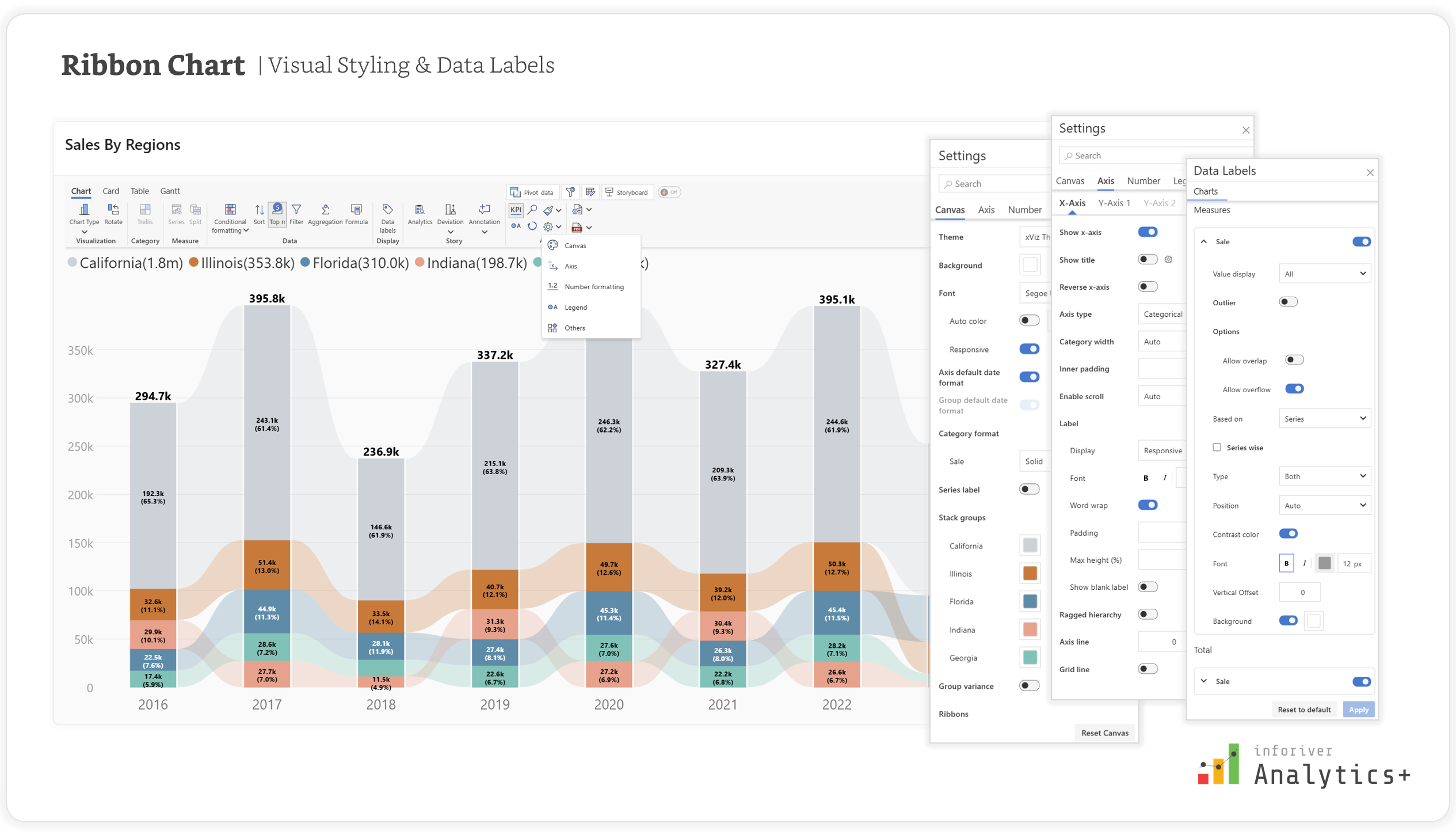
Colors and labels are crucial for distinguishing ribbons and providing necessary data context.
What it means:
Why it's important: Without clear color differentiation, ribbons can blend into one another, making it nearly impossible to follow a single category's trend or compare it to others. Similarly, the absence of labels forces users to estimate values or hover over every data point, which can be inefficient and frustrating for quick analysis.
For colors: Utilize distinct hues, or variations in lightness/darkness, to make each ribbon stand out. Avoid overly bright or clashing colors. Consider using a consistent brand palette if applicable. Accessibility is also key; ensure your chosen colors are distinguishable by individuals with color vision deficiencies.
For labels: Use labels sparingly and strategically to avoid clutter. Perhaps only label the top N categories at the start and end points, or at significant turning points. Ensure the font size and color of labels are legible against the ribbon's color.
The visual flow of a rRibbon chart is highly dependent on how your data is sorted. Proper data sorting ensures the chart accurately reflects the ranking changes.
What it means: The order in which your ribbons stack or are drawn for each time period directly reflects their ranking. Typically, the highest-ranking category (or the category with the largest value) for a given time period will be positioned at the top of the stack, with subsequent categories layered below based on their values.
Why it's important: Incorrect sorting can lead to misleading interpretations. If ribbons aren't stacked according to their true rank at each point in time, the viewer might misinterpret which category is performing best or worst, or how their positions are changing.
Actionable advice: Most visualization tools offer options to sort your data. Ensure you sort your categories by the measure of interest (e.g., sales, revenue, market share) in descending order for each time slice. This ensures that the ribbon at the top consistently represents the highest-ranking item for that period.
Analytics+ provides powerful features to help you effortlessly implement best practices for Ribbon charts, transforming your data into clear and compelling narratives.
To limit categories and enhance clarity, Analytics+ offers robust Top N ranking with the "Show Remaining items as" (Others) feature. This allows you to highlight top-performing categories while grouping less significant ones, maintaining a clean chart. Dynamic ranking with Power BI numeric parameters further enhances interactivity, letting users adjust the Top N filter on the fly.

To adhere to the "Appropriate Color Schemes and Labels" best practice and ensure overall visual clarity, Analytics+ offers extensive customization options:
By integrating these powerful features, Analytics+ acts as a comprehensive solution, enabling users to generate not just visually appealing but also highly analytical and best-practice compliant Ribbon charts, ultimately leading to more impactful data storytelling.
Ribbon charts provide a clear way to track how rankings and category performance change over time. When designed with best practices such as focusing on meaningful categories, applying consistent colors and labels, sorting data carefully, and enabling interactivity they reveal patterns that static visuals often miss.
With advanced customization, ranking options, and flexible formatting, Inforiver Analytics+ takes ribbon charts further by making them easier to build and more effective for analysis.
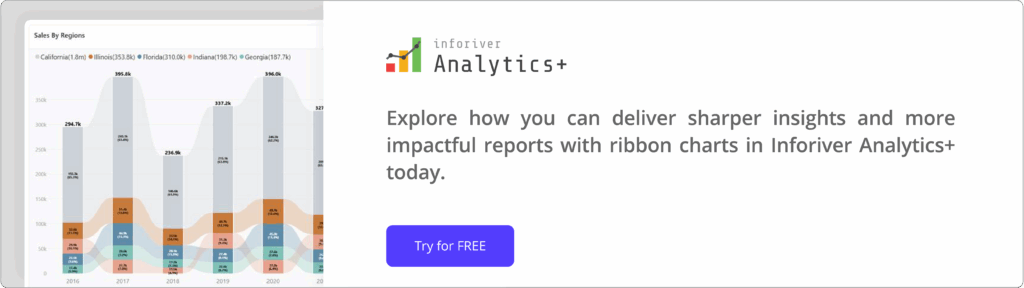
Explore how you can deliver sharper insights and more impactful reports with ribbon charts in Inforiver Analytics+ today.

Inforiver helps enterprises consolidate planning, reporting & analytics on a single platform (Power BI). The no-code, self-service award-winning platform has been recognized as the industry’s best and is adopted by many Fortune 100 firms.
Inforiver is a product of Lumel, the #1 Power BI AppSource Partner. The firm serves over 3,000 customers worldwide through its portfolio of products offered under the brands Inforiver, EDITable, ValQ, and xViz.