Dashboards are built to inform, but when they’re packed with metrics, it can be difficult to spot what actually requires action. Action Dots in Power BI solve this problem by highlighting key insights directly within your visuals. Instead of scanning through dozens of numbers, users can immediately identify where attention is needed—helping teams prioritize faster and make more effective decisions.
Action Dots offer a simple yet effective way to highlight the metrics that matter most. These color-coded indicators draw attention to data points that require action, helping users quickly identify issues or opportunities within a dashboard or table, without needing to sift through every detail. Imagine a sprawling dashboard filled with numbers; Action Dots act as immediate visual signals, guiding your eye to where it's most needed.
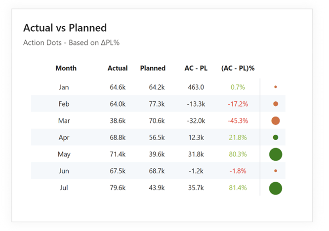
Typically, these intuitive visual cues are color-coded in red and green to instantly highlight underperforming or overachieving metrics, making it effortless to discern success from areas needing intervention. Developed by DataViz expert Nick Desbarats, Action Dots are designed to help you cut through the clutter and quickly grasp the story your data is telling.
This blog post will delve into the profound value Action Dots provide, demonstrate how easily you can create them in Power BI using Inforiver Analytics+, and share best practices for their effective use. We’ll also briefly explore alternative visualization methods and compare their respective capabilities, giving you a comprehensive understanding of how to optimize your Power BI dashboards for actionable insights.
What Value Do Action Dots Provide?
Action Dots aren't just aesthetically pleasing additions to your visuals; they offer significant and tangible advantages for anyone looking to optimize their data analysis and decision-making processes:
Filter Out the Noise and Focus Attention: Dashboards can easily become cluttered with too much information, making it hard to know where to focus. Action Dots help cut through the noise by signaling only the metrics that require attention. This targeted approach reduces cognitive load, prevents analysis paralysis, and keeps your focus on the insights that drive action.
Gear Reports Towards Action: The primary purpose of any good report or dashboard is to drive action. Action Dots facilitate this by highlighting only metrics that are either "actionably good" or "actionably bad.". This clear distinction helps you prioritize tasks, address underperformance swiftly, and capitalize on successful trends.
Evaluate Dissimilar Metrics Efficiently: Action Dots allow you to evaluate metrics with different units and scales all within one dashboard. This includes complex scenarios such as:
"Reverse" qualitative scales: Where a lower number is preferable (for example, with expenditure or defect rate). For these metrics, Action Dots can be configured to flag high (undesirable) values in a 'bad' color and low (desirable) values in a 'good' color, providing immediate clarity despite the inverted scale.
"Goldilocks" metrics: Where the ideal performance lies within a specific, optimal range, not simply higher or lower. For instance, consider ideal inventory levels (not too much, not too little) or employee workload (not too light, not too heavy). Action Dots excel here by highlighting when performance deviates from this "just right" sweet spot, whether it's critically too low or alarmingly too high. This comprehensive capability ensures you can assess a wide array of KPIs uniformly.
Compact Representation: Despite their powerful analytical capabilities, Action Dots maintain a remarkably compact representation. This ensures a quick, at-a-glance overview of the entire canvas, allowing executives and decision-makers to grasp the overall performance picture without needing to delve into granular details immediately.
Creating Action Dots in Power BI with Inforiver Analytics+
Adding Action Dots in Power BI tables and matrices is remarkably simple with Inforiver Analytics+. Follow these easy steps:
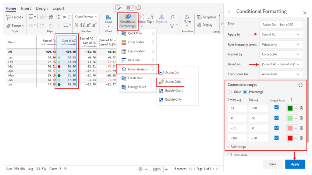
Select the Measure: In your Inforiver Analytics + Table, navigate to the column header of the measure you want to enhance with Action Dots (in this example, 2020 Actual) Click on the three lines that appear upon hovering over the header to open the “Table Context Menu.”.
Apply Conditional Formatting: In the “Data”, select "Conditional Formatting." This will open the Conditional Formatting pane on the right side of your Inforiver Analytics + Canvas.
Choose "Action Dots": Within the Conditional Formatting pane, under the "Display" section, you'll find various icon options. Select the "Action Dots" icon set. Inforiver provides a default set of red, amber, and green dots.
Apply: Once you have defined your ranges and selected your Action Dot style, click the "Apply" button at the bottom of the Conditional Formatting pane. Your Inforiver visual will now display Action Dots next to the selected measure, instantly highlighting performance based on your defined thresholds.
With these intuitive steps and customization features in Inforiver Analytics+, creating impactful Action Dots in your Power BI dashboards is quick and efficient, allowing you to focus on the insights that truly drive action.
Customization Features: Inforiver Analytics+ provides several key customization options to tailor your Action Dots for maximum impact and clarity:
Positioning: You can control the placement of the Action Dots relative to the metric value. Choose to display them to the "Left" or "Right" of the number using the "Position" dropdown.
Show As New Column: For enhanced visual separation and emphasis, you can opt to display the Action Dots in a separate column. Simply toggle the "Show As New Column" option to "On". This creates a dedicated column containing only the Action Dots.
Creating Action Dots in Power BI with Inforiver Reporting Matrix
Inforiver Reporting Matrix also offers a streamlined process for implementing Action Dots, enhancing your tabular reports with quick visual insights. Here’s how you can create them in just a few steps:
Access Conditional Formatting: Within your Inforiver Reporting Matrix visual, select the measure column where you wish to apply Action Dots. Navigate to the "Conditional Formatting" option, typically found in the visual's formatting pane or ribbon.
Select Action Analysis -> Action Dots: From the Conditional Formatting options, choose "Action Analysis" and then select "Action Dots." This will enable the dot indicators for your chosen measure.
Define Thresholds: Specify the numerical thresholds for each color of the Action Dots (e.g., values below X are Red, values between X and Y are Amber, values above Y are Green). You can adjust these ranges to align with your performance targets.
Apply and Customize: Confirm your selections to apply the Action Dots to your report.
Feature
Action Dots
Bullet Charts
Gauges/Bars with Variances
Heatmaps/Conditional Formatting
Focus Attention on Exceptions
✔
✔
✔
Evaluate Dissimilar Metrics
✔
✔
● (within a table)
Compact Representation
✔
●
● (within a table)
Highlights Target Variance
●
✔
✔
● (can be configured)
Shows Performance Distribution
✔
✔
✔
Best Practices for Creating Action Dots in Power BI
While Action Dots is powerful method for drawing attention to critical insights, implementing them effectively requires adherence to a few key best practices to maximize their impact and ensure your dashboards remain clear and actionable:
Be Selective with Metrics – Focus on What Needs Action: The primary purpose of Action Dots is to highlight metrics that demand attention or require a specific response. Therefore, it's crucial not to add Action Dots for every single metric on your dashboard. Overuse can lead to visual clutter, dilute the significance of the dots, and create decision fatigue for users, making it harder to discern truly important areas. Only apply them to Key Performance Indicators (KPIs) that, when outside their desired range, necessitate an immediate review, investigation, or strategic decision. This targeted approach ensures the dots genuinely serve as actionable alerts.
Limit Color Variants for Clarity and Quick Interpretation: To maintain visual simplicity and ensure immediate understanding, avoid using more than 3-4 distinct color variants or shades for your Action Dots. Introducing too many colors can overwhelm users and make it difficult to quickly interpret the meaning of each dot, defeating their purpose of providing a compact, at-a-glance overview. A widely effective and clear palette typically defines performance levels such as:
Dark Red: Indicating a "Crisis" or critically underperforming metric.
Light Red: Signalling "Actionably Bad" performance that requires attention.
Light Green: Representing "Actionably Good" performance that is on track or slightly exceeding targets.
Dark Green: Denoting "Best Case" or significantly overachieving performance. This limited, meaningful palette helps users quickly grasp the severity or success level of a metric at a glance.
Alternatives to Action Dots That Visualize Performance
While Action Dots excel at drawing immediate attention to specific metrics requiring action, several other visualization types can effectively communicate performance and can also be created using Inforiver Analytics+:
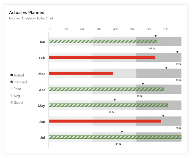
Bullet Charts: Bullet charts are designed to visualize the quantitative and qualitative evaluation of a single metric. They typically display a primary measure against a target value and provide context through comparative measures, such as ranges indicating satisfactory, good, and excellent performance.
Gauges: Gauges can display current performance against a target. Integrating variance indicators, such as arrows or color-coding, help quickly show whether the performance is above or below the expected level.
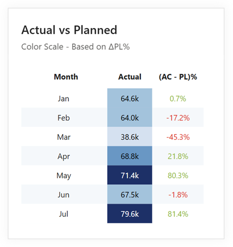
Heatmaps/Conditional Formatting: Applying conditional formatting rules, such as color scales or icon sets, to tables or matrices can create heatmaps that quickly reveal outliers and areas of concern or strong performance. By using color intensity to represent data values, heatmaps provide a visual overview of performance patterns across multiple categories.
How Do Action Dots Compare?
Here's a comparison of Action Dots with the alternative performance visualization types mentioned:
Feature
Action Dots
Bullet Charts
Gauges/Bars with Variances
Heatmaps/Conditional Formatting
Focus Attention on Exceptions
✔
✔
✔
Evaluate Dissimilar Metrics
✔
✔
● (within a table)
Compact Representation
✔
●
● (within a table)
Highlights Target Variance
●
✔
✔
● (can be configured)
Shows Performance Distribution
✔
✔
✔
Legend: ✔ - Strong Capability ● - Moderate Capability Blank - Limited or Not Directly Applicable
Conclusion
Action Dots are a valuable tool for Power BI dashboards. They quickly show you what's important, cutting through the noise to highlight metrics that need your attention. Easy to create with Inforiver Analytics+, they help you evaluate all kinds of data uniformly. While other visuals have their uses, Action Dots truly stand out for making dashboards actionable and easy to read at a glance. Start using them to make your data work harder for you.
Learn more and get started with Inforiver
To learn more about the latest from Inforiver and why we are garnering recognition from industry experts, check out our newest brochure.
Inforiver and all our planning and analytics products are continually updated to provide a diverse range of users with optimal performance.
If you’re ready to level up your planning, reporting, and analytics, try it for free today.
Inforiver helps enterprises consolidate planning, reporting & analytics on a single platform (Power BI). The no-code, self-service award-winning platform has been recognized as the industry’s best and is adopted by many Fortune 100 firms.
Inforiver is a product of Lumel, the #1 Power BI AppSource Partner. The firm serves over 3,000 customers worldwide through its portfolio of products offered under the brands Inforiver, EDITable, ValQ, and xViz.