Upcoming webinar on 'Inforiver Charts : The fastest way to deliver stories in Power BI', Aug 29th , Monday, 10.30 AM CST. Register Now
Upcoming webinar on 'Inforiver Charts : The fastest way to deliver stories in Power BI', Aug 29th , Monday, 10.30 AM CST. Register Now
Analyzing datasets with multiple variables, such as sales, costs, production time, customer satisfaction, and quality metrics—can quickly become overwhelming using standard visualizations. When you need to explore relationships across several dimensions at once, the Parallel Coordinates chart in Power BI offers a powerful solution. This chart type allows you to compare many variables simultaneously, making it easier to identify patterns, correlations, and outliers in complex data.
Let's break down what this chart shows you. Instead of the usual side-by-side bars or scatter plots, a Parallel Coordinates chart creates a dedicated vertical line for each measurement you have in your data. These lines stand parallel to one another, like lanes on a highway.
Now, think about each individual item in your dataset, such as one specific product. This product is represented by a single continuous line drawn across the chart. This line connects the product's value on the "Sales" line to its value on the "Cost" line, then to its value on the "Manufacturing Time" line, and continues connecting its values across all the vertical lines you have for every measurement.
So, for every single product, you get one unique line weaving across the entire chart. Following a line from left to right gives you a quick visual summary of that item's 'profile' across all the different things you've measured. Since measurements might be in very different units (like dollars, hours, or percentages), the chart smartly adjusts the scale on each vertical line. This makes sure the way the lines move truly reflects the relative values, allowing for fair comparisons even between very different types of numbers.

(b)
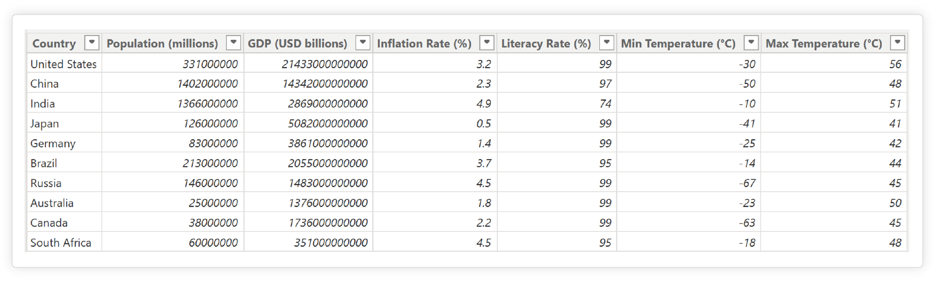
Image (b) utilizes a Parallel Coordinates chart to enable a powerful visual exploration of the diverse economic and climate data for countries presented in Image (a), making it easier to identify similarities, differences, and correlations across dimensions.
Parallel Coordinates charts are exceptionally good at revealing insights that are hard to spot in tables or simpler graphs. Here’s why they are a valuable addition to your analytical toolkit:
Putting it into Practice: Capabilities in Tools like Inforiver Analytics+
To truly harness the power of Parallel Coordinates charts in Power BI, you need a visualization tool that provides the necessary flexibility and ease of use. Inforiver Analytics+ offers its multi-variate chart with features designed to help professionals work with complex data:

This image illustrates the intuitive data assignment process within Inforiver Analytics+, showing how measures and dimensions are mapped to build a Parallel Coordinates chart.

The screenshot demonstrates the granular control users have over each vertical measurement line in Inforiver Analytics+'s Parallel Coordinates chart. Options visible include customizing scale type, labels, prefixes, suffixes, and axis line appearance, ensuring tailored data representation.

The screenshot highlights the Inforiver Analytics+ settings, showcasing how users can fine-tune the appearance of individual data lines within the Parallel Coordinates chart. This includes controlling line styles, widths, markers, and coloring lines by category to make specific trends and groups stand out.
By offering these straightforward and flexible capabilities, Inforiver Analytics+ empowers professionals to easily configure and interact with Parallel Coordinates charts, enabling deeper visual exploration and understanding of their complex multi-variate data within the Power BI environment.

Navigating the complexities of multi-variate data no longer needs to be a daunting task. Parallel Coordinates charts stand out as an incredibly effective visualization tool, empowering you to effortlessly uncover hidden patterns, identify critical relationships, and spot outliers across numerous variables. With robust platforms like Inforiver Analytics+ providing the necessary capabilities, bringing this powerful form of multi-variate analysis visualization into your Power BI reports is more accessible than ever. It's time to transform your multi-dimensional data into actionable insights and drive better decisions.

Inforiver helps enterprises consolidate planning, reporting & analytics on a single platform (Power BI). The no-code, self-service award-winning platform has been recognized as the industry’s best and is adopted by many Fortune 100 firms.
Inforiver is a product of Lumel, the #1 Power BI AppSource Partner. The firm serves over 3,000 customers worldwide through its portfolio of products offered under the brands Inforiver, EDITable, ValQ, and xViz.