Upcoming webinar on 'Inforiver Charts : The fastest way to deliver stories in Power BI', Aug 29th , Monday, 10.30 AM CST. Register Now
Upcoming webinar on 'Inforiver Charts : The fastest way to deliver stories in Power BI', Aug 29th , Monday, 10.30 AM CST. Register Now
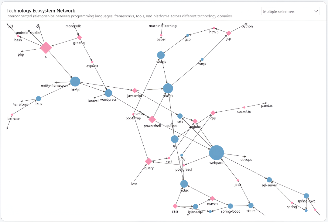
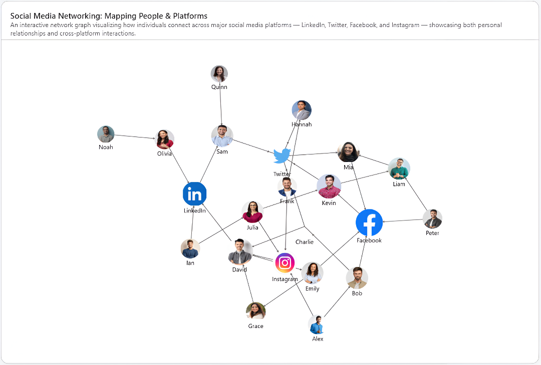
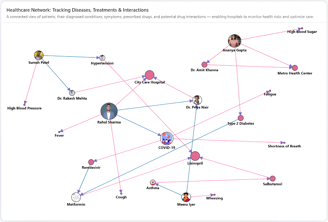
In many analytical scenarios, understanding the relationships between data points is just as important as the data itself. Whether mapping social networks, optimizing IT infrastructure, or detecting hidden links in fraud investigations, analysts need a visual approach that reveals patterns and connections at a glance. Network Graph in Power BI offers exactly that transforming complex relational datasets into an intuitive, interactive graph.
By representing entities as nodes and their connections as edges, a network graph uncovers the structure within your data identifying influential points, and isolated elements that might otherwise remain hidden in spreadsheets or traditional visuals.

The Inforiver Analytics+ Network Graph for Power BI is a graph visualization that goes beyond basic relationship mapping. Designed for complex relational datasets, it combines structural clarity with interactive features. As part of the hierarchy chart family, it helps you visualize complex connections in a way that’s both intuitive and dynamic.
Instead of relying on multiple visuals for teams, dependencies, and processes, this chart consolidates all relationships into a single, unified view. It doesn’t just display links; it highlights patterns, central nodes, and hidden dependencies.

Analyzing modern data relationships requires more than just plotting connections. It demands tools that can simplify complexity and reveal actionable insights. The Inforiver Analytics+ Network Graph does exactly that by transforming intricate, interconnected relational datasets into an interactive visual experience. Our Network Graph helps you uncover influencers, detect anomalies, and understand data relationships within seconds.
Unlike regular charts, this one adapts to your analysis, helping you find influencers, spot anomalies, and understand relationships fast delivering clarity without extra complexity.
Inforiver takes this a step further with powerful customization and interaction options that adapt to a wide range of analytical perspectives. From revealing directional flows to optimizing layout structures, the Network Graph becomes more than a visualization.
Here are the key features available in the Inforiver Analytics+ Network Graph:
Inforiver Analytics+ Network Graph offers multiple layout options to display data relationships. Each layout gives a unique view, making it easy to highlight patterns, clusters, and key nodes in Power BI.
Supported Layouts:

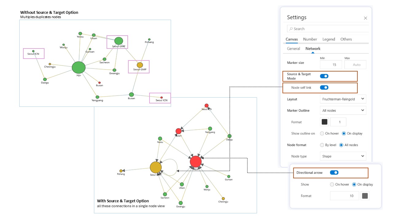
The Inforiver Analytics+ Network Graph allows you Merge duplicate nodes into one unified node by toggling Source and Target. The combined node connects to all linked points for a cleaner view, where Source is the starting point and Target is the ending point.
For clearer interpretation, enabling directional arrows along with Source and Target makes it easy to understand the flow of information or actions. The self-link feature lets you visualize self-referencing relationships directly in the chart.
Inforiver Analytics+ Network Graph offers different outline modes including Parent Mode (outlines only parent nodes), All Nodes (outlines every node), and Off (no outlines). The outline is a customizable border around each node, where you can adjust color and line width.
You can also control whether outlines appear by default or only on hover, providing flexible options to highlight nodes as needed.

Inforiver Analytics+ Network Graph provides extensive formatting options for nodes at two levels: All Nodes and By Level, giving you full control over the appearance and behavior of your network.
1. All Nodes:
Key features include:
a. Node Type: Inforiver Analytics+ offers three node type display options Shape, Text, and Image that can be applied across all nodes:
b. Color Mode:
c. Shape Styling: Customize shape color and fill options, including solid fill, outline only, or hatched patterns.

2. By Level Node
The By Level option in Inforiver Analytics+ allows you to apply formatting to specific categories such as Source and Target nodes individually. This gives you the flexibility to set distinct visual styles for each role in the network.
Key Features:
a. Individual Control – Apply unique formatting to Source and Target nodes separately, ensuring clear differentiation.
b. Multiple Display Options – Both Source and Target nodes support all three display types: Shape, Text, and Image. You can also mix these formats as needed. For example:
c. Full Flexibility – Combine any option for each level such as Source as text and Target as image, or both as shapes depending on your visualization needs.
A variety of options are also available to customize the appearance of links (edges) between nodes, helping you create clearer and more informative network visuals.
Inforiver Analytics+ Network Graph supports Dynamic Link mode, which automatically adjusts the thickness of connections based on their associated values. When this option is toggled on, links with higher values appear thicker, while those with lower values are thinner.
Why it’s useful:
This feature makes it easy to visually interpret the strength or importance of relationships at a glance by prioritizing key connections or dominant relationships.

Inforiver Analytics+ Network Graph allows you to display descriptive labels on the links connecting nodes, providing additional context for the relationship between two entities. To enable this feature, add the desired field to the Link Label section in the Data Pane and toggle it on.
Customization Options:

Inforiver Analytics+ Network Graph for Power BI comes packed with powerful features that enhance clarity, control, and customization, making your network data easier to explore and interpret:
Conclusion
Inforiver Analytics+ Network Graph brings advanced, flexible visualization capabilities to Power BI, making it easier than ever to explore complex relationships and uncover hidden insights of relational and graphical databases. Whether you’re analyzing organizational structures, tracking connections, or detecting patterns, these charts offer the customization and interactivity needed to make your data tell a clear story.
Ready to transform your data analysis with powerful network visuals?
Try Inforiver Analytics+ today and experience a smarter way to visualize relationships.
Have questions or want a demo? Contact us to learn how Inforiver can elevate your Power BI reports.
Don’t forget to share your thoughts and insights - we’d love to hear how you’re using network charts in your work!

Inforiver helps enterprises consolidate planning, reporting & analytics on a single platform (Power BI). The no-code, self-service award-winning platform has been recognized as the industry’s best and is adopted by many Fortune 100 firms.
Inforiver is a product of Lumel, the #1 Power BI AppSource Partner. The firm serves over 3,000 customers worldwide through its portfolio of products offered under the brands Inforiver, EDITable, ValQ, and xViz.