Upcoming webinar on 'Inforiver Charts : The fastest way to deliver stories in Power BI', Aug 29th , Monday, 10.30 AM CST. Register Now
Upcoming webinar on 'Inforiver Charts : The fastest way to deliver stories in Power BI', Aug 29th , Monday, 10.30 AM CST. Register Now
Effective market analysis requires more than just data. It demands clarity in how that data is presented. When evaluating competitive positioning, segment performance, and market share, decision-makers need tools that reveal insights at a glance. Mekko Charts in Power BI offer a powerful way to visualize these dynamics in a single, comprehensive view—eliminating the need to piece together information from multiple charts and helping teams make faster, more strategic decisions.

Understanding the Standard Mekko Chart
The Standard Mekko chart is a two-dimensional chart designed to visualize the relationship between two categorical variables and two numerical variables. It achieves this by using the width of columns to represent the proportion of one categorical variable to the total, while the height of the columns is divided into segments representing the proportion of the second categorical variable within each of the first. The area of each segment, therefore, visually communicates the joint distribution of the two categorical variables. This makes it particularly useful for understanding market segmentation, where you might see the size of different market segments (width) and the distribution of product categories within those segments (height).
The Inforiver Analytics+ Marimekko chart builds upon these fundamental principles, offering a powerful and versatile alternative for visualizing complex relationships.
For Power BI, Marimekko charts are a flexible two-dimensional chart that utilizes variable column width and height to represent measures across categories. This dynamic scaling of both dimensions is a key feature, enabling the visualization of relationships between multiple variables in a single visual. Unlike a standard bar chart, it uses both width and height to encode values, allowing for the display of more complex data relationships. Depending on the configuration, it can show interactions between several variables or present data with a single category and measure.
Consider sales data where you might typically encounter separate charts illustrating sales by product, units sold by product, and product sales within each quarter. While these individual charts offer specific insights, they don't readily reveal the interconnectedness between total sales and units sold for each product, or how a single product's sales fluctuate across different quarters and contribute to overall revenue. An Inforiver Analytics+ Marimekko chart can simultaneously depict all this information.

Inforiver Analytics+ Marimekko charts are exceptionally well-suited for market analysis because of their ability to visualize data across categories using both column width and height to represent different measures. This allows for a more integrated view of market size and performance within segments.
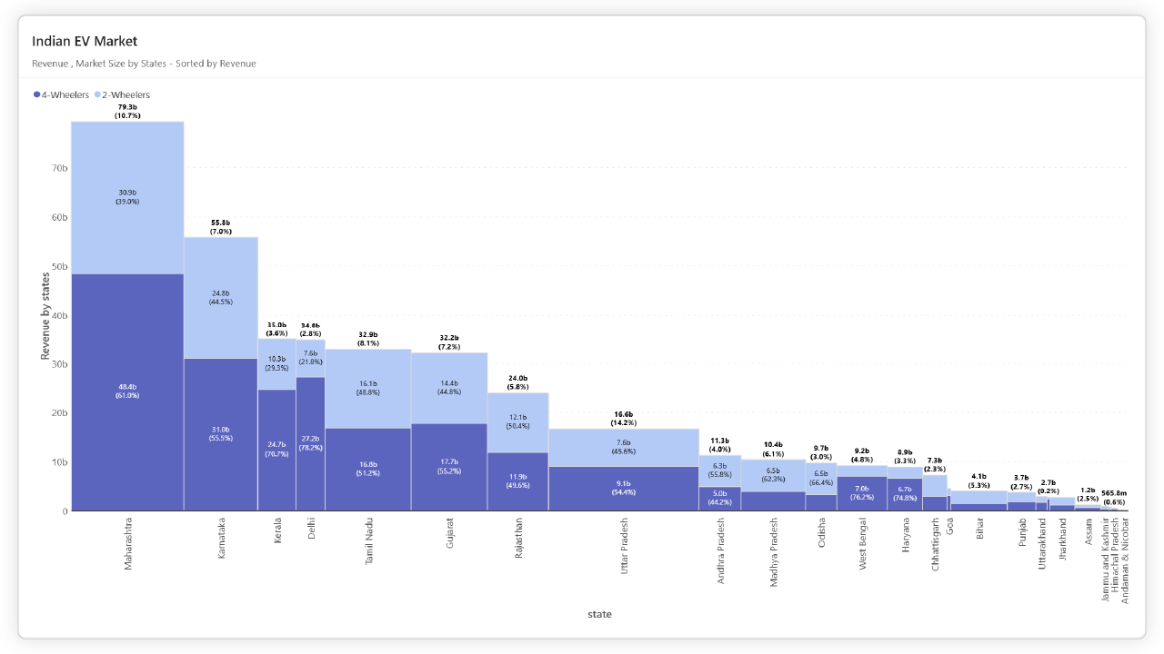
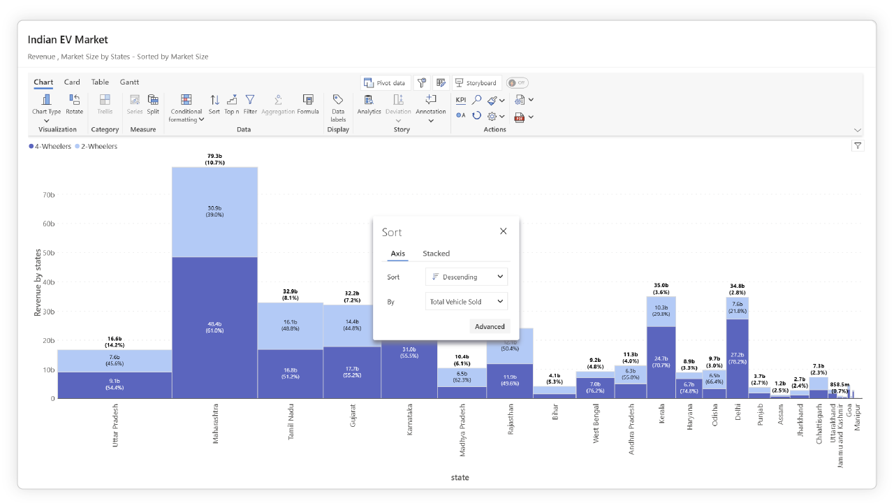
This unique structure of Inforiver Analytics+ Marimekko charts allows you to discern the relationships between different market dimensions within a single, compact view. For example, you can visualize products (as categories) with their corresponding market share (as width) and sales performance broken down by region (as stacked height). This newly synthesized information empowers decision-makers to identify patterns that are considerably more challenging to extract from disparate charts. It provides a "bird's-eye overview" of broad trends, effectively highlighting major contributors or segments that stand out.
Inforiver Analytics+ provides a range of flexible Marimekko chart options to cater to various analytical perspectives. These options allow you to visualize relationships between categorical and numerical data with precision. The core Marimekko chart uses variable column widths and heights to represent different measures across categories.
Here are the available orientations and stacking configurations:


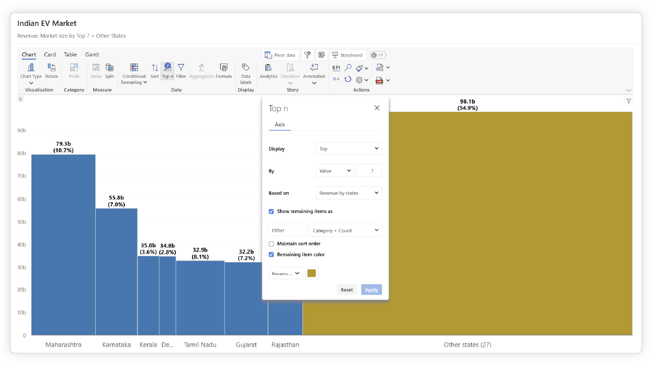
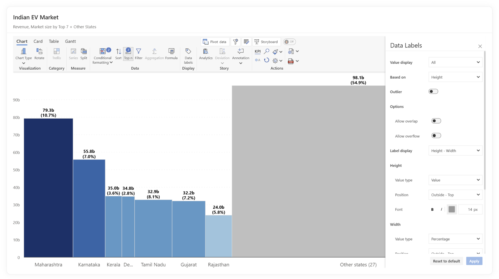
For Power BI users, Inforiver Analytics+ offers an advanced Inforiver Analytics+ Marimekko chart visual equipped with key features that further elevate strategic market analysis. These functionalities enable deeper insights and greater customization:


While Inforiver Analytics+ Marimekko charts excel at providing a broad overview rather than precise estimations due to the inherent limitations of visual perception with areas and baselines, their strength lies in presenting the comprehensive picture and emphasizing major contributors and segments.

By consolidating planning, reporting, and analytics on a unified platform like Power BI with tools such as Inforiver Analytics+, enterprise decision-makers can harness the visual power of Marimekko charts to gain a holistic, insightful, and visually engaging understanding of the market landscape, ultimately informing strategic decisions regarding market entry, resource allocation, and competitive positioning.
Mekko Charts in Power BI provide a clear, consolidated view of market landscapes, enabling more informed and confident decision-making. Whether you're comparing market share, analyzing segment performance, or uncovering competitive insights, these charts help you do it all in a single visual.
To dive deeper, learn more about Inforiver Analytics+ Combo/Multi Axes Chart, start a free trial of Inforiver Analytics+, or explore additional articles on Combo/Multi Axes Charts.

Inforiver helps enterprises consolidate planning, reporting & analytics on a single platform (Power BI). The no-code, self-service award-winning platform has been recognized as the industry’s best and is adopted by many Fortune 100 firms.
Inforiver is a product of Lumel, the #1 Power BI AppSource Partner. The firm serves over 3,000 customers worldwide through its portfolio of products offered under the brands Inforiver, EDITable, ValQ, and xViz.