Upcoming webinar on 'Inforiver Charts : The fastest way to deliver stories in Power BI', Aug 29th , Monday, 10.30 AM CST. Register Now
Upcoming webinar on 'Inforiver Charts : The fastest way to deliver stories in Power BI', Aug 29th , Monday, 10.30 AM CST. Register Now
Every project has one common truth: time defines success. Whether you are coordinating a product release, managing a construction schedule, or planning release, or planning a marketing campaign, understanding when tasks start, finish, and overlap is critical. Yet most reports focus on numbers and outcomes, leaving timelines buried in spreadsheets or disconnected tools. This is where choosing the right Gantt Chart for Power BI becomes essential.
A wellstructured Power BI Gantt chart transforms complex schedules into a clear, interactive visual. By bringing tasks, dependencies, and progress into a single timeline view, a Gantt chart helps teams align, spot risks early, and make informed decisions without ever leaving the BI environment. Unlike static spreadsheets, a Gantt chart visual for Power BI turns your project data into a dynamic planning and tracking tool that evolves in real time.
This guide walks you through everything you need to know: What is a Gantt Chart in Power BI? How do you build one? When should you use timelines versus other visuals? And how can advanced visuals like the Inforiver Analytics+ Gantt elevate project reporting and execution?
Gantt charts transform complex schedules into clear, actionable visuals. A Power BI Gantt chart visual displays tasks as horizontal bars across a timeline, revealing start and end dates, durations, progress, and overlaps. This level of visibility helps teams:
Imagine you’re leading a product launch. Your team has several tasks such as design, development, testing, marketing. Each has its own start and end date. Some tasks overlap, others depend on previous steps. You could keep all this in a spreadsheet, but it feels like staring at a maze of numbers. You need a pictorial overview or a timeline that tells the whole story.
That’s where a Gantt chart comes in. Think of it as a project’s timeline brought to life. Each task becomes a horizontal bar, stretching from its start date to its end date. When you glance at the chart, you instantly see:
To make this happen, your data needs a few key ingredients:
In short, a Gantt chart turns your project from a static list into a living timeline that tells the story of your work.
Picture this: you’re managing a major project, and your team needs to know not just what tasks exist, but when they happen and how they fit together. A timeline is your visual roadmap. It arranges tasks or events in chronological order so you can see when activities start and end, how they overlap, and how they fit into the bigger picture. Unlike a static list, a timeline gives you a clear sense of sequence and duration, making dependencies and time constraints easy to understand. In Power BI, timelines can include milestones, progress indicators, and reference lines to add context and improve decision-making.
But timelines aren’t one-size-fits-all. Different situations call for different views. Here are three common approaches:
This is the classic Gantt chart. Each task appears as a horizontal bar spanning its planned timeline. These bars show start and end dates, giving stakeholders a clear picture of how tasks align over time. Advanced versions often include a baseline bar beneath the planned timeline and an actual overlay to measure variance. This makes it easy to spot delays or deviations from the original schedule. It’s ideal for project teams and PMOs who need to manage the critical path and allocate resources effectively.
For example, a software release plan might include phases like Discovery, Design, Development, Testing, and Launch. Each task can display extra details such as percentage complete, assigned owner, dependencies, and milestones like feature freeze or code complete. Reference ranges can mark sprint boundaries or UAT windows, helping teams stay aligned throughout the release cycle.
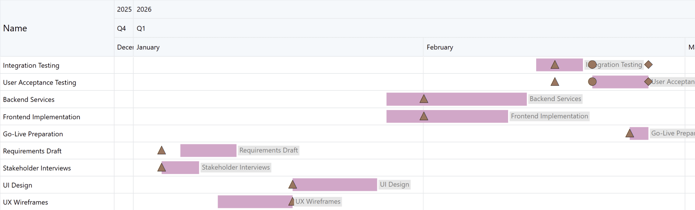
Figure 1: Gantt chart in Inforiver Analytics+ showing overlapping project tasks and milestones across late 2025 and early 2026 for planning, design, development, and testing phases.
An activity chart focuses on people and resources. It answers the question: who is doing what, and do they have bandwidth? It highlights over-allocation when someone has overlapping assignments and reveals idle periods where resources are underutilized. Managers can quickly spot imbalances and make staffing decisions that optimize productivity and prevent burnout.
Common use cases include project staffing, shift planning in healthcare or manufacturing, and scheduling field service technicians.
In short, while a task-based Gantt chart answers “When will this task be done?”, an Activity or Resource chart answers “Who is doing what, and do they have bandwidth?”. This perspective is essential for organizations that need to balance workloads and ensure efficient resource utilization.
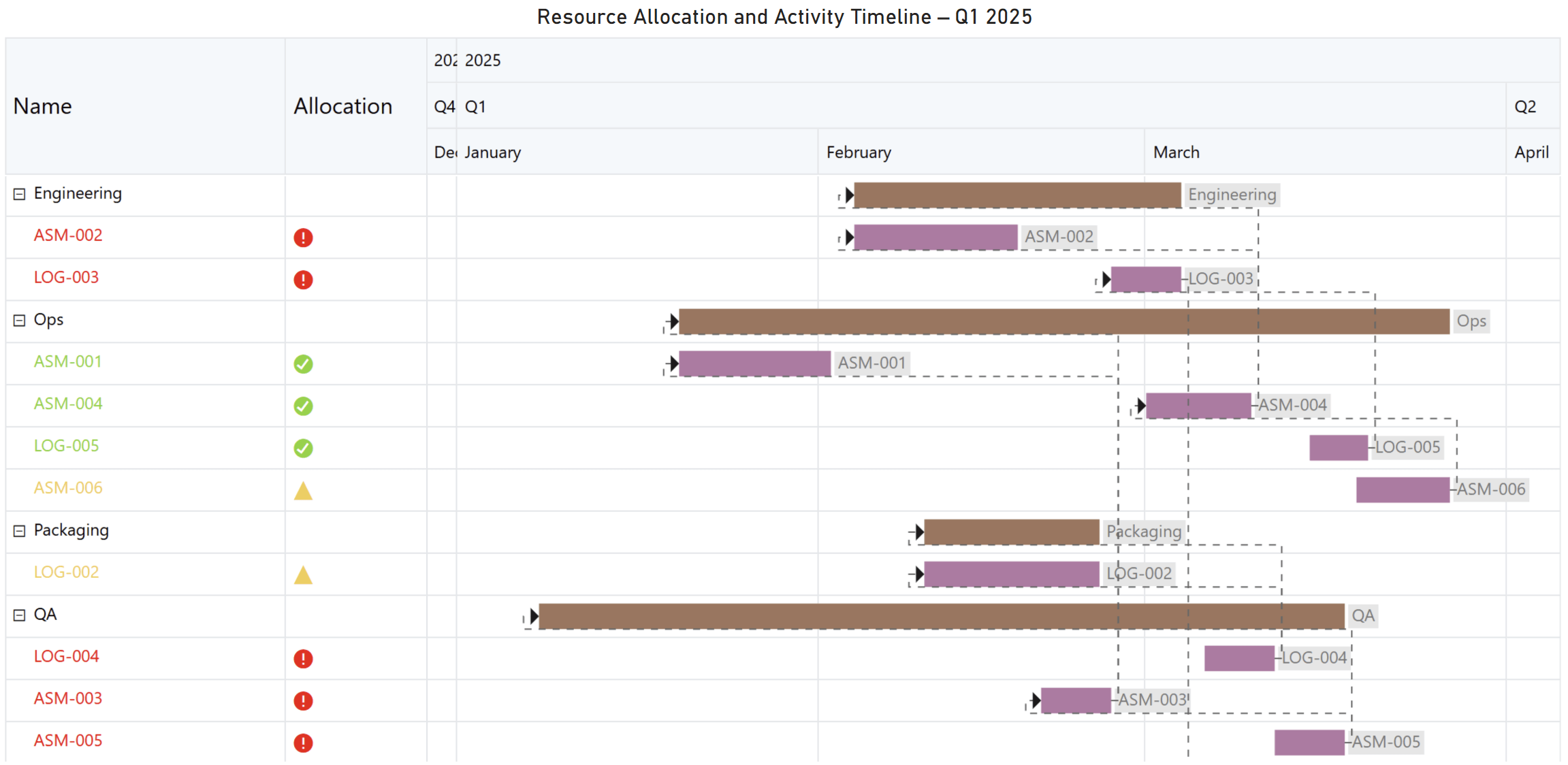
Figure 2: A resource allocation Gantt chart showing engineering, operations, packaging, and QA activities across Q1 2025, with colored bars and icons indicating workload, task duration, and dependencies.
When scheduling short-duration tasks like shifts, classes, maintenance windows, or marketing campaigns, a weekly timetable view is essential. Unlike a standard Gantt chart that focuses on long-term timelines, this view offers day and hour-level detail. It allows you to visualize blocks of time across a week, ensuring assignments are spaced properly and conflicts are avoided.
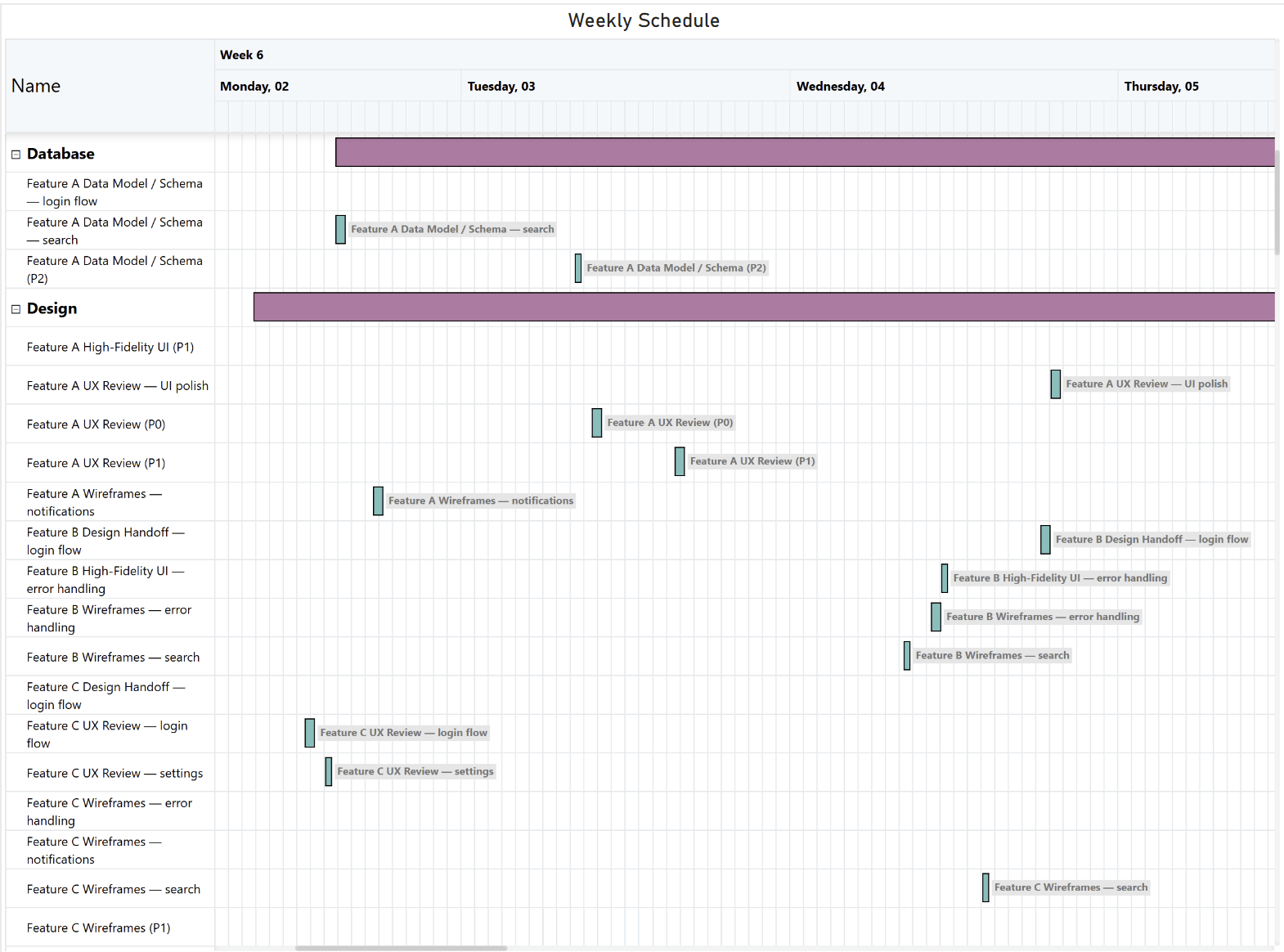
Figure 3: Weekly timetable built using Inforiver Analytics+ Gantt, illustrating hour‑level task scheduling.
A Gantt chart is more than a timeline. It is a communication tool that shows where work stands and what needs attention. Effective progress tracking starts with visual cues that make status clear.
Figure 4: A color‑coded progress chart built using Inforiver Analytics+ illustrating task completion percentages, using blue for completed work, green for high progress, amber for mid‑range progress, and red to highlight tasks requiring attention.
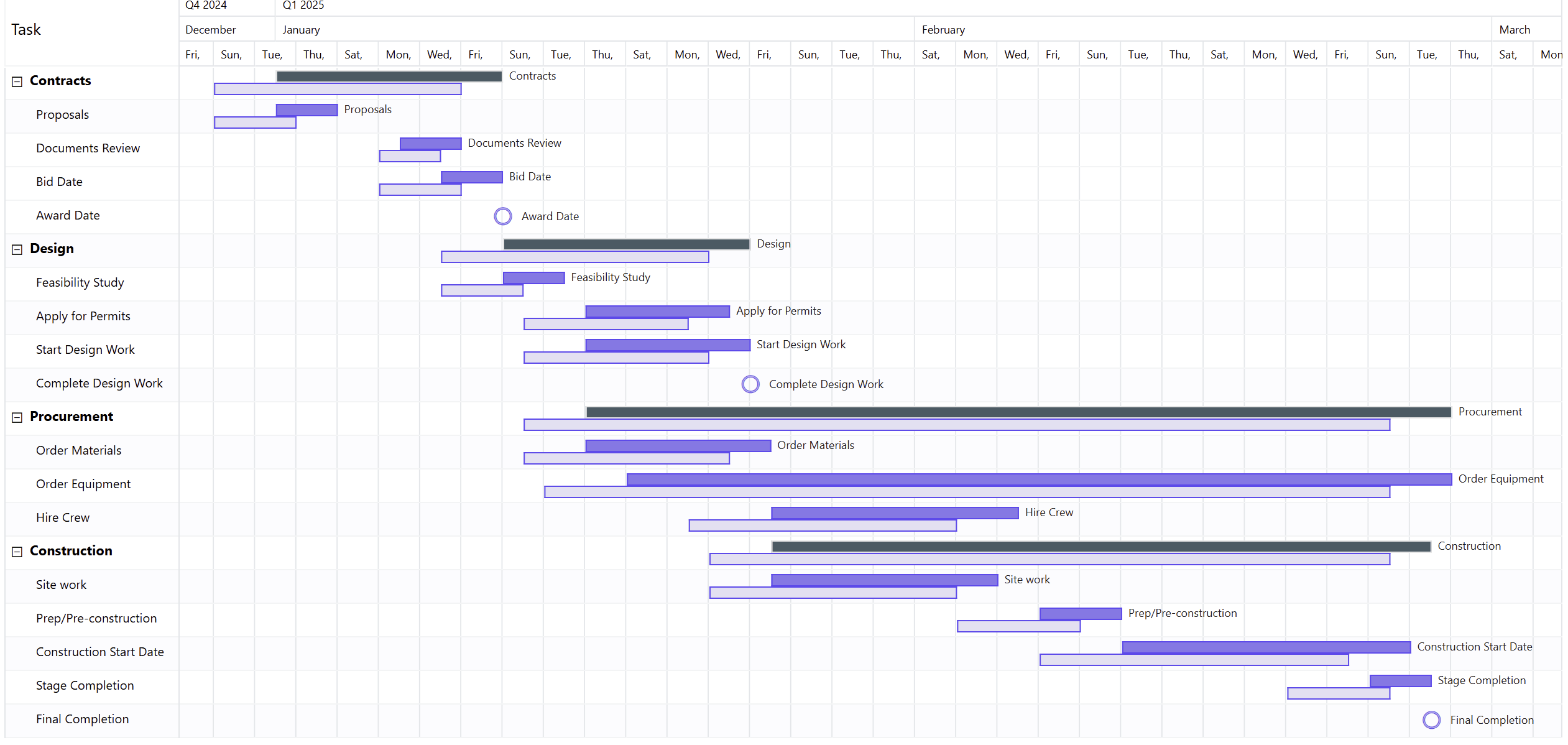
Figure 5: A multi‑phase project schedule built using Inforiver Analytics+ Gantt, illustrating actual task durations and baseline durations across Contracts, Design, Procurement, and Construction in a clean, week‑by‑week timeline format.
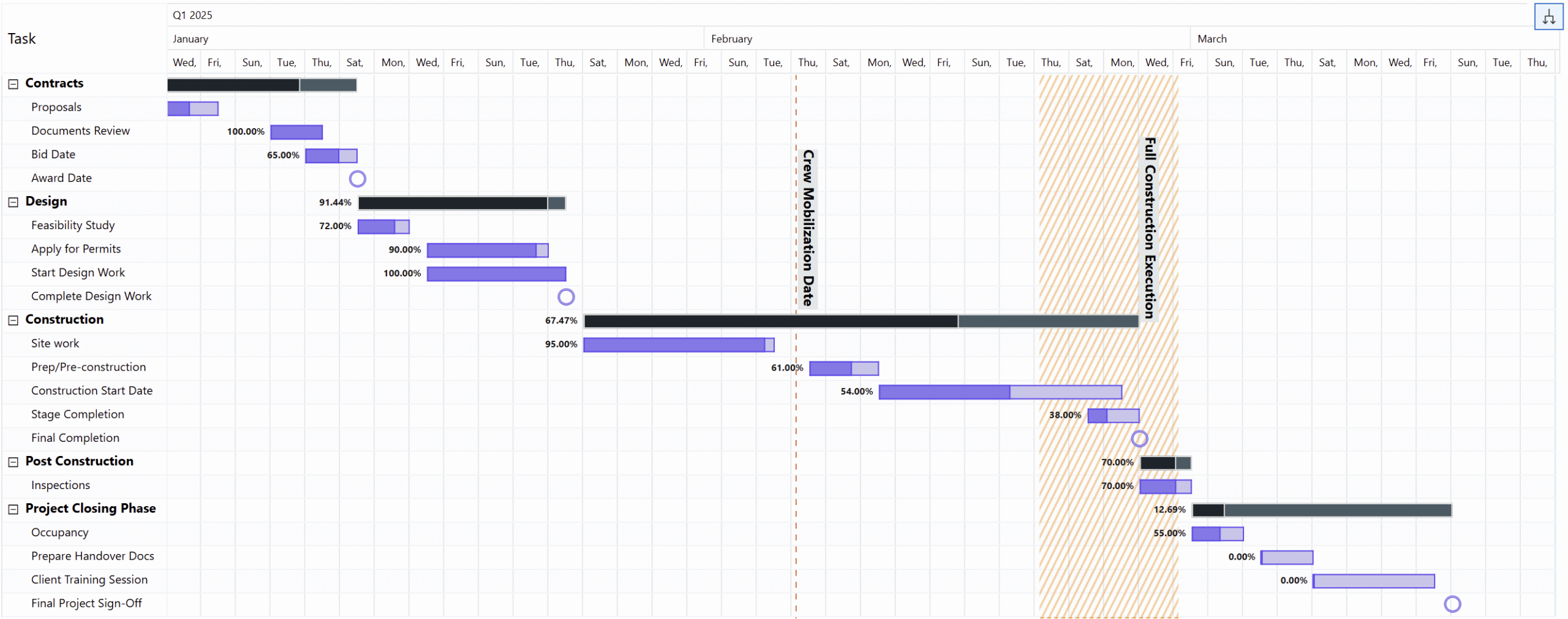
Figure 6: A concise project timeline built with Inforiver Analytics+ Gantt, featuring a clear reference line for the Crew Mobilization Date and a highlighted range band marking the Full Construction Execution period.
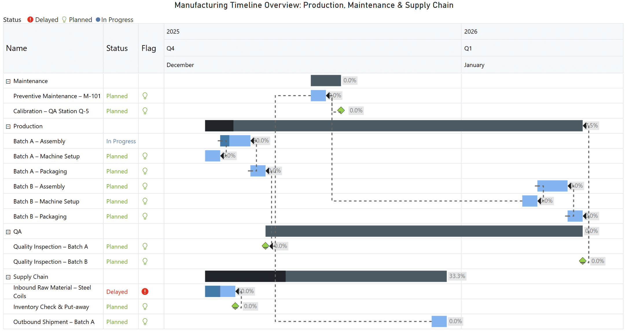
Figure 7: Inforiver Gantt provides a clear view of production schedules, maintenance windows, and supply chain activities, enabling teams to identify delays and optimize resource allocation.
When combined, these features transform a Gantt chart from a static schedule into a dynamic dashboard that helps teams monitor progress, identify risks early, and make informed decisions.
Time granularity refers to the level of detail shown in a timeline. In simple terms, it determines how fine or broad your time intervals are. High granularity means very detailed views, such as hours or days. Low granularity means broader views, like weeks, months, or quarters.
Granularity matters because different stakeholders need different perspectives. Executives often want a high-level roadmap showing phases and milestones, while project managers need daily handoffs and dependency details. Without flexible granularity, you end up creating multiple reports for different audiences, which is inefficient and prone to errors. A dynamic Gantt chart solves this by allowing you to zoom and scroll through time scales in real time.
Modern Gantt visuals in Power BI let you move seamlessly between years, quarters, months, weeks, and days. Here is how each level adds value:
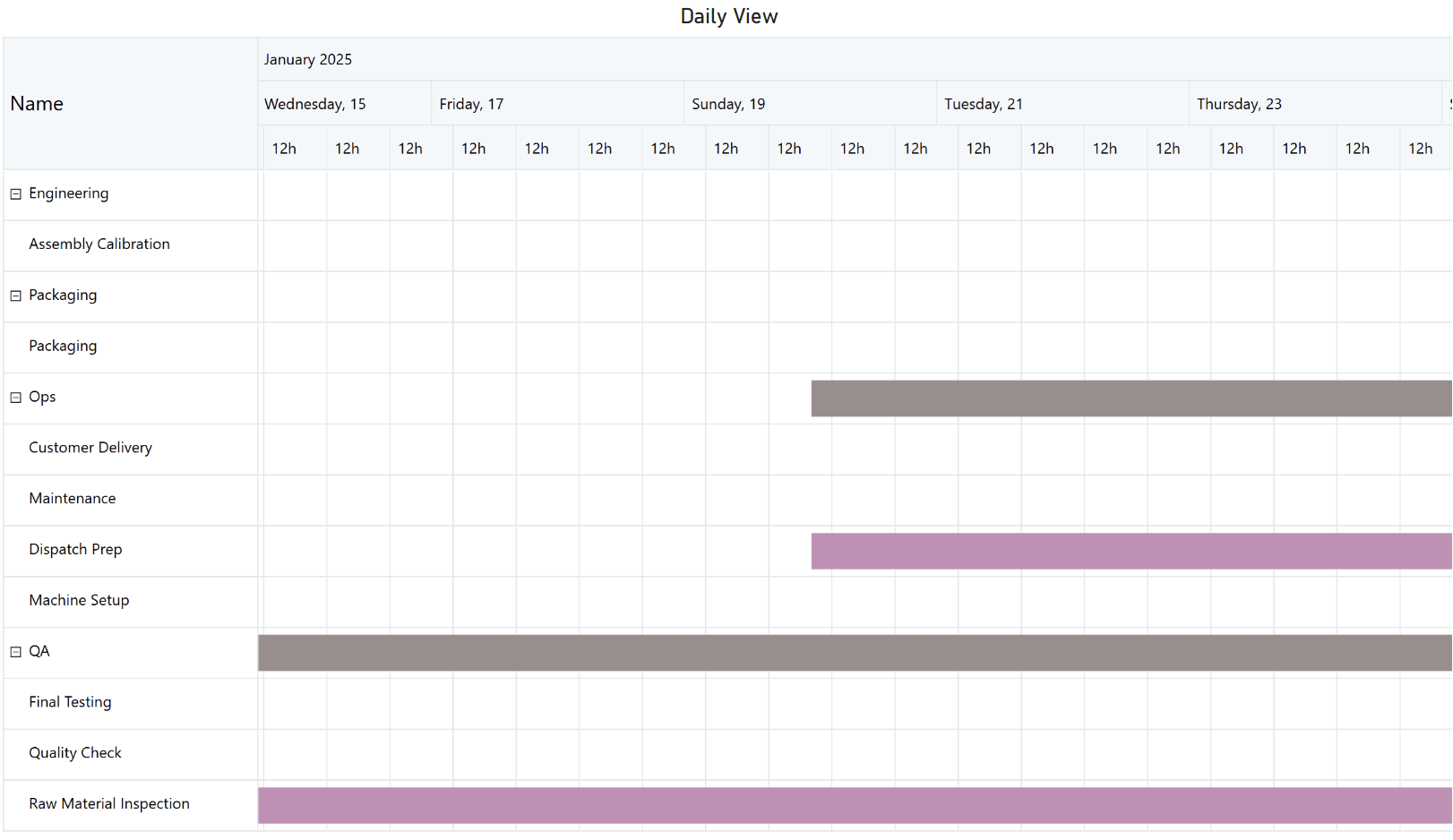
Figure 8: Daily granularity built using Inforiver Analytics+
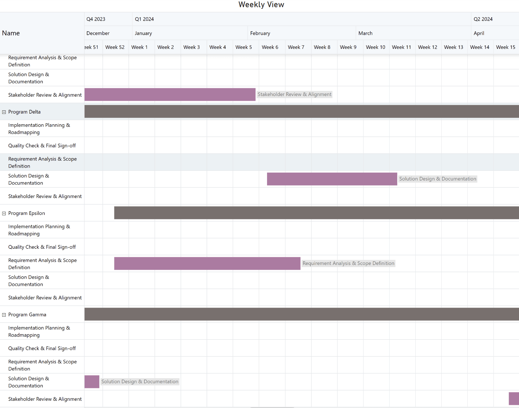
Figure 9: Weekly granularity built using Inforiver Analytics+
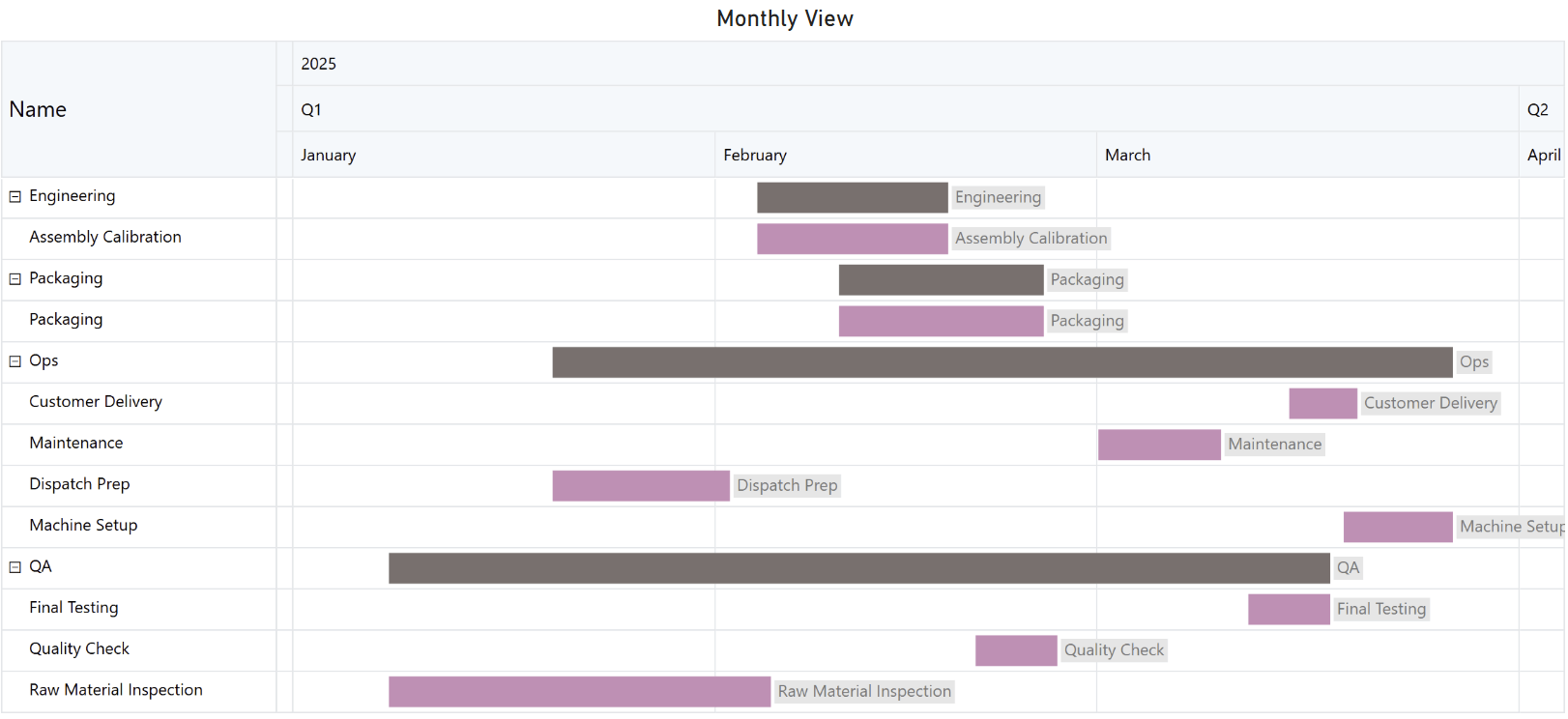
Figure 10: Monthly granularity built using Inforiver Analytics+
To make timelines realistic, advanced visuals add features like non-working day shading and custom fiscal calendars, ensuring the schedule reflects your organization’s rhythm. This builds trust and make reporting actionable.
The native Gantt Chart in Power BI by Microsoft can show timelines, but when projects grow complex, teams need more than bars and dates. They need interactive features that make planning and tracking effortless. This is where advanced tools like Inforiver Analytics+ come in.
Inforiver Analytics+ transforms a simple Gantt chart into a powerful project management dashboard inside Power BI. Here’s what makes it stand out:
Inforiver combines ease of use with enterprise-grade features, making it ideal for PMOs, project managers, and executives who need clarity and control in one place.
Building a Gantt chart in Power BI is easier when you start with practical templates. These examples show how timelines can adapt to different industries and use cases.
Example 1: Product Launch Timeline
Imagine planning a major software release. Your roadmap includes phases like Discovery, Design, Development, Testing, and Launch. Here’s how the template looks:
How it helps: Executives see baseline vs. actual timelines and color-coded progress. Engineers zoom from quarterly to weekly views to inspect overlaps and dependencies.
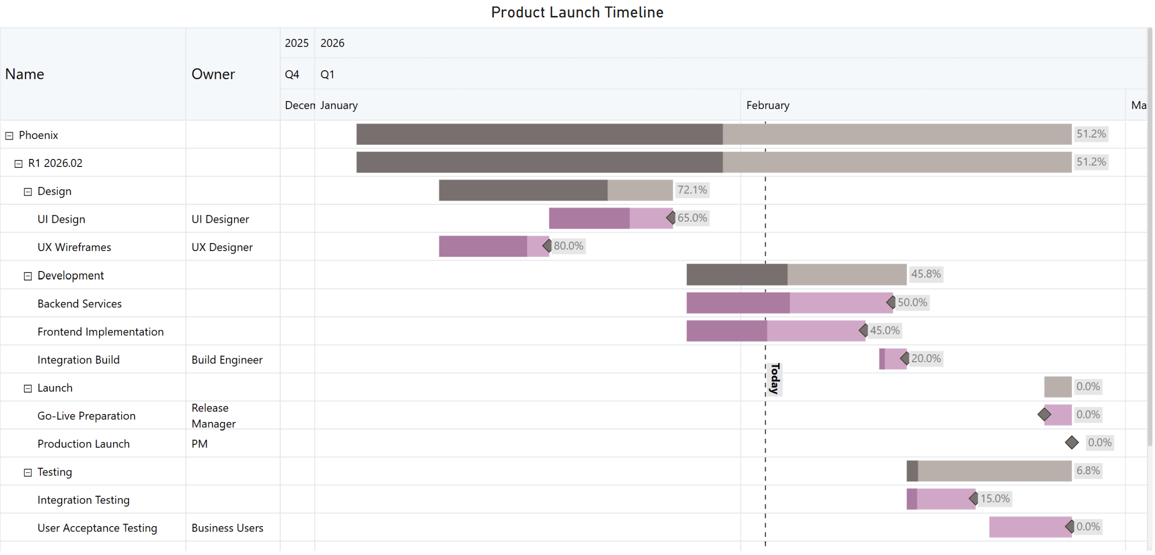
Figure 11: A streamlined product launch timeline created with Inforiver Analytics+ Gantt, featuring task ownership, progress bars, and milestone markers for key delivery stages.
Example 2: Construction Project Schedule
Picture a large construction project with multiple phases. Here’s what the template includes:
How it helps: Stakeholders track dependencies like permits before foundation work. Progress bars and status flags surface at-risk phases. Executives collapse to phases for high-level reporting or expand to tasks for daily coordination.
These templates are not just examples. They are starting points for building dynamic, interactive timelines in Power BI. With advanced visuals like Inforiver Analytics+, you can add conditional formatting, annotations, and export options to make these templates executive ready.
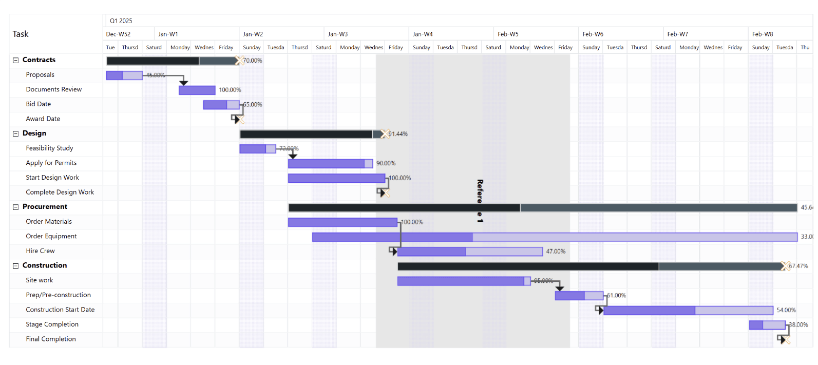
Figure 12: A structured project timeline created with Inforiver Analytics+ Gantt, showing phased task progress and dependencies across Contracts, Design, Procurement, and Construction, with key reference markers and highlighted schedule bands to emphasize important project milestones.
Not all visuals serve the same purpose. Timelines, Gantt charts, and Work Breakdown Structures (WBS) each tell a different part of the project story. Understanding when to use each can save time and improve clarity.
A timeline is the simplest view. It shows events or tasks in chronological order, focusing on sequence and duration without adding complexity. Timelines are perfect for roadmaps, campaign calendars, and high-level communication where the goal is to show what happens when, not how it gets done. You can use the Microsoft Project or Inforiver Analytics+ Gantt to showcase the timeline.
Best for: Executives and stakeholders who need a quick overview.
Figure 13: A multi‑year project portfolio timeline built with Inforiver Analytics+ Gantt, showcasing progress across industry sectors using consistent bar indicators and milestone icons for clear, long‑range schedule visibility.
A Gantt chart goes beyond dates. It adds progress indicators, dependencies, milestones, and baseline vs. actual comparisons. This makes it ideal for project managers and PMOs who need to monitor critical paths, manage risks, and ensure timely delivery.
Best for: Teams managing execution and tracking progress in detail.
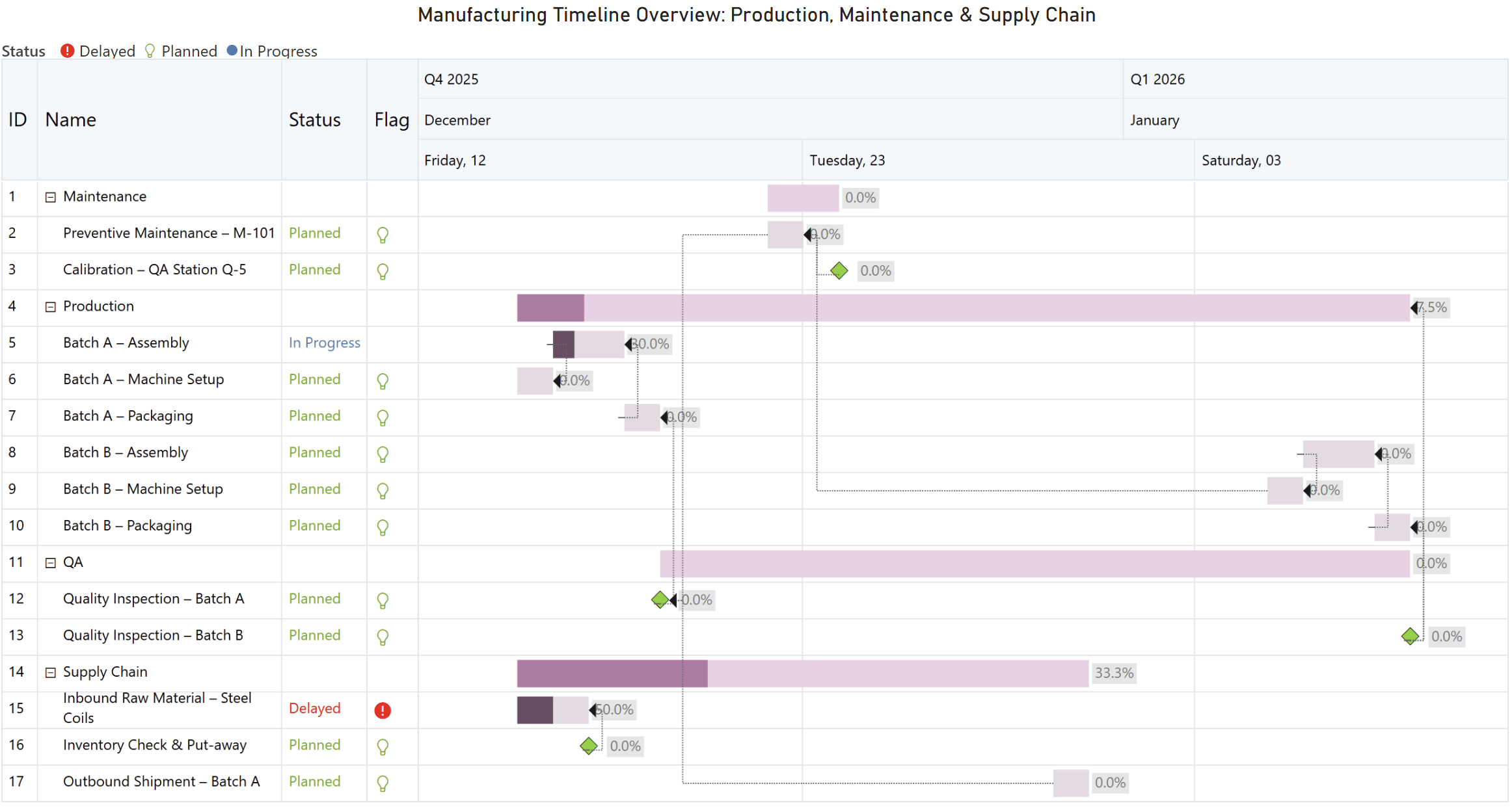
Figure 14: A manufacturing timeline created with Inforiver Analytics+ Gantt, highlighting planned, in‑progress, and delayed activities across production, maintenance, and supply chain workflows using clear status indicators and milestone markers.
A WBS breaks down a project into a structured hierarchy of phases, deliverables, and tasks. It focuses on “what needs to be done” rather than “when it needs to happen.” This makes WBS a cornerstone for defining scope and planning work before scheduling begins.
WBS is often paired with a Gantt chart for timeline and dependency management, but its primary purpose is to provide a clear view of the project’s scope.
Example visuals:
Best for:
Planning teams and stakeholders who need to define scope and responsibilities before moving into scheduling and execution.
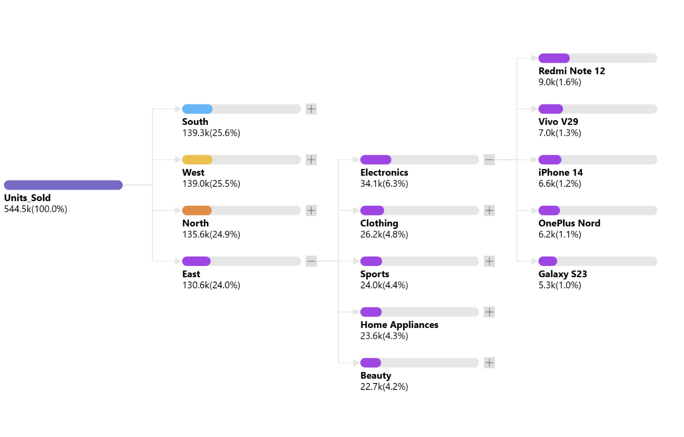
Figure 15: A hierarchical sales performance breakdown visualized using Inforiver Analytics+ Decomposition Tree, showing units sold across regions, categories, and top products with proportional bars for clear contribution comparison.
| Feature / Purpose | Timeline | Gantt Chart | WBS |
| Primary Focus | Sequence of events | Detailed schedule with progress and dependencies | Hierarchical structure of work |
| Shows Dates? | Yes | Yes (with baseline vs. actual) | No |
| Shows Progress? | No | Yes (% complete, color coding) | No |
| Shows Dependencies? | No | Yes (connector lines) | No |
| Shows Milestones? | Optional | Yes | No |
| Hierarchy Support | Limited | Yes | Yes |
| Best For | Roadmaps, campaigns | Execution tracking, risk management | Scope definition and planning |
How to Decide:
All three can coexist in a single Power BI report, giving stakeholders the flexibility to move from strategy to execution without leaving the dashboard.
Gantt charts are more than visuals. They are strategic tools that turn complex schedules into clear, actionable insights. In Power BI, they bridge the gap between planning and execution, helping teams track progress, manage dependencies, and communicate effectively.
Whether you start with a simple timeline or adopt advanced visuals like Inforiver Analytics+, the goal is the same: make time visible, risks predictable, and decisions faster.

Inforiver helps enterprises consolidate planning, reporting & analytics on a single platform (Power BI). The no-code, self-service award-winning platform has been recognized as the industry’s best and is adopted by many Fortune 100 firms.
Inforiver is a product of Lumel, the #1 Power BI AppSource Partner. The firm serves over 3,000 customers worldwide through its portfolio of products offered under the brands Inforiver, EDITable, ValQ, and xViz.