Inforiver

Upcoming webinar on 'Inforiver Charts : The fastest way to deliver stories in Power BI', Aug 29th , Monday, 10.30 AM CST.    Register Now

Table of content

Visualizing Stages: Funnel & Pyramid Charts for Power BI 

by Inforiver | Jul 03, 2025 |

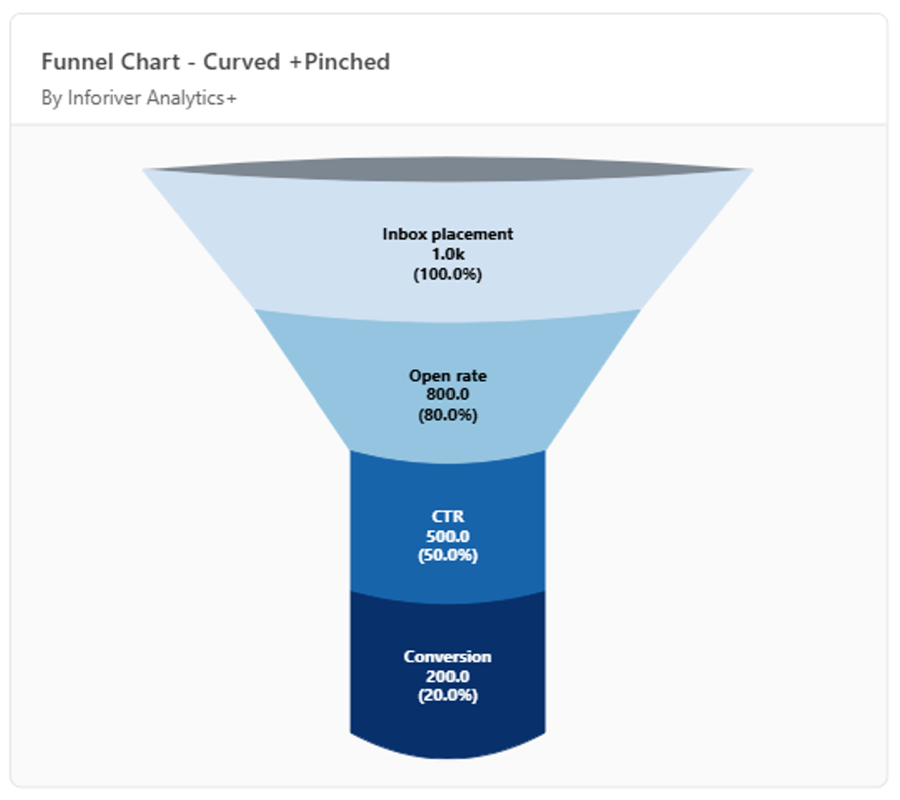
Funnel and pyramid charts are powerful tools for visualizing sequential data, each serving distinct analytical purposes. They help with understanding how data progresses or transforms through various stages. A funnel chart is designed to represent processes where values decrease at each step. A classic example is a sales pipeline, where a large number of initial prospects narrows down to a smaller number of closed deals. The decreasing width of the chart segments highlights conversion rates and areas of attrition at each stage.  

Funnel charts are especially useful for tracking conversion efficiency, detecting bottlenecks, and measuring how effectively each stage contributes to the overall process. Users read the chart from the widest segment at the top (the starting point) down to the narrowest point, with noticeable drops between stages highlighting potential inefficiencies. 

A pyramid chart, by contrast, is essentially an inverted funnel. It’s commonly used to represent data that builds from a foundational base, such as organizational hierarchies, market segmentation, or resource distribution across different tiers. Pyramid charts are well-suited for illustrating layered structures or processes where each level supports the one above it, providing a clear view of how components are distributed or grow from the bottom up. 

Inforiver Analytics+ Funnel Visuals 

Power BI provides a native funnel chart, but it frequently falls short in offering the extensive configuration options required for diverse stakeholder needs. Inforiver Analytics+ addresses this with a comprehensive set of these charts. The Inforiver Funnel Chart Family includes three types: the Funnel Chart, the Pyramid Chart, and the Executive Funnel Chart (an advanced type). This "3-in-one" visual pack allows you to set up one visual as a Funnel Chart, a Pyramid Chart, or an advanced Executive Funnel Chart, with each type boasting its own display and customization choices. 

Display Styles for Funnel and Pyramid Charts

Inforiver Analytics+ provides distinct display options for both Funnel and Pyramid charts, allowing you to tailor the visual look that best fits your data.

For the Funnel Chart, you can choose from:  

  • Include Total Sum (Dynamic Height): This feature dynamically adjusts the height of band for each stage based on its total value, providing a clearer visual representation of volume. This helps you to:  
  • Visually Grasp Magnitude: Quickly see the actual size of each stage, as larger stages take up more vertical space. 
  • Compare Stage Sizes Easily: Get an intuitive sense of the total volume at different steps, making it simple to compare stages with varying scales. 
Inforiver Analytics+ funnel chart with dynamic height enabled, showcasing varying stage sizes to represent total value and aid intuitive comparison

  • Curved: Provides a smooth, flowing representation of transitions between stages. This style is particularly useful when visualizing processes with an expected continuous progression, allowing stakeholders to quickly grasp the overall trend and flow without focusing on abrupt, discrete drops. It emphasizes the journey and gradual changes. 
 funnel chart in curved style showing smooth transitions between stages to emphasize continuous flow and gradual change in process visualization

  • Dynamic Slope: Changes the angle between segments based on value differences, highlighting significant changes. This directly ties the visual angle to data fluctuations, making steep drops or notable increases immediately apparent and drawing attention to critical conversion points or bottlenecks. 
funnel chart in pinched style showing sharp stage drop-offs, emphasizing major conversions and bottlenecks from top to final stage

  • Pinched: This variation of the funnel chart is characterized by the funnel narrowing more sharply, often presenting the final stage as a distinct rectangle, which makes the bottom appear significantly skinnier than the top. This visual style is highly effective for clear interpretation:  
    • Understanding Stage Progression: The wide top represents the largest initial group (e.g., all prospects), with middle stages showing remaining numbers, and the narrowest part (often a rectangle) highlighting the final output (e.g., closed sales). 
    • Highlighting Major Drop-Offs: The sharpness of the pitch visually emphasizes where the most significant losses or drop-offs occur, such as a wide 'Prospects' bar transitioning acutely to a thin 'Closed' bar. 
power bi funnel chart in pinched style

  • Inverted: Shows the funnel in an upside-down shape, useful for different data presentations. While a traditional funnel shows reduction, an inverted funnel (or pyramid) can visually represent growth, accumulation, or a hierarchy building upwards from a base. 
Inverted funnel chart in power bi

For the Pyramid Chart:  

  • The primary display style is an inverted triangle. 
  • Inverted: This specific style is for the Pyramid Chart. It shows the visual as a pyramid, which is its common shape for illustrating hierarchies or processes that develop from a base. 
pyramid funnel chart in power bi

Both Standard Funnel and Pyramid Charts also include: 

  • Data Label Customization: Control how data labels appear, including combinations of categories, values, or percentages. Labels can be placed inside or outside the bars, with options for inline and split data labels for clarity. 
  • Conditional Formatting: Apply rules to highlight important numbers or thresholds directly in the visual, such as marking stages with high loss percentages. 

Series Stacking

Enable stacking of different series within a single stage by adding a category to the 'Legend' data well. This feature offers a powerful way to break down complex processes by:

  • Revealing Internal Composition: Clearly illustrating how different contributing factors or sub-categories form the total value of each stage. For instance, in a sales funnel, you can dissect the 'Qualified Leads' stage to see the proportional contribution of leads from various marketing channels, product lines, or geographic regions. 
  • Enabling Sub-Segment Performance Tracking: Allowing users to observe the journey and conversion rates of individual series across the entire funnel. This helps in understanding if specific segments are progressing efficiently or are experiencing higher attrition rates than others. 
  • Facilitating Granular Comparison: Providing a direct visual comparison of the performance, volume, and relative proportion of distinct series within the same stage.
  • Driving Insights: By clearly showing the flow and contribution of each series, it becomes easier to identify which sub-segments are the primary drivers of success or the main sources of loss, enabling more precise strategic adjustments and resource allocation.
funnel-series-stacking-subsegment-analysis

Conclusion 

Inforiver Analytics+ delivers a comprehensive funnel visual designed to help you move beyond basic charts and unlock deeper insights into your processes. With flexible display styles like Curved, Dynamic Slope, and Pinched, along with features such as total sums, conditional formatting, data label customization, and series stacking, you can easily visualize every stage of your workflow with precision. Whether you're analyzing sales pipelines, marketing funnels, or operational processes, Inforiver makes it simple to spot bottlenecks, measure conversions, and drive smarter decisions. 

Try Inforiver Analytics+ for yourself and explore how it can transform your reporting experience. 

inforiver-advanced-funnel-chart-visualization

Share this on:

Get Inforiver brochure

Maximize your business potential with Inforiver's paginated reporting, data entry, planning & budgeting capabilities
Download now
Inforiver

Inforiver helps enterprises consolidate planning, reporting & analytics on a single platform (Power BI). The no-code, self-service award-winning platform has been recognized as the industry’s best and is adopted by many Fortune 100 firms.

Inforiver is a product of Lumel, the #1 Power BI AppSource Partner. The firm serves over 3,000 customers worldwide through its portfolio of products offered under the brands Inforiver, EDITable, ValQ, and xViz.

linkedin facebook pinterest youtube rss twitter instagram facebook-blank rss-blank linkedin-blank pinterest youtube twitter instagram