Upcoming webinar on 'Inforiver Charts : The fastest way to deliver stories in Power BI', Aug 29th , Monday, 10.30 AM CST. Register Now
Upcoming webinar on 'Inforiver Charts : The fastest way to deliver stories in Power BI', Aug 29th , Monday, 10.30 AM CST. Register Now
We are ecstatic to announce the flagship 3.0. release for Inforiver Analytics+! The re-architected version of Inforiver Analytics+ comes packaged with core enhancements across Data Management, Trellis, UI/UX, Top N, and various other features to style and elevate your reports.
We have more exciting things coming soon with Inforiver Analytics+ and you can read our vision and roadmap here.
Feel welcome to explore the sections that interest you!
Inforiver Analytics+ have been expanded to accommodate Power BI field parameters. You can now seamlessly configure your Analytics+ on the fly using field parameters to drive the data.
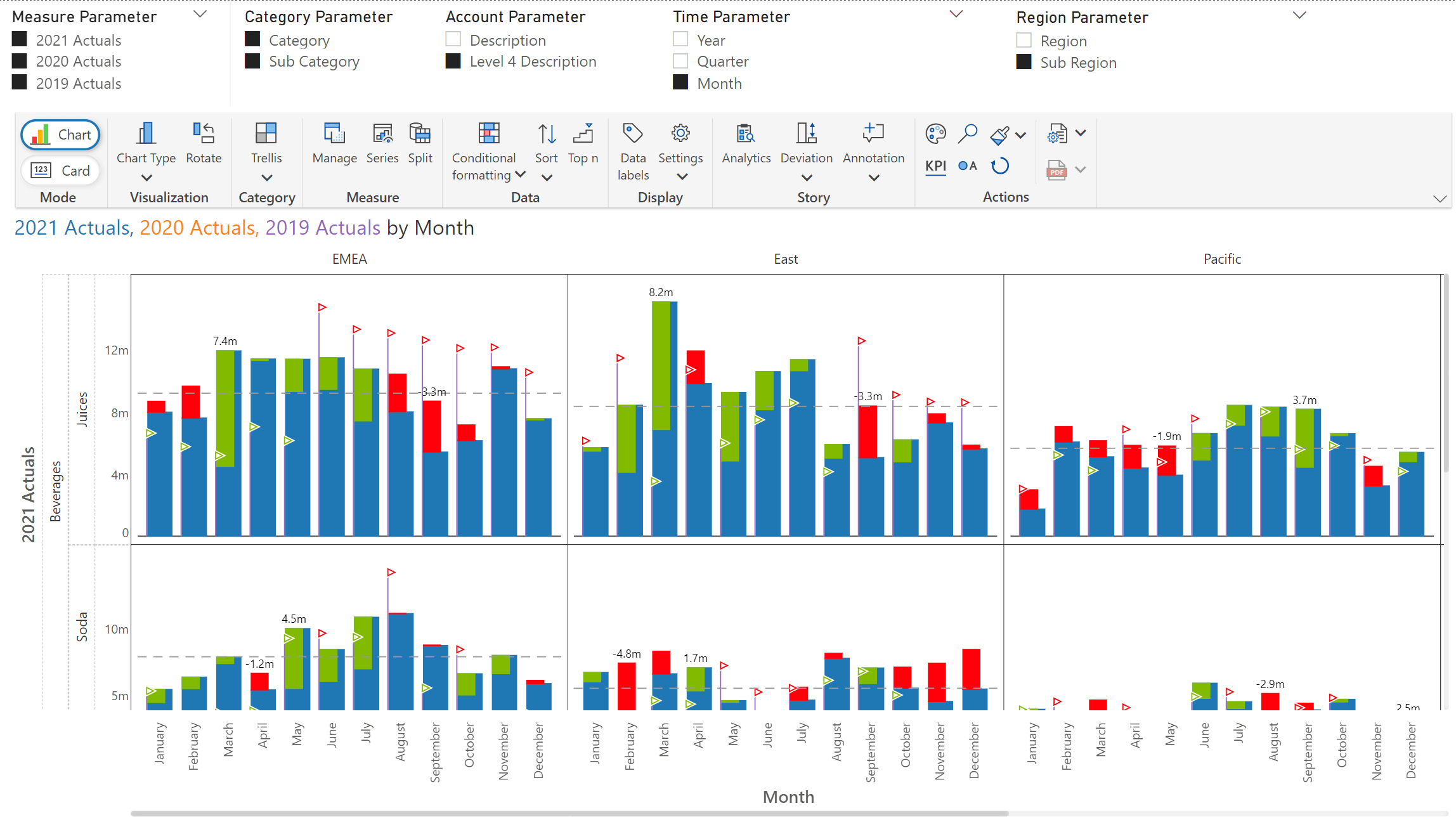
The newly launched Category tab will allow users to map dimensions into either Row or Columns or Stacked wells. The 3.0 release also supports hierarchical dimensions, turning this to a “Visual Pivot Table”.
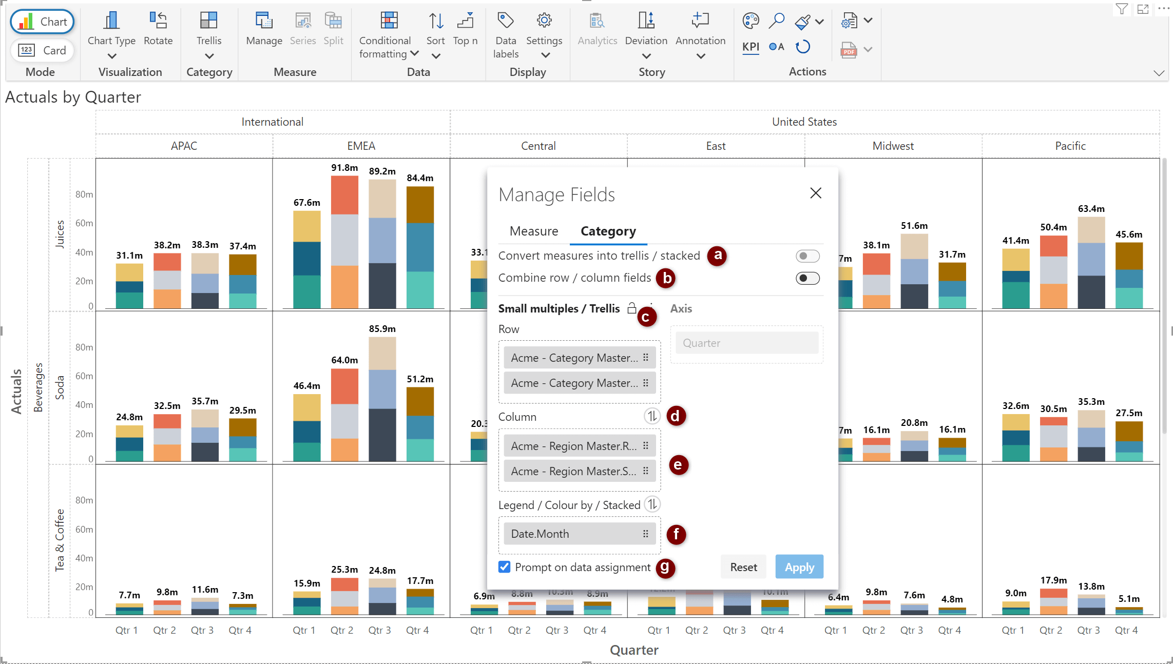
a) Convert measures into trellis/stacked
Measures can be split into separate layers and converted into a trellis or stacked charts. A new ‘Measures Group’ element is created when this option is enabled.
In the example below, notice how the Sales, Profit, and Quantity measures have been rendered in separate rows based on the assignment of the ‘Measures group’ element.
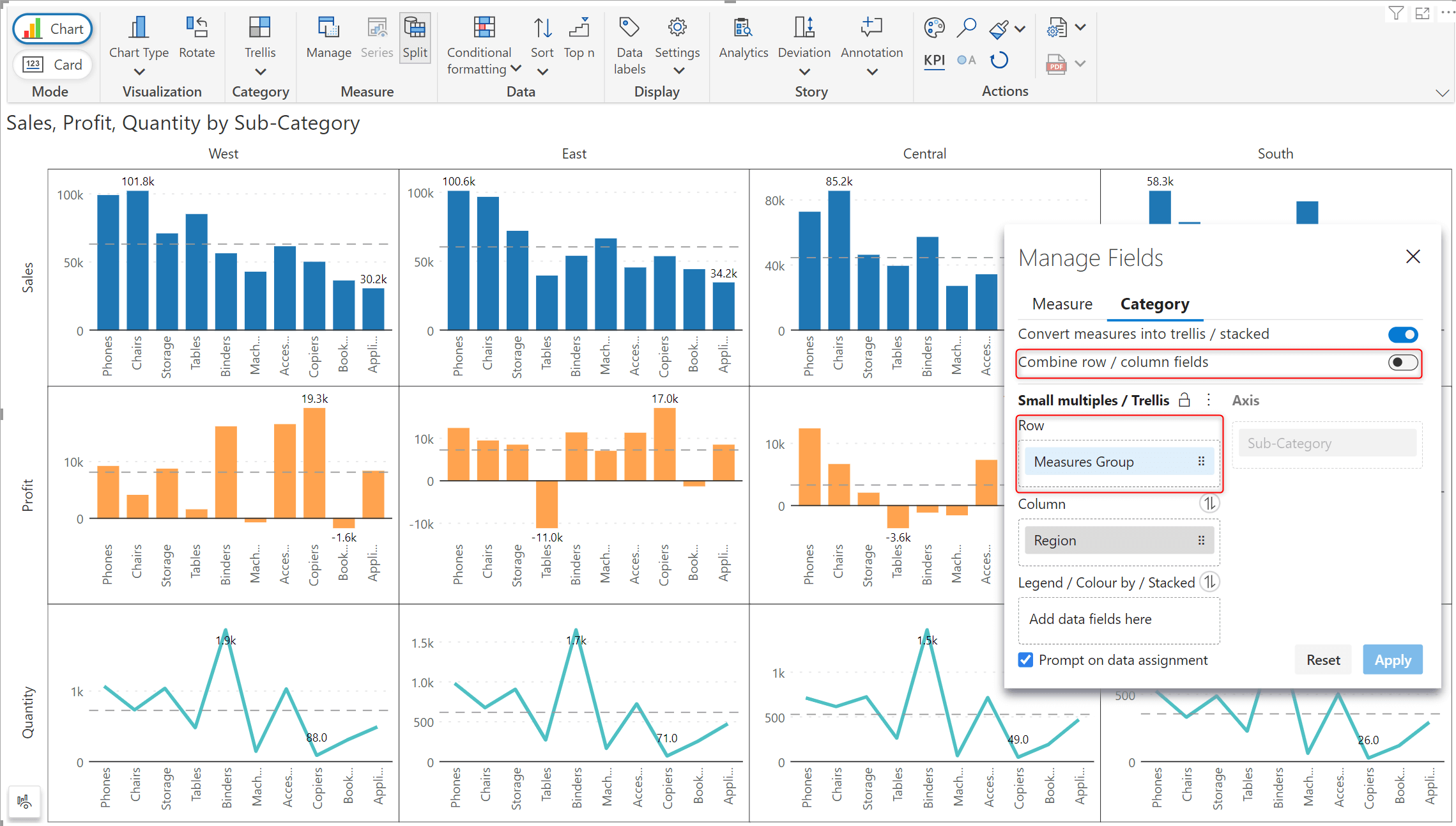
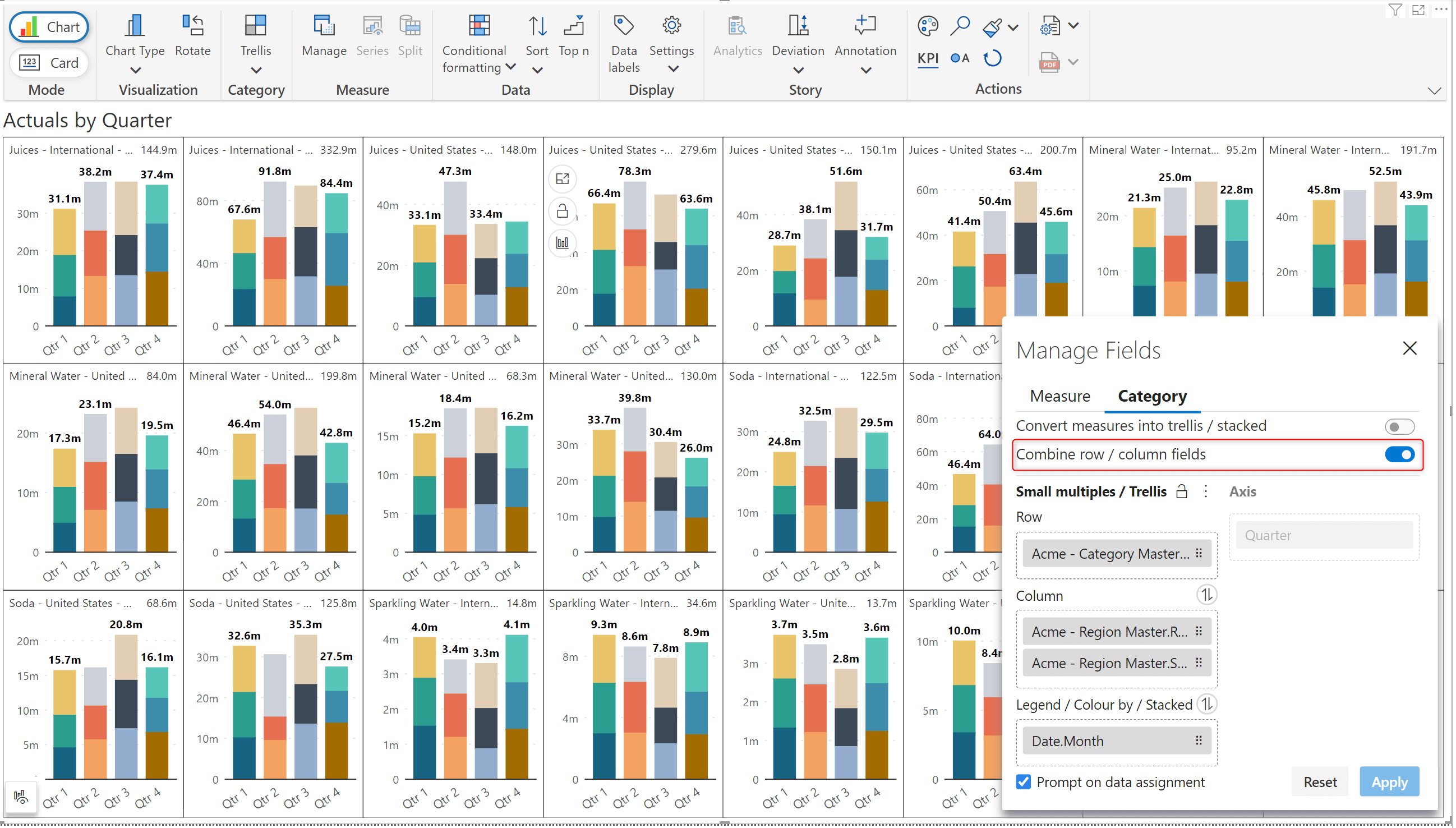
b) Combine row/column fields
Hierarchical trellis can be smoothly converted into a linear trellis by combining rows and columns.
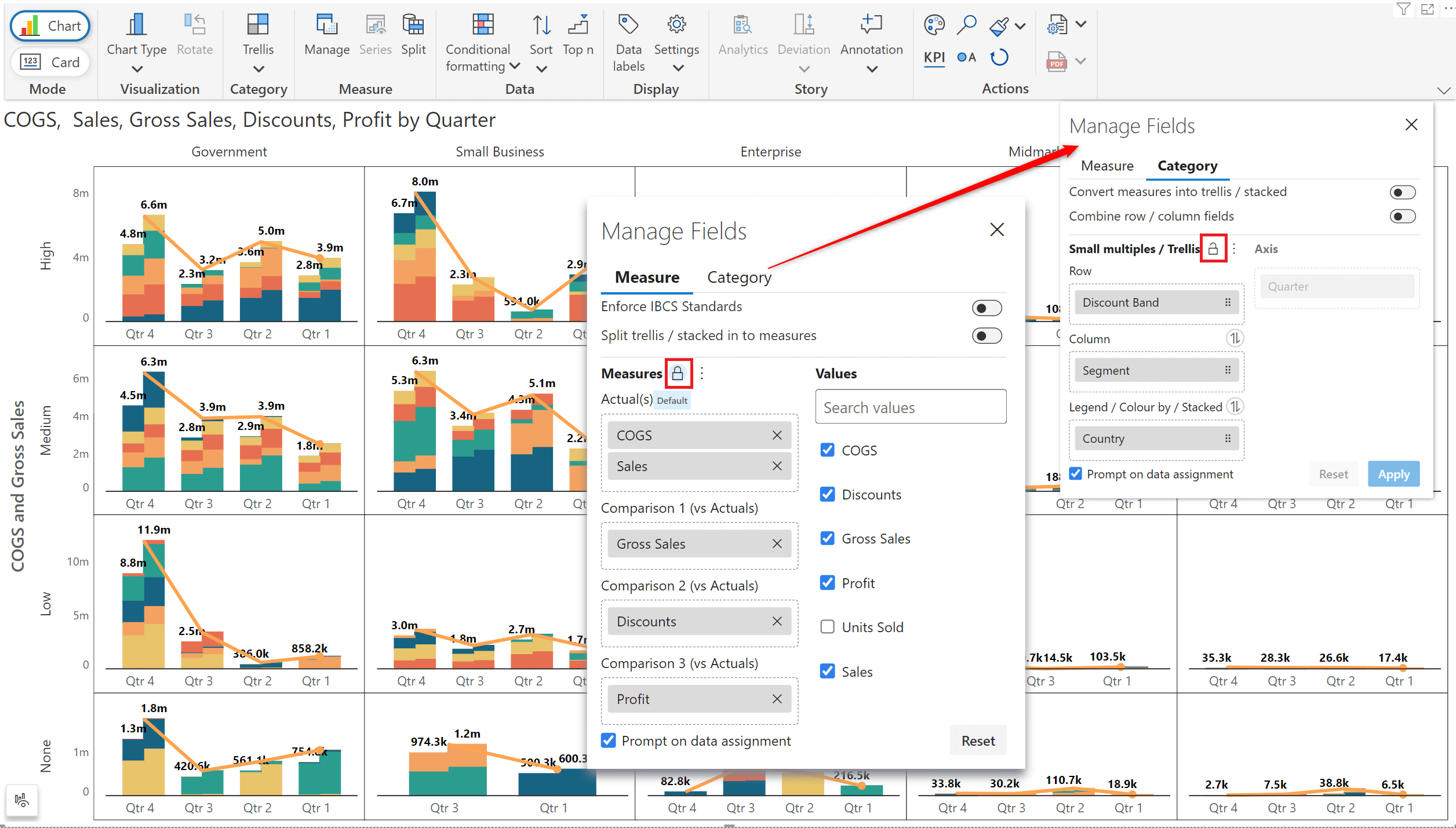
c) Lock measures and dimensions
Inforiver automatically adds measures to the ‘Actuals(default)’ data well. You can, however, set up a user-defined data configuration and choose to retain it using the lock option, i.e., if you remove and then add a measure back, it will be assigned to the pre-designated bucket instead of the default actuals bucket. The same applies to dimensions added to the category tab.
d) Swap dimensions
You can easily swap the dimensions between the data wells by clicking on the toggle icon. The chart will be dynamically re-rendered based on the new assignment.
e) Hierarchical dimensions
You can add multiple measures in the Row/Column/Legend buckets as hierarchies or as separate dimensions. This feature will be elaborated on in the Trellis/Small Multiples section.
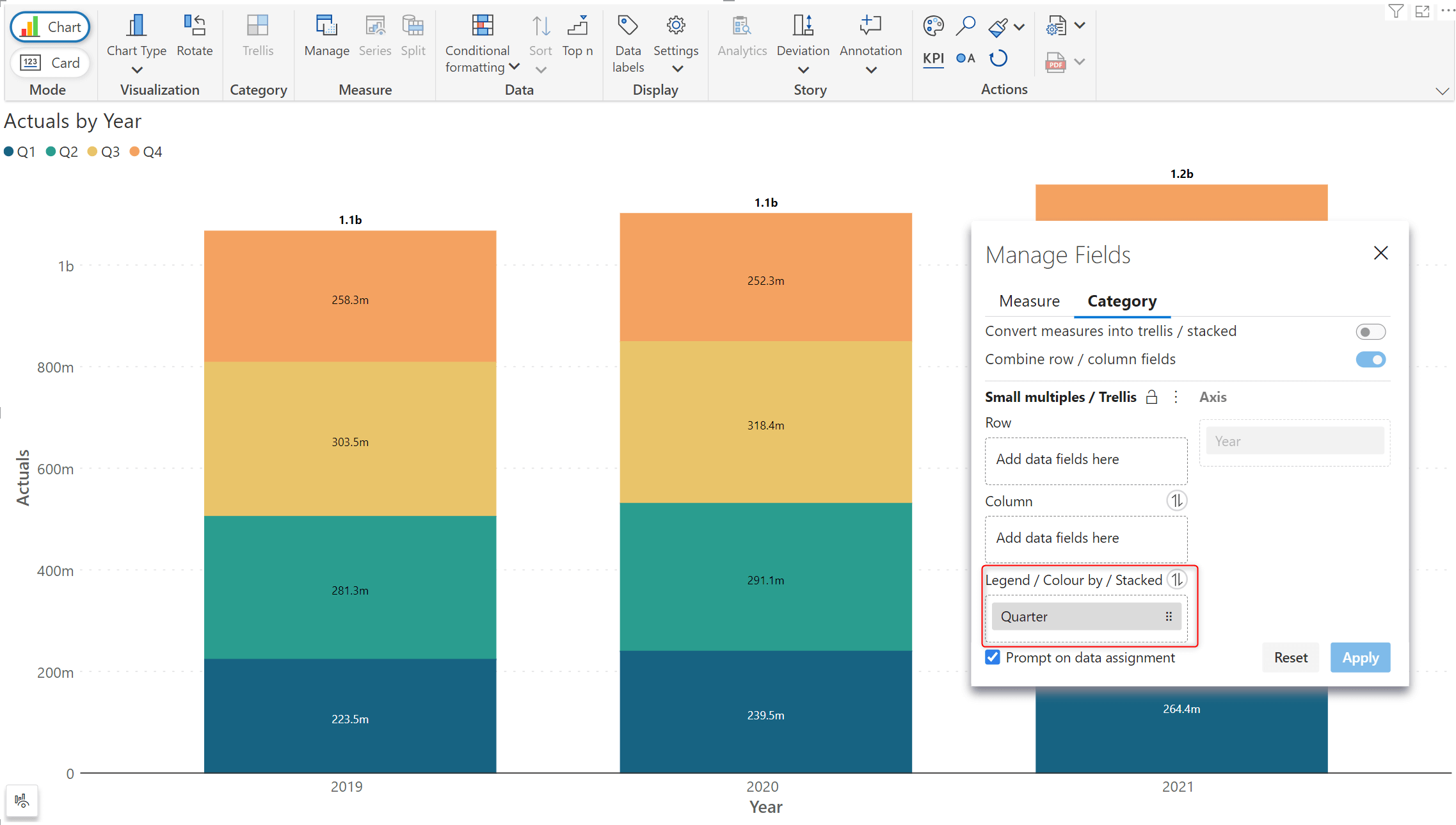
f) Legend/ Colour by/ Stacked
The category tab is equipped with a separate data well, which can be used to configure stacked dimensions, as demonstrated in the example below.
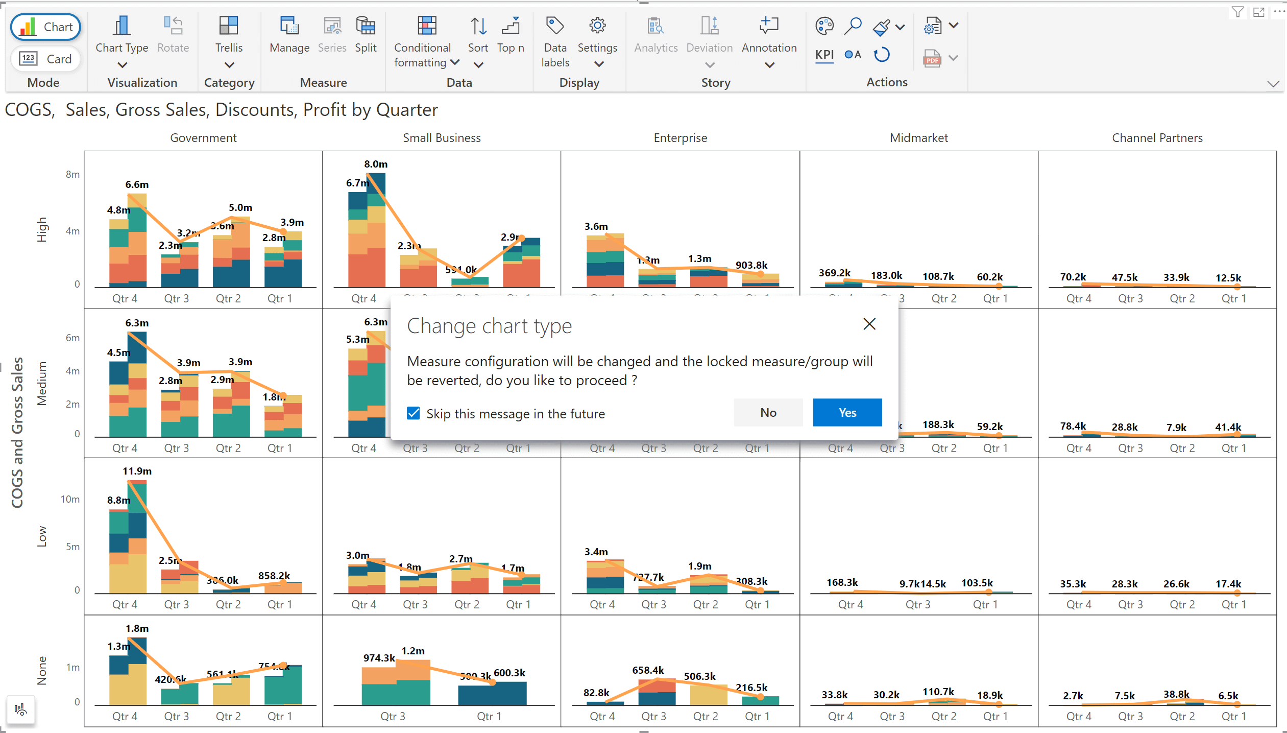
g) Prompt on data assignment
If you try to change the chart type to one that does not conform to the designated section assignments, Inforiver will generate a prompt before re-assigning measures.
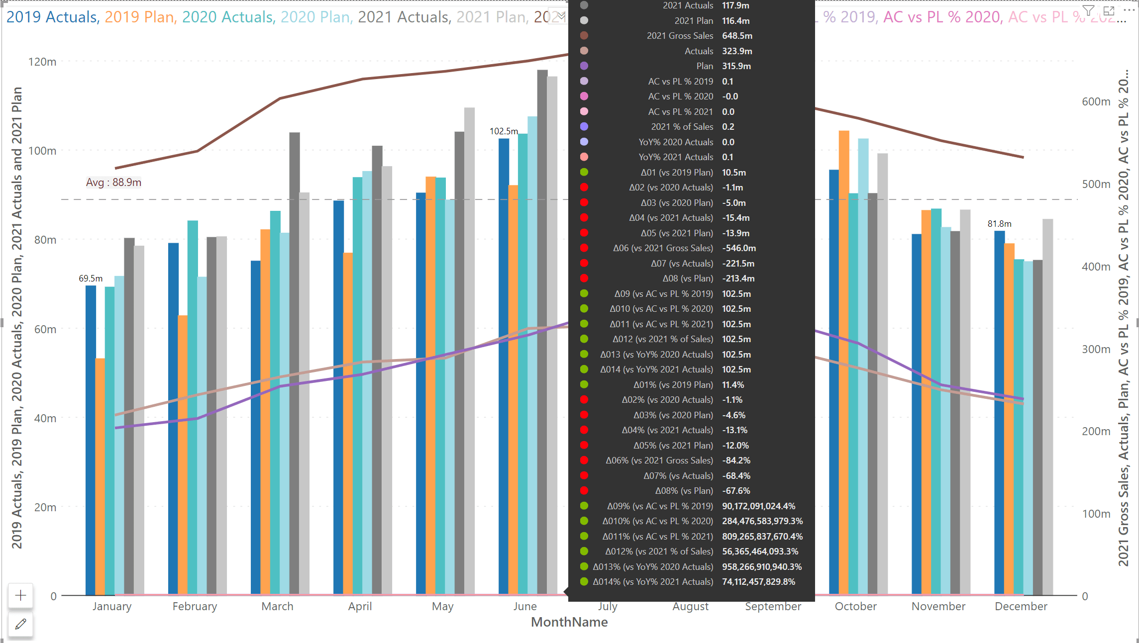
Gain even more insights from your data with the 3.0. version – Inforiver Analytics+ can now crunch up to 30 measures!
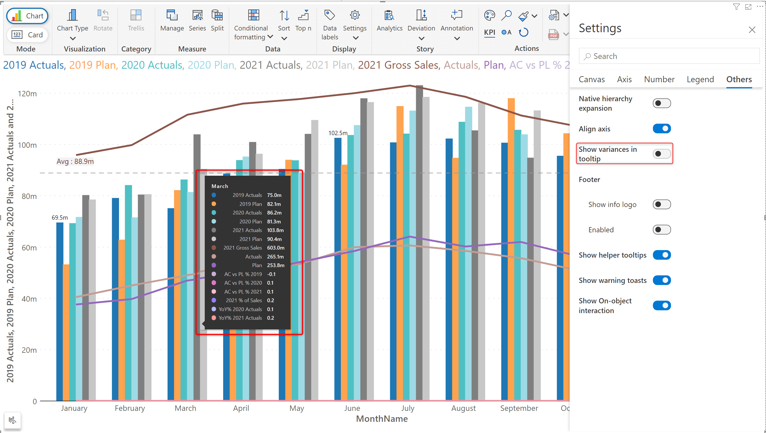
If your chart is driven by measures that cannot be compared, you can also hide the variances in the tooltip.
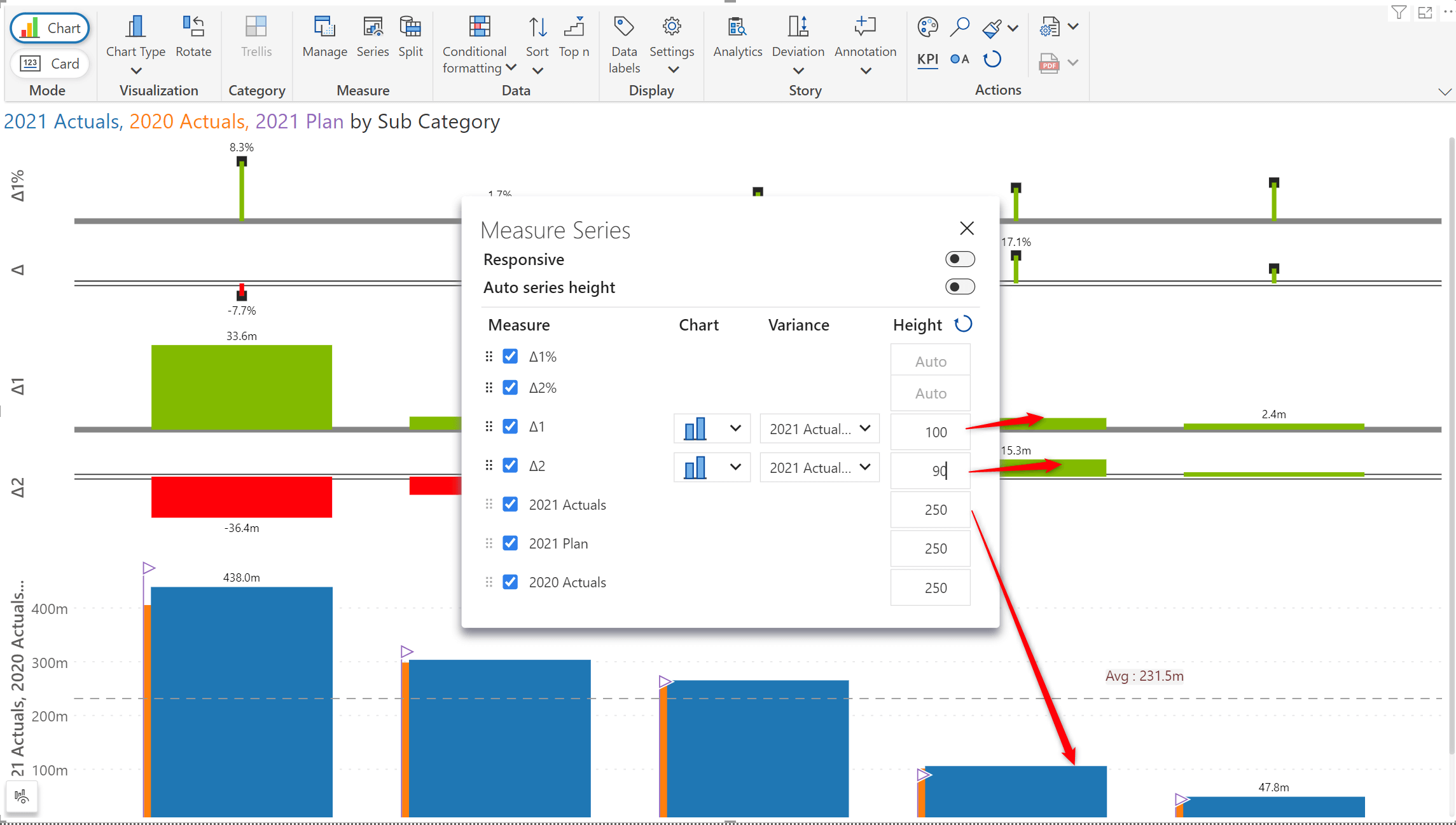
The 3.0. release provides the flexibility to set specific heights for measures and variances.
With the latest version of Inforiver Analytics+, performing drill-down or roll-up operations on your hierarchical data is only a single click away.
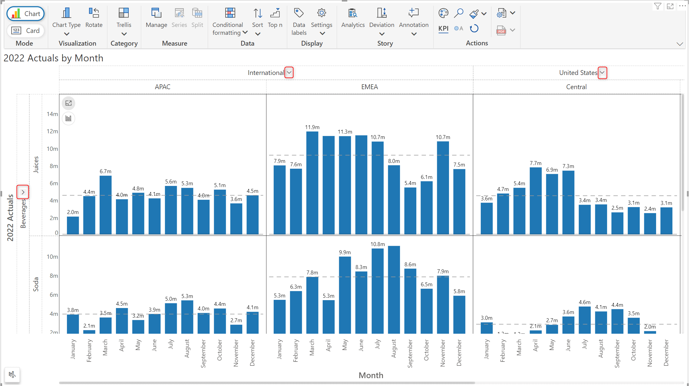
In the image below, notice how the ‘International’ and ‘Beverages’ levels of the hierarchies have been collapsed.
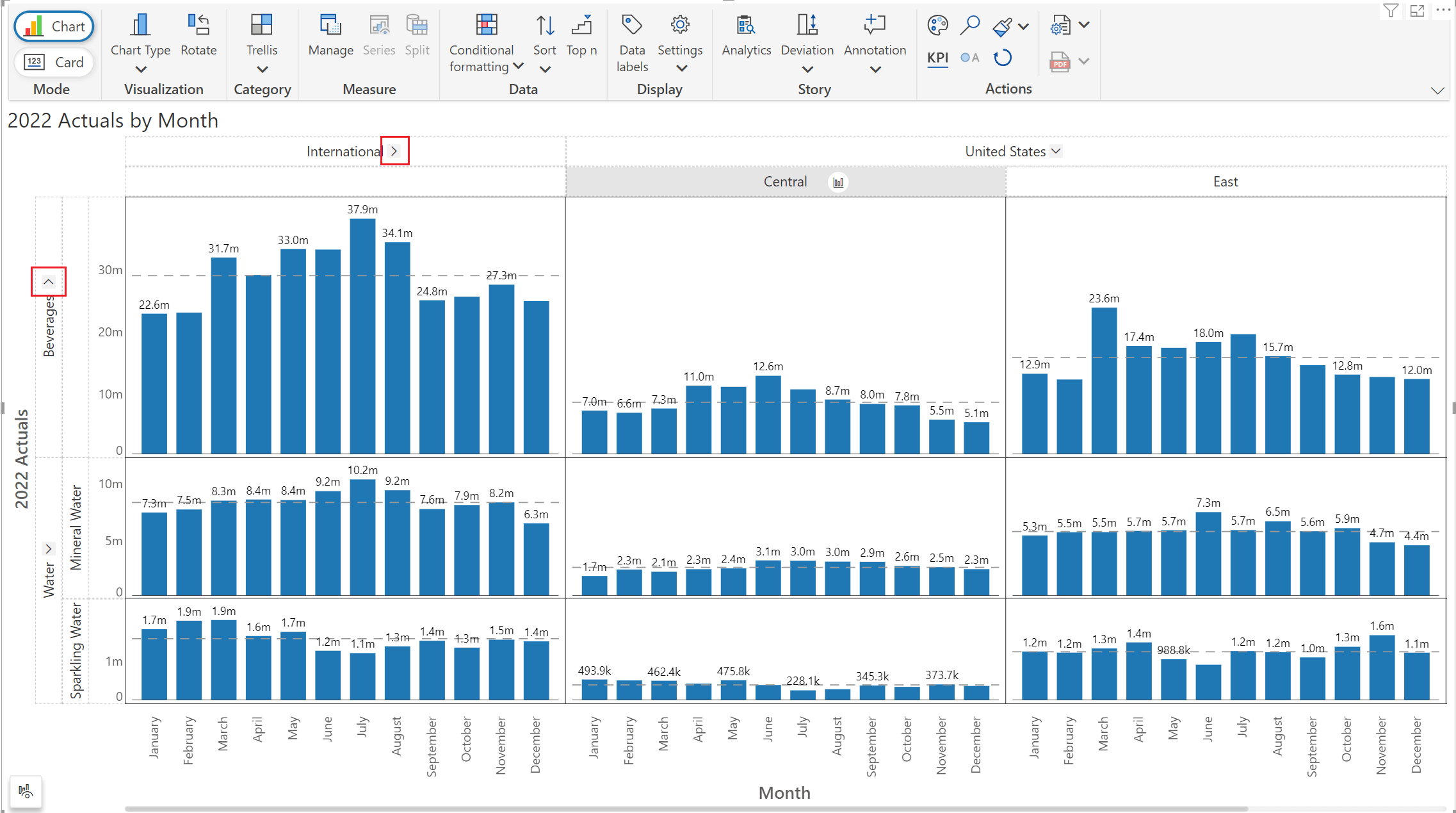
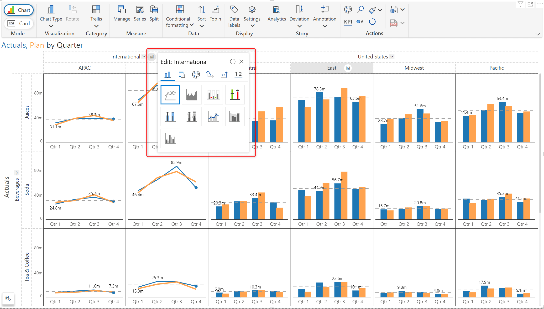
Inforiver Analytics+ 3.0. offers you the capability to showcase specific data aspects by applying customizations at a given level of the hierarchy. You can rapidly apply customizations like changing the chart type or applying a scaling factor.
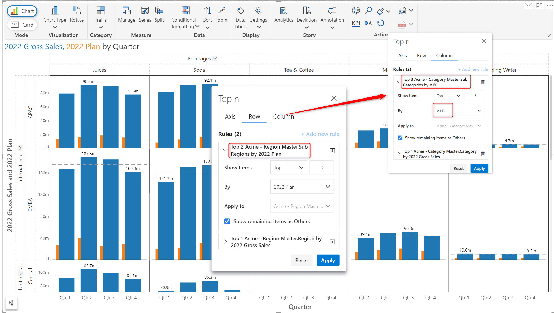
The signature Top N feature of Inforiver Analytics+ has been augmented to aid in quickly deriving patterns and outliers from hierarchical data. You can set Top N rules at all levels of the hierarchy E.g., determine the region with the highest gross sales and the sub-regions with the highest budget allocated. If you have row-level and column-level hierarchies, you can set Top N rules for both.
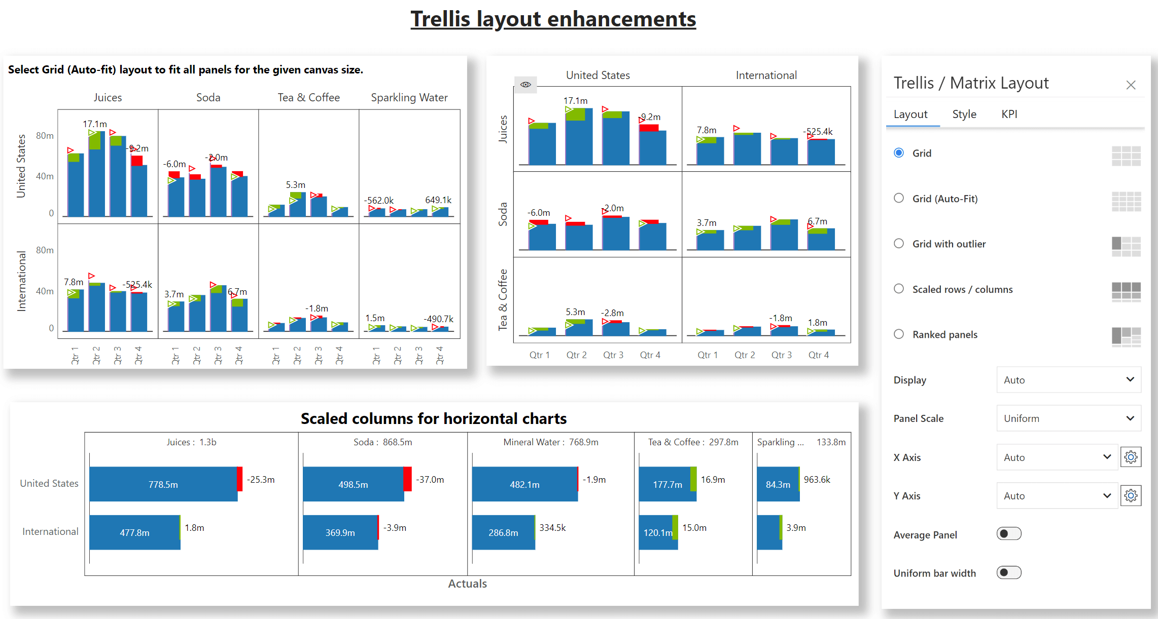
The 3.0 release aids in emphasizing your data with the scaled columns layout for horizontal charts. You can also employ the ‘Grid Auto-Fit’ option to condense and present all your data in the canvas, without having to scroll.
The 3.0 release offers you the flexibility to specify panel dimensions by setting the width and height.
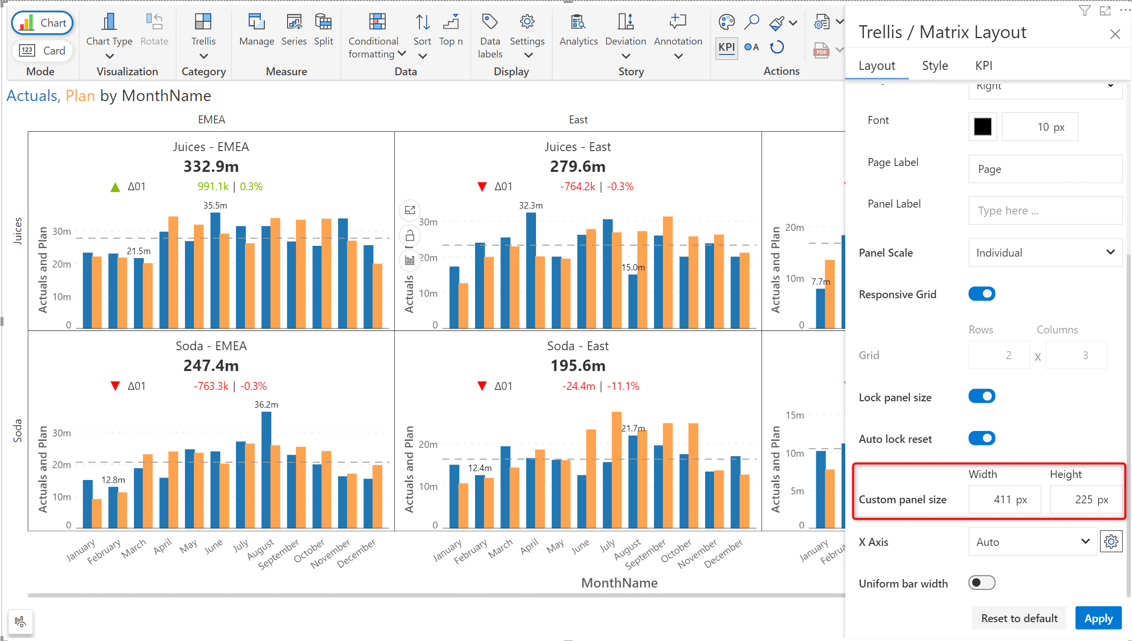
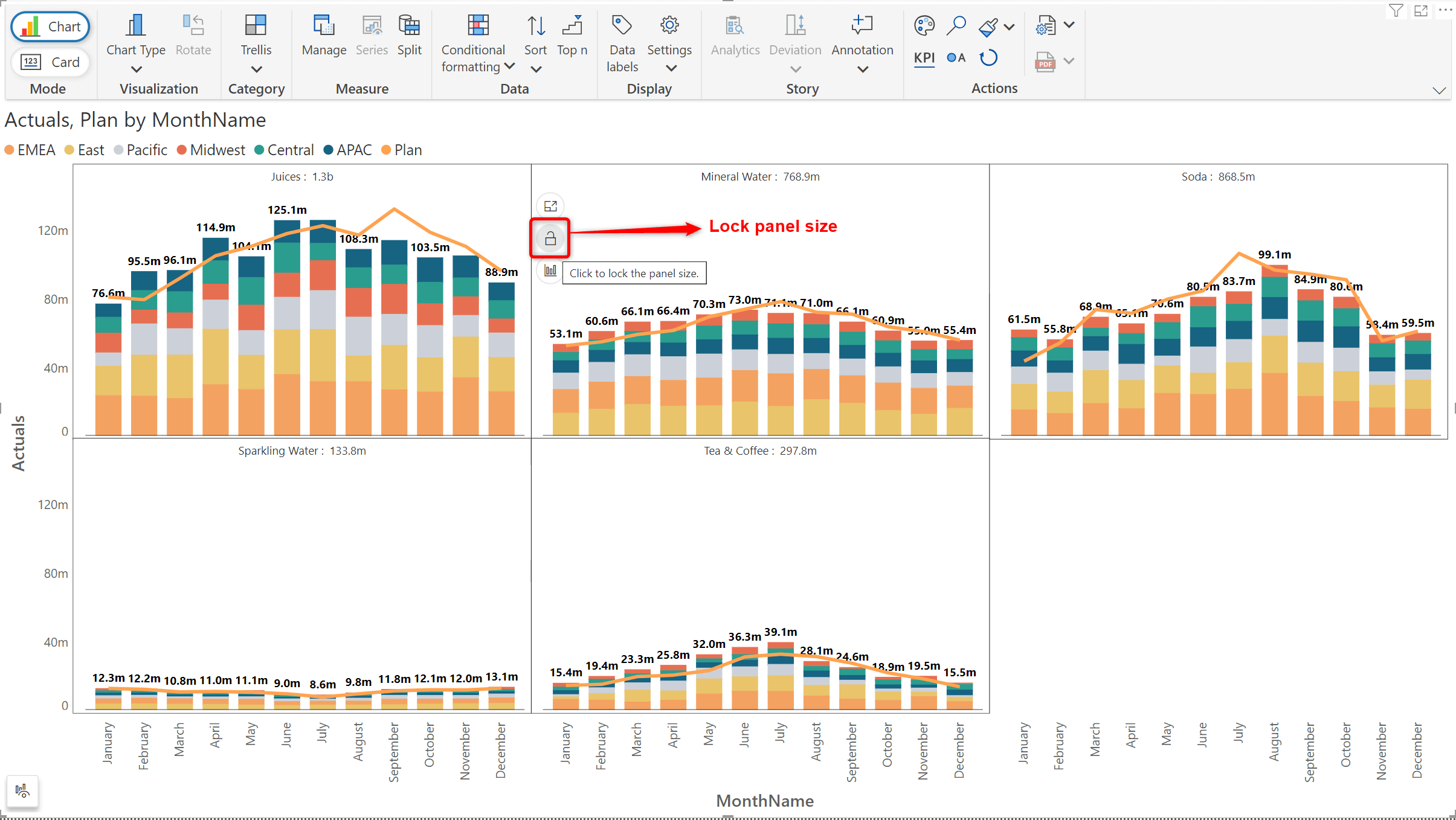
You can also make the panel dimensions fixed by clicking on the lock icon that appears when you hover over a panel - the panel size will remain constant irrespective of the size of the canvas. You can also lock the panel size from Trellis settings.
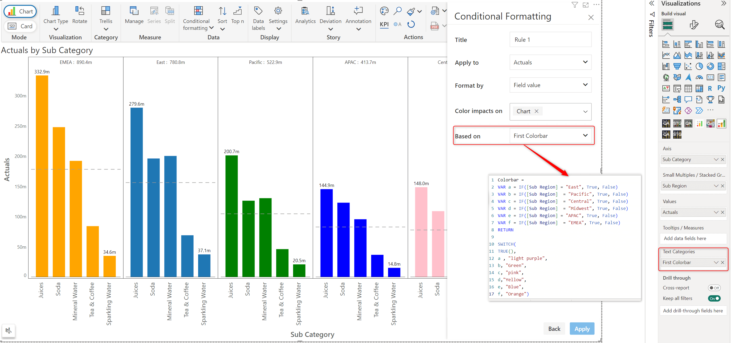
The new ‘Text categories’ visual parameter in Inforiver Analytics+ now allows you to efficiently reuse any conditional formatting created using DAX queries.
The 3.0 release offers chart customization options at your fingertips. To instantly fine tune your chart from a range of options, enable the “Show On-object interaction” property from the ‘Others’ tab in Settings.
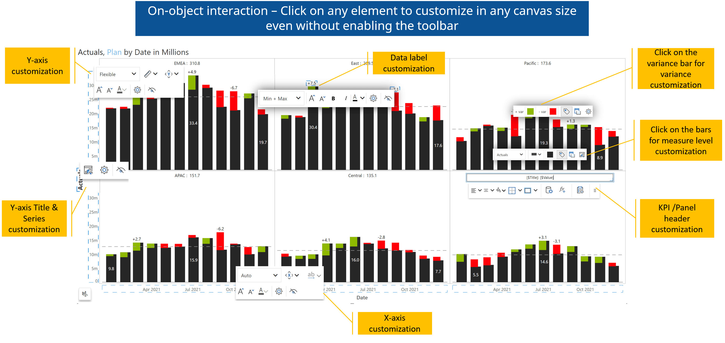
Inforiver’s distinctive reading view preview facilitates uninterrupted interactions with your chart. You can smoothly select elements and view the tooltip while in reading mode. Modifications to the chart can be done by easily switching to edit mode.
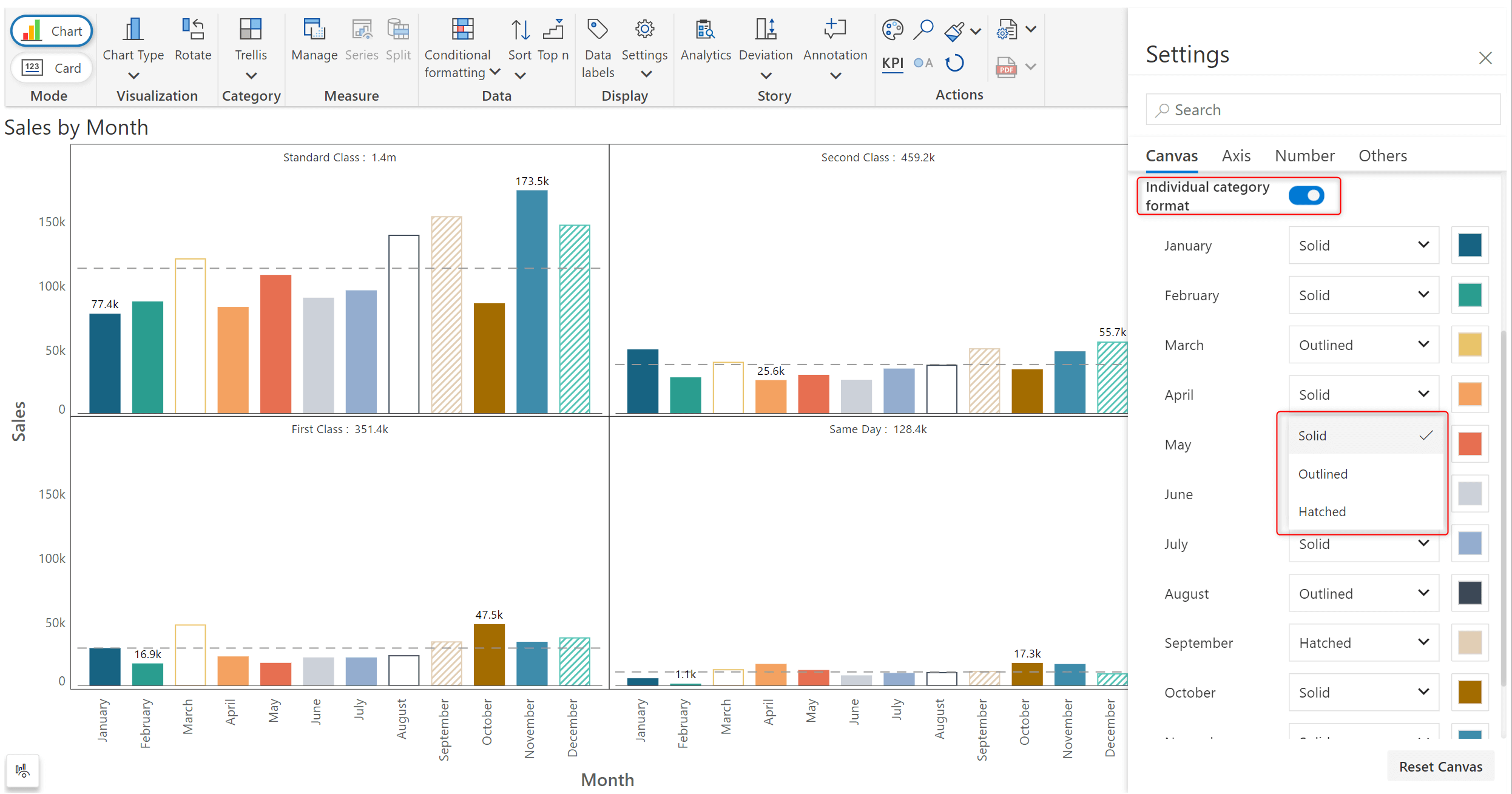
Accentuate your data with an extended array of choices for applying custom styling to Analytics+.
a. Styling axis categories
For single measure charts, you can opt for each axis category to be rendered in a different style.
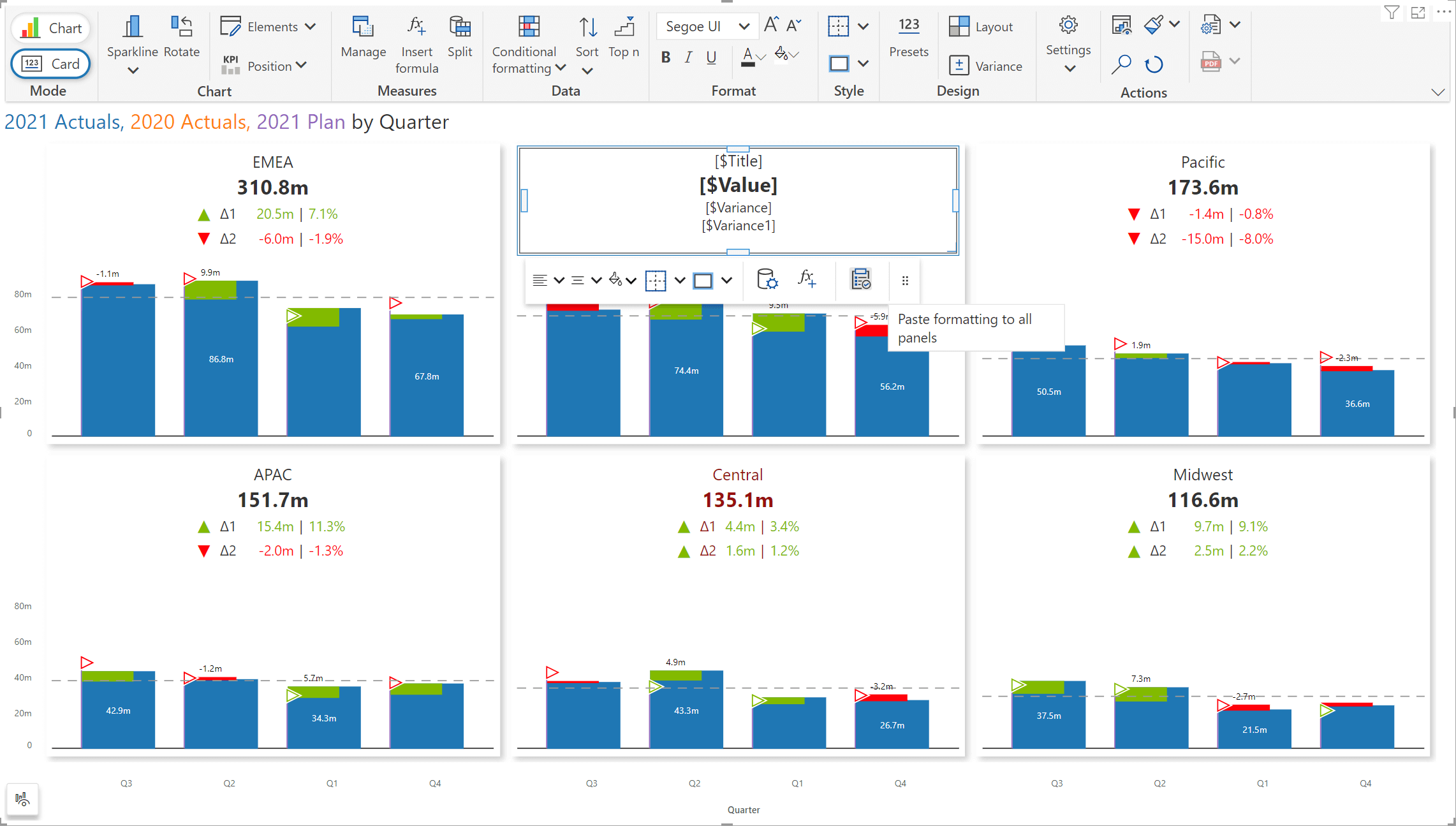
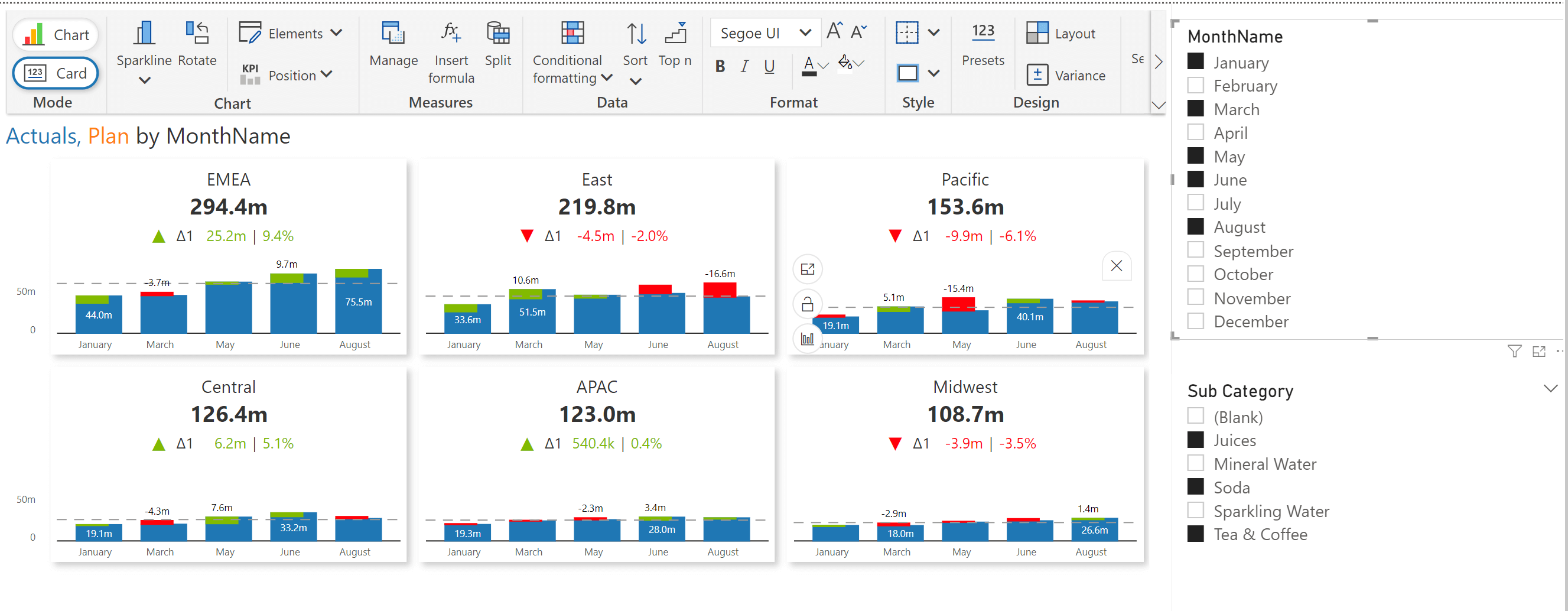
KPI cards in the 3.0 release are supplemented with a floating toolbar to efficiently format individual cards and replicate the same formatting across all the panels. You can even insert formulas into your KPI cards.
You can now apply filters on the data categories - the calculated values in KPI cards will be dynamically updated based on your selection.
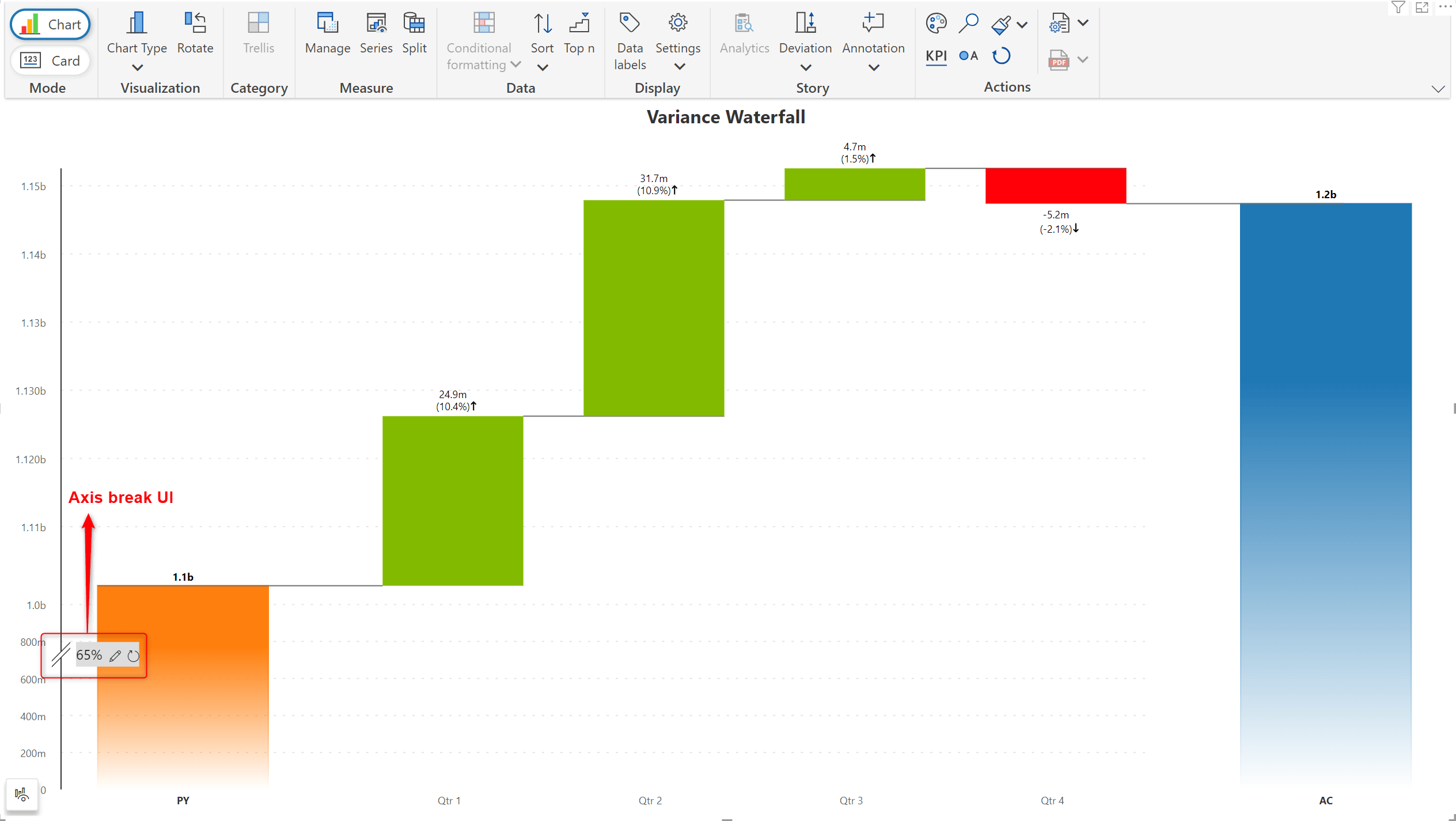
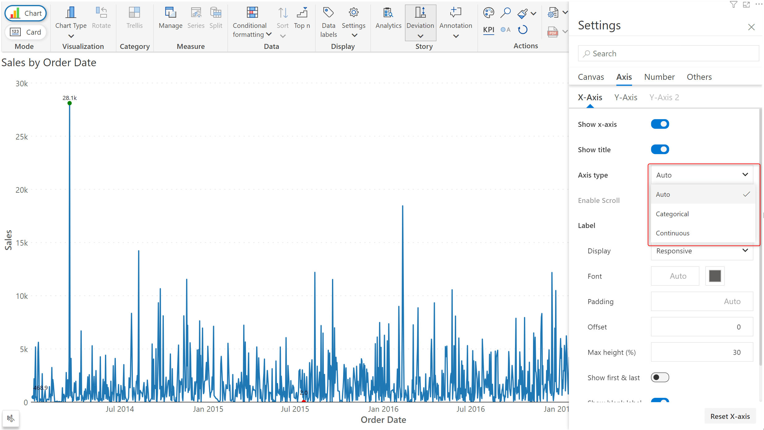
The Axis break capability has been retrofitted with a handy UI, allowing you to set the axis break value conveniently. The UI is enabled by hovering over the Y-axis.
a. X- axis
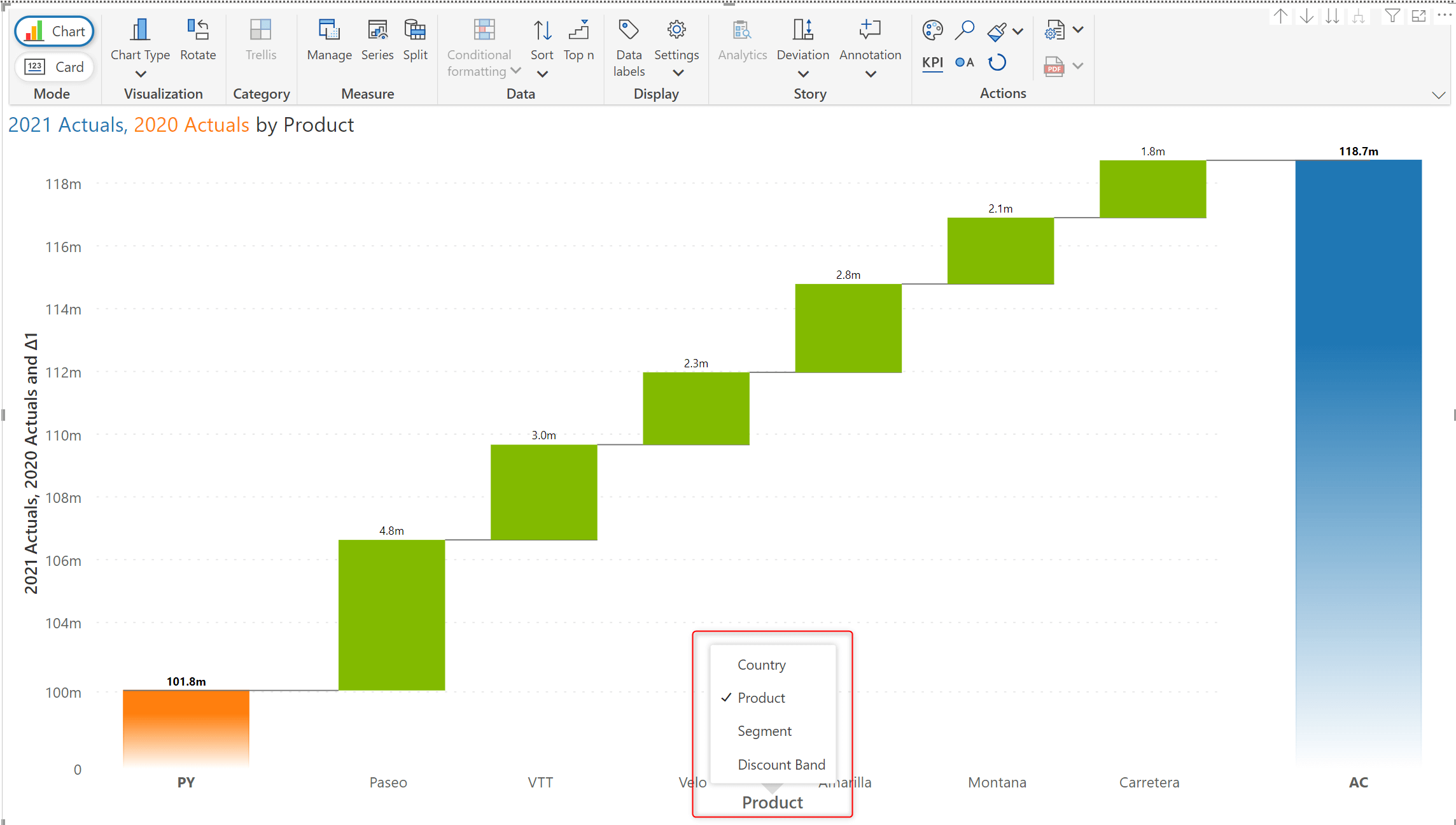
Evaluating your data across different dimensions has never been easier! The new category selector component with Inforiver Analytics+ 3.0 can flawlessly re-render the chart based on the chosen category.
b. Y-axis
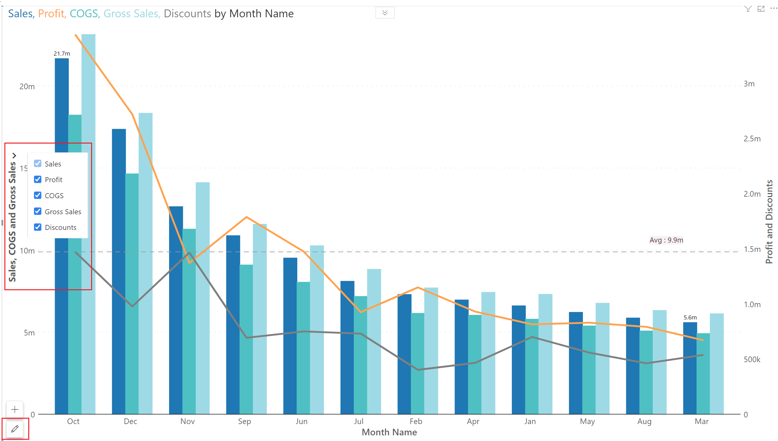
Using the Y-axis selector, you can now effortlessly display or mask measures in both edit and read modes.
If your axis data contains a time series, Inforiver Analytics+ will automatically render the chart with a continuous axis.
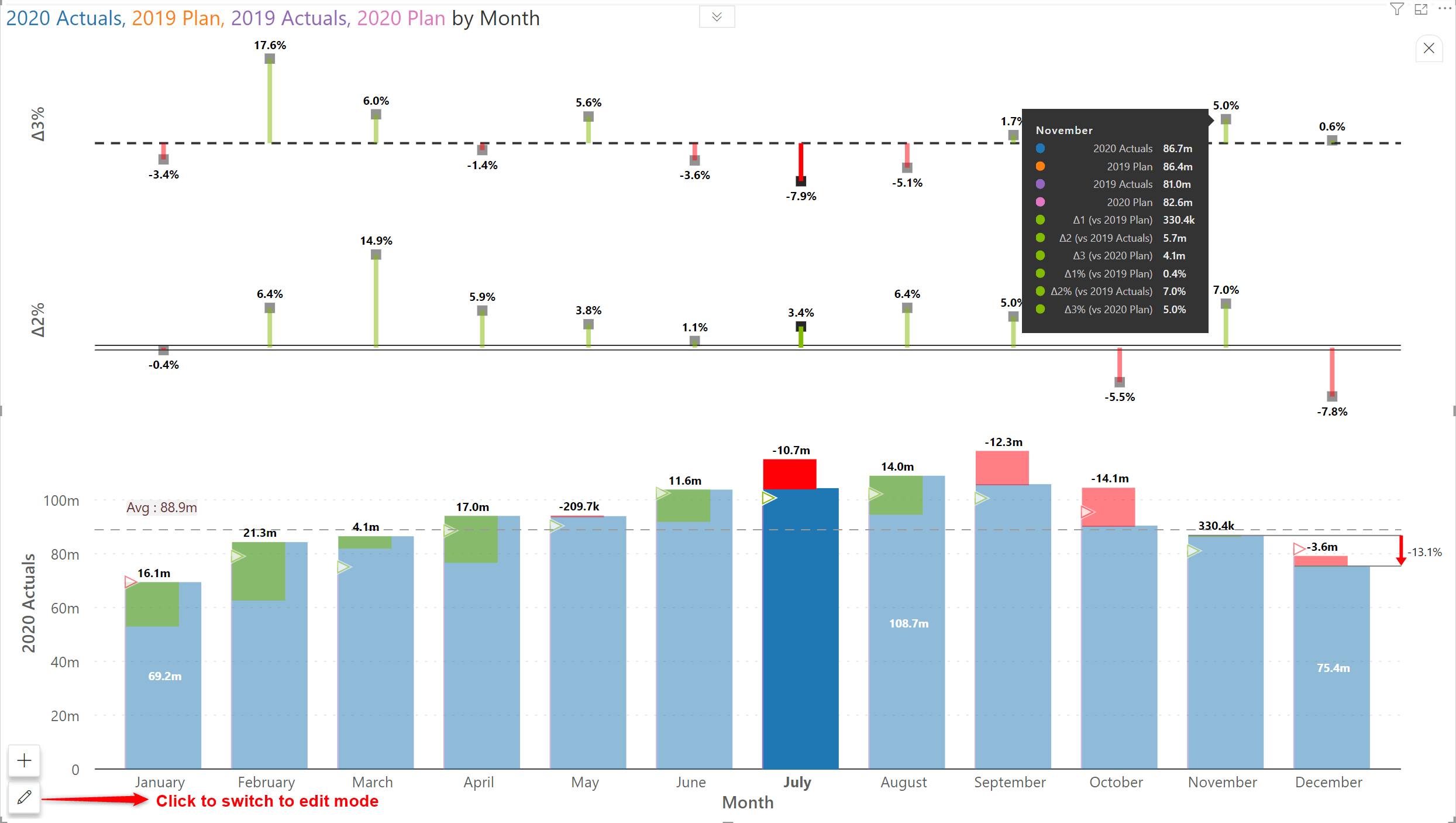
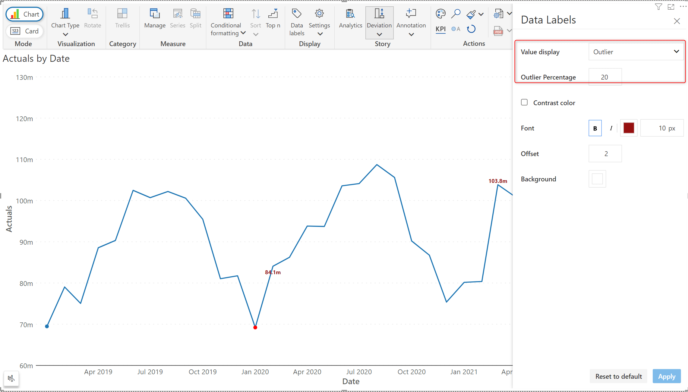
Draw attention to the outliers in your data by highlighting the data labels for outliers. For each measure, Inforiver Analytics+ will internally calculate the percentage difference between different categories. You can leverage this and choose to display the data label if the percentage difference exceeds a specific threshold.
Free license users will be able to view the visual. The user can perform drill-down, export and pagination operations however they cannot edit the visual.
We'd love to hear your ideas for Inforiver – be it a cool new feature or an improvement on existing features. Visit the Inforiver Community to share your ideas, vote on other submissions, and interact with other users.
*Inforiver Charts has been renamed to Inforiver Analytics+, a 3-in-1 visual for dashboards and storyboards. It offers 50+ charts, cards, and tables.

Inforiver helps enterprises consolidate planning, reporting & analytics on a single platform (Power BI). The no-code, self-service award-winning platform has been recognized as the industry’s best and is adopted by many Fortune 100 firms.
Inforiver is a product of Lumel, the #1 Power BI AppSource Partner. The firm serves over 3,000 customers worldwide through its portfolio of products offered under the brands Inforiver, EDITable, ValQ, and xViz.