Upcoming webinar on 'Inforiver Charts : The fastest way to deliver stories in Power BI', Aug 29th , Monday, 10.30 AM CST. Register Now
Upcoming webinar on 'Inforiver Charts : The fastest way to deliver stories in Power BI', Aug 29th , Monday, 10.30 AM CST. Register Now
With the November 3.2 release, Inforiver Charts becomes a 3-in-1 integrated visual for dashboards & storyboards - the first of its kind with 50+ charts, KPI cards, and tables in a single visual platform. To reflect this change, we have renamed the product from Inforiver Charts to Inforiver Analytics+.
There are three reasons why we renamed the product.
(a) The product is no longer just a charting app. In addition to 50+ charts, the product now delivers customizable KPI cards and tables with extremely powerful and advanced capabilities.
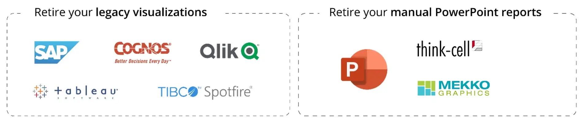
(b) With this update, Inforiver Analytics+ changes from a visual to a no-code storytelling platform that can support a variety of migration use cases from Tableau, Spotfire, Qlik, Cognos, SAP Lumira, etc., to Power BI. Enterprises running dashboards on PowerPoint using add-ons like Think-cell or Mekko Graphics can also use Analytics+ to consolidate all their reporting needs inside Power BI.
(c) In December, the product will incorporate a powerful storyboarding feature that allows you to build complex dashboards using a single visual. For example, if you need a report with 12 visuals in a single tab, you need not use 12 visuals. Instead, you can use a single Inforiver Analytics+ visual and configure an entire dashboard within it. This highly accelerates performance and go-to-market. In fact, some of the most popular and complex Tableau dashboards that take a few hours (for experts to build) can be delivered in less than five minutes using storyboarding capabilities.
For all the above reasons, we decided to move forward from the Charts nomenclature to something appropriate: Analytics+.
Before we proceed, here is a quick summary of the last two product updates in September and October 2023.
In the September 3.0 release, we launched the flagship version of the product with 50+ IBCS-compliant chart types and exclusive features like the multi-dimensional hierarchical trellis, measure management, on-canvas interaction, and a host of single-click styling and formatting options.
In the October 3.1 release, we launched Inforiver’s signature data table. The release added extensive data selection options, the ability to expand/collapse the hierarchical axis, and a beta version of Inforiver’s filter context feature.
Here are some of the key capabilities in the 3.2. release. Click on any link to jump to that section.
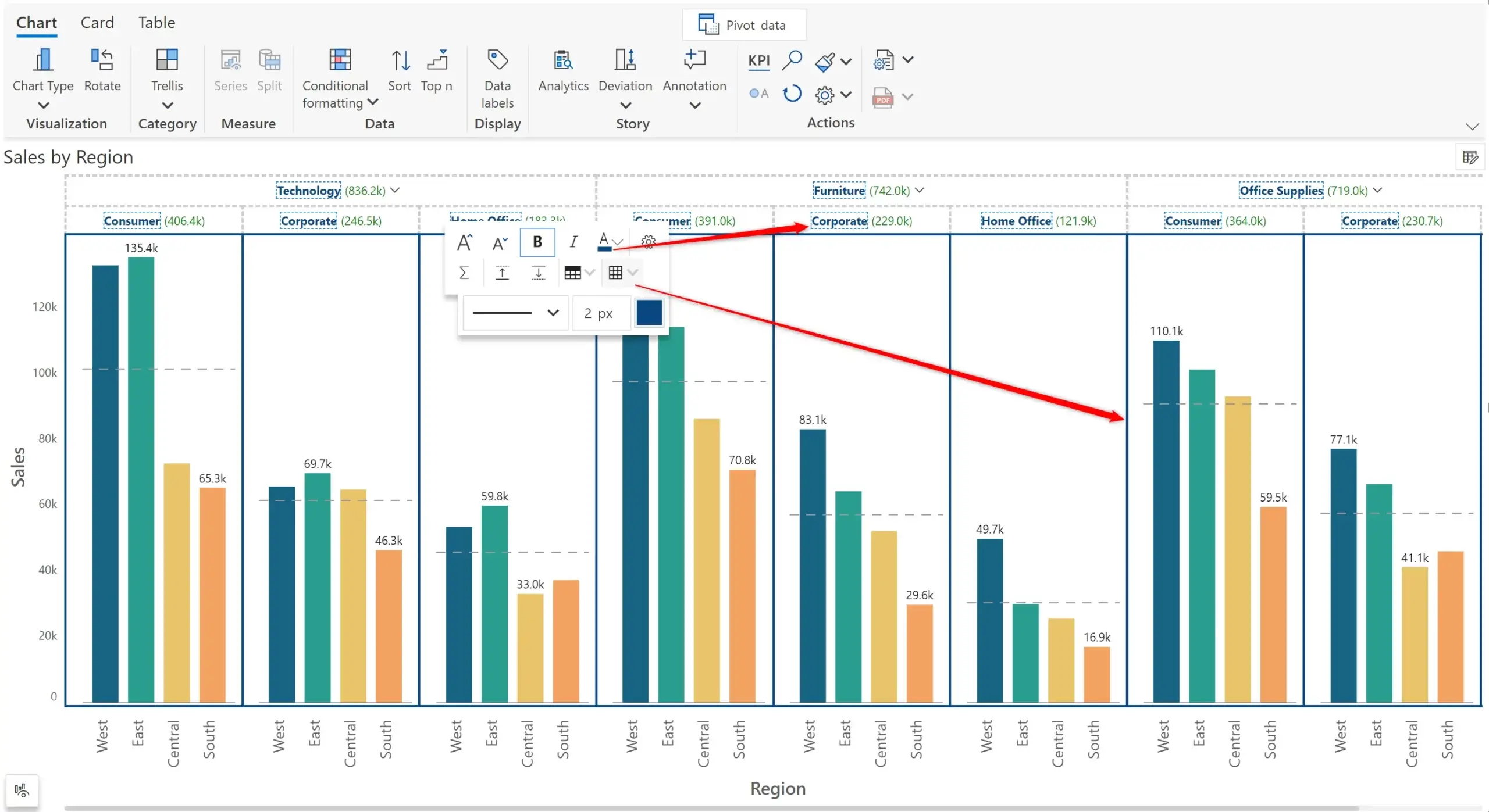
In the 3.2 release, Analytics+ ships a revamped toolbar that makes it easier for users to customize the properties of charts, cards & tables.
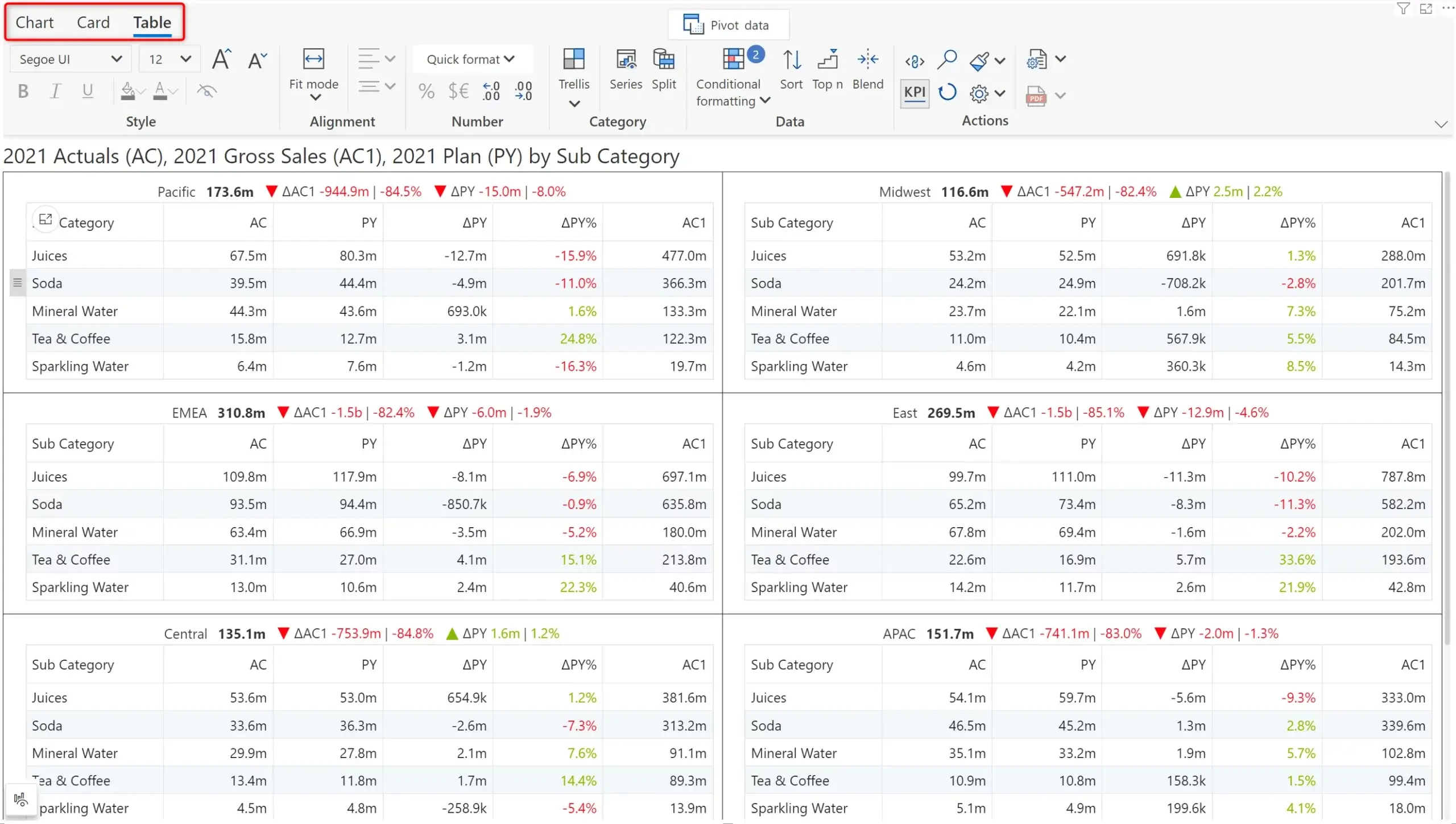
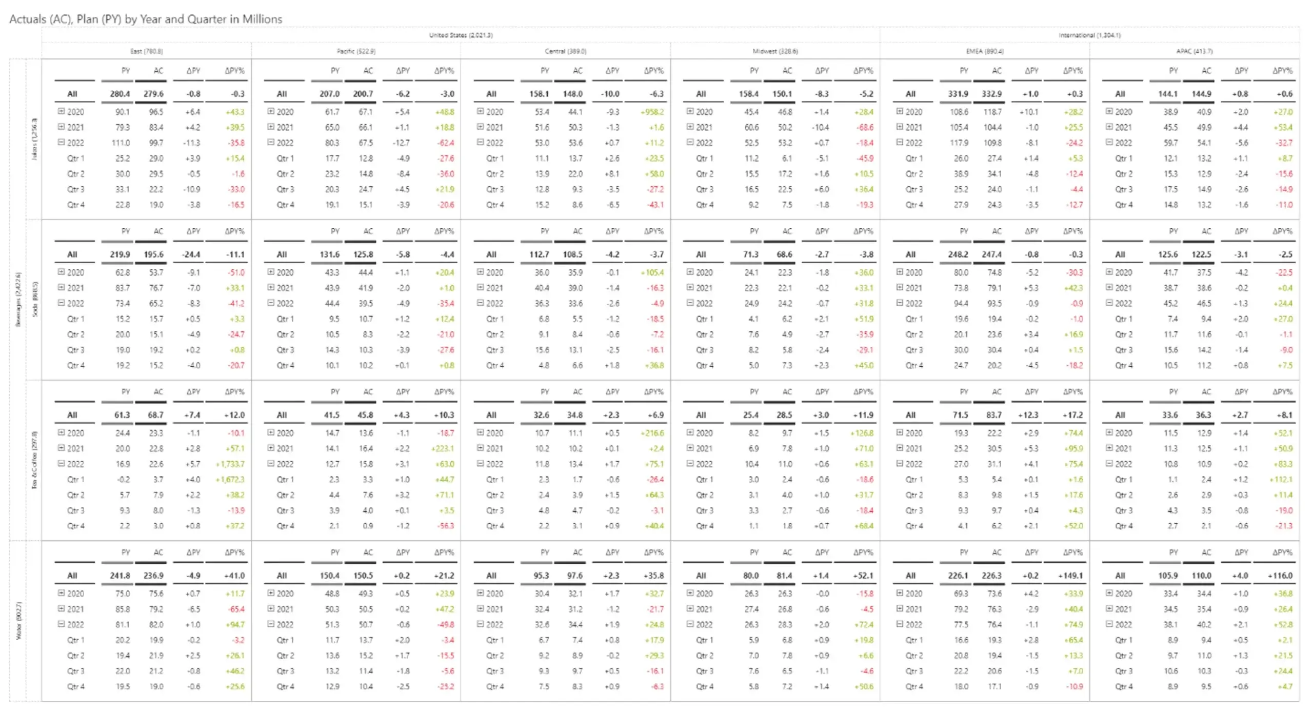
As you notice in the above image, Analytics+ becomes the only platform to deliver a game-changing feature: small multiple tables. This facilitates comparative analysis with synchronized horizontal & vertical scrolling for ease of use.
The toolbar now features expanded themes and formatting options (like Reporting Matrix) and is fully IBCS-compliant.
A powerful feature included in small multiple tables is the ability to perform formatted exports to PDF.
Additional features supported by Tables include:
With the integrated Tables capabilities in Analytics+, one logical question arises: when should I go for Inforiver Analytics+ vs. Reporting Matrix?
The following gives you a quick comparison.
Traditional boxplot charts allow you to plot interquartile ranges (IQR) in one of two ways: either they will calculate IQR or will allow users to enter IQR manually.
Inforiver Analytics+ is the only visual offering Boxplots that offers both options listed above. Inforiver also allows you to render overlapped boxplots and plot forecasts or variances, as shown below.
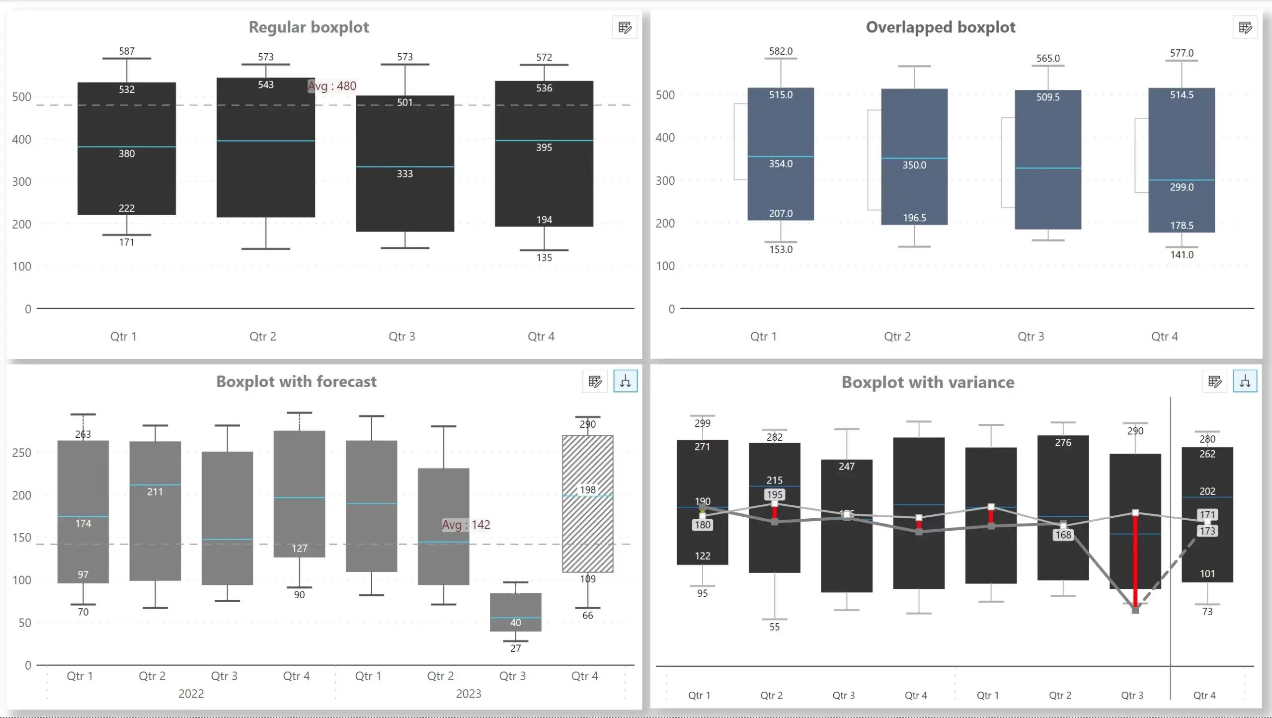
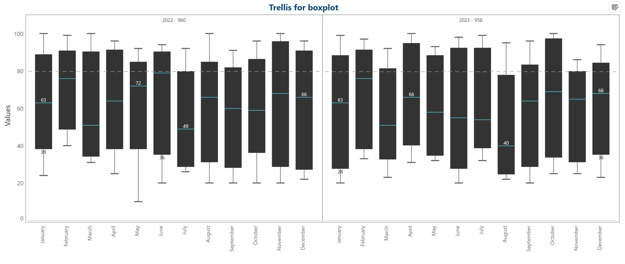
The Boxplot is also IBCS compliant and is supported in the small multiple mode.
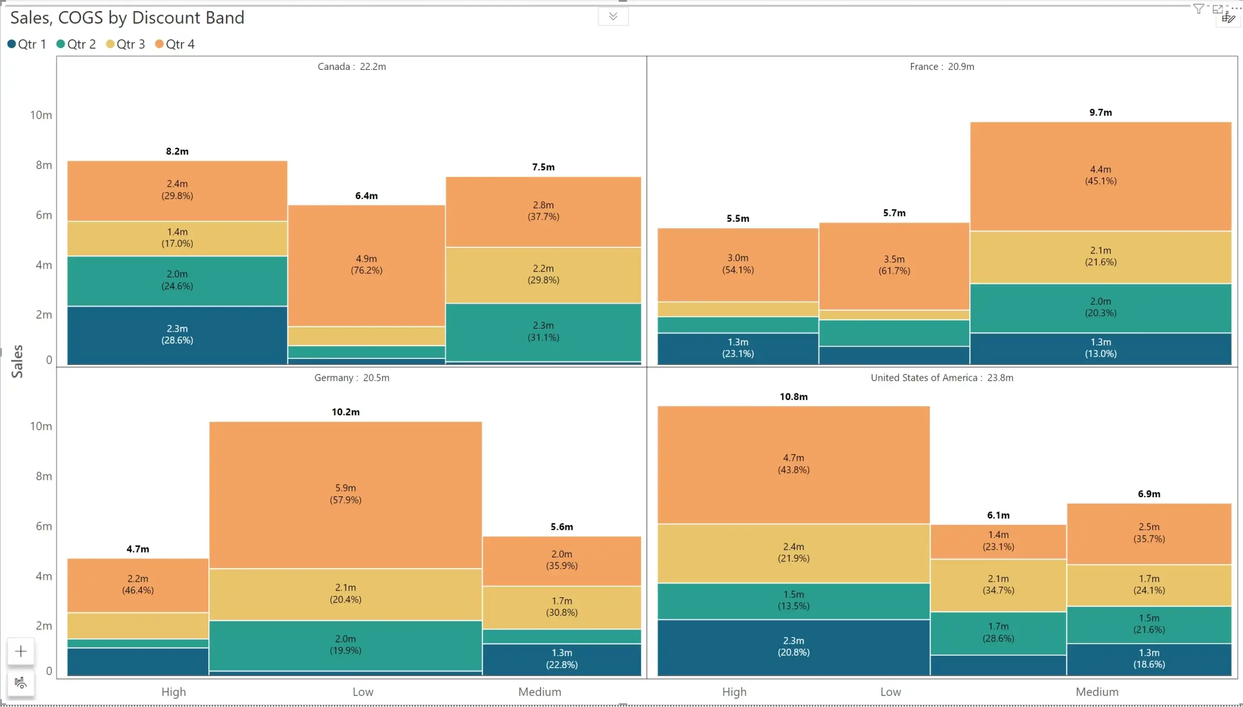
The new release now supports Marimekko charts that help you track performance across categories across contexts. The fully fledged Marimekko provides legend and label support and is IBCS compliant.
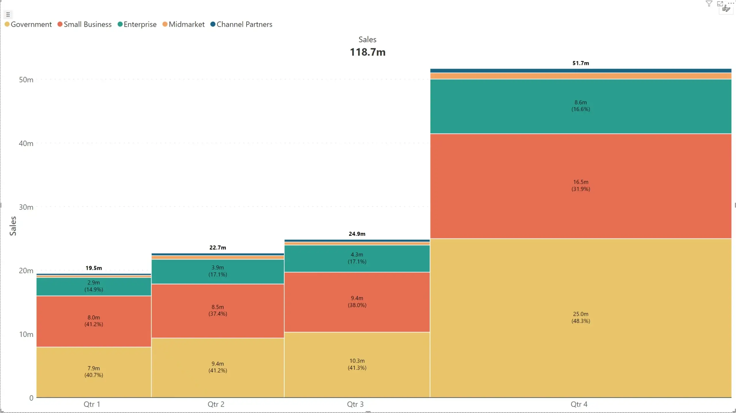
Marimekko visuals can also be plotted in the small multiple mode.
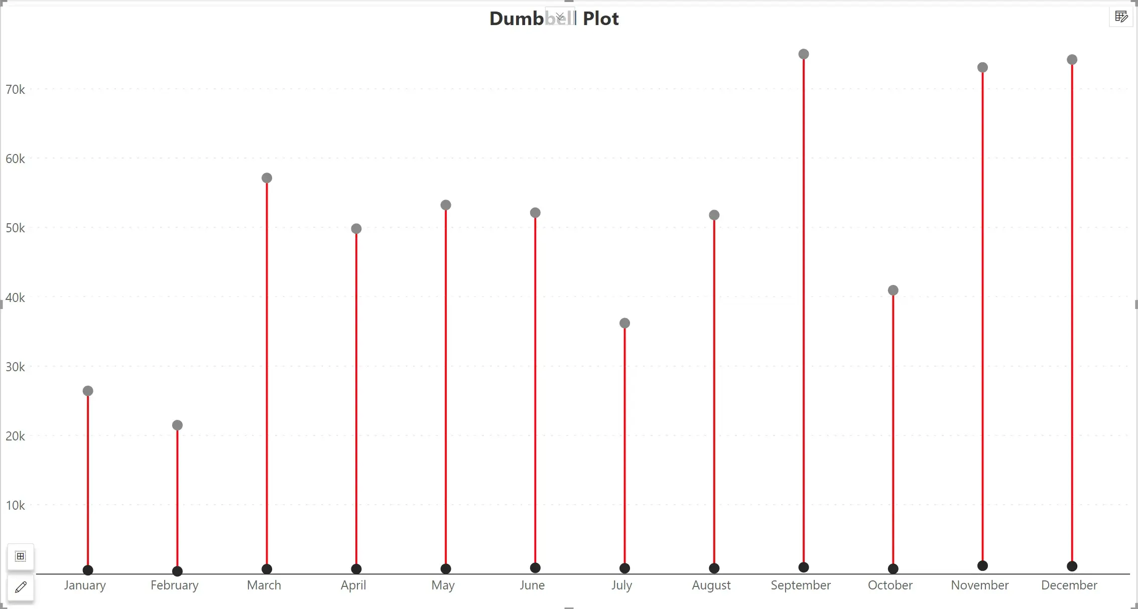
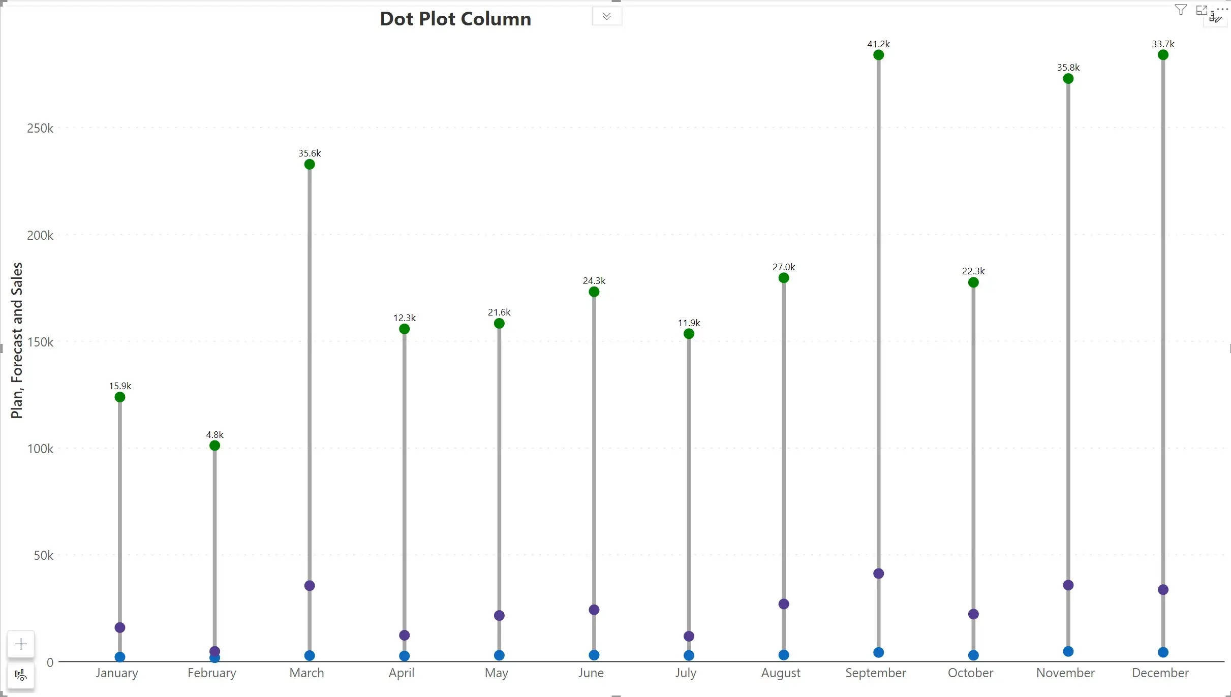
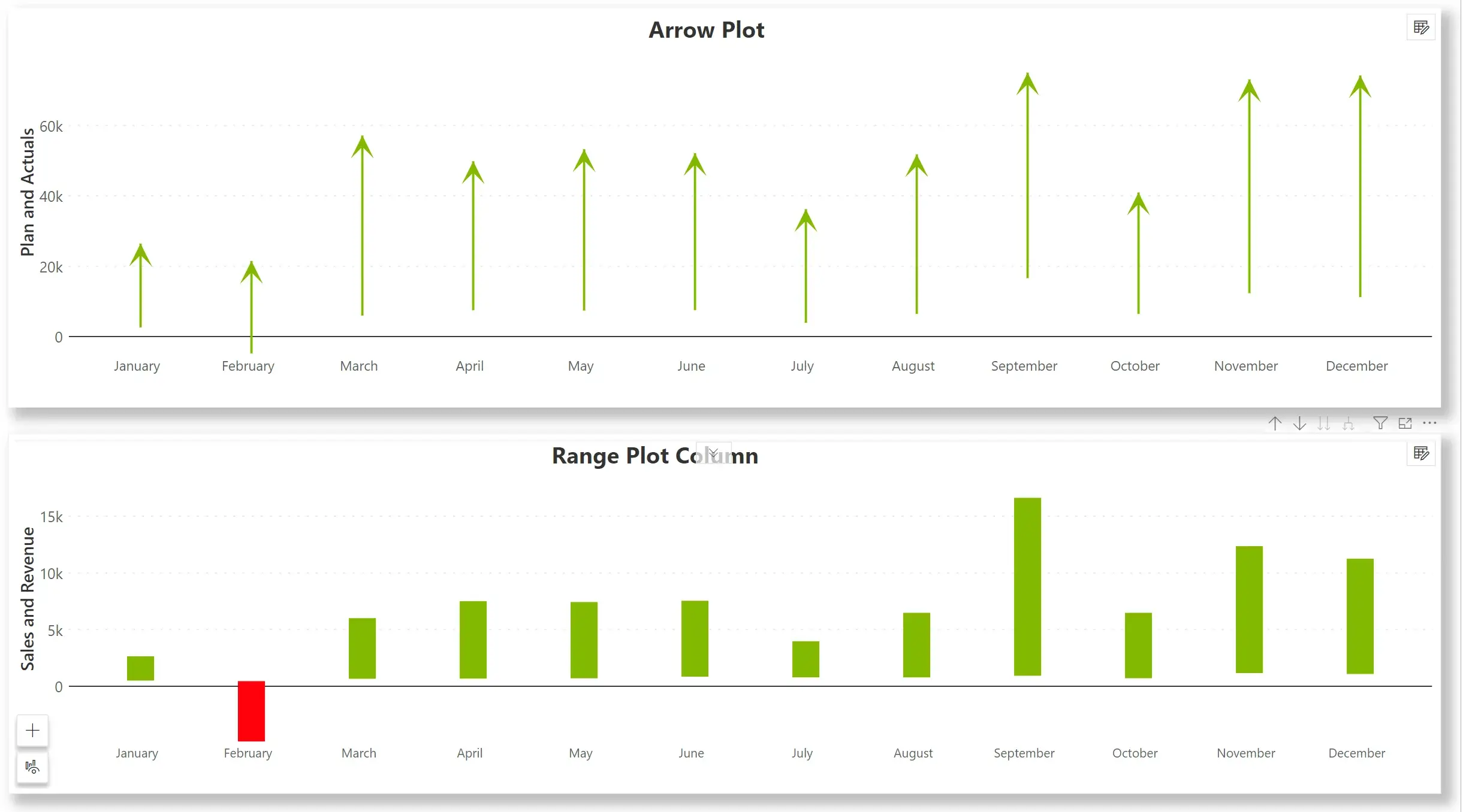
The 4 new storytelling charts added to Inforiver’s library:
From this release, a dedicated toolbar pane is available for cards. The product now can now incorporate additional shortcuts and actions inside the toolbar. In this release, the toolbar includes options for Layout, Format, Style, Measure, Data, Design, and Action sections.
Notable amongst them is the ability to decide the orientation of integrated KPI cards – at the top, left, right, or bottom, as shown below.
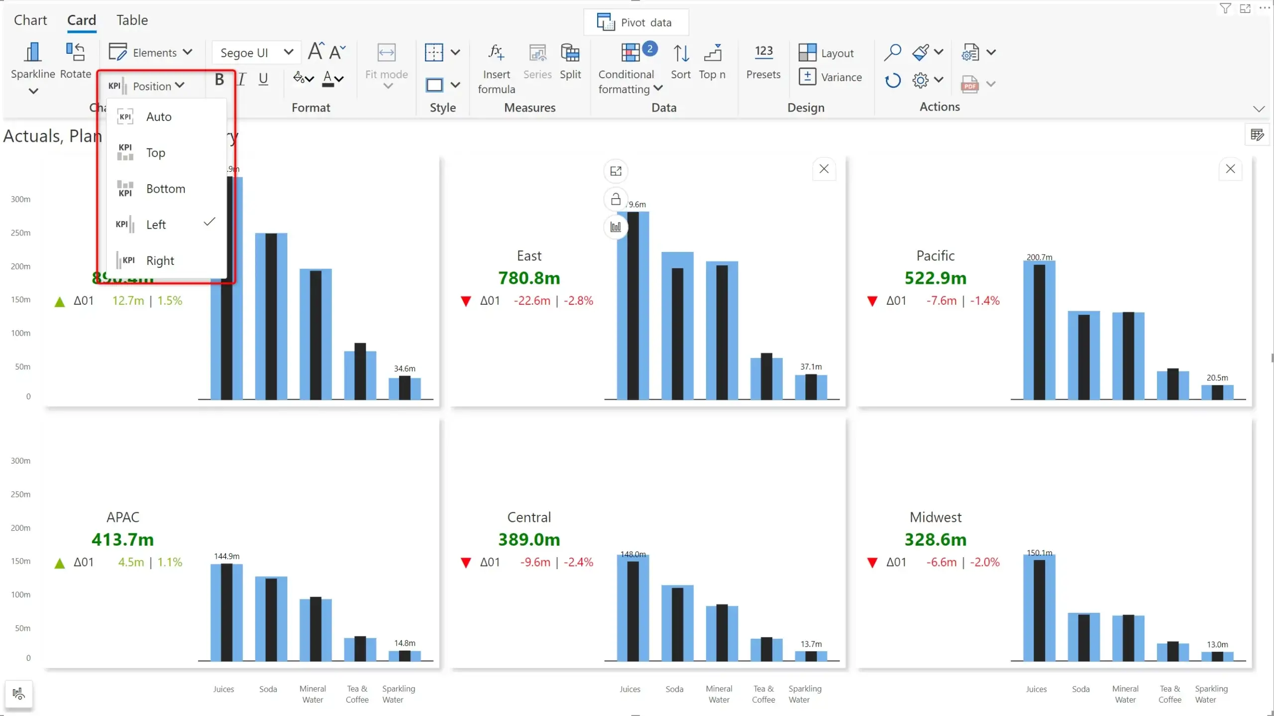
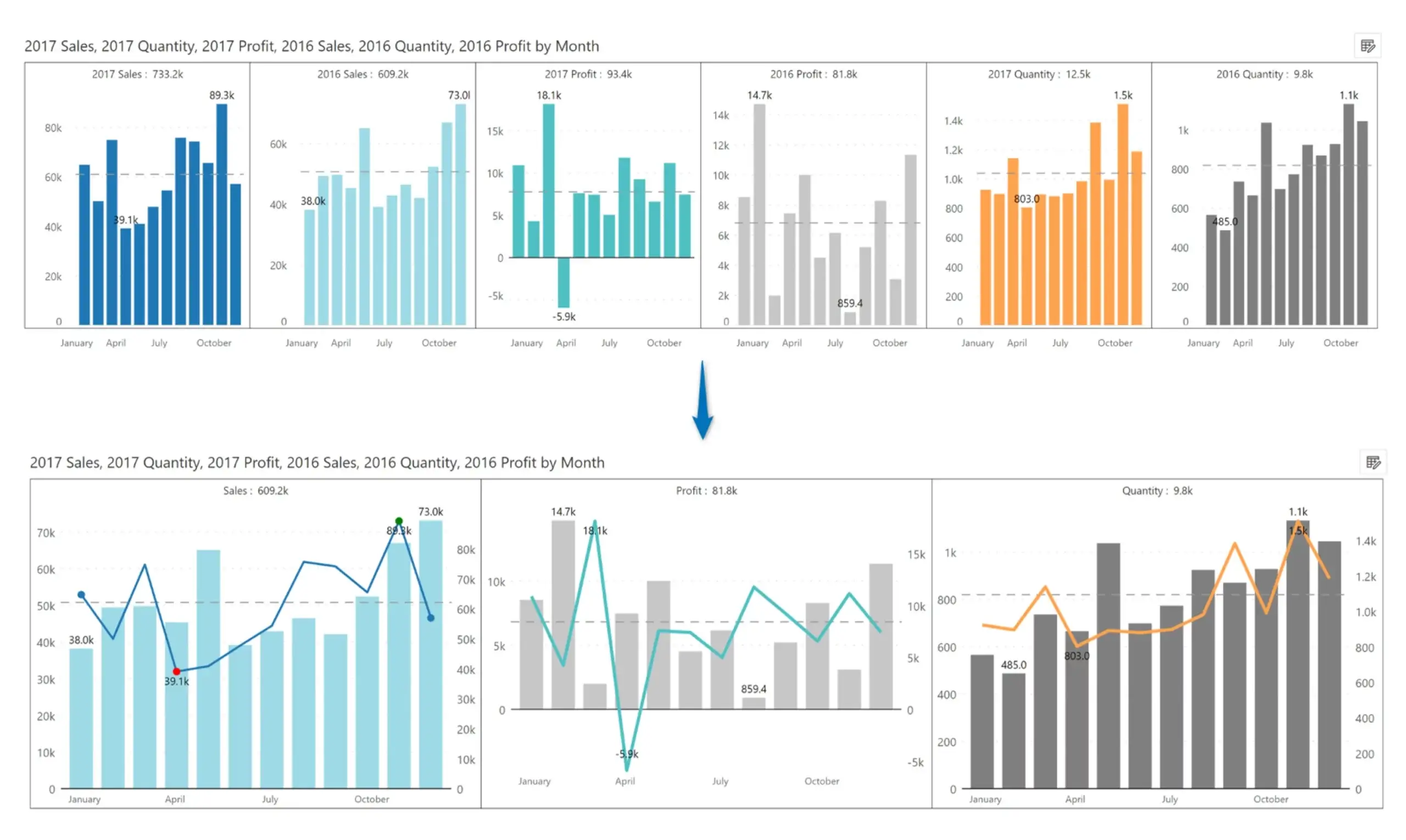
You can now group distinct measures in distinct panes while operating in the small multiple mode. For example, a visual that processes four measures can show all the four measures in a single chart, or four separate charts in the small multiple mode.
Inforiver allows you to group measures differently. In the example shown below, the first small multiple pane shows the two measures 2017 Sales & 2016 Sales grouped together, while the second pane and third pane show the profit and quantities for 2017 and 2016.
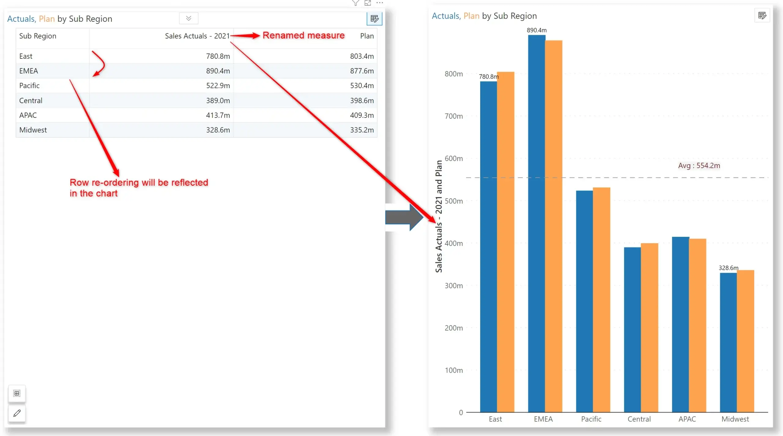
Any changes you do in the summary data view in charts can be reflected in the charts. For example, updating the category labels or reordering the fields will instantly update the underlying charts. Note that this will not make any changes to the underlying dataset.
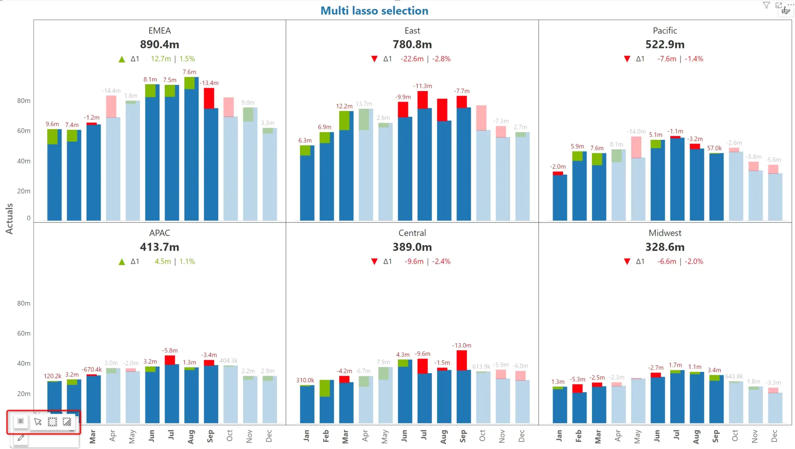
Use the Ctrl + Click and drag interface to select and highlight multiple categories. This feature works seamlessly in small multiple mode as well.
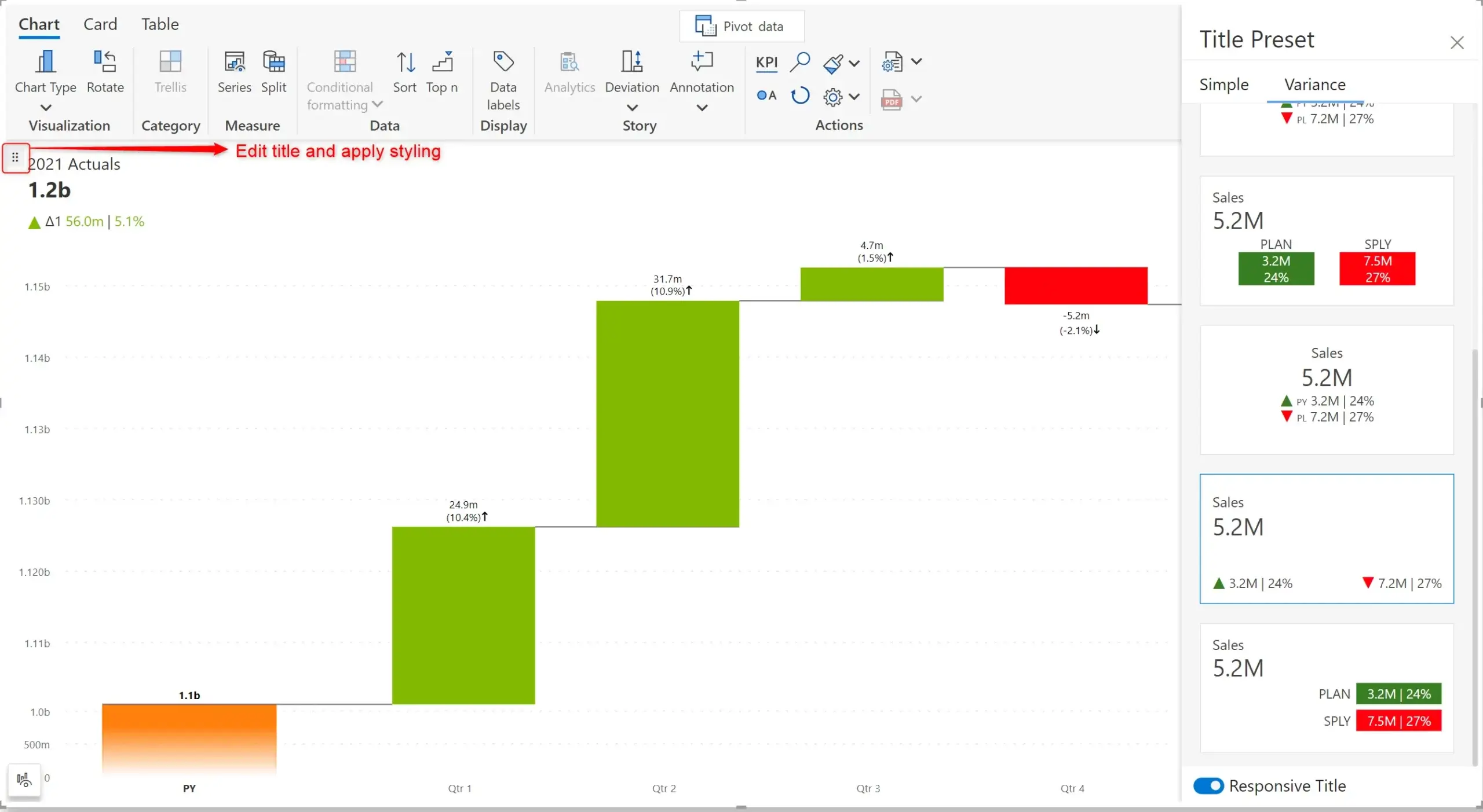
You can configure the titles for your charts using Title presets.
Using Inforiver’s handy on-object interaction menu, you can now set different styles for the header and value in a small multiple. You can even set the border pattern and thickness for each panel. Note that the formatting is uniformly applied to all the categories.
When you work with charts, you have three options:
(a) Show the default chart as is
(b) Show a KPI summary on top of the chart
(c) Show a KPI summary only; hide the chart
You can even customize these settings for each chart individually in a small multiple mode.
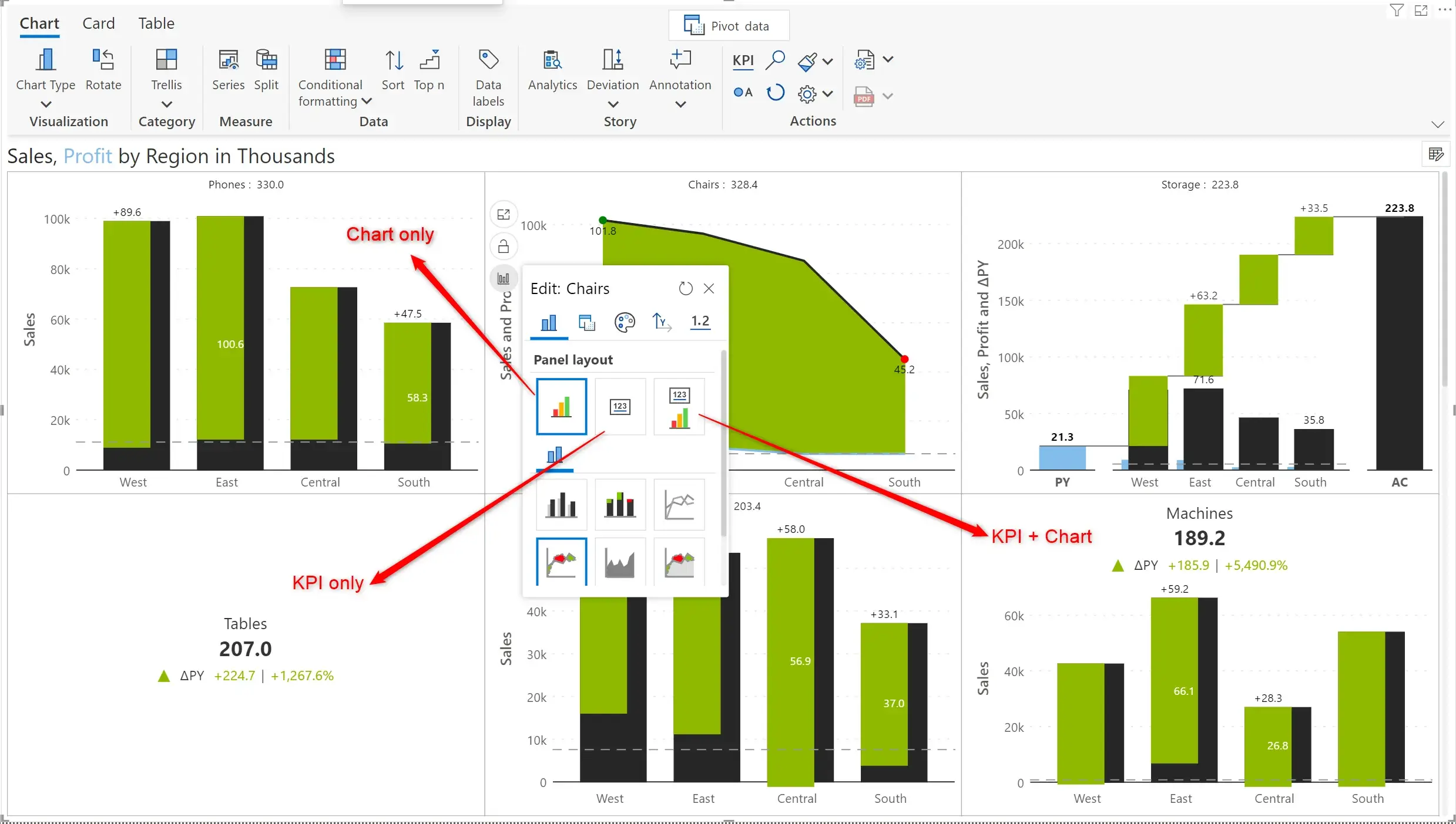
In the example shown above, the chart on the top left features a normal chart. The one immediately below it features only a KPI summary. The chart on the bottom right extreme features both.
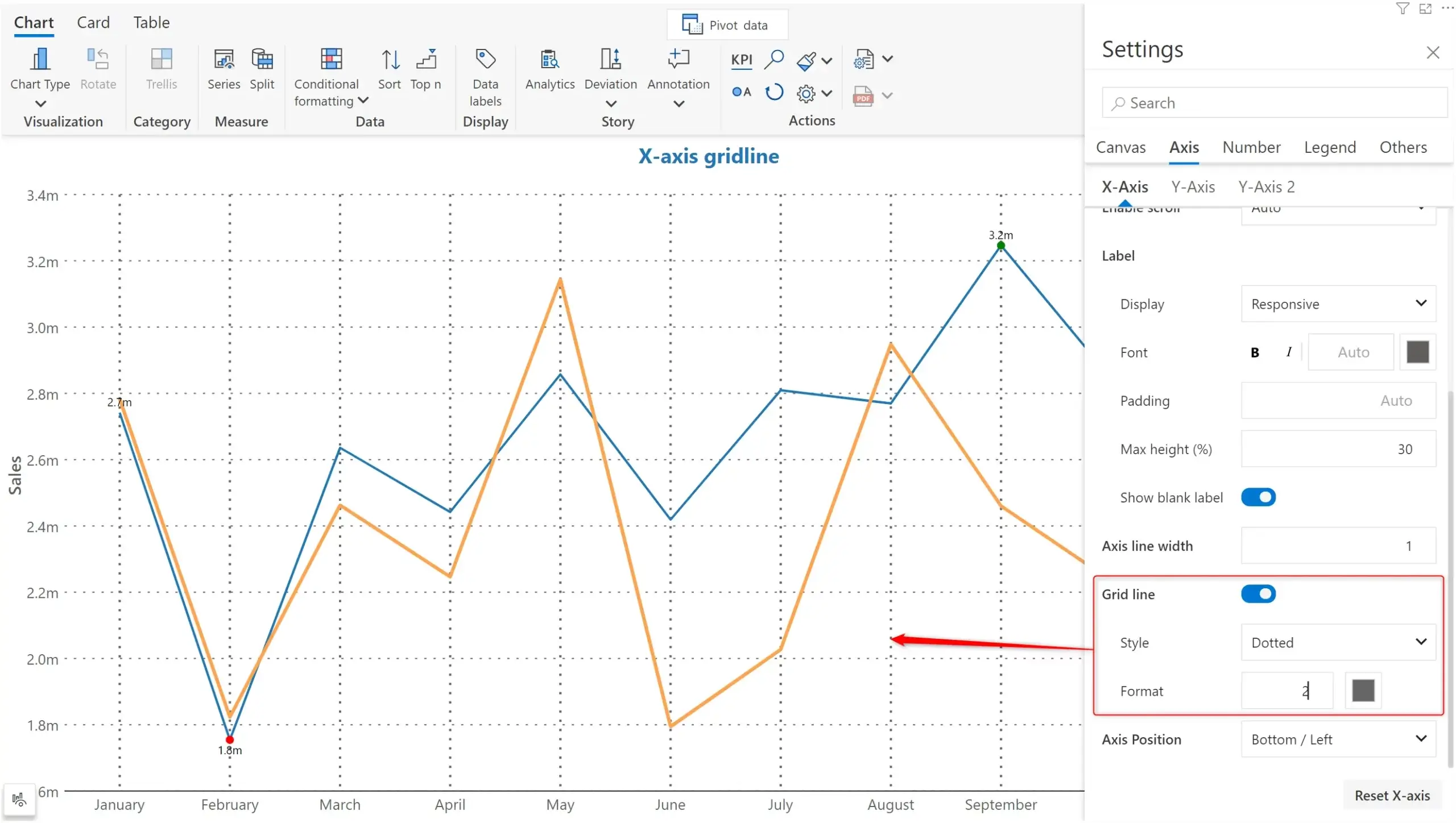
Enable gridlines on the x-axis, making your charts clearer and easier to comprehend. You can customize the x-axis gridlines by assigning a pattern and thickness.
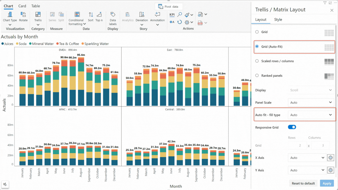
If you are using the Auto-fit layout for your small multiple, you have the additional flexibility to specify whether to prioritize an arrangement in rows or columns.
A host of styling and design options have been introduced for bullet charts. You can set the color, size, shape and fill for the markers. You can also apply conditional formatting on the column to highlight specific data.
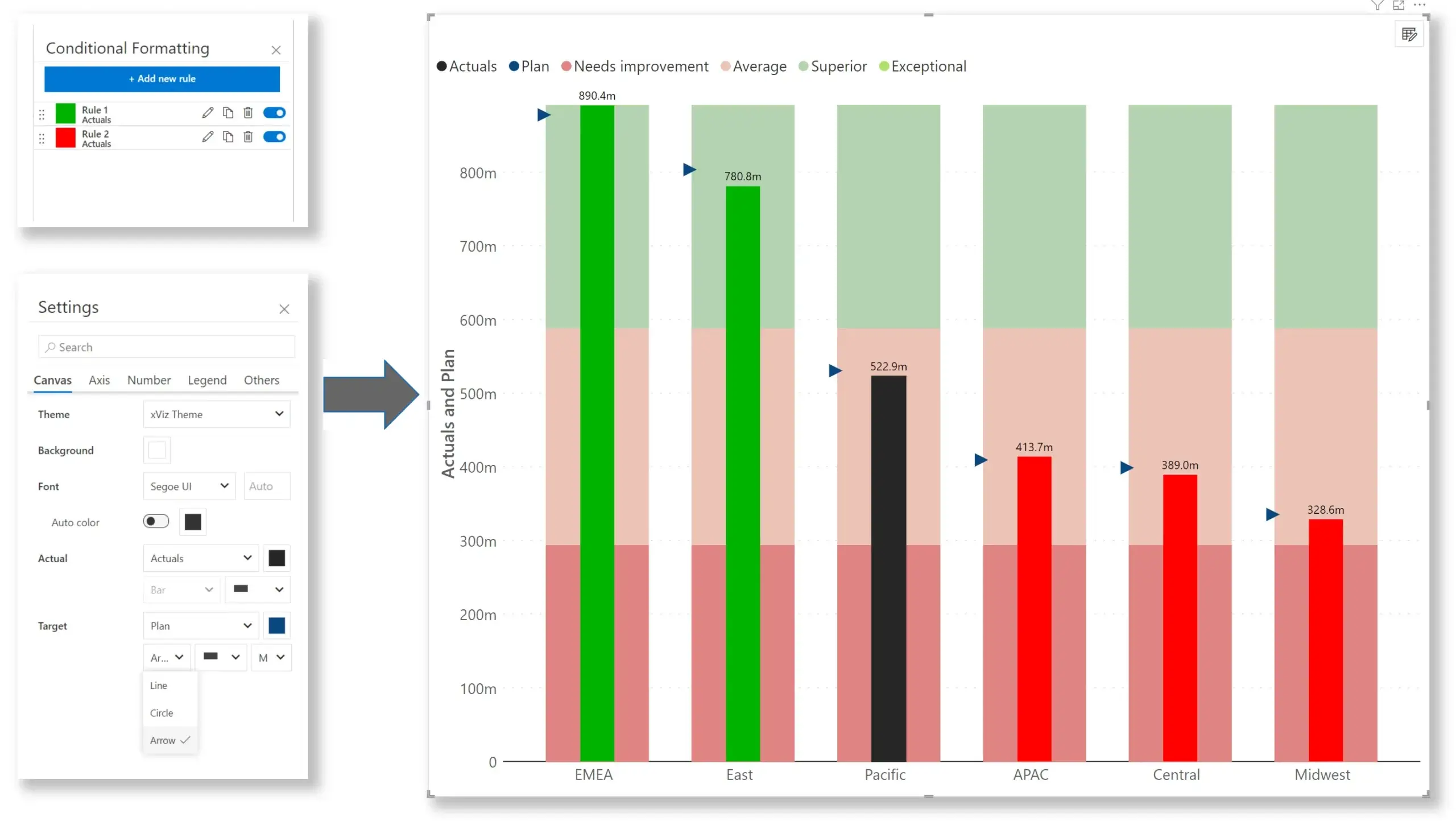
The November edition allows you to render your charts for a specific date range when using a continuous axis. This can be helpful if you want to highlight your data for specific periods (e.g., last 90 days) instead of showing the data for the entire interval.
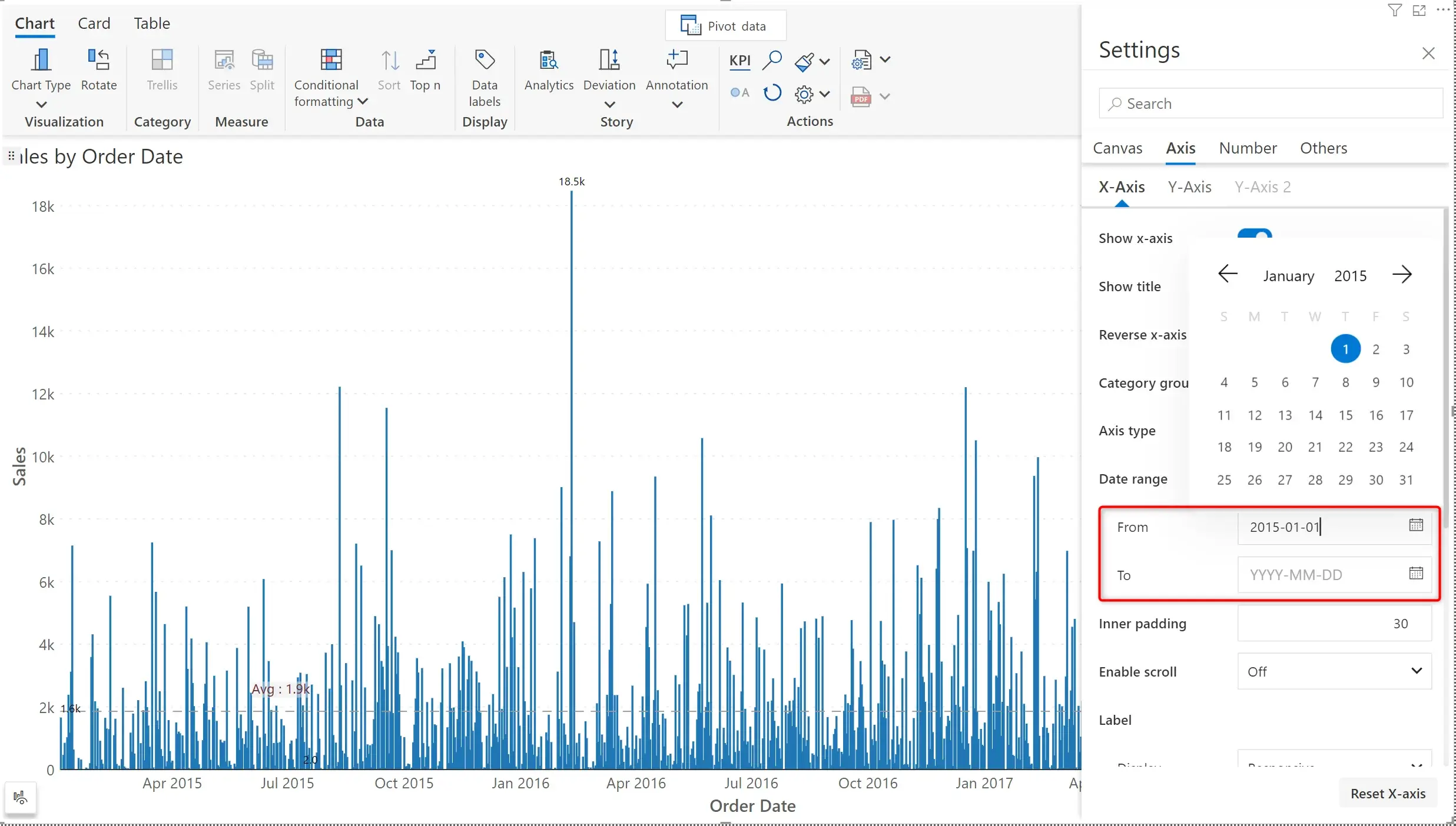
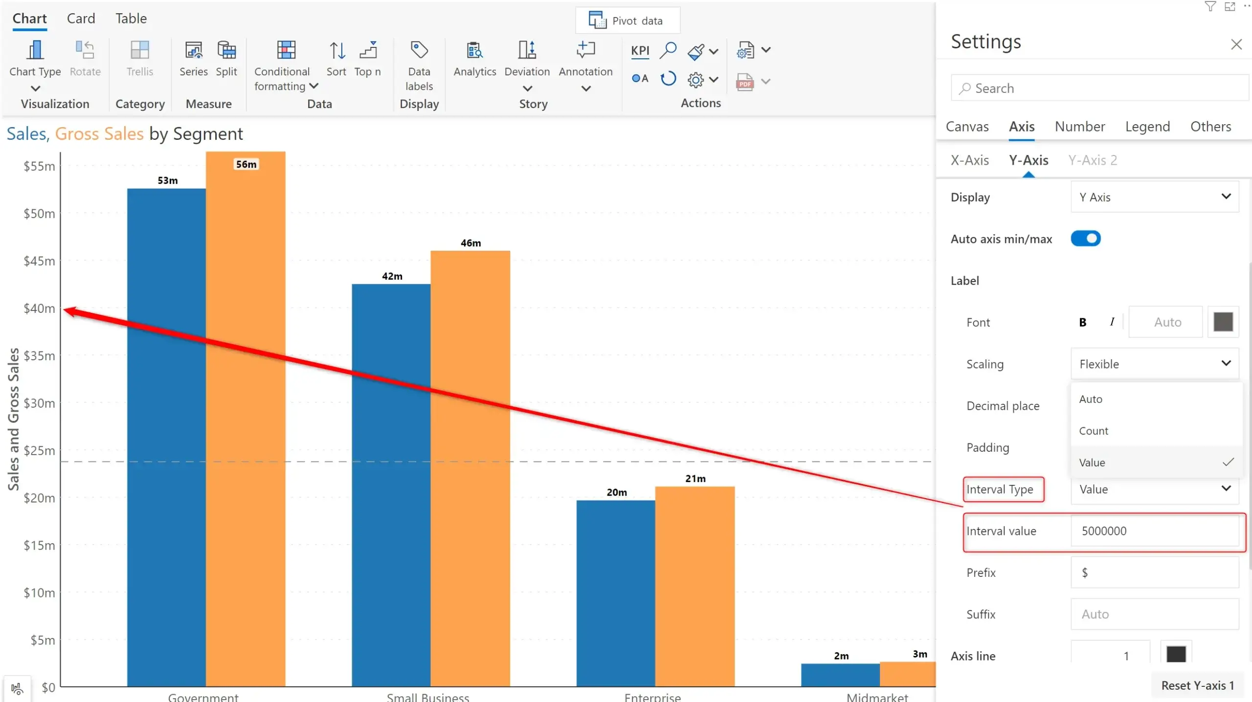
Inforiver automatically sets tick intervals best suited to your data. From this release, you can also define a custom tick interval using the Interval Type option. You can additionally specify a prefix and suffix when you set the interval type dropdown to Count or Value.
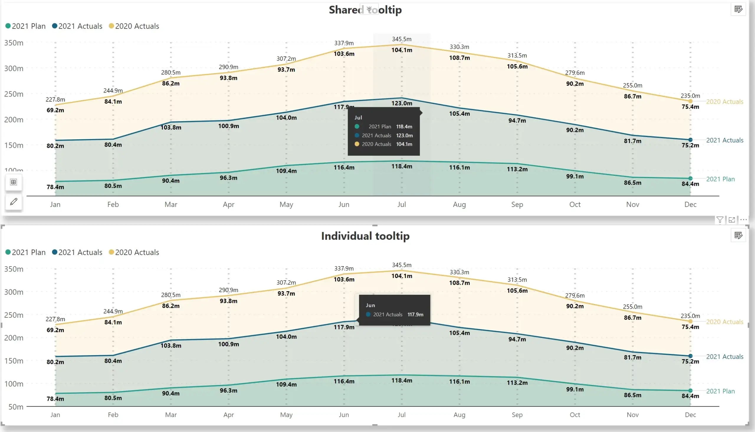
If your reports use area or line charts, you have the option to use a shared tooltip or go for individual tooltip as shown below.
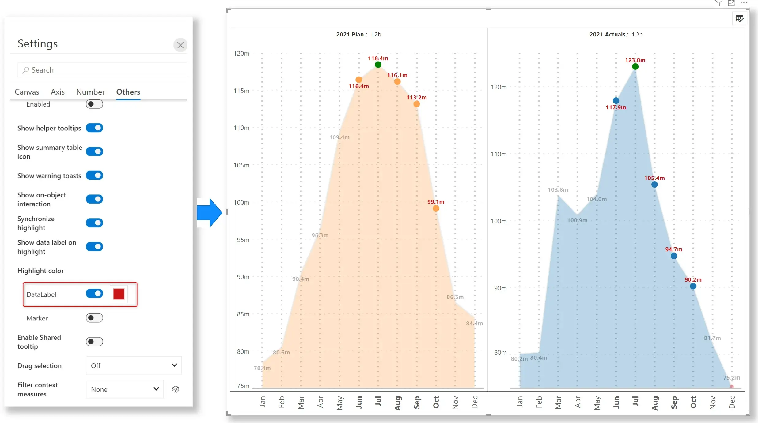
You can now set a separate color for the data label when the data point is selected. With this feature, you can easily draw attention to specific areas of your charts. In the below image, the range Jun– Oct is selected. You can see that the data labels for the selected area are shown in red color, whereas the remaining data labels are light grey.

Inforiver helps enterprises consolidate planning, reporting & analytics on a single platform (Power BI). The no-code, self-service award-winning platform has been recognized as the industry’s best and is adopted by many Fortune 100 firms.
Inforiver is a product of Lumel, the #1 Power BI AppSource Partner. The firm serves over 3,000 customers worldwide through its portfolio of products offered under the brands Inforiver, EDITable, ValQ, and xViz.