Upcoming webinar on 'Inforiver Charts : The fastest way to deliver stories in Power BI', Aug 29th , Monday, 10.30 AM CST. Register Now
Upcoming webinar on 'Inforiver Charts : The fastest way to deliver stories in Power BI', Aug 29th , Monday, 10.30 AM CST. Register Now
Inforiver delivers a powerful 'Manage Columns' feature that helps you show/hide columns, reorder measures, resize columns by setting default column widths and apply custom aggregations in your Power BI table / matrix reports.
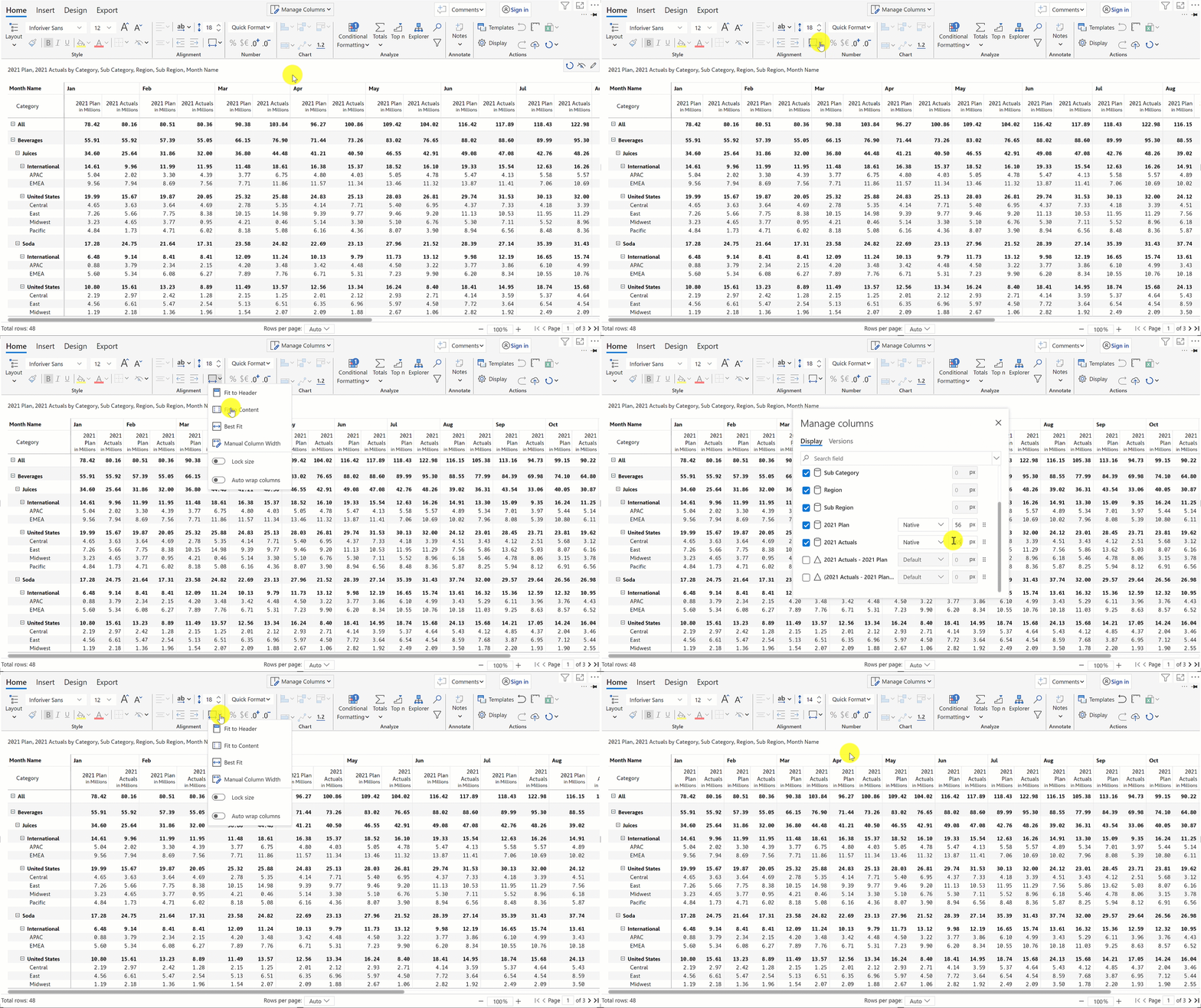
To access this feature, click on the 'Manage Columns' dropdown from the top of the ribbon menu.
Using the check boxes on the right, you can choose to show/hide measures from your report. You may want to hide one or more columns under several circumstances:
In the above image, the icon preceding each measure name shows how that specific measure is displayed. E.g. 2021 Actuals is shown as a bar chart. This is very helpful to figure out where the columns are relatively positioned in the table.
The search feature at the top of this window helps you to find any measures from the list.
Finally, when you press the gear icon from on the top right, you will see a more detailed window as shown below.
In the Display tab, you can
Note that when you override default aggregation, Inforiver will use only the data presented to the visual.
In the Versions tab, you can set/update the versions and perform variance analysis.
Note that, by default, if the data fields are assigned to the AC, PY and PL fields during data mapping, it gets automatically updated.
Finally, there are a couple of additional ways by which you can quickly adjust column width, especially when you have a lot of columns in the report. This can be done directly from the toolbar in three ways:

Related Power BI Ideas: Hide/Show Column on Table
Curious about Inforiver? Read why Matt Allington (Self Service BI Expert + Microsoft MVP) , Excelerator BI prefers Inforiver over the Analyze in Excel capability that comes with Power BI for ad-hoc analysis.
Inforiver helps enterprises consolidate planning, reporting & analytics on a single platform (Power BI). The no-code, self-service award-winning platform has been recognized as the industry’s best and is adopted by many Fortune 100 firms.
Inforiver is a product of Lumel, the #1 Power BI AppSource Partner. The firm serves over 3,000 customers worldwide through its portfolio of products offered under the brands Inforiver, EDITable, ValQ, and xViz.