Inforiver

Upcoming webinar on 'Inforiver Charts : The fastest way to deliver stories in Power BI', Aug 29th , Monday, 10.30 AM CST.    Register Now

Table of content

Comparative insights through Storytelling Charts in Power BI 

by Inforiver | Aug 07, 2025 | , ,

Identifying precise differences and trends between business units or time periods is essential for targeted strategy and resource allocation. While Power BI offers a variety of standard visuals, they can miss subtle but important variations in your data. Storytelling charts such as the Dumbbell Chart, Dot Plot, Range Bar, and Arrow Plot are designed to reveal these comparative insights with greater clarity and impact. These visuals enable analysts to pinpoint shifts, gaps, and directional changes that inform actionable decisions. 

  • Dumbbell Chart: Also known as barbell charts or connected dot plots, these visuals display two data points for each category connected by a line, resembling a dumbbell. They are perfect for illustrating "before & after" scenarios, comparing a target to an actual, or showing the range between two related measures across multiple categories. The length of the connecting line immediately conveys the magnitude of the difference. 
  • Dot Plot: In their most common "Cleveland Dot Plot" form, these charts plot individual data points along an axis. They are excellent alternatives to bar charts when you need to compare quantitative values across numerous categories without the visual clutter of long bars, or when emphasizing individual points over summed totals. A simple dot plot can also show the distribution of a small dataset. 
  • Range Bar: These charts, often appearing as "floating bars" or "range bars," display a span between a start and an end value for each item or category. They are ideal for visualizing durations, intervals, or the spread of data, such as project timelines, temperature ranges over a period, or the minimum and maximum values of a metric. 
  • Arrow Plot: A highly intuitive chart type, Arrow Plots specifically show how data points have changed or moved between two distinct points (e.g., two dates). Each arrow connects the initial and final value, with the arrow's direction indicating increase or decrease, and its length representing the magnitude of that change. They are invaluable for visualizing trends and shifts at a glance. 

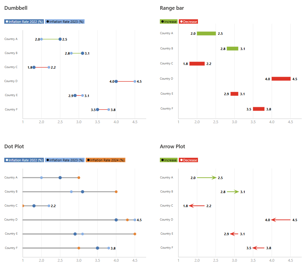
What these four charts share in common is their fundamental purpose to illustrate direct comparison and clearly articulate relationships or differences within your data. Unlike many standard charts that might only show a single value or distribution, these visuals inherently focus on demonstrating how one point relates to another—be it a difference, a change over time, or a defined range. They move beyond simple magnitude to highlight the context of your numbers. 

However, the Dot Plot stands out than other three in a key aspect. While Dumbbell, Range Plot and Arrow Plot intrinsically deal with two distinct, connected points (showing a difference, a range, or a change/movement), a basic Dot Plot can simply display individual data points or distributions across categories. It doesn't necessarily require two connected points to convey its primary message. While a "connected dot plot" is essentially a dumbbell chart, the versatility of the general dot plot allows it to also function as a cleaner alternative to a bar chart for single-value comparisons, or to show the spread of data without implying a direct "from-to" relationship like the others. 

Data Structure Essentials for Comparative Charts 

To plot these comparative charts, your underlying data needs to be structured in a precise, aggregated format, much like the organized layout of a pivot table. For Dumbbell Charts, Range Bars, and Arrow Plots, the essential data structure typically involves at least three key columns: a Category or unique identifier (such as a product name, region, or time period) to delineate each comparative instance, followed by two distinct value columns that represent the 'start' and 'end' points of the comparison. For instance, an Arrow Plot comparing performance might need 'Product', 'Sales_Q1', and 'Sales_Q2', while a Range Plot might use 'Task', 'Start_Date', and 'End_Date'. 

In contrast, the data structure for a Dot Plot is highly flexible. While it can display individual quantitative measures across various categories using just a Category and a single Value column, it also readily supports multiple Value columns to plot different series alongside each other (e.g., 'Product', 'Sales 2023', 'Sales 2024', 'Sales 2025'…… so on) .This versatility allows Dot Plots to enable straightforward point-to-point comparisons for single metrics or to show multiple comparative measures for each category without necessarily needing an inherent 'start' and 'end' pair for each data item. 

Inforiver Analytics+: Elevating Comparative Storytelling 

Inforiver Analytics+ significantly enhances the capabilities of these comparative storytelling charts in Power BI by offering a suite of powerful features that go far beyond standard visuals. These capabilities ensure your data narratives are precise, impactful, and easy to understand: 

  • Flexible Orientation: Easily switch between horizontal and vertical chart layouts, adapting your visuals to best fit your dashboard design and specific data presentation needs. 
  • Tailored Canvas Settings: Beyond shared capabilities, Inforiver Analytics+ offers tailored Canvas Settings to fine-tune each comparative chart for optimal visual impact and clarity. While general options like themes, background, and font styling provide a consistent foundation, each chart type also features unique controls.  
  • For Dumbbell Charts, you gain specific control over the marker style for both 'Actual' and 'Target' points (e.g., shape, size, color) and can apply rounded edges to the connecting bars for a softer aesthetic.  
  • Range Plots feature a unique Variance pattern to define how positive or negative differences are visually represented within the bars, along with the option for Rounded Edges on the bars themselves.  
  • Arrow Plots provide granular customization for the Line style (thickness, pattern) and Marker style (e.g., arrow shape, size) of the arrows, ensuring clear and customized indications of change. 
  • Finally, Dot Plots offer distinct settings like Extend Baseline to emphasize comparisons against a reference point, and Stem color to customize the lines connecting dots to the axis or baseline, allowing for precise control over individual point representation. 
  • Crucially, Dumbbell, Range Plots, and Arrow Plots also benefit from integrated Variance settings to define positive and negative color schemes, ensuring consistent visual cues for performance across your comparative narratives. 
  • Conditional Formatting: Conditional formatting in Inforiver Analytics+ can be applied using two primary methods: Color Scales for a gradual visual gradient across data, or Rules for precise alerts based on thresholds.  What truly sets Inforiver apart is the granular control over which visual elements receive the styling: 
     
  • For Dumbbell Chart & Dot Plot, you can apply formatting to All relevant elements including specifically to the Stem (the connecting line between points). 
  • Range Plots allow you to format All elements including the Range Bar itself. 
  • Similarly, Arrow Plot enable formatting for All elements including the Arrow Plot itself. 
  • Data Label Customization: Inforiver Analytics+ offers comprehensive and granular control over data labels to enhance chart readability and reduce visual clutter. Users can precisely define which values are displayed, including specific options such as minimum, maximum, first, last, or all data points. Furthermore, the platform provides full customization over label color, font, and positioning, ensuring optimal clarity and seamless integration within the chart's design. 
  • Contextual Annotations: Add rich, filter-aware text annotations, footnotes, and commentary directly onto your charts. This provides crucial context, explains anomalies, or guides your audience through specific data points in your narrative. 
  • Comprehensive Built-in Analytics: Inforiver Analytics+ includes powerful integrated analytical features. These enhance comparative insights with options such as dynamic reference lines and bands, error bars for statistical context, trend lines to identify patterns, and running totals. 
  • Small Multiples (Trellis Mode): This feature automatically generates multiple smaller versions of your chart. Each mini chart represents a different category or dimension, allowing for easy comparison of trends and performance across various segments. 

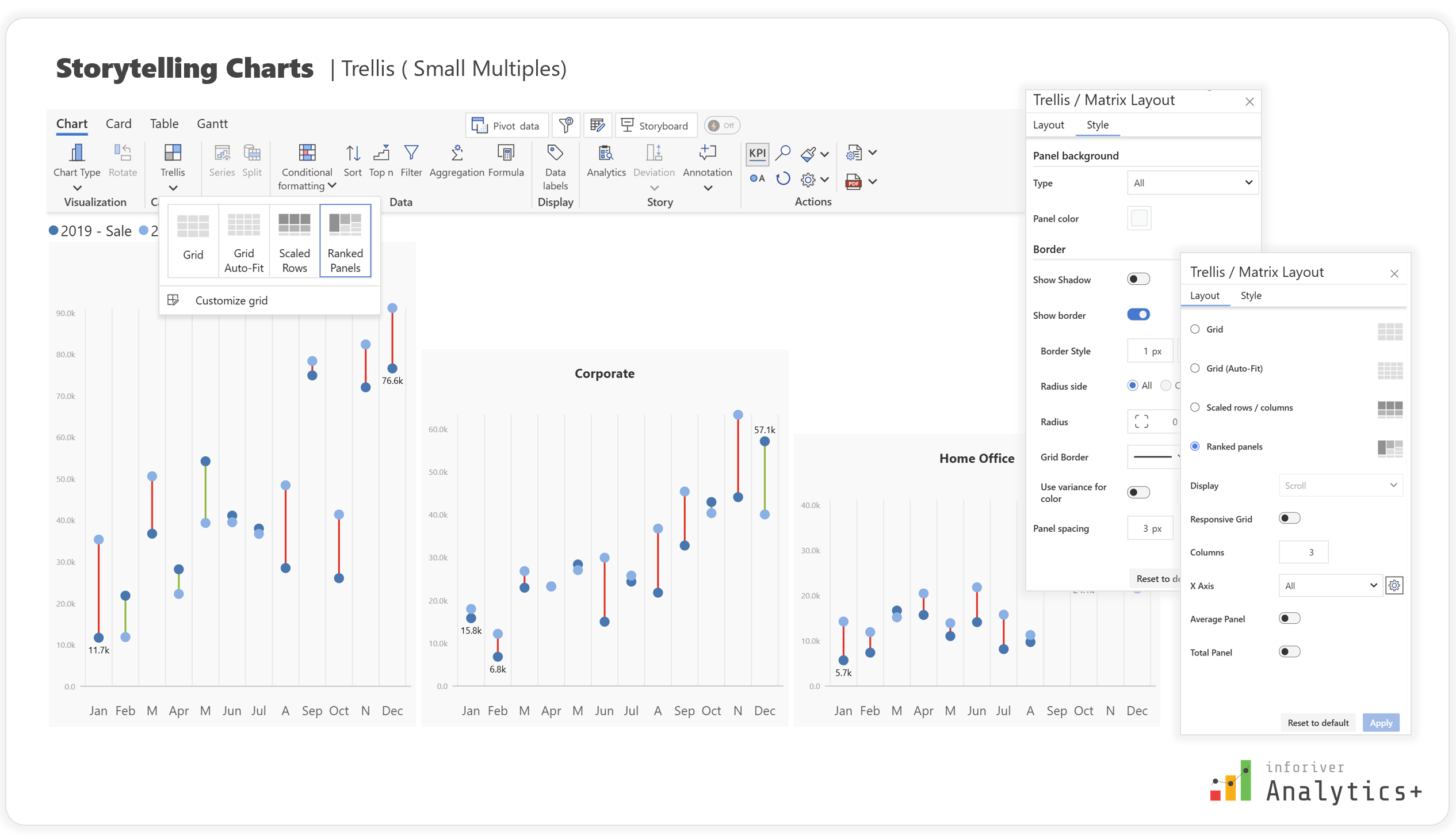
These robust features collectively empower users to transform raw data into compelling and insightful comparative narratives, making your Power BI reports truly stand out.

Conclusion 

Effectively communicating comparisons and changes within your data is crucial for informed decision-making. While Power BI's native capabilities provide a strong foundation, custom visuals like Inforiver Analytics+ unlock a new realm of visual storytelling. By leveraging Dumbbell Charts, Dot Plots, Range Plots, and Arrow Plots with Inforiver's extensive customization and analytical features, you can create reports that not only present data but also articulate clear, actionable insights, empowering your audience to understand trends, differences, and relationships briefly. 

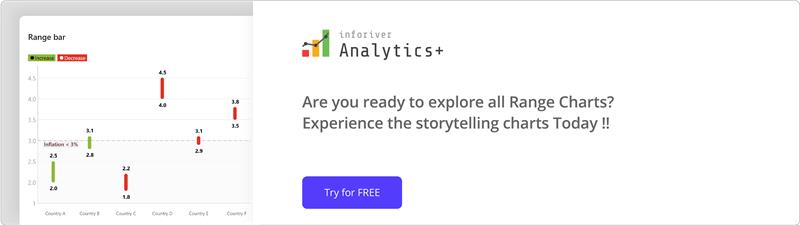
Try Inforiver Analytics+ for yourself with a free trial and explore how it can transform your reporting experience.   


Share this on:

Other Blogs

Get Inforiver brochure

Maximize your business potential with Inforiver's paginated reporting, data entry, planning & budgeting capabilities
Download now
Inforiver

Inforiver helps enterprises consolidate planning, reporting & analytics on a single platform (Power BI). The no-code, self-service award-winning platform has been recognized as the industry’s best and is adopted by many Fortune 100 firms.

Inforiver is a product of Lumel, the #1 Power BI AppSource Partner. The firm serves over 3,000 customers worldwide through its portfolio of products offered under the brands Inforiver, EDITable, ValQ, and xViz.

linkedin facebook pinterest youtube rss twitter instagram facebook-blank rss-blank linkedin-blank pinterest youtube twitter instagram