
Upcoming webinar on 'Inforiver Charts : The fastest way to deliver stories in Power BI', Aug 29th , Monday, 10.30 AM CST. Register Now
Upcoming webinar on 'Inforiver Charts : The fastest way to deliver stories in Power BI', Aug 29th , Monday, 10.30 AM CST. Register Now
Range and dumbbell charts primarily track how a metric has changed between two time periods or categories. Instead of visualizing each magnitude directly, these charts plot the difference between the magnitudes. This shifts the focus from the values themselves to their variance. However, the information on the magnitudes is not lost in many of the variations. Let us first understand why we may want to look at the variance and then explore the various types of range and dumbbell charts using examples.
In statistics, the variance value for a set of data points tells us how large the spread of the data is around the mean value. In a business context, however, we often refer to the difference between actual values and the expected values as their variance. This value allows us to examine how far performance has deviated from the target, forecast, or previous year’s performance and can be critical information in making adjustments and plans for the future to stay on target. There are two broad types of range charts that we can use to visualize this metric – bar-type charts and area-type charts.
Many of the charts used to visualize the difference between two categories can be loosely grouped into the “bar type” charts. These charts typically show variance as a length or a height and require two values for each data point. Bar type charts are used for discrete values or categories. Let us explore some of the charts below:
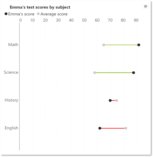
Dumbbell charts plot two values for each data point, shown as points or dots, with a line connecting these points that shows the magnitude of the difference between the points.
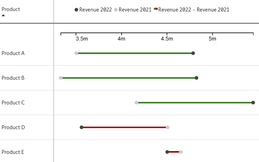
The above chart, for example, compares the current and prior year performance for different products. Notice how the difference between the performance is highlighted by the color-coded bars – products A, B and C have performed better than the previous year, but products D and E have underachieved compared to last year.
Arrow charts carry the same information with a slightly different focus - this chart type emphasizes the movement between years using arrows to connect the two values for each data point. The arrow shows us the direction of movement, while its length shows us the magnitude of movement, as seen below. This chart shows the change in the average rating of several brands between the prior year and the current year. While ratings for both Brand 2 and Brand 5 have fallen, notice that Brand 2 has suffered a much larger dip.
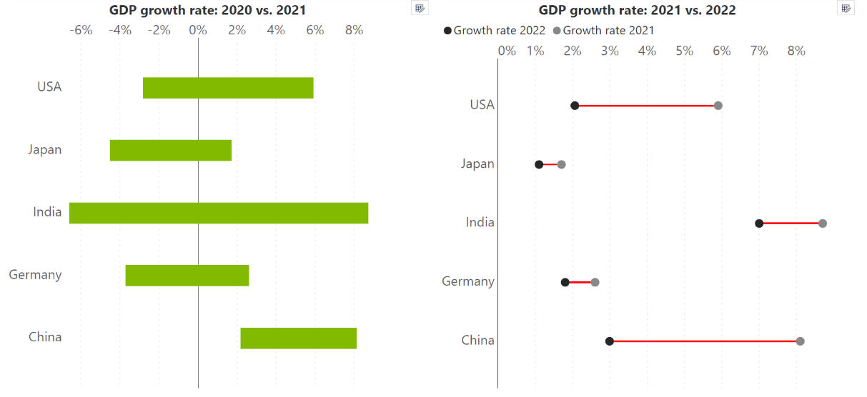
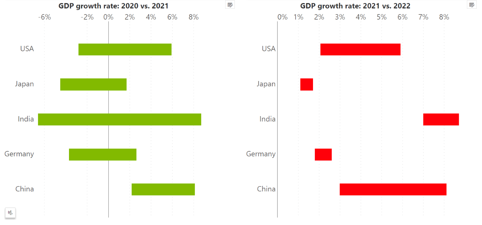
As indicated by their name, range bar charts show us the difference between the two time periods as a range or a bar. This range can be seen as encompassing a minimum and maximum value, or as a comparison between categories. The two range charts below show the change in GDP growth rate between 2020 and 2021, and between 2021 and 2022 respectively. While all the countries shown here showed increased growth between 2020 and 2021, they all subsequently showed a decline in growth between 2021 and 2022, as shown by the color coding of the bars. Notice that range bar charts require labels and/or color to distinguish between the actuals and the prior year, unlike arrow charts. These charts are also commonly called floating bar charts.
Integrated variance bar charts can be thought of as a combination of a bar chart and a range chart. The two data values as well as their difference is integrated into a single bar, as seen below. This chart emphasizes both the magnitudes as well as the difference in magnitude.
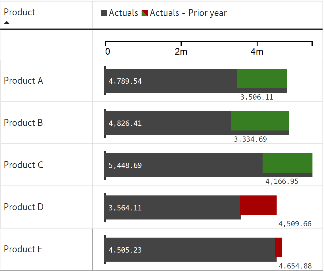
Here, the primary measure (in this case, the Actuals) is given importance by using a dark bar to lend visual weight. The difference with the secondary or comparative measure (in this case, the prior year values) is shown as a green or red bar depending on whether the difference is positive or negative. The primary change in this chart compared to the charts we discussed previously is that one of the measures is given special importance compared to the other.
Note that bar-type range charts can not only show differences between two points in time, but also between two categories, as seen in this chart below.
Unlike bar-type charts, area-type charts are used for continuous values. These charts also emphasize the difference in magnitude, but this is shown as an area, rather than as a length or height. As with area charts in general, this leads us to read this variance as a volume, instead of as a set of magnitudes evolving over time.
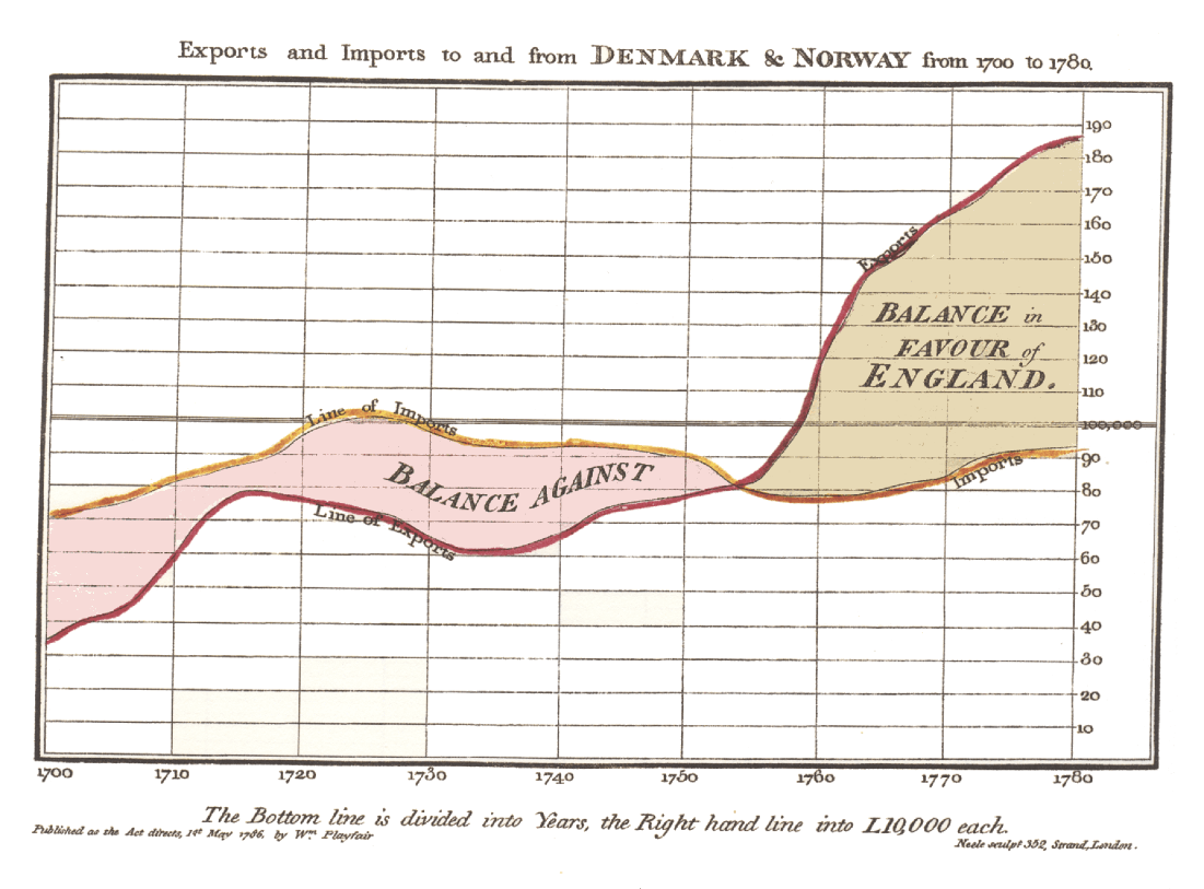
Range area charts plot the difference between two continuous series by filling in the area between two line charts representing these two series. This is seen in one of the earliest examples of data visualization from William Playfair’s 1786 Commercial and Political Atlas, depicting imports from and exports to Denmark and Norway from 1700 - 1780, with the area between the two showing the trade balance between these countries and England.
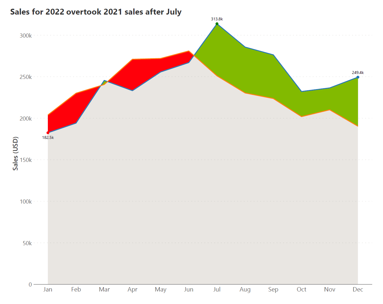
A color-coded example (with negative variances in red and positive in green) comparing monthly sales values between two years is seen below.
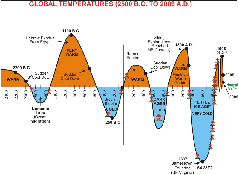
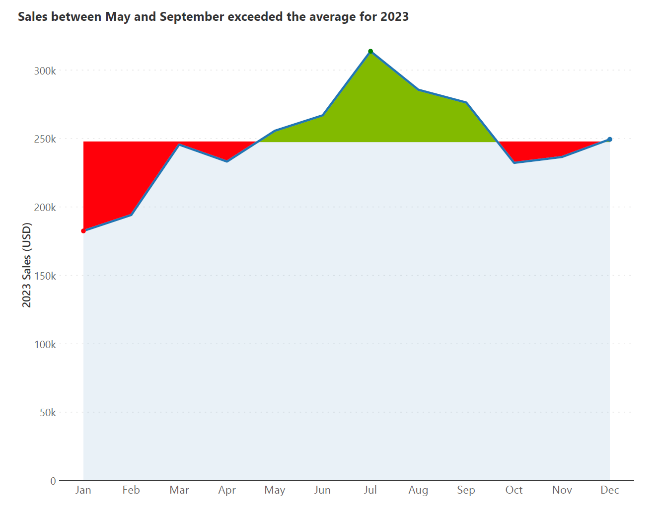
Unlike range area charts, variance area charts plot the deviation from a fixed baseline. This allows us to visualize periods of under- or overperformance, or positive and negative deviations from an expected value. The chart below, for instance, shows the fluctuations of average global temperatures roughly over the last 4500 years. The baseline for the chart, which can be interpreted as the “normal” temperature is taken to be at 57° F, and the changes in temperature can be seen as deviations from this normal. We see the different warm and cool periods that the earth has gone through, including the little ice age and the more recent warming caused by human activity.
Another example using sales values compared to the yearly average is seen below:
A fascinating and important application of the range chart from the domain of Economics is a measure called the Gini coefficient. The Gini coefficient is a measure of the level of wealth inequality in a given society. It compares the level of income earned to the share of the population that earns it. For example, in a highly unequal society, 10% of the population may earn 90% of the wealth, whereas a more equal society would have levels of income in proportion to the share of the population. A visual explanation of the Gini coefficient is given in the chart below.
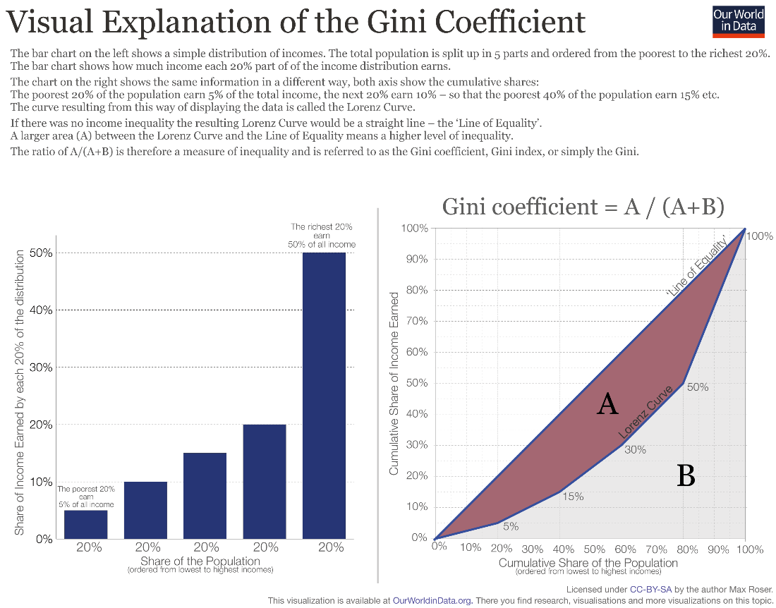
If you pay close attention to the chart on the right, you may notice that this is in fact a range area chart. The line of equality passing through the diagonal represents a society where the cumulative share of the population is proportional to the cumulative share of the income earned, meaning that a certain percentage of the population receives the same percentage of the total income. The Lorentz curve represents the actual reality in a given country, and the difference between the two, given by the area “A” can be interpreted as a range area chart. The Gini coefficient is calculated as the proportion of the area taken up by “A” with respect to the total area under the line of equality. The Gini coefficient draws attention to the fact that while economic growth is a positive sign, it can hide many inequalities in terms of how this wealth is distributed.
See How Inforiver Enhances Power BI Variance Analysis
To try the different types of range charts for yourself, get your free copy of Inforiver Analytics+ by clicking here!
Other related charts:
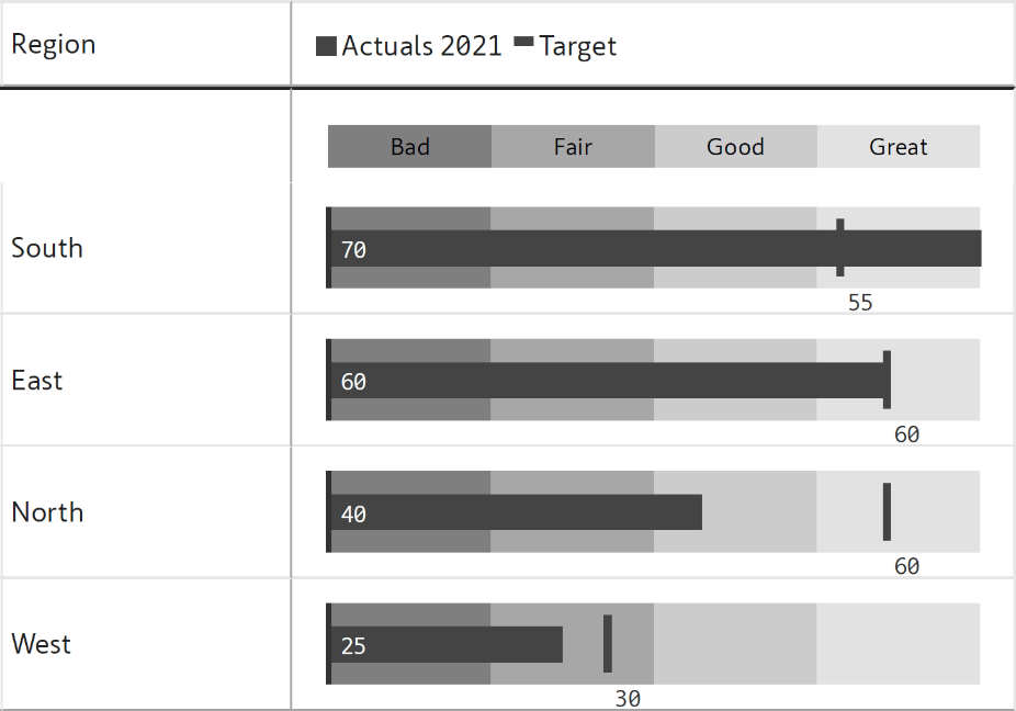
Bar-type range charts are sometimes classified under the same category as bullet charts. Like range charts, bullet charts also plot a performance measure against a target, but have additional qualitative bands added. The actuals measure is shown as a bar, while the target is shown by a marker, as seen below.
By - Hamsini Sukumar
To learn more about bullet charts, check out the articles below:

Inforiver helps enterprises consolidate planning, reporting & analytics on a single platform (Power BI). The no-code, self-service award-winning platform has been recognized as the industry’s best and is adopted by many Fortune 100 firms.
Inforiver is a product of Lumel, the #1 Power BI AppSource Partner. The firm serves over 3,000 customers worldwide through its portfolio of products offered under the brands Inforiver, EDITable, ValQ, and xViz.