
Upcoming webinar on 'Inforiver Charts : The fastest way to deliver stories in Power BI', Aug 29th , Monday, 10.30 AM CST. Register Now
Upcoming webinar on 'Inforiver Charts : The fastest way to deliver stories in Power BI', Aug 29th , Monday, 10.30 AM CST. Register Now
Bullet charts are a fantastic tool for showcasing KPIs, capable of presenting large quantities of information in a compact area. They can be thought of as modified bar charts that allow us to visualize a featured measure, understand how it stands against a comparative measure like a target or a forecast, and make a qualitative assessment of its value. Bullet charts have many advantages, including their compactness, information density, and accuracy. Nevertheless, they present some challenges in visualization and interpretation. We shall discuss some of these challenges below. For best practices that help you make an effective bullet chart, click here.
Here are the key disadvantages of bullet charts that we will explore in detail:
1. Relatively Difficult to Interpret for Casual Users
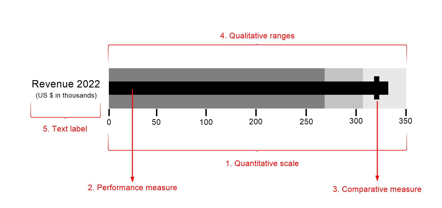
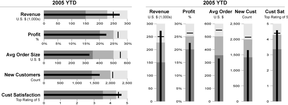
Bullet charts pack a punch with the quantity of information that they visualize. While this is one of their major advantages, it can also be intimidating for casual users with a limited depth of knowledge of data visualization. Even those with experience may struggle to interpret the chart correctly. This limitation of the bullet chart means that your audience will likely need some preparation before being able to understand the chart, given its many elements (pictured below). Other charts, such as line charts or bar charts are much more familiar and intuitive to interpret, while bullet charts require prior training.
2. Does not Visualize the Performance Gap
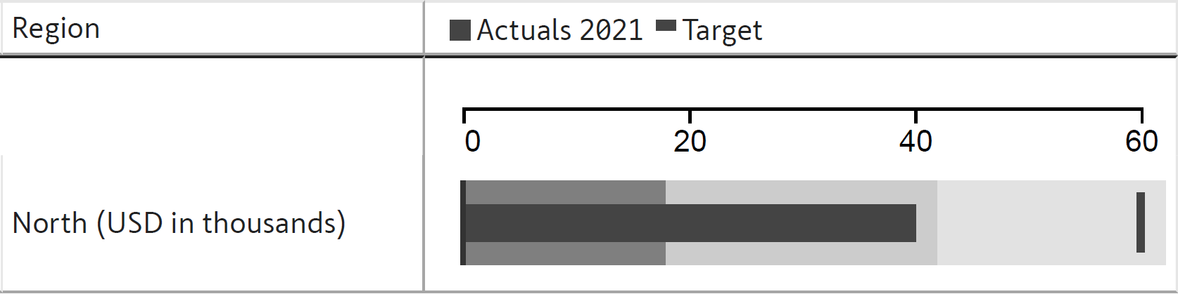
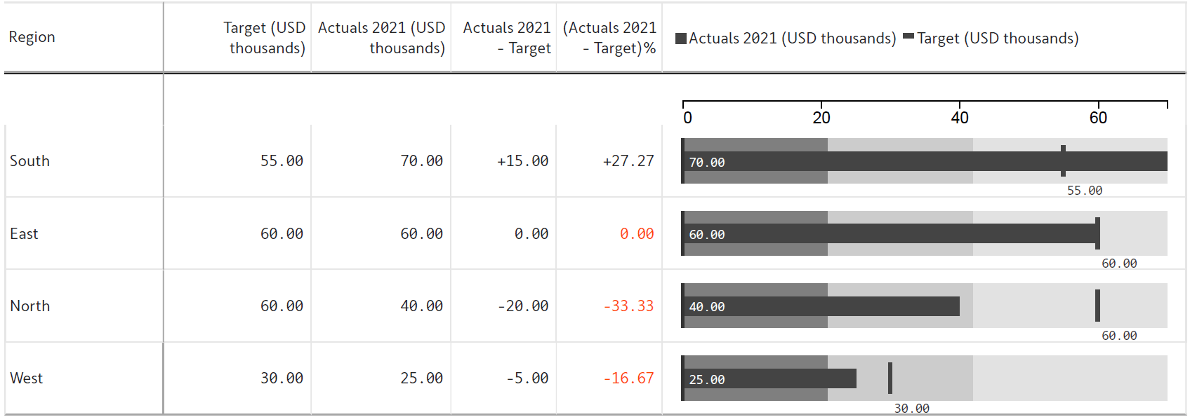
The classic bullet chart shown above tells us whether a metric has exceeded or missed its target using the intersection between the performance bar and the comparative measure marker. This is a conspicuous visual cue. However, what is the value of the difference between the performance and target measures? This is a common question that requires some mental math to answer – we would need to read the values of the performance bar and the target and then find their difference. For example, the following chart shows a metric that has missed the target. To know the exact value of the gap, we note that the featured measure bar has a value of 40,000 USD, while the target measures 60,000 USD, with their difference therefore being a value of 20,000 USD. This is a cumbersome process.
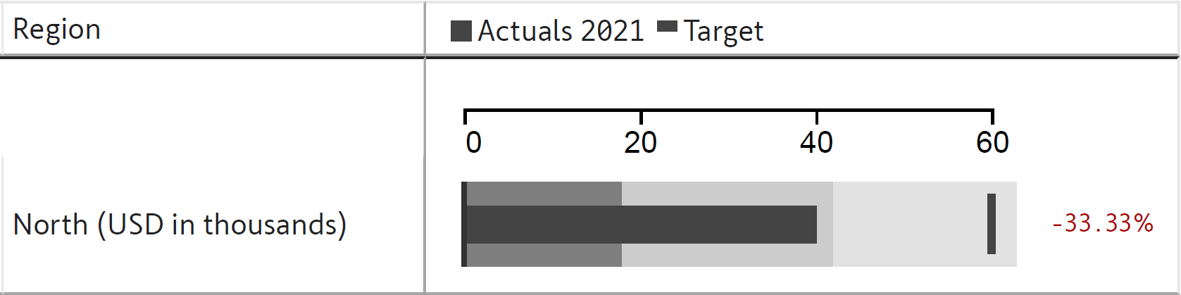
Instead, we may overcome this disadvantage of bullet charts by using a variation that directly visualizes or labels the variance or the variance percentage, as shown below. Some data visualization purists recommend that labels should never be used for values, and that the visualization should speak for itself. While this is true as a general rule, there are cases, like in this chart, where using labels clarifies the chart and saves the reader the trouble of calculating values.
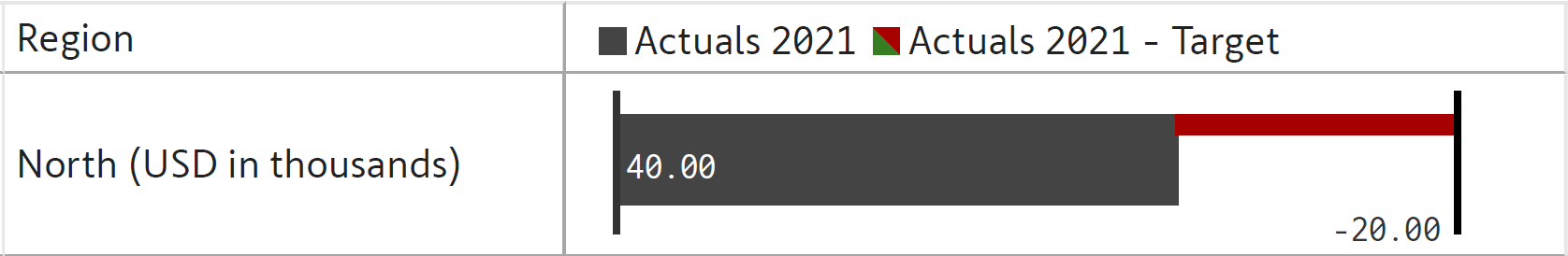
We may also make it easier for our readers to visualize the variance and the % variance by including the values in a table, as seen here.
3. No Common understanding of Qualitative Ranges for a given Metric
The qualitative comparison bands on a bullet chart can pose problems, as the definitions for “good”, “satisfactory” and “bad” can be arbitrary and subjective. The analyst who makes the chart may have a different interpretation of the terms than the executive who reads the chart. The terminology can be vague and the audience for the chart may not agree with the ranges or may not even understand the areas. Further, the bands change for each KPI as each has its own scale and unit of measurement. This lack of a common understanding can lead to confusion.
4. High Information Density
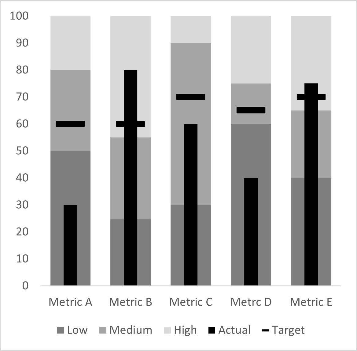
One of the main advantages of the bullet chart is the quantity of information that is packed into a small space. However, this can also have a downside – it can be cumbersome to quickly scan and process the information on dashboards with a series of bullet graphs. As we will see below, this also means that it is difficult to pick out metrics that require attention. This quantity of information can be hard to process, and the chart can quickly become overwhelming.
5. Visually Busy
The number of elements present in a bullet chart, including the performance bar, the target markers and all of the comparison bands, can make the chart very visually busy. This is especially true when we stack multiple bullet charts together on a dashboard.
6. Hard to notice Problematic Metrics and Crises
This visual density can make it difficult for problematic metrics and crises to stand out against other charts on your dashboard. This is especially since darker bands usually denote worse outcomes, reducing the contrast between the performance bar and the comparison band for measures that fall within this range, as seen below. This makes underperforming metrics less likely to stand out.
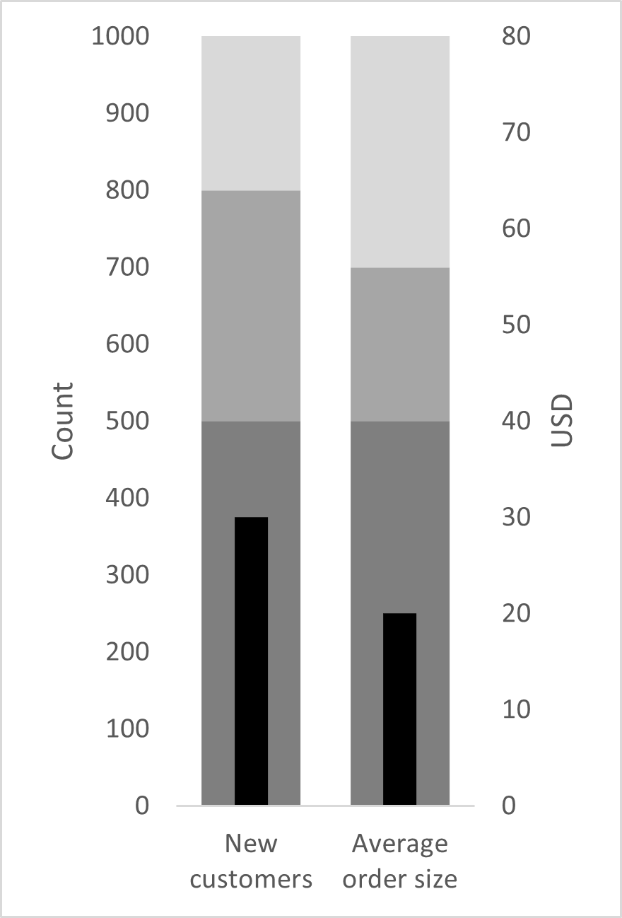
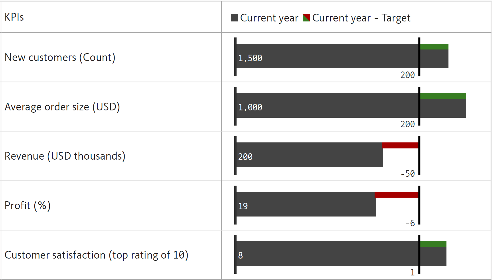
Another potential problem with bullet charts occurs when we have metrics that are not directly comparable. When we have two such metrics that are in the "bad” qualitative range, how do we determine which one needs more attention? In the chart below, for example, we see that the count of new customers and the average order size are within the “bad” range, and we see that average order size is lower in its “bad” range than the new customers bar. However, does this really mean that it is in more of a crisis? Each metric has its own threshold for crises, which means that this is not necessarily true.
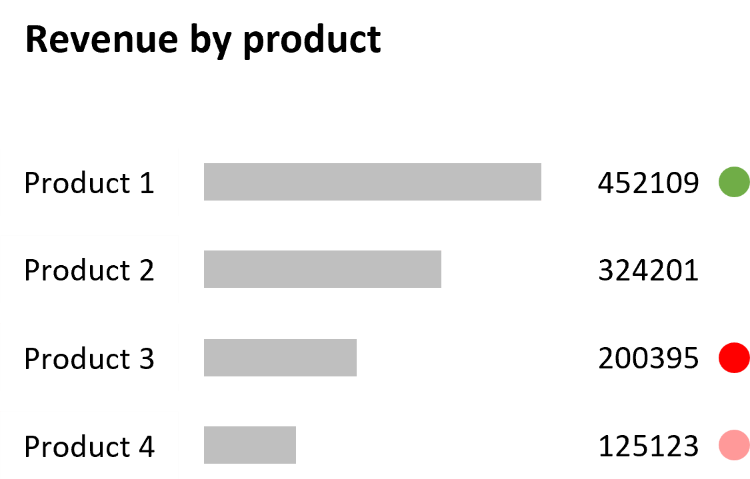
Action dots, designed by Nick Desbarats, are an alternative visualization that can overcome some of the limitations of bullet charts. Here, problematic metrics, crises, as well as overachieving metrics are highlighted using colored dots that immediately draw the reader’s attention.
7. Difficult to Compare Metrics from Different Categories
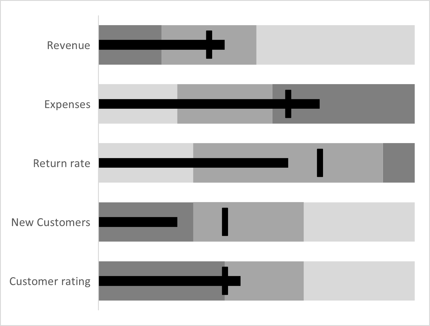
This leads us to our next point. A dashboard often contains several KPIs that are not directly comparable, each using a different unit of measurement and a different scale. This can sometimes lead to confusion. In the image below, for example, we see three metrics presented together – Revenue, Expenses and Return rate. We see that the bar for Revenue is twice as long as the bar for Expenses, and we may assume that its value is twice as much. However, this is not actually true as Revenue is on a totally different order of magnitude (in millions of dollars) compared to Expenses (which is in thousands of dollars).
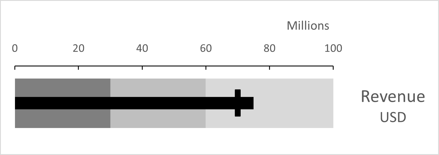
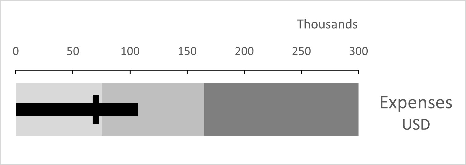
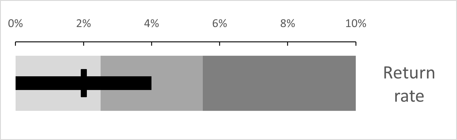
One solution to this is to normalize the target marker, so that all markers are at the same level regardless of their value. The rest of the bar is then scaled according to the value of the of the target. This allows us to see overachievement and underachievement as a percentage of the target for each KPI, making the understanding of different scales and units easier.
8. Confusing when lower numbers mean a better Outcome
A bullet chart is also not the most intuitive choice for negative numbers, and for metrics where lower numbers are more desirable, such as expenses, return rate, and number of defects. The chart below shows two metrics, namely expense deviation from budget as a percentage, and defect rate, along with their targets. Now, usually, the intersection of the performance measure with the target marker is a good sign, but in our case, the targets represent a maximum that must not be exceeded. We also see that in cases where lower numbers are better, we must reverse the gradation of the qualitative bands to reflect the difference (as seen below) or change the direction of the performance bar while keeping the gradation the same.
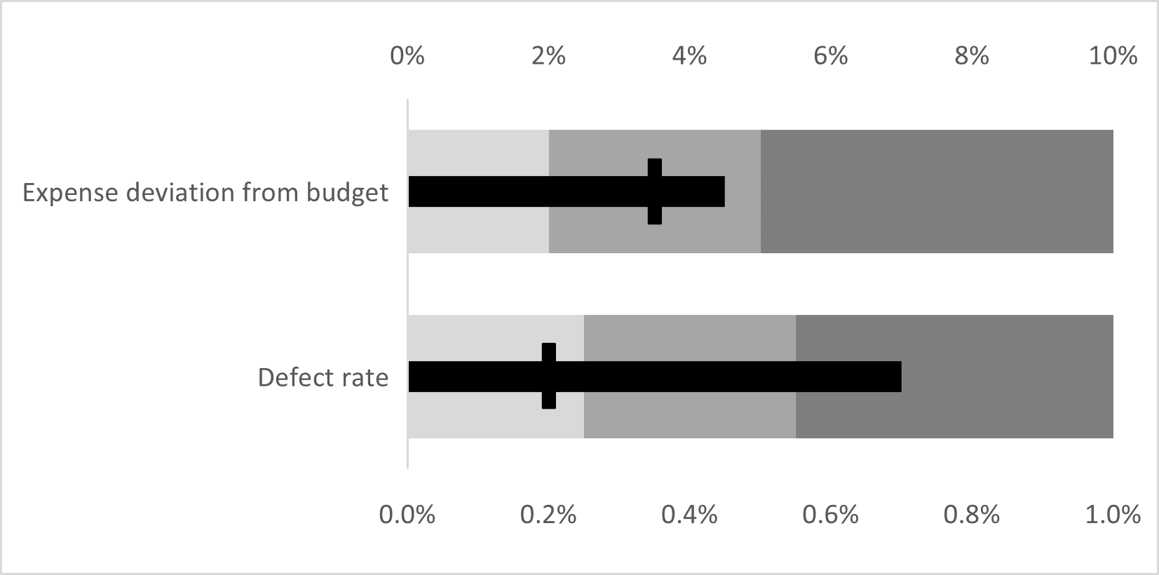
This is a confusing aspect of bullet charts that gets even more difficult to understand if we have multiple KPIs, as in the chart below, some of which have not-to-exceed targets, and some of which have targets that should be achieved.
9. Increased complexity for “Goldilocks” Metrics
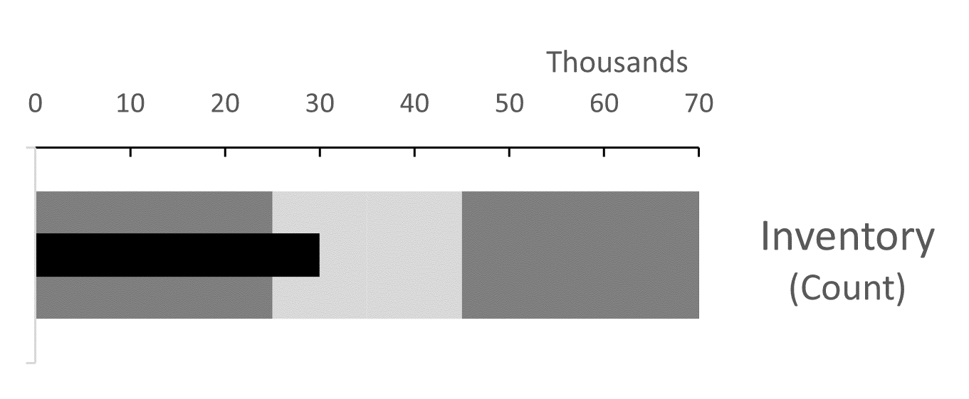
It can also be difficult to visualize “Goldilocks” or “sweet spot” metrics where there is an ideal range which the feature measure should neither exceed nor fall below. This includes metrics like employee headcount, product pricing and inventory where numbers that are too low or too high can both be detrimental. The chart below shows the inventory count of a warehouse, with the ideal range between 25,000 and 45,000 shown in light grey, sandwiched between dark grey bands that represent numbers that are either too high or too low. In this case, the count falls within the ideal range. The comprehension of such target areas requires the reader to recognize the difference and modify expectations and interpretations accordingly. This can sometimes be difficult for the uninitiated.
10. Complexity increases with Several Comparison Metrics
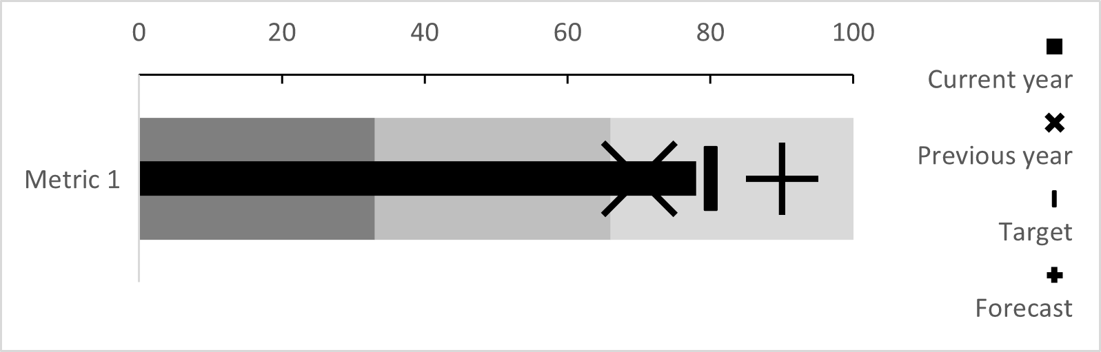
Bullet charts can also be hard to interpret when there are several comparison metrics involved. While they are capable of handling more than one comparative measure using markers of different shapes, this increases the complexity and quantity of information presented, resulting in a visually busy chart that can be confusing to interpret, as seen below. This chart shows a metric from the current year (indicated by the black bar) that is compared against three measures – the value during the previous year (indicated by an “x” marker), the target (indicated by a line marker) and the forecast (indicated by a “+” marker). Here, the metric has exceeded the previous year’s value, which is good, but has missed the target by a small margin, and has also fallen short of the forecast value. However, when compared to the qualitative bands, the metric still falls within the “good” range. This can be tough to understand and assess in a visually busy and complex chart.
11. Difficulty in Engaging Users
The bullet chart is a utilitarian tool rather than a flashy visual. This is an advantage in terms of accurately conveying information, but it also means that the chart may not be attractive enough to boost engagement. Data visualization is at the intersection of science and art, and aesthetic considerations and audience engagement and perception matter as much as accuracy.
Discover how to effectively use bullet charts in Power BI with this complete and detailed guide here.
See How Inforiver Solves Bullet Chart Limitations
Other Resources:

Inforiver helps enterprises consolidate planning, reporting & analytics on a single platform (Power BI). The no-code, self-service award-winning platform has been recognized as the industry’s best and is adopted by many Fortune 100 firms.
Inforiver is a product of Lumel, the #1 Power BI AppSource Partner. The firm serves over 3,000 customers worldwide through its portfolio of products offered under the brands Inforiver, EDITable, ValQ, and xViz.