
Upcoming webinar on 'Inforiver Charts : The fastest way to deliver stories in Power BI', Aug 29th , Monday, 10.30 AM CST. Register Now
Upcoming webinar on 'Inforiver Charts : The fastest way to deliver stories in Power BI', Aug 29th , Monday, 10.30 AM CST. Register Now
Bar charts may be some of the most ubiquitous charts seen, used in contexts ranging across business, media, science and education, but misrepresentations and design errors are almost as common as the charts themselves! This article is a comprehensive overview of bar charts. We will explore when to use bar charts and when to avoid them in the first section and then dive deep into bar chart best practices as well as common errors to avoid when designing these charts in the second section on bar chart dos and don’ts. Use this guide to level up your data literacy and representation skills.
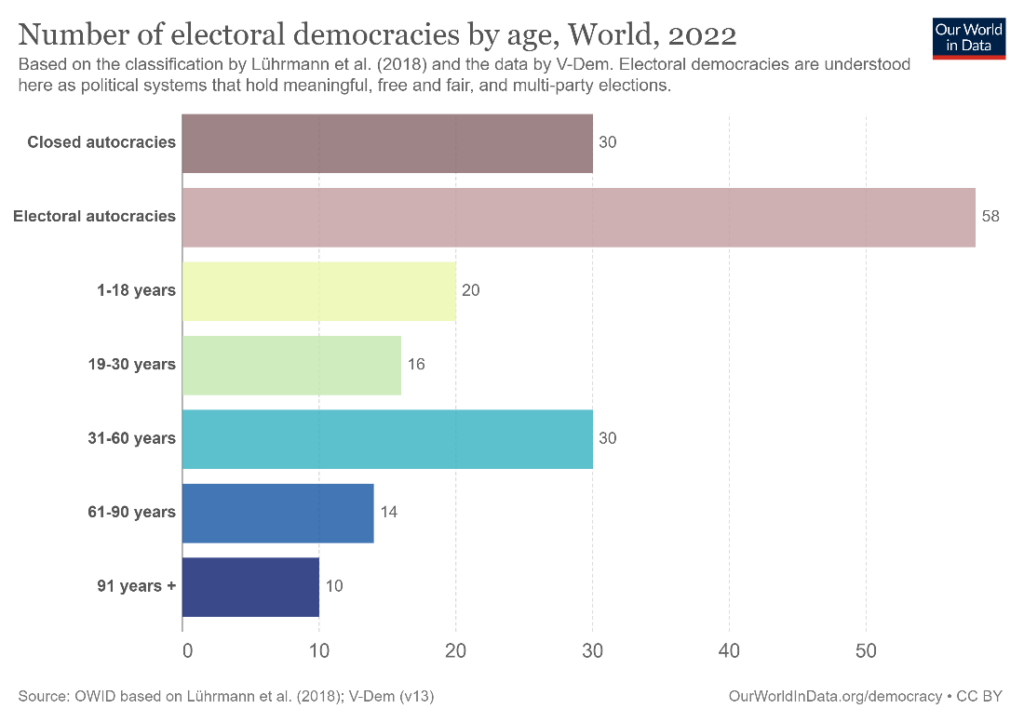
Bar charts are some of the most widely used and recognizable charts. They plot one categorical variable (e.g., quarter) and one numerical variable (e.g., revenue), and use the length of horizontal or vertical bars to represent values. They are easily understood thanks to their familiarity and are versatile in use. The chart below, for example, shows the number of electoral democracies by age, with the category labels along the vertical axis and the number of democracies along the horizontal axis.
We begin with an exploration of some common use cases for bar charts. There are also many types of bar charts, demonstrating the versatility of this chart type, and it is important to choose the right bar chart for the right context.
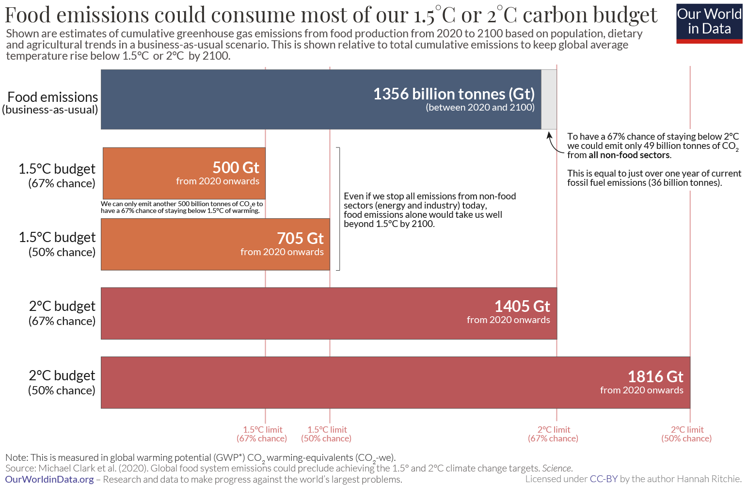
Bar charts are ideally suited to making comparisons between categories because our visual perception is excellent at interpreting the lengths of bars that have a common baseline. The following chart, for example, compares the emissions limit (carbon budget) for different temperatures of global warming with the emissions from food to show that just food emissions exceed the budget for 1.5 °C of warming and could take up most of our carbon budget for 2 °C of global warming.

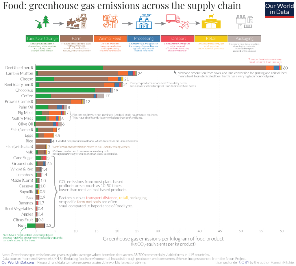
Bar charts are well suited to show rankings where the categories can be sorted from highest to lowest to emphasise the largest value, and from lowest to highest to emphasise the smallest value. The following chart sorts greenhouse gas emissions from food sources from highest to lowest and particularly draws attention to how beef contributes the highest emissions across the various sources.
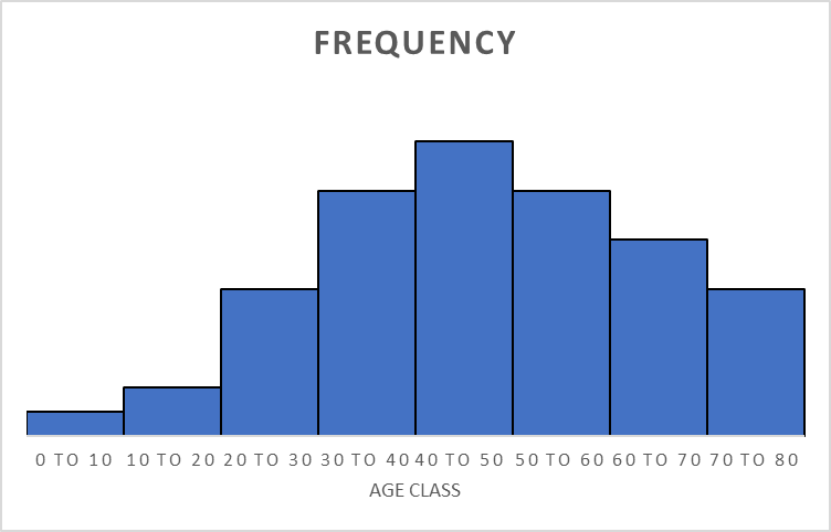
A close relative of the bar chart is the histogram, which is used to visualize frequency distributions. The histogram emphasises the continuous nature of a distribution by omitting the space between bars.
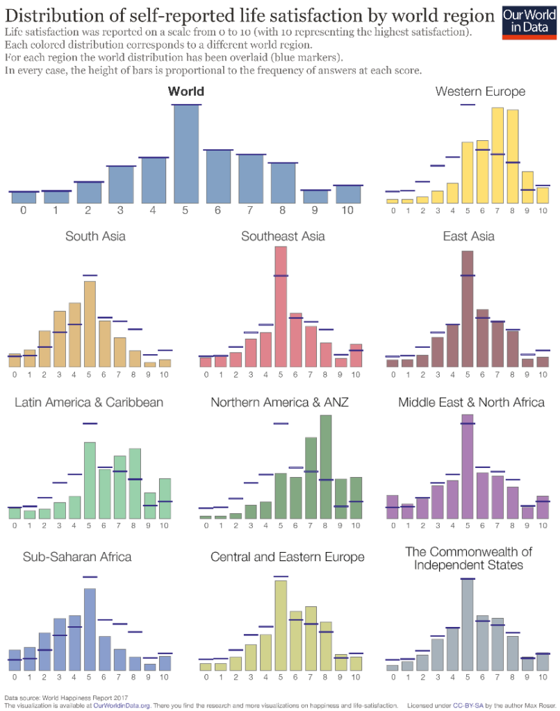
The following chart uses bars (in their vertical orientation, also commonly referred to as column chart) to show the distribution of life satisfaction in various regions of the world, and compares these regions to the global distribution using markers. We see how most people in the world report a mid-level satisfaction score of 5, while individual regions show variation in the overall shape with peaks at different levels. Sub-Saharan Africa and South Asia, for example, report lower levels of satisfaction overall than Latin America and Western Europe.
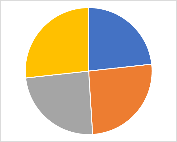
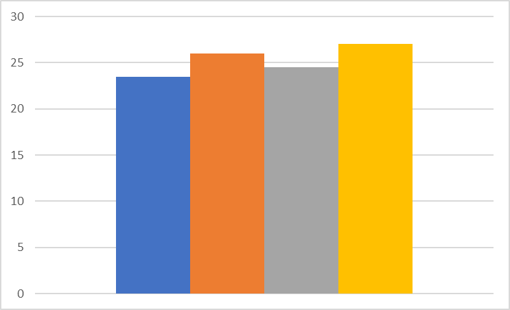
Standard column charts can be an alternative to traditional part-to-whole representations like the pie chart. The contributing categories in a pie chart can be separated into different columns for a clearer representation of their relative proportion. Consider the pie chart and the column chart below showing the same data. The pie chart has roughly equal areas and it is difficult to determine which part is larger. The bar chart on the other hand makes the size order evident at a glance – even though the differences are slight, we can still clearly see that the blue bar is the smallest, followed by grey, orange and finally yellow.
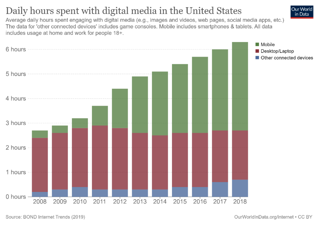
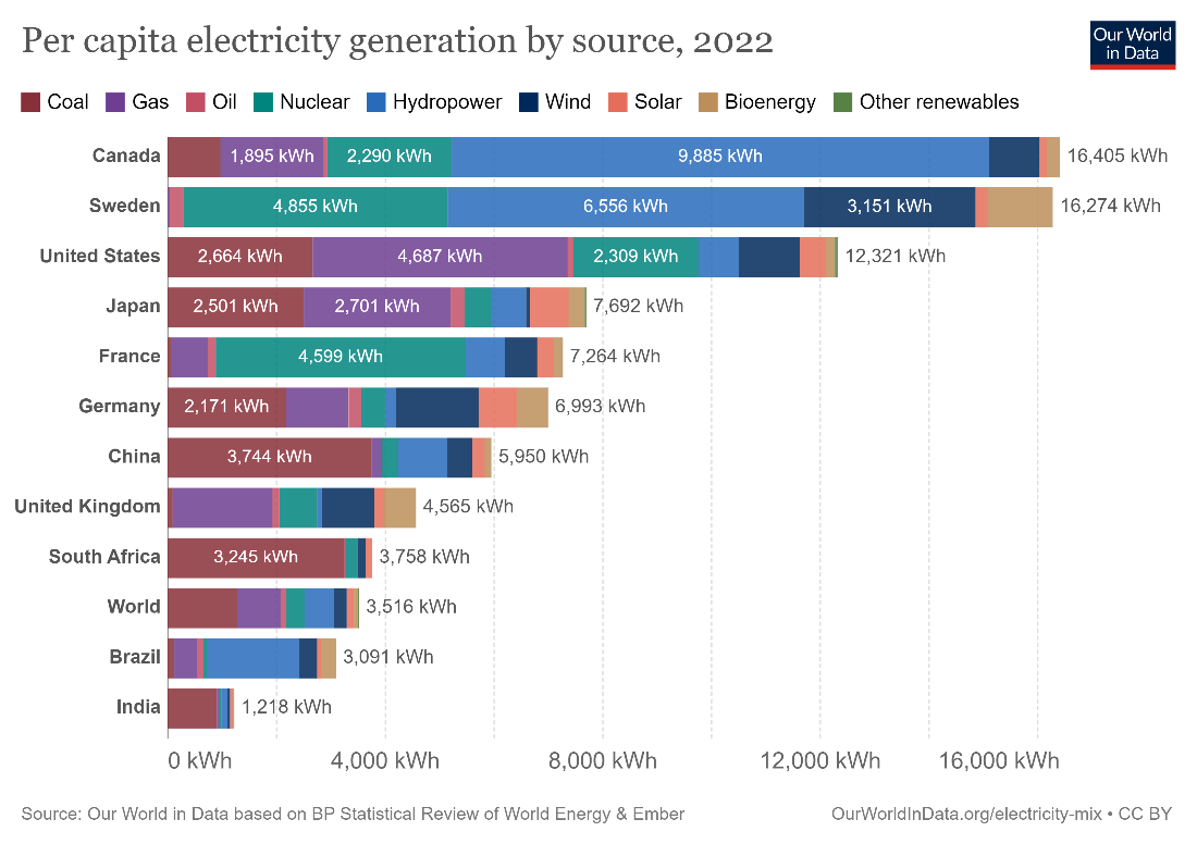
You may use also use a segmented bar or column chart to show parts that add up to the total. The chart used below is a stacked column chart which divides the total hours spent on digital media from 2008 to 2018 by the type of device used. We see the increasing trend overall, as well as how the increase in mobile usage for these purposes has contributed to much of the upward trend.
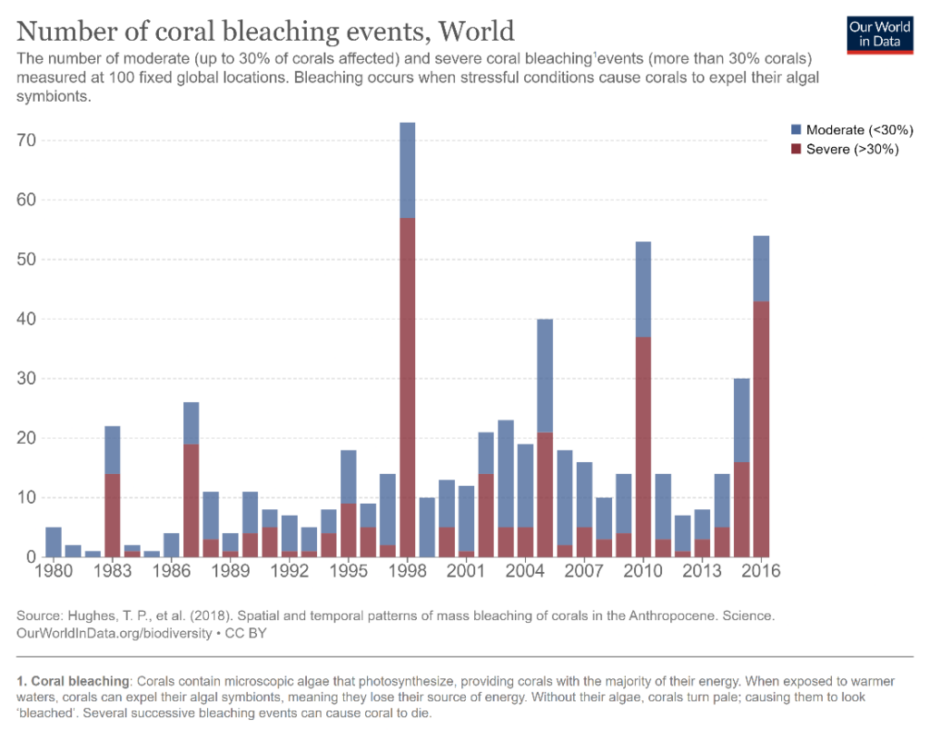
Using bar charts to represent time series can be a controversial subject, and there is one school of thought that believes that only line charts should be used. However, the column chart can be useful to visualize time series data because the primary category is plotted on the horizontal axis. It can be employed specifically to make comparisons of individual values, which is difficult to accomplish with a line chart where the focus is on the shape of the trend. Line charts can be a messy choice in cases where values vary wildly and bar charts may be a better choice for this type of data. For example, the following chart shows the number of coral bleaching events by year, where totals show high stochasticity. The bars provide a clean representation and the years with unusually high events compared to the general trend especially stand out.
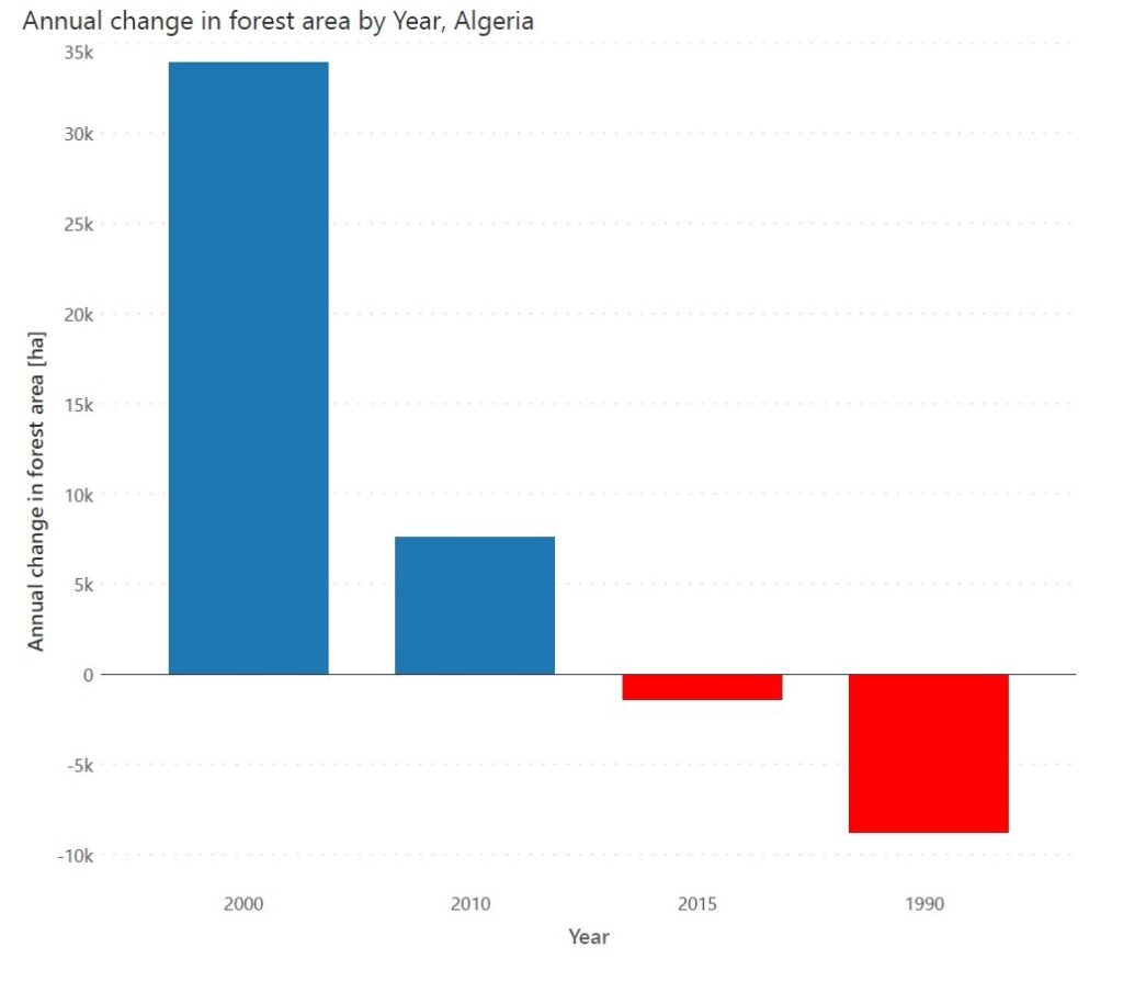
Use diverging bar charts to show deviations from a fixed baseline – with positive values on one side and negative values on the other side of a central axis. For this chart, it is useful to employ a diverging colour scheme like in this chart showing the annual change in forest area by year in Algeria.
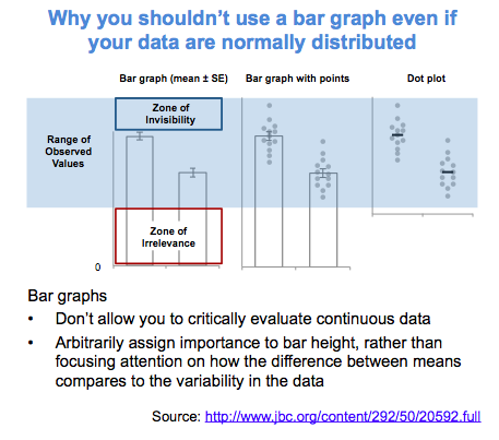
Bar charts can obscure the nature of the underlying data when it comes to summarizing continuous distributions. Distributions with different shapes can result in the same summary bar chart, as seen in this chart below from a journal article quoted on twitter.
For extremely long time series where showing the overall trend is important, consider using a line or an area chart instead. The continuous nature of these charts draws the eye to the overall shape of the trend, while the bars in a column chart instead lend themselves to comparisons between individual values.
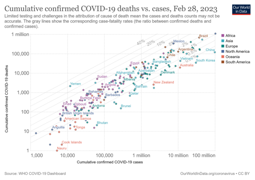
Bar charts are not ideal to show correlations between two series. Use a scatterplot where the overall form of the underlying data is visible, like in the chart below showing the correlation between the number of COVID-19 cases and the number of deaths. You may add a regression line to show how the variables are related.
Avoid using bar graphs overlayed on a map to show geospatial information, unless the chart has enough space to show the entire bar for all bars. Otherwise, this can lead to occlusion, where some bars hide shorter bars behind them, like in this chart showing the populations of the 100 biggest cities in the world. Even in cases where the entire bar is seen, it can be difficult to compare the lengths of the bars because the positions of their baselines vary in two dimensions. Many representations of this kind also use boxes instead of rectangular bars, which creates further ambiguity.
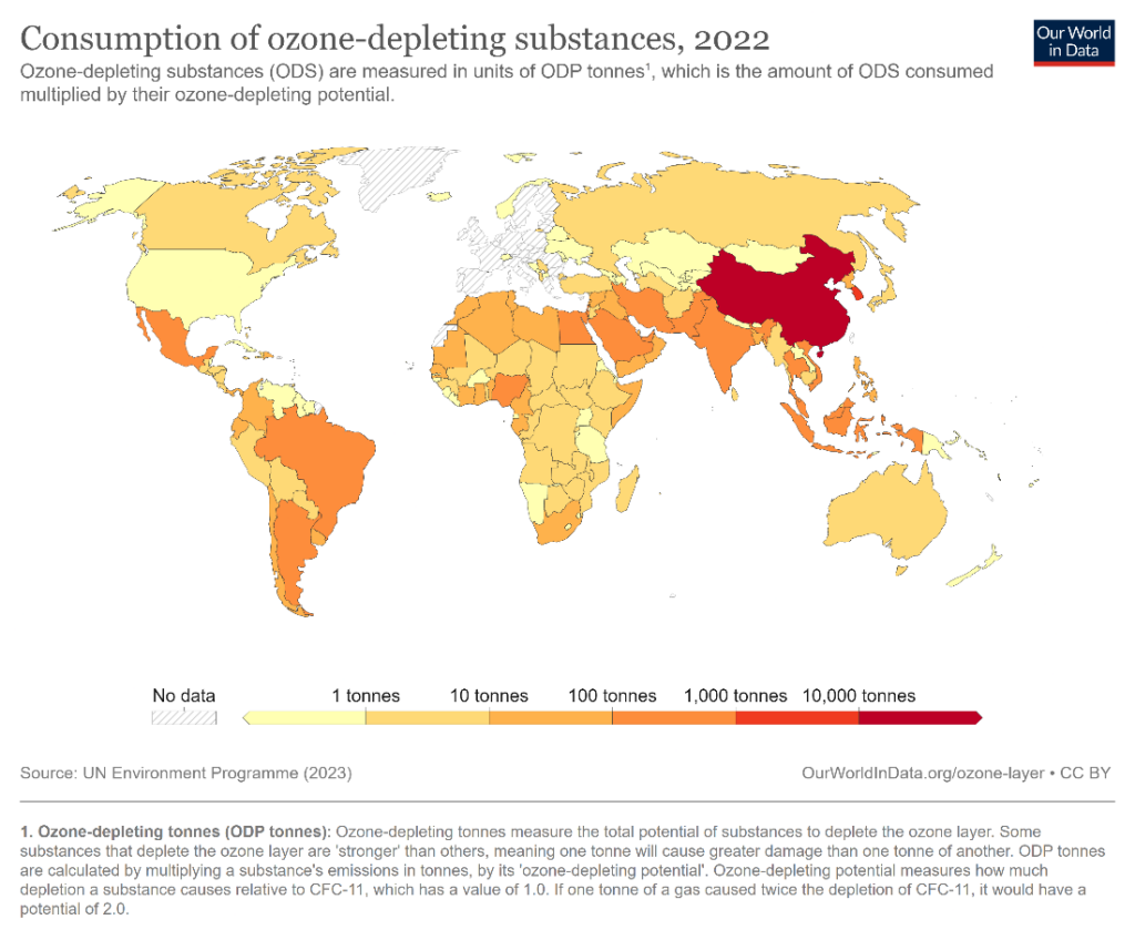
Instead, consider using a choropleth map like the one below to represent numerical values on a map. This chart uses a gradient color scale to represent increasing values. The one below used a gradient from yellow to red to show the consumption of ozone-depleting substances in different countries.
This section explores best practices to keep in mind, and common mistakes to avoid when designing bar charts to make for faithful representations of data with the right message highlighted.
Let us first go over some best practices for bar charts that enhance the readability of your charts while keeping the visualization true to the data.
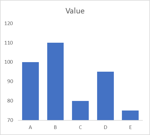
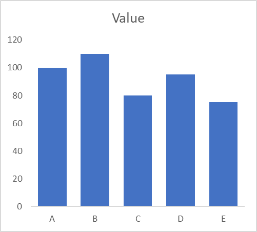
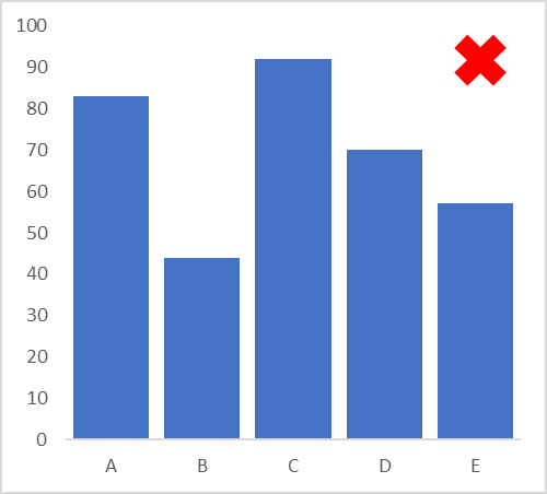
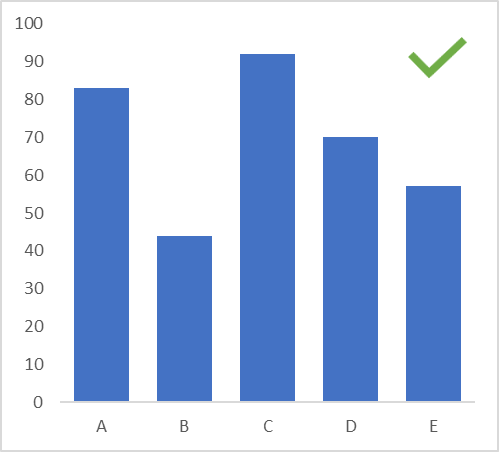
One of the most common manipulations of data using bar charts is to begin the vertical axis at a point different from zero. Take a look at the chart below on the left – the discrepancies between the categories appear significant. This is however a result of the y-axis starting at 70. The chart on the right is the correct representation with the y-axis beginning at zero and we understand that the differences in value are not as large as they appeared before. Bar charts use the height of the bar to assign value, and beginning the y-axis at a different point truncates the bars. We also tend to assign more value to areas that appear larger, ignoring the readings themselves in favor of the areas of the bars. The two graphs below thus appear very different from each other, even though they visualize the same data.
Keep the spacing between bars to 50% of the width of the bars themselves. This allows for a well-balanced and aesthetically pleasing graph, where the chart area is neither too crowded nor too sparsely populated. Notice how the chart with the tick mark below makes good use of the chart area, while keeping the chart clean.
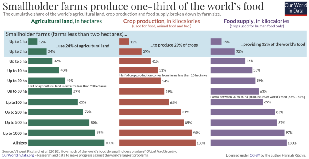
Include context in the form of a chart title, labels, annotations and comments to improve understanding of your chart and provide further information. The chart below uses data level annotations to illustrate that smallholder farms produce almost a third of the world’s food. The annotations provide a spotlight on the message and contribute to its clarity. While these elements may be useful, use them strategically to avoid overcrowding your chart area.
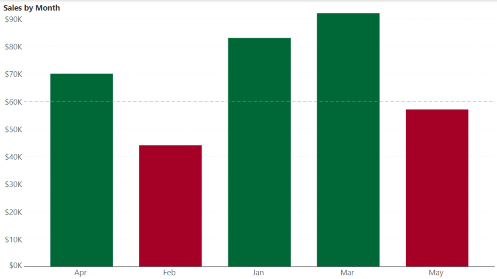
Use color in your bar chart to draw attention to your message and enhance insights. The following chart, for example, shows sales by month along with a target line. Months that fall short of the target are shaded red, while those that meet or exceed the target are shaded green. This allows the reader to immediately draw the correct inference about the trends over various months, illustrating how color usage for bar charts needs to be strategic.
You could also color bars within the same group or category with the same shade. The chart below illustrates this by using a single color for bars related to the same threshold of global warming. This allows us to quickly see the categorization of the data and how it relates to the comparison being made.
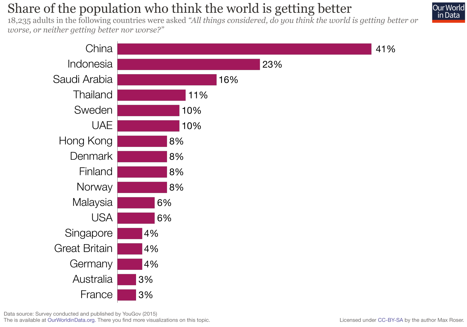
Consider the order in which you want to sort your bars. There may be a natural or logical order to your categories which you want to highlight, or you may want to sort by size to emphasize the largest or smallest values (sort from largest to smallest to emphasize the largest value and vice-versa for the opposite effect). This allows your readers to quickly parse through information to gain insights. The following chart, for example, sorts from largest to smallest, allowing the reader to immediately pick out the most optimistic countries.
Build clean, professional, and clutter-free bar charts in seconds with Inforiver's no-code visualization suite

Let us now go over some common bar chart design mistakes to be avoided while creating your own charts.
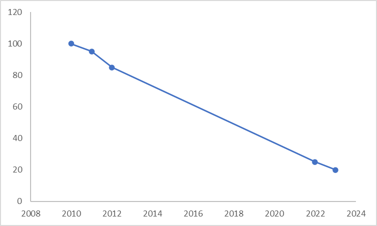
A common mistake in cases where data shows high variation in values is to break longer bars to show the differences between the bars with smaller values. This can lead to confusion as the values may appear to be much closer together than in reality. This is illustrated in the charts below, with an axis break in the chart on the left, and the true representation on the right. Notice how the values are far more separated in the chart without the break.

Bar charts use a lot of ink and can quickly become overcrowded. This removes the spotlight from the information, like in the chart below. Limit the usage of gridlines, outline boxes, and tick marks while avoiding pattern fills on your bars altogether. If it is necessary to use some of these elements to add context, be mindful of the line thickness and color used (for example, try using grey instead of black and thinner lines) to keep your chart clean and legible. A general rule of data visualization is to limit non-data ink as much as possible.
For time series representations, make sure that the interval between bars is consistent, and do not skip values to avoid distortion of the trend. Consider the bar chart on the left. There appears to be a steep dip in values after the third value, but the correct representation is given by the line chart below on the right. We see from this chart that the decline is actually gradual, with a slope that is fairly consistent indicating that the rate of decline is consistent throughout.
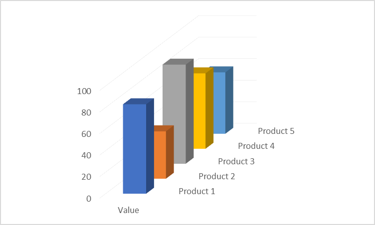
Avoid flashy representations like 3-dimensional effects for bar charts. The effectiveness of the bar chart lies in its simplicity – it is in fact at the very top of our perceptual ranking list! This means that the standard bar chart is the most accurate representation with bars that begin on a common baseline. 3D effects like in the chart below put the bars on different baselines, introduce ambiguity in the heights themselves, and lead to occlusion.
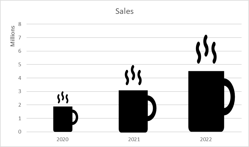
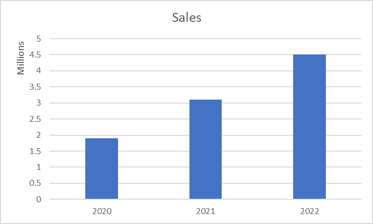
Icons sometimes provide an engaging way of presenting data in a bar chart, but more often become a source of confusion when it comes to accuracy. A coffee company, for example, may choose to use a coffee mug to show its sales data as on the left below. However, remember that the area of an icon changes along with its height as we need to change its breadth in proportion to its height. This means that we perceive a disproportionate increase in value as we use larger and larger icons for increasing values. The bar chart on the right gives the true representation, allowing us to understand the correct proportions.
Bar charts use vertical or horizontal bars to describe a quantitative variable. The value of the variable is encoded by the length of the bar. These are some of the most common and recognizable charts in use today because of their ease of interpretation and many applications. In this article, we seek to examine what bar charts are, the different variations and their uses, and some advantages and shortcomings of these charts. We will also briefly look at some best practices.
Bar charts are used to make comparisons, show rankings, frequency distributions, and deviations, and to emphasize individual values. There are different variations of the bar chart that are suitable for each of these purposes. We will examine some of them below.
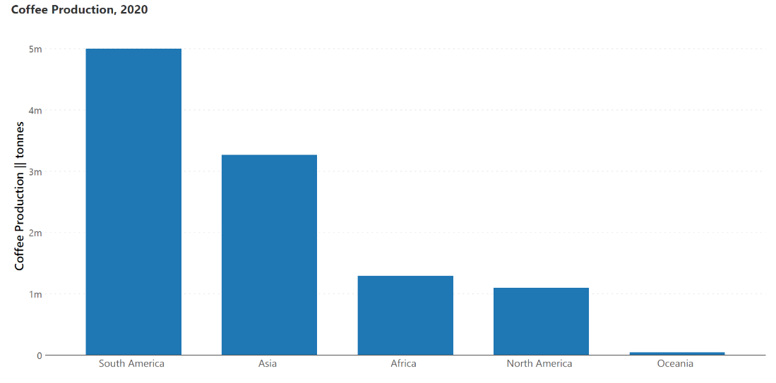
Column charts use the height of vertical bars to represent the value of a quantity. The primary categorical variable is on the horizontal baseline, which means that these charts can be used to show time series data, as well as make nominal comparisons at a single point in time. An example of the latter is illustrated in the chart below showing coffee production in various regions in the year 2020.
The horizontal bar chart (sometimes just called the bar chart) uses horizontal bars to describe quantitative variables. The length of the bar is linearly proportional to the value of the measure. This chart plots one categorical variable, which is designated as the primary variable and set on the vertical axis (country in the chart below), and one numerical variable which is designated as the secondary variable and plotted on the horizontal axis (percentage of the population in the chart below). This chart is best used when column labels are long and to show ranking, like in the chart below.
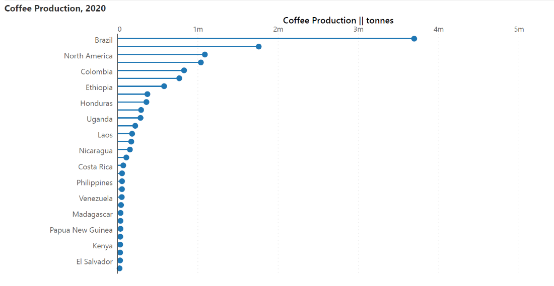
Lollipop charts are similar to the bar charts described above but use a line with a dot at the end to indicate values. They are used for the same purposes as the charts above but provide a better data-ink ratio to make the chart less cluttered and more visually appealing. This is ideal for bar charts with values that are close to each other.
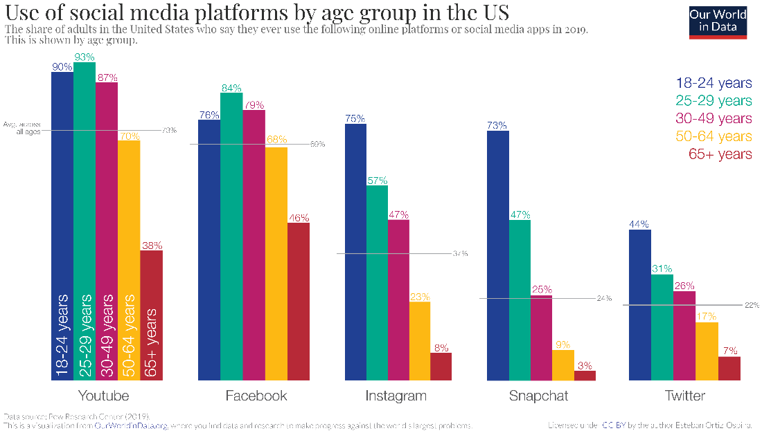
Clustered bar charts plot two categorical variables and one numerical variable. In the chart below, the two categorical variables are the social media platform and the age classes, while the quantitative measure is the percentage of users. These charts are thus used to compare subcategories and show an extra categorical variable.
Stacked bar charts are a variation where the bars in a standard chart are divided into segments denoting contributing categories that sum up to the whole. These charts are used to compare totals and simultaneously understand the values of contributing categories. This presents a parts-to-whole view where the length of each segment is proportional to its contribution.
A stacked column chart is a vertical variation of the stacked bar. Learn more about the application of stacked column/bar charts here.
This chart employs bars that diverge from a central axis to show positive and negative values on either side. While standard bar charts can only handle values that are all positive or all negative, diverging bar charts can handle a mix of both types of values. The chart below, for example, shows revenue as positive, and costs as negative, allowing us to compare these values by month.

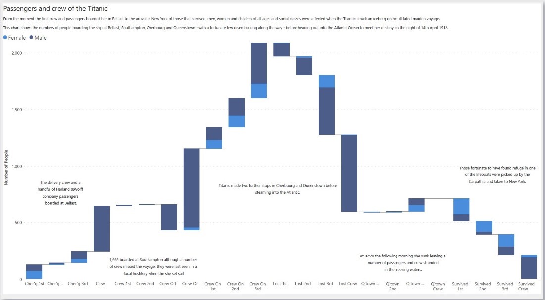
Waterfall charts also use bars to denote the values of contributing categories like in a stacked bar chart, but the contributions can be negative or positive. To accommodate this and to show a parts-to-whole view, this chart unstacks the segments and allows the eye to move across the contributions to arrive at the total.
The response of the brain to visual stimuli has been studied in detail to form a perceptual ranking list, which ranks different types of charts according to how accurately our visual perception allows us to interpret them. The standard bar chart is at the top of this list, meaning that it allows for very accurate interpretation of values. This is because of two factors – all of the bars on a bar chart are positioned on the same baseline, and the chart uses the lengths of the bars to encode value, which is a representation that our brains can estimate very well. This leaves little room for ambiguity.
Bar charts are also incredibly easy to make – so much so that even pen and paper suffice! This means that they are widely accessible even without specialized software, making them usable across contexts ranging from business to science and education.
As noted above, bar charts are some of the most commonly used charts. This can act as a significant advantage when it comes to ease of interpretation. Unlike more specialized charts, their familiarity means that their message is immediately understood by a wide audience without further annotations or explanations.
Data-ink is the set of all elements on a chart that are directly relevant to the data represented. While non-data ink can be erased without removing any information on the chart, data-ink is essential to the completeness of the information. The data-ink ratio, which is the ratio of data-ink to total ink, should always be maximized. In other words, all irrelevant elements of the graph should be minimized. This concept was introduced by Edward Tufte and he points out that bar charts have several redundant elements – each bar typically indicates the value of the measure shown in several ways including the height of the left line, the height of the right line, the height of the shading, the position of the top line, and sometimes also with the number on top of each bar. This means there are many extraneous elements that can be removed without losing information.
The ubiquitousness of the bar chart can also act as a disadvantage – it may not pique the curiosity of your audience like a flashier chart. Other graphs like streamgraphs or waffle charts may sacrifice accuracy to some extent, but invite viewers to investigate further thanks to their novelty and eye-catching form. A bar chart may not generate the same engagement because of its perception as being technical and common.
We will briefly examine some best practices below. For a longer discussion, take a look at our dos and don’ts article here.
Bar charts indicate values using the height of the bar as measured from the horizontal axis. This means that beginning the y-axis at any point other than zero would truncate (or elongate) the bars, resulting in misrepresentation of data. Always begin the y-axis at zero to ensure accuracy.
Bar charts already have a lot of ink contributing to their visual weight. They can quickly look overcrowded with tick marks, gridlines, outline boxes, and individual labels. Use these elements strategically to add value to your graph, but avoid unnecessary clutter to keep your chart clean and legible.
Set the spacing between the bars to 50% of the width of the bars. This ensures a legible and clean chart, with adequate spacing to allow users to see the separate values and compare them.
- By Hamsini Sukumar

Inforiver helps enterprises consolidate planning, reporting & analytics on a single platform (Power BI). The no-code, self-service award-winning platform has been recognized as the industry’s best and is adopted by many Fortune 100 firms.
Inforiver is a product of Lumel, the #1 Power BI AppSource Partner. The firm serves over 3,000 customers worldwide through its portfolio of products offered under the brands Inforiver, EDITable, ValQ, and xViz.