
Upcoming webinar on 'Inforiver Charts : The fastest way to deliver stories in Power BI', Aug 29th , Monday, 10.30 AM CST. Register Now
Upcoming webinar on 'Inforiver Charts : The fastest way to deliver stories in Power BI', Aug 29th , Monday, 10.30 AM CST. Register Now
Data visualization allows business users and decision-makers to make sense of large and complex data sets. However, creating effective visualizations is not always straightforward and requires a good understanding of the data and the audience.
In this blog post, we will discuss 12 best practices for data visualization in Power BI that will help you to create clear and engaging visualizations that effectively communicate key insights from your data.
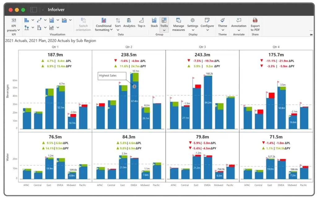
1. Choose appropriate visualizations: Choose the best chart type for the data you are trying to communicate. For example, use bar charts for comparison, line charts for trends, scatter plots for relationships and variance charts for deviations.
2. Use clear and consistent formatting: Use a consistent color scheme, font size and style throughout the report to make it easy to read and understand.
3. Label and annotate: Label axes, legend, and notes provide context to the data to help the viewer understand the data.
4. Use filters and slicers: Allow the viewer to filter the data based on different criteria to help them drill down into the data.

5. Use drillthrough and drilldown: Allow the viewer to drill through the data and see detailed information, or drill down to see related data.
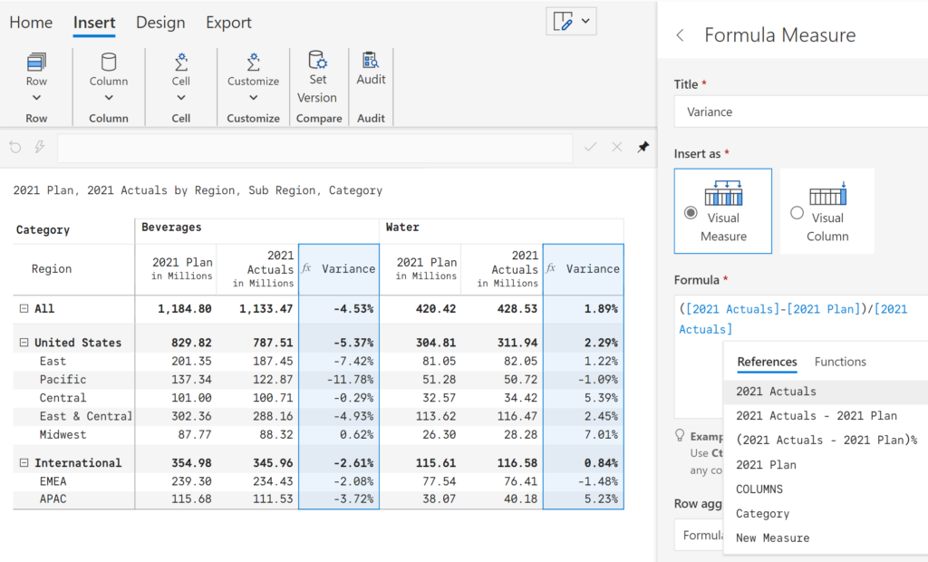
6. Use calculated columns and measures: Use calculated columns and measures to add context and additional insights to the data.
7. Incorporate certified third-party visuals: Utilize certified third-party visualizations (such as xViz and Inforiver) to create advanced interactive reports out-of-the-box.
8. Leverage the power of storytelling: Use storytelling techniques to create a narrative and guide the viewer through the data.
9. Optimize for performance: Use Performance Analyzer to optimize the performance of your report.
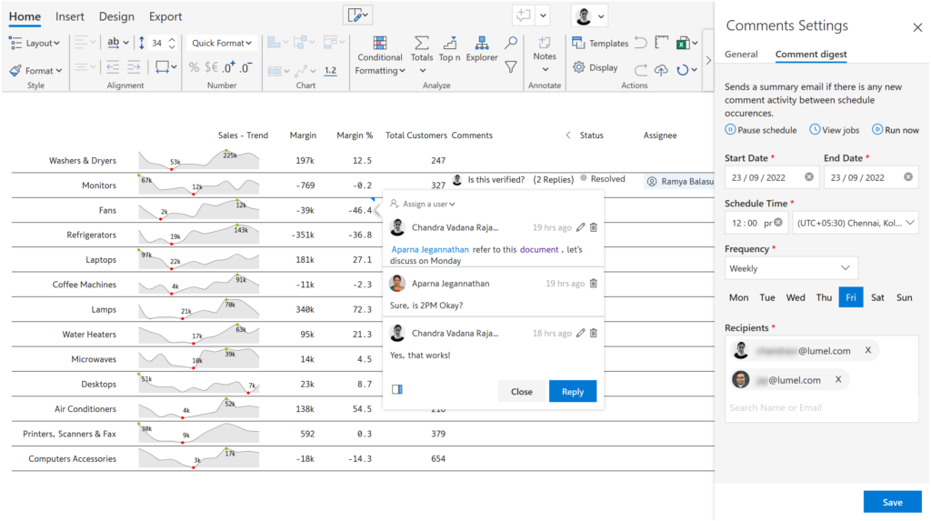
10. Data-level collaboration: Allow your report consumers to collaborate with each other by enabling secure, data-level annotation capabilities.
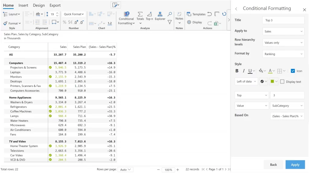
11. Use conditional formatting: Use conditional formatting to bring attention to important data or patterns in the data.
12. Utilize data hierarchies: Use data hierarchies in your reports to show data in a logical and organized manner.
By following these best practices, you will be able to create visualizations that are insightful, professional-looking and memorable. These will help you to create visualizations that are easy to understand and that effectively convey the story that your data is telling.

Inforiver helps enterprises consolidate planning, reporting & analytics on a single platform (Power BI). The no-code, self-service award-winning platform has been recognized as the industry’s best and is adopted by many Fortune 100 firms.
Inforiver is a product of Lumel, the #1 Power BI AppSource Partner. The firm serves over 3,000 customers worldwide through its portfolio of products offered under the brands Inforiver, EDITable, ValQ, and xViz.