Upcoming webinar on 'Inforiver Charts : The fastest way to deliver stories in Power BI', Aug 29th , Monday, 10.30 AM CST. Register Now
Upcoming webinar on 'Inforiver Charts : The fastest way to deliver stories in Power BI', Aug 29th , Monday, 10.30 AM CST. Register Now
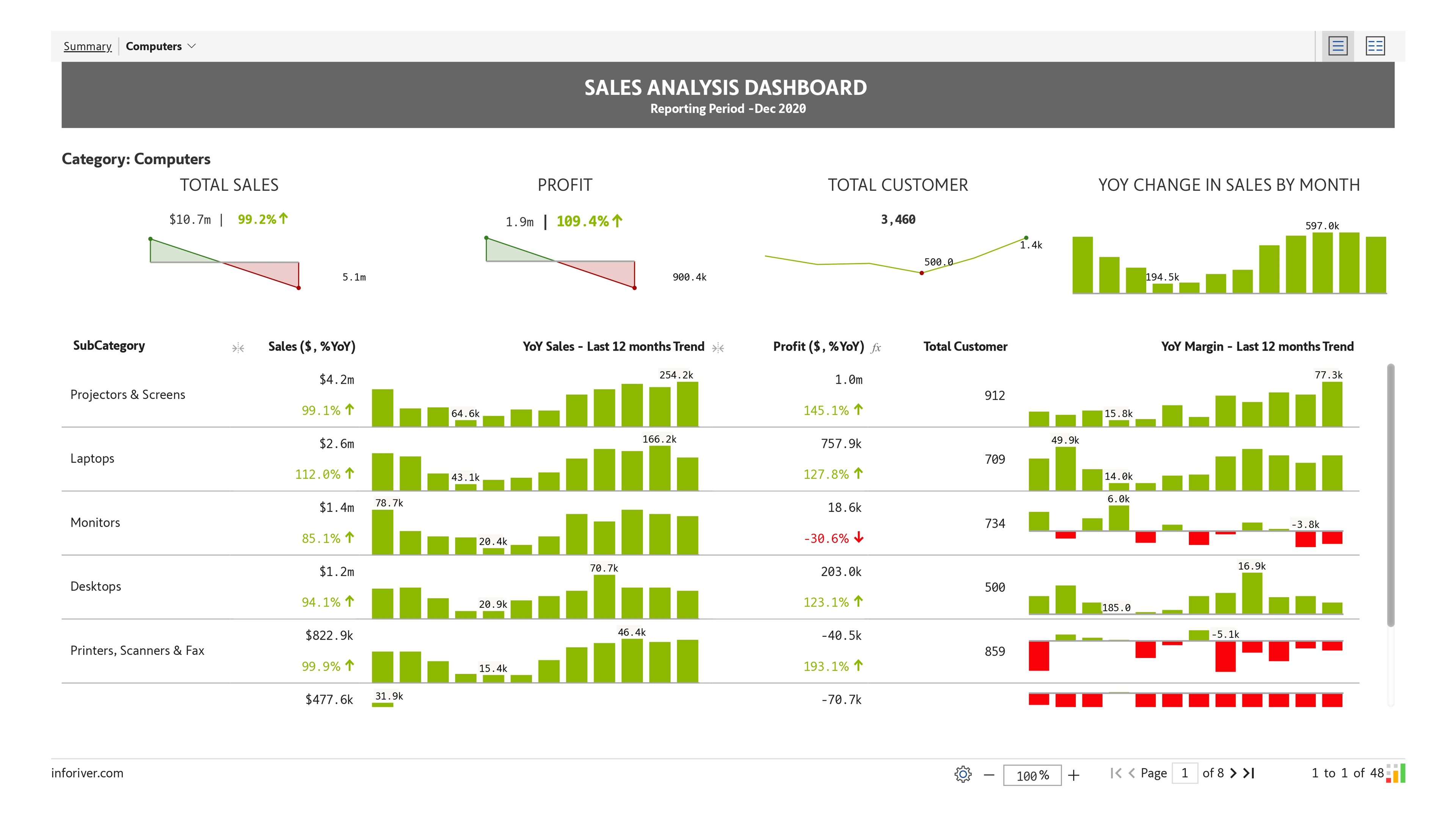
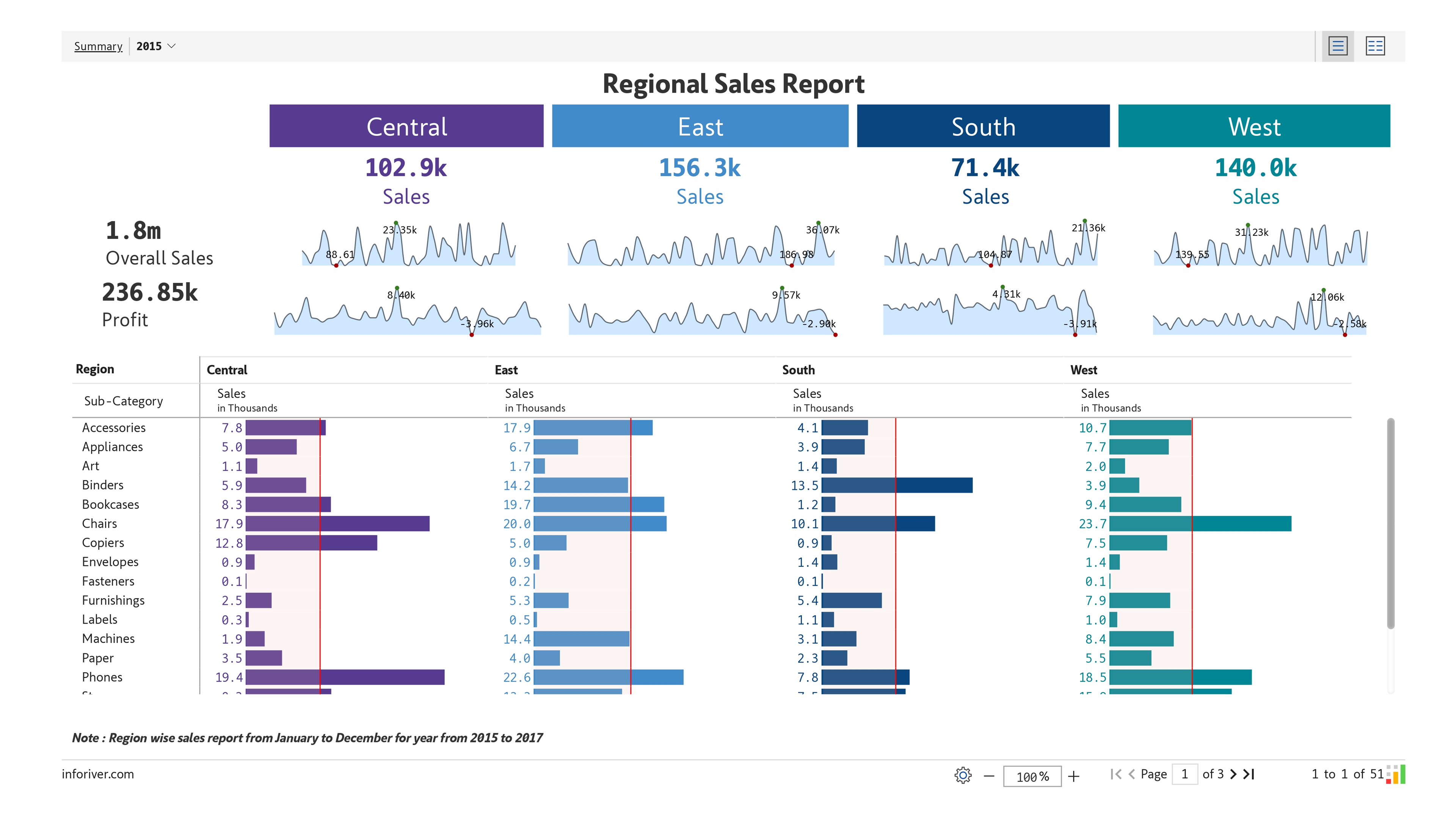
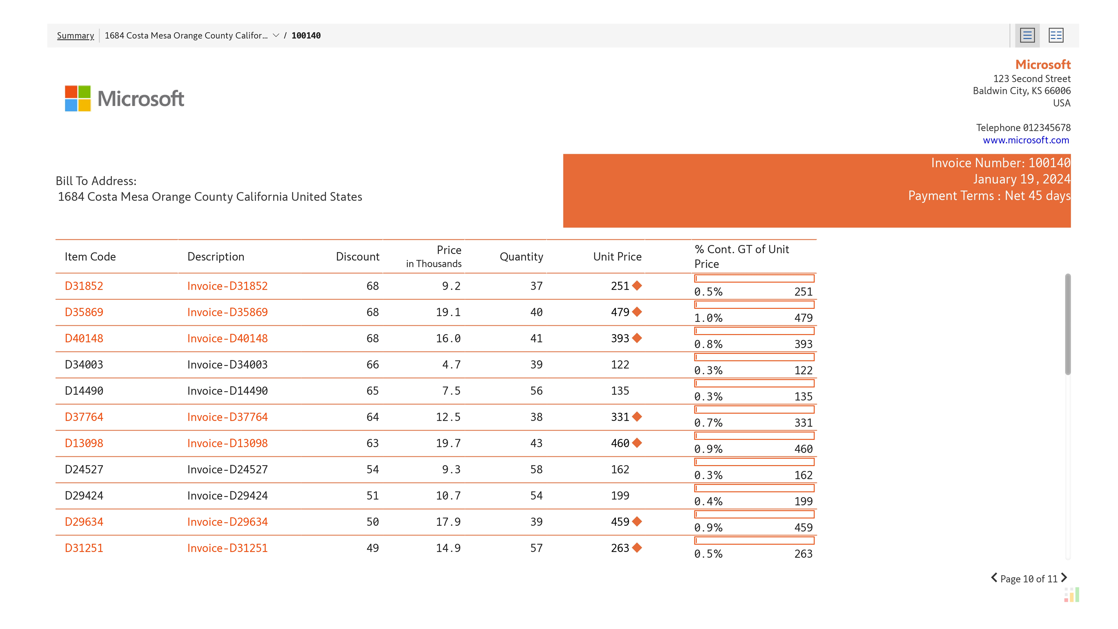
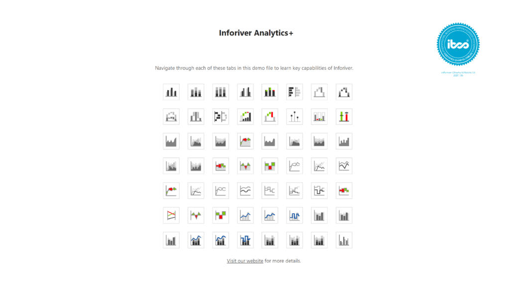
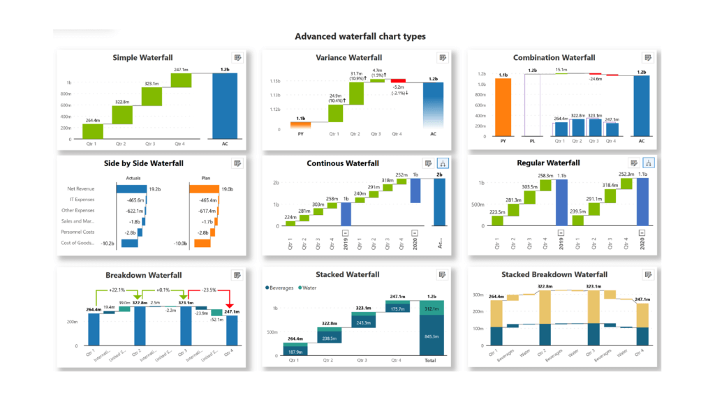
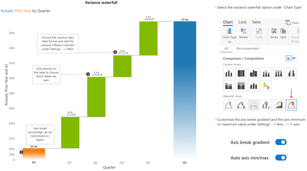
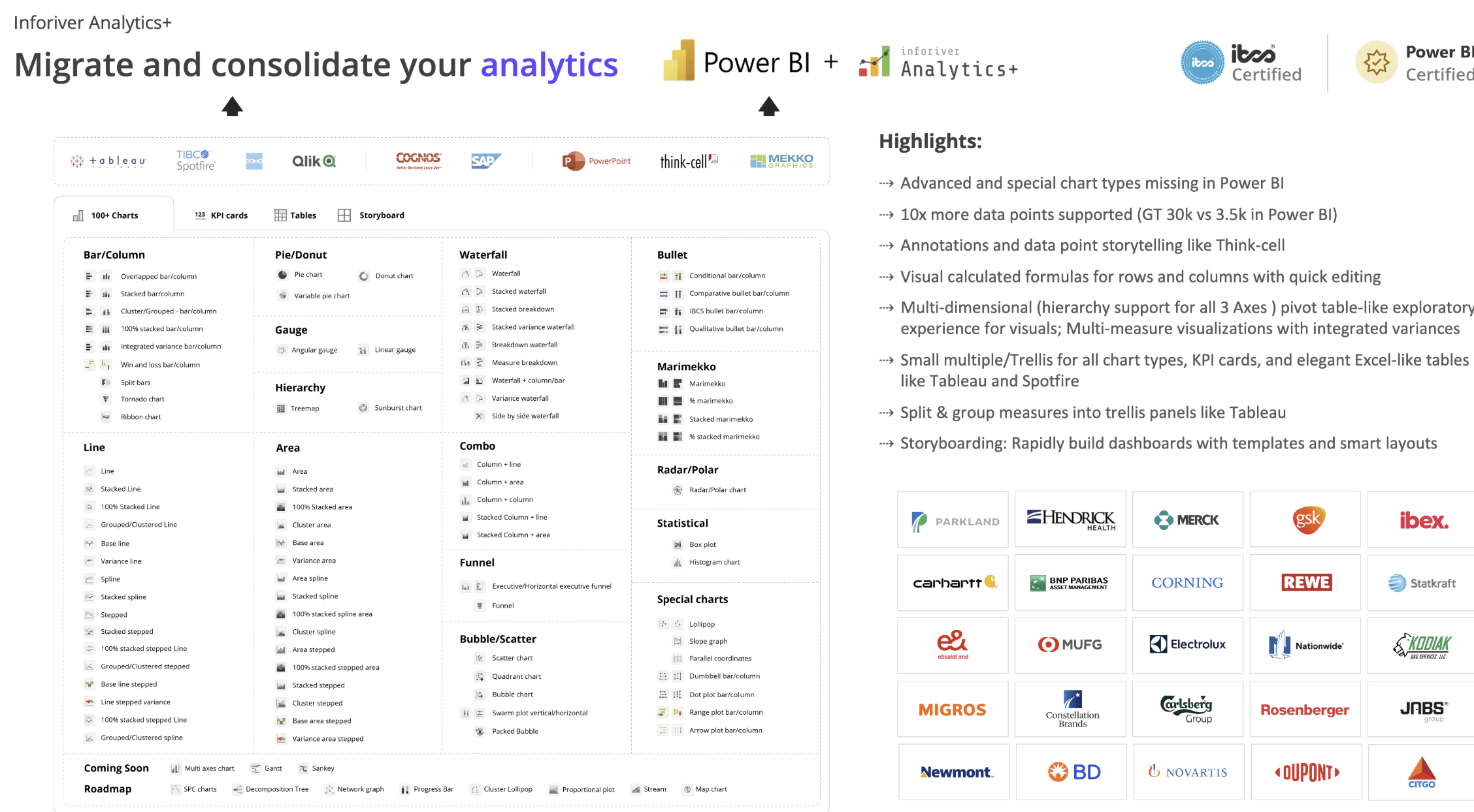
Inforiver Analytics+ transforms the way you visualize data in Power BI by offering an incredibly rich and dynamic suite of over 100 advanced chart types. Whether you're building executive dashboards or deep-dive analytical reports, this tool empowers you to tell compelling data stories with precision and flair.
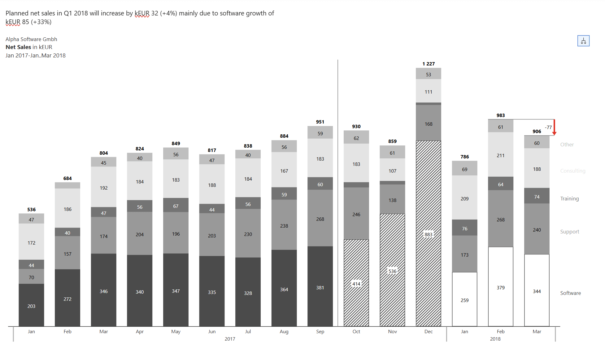
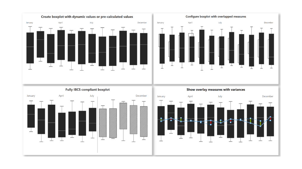
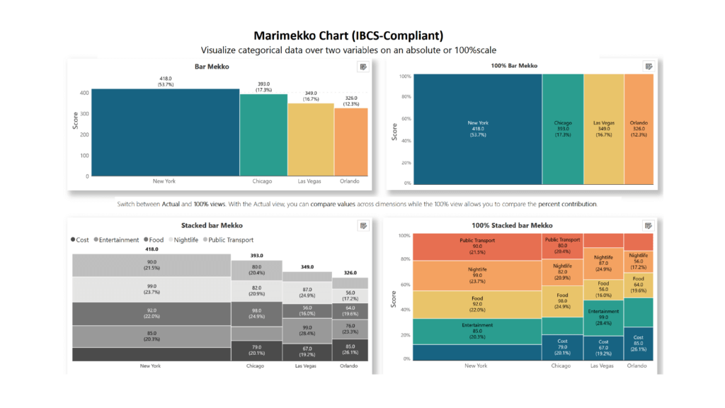
From sleek bar and column charts to intricate Waterfall and Gantt charts, from vibrant radar/polar charts to insightful Scatter plots and Sankey charts, every chart is designed to be both beautiful and functional.
With support for IBCS standards, small multiples, and multi-axis configurations, Inforiver Analytics+ doesn’t just display data—it brings it to life.
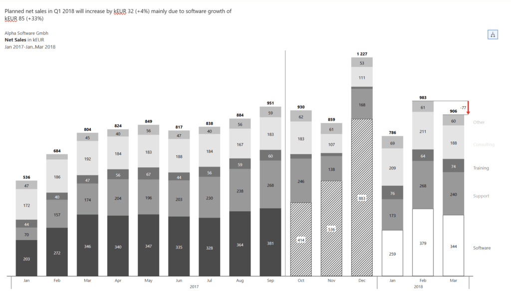
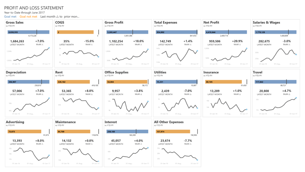
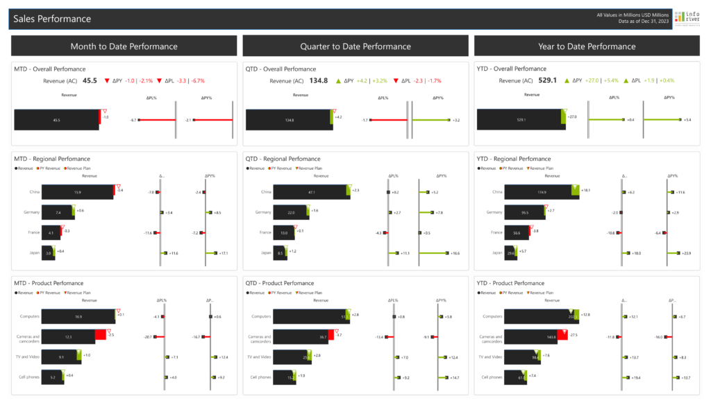
to try advance features
[demo_download_modal title="Discover 100+ Chart Types in Inforiver Analytics+" link="https://inforiver.com/wp-content/uploads/Analytics-Introduction-All-Charts.zip"]
Inforiver helps enterprises consolidate planning, reporting & analytics on a single platform (Power BI). The no-code, self-service award-winning platform has been recognized as the industry’s best and is adopted by many Fortune 100 firms.
Inforiver is a product of Lumel, the #1 Power BI AppSource Partner. The firm serves over 3,000 customers worldwide through its portfolio of products offered under the brands Inforiver, EDITable, ValQ, and xViz.