
Upcoming webinar on 'Inforiver Charts : The fastest way to deliver stories in Power BI', Aug 29th , Monday, 10.30 AM CST. Register Now
Upcoming webinar on 'Inforiver Charts : The fastest way to deliver stories in Power BI', Aug 29th , Monday, 10.30 AM CST. Register Now
In the 4.0. release, we’ve added many much-anticipated chart types, such as the Pie, Sunburst, Treemap, Bubble, Quadrant, Scatter, and Radar/polar charts. As you work with the latest version, you will find that your overall reporting experience has been streamlined with features like image support, data label enhancements, summary table structure changes, and the new and improved color picker. You have the flexibility to include more metrics in KPI cards by adding containers. You will also notice a significant performance improvement compared to the previous 3.6. version.
Let’s discover the innovations in the 4.0. release as we continue to deliver features that are most sought after and anticipated by the Power BI community. Thank you for choosing Analytics+!
The blog has been organized based on the toolbar, feel free to explore the sections that interest you.
1.1. A whole new range of chart types
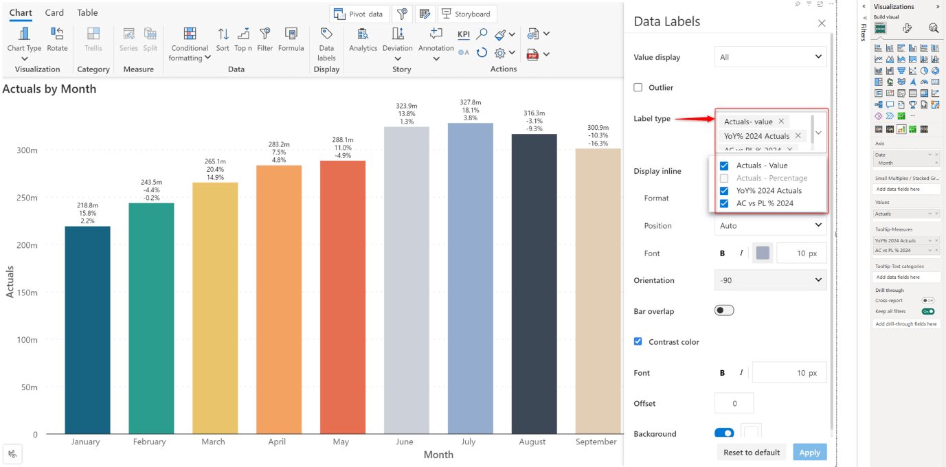
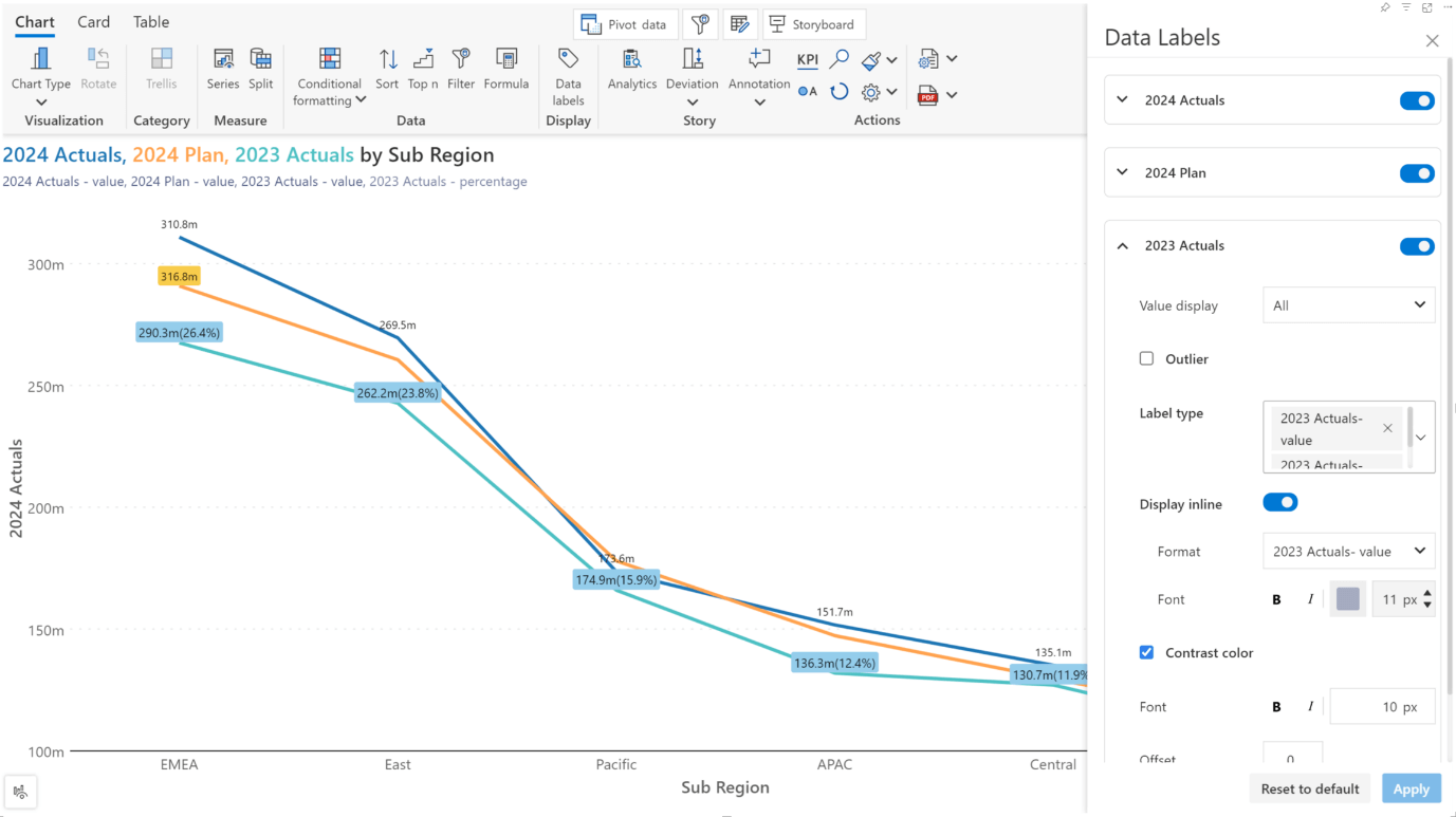
1.4. New options in display settings
1.5. On object interaction enhancements
1.7. Variance for bullet charts
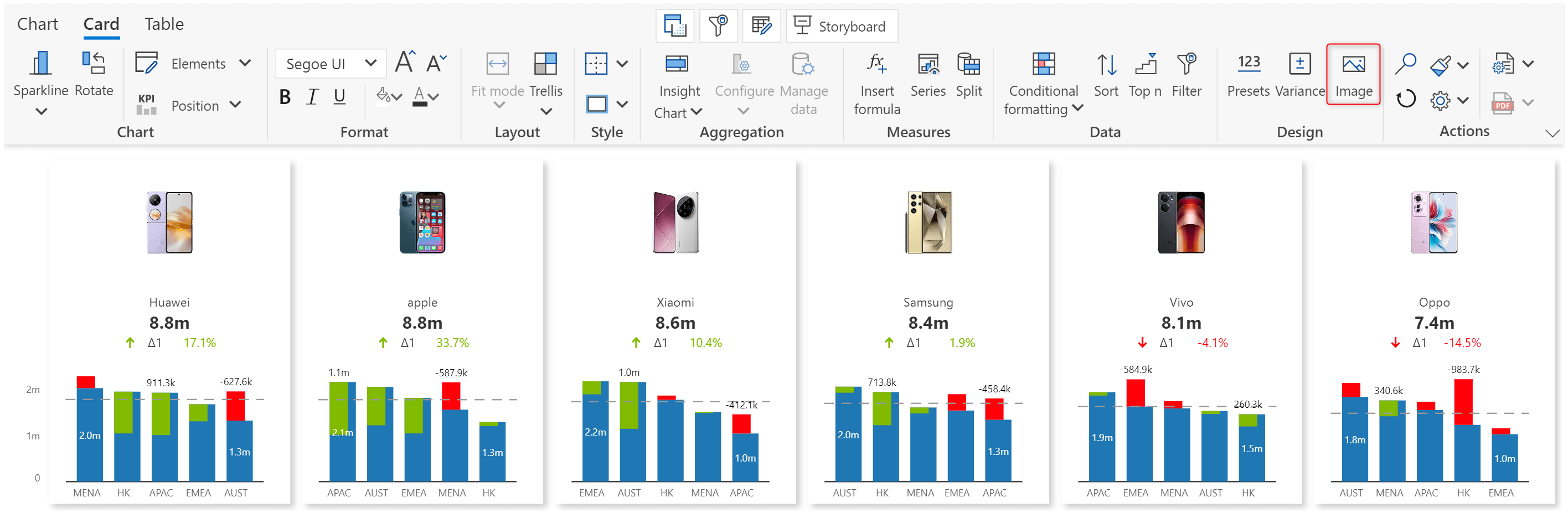
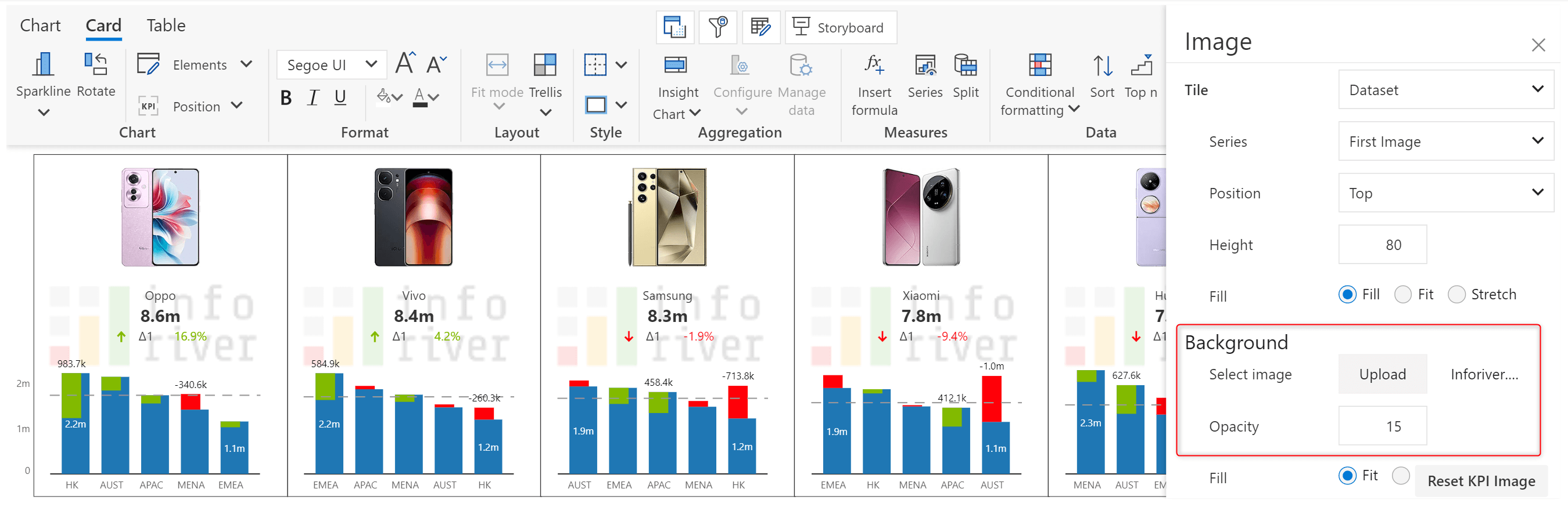
2.1. Embedding images in cards
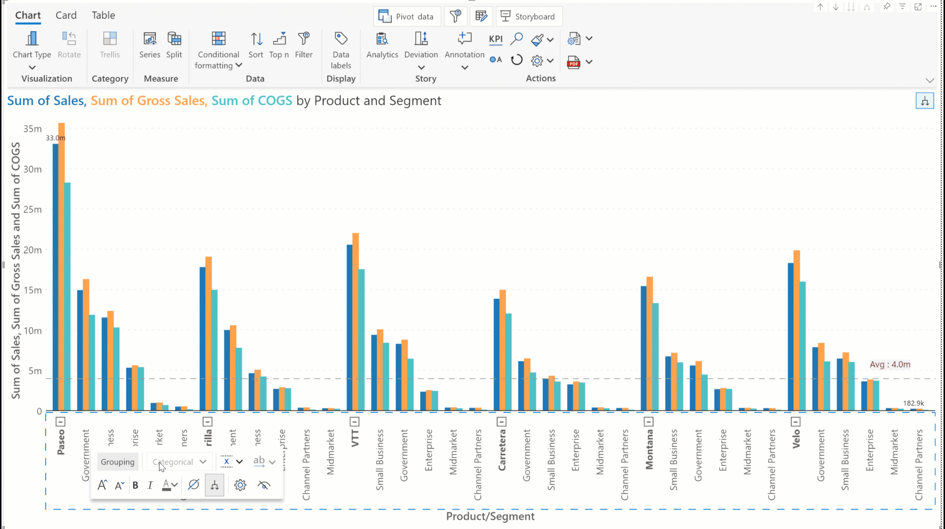
3.1. Visual hierarchies with custom groups
3.2. Formula editor enhancements
3.6. Date format recommendations
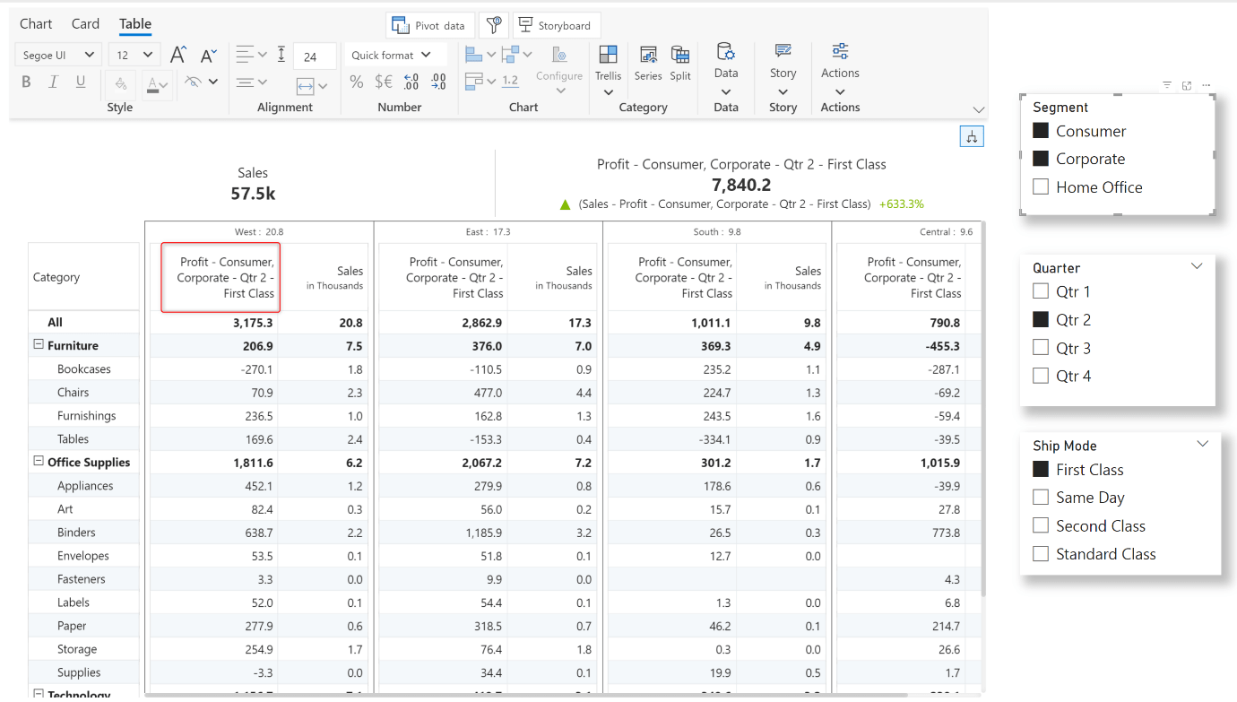
3.7. Context awareness in measure headers
3.9. Native Power BI number formatting
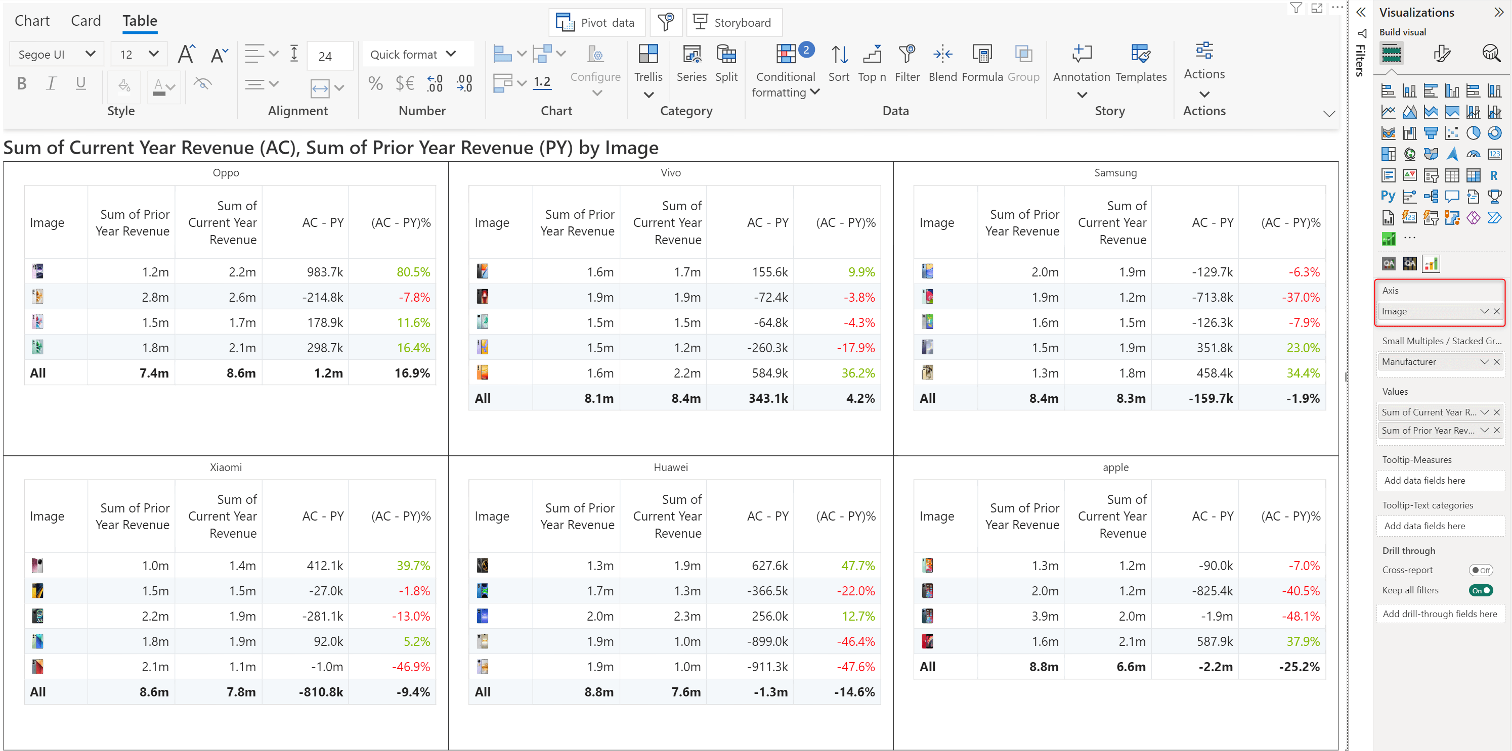
3.10. Image support in axis dimensions
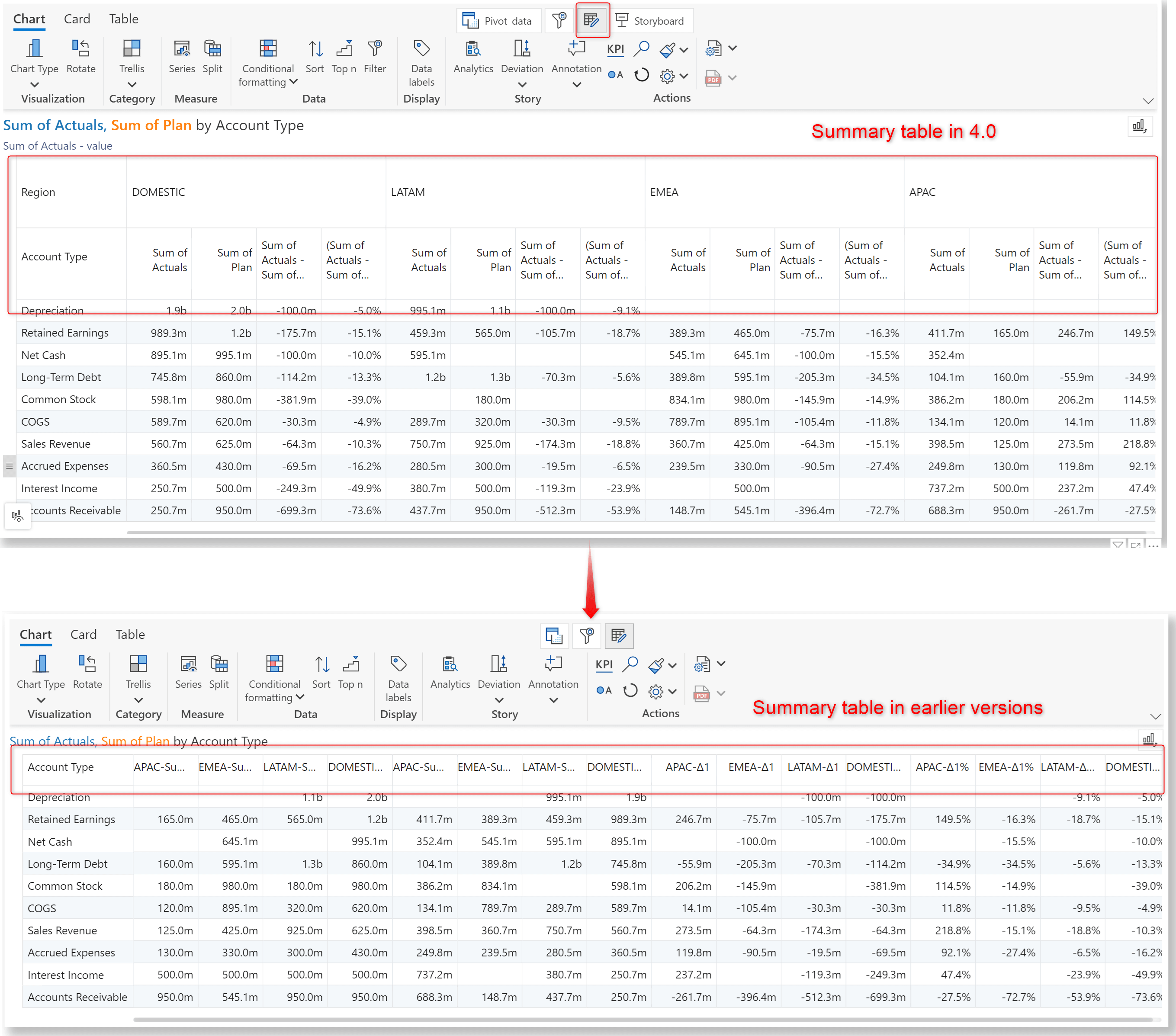
4.1. Summary table design changes
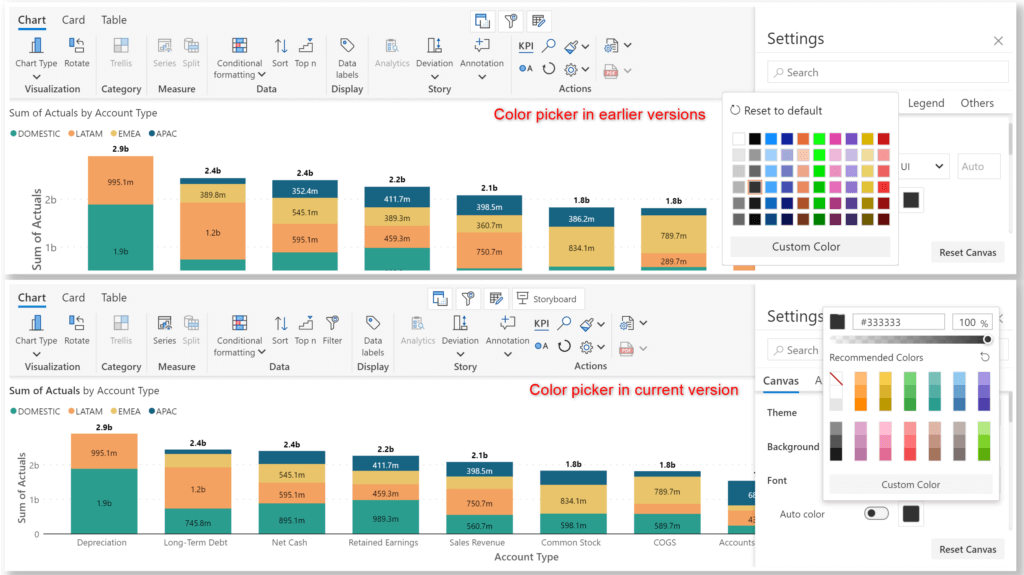
4.2. Color picker look and feel upgrade
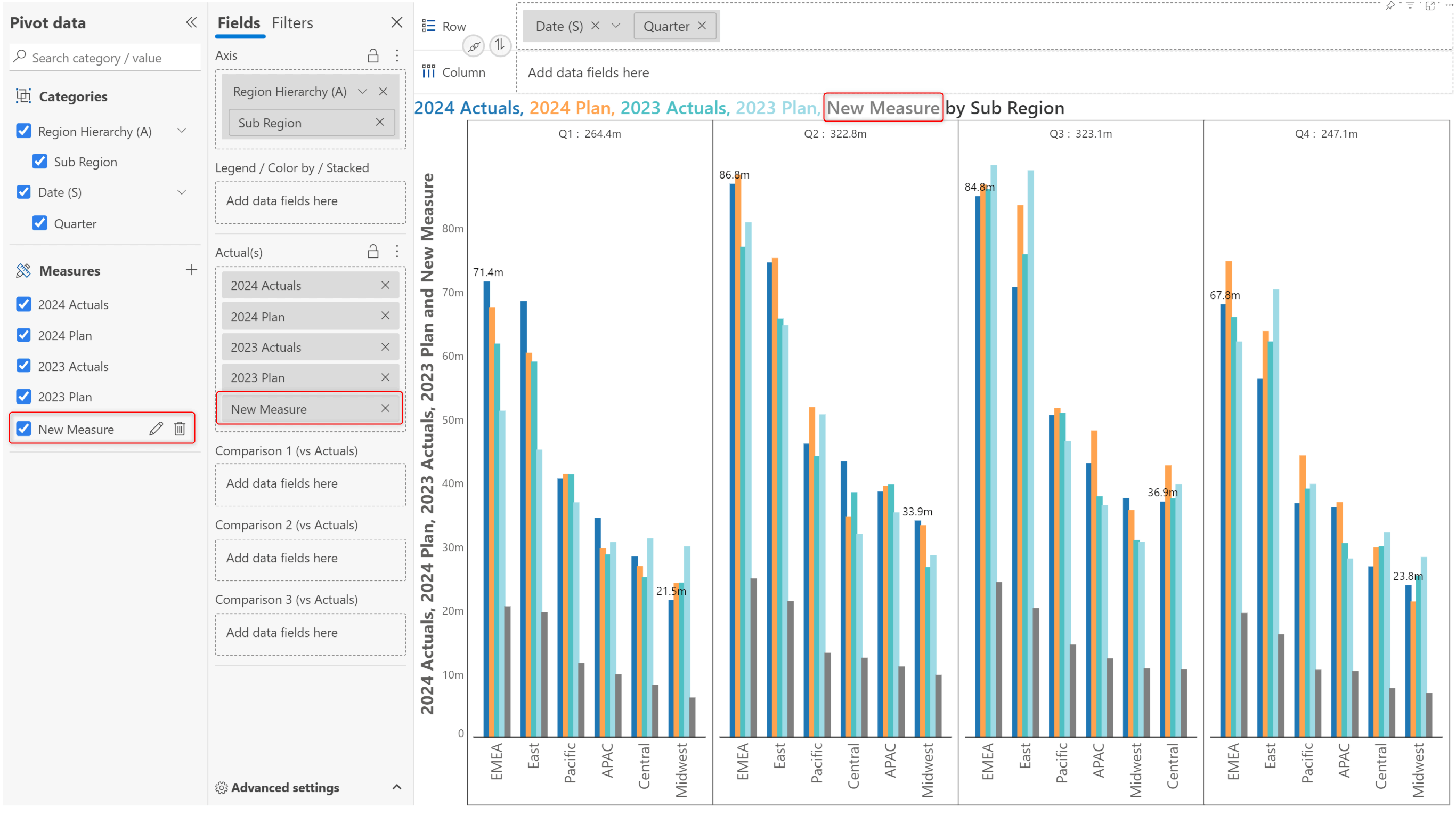
4.3. Adding calculated measures
You name it, we have it. Our library contains chart types suitable for every business scenario, be it trend identification, storytelling, communication, or comparative analysis. Inforiver’s vast repository of diverse charts has been expanded to include additional popular charts like the pie, radar/polar, treemap, sunburst, bubble, scatter, quadrant, etc.
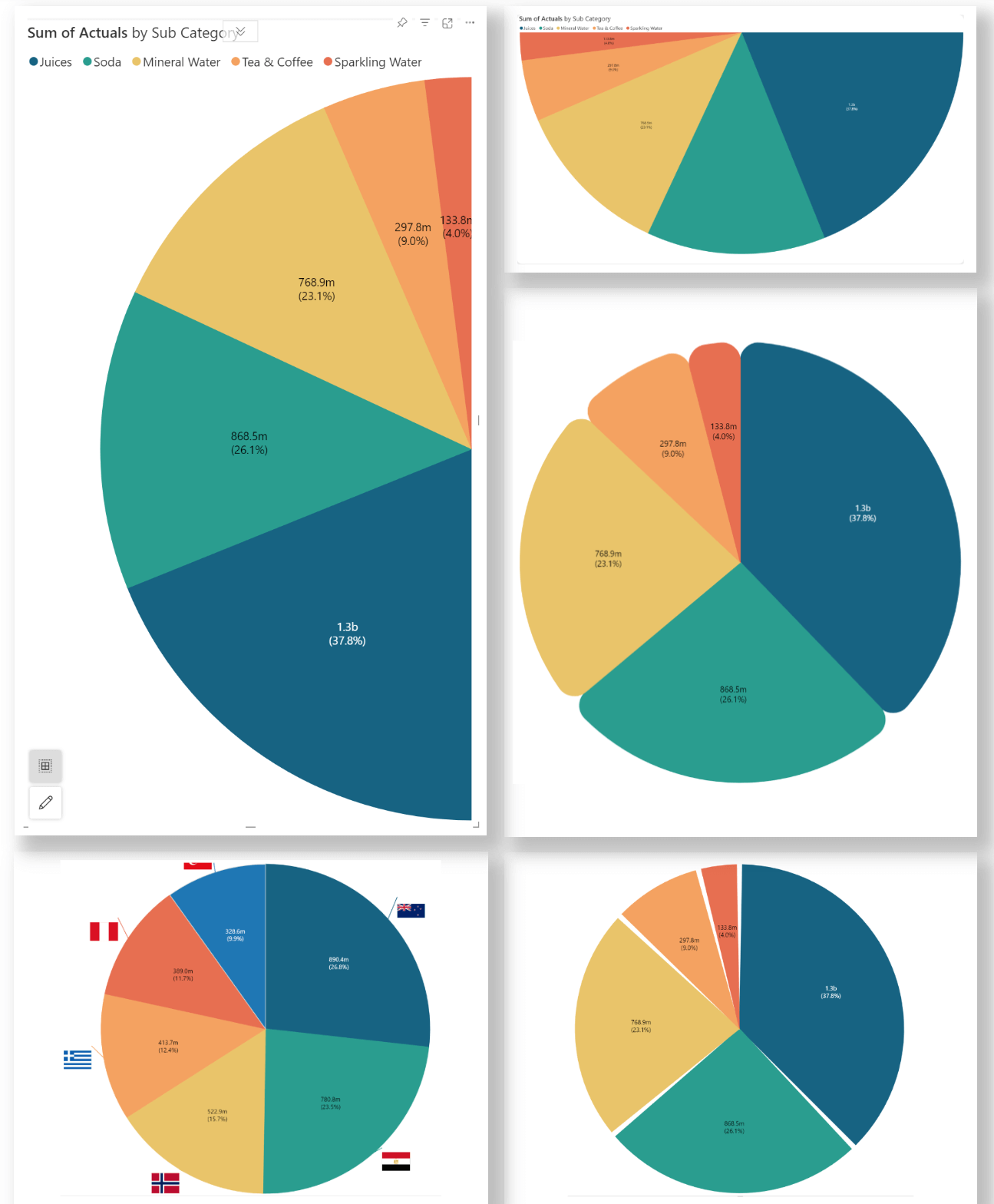
Pie charts stand out for their simplicity and universal recognition. Analytics+ 4.0 supports pie chart variations: the regular pie chart, the donut chart, and the variable pie chart.
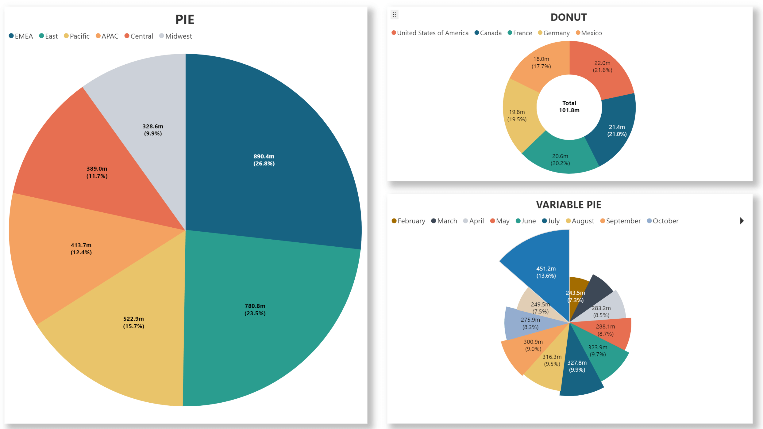
Analytics+ ships with a range of settings for pie charts. You can customize the angle, shape (semi-circle/circle), orientation, and even add images. Pie charts also have dedicated data label settings for the size and value.
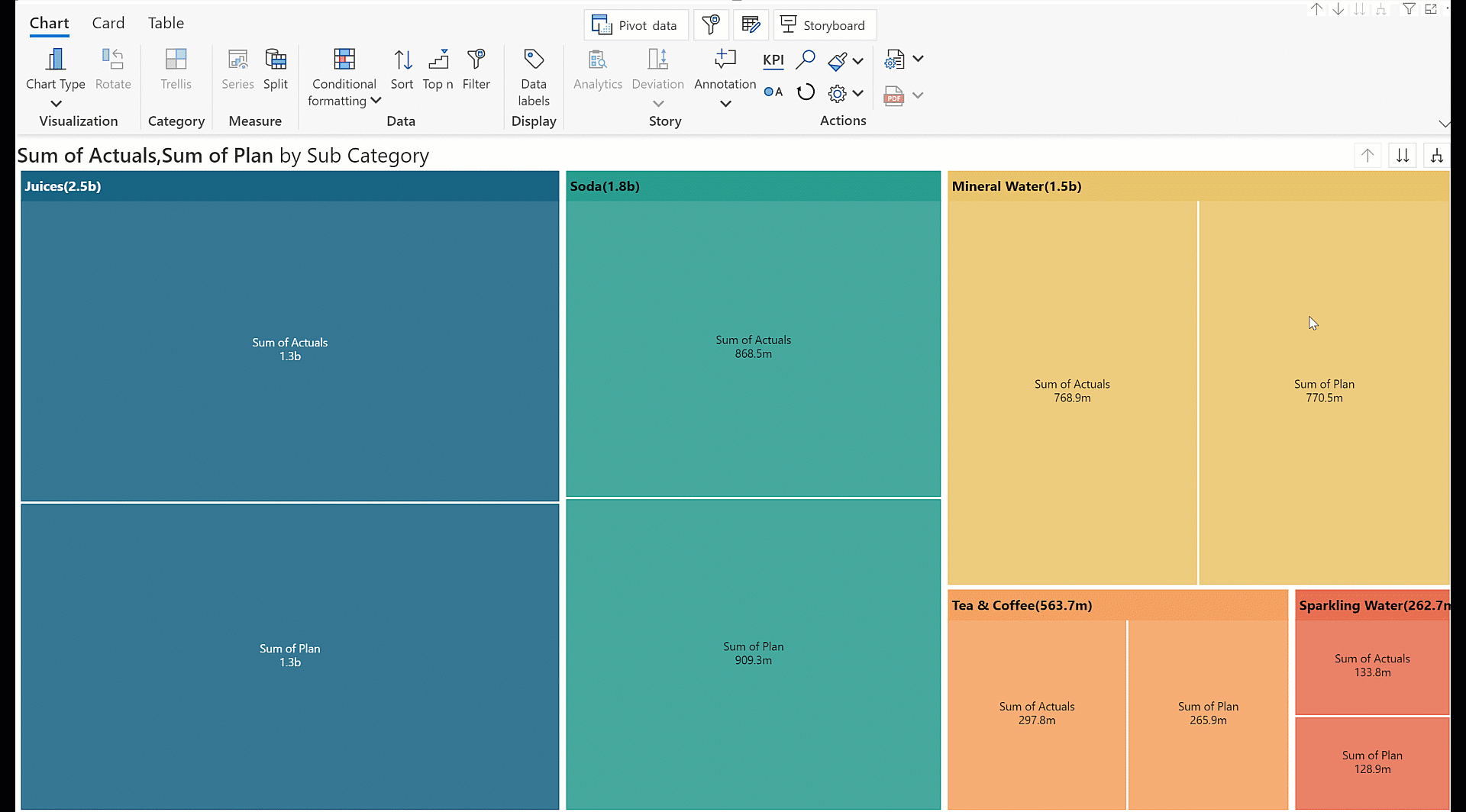
Use the treemap to present your data as linear nested rectangles. It comes packaged with advanced drill-down and roll-up capabilities for hierarchical dimensions.
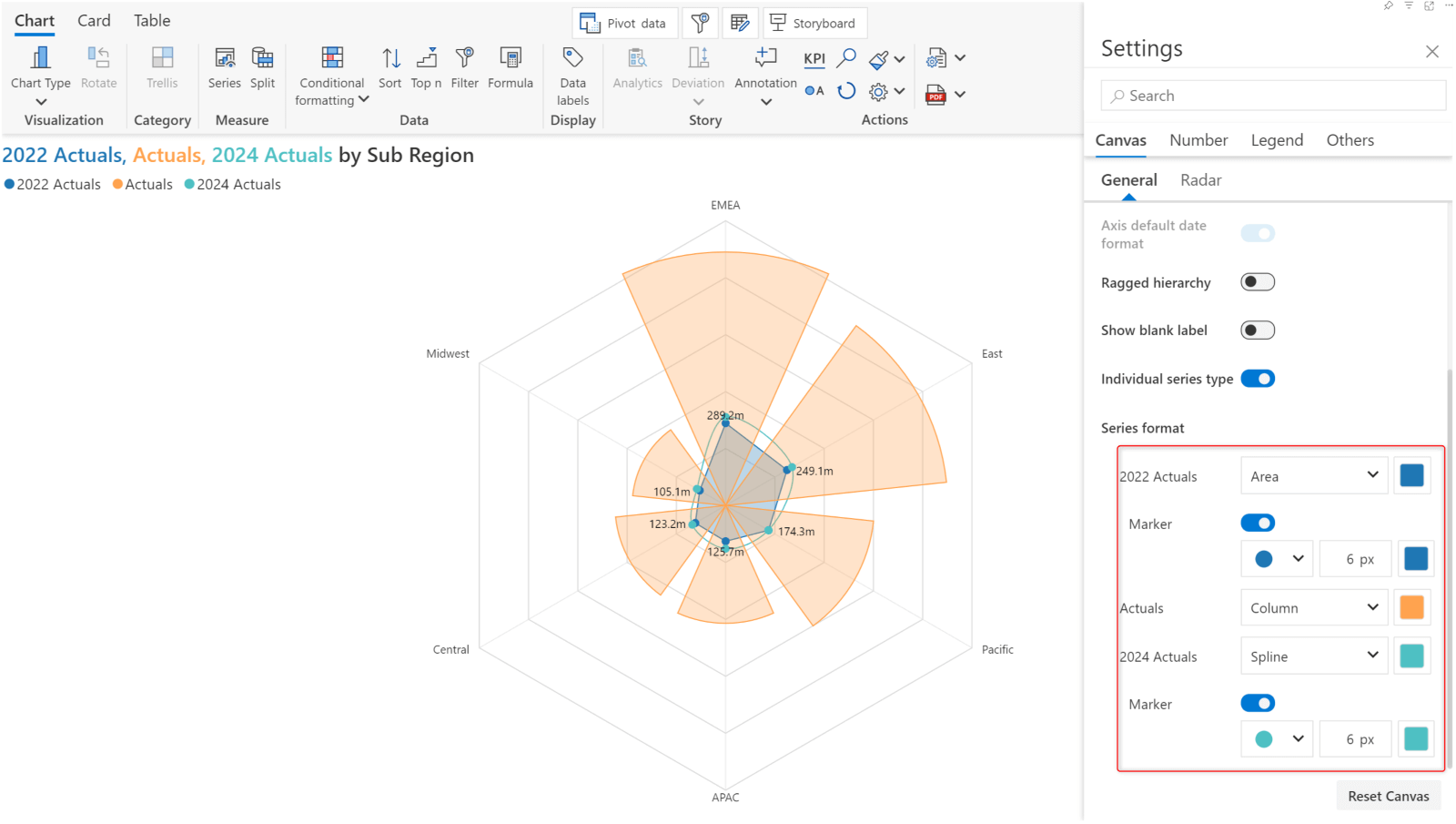
With the 4.0. release, you can identify trends and reveal relationships in your datasets with Radar/Polar charts.
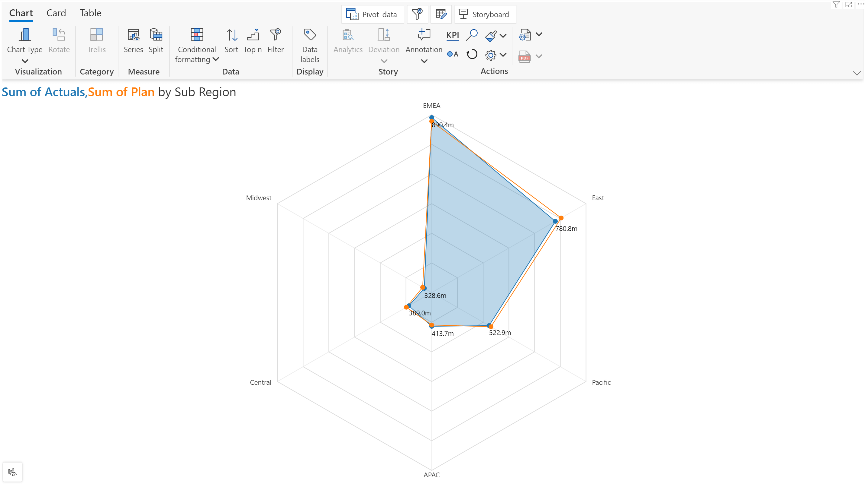
You can opt for different methods like line/spline/column/area to plot multiple measures in a single radar/polar chart. Radar/polar charts also ship with dedicated customization settings for axis, grid, and value display.
You can now apply funnel charts to identify potential bottlenecks or areas of improvement in a process. In this example, we’ve used a funnel chart to view the sales across various regions and quickly spot the areas that need increased focus. Similarly, we’ve used the pyramid chart to visualize the sales across different product categories.
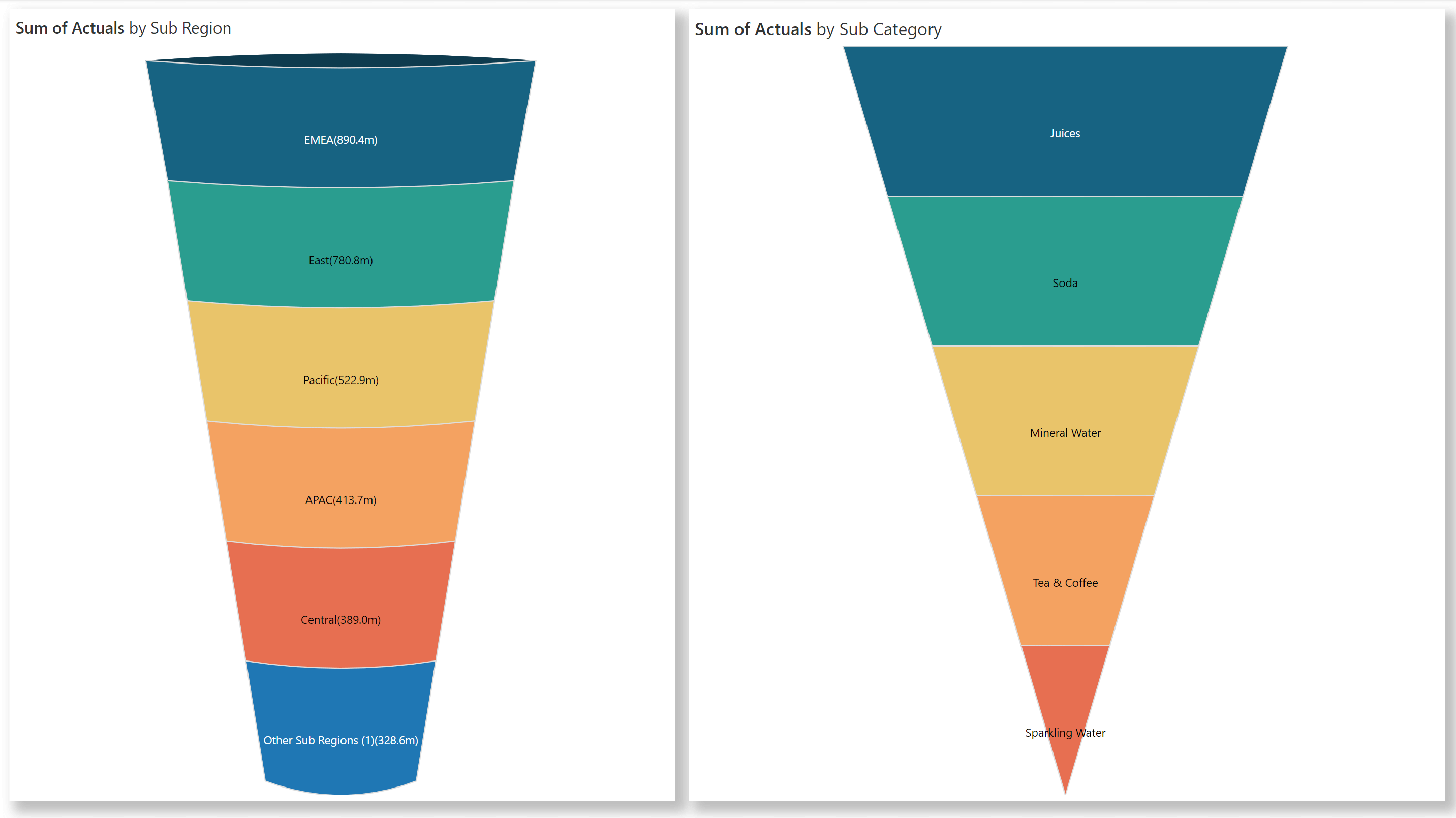
Funnel charts are built with custom settings for curvature, width, pinch count, and slope.
Visualize hierarchies in the form of concentric rings with the sunburst chart.
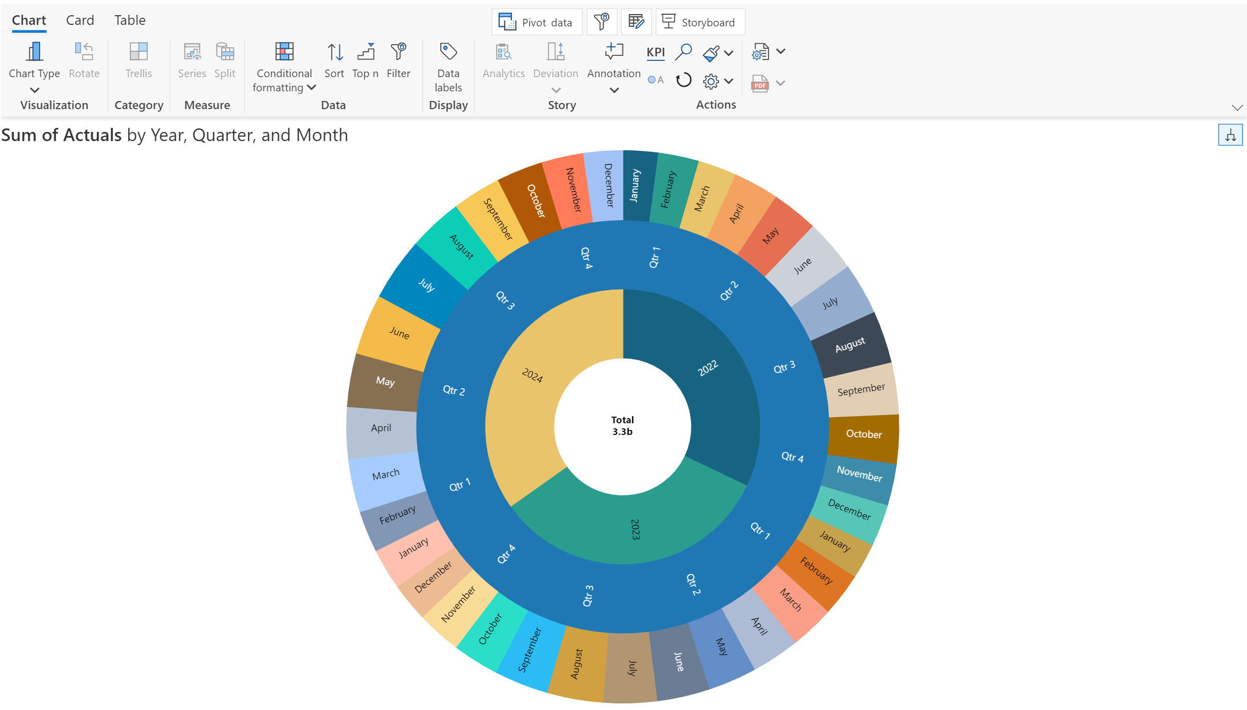
*You can switch between Sunburst and Treemap from the on-object interaction menu, as they belong to the same family.
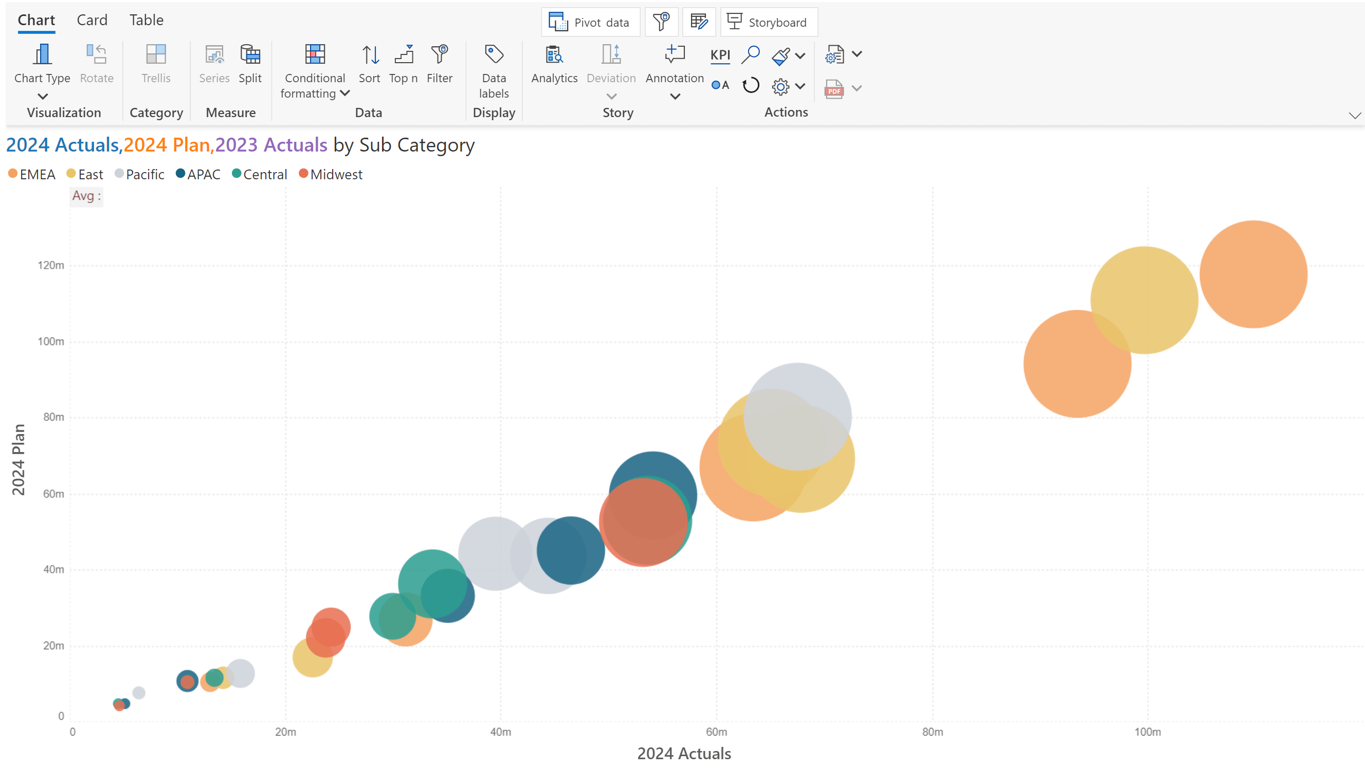
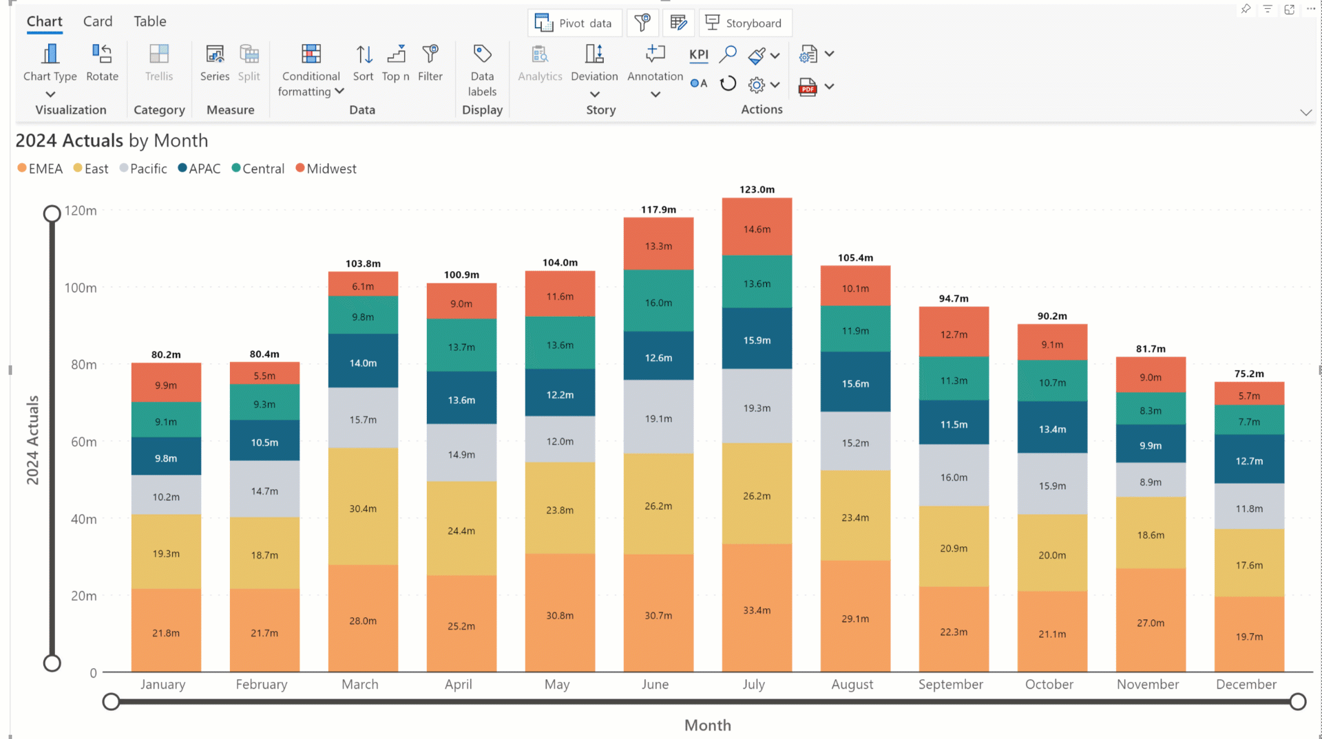
Bubble charts are commonly used in fields such as finance, economics, and data analysis to visualize relationships between variables, identify trends, and detect outliers. Unlike other charts, adding a small multiple dimension to a bubble chart will create a color-coded bubble with a legend instead of rendering a trellis.
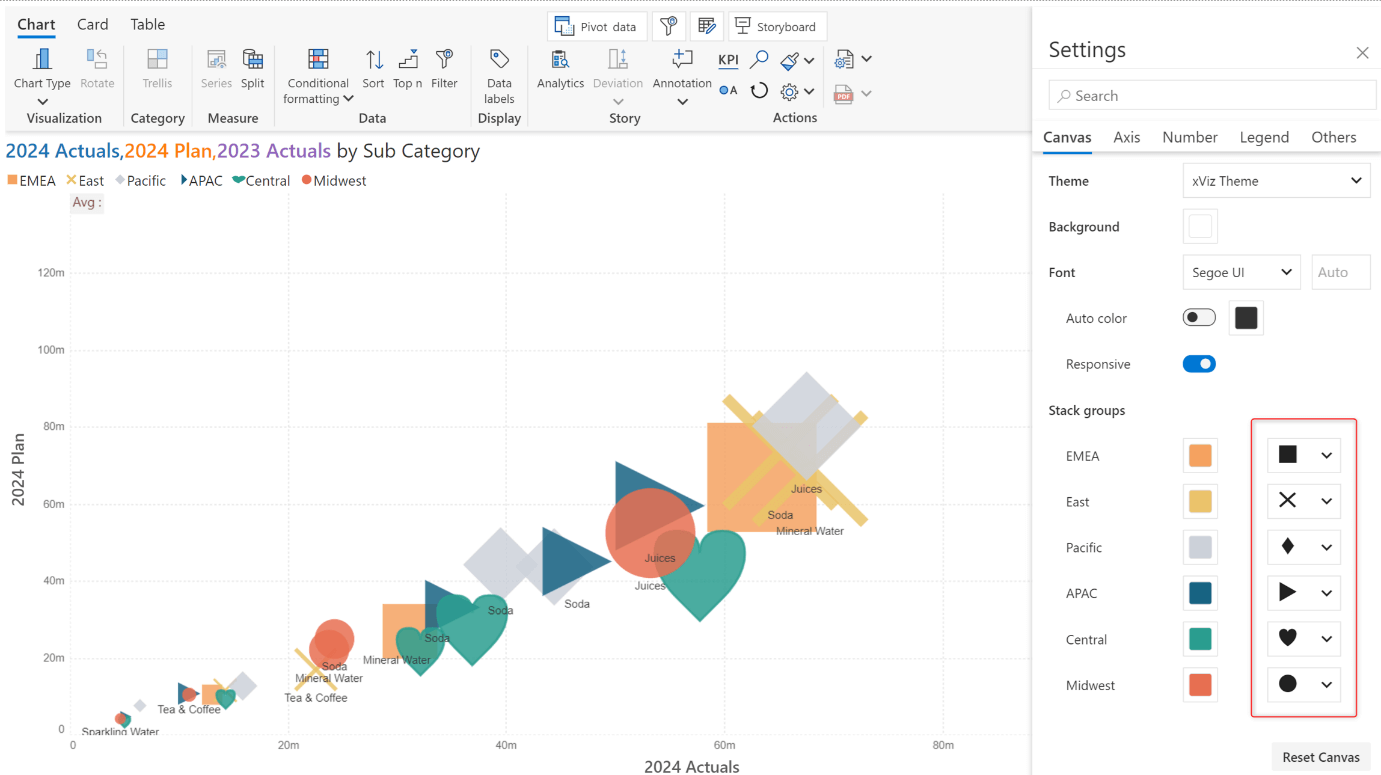
You can use markers to distinguish between each category instead of bubbles.
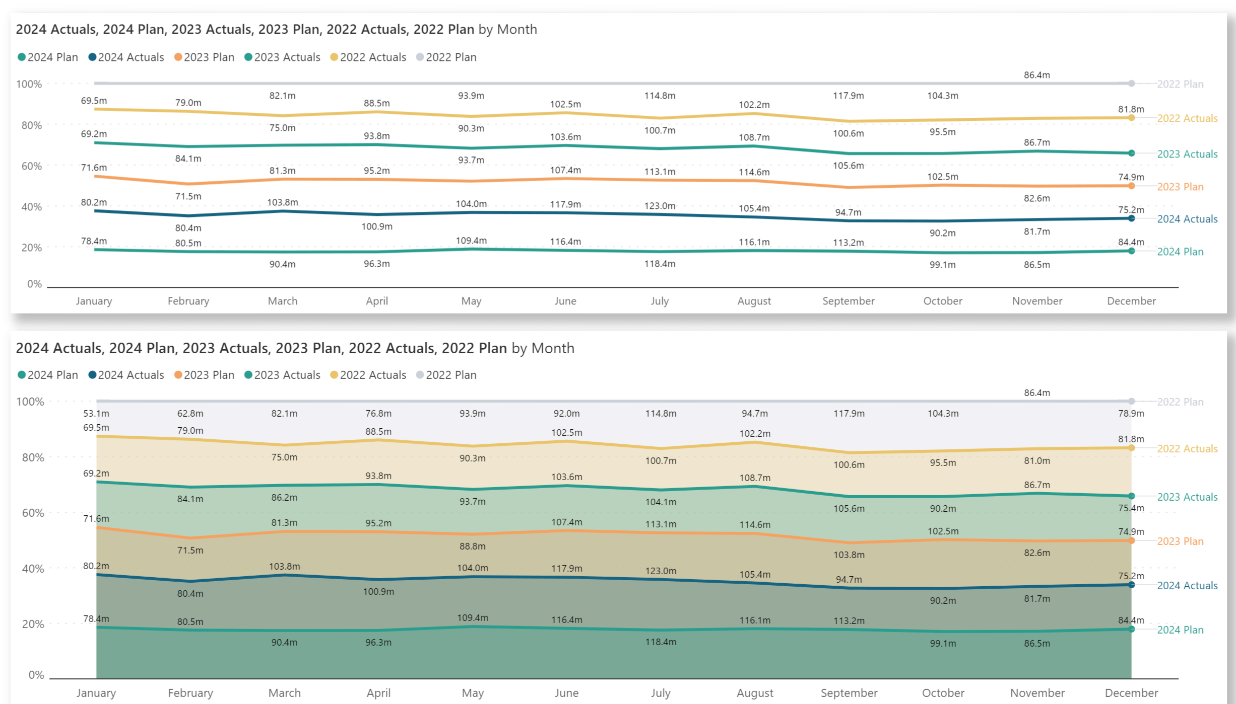
100% stacked charts provide a consistent scale for comparison across different categories, regardless of the absolute values, by normalizing the data to 100%.
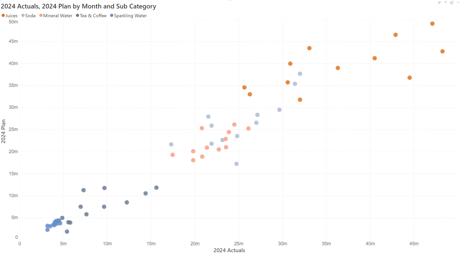
Use scatter plots to explore the correlation between two measures and easily detect outliers. You can add a third measure to a scatter plot, to convert it into a bubble.
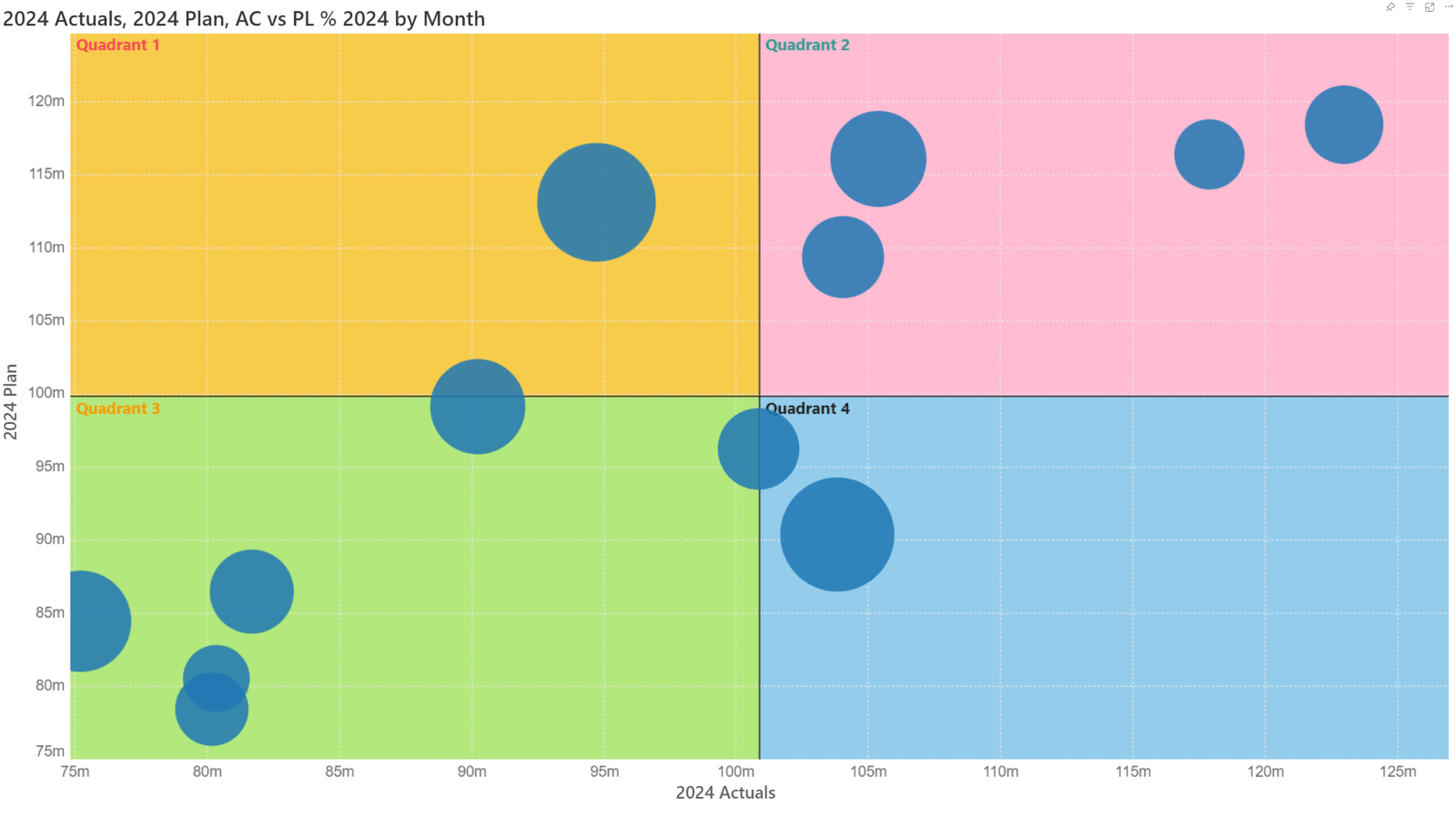
Quadrant charts are a combination of bubble and scatter plots. They are widely applied in areas such as SWOT analysis, risk management, and performance analysis. Analytics+ offers quadrant title, axis, and background color customizations that are designed specifically for Quadrant charts.
When you enforce IBCS standards, you’ll notice that the chart title conforms to the prescribed standard. Navigate to Display settings > Others tab> Report Title to customize the ‘Inforiver Analytics+’ line.
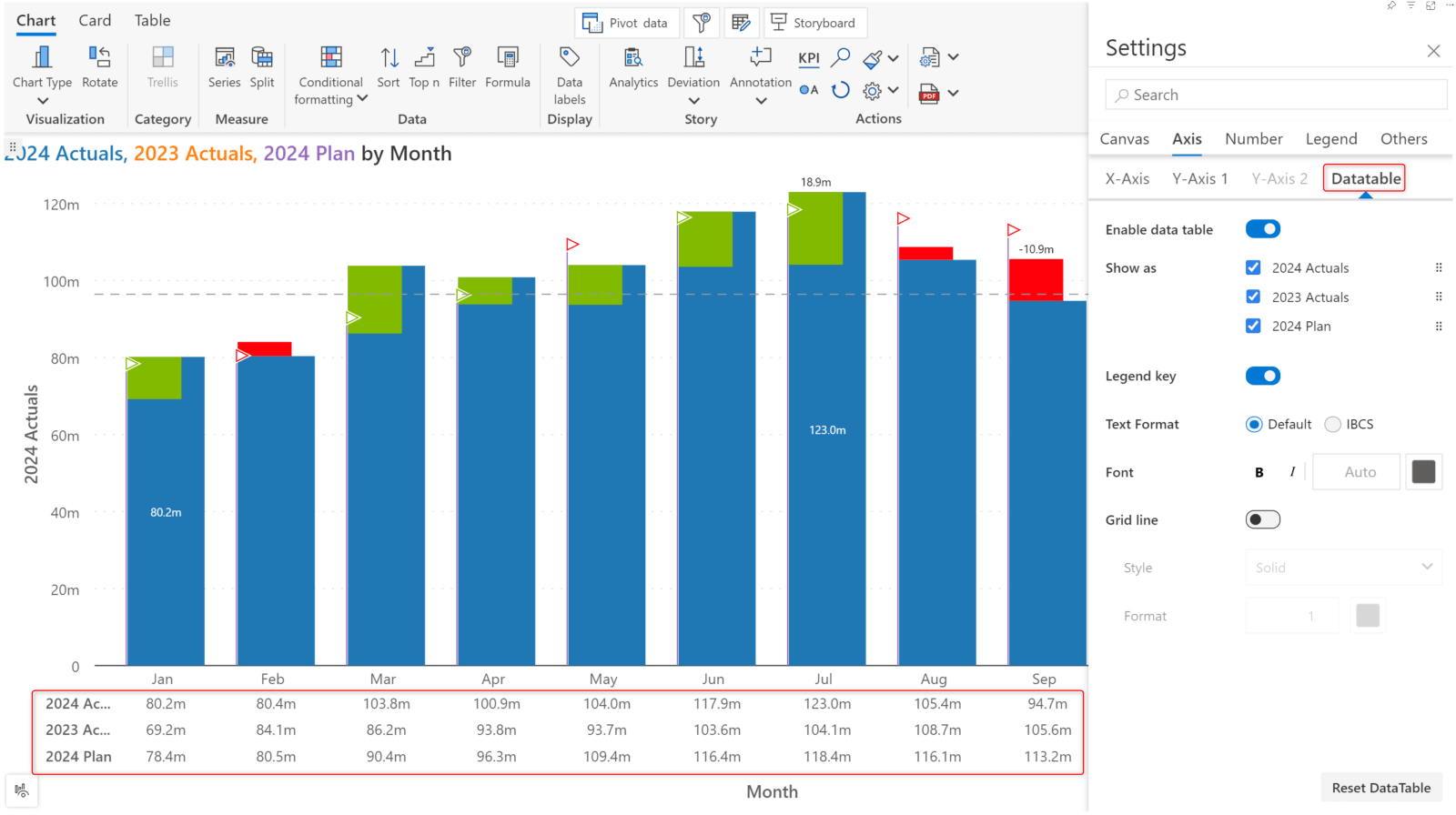
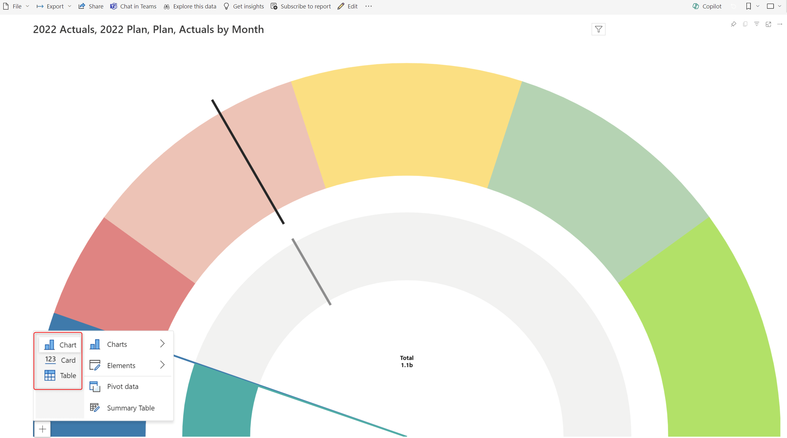
Have you been switching to the summary table mode often to view the underlying data for your chart?
In the June release, we bring you the data table for charts. You can now view your charts and the underlying data in a single window! You can enable this option from the Display Settings > Axis tab > Data table tab > Enable data table.
Analytics+ brings you a shortcut for filtering axis categories. Enable the range slider to dynamically render your charts by calibrating the axis categories (x-axis) and measure values (y-axis).
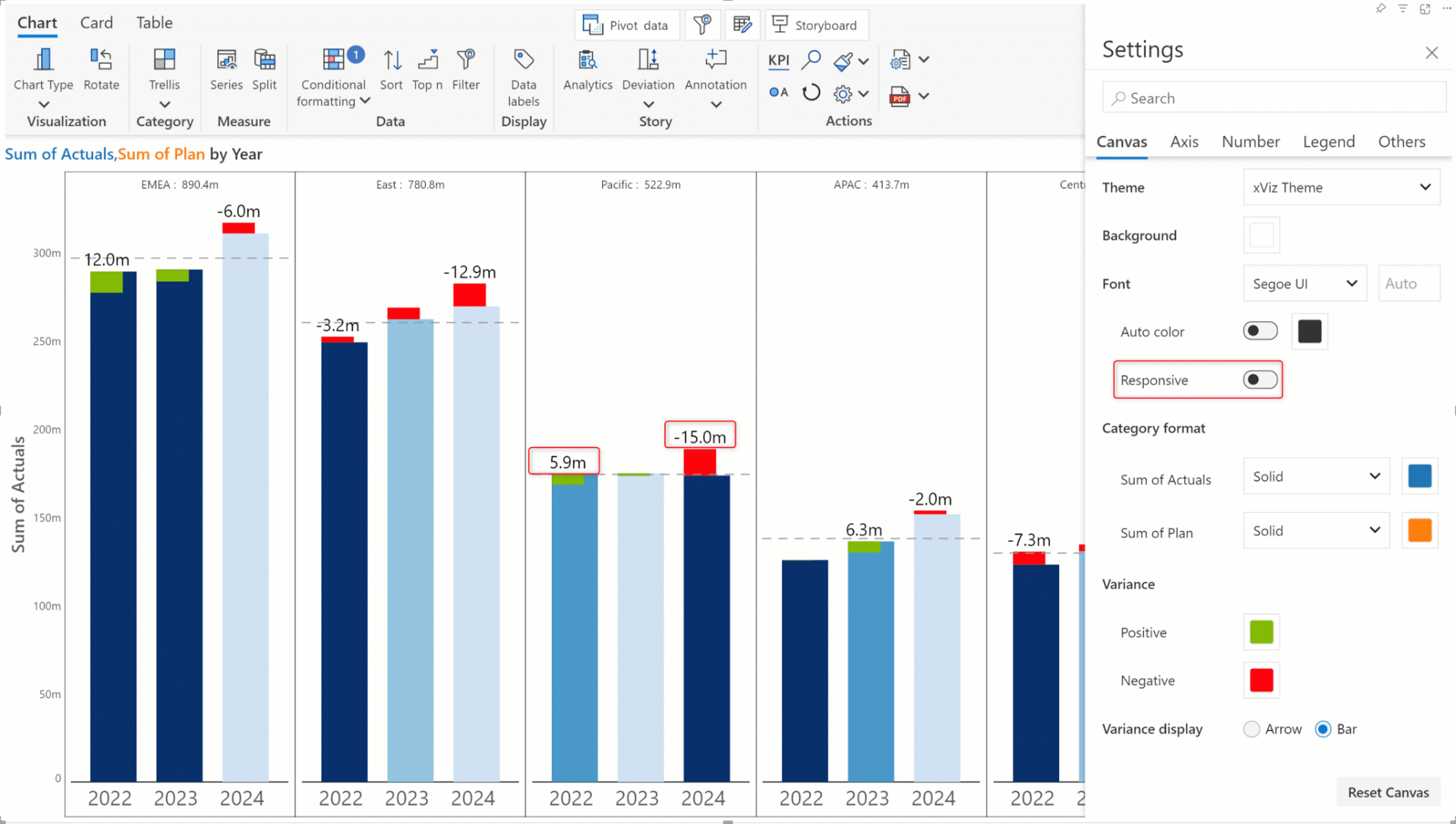
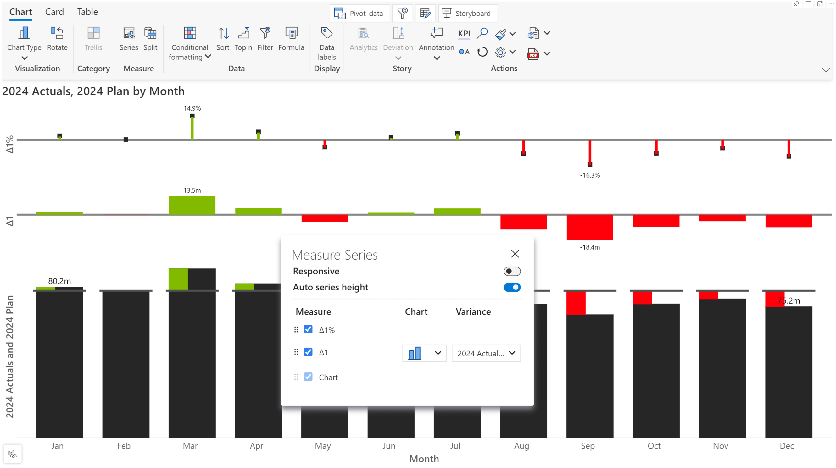
The Analytics+ visual has been built to support varying canvas sizes. As you resize the canvas, the legends, axis, and data label fonts are adjusted to fill the available space. If you want to set a specific size that remains static irrespective of the canvas size – disable the Responsive toggle.
In the example, when the responsive font is disabled, notice how the variance data labels are disproportional to the size of the chart.
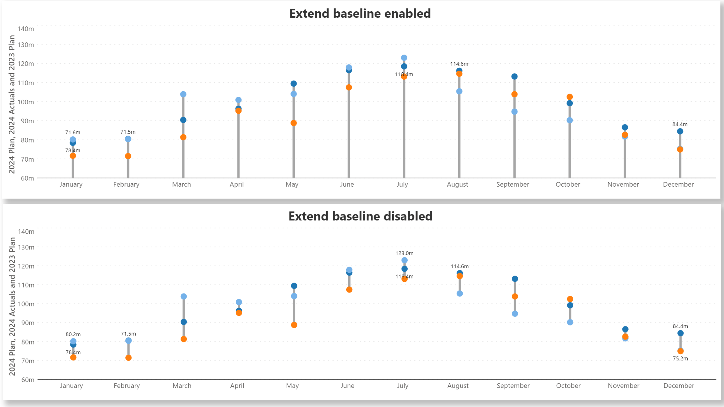
You can extend the connecting line to join the x-axis by enabling this option.
Inforiver provides customization at your fingertips with its vast range of on-object interaction menus. When creating dashboards, you can instantly customize each element of your chart without having to switch to focus mode.
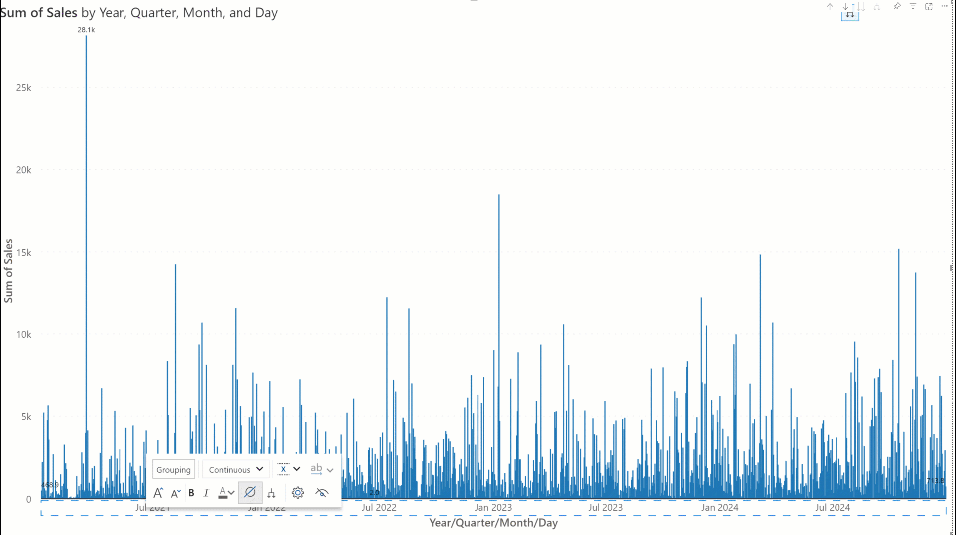
When category grouping is disabled, you can switch between categorical and continuous axes for time series axis dimensions.
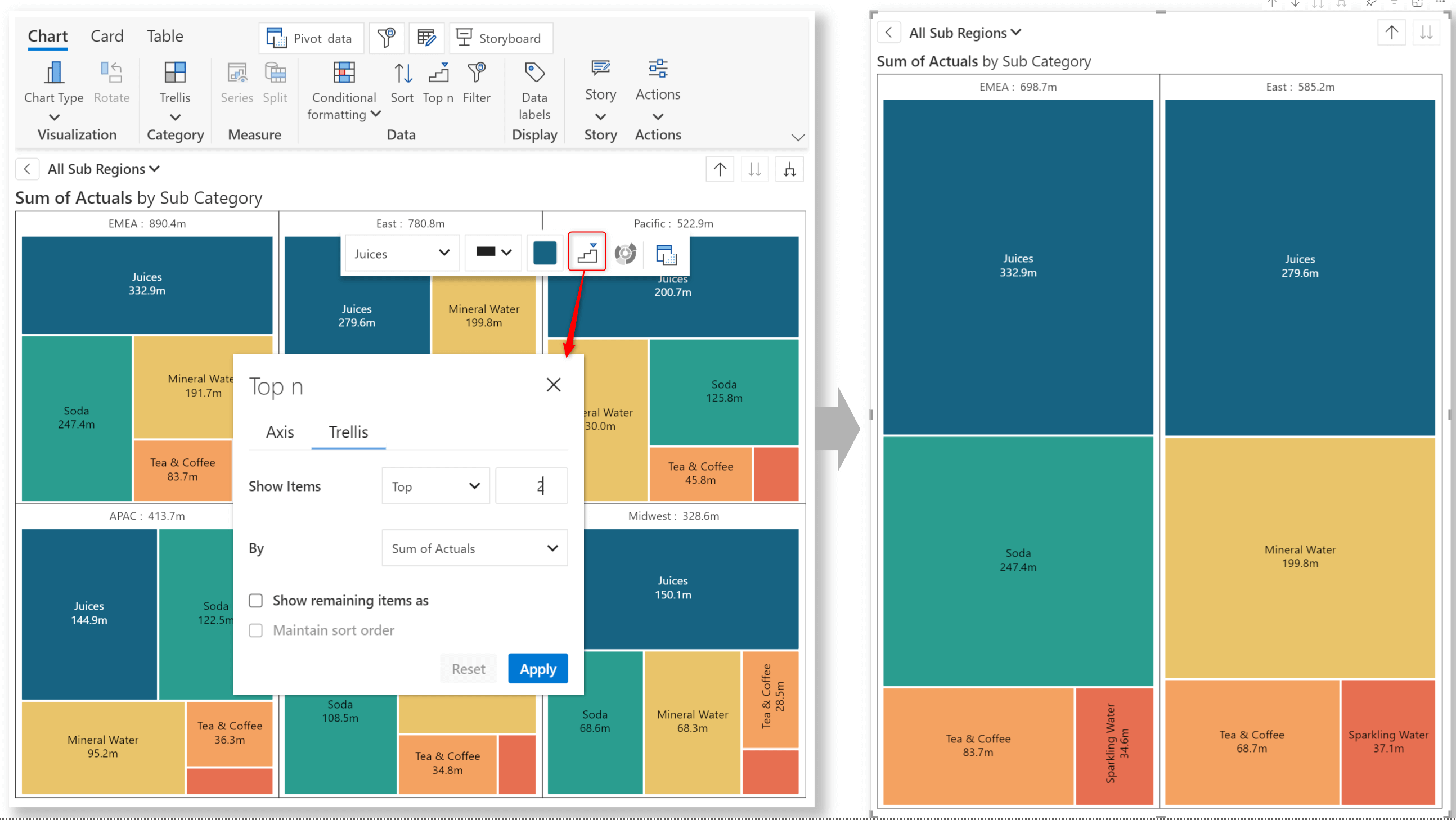
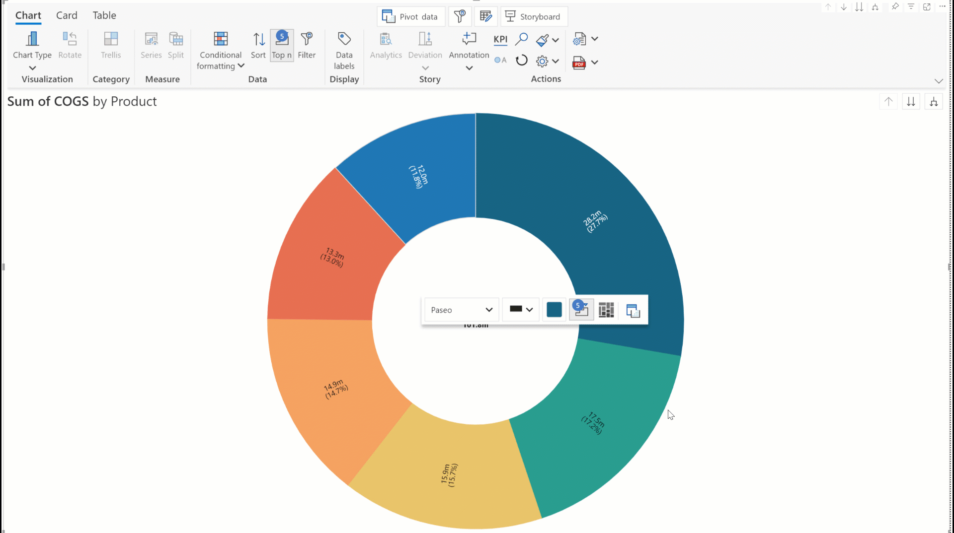
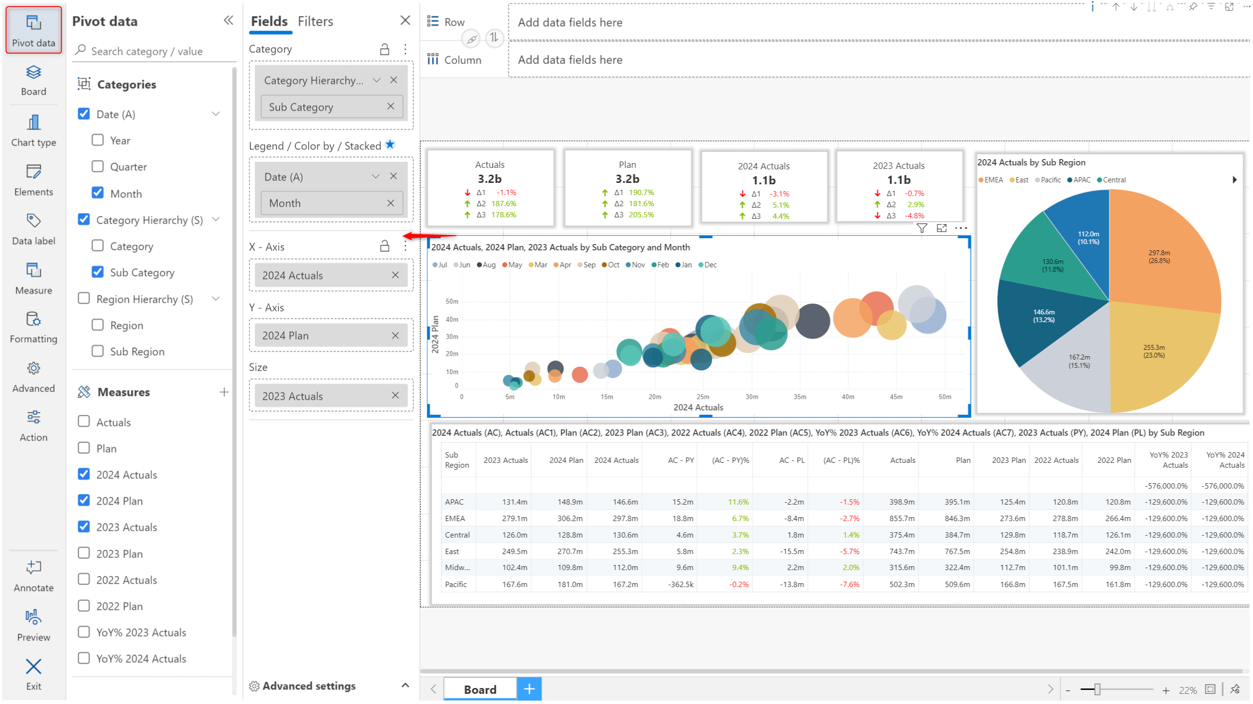
Analytics+ comes packaged with an unprecedented range of chart types. In the February release, we introduced name-based, tag-based searches and scenario-based chart selection to help you navigate the wide range of charts.
As we constantly add new chart types to our repository, we’ve changed the interface to accommodate them all. You can now browse charts based on the family they belong to.
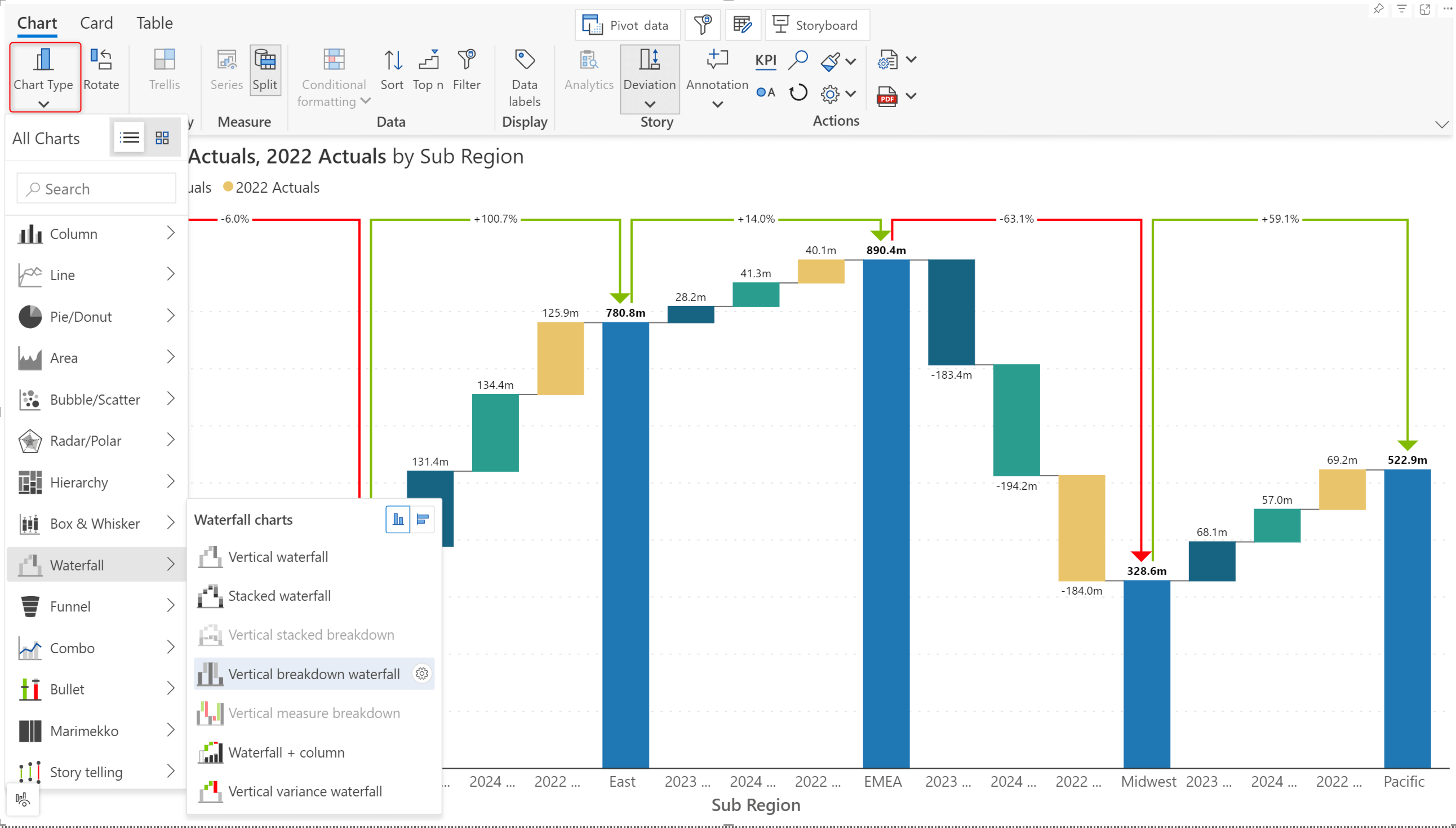
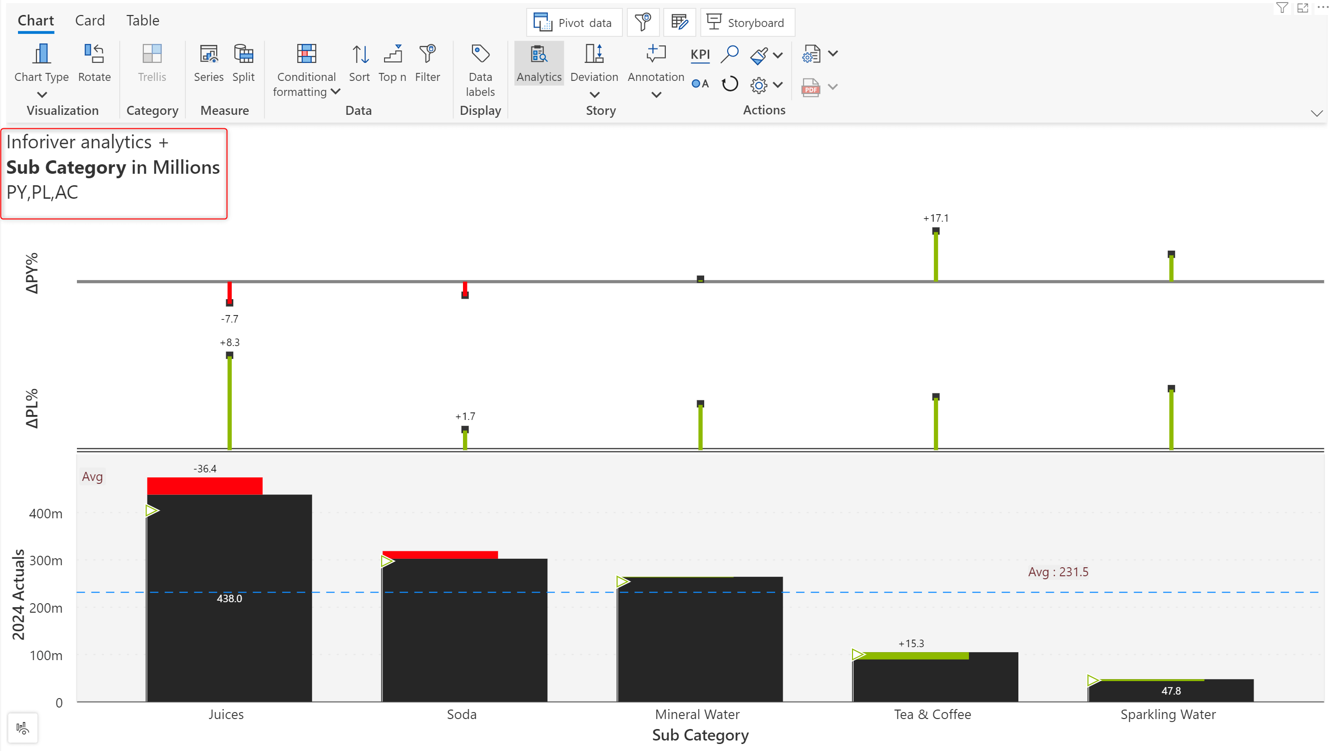
In the 4.0. release, bullet charts ship with the option of plotting the variances as separate IBCS-compliant charts. The absolute variance is plotted as a bar chart, and the relative variance is plotted as a pin chart.
Give your dashboards an extra boost with the new Image feature. Please bear in mind that to use images in your reports, the Power BI Data category should be Image URL.
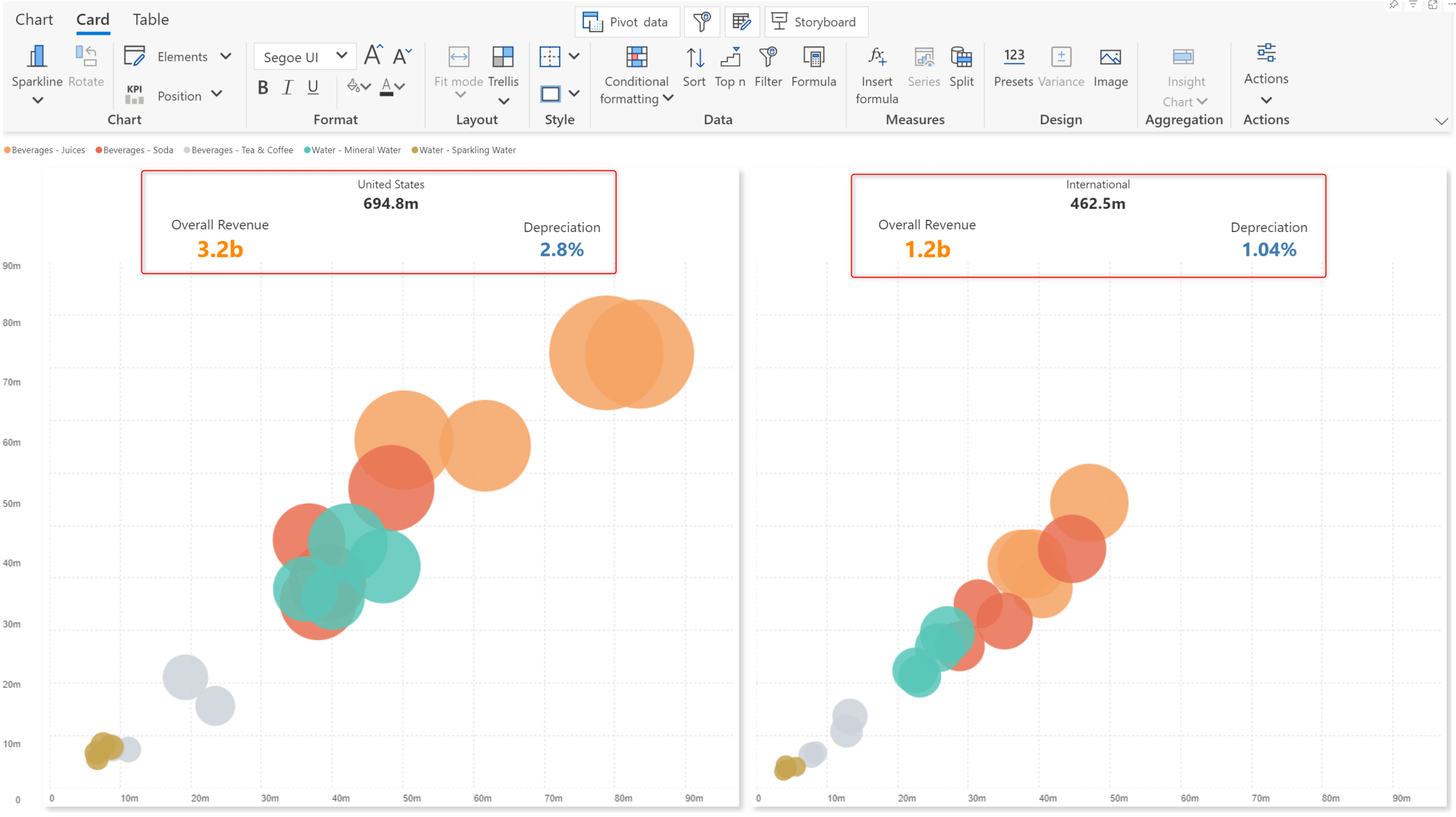
The KPI container feature allows you to add more information to your cards. Click on the edit icon, then click the + icon to add containers to the KPI section and define multiple KPIs.
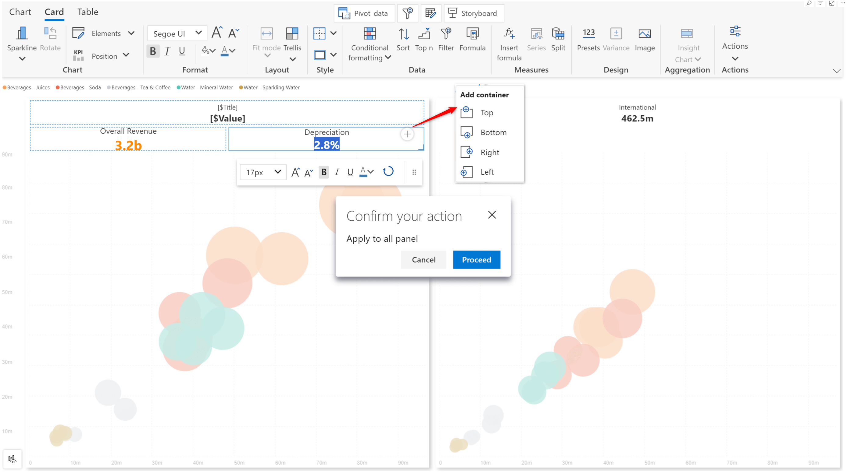
Analytics+ makes life easier by allowing you to cascade the containers set up in one card to the rest of the cards. Confirm the prompt to ‘Apply to all panels’ and notice how the containers are replicated across all the cards.
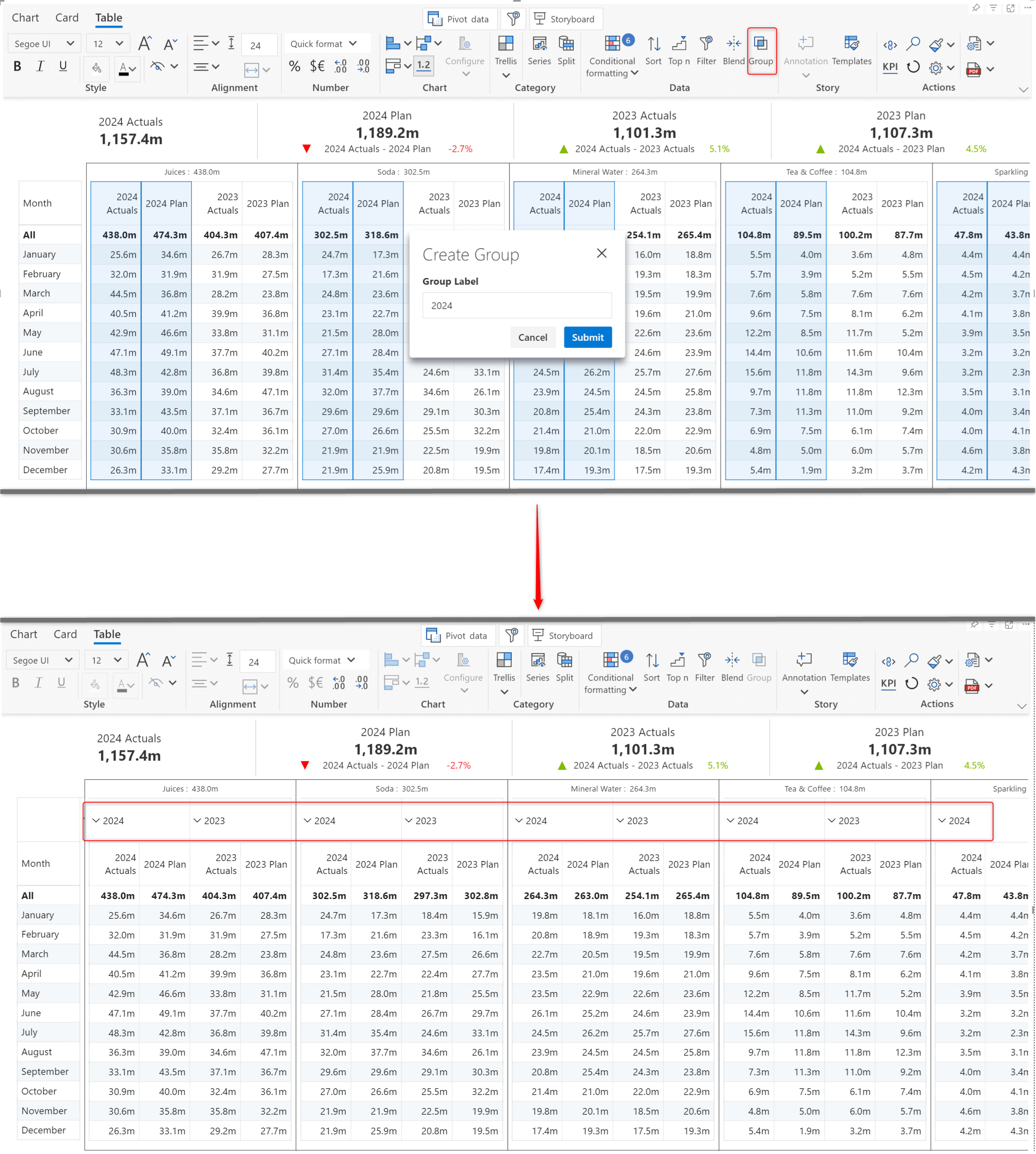
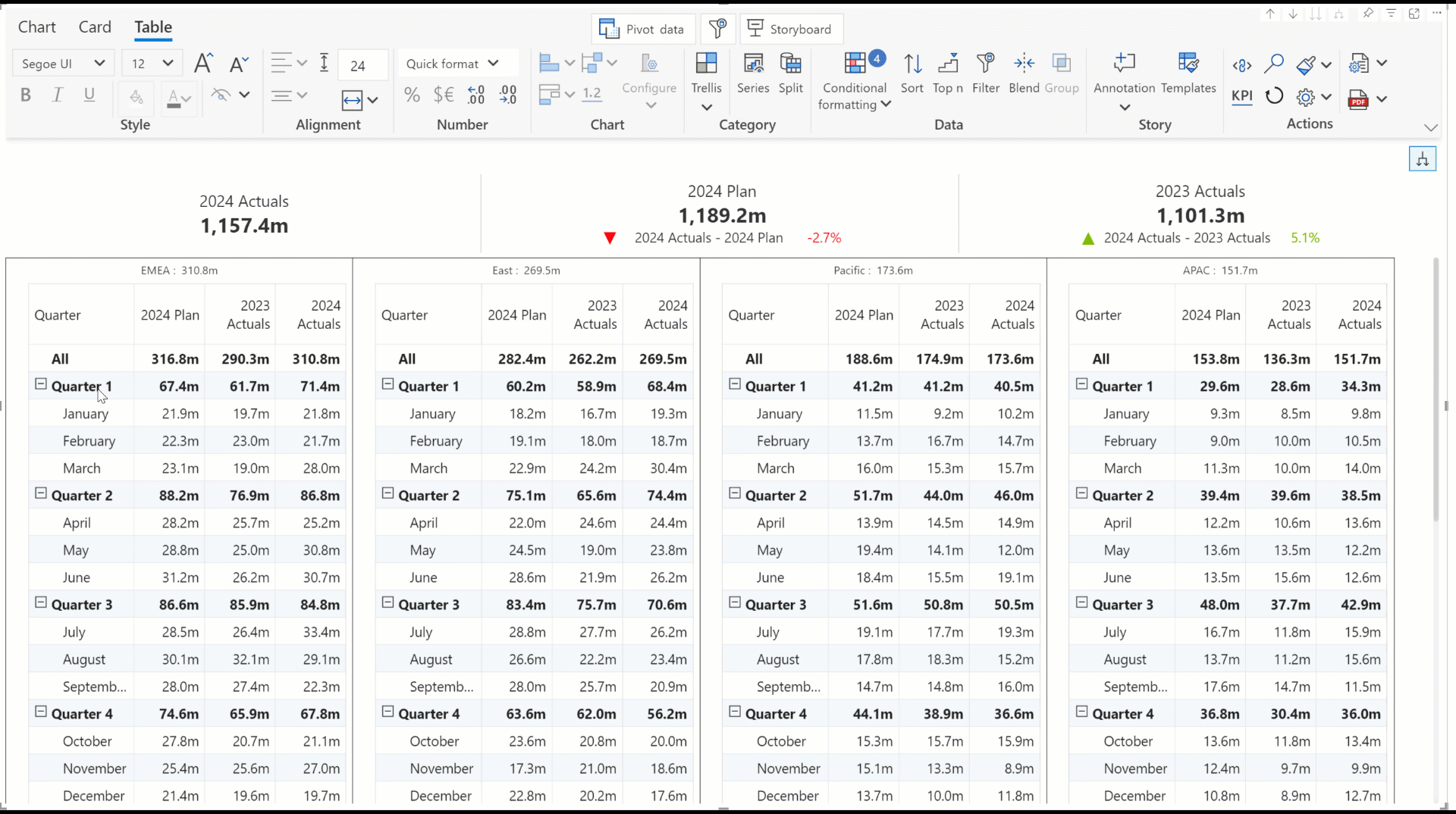
Create visual-level column hierarchies in a single click with the new Group feature. All that is required is to select the measures to be grouped and click the Group button. You can expand and collapse the column groups just as you would with hierarchies in the data source.
In this report, we’ve grouped the Actuals and Plan corresponding to each year and created two column groups: 2024 and 2023.
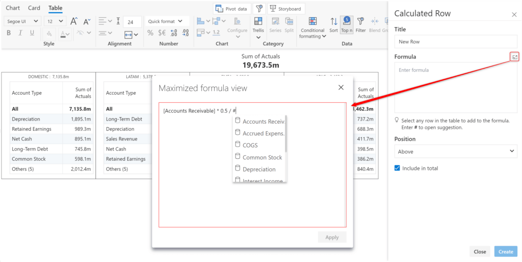
With Analytics+, you can add calculated rows at a visual level. We’ve improved the ease of use of the formula editor with the 4.0 release.
Do your reports require complex, multi-line calculations? You can now create and edit large formulas in the Maximized formula view.
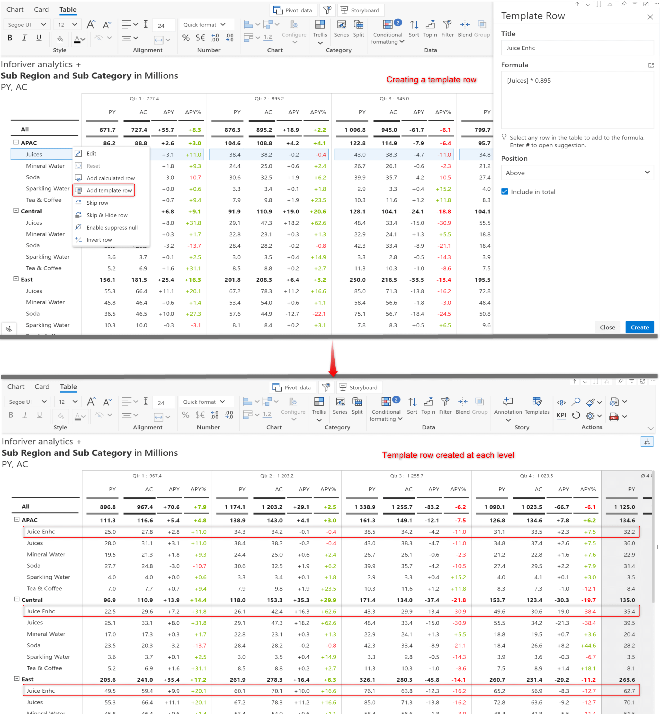
Analytics+ comes packaged with various features, making reporting hierarchical data straightforward and efficient. You can insert calculated rows at each hierarchy level in a single show with the Add Template row option in the row gripper.
We’ve used the Template row feature to insert the Juices Enhc row for each region in one shot.
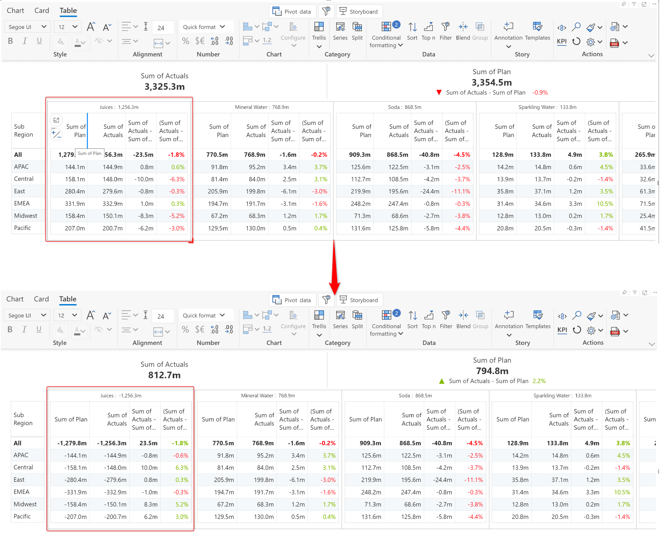
With Inforiver reports, you can indicate poor performance in a particular segment or region with the invert panel option. Hover over the panel and click on the invert button. We’ve inverted the Juices panel with this option.
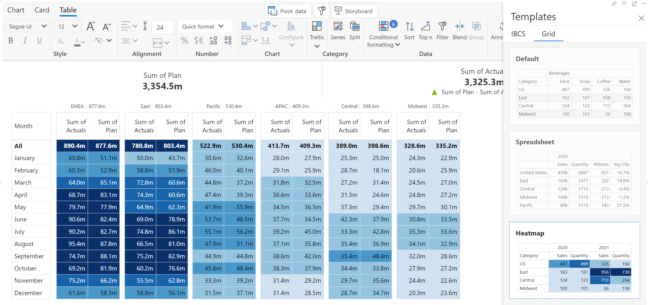
The color gradient in heatmaps provides immediate insights into the distribution of values across categories. You can instantly apply conditional formatting with the new heatmap template.
You can set custom formats for axis date dimensions with just two clicks. Double-click on a date dimension like year/quarter/month and select a custom format from the list of suggestions.
The Analytics+ visual is responsive to changes in external filters and slicers. In this release, context awareness has been extended to measure headers. After setting up the filter context, when you double-click a measure header, Analytics+ will display the list of filters.
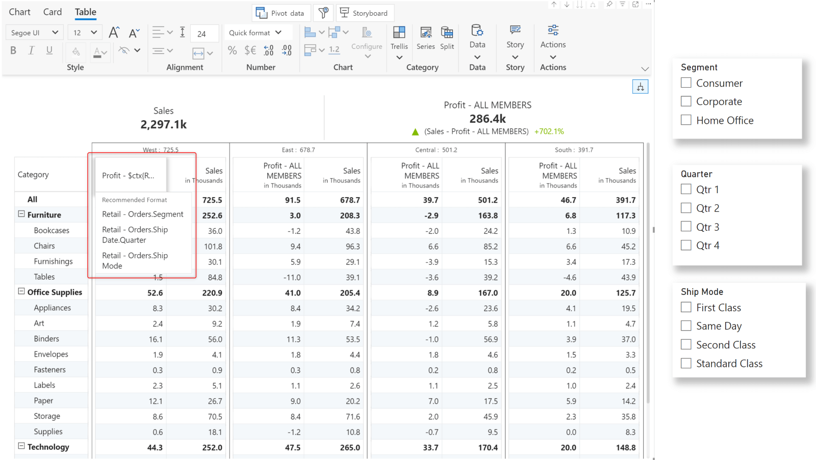
You can append a filter name to the measure header. The filter selection will then be dynamically displayed in the header.
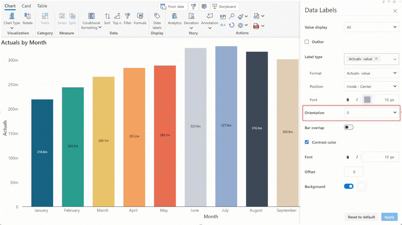
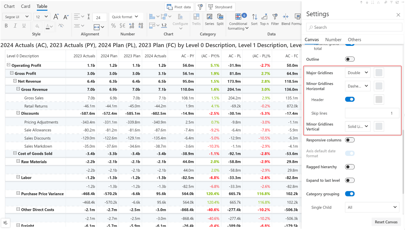
Customize the horizontal and vertical gridlines. You can choose a double gridline, a dotted line, or a single line to demarcate categories. You can also opt not to have gridlines or render gridlines after a specific number of rows instead of every row.
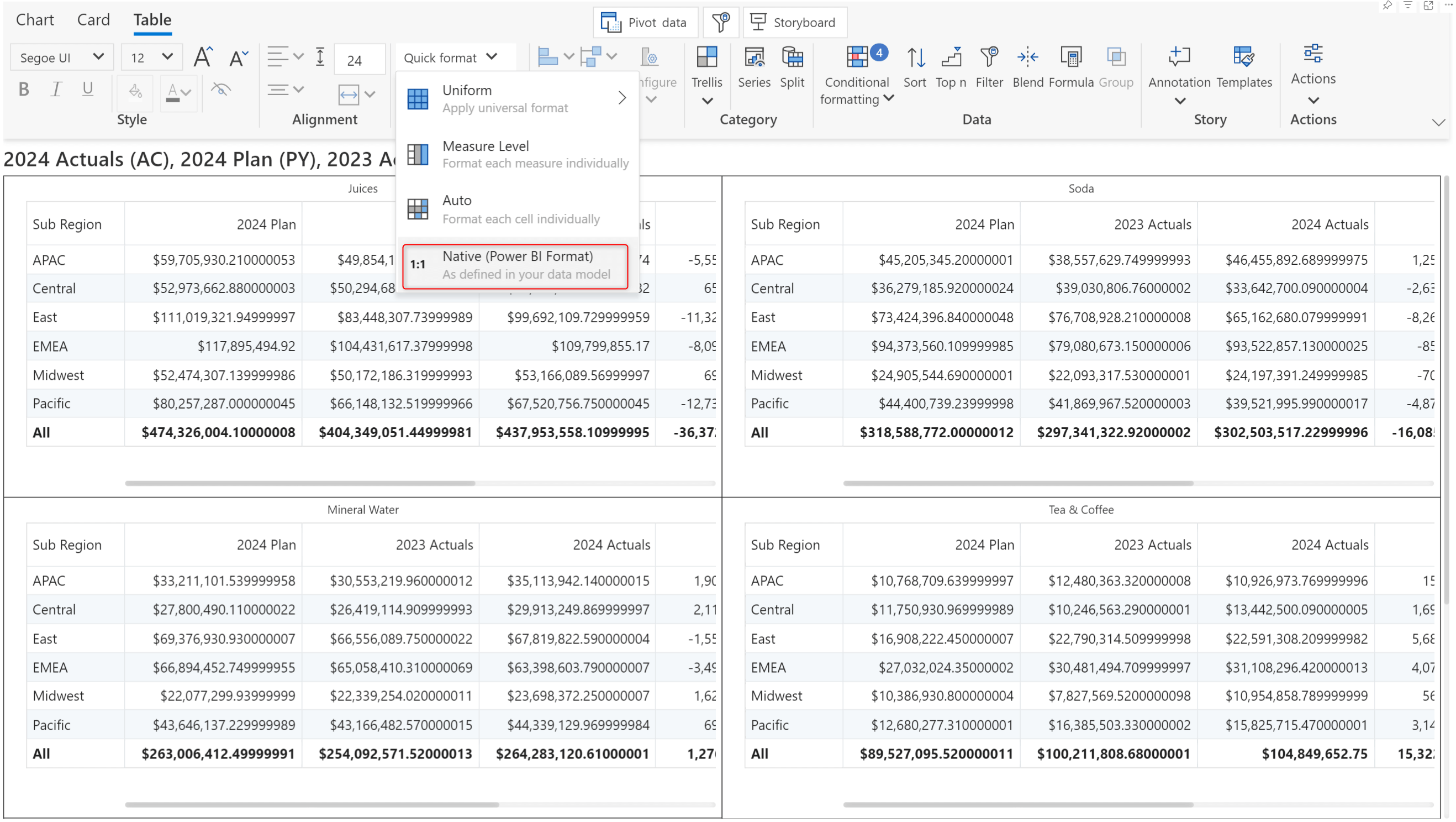
Analytics+ can apply the number formatting from your Power BI data model. Choose the Native option from the Quick format dropdown to set Power BI formatting.
Create eye-catching tabular reports with images in your axis categories. To display images as axis categories, add the image URL field to the Axis parameter.
The layout for summary tables has been changed to enhance the data's readability. Measures are now grouped under small multiple dimension categories, whereas in earlier versions, they were not bucketed under each category.
The color picker has been upgraded to a more intuitive version with a range of colors tailored for dashboards.
With the latest version, you can create visual-level measures within the Analytics+ visual without having to modify your data source. You can create new measures from the pivot data window or use the new Formula button in the Data section of the toolbar. If you use the pivot data option, click the ‘+’ icon to enable the formula bar and enter the calculation.
Note: Type ‘#’ to open the suggestion panel and select measures.
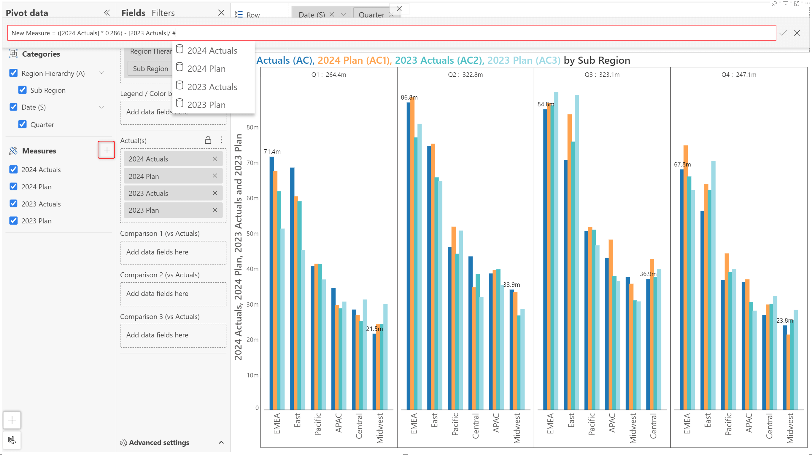
The measure can then be assigned to the Actual or Comparison buckets and plotted like measures from the data source.
Be the first to experience the initial version of the Analytics+ storyboard and directly influence the development of the final product with your feedback. Please be mindful that this is a preliminary version, intended to give you a glimpse into the evolving storyboard. Once all the moving parts come together, the storyboard will enable you to create dashboards in a matter of minutes.
The latest version has much better performance compared to the older versions. Performance optimization has been done at both the data processing and visual rendering layers.
The Data processing layer is where Analytics+ receives data from Power BI, and processes it to prepare for many operations like ranking, sorting, etc. This is now enhanced to function seamlessly along with many more such operations.
Visual rendering is also boosted simultaneously as common and important data points such as minimum and maximum, average values, etc., which are used for plotting axis labels and data labels are stored for an instant fetch and render. Unlike most native Power BI visuals, Analytics+ can render up to 30,000 data points for all chart types.
As a best practice and for a seamless experience when you are working with high data volumes, it's recommended to apply any necessary filters. You can find the data point limitations on Power BI charts here: Apply data point limits and strategies by visual type - Power BI | Microsoft Learn.
In the 4.0. release, as a report author, you can decide whether report users can switch between charts, cards and tables. For instance, if you have created a chart-based report, you can disable the card/table tabs in the reading view. Similarly, for tabular reports, you can choose to hide the chart and card tabs.
When tabs are enabled, users will be able to see all 3 tabs in reading view.
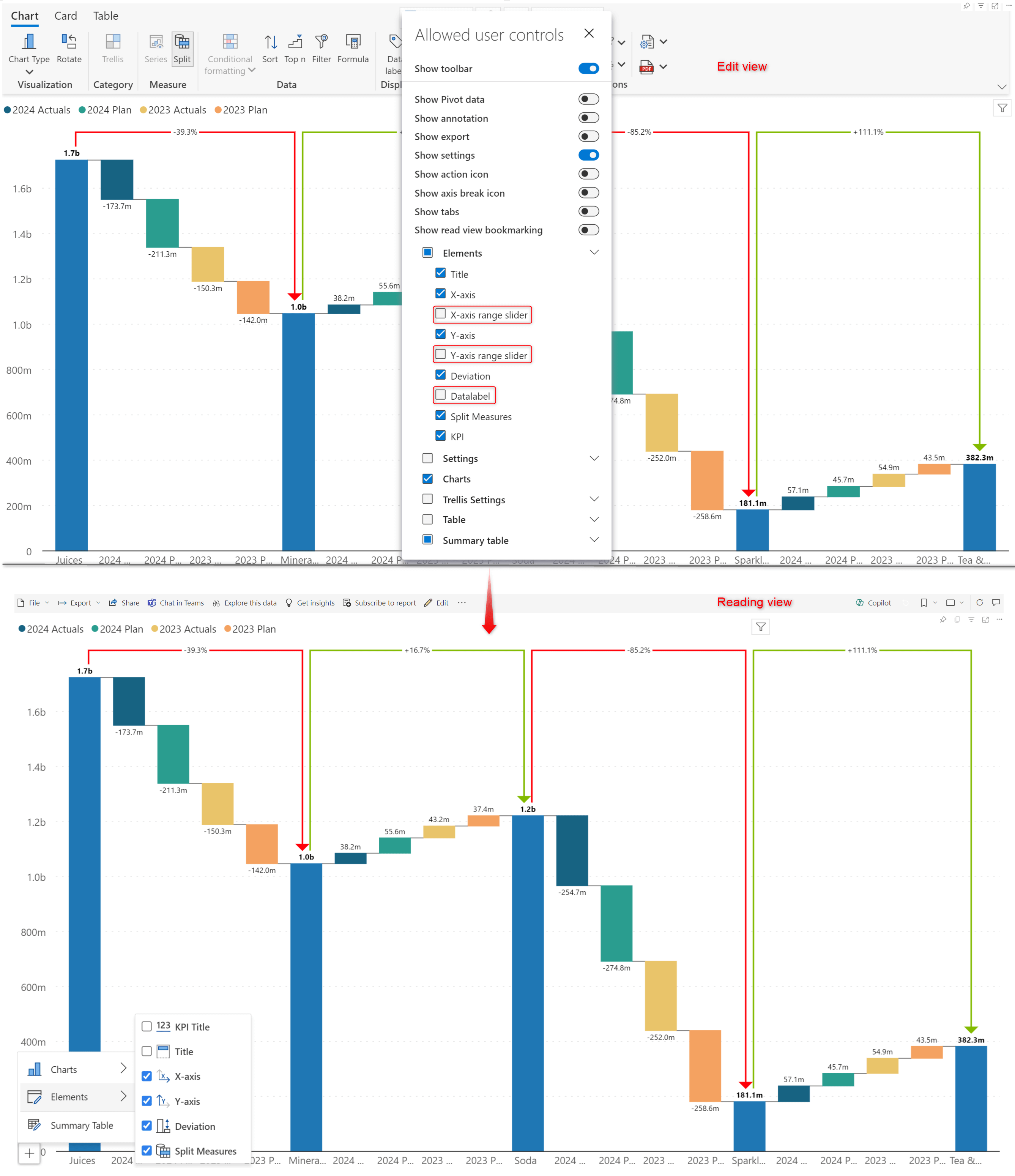
You can disable the ‘Show tabs’ option from the Allowed user controls window to hide tabs in reading view.
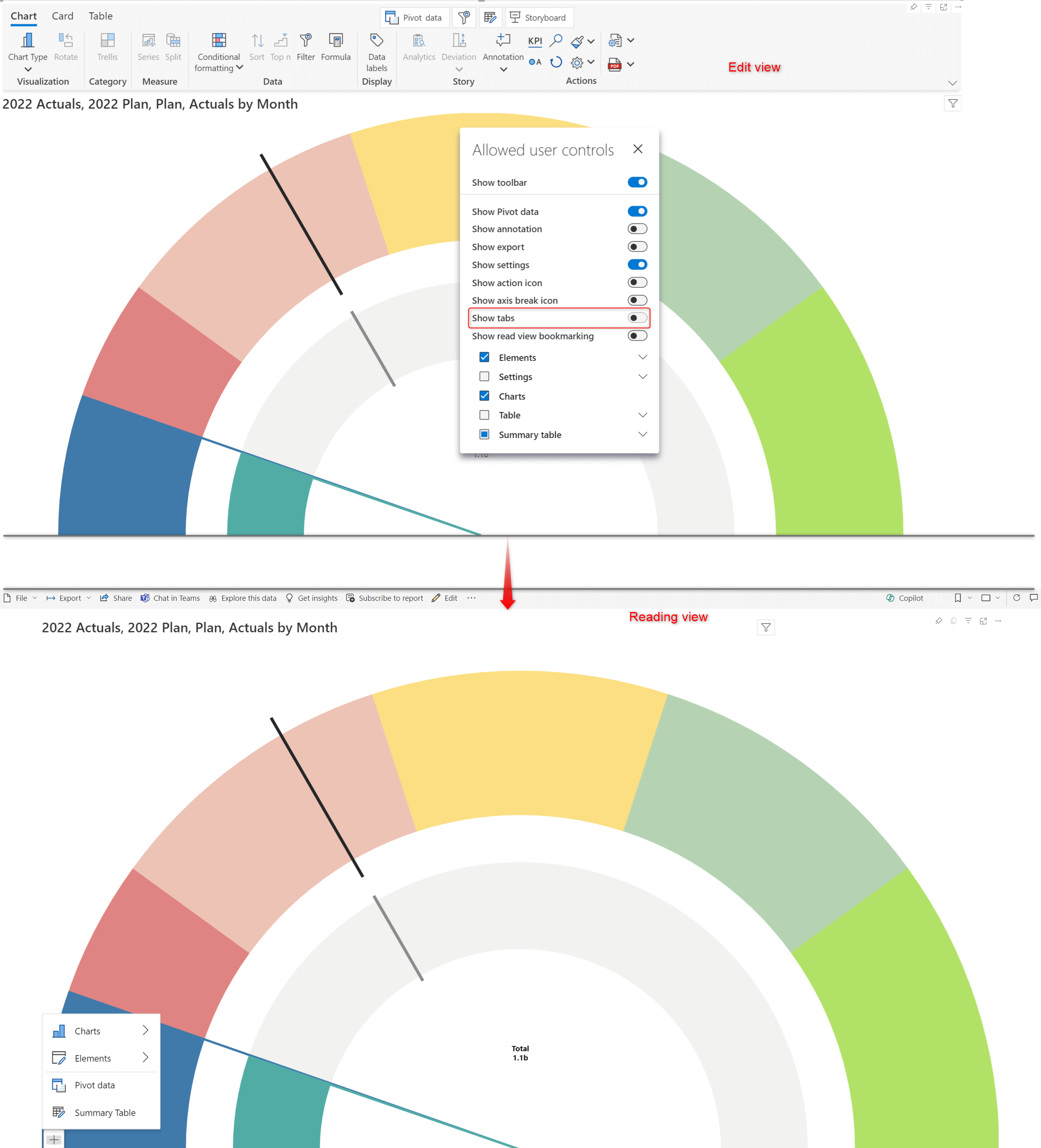
You can also use the Allowed user controls options to disable the data label and range slider options in reading mode.
The image below shows the customization options in reading view when data labels and range sliders and enabled.
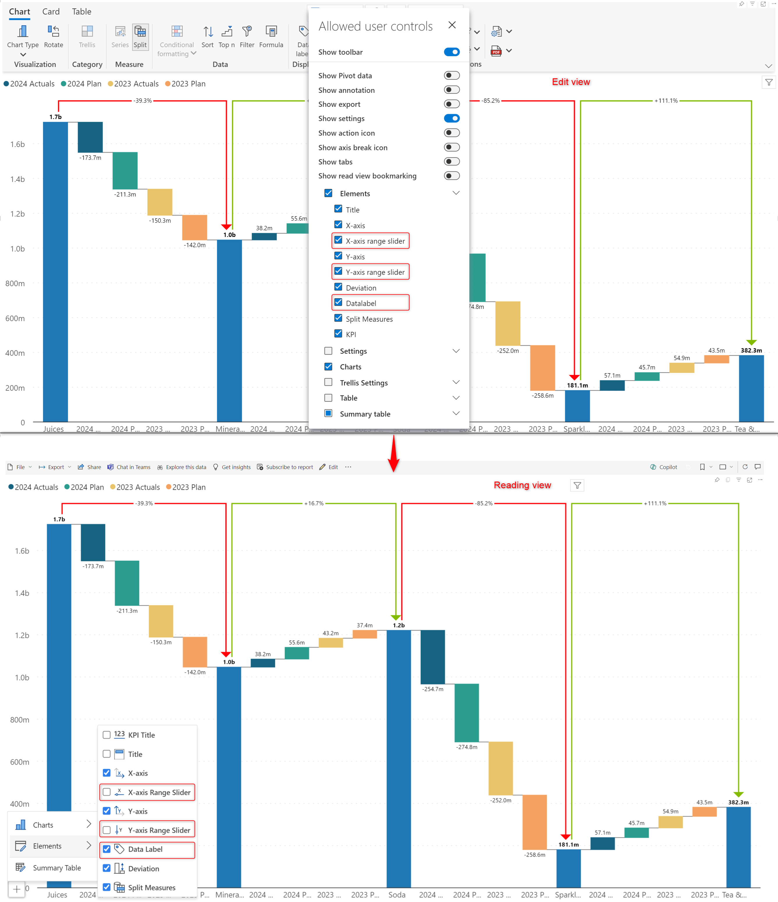
When you uncheck these options from the 'Allowed user controls' window, report users will not be able to see them in the reading view Elements menu.
With that, we come to the end of the 4.0. release updates.
If you have any questions about the new release or need assistance, feel free to reach out to us.
The refinements that we continuously make to Analytics+ were made possible with your support and feedback. We look forward to your suggestions and have many more exciting innovations lined up! Visit the Inforiver Community to share your ideas, vote on other submissions, and interact with other users.

Inforiver helps enterprises consolidate planning, reporting & analytics on a single platform (Power BI). The no-code, self-service award-winning platform has been recognized as the industry’s best and is adopted by many Fortune 100 firms.
Inforiver is a product of Lumel, the #1 Power BI AppSource Partner. The firm serves over 3,000 customers worldwide through its portfolio of products offered under the brands Inforiver, EDITable, ValQ, and xViz.

Learn how to accelerate your migration from Tableau, Qlik, Cognos, Spotfire, and SAP to Power BI using Inforiver - featuring faster development, advanced visuals, and a live demo.