Upcoming webinar on 'Inforiver Charts : The fastest way to deliver stories in Power BI', Aug 29th , Monday, 10.30 AM CST. Register Now
Upcoming webinar on 'Inforiver Charts : The fastest way to deliver stories in Power BI', Aug 29th , Monday, 10.30 AM CST. Register Now
A delayed BI migration can cost organizations hundreds of thousands in lost productivity for every week a go-live is delayed. In one recent migration, report rebuilds consumed more than 60 percent of project resources and took three times longer than expected.
In Part 1, we explored how architectural choices shape long-term outcomes. This installment moves to the next pressure point: the report rebuild. Most migration plans account for data movement, yet far fewer estimate the effort required to recreate legacy reports in a form business users recognize and trust. In many projects, rebuild work quietly exceeds the time spent moving data and becomes the primary driver of cost and delay.
In some engagements, this phase represents the majority of migration workload. One team completed their database transfers in a week but spent the next month rebuilding structured financial reports so executives would recognize them. The true scale of this effort usually becomes visible only once rebuilding begins.
Legacy platforms like SAP BusinessObjects and Cognos were designed for dense, structured reporting. Over time, these reports became the operational "single source of truth." For a CFO, opening a familiar legacy report feels like opening the company's playbook. The layout, bolded subtotals, and decades-old color conventions signal that every detail has already been validated.
For executives, trust is not just about numbers matching; it is about seeing data in the exact shape they expect. Even a small formatting change can trigger concern because, in their experience, format equals trust. When organizations migrate, stakeholders expect that familiarity to continue.
However, business users evaluate reports differently from developers. They notice row order and indentation as closely as the numbers themselves. Teams often enter a “penny-finder phase”—a grueling period spent tracking down tiny variances caused by rounding rules or subtle differences in calculation behavior.
Power BI was designed for interactive analytics, not static, structured financial reporting. Rebuilding these reports introduces layout requirements that do not map cleanly to native visuals.
Developers often respond with helper tables and layers of nested measures to reproduce familiar layouts. A single P&L visual might require dozens of measures simply to handle conditional formatting and subtotal logic. Over time, this leads to “DAX bloat.” Presentation logic accumulates inside calculations, gradually making the semantic model increasingly brittle.
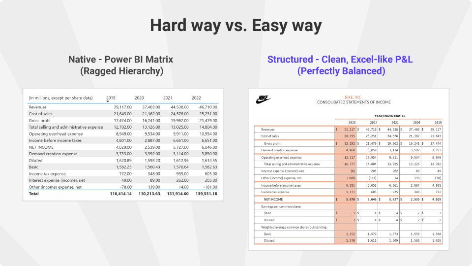
Some organizations address this by using visuals designed specifically for structured financial reporting. Tools such as the Inforiver BI Bundle provide capabilities that mirror the expectations of finance and operations teams accustomed to Excel or legacy reporting platforms.
For example, structured reporting visuals support ragged hierarchies by ignoring null or zero values, maintain financial formatting conventions such as indentation and sign inversion, and allow teams to apply consistent report templates across financial statements. They also provide features commonly expected in executive reports, such as KPI indicators in headers, dynamic report footers, company branding, and contextual notes.
By moving these presentation requirements into the visual layer, organizations avoid embedding formatting logic inside the semantic model. This keeps measures cleaner and reduces rebuild complexity.
Pixel-perfect replication can reduce resistance because stakeholders recognize the layout. Yet this drive for a one-to-one replica raises a critical trade-off: Is matching every detail worth delaying broader benefits such as self-service analytics?
Exact replication often pushes presentation rules directly into the semantic model. Formatting rules that belong in the reporting layer gradually move into calculations. As complexity grows, flexibility declines. The issue is not visual fidelity, but where the logic lives.
Rebuild work is often underestimated because early pilots involve only a few reports. At enterprise scale, the situation changes. Hundreds of reports must be recreated, each with subtle layout differences.
Without a consistent strategy, teams repeatedly solve the same formatting problems. Developers end up recreating the same logic repeatedly because report structures differ slightly. At this stage, rework—not modeling—becomes the primary constraint on progress.
Successful migrations focus on preserving business meaning rather than reproducing every formatting rule. To avoid the rebuild trap, focus on three practical steps:
How can we better estimate the time and resources needed for report rebuilds?
Estimation often fails because teams count report volume rather than structural complexity. We recommend a Complexity Audit that categorizes reports by the number of custom hierarchies and row-level formatting rules.
What early warning signs indicate that rebuild work is becoming a project bottleneck?
The biggest red flag is “90% completion syndrome,” where a report appears finished but remains in QA for weeks due to minor formatting discrepancies.
How do we decide when to use native Power BI visuals versus third-party tools?
If a report requires Excel-like features—such as ragged hierarchies, custom row layouts, or financial formatting rules—native visuals often require complex DAX workarounds.
Migration succeeds when the new system becomes scalable, maintainable, and trusted. In the final part of this series, we will move from rebuild considerations to production realities, including governance, distribution, and sustaining performance.
If you are navigating modeling or rebuild pressure in an active migration, we will examine these patterns in more depth during our upcoming masterclass.
Register Here: Join peers from more than 500 organizations already enrolled and learn how teams are reducing report rebuild time in real-world migrations.

Inforiver helps enterprises consolidate planning, reporting & analytics on a single platform (Power BI). The no-code, self-service award-winning platform has been recognized as the industry’s best and is adopted by many Fortune 100 firms.
Inforiver is a product of Lumel, the #1 Power BI AppSource Partner. The firm serves over 3,000 customers worldwide through its portfolio of products offered under the brands Inforiver, EDITable, ValQ, and xViz.