Upcoming webinar on 'Inforiver Charts : The fastest way to deliver stories in Power BI', Aug 29th , Monday, 10.30 AM CST. Register Now
Upcoming webinar on 'Inforiver Charts : The fastest way to deliver stories in Power BI', Aug 29th , Monday, 10.30 AM CST. Register Now
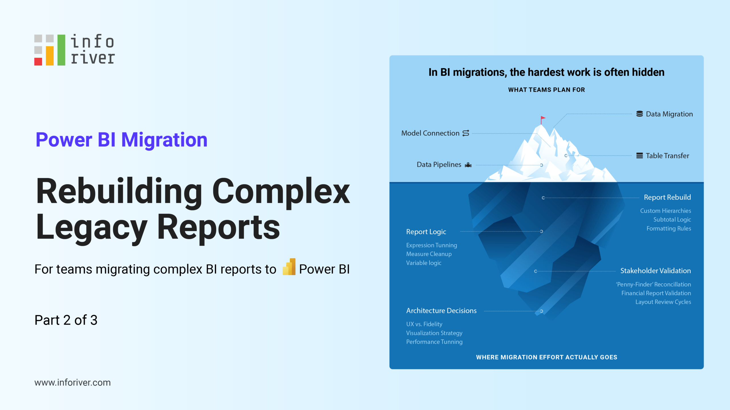
In Part 1 of this series, we explored how foundational modeling decisions—such as moving from flat logic to a clean star schema—impact long-term performance and scalability. In Part 2, we examined the hidden effort of rebuilding legacy reports, specifically focusing on the “looks right” problem and why formatting often becomes the primary project bottleneck.
This final installment focuses on the next phase: moving from rebuilt reports to a sustainable production strategy at scale. Rebuilding a report is only half the journey. The real challenge is designing a system that supports diverse reporting needs at scale without complexity growing unchecked. Many migrations appear successful at the rebuild stage but begin to struggle once deployed across the enterprise. What works for a 10-user pilot often fails under the weight of 5,000 users, complex row-level security, and the “feature creep” of a live production environment.
Power BI is often positioned as a “do-it-all” platform, but organizations quickly discover that different departments operate with fundamentally different expectations. These are not just variations of the same need; they are distinct reporting patterns that require different architectural approaches. There is no single “correct” way to build every report in Power BI.
When organizations force all of these needs into a single native approach, three things happen. The semantic model becomes overloaded with "helper columns." DAX begins to carry most of the formatting logic, and maintenance overhead skyrockets.
The issue is not Power BI’s capability; it is a lack of alignment between the use case and the approach. At scale, misalignment—not tooling—is what breaks BI systems.
To scale effectively, reporting needs should be grouped into four clear patterns. Each pattern requires a different design philosophy to ensure that calculation logic stays in the model and presentation logic stays in the reporting layer.
This category includes P&L statements, balance sheets, and operational scorecards, where layout and structure are tightly defined. These are the reports where “format equals trust.”
These reports require multi-level hierarchies, precise subtotals, indentation, sign conventions, and consistent row-level formatting. Native visuals, such as the Power BI Matrix, work well for basic pivot-style analysis. However, as complexity grows—specifically regarding “ragged hierarchies” where different departments have different organizational depths—limitations appear.
To solve this natively, developers often resort to increasingly complex DAX workarounds to hide blank rows or force custom sorting. Specialized tools like the Inforiver Reporting Matrix address this by handling layout and structure directly in the visual layer. Features like sign inversion, dynamic footers, and cell-level commentary allow teams to recreate familiar reports while keeping the underlying DAX clean and focused solely on business logic.

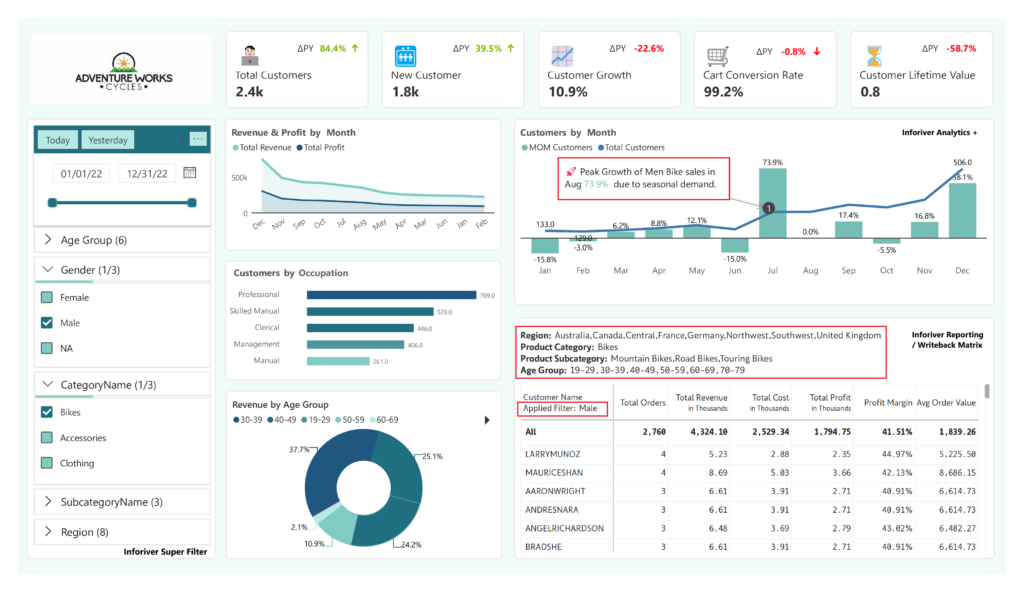
In many executive reports, the challenge isn’t just the layout—it’s how users interact with the data. In complex environments, standard slicers can become overwhelming. Users need to understand the context of their view: What filters are currently active? How does this view compare to the global average? Tools like Inforiver Super Filter extend this capability by enabling advanced filtering logic and displaying active filter selections directly in the report header. This provides much-needed transparency for executive audiences making decisions, ensuring they know exactly what subset of data they are analyzing.
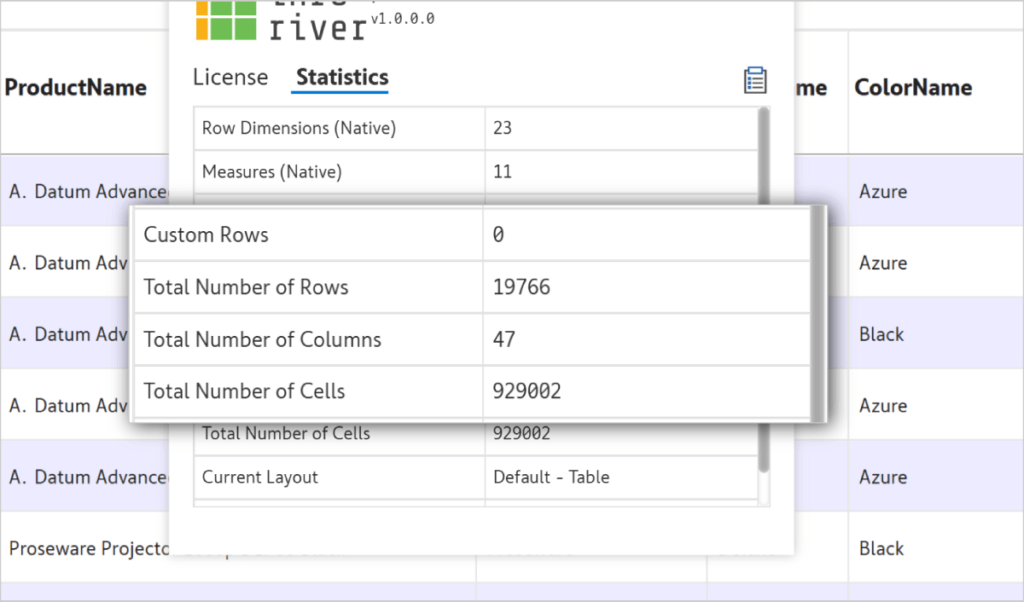
Some reporting scenarios are driven by sheer volume. These include logistics logs, audit trails, or transaction-level analysis where users need to sort through hundreds of thousands of rows.
Traditional visuals can struggle with very dense datasets, leading to the “spinning wheel” that frustrates business users. This performance lag often drives users back to “Export to Excel,” which breaks the data’s security, lineage, and governance. The Inforiver Premium Table is designed for these high-performance tabular needs, allowing for advanced grouping and aggregation on the fly. By keeping users inside Power BI for their dense data needs, you maintain a single source of truth—and more importantly, you avoid pushing users back into unmanaged Excel workflows.
Data without context is difficult to act on. High-level leadership often needs a narrative, not just a grid of numbers. This involves comparative analysis (Actuals vs. Budget vs. Forecast) and the ability to explain variances with text.
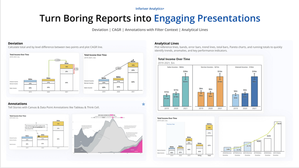
While standard charts handle basic trends, complex storytelling benefits from IBCS-compliant visuals and integrated annotations. Tools like Inforiver Analytics+ allow developers to add reference lines and narrative notes directly onto the charts. This ensures that the insight—the “why” behind the numbers—is captured and distributed alongside the data.
Many migration challenges are not technical limitations, but governance failures. These issues rarely appear during a pilot; they emerge only when the system scales.
Common pitfalls include:
Avoiding these pitfalls requires an intentional “Gatekeeping” process. Not every report should be built the same way—and not every request should be accepted as-is. At scale, consistency is a design decision—not an outcome. The architect must ask: Is this an analytical sandbox, or a structured financial statement? The answer dictates the tool, the logic placement, and the maintenance schedule.
A successful Power BI deployment is not defined by how many reports are rebuilt. It is defined by how well those reports can be maintained, extended, governed, and trusted over time.
At scale, this requires two non-negotiable separations:
Organizations that scale successfully standardize a small number of reporting patterns and apply them consistently. This creates a predictable environment for users and a manageable workload for IT.
Across this three-part series, we have seen that migration success depends on the synergy between three key decisions:
These decisions are interconnected. Modeling affects rebuild complexity. Rebuild decisions affect production scalability. Production strategy determines long-term scalability. When these three are aligned, Power BI transitions from a visualization tool into a scalable, enterprise-ready platform.
If you missed our live deep dive into these patterns, you can now access the Power BI Migration Masterclass on-demand.
We walk through real-world architectural diagrams, demonstrate the Inforiver BI Bundle in action, and solve common “Rebuild Bottlenecks” live. Whether you are moving from SAP BusinessObjects, Cognos, or Tableau, these strategies will help you deliver a scalable, production-ready environment.
👉 [Watch the Masterclass On-Demand: Fixing Modeling, Rebuild & Production Challenges]

Inforiver helps enterprises consolidate planning, reporting & analytics on a single platform (Power BI). The no-code, self-service award-winning platform has been recognized as the industry’s best and is adopted by many Fortune 100 firms.
Inforiver is a product of Lumel, the #1 Power BI AppSource Partner. The firm serves over 3,000 customers worldwide through its portfolio of products offered under the brands Inforiver, EDITable, ValQ, and xViz.