
Upcoming webinar on 'Inforiver Charts : The fastest way to deliver stories in Power BI', Aug 29th , Monday, 10.30 AM CST. Register Now
Upcoming webinar on 'Inforiver Charts : The fastest way to deliver stories in Power BI', Aug 29th , Monday, 10.30 AM CST. Register Now
Funnel charts are typically used to visualize sales, marketing, or project pipelines. However, the typical funnel chart is underwhelming, offering limited insights given the amount of space it occupies (poor data-ink ratio).
To cater to the needs of executives, Inforiver has introduced the Executive Funnel Chart a.k.a Horizontal Funnel Chart (as part of Inforiver Analytics+*). This chart delivers significant improvements over the standard funnel visualization in Power BI and other tools such as Tableau, Qlik, and Spotfire. The visual incorporates best design & visualization practices and additional insights that augment the consumption experience for executives and decision-makers.
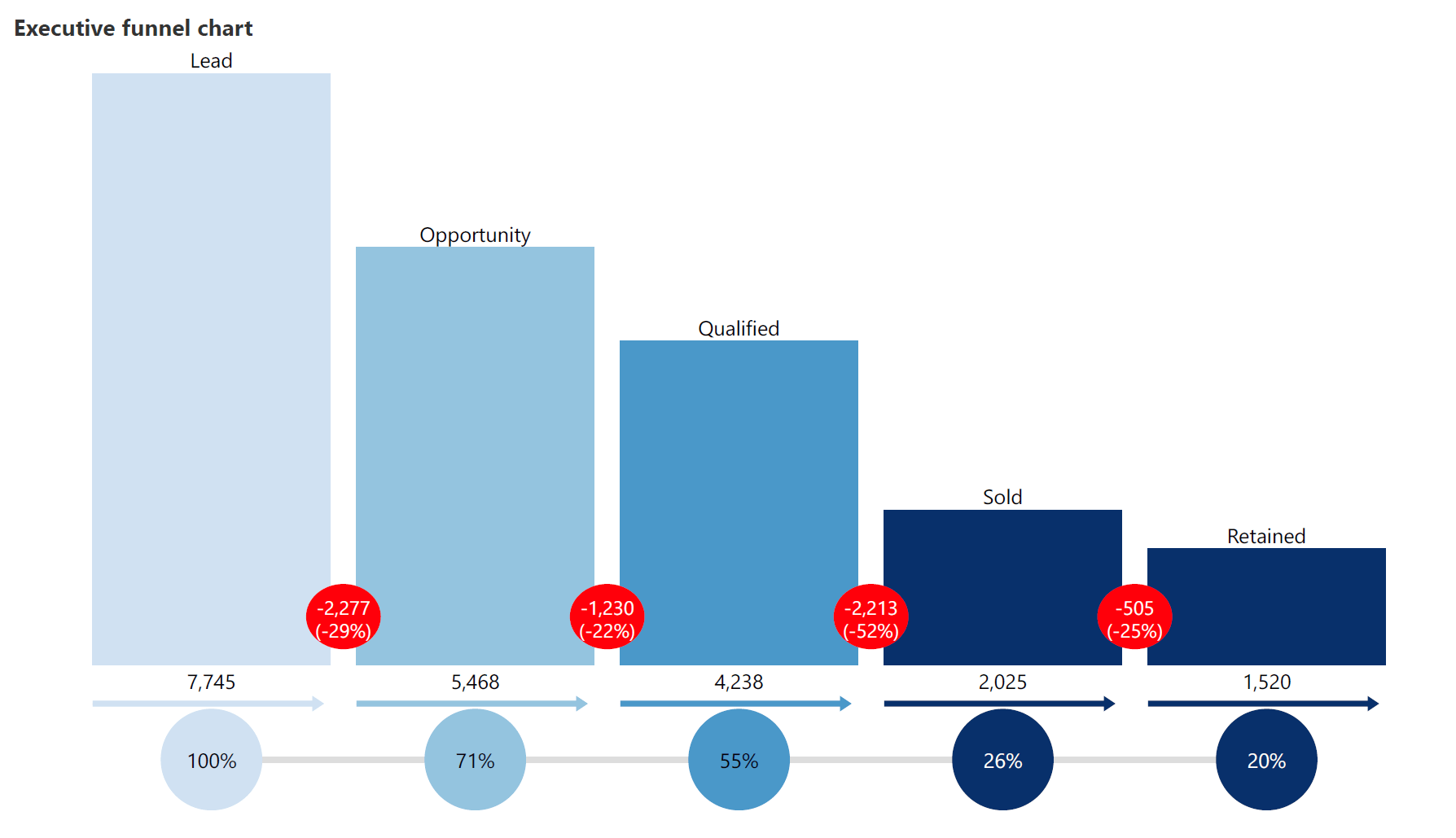
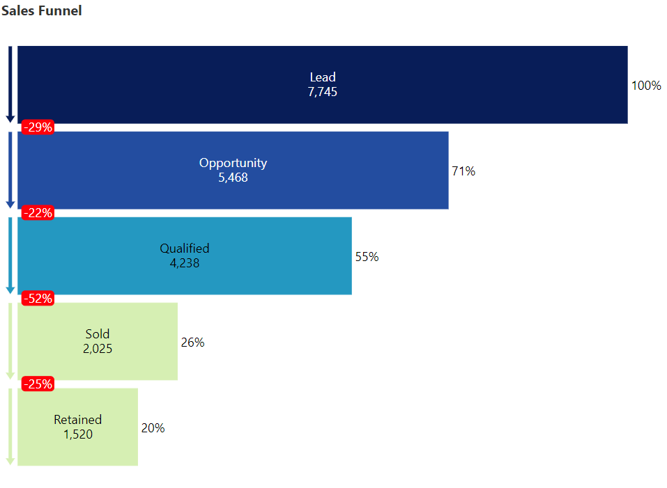
This is how the Executive funnel chart looks.
Before we understand its key features, let us take a quick look at how to create it in Power BI.
Follow these 3 simple steps to create an Executive Funnel using Inforiver Analytics+*.
1. Fetch your data
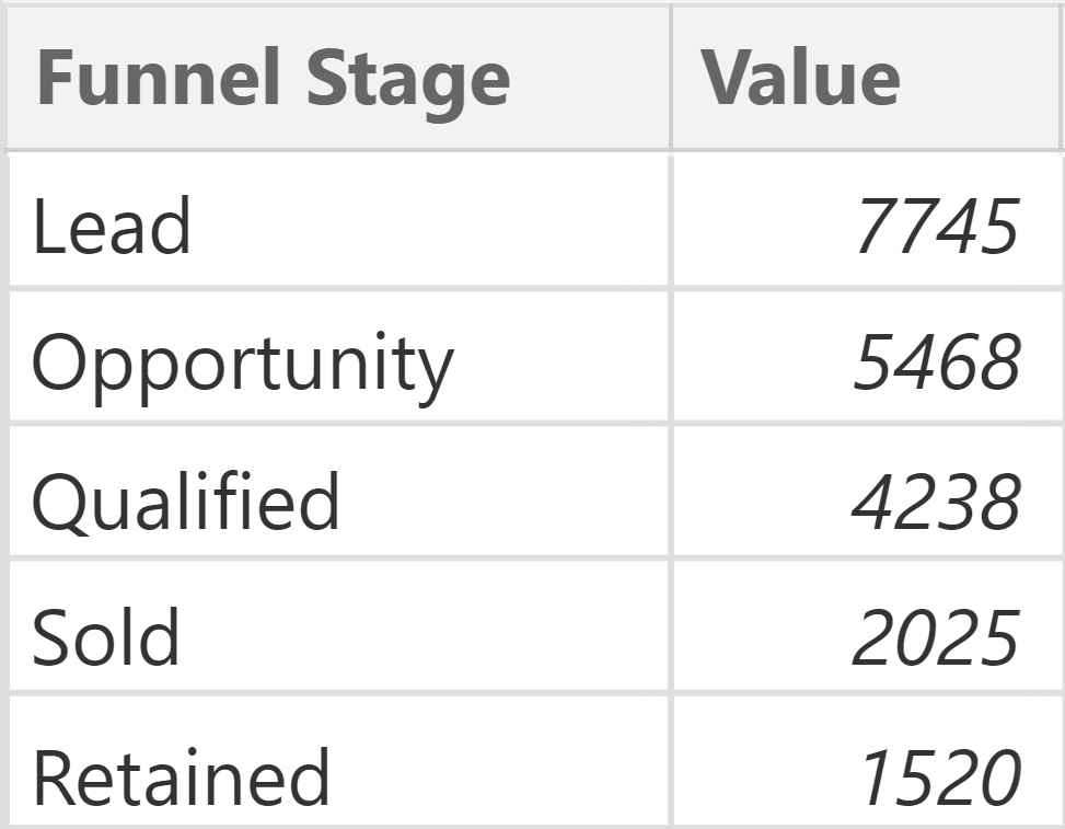
Just as with the standard funnel, you only need two columns to begin with – the funnel stage and value. Fetch your data in Power BI in this format.
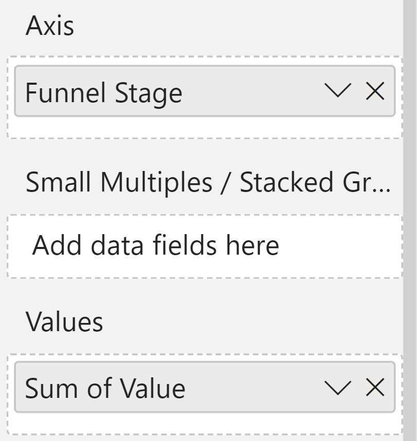
2. Choose Axis and Values
Open Inforiver Analytics+* in your canvas. Drag and drop the “Funnel Stage” column under the Axis field, and the measure under the Values field.
3. Select “Executive Funnel” chart type from the toolbar to change the default chart type (column chart).
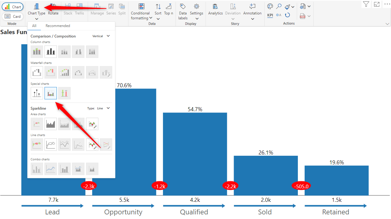
Your Funnel Chart is Now Created!
Additional customization options are available at this stage. You’ll notice that the chart image shown earlier is different from the default look & feel of the executive funnel chart.
Let’s look at the key features of this visual that make it endearing to executives & decision-makers.
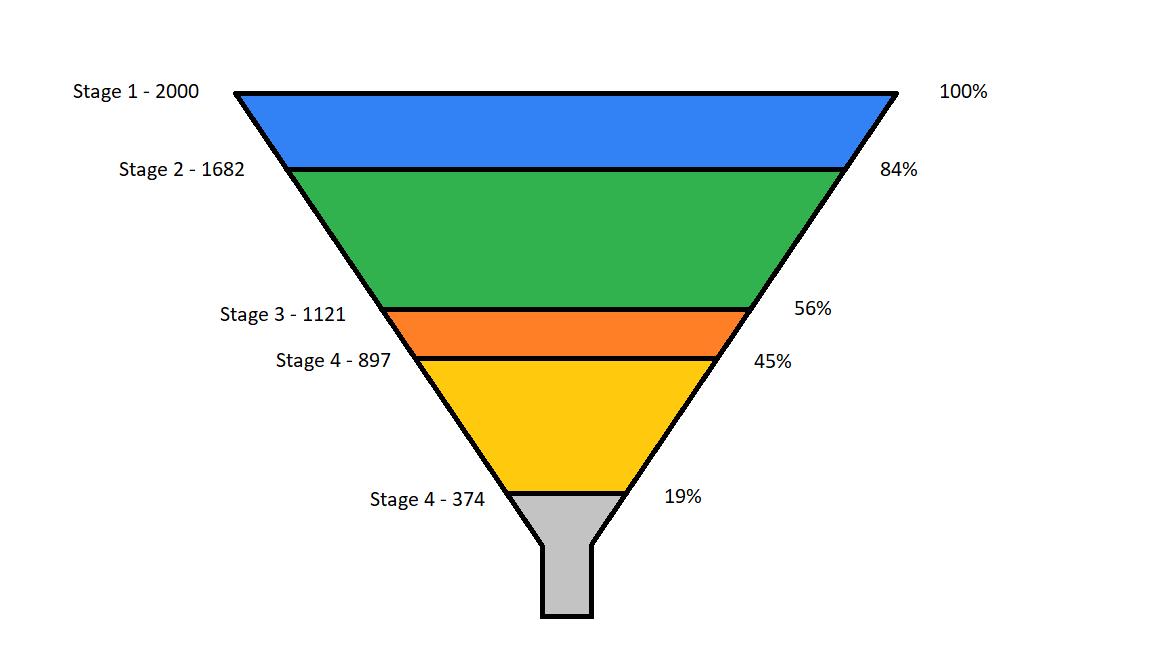
1. More Accurate Visual Representation of Data
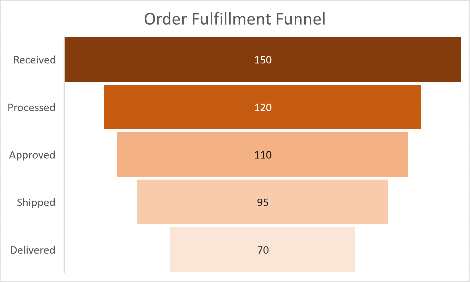
The traditional funnel chart is a literal interpretation of the funnel metaphor as shown on the left below. When you explore closely, you will realize that there are certain ambiguities. For example, is the data represented by the area or height of each stage? How do we consider the rectangular neck of the funnel at the bottom? As a result, insights in a traditional funnel chart are encoded in data labels (in actual values or percentages). Without them, the user would be lost.
By contrast, the Inforiver funnel on the right uses the length of bars to represent values in each stage. Our visual perception improves considerably as a result.
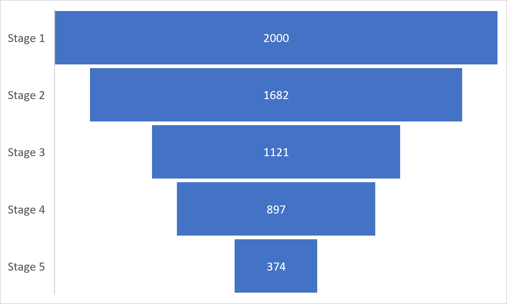
2. Ease of Comparison Between Two Stages
Let us imagine that we need to compare two stages (adjacent or otherwise) in a normal funnel. Even if you center-align bars to create a funnel (as shown in the image on the left below), it is harder to compare magnitude across two stages.
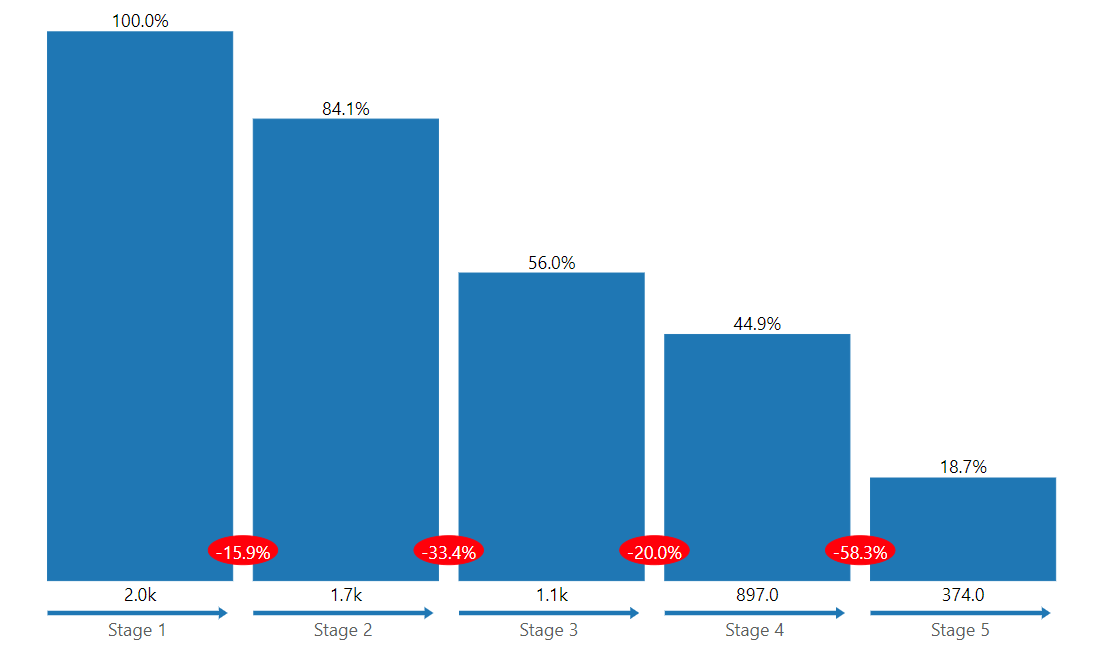
On the other hand, the Executive funnel has its stages starting off on a common baseline (x-axis, as per the image on the right), it is easier to compare the performance of any two stages, adjacent or otherwise.
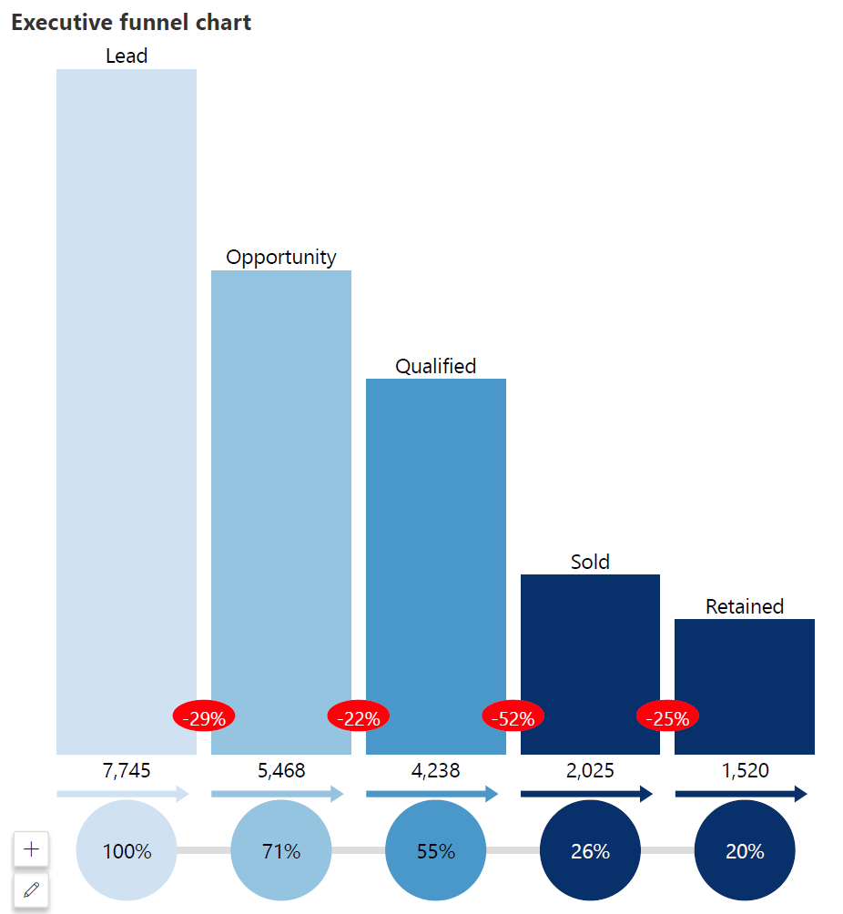
3. Display Retention Rate at Each Stage
To enhance the comparison, the Executive funnel also displays data labels that show the percentage of each stage relative to the first stage. In the sales funnel shown below, one can easily understand what proportion of leads have been qualified, sold-to and retained (55%, 26% and 20% respectively). This is highlighted below the axis.
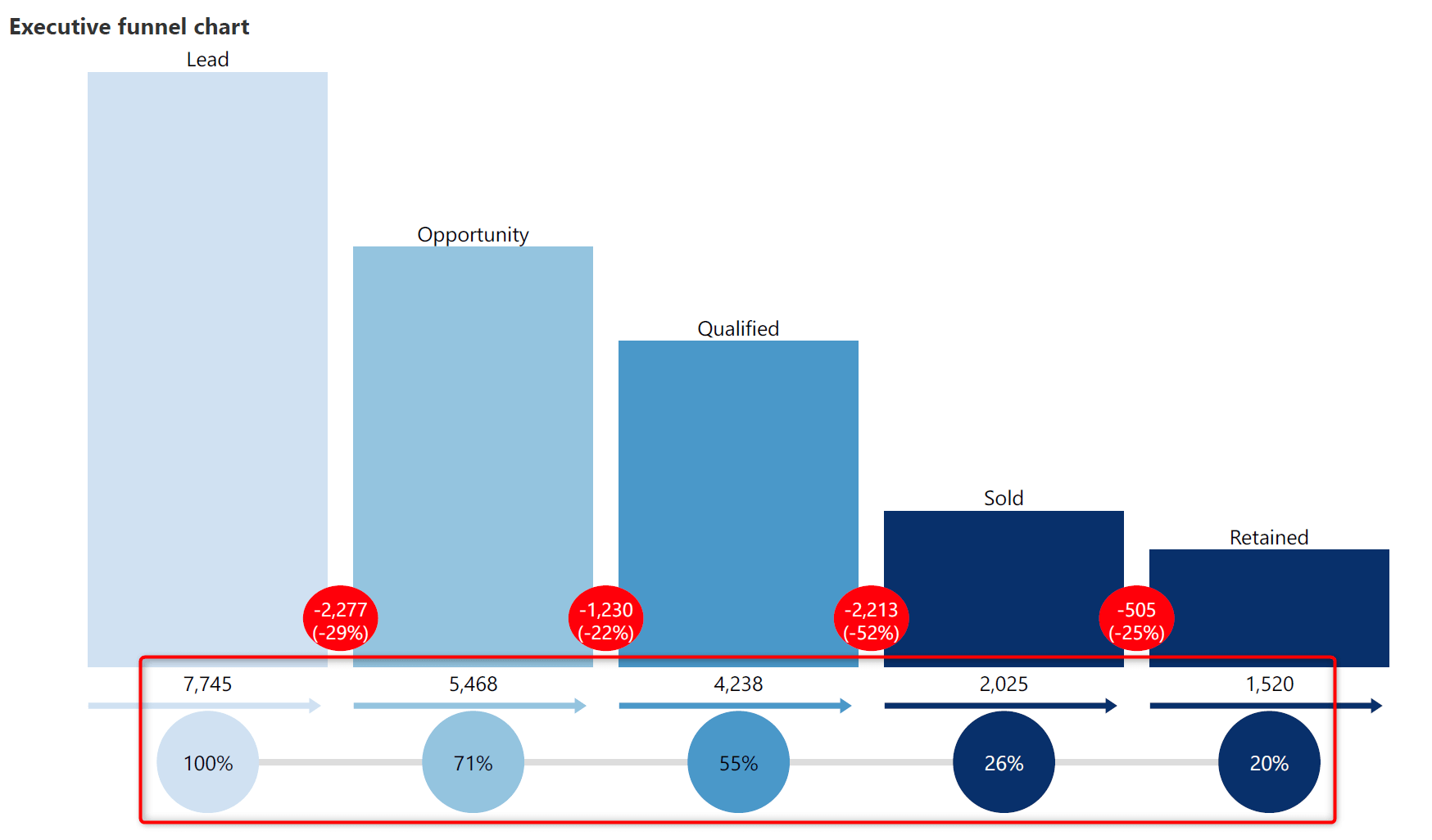
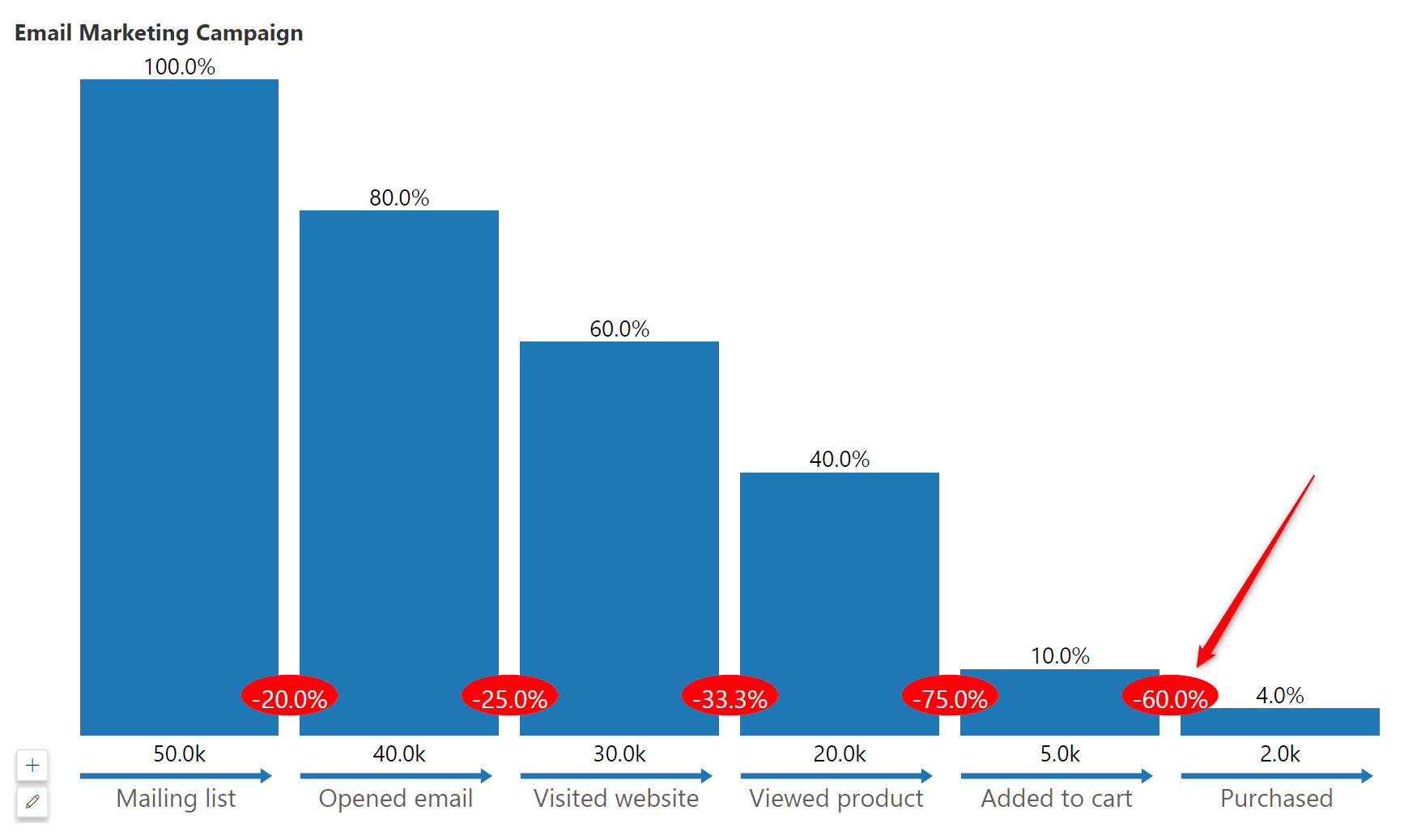
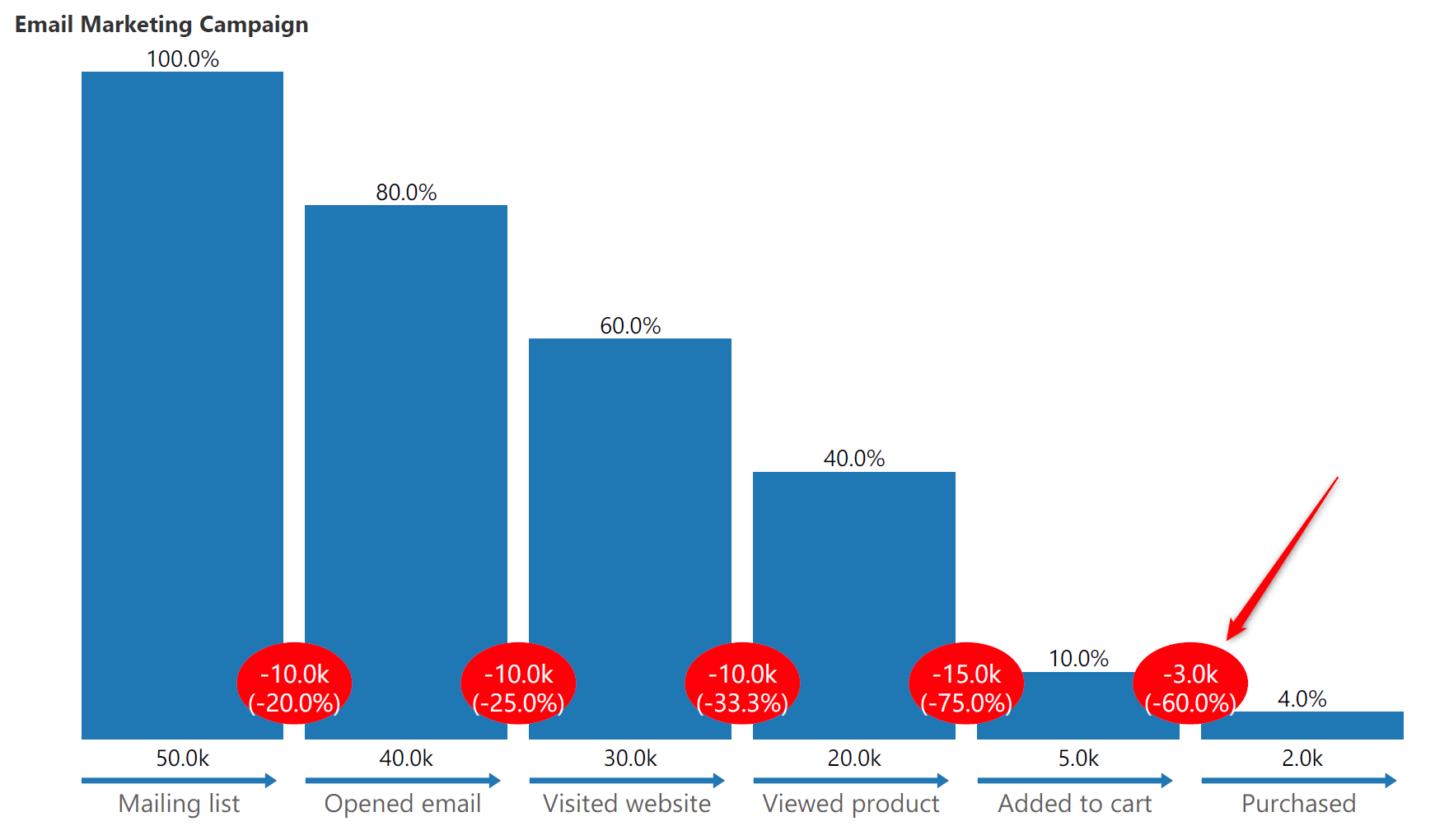
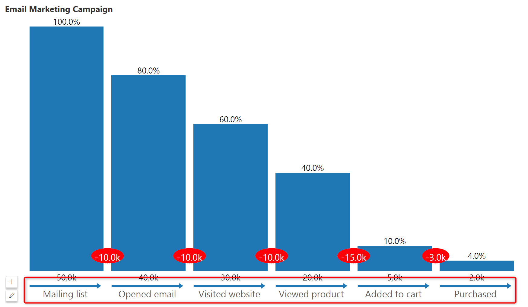
4. Display Funnel Drop-Off / Abandonment Rate
The Inforiver executive funnel also displays stage-to-stage drop off rate, allowing us to see how much flows from one stage to the next.
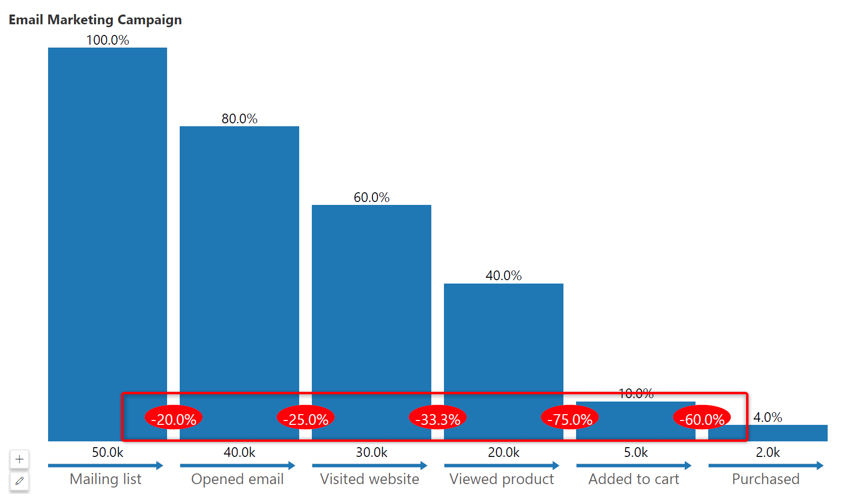
In an e-commerce scenario shown above, you can easily notice that 60% of visitors have abandoned the cart. i.e., they added things to the cart but did not complete the purchase.
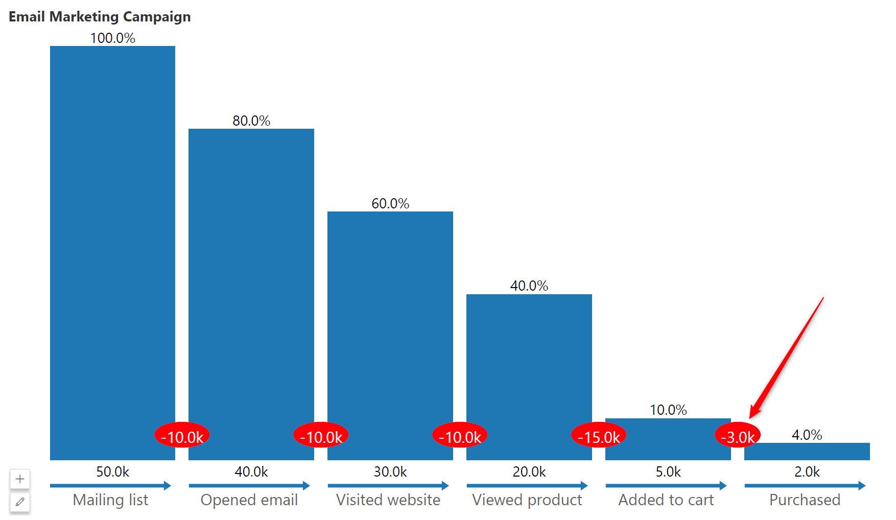
Note that these drop-off values can be displayed as an absolute number, a percentage or both as shown below.
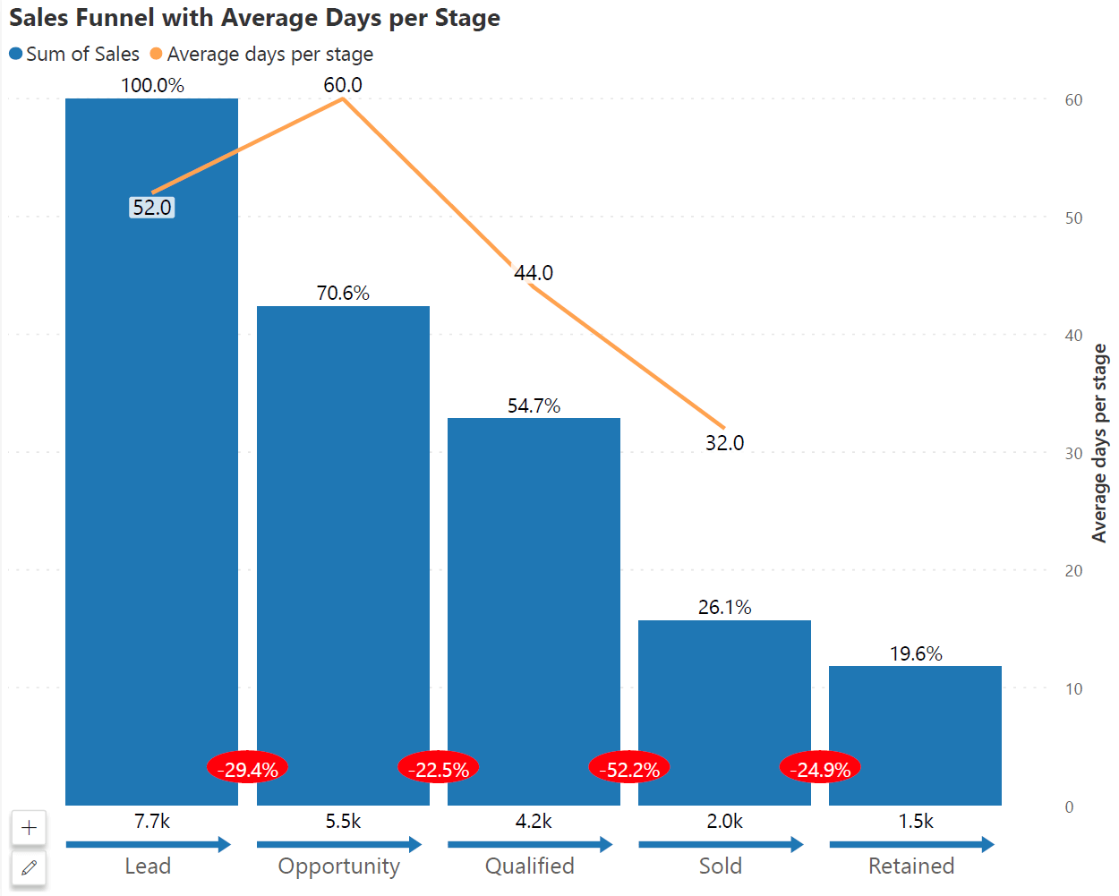
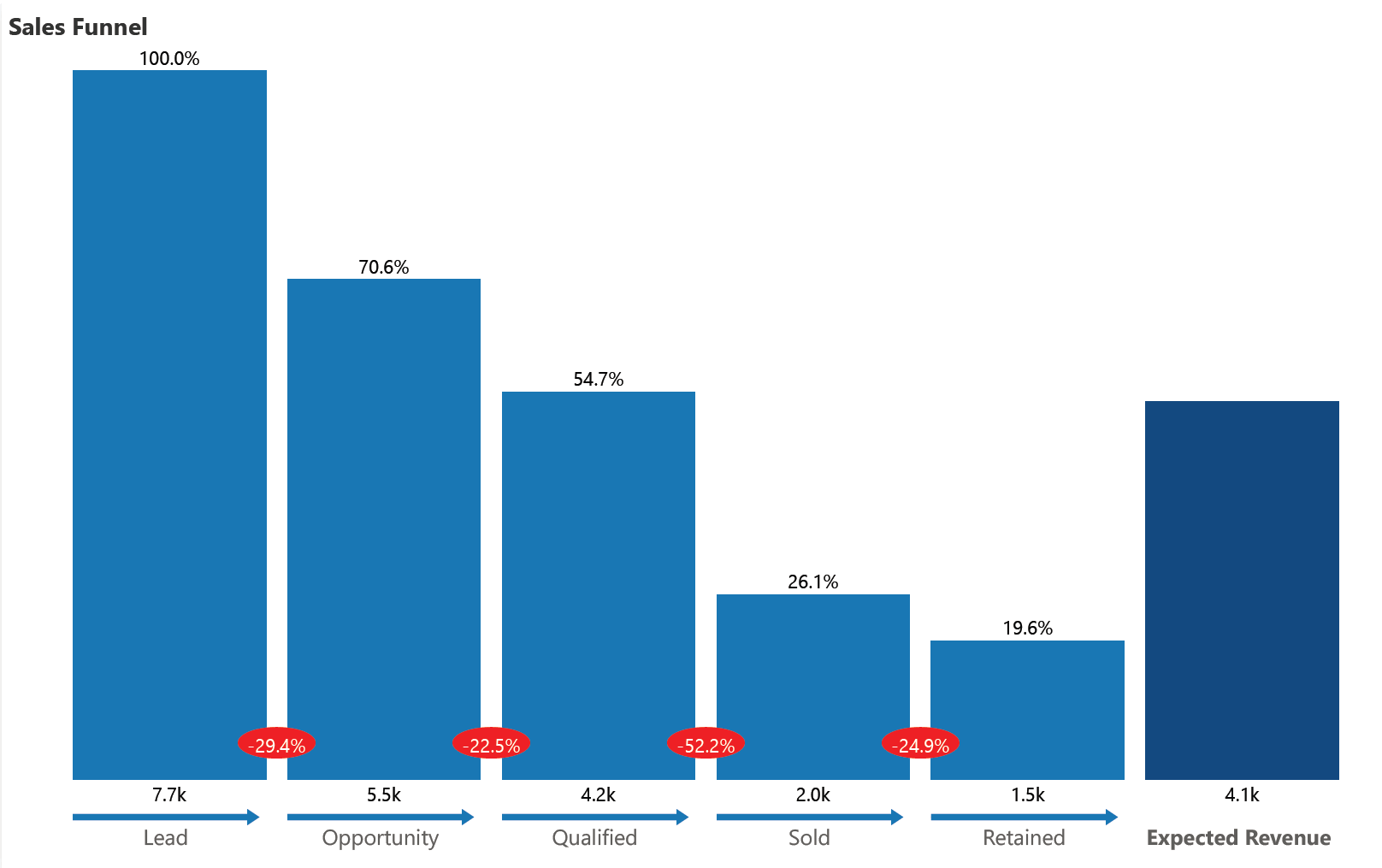
5. Add a Secondary KPI to the Funnel
With the executive funnel chart, you can add a secondary KPI in the form of a line chart or a separate bar at the end as shown below.
In this example below, you can track the average number of days a prospective deal stays in each stage before moving to the subsequent stage.
In the next example below, you can display the expected revenue from all these opportunities (which is usually a sum-product of each opportunity size along with conversion probability based on the stage the deal is in). For example, Expected revenue from the pipeline = 5% of deals in the lead stage + 20% of opportunities + … etc.
6. Display Funnel Flow Direction
The direction of flow between stages is also clearly indicated to make it stand out against another bar or column chart in the same report.
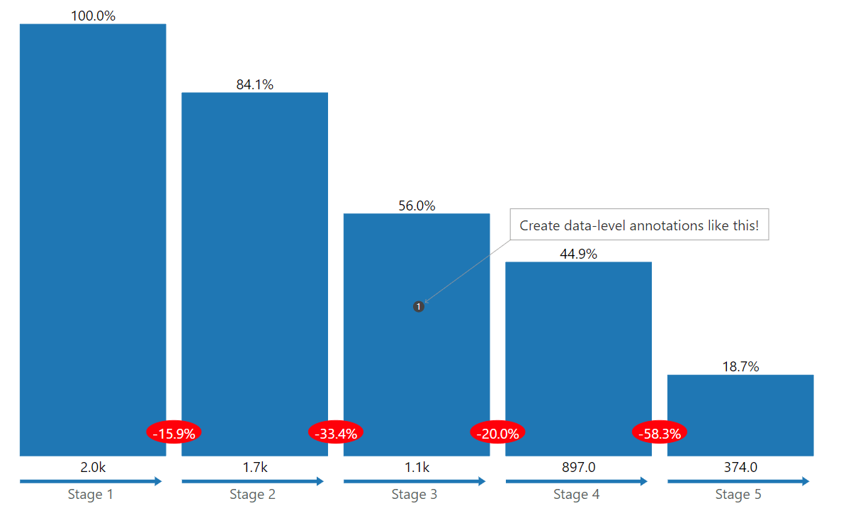
7. Data-Level Annotations
The Executive Funnel supports data-level annotations and comments which can help you deliver context and additional insights into your data.
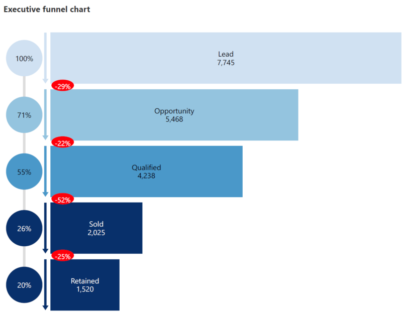
8. Vertical vs. Horizontal Funnel Orientation
Finally, you may choose between horizontal and vertical orientation for your reporting needs.
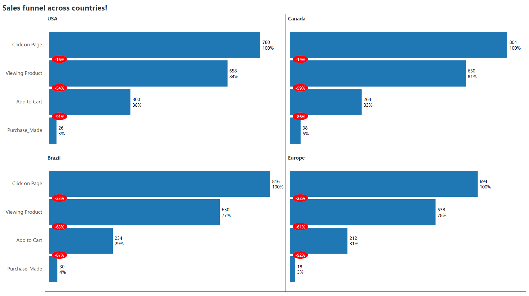
9. Small Multiples
Create an information-rich dashboard to simultaneously analyze several metrics with small, multiple funnels.
Hope you love this new visual from Inforiver. If you would like to try it in Power BI, download your free copy of Inforiver Analytics+ today from Microsoft Appsource and try this demo file for the Inforiver funnel!
*Inforiver Charts has been renamed to Inforiver Analytics+, a 3-in-1 visual for dashboards and storyboards. It offers 50+ charts, cards, and tables.

Inforiver helps enterprises consolidate planning, reporting & analytics on a single platform (Power BI). The no-code, self-service award-winning platform has been recognized as the industry’s best and is adopted by many Fortune 100 firms.
Inforiver is a product of Lumel, the #1 Power BI AppSource Partner. The firm serves over 3,000 customers worldwide through its portfolio of products offered under the brands Inforiver, EDITable, ValQ, and xViz.
 Transform Power BI dashboards into decision-driving tools. Discover data visualization best practices tailored for Power BI users.