Upcoming webinar on 'Inforiver Charts : The fastest way to deliver stories in Power BI', Aug 29th , Monday, 10.30 AM CST. Register Now
Upcoming webinar on 'Inforiver Charts : The fastest way to deliver stories in Power BI', Aug 29th , Monday, 10.30 AM CST. Register Now
Table and matrix visuals differ from your typical chart & graphs.
Unlike other visualizations, they represent data closest to its original form. They feature values in numeric form rather than focusing upon visual qualities.
Generally, tables and matrices are very commonly used to display dense value structures in static reports and presentations, or as active dashboard controls. Matrices, (also commonly known as Crosstabs or Pivot Tables) are also powerful instruments for data examination when combined with conditional formatting and graphical in-cell visualizations.
However, in many ways, tables and matrices are the same thing. They are both flat displays of rows and columns upon which various manipulations can be performed.
But, there is one key difference. In simple terms, a Table is very similar to data in an ordinary spreadsheet, while a Matrix is very similar to Pivot Table in MS Excel. It aggregates and presents data in a Crosstab or Pivot Table format. In short, as a class of data presentations, Tables are a subset Matrices; and a Table is often best understood in Matrix terms.
A Table is very similar to data in an ordinary spreadsheet, while a Matrix is very similar to Pivot Table in MS Excel
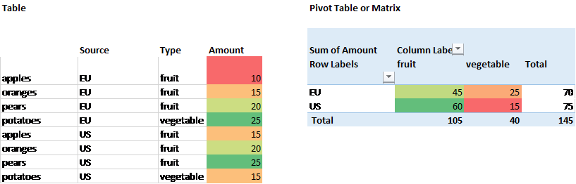
Following are some very basic table and matrix visuals to show how they work. For example, the table below illustrates the produce of a greengrocer who purchases bags of fruits and vegetables to sell from distributors in the US and in the EU.
| Table | |||
| Item | Source | Type | Amount |
| apples | EU | fruit | 10 |
| oranges | EU | fruit | 15 |
| pears | EU | fruit | 20 |
| potatoes | EU | vegetable | 25 |
| apples | US | fruit | 15 |
| oranges | US | fruit | 20 |
| pears | US | fruit | 25 |
| potatoes | US | vegetable | 15 |
This table has three dimensions: Item, Source and Type; and one measure or value, Amount. Each row corresponds to a record. You can sort or filter the table by any category or value field.
For example, let us assume you are interested in analyzing the mix of fruits & vegetables coming from EU and US. Generally, it is a bit difficult to accomplish with a table visual.
According to Stephen Few, "A common problem with tables and graphs is the excessive presence of visual content that isn’t information. Whenever quantitative information is presented, that information should stand out clearly, without distraction." -- “Designing Effective Tables and Graphs” (Perceptual Edge blog)
Please note that what you can do with a table is largely dependent on the software you are using.
This is where a matrix really shines. It can provide a more focused look at data in summary form, avoiding clutter and emphasizing critical figures.
| Pivot Table or Matrix | |||
| Sum of Amount | Column Labels | ||
| Row Labels | fruit | vegetable | Grand Total |
| EU | 45 | 25 | 70 |
| US | 60 | 15 | 75 |
| Grand Total | 105 | 40 | 145 |
The Matrix is essentially the same as a Pivot Table. But, it is a summation table built from raw data—generally Tables—through category selection and summarization. They also show data grouped by rows and columns, but it is summary data rather than detailed line-item records. However, matrices are frequently used as active desktop controls, permitting what-if scenarios and experimentation with different groupings.
When it comes to reviewing raw data, a table is sufficient. But, for analysis needs, as shown in the example above, the Matrix is often desired. Almost all leading BI software including Power BI, Tableau and Spotfire provide matrix reporting capabilities in addition to tabular reporting.
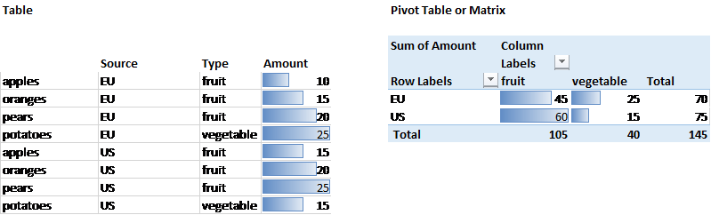
In addition to display of numbers, table and matrix visualizations can be enhanced with cell-level alerts. One typical visualization is a heat chart, in which colors such as green to red are used to highlight the values in individual cells. This draws users’ attention to critical areas.
Another type of visualization is to superimpose a bar chart on top of the table or matrix.
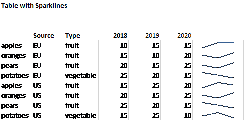
Finally, the addition of Sparklines to a table is becoming increasingly common. These are small single-cell worksheet charts that illustrate trends in the data. For example , here, we expand our diagram to show trend of grocery delivery across time periods.
As active dashboard components, the Matrix visuals hold a place of their own. However, it allows a prodigious amount of experimentation to explore suspected relationships or correlation between categories – something that a Table visualization may not reveal in itself.
Sophisticated matrices also break through two dimensional limitations and provide drill down capabilities.
In conclusion, the Table and the Matrix, in all their variations, are fundamental to data visualization. They are essentially variants of the same idea: manipulation of a basic row vs column record set. They are often used when standard charts are not enough to provide enough information around a specific context.
Curious about Inforiver? Read why Matt Allington (Self Service BI Expert + Microsoft MVP) , Excelerator BI prefers Inforiver over the Analyze in Excel capability that comes with Power BI for ad-hoc analysis.

Inforiver helps enterprises consolidate planning, reporting & analytics on a single platform (Power BI). The no-code, self-service award-winning platform has been recognized as the industry’s best and is adopted by many Fortune 100 firms.
Inforiver is a product of Lumel, the #1 Power BI AppSource Partner. The firm serves over 3,000 customers worldwide through its portfolio of products offered under the brands Inforiver, EDITable, ValQ, and xViz.