
Upcoming webinar on 'Inforiver Charts : The fastest way to deliver stories in Power BI', Aug 29th , Monday, 10.30 AM CST. Register Now
Upcoming webinar on 'Inforiver Charts : The fastest way to deliver stories in Power BI', Aug 29th , Monday, 10.30 AM CST. Register Now
Treemaps are most intuitively understood when seen rather than described, so here’s an example of a treemap!
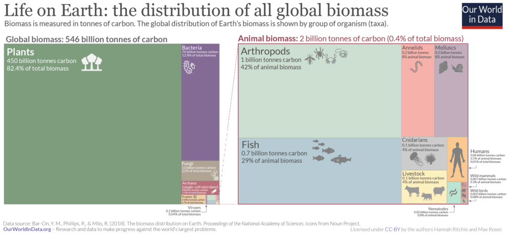
As seen here, treemaps use rectangles divided into sections to represent categories that add up to a whole, with the area of each section in proportion to the value of the corresponding category. They can be thought of as a “squarified” pie chart that can show parts-to-whole relationships and can, in addition, represent hierarchies using nesting. The chart above is a parts-to-whole representation of the distribution of global biomass among the different types of organisms.
The area of each rectangle corresponds to the proportion of global biomass that it represents. For example, we see that plants far outweigh every other category, and in fact weigh more than all the other taxa put together! In this article, we will look at the hierarchical data structure needed for treemaps, discuss their uses and their advantages along with some drawbacks that these charts present. We will then examine some best practices that will help you make effective treemaps, and conclude with a brief discussion on related charts.
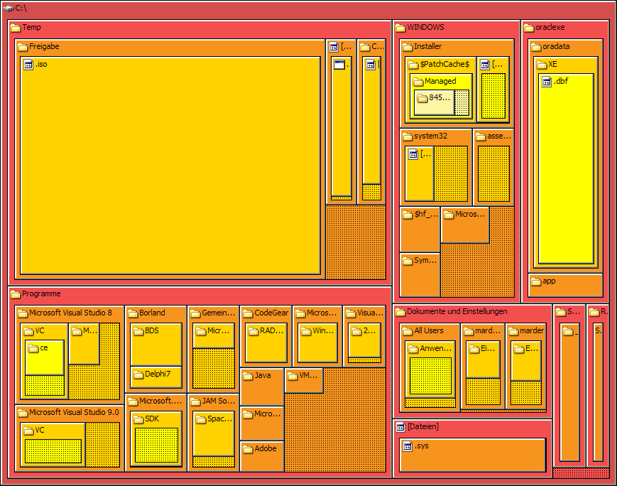
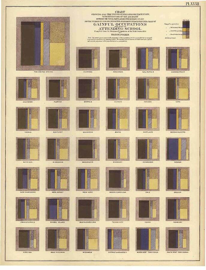
Treemaps in their present form were developed in the 1990s by Ben Shneiderman from the University of Maryland as an alternative to tree diagrams to represent hierarchical information, specifically to visualize file directories on a computer. The image above shows such a chart, with the nested rectangles representing the hierarchy of folders and the files therein. Older “treemap-like” representations do exist, like this chart below from the 1870 Statistical Atlas of the United States, showing the occupational patterns of various states.
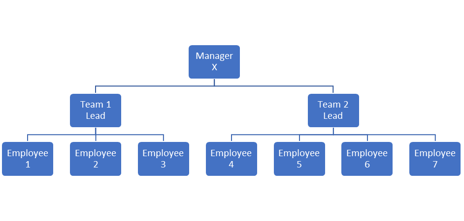
A hierarchy is a nested list with multiple levels. An example of a hierarchical list is shown here, depicting the hierarchy at a company.
This type of hierarchy is usually represented as a tree diagram (which is different from a treemap!) as follows:
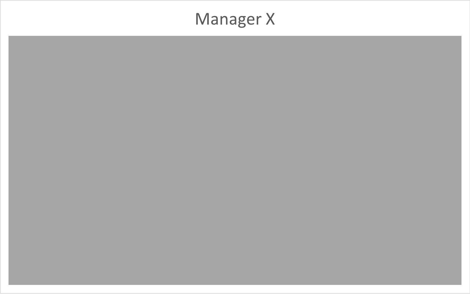
We may represent this hierarchy using nested rectangles in the following steps. The top-level hierarchy (Manager X) is represented by the whole rectangular area, as in the image below.
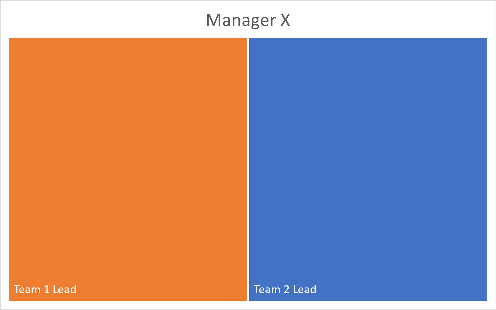
The second level of hierarchy consists of the two team leads that are under the manager. The rectangles representing these can be nested inside the area of the rectangle representing Manager X.
Now, the last level of hierarchy showing the employees in each team can be nested once again inside the rectangles representing the leads.
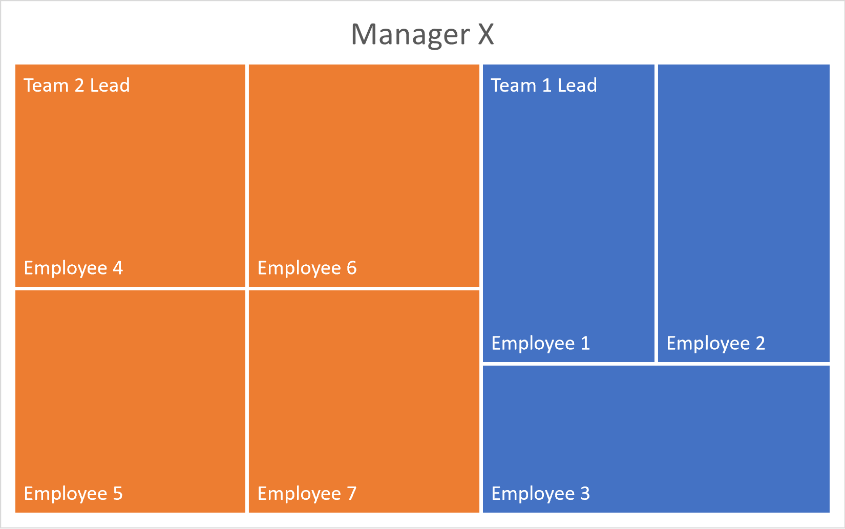
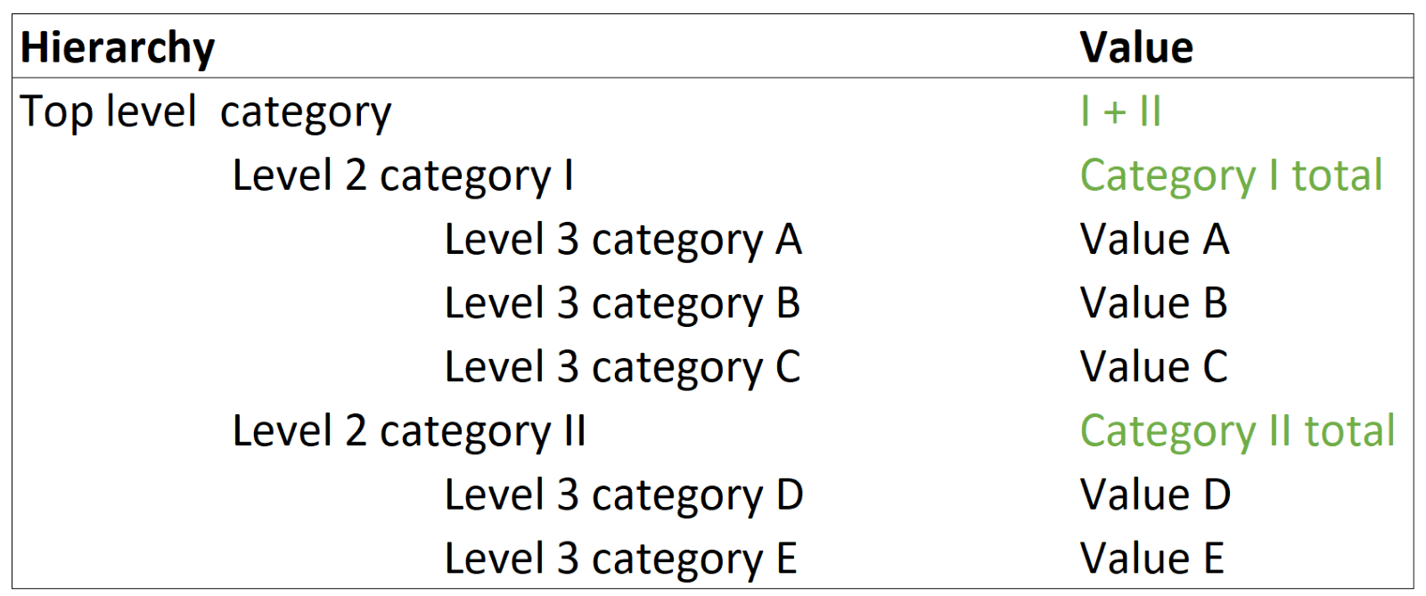
Thus, treemaps use recursive nesting to represent hierarchies. In reality, each of these rectangles would be sized according to the value that it represents. The data structure for a treemap should have the form shown below, with the values for the higher levels usually calculated as the sum of the levels below.
To summarize, treemaps are ideal for datasets with the following properties:
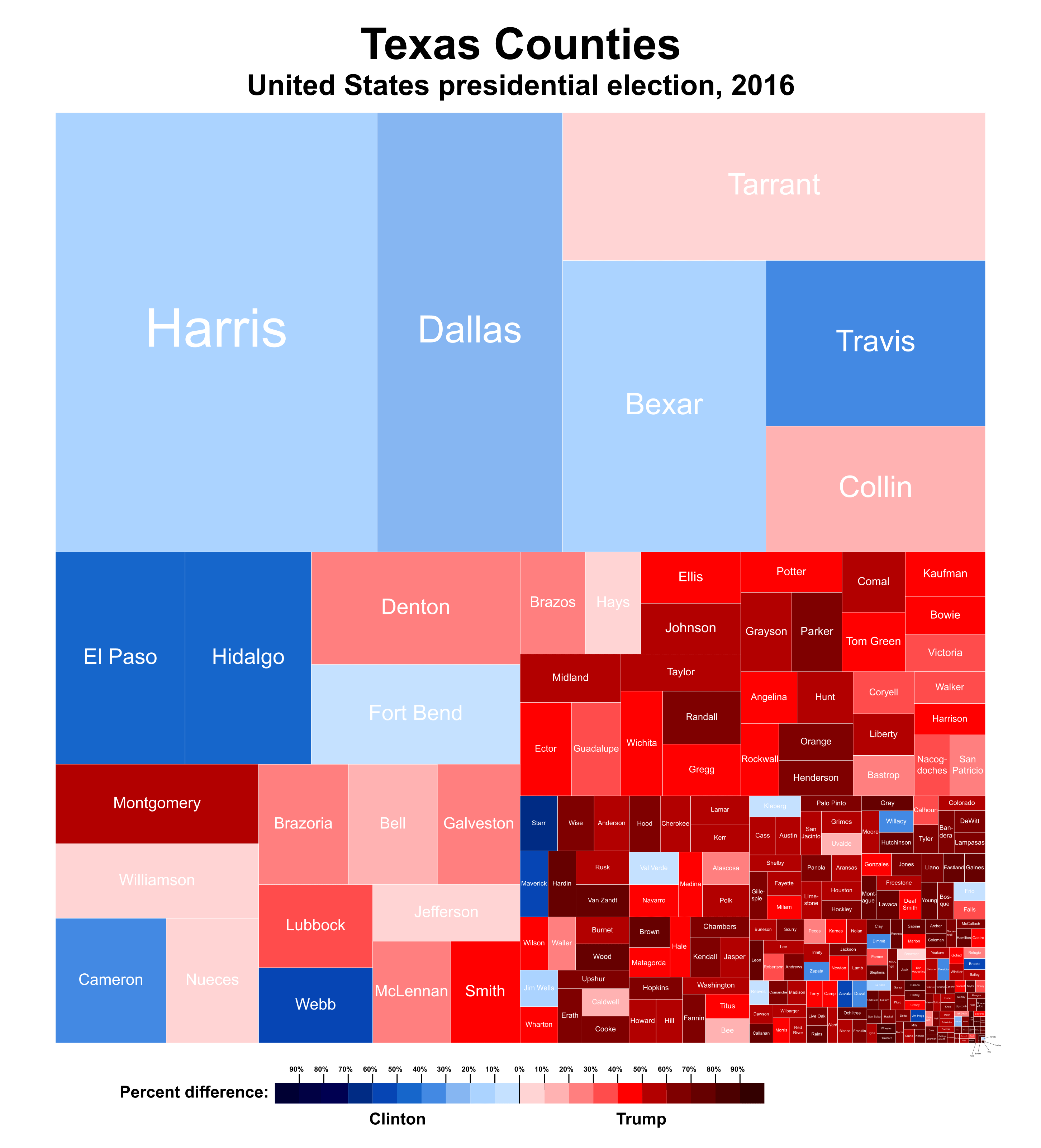
As discussed earlier, treemaps can be seen as a rectangular version of the pie chart, and like a pie chart, they can be used to see how categories add up to a total. In fact, it may be easier for us to estimate rectangular areas rather than slices or angles, as in a pie chart. The following chart, for example, shows how different counties in Texas voted during the 2016 presidential election. Each county is sized by population, and we see a parts-to-whole view of how the populace voted.
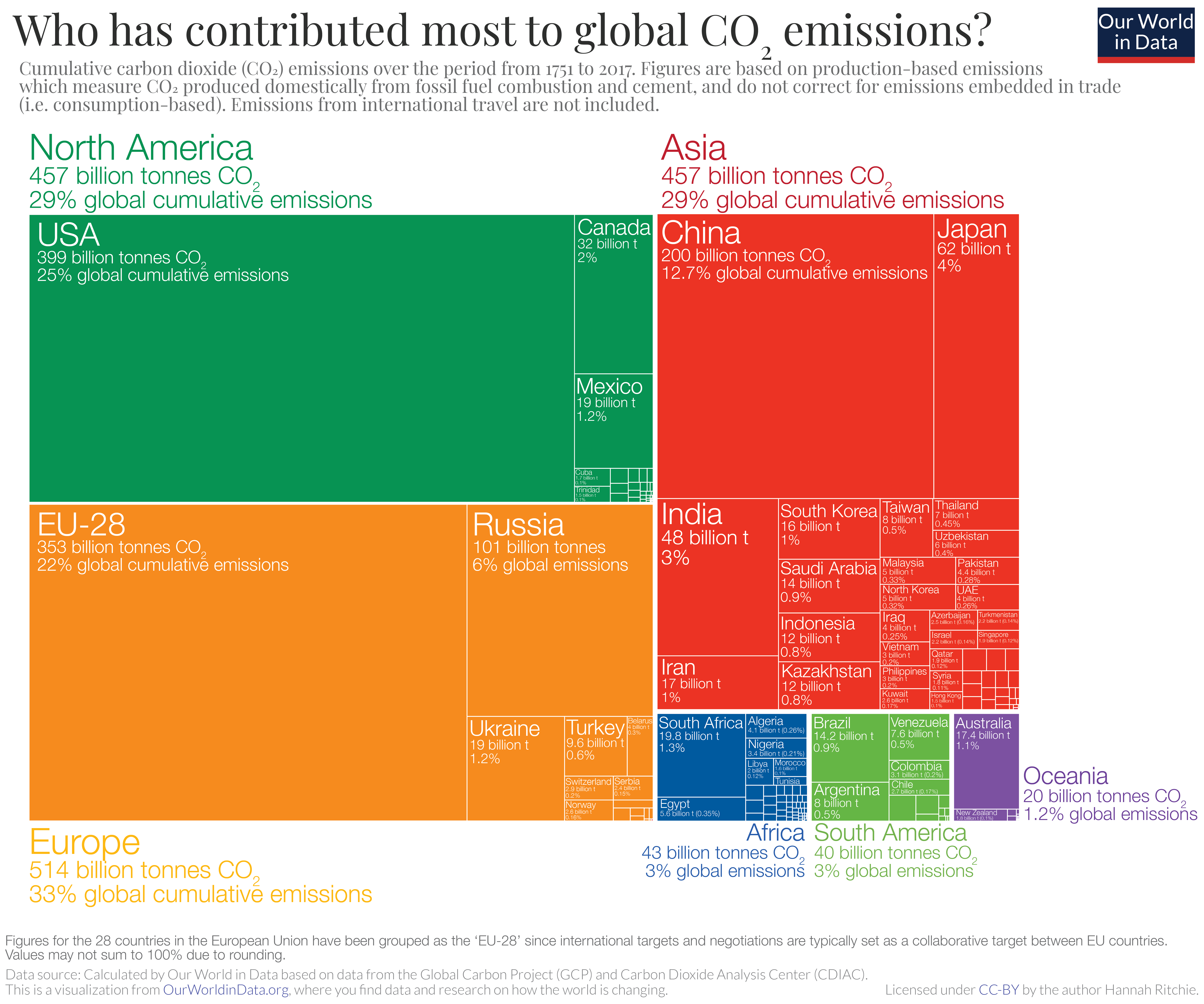
Treemaps were originally made for hierarchies, as in the chart below that divides global carbon emissions first into continents, each of which are colored differently, and then into countries within each continent, showing how each entity has contributed to emissions. This represents two levels of hierarchy – the top level with continents, and the second level with continents divided into countries according to their contribution.
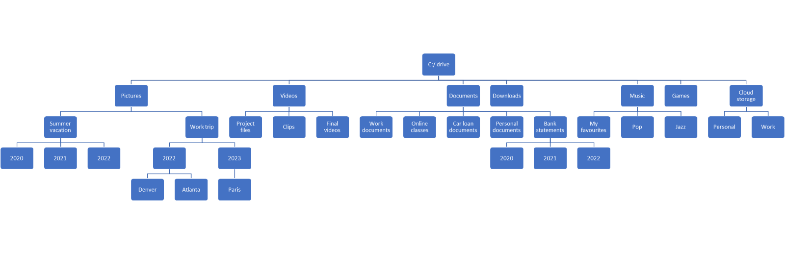
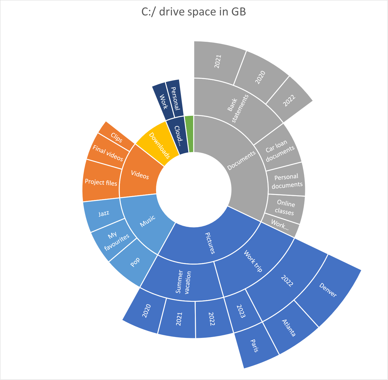
One of the biggest advantages of a treemap is its ability to represent a very large hierarchy in a very compact space thanks to the nested rectangles. For example, we may want to know how the space on a hard drive is divided into different folders. This can be represented using a tree as shown, but we see that the tree is so large that we can barely read the labels.
Instead, we may represent the same data using a treemap as follows. Notice how the nesting of different hierarchies ensures that the map remains very compact.
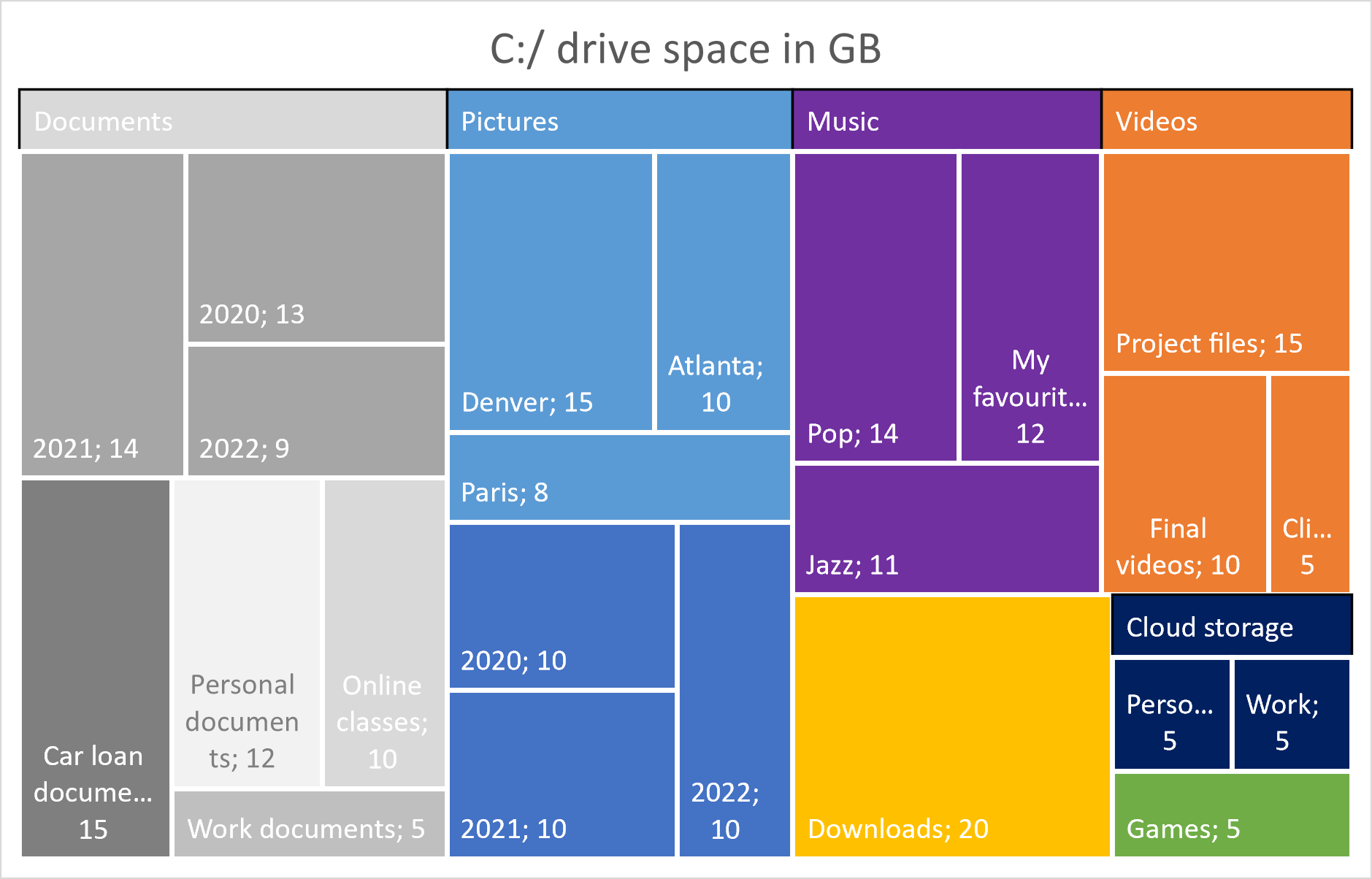
In the above example, we also see that while the tree only showed us the hierarchy, the treemap can actually represent the size of each folder using the area of the corresponding rectangle. For the tree, we would instead need to print the values of each category, which is much more cumbersome to read and compare. Few other visualization techniques allow us to visualize both hierarchies as well as quantities.
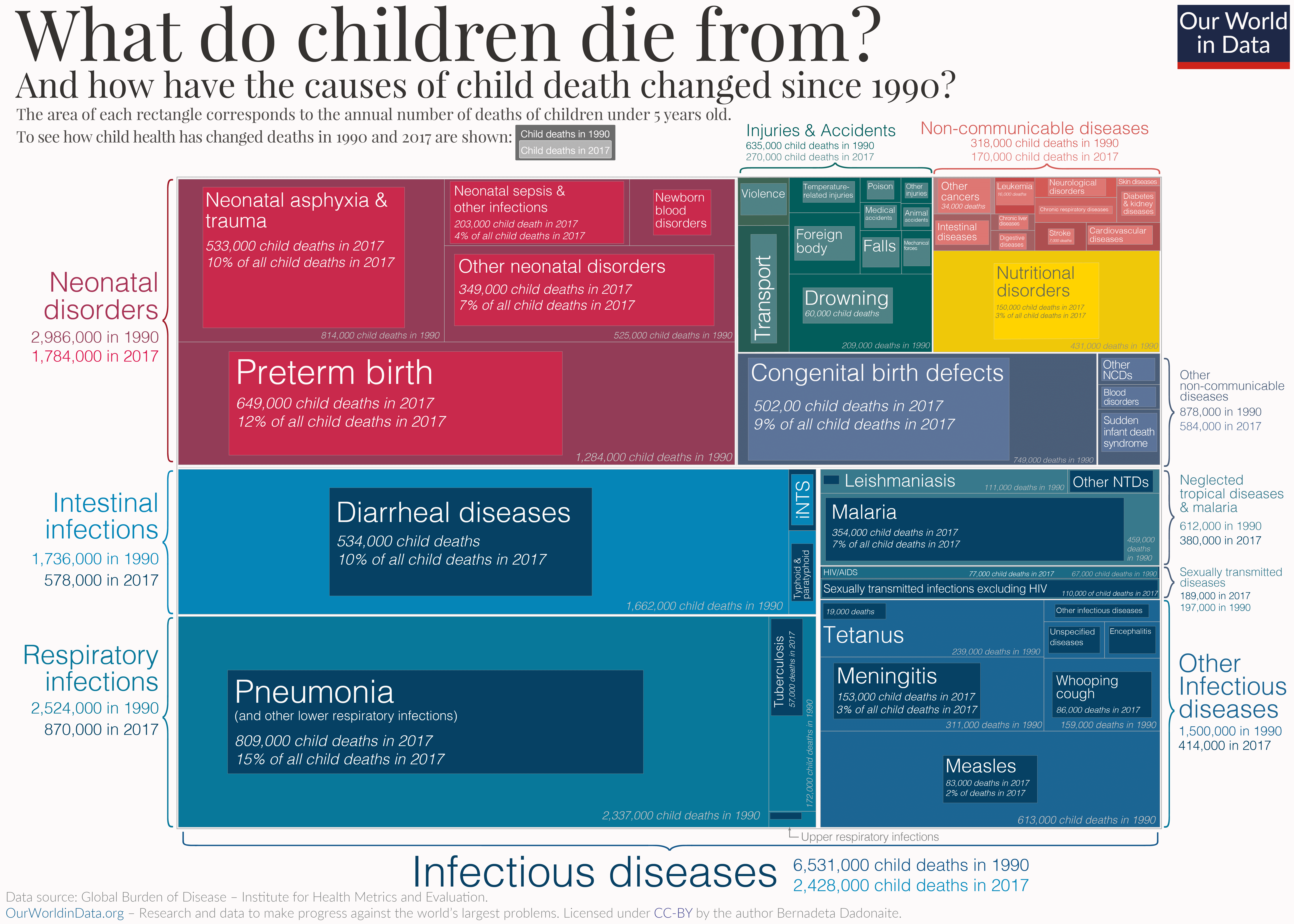
Treemaps work well when the focus is on the overall patterns, rather than an accurate reading of each value. The chart below shows the causes of child mortality, and how the volume of deaths from each cause has changed between 1990 and 2017. The darker rectangles represent the data from 1990, while the lighter rectangles represent 2017. The message of this chart is clear – in almost every category, childhood mortality has decreased since 1990.
Build Better Treemaps in Power BI — Explore Inforiver Analytics+ Features
Treemaps also present significant difficulties:
The primary disadvantage of using a treemap is our limited ability to estimate areas accurately because of how our visual perception works. This means that any chart that uses area as a way of encoding values is read much less accurately than one that, for instance, uses height measured from a common baseline. Try to answer the following questions about the chart below. Which area is larger – that of C or E? Two of these rectangles are of the same size as each other, but smaller than all the other values. Which ones are they and how much smaller are they?
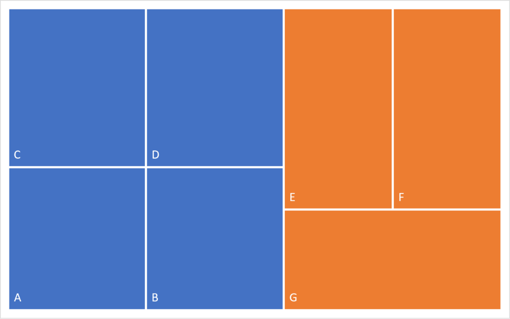
You will likely find it difficult to answer these questions. In fact, C and E are of the same size, as are all the rectangles except A and B, which are smaller than the rest by 10%!
The hierarchies shown in a treemap may also be unfamiliar to many readers and may be harder to read than in a tree diagram, where we see each level of hierarchy clearly, with parent and child nodes clearly indicated.
There are many algorithms that generate treemaps from a given dataset, but “squarifying” algorithms that try to make the rectangles as close to a square as possible are popular. This is because labeling and reading long and thin rectangular areas is much more difficult than relatively square areas. In general, it is better to stick to an aspect ratio that is as close to 1:1 as possible.
Sorting the rectangles by size allows the reader to parse through information quickly and find the major contributors to a metric. The chart below, for example, sorts the counties in Texas by population and places the largest ones on the top left, petering down to smaller counties at the bottom right. This gives us a birds-eye view of how Texas voted during the 2016 presidential election, with larger counties leaning more towards Clinton than smaller ones.
Color can be an important tool for secondary encoding by category (while the primary encoding of value is given by the area of the rectangles). This chart, for example, classifies the causes of child mortality, with causes grouped into broad categories, each of which is shaded in a different color.
We may use the same example of the voting preferences in Texas. A similar technique is used to show the political inclinations of each county here, using a blue and red color scheme. Here, the primary encoding by size is done according to the population, and the secondary categorical encoding is by voting percentages.
As discussed earlier, treemaps can handle many more entities than a pie chart in a parts-to-whole representation. Despite this, too many small categories can make reading the chart very difficult in addition to making labeling of each category hard, as in the chart below. One solution to the latter problem is to use tooltips for the smaller areas, but smaller values may still remain obscure. Limit the number of categories plotted as well as the number of levels of hierarchy to keep your chart legible and clean.
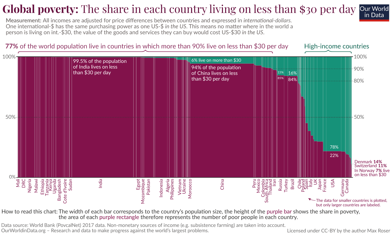
A Marimekko chart can be thought of as a variation on the bar chart, where the widths of the bars have been scaled according to a specific data value. The following chart acts as a variation of the 100% stacked bar chart, with the x-axis showing different countries, where the widths of the bars are scaled according to their populations. The y-axis is a percentage bar showing the proportion of each country that lives on less than or more than $30 per day. We thus get a parts-to-whole view of the economic circumstances within the population of each country as well as an understanding of how the global population is divided into these categories.
Sunburst charts use concentric annular areas to represent hierarchies, with the highest level towards the center and the lower levels expanding outwards. These rings are divided into sections that are proportional in area to the value of the corresponding category. The chart below shows the same information as discussed earlier on how a hard drive is divided into folders.
By - Hamsini Sukumar
Other resources

Inforiver helps enterprises consolidate planning, reporting & analytics on a single platform (Power BI). The no-code, self-service award-winning platform has been recognized as the industry’s best and is adopted by many Fortune 100 firms.
Inforiver is a product of Lumel, the #1 Power BI AppSource Partner. The firm serves over 3,000 customers worldwide through its portfolio of products offered under the brands Inforiver, EDITable, ValQ, and xViz.