
Upcoming webinar on 'Inforiver Charts : The fastest way to deliver stories in Power BI', Aug 29th , Monday, 10.30 AM CST. Register Now
Upcoming webinar on 'Inforiver Charts : The fastest way to deliver stories in Power BI', Aug 29th , Monday, 10.30 AM CST. Register Now
Stacked column charts are a variant of standard column charts, where the totals indicated by the height of the columns are shown using stacked segments as a sum of various contributing categories. These charts thus plot two categorical variables – one on the x-axis for the columns, and the other to divide the columns into categories. Use these guidelines to design an effective and aesthetically pleasing stacked column chart that puts the focus on the right message, while prioritizing accuracy.
Keep the following suggestions in mind while creating your stacked column chart.
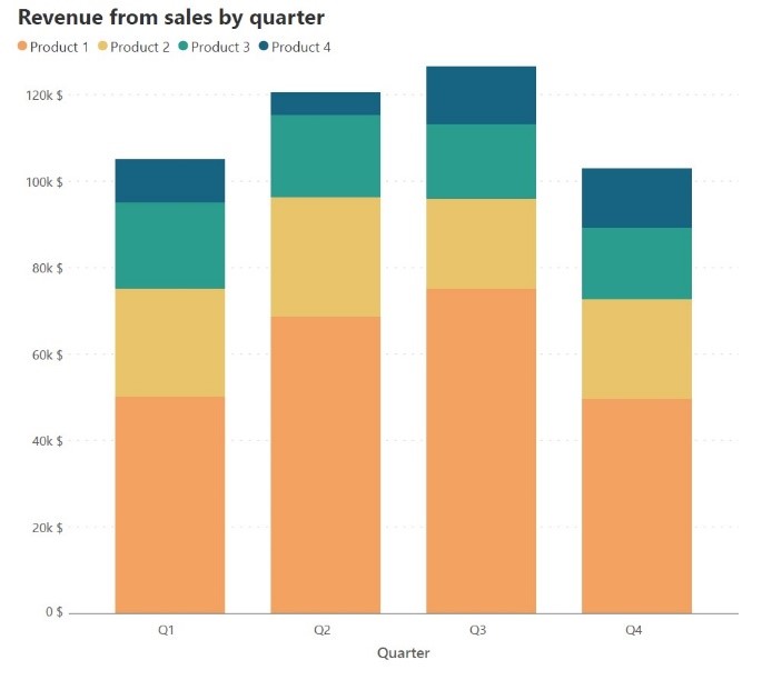
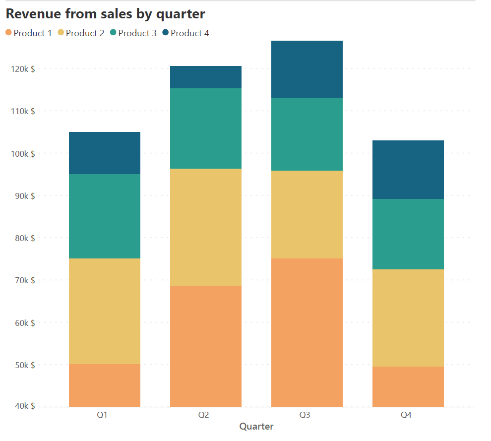
The height of each segment in a stacked column chart is determined by the magnitude of its contribution, and the sum of these heights gives us the cumulative total. It is therefore important to begin the y-axis at zero to avoid changing the heights of the totals as well as the series directly on the horizontal baseline. Consider the two charts below, both of which plot the same sales revenue data by quarter, divided into revenue from different products. The chart on the left has the y-axis beginning at zero and gives us a faithful representation of the data, while the chart on the right has 40,000 $ as the starting point for the y-axis. Notice how the columns for Product 1 are truncated which gives a false impression about the value of this series – while revenue from Product 1 is higher than revenue from any other product across quarters, the chart on the right gives us the impression that in quarters 1 and 4, the revenue is smaller than for other products.
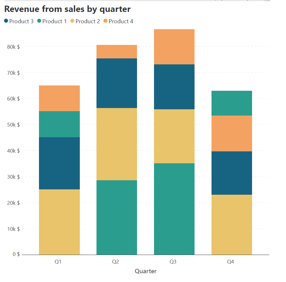
The x-axis provides a constant baseline for the totals as well as the data series that is positioned directly on top of it. This allows the reader to accurately understand values and compare heights for the totals and for this series. For all other series, the baseline is given by the cumulative total of the segments below. If you have an important contributing series in your data, position it directly on the x-axis for the reader to correctly understand its patterns. Stacking this series on top of another would lead to a changing baseline with each column, making height estimations difficult. This can be illustrated with the following example.
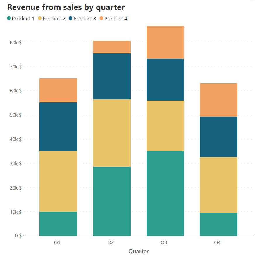

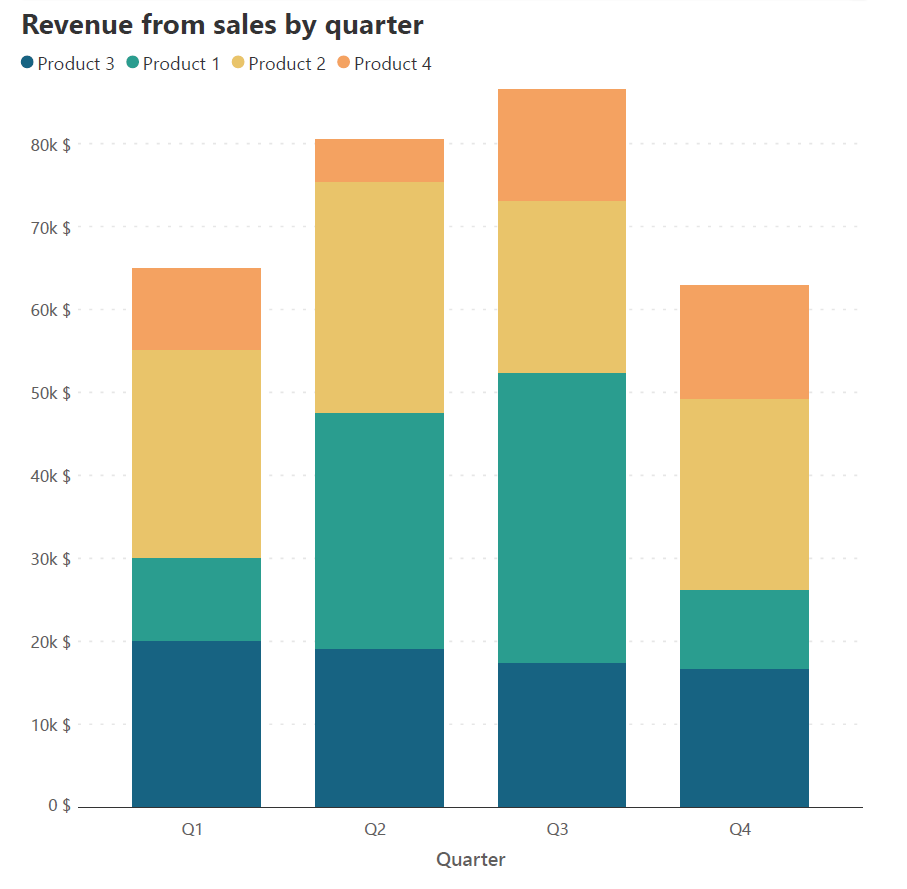
Consider the two stacked column charts above. Both of these charts plot the same sales revenue data for each quarter as a sum of the revenue generated by each product. Imagine that we want to track the changes in revenue of Product 3. This is difficult in the first chart because of the changing baseline provided by the cumulative sum of the series below Product 3. We can therefore move the series for this product to the horizontal baseline, where we see more clearly that there has been a slight decrease in the revenue from Quarter 1 to Quarter 4.
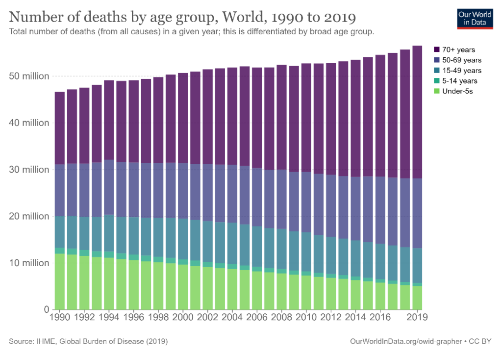
Examine your contributing categories for a natural order in terms of size, progression, classification, or importance, and use this order to stack the corresponding series on top of each other. If your data has age cohorts like the chart below, it makes intuitive sense for the order of stacking to be according to the age classes as shown.
You may also stack data in an order that allows you to answer a specific question. We examine a sales revenue dataset with a similar structure to the one discussed above. As seen above, we may choose the order of stacking to be Product 1, Product 2, Product 3, and Product 4, to obtain the chart on the left below. Instead, we may want to know how the different products performed relative to each other within a single quarter. To answer this question, we may stack the series within each quarter in descending order of the revenue it generated. This means that each column will have a different stacking order, depending on the volume of revenue generated by the different products, as pictured on the right below. This allows us to observe the changes in the totals and the relative performance of the categories within each quarter.

Choose a color palette that corresponds to the type of data that you have – use a diverging color palette, progressing from red to green for example, when showcasing opinions, choose a sequential palette with progressively darker colors of the same hue to represent sequential data like age cohorts, or use a qualitative palette with clearly distinguishable colors to show different categorical series. In the following chart, a sequential palette is used to show how often people reported feeling lonely, progressing from always to never.

Stacked column charts can get visually crowded, and it is best to keep legends to the left of the leftmost column or to the right of the rightmost column. This keeps the chart area clean and legible and keeps the reader’s focus on the patterns in the data. The chart below, for instance, positions the legend to the right of the rightmost column. This allows the reader to focus on the patterns in the chart without being distracted by a detailed legend.

If you are plotting a 100% stacked chart showing the percentage contribution of the different series, the information about the absolute numbers is lost. You may still indicate the totals for each column in an unobtrusive way at the top of the columns.
Avoid making the following mistakes when creating your stacked column chart.
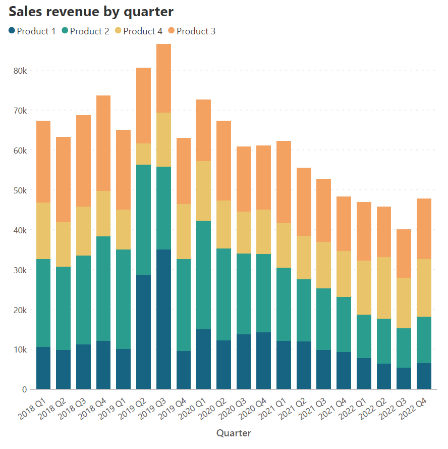
Nowadays, the reader often sees reports in digital format, and the width of the chart is usually limited by the screen on which the chart is seen. It is thus best to limit the number of columns to a reasonable number and use a horizontal bar chart whose vertical distance is not limited by a screen. Column charts are in general best used for highlighting individual totals and comparing values, rather than showing data over an extended period of time. This property extends to stacked column charts like the one below. Consider how easy it is to compare totals in the chart on the right with fewer columns compared to the chart on the left. If you have a continuous data series over a long period of time, consider using a stacked area chart instead.
Limit the number of contributing series to make your chart easy to understand. Stacked column charts are intended to provide a parts-to-whole view of the data and stacking too many series on top of each other distracts from the big picture. It may also become complicated to select distinguishable colors for each series and to keep the legend to a manageable length.
If the columns have long labels, we need to rotate or truncate the labels to accommodate their width. This makes for hard reading, and it is thus best to use short labels as far as possible. If a long label is unavoidable, consider using a horizontal stacked bar chart instead, like the one below, instead of a stacked column chart.
Reduce the number of tick marks and gridlines used in a stacked column chart to a minimum to make the chart area less crowded. Stacked columns already have a lot of visual weight, and excessive usage of these features can take away from the message of the chart.

Stacked column charts are not designed to allow accurate comparisons between segments within the same column. They can be used to give a rough idea, especially when differences between the series are large and obvious, but the changing baseline for each series means that readers would have to do mental math to understand the contributions of different series within a column. A study by Cleveland and McGill showed that the error margins in estimation are greatest for comparisons between segments of the same column. Consequently, it is also best to avoid using these charts for data with only one categorical variable.
In the chart above, for example, the title tells us that the total height of the chart corresponds to 58 million, but it is very hard to estimate the individual values of the segments from this information, without the given labels.
Build Professional Stacked Column Charts in Minutes—No DAX Required.
-By Hamsini Sukumar
For an introduction to stacked column charts, click here!
For a discussion on the scenarios in which stacked column charts are a suitable choice and those in which these charts are best avoided, click here!

Inforiver helps enterprises consolidate planning, reporting & analytics on a single platform (Power BI). The no-code, self-service award-winning platform has been recognized as the industry’s best and is adopted by many Fortune 100 firms.
Inforiver is a product of Lumel, the #1 Power BI AppSource Partner. The firm serves over 3,000 customers worldwide through its portfolio of products offered under the brands Inforiver, EDITable, ValQ, and xViz.