
Upcoming webinar on 'Inforiver Charts : The fastest way to deliver stories in Power BI', Aug 29th , Monday, 10.30 AM CST. Register Now
Upcoming webinar on 'Inforiver Charts : The fastest way to deliver stories in Power BI', Aug 29th , Monday, 10.30 AM CST. Register Now
Marimekko charts pack the power of several bar charts into a single powerful and eye-catching visual. A Marimekko chart is a two-dimensional stacked chart that can be thought of as a variation of the stacked bar chart, where the widths of the bars change according to the value of a given variable. As a result, these charts are often called variable width charts (or variwide charts).
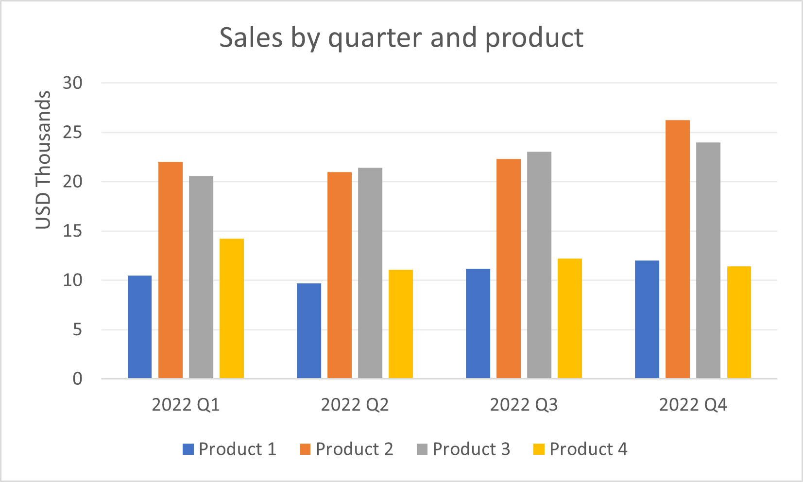
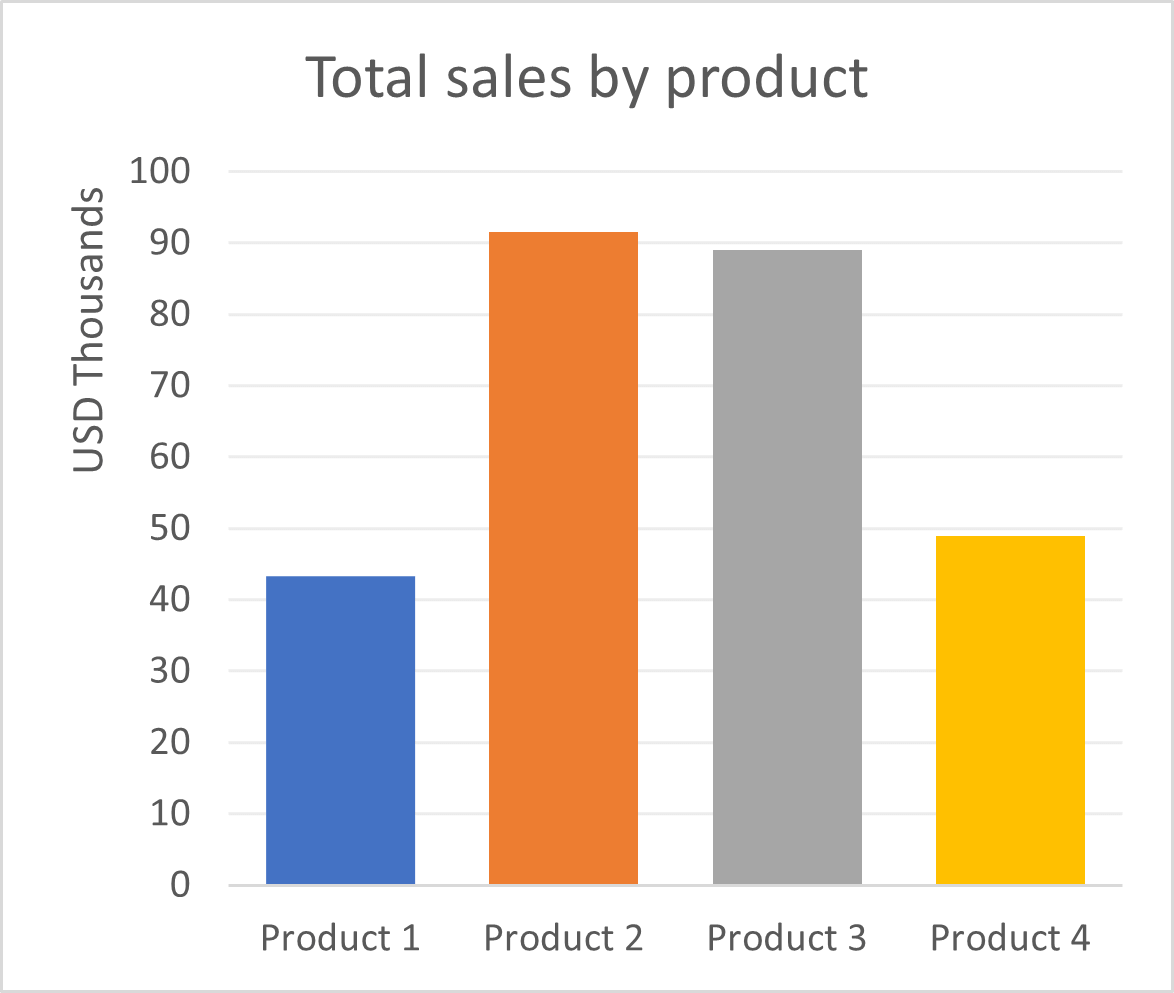
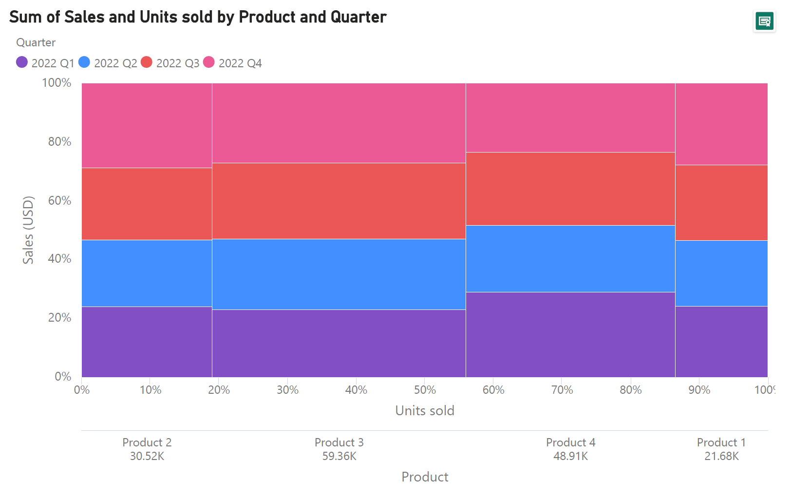
Let us first understand what a Marimekko chart is using the example of the three bar charts below, which show sales data for a fictional company. The clustered bar chart allows us to compare the sales of different products within each quarter, while the two bar charts beneath show us the total sales by product and the total units sold by product, respectively. However, consider the following questions – what is the relationship between total sales and total units sold for each product? How do the sales for a single product compare over different quarters and contribute to the total revenue generated by each product?
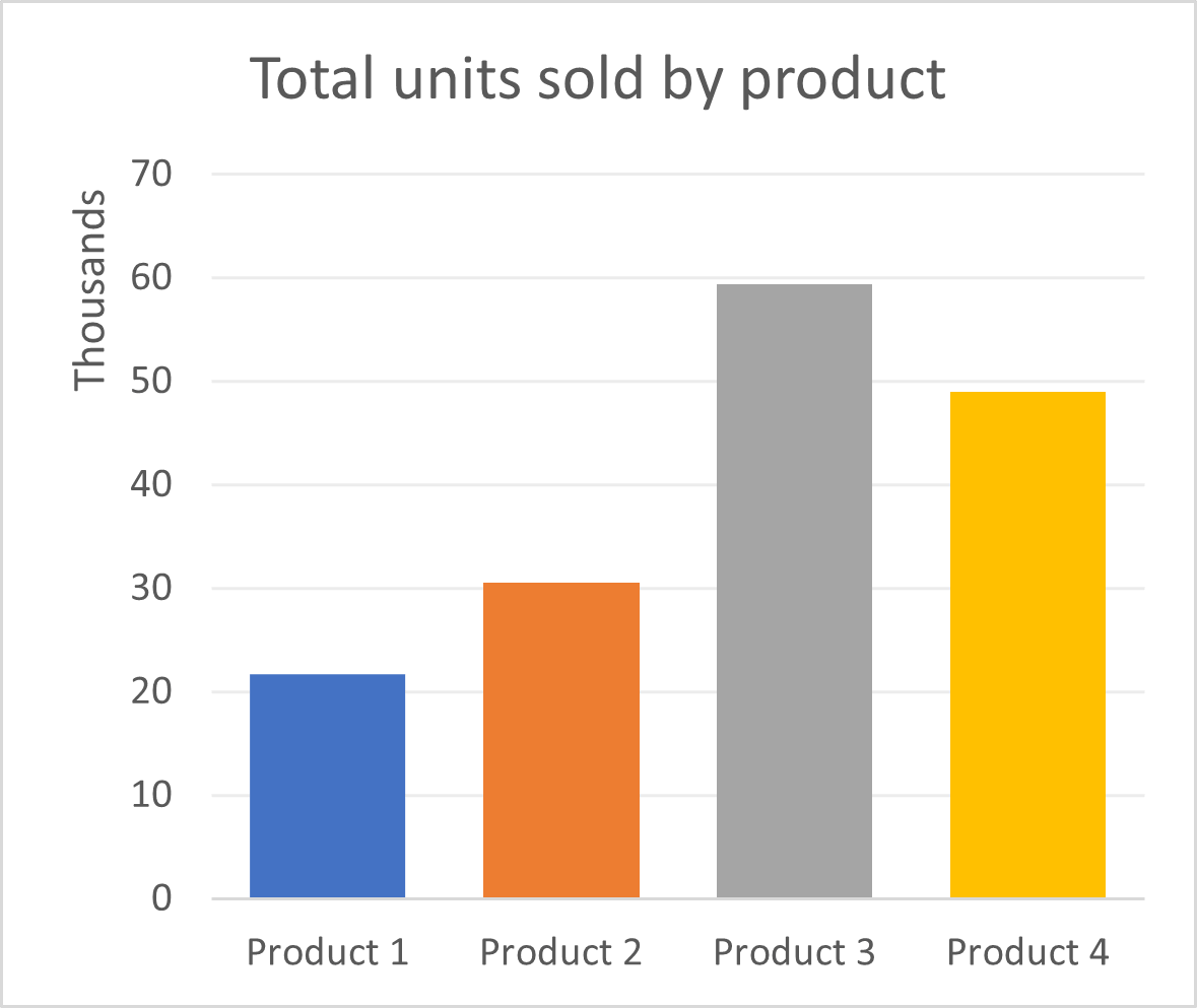
All of the above information can be represented in a single Marimekko chart! The chart below scales the heights of the columns according to the total sales of the products, and segments each column into sales from each quarter, with the height of each segment in proportion to the sales value. In addition to this, the widths of the columns are scaled according to the number of units sold for each product. Thus, we see that even though Product 2 is the top performer in terms of sales revenue, the number of units sold is far fewer than Product 3, which is second in line. The latter is seen by comparing the widths of the two columns – the column for Product 2 is much narrower than that of Product 3.
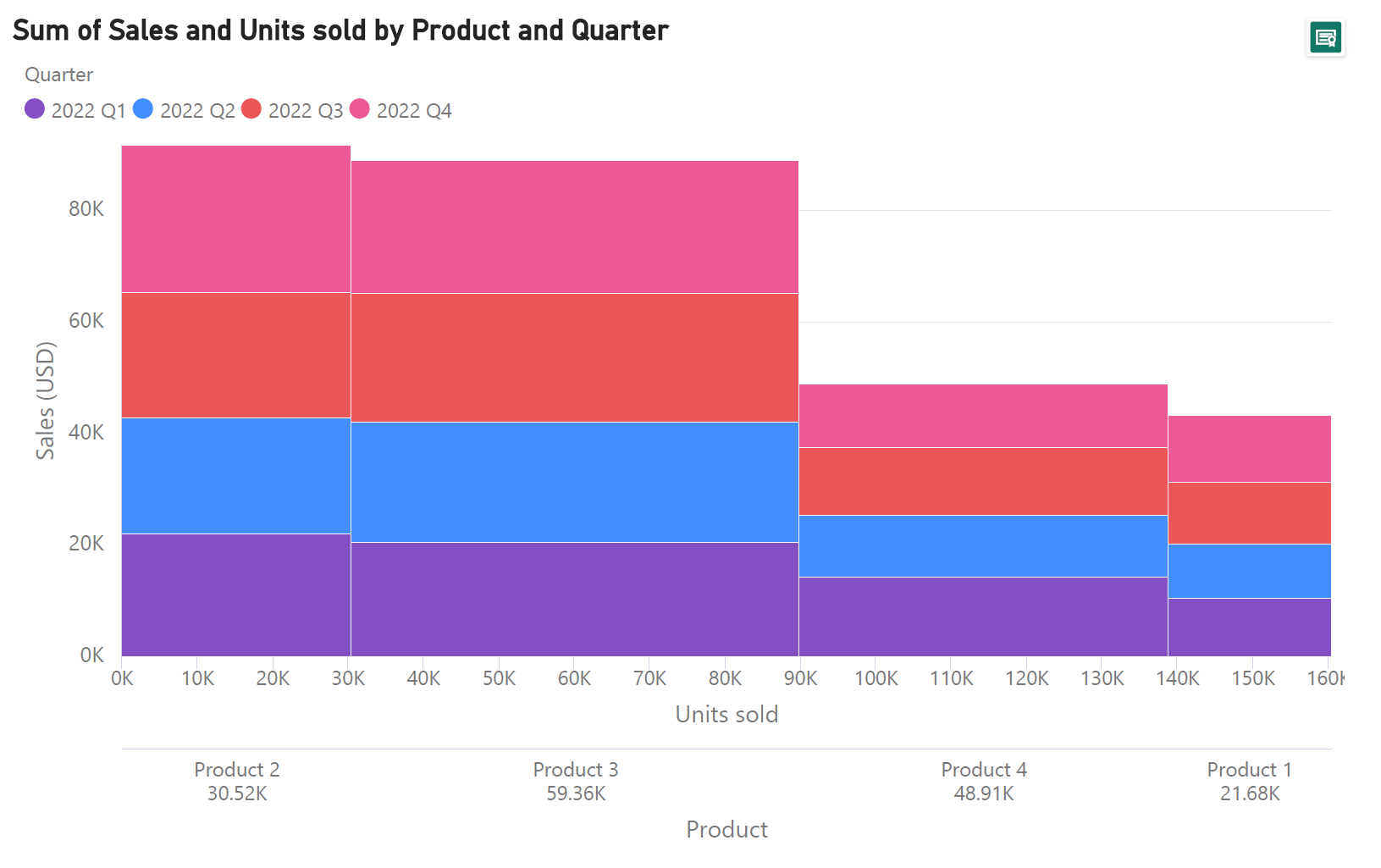
As seen here, not only do we show all of the information relayed by the three bar charts above, we also show the relationship between the variables in previously separate charts by combining them into a single compact chart. This is new information that allows us to see patterns that are much more difficult to discern from separate charts and is one of the major advantages of the Marimekko chart!
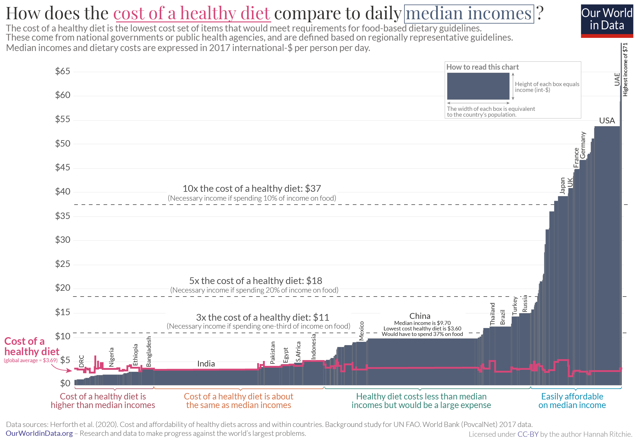
Marimekko charts can also come in the following variations. One variation, called the variable width chart, can be thought of as a Marimekko chart as introduced above, but without the stacking of contributing categories within each bar. In effect, this is a modification of the bar chart where the gaps between the bars are eliminated and the widths of the bars are changed according to the value of a second numerical variable. The chart below, for example, shows different countries on the x-axis, with the width of the columns scaled according to the population. The height of each column represents the mean daily income of each country in US dollars. For instance, the United States, towards the extreme right of the chart has one of the highest average daily incomes in the world, while China, with one of the highest populations (indicated by the width of the bar), has relatively low mean income levels. While each variable may be individually read using each axis, it is the area of each segment that gives us a measure of the wealth of each country as estimated using income.
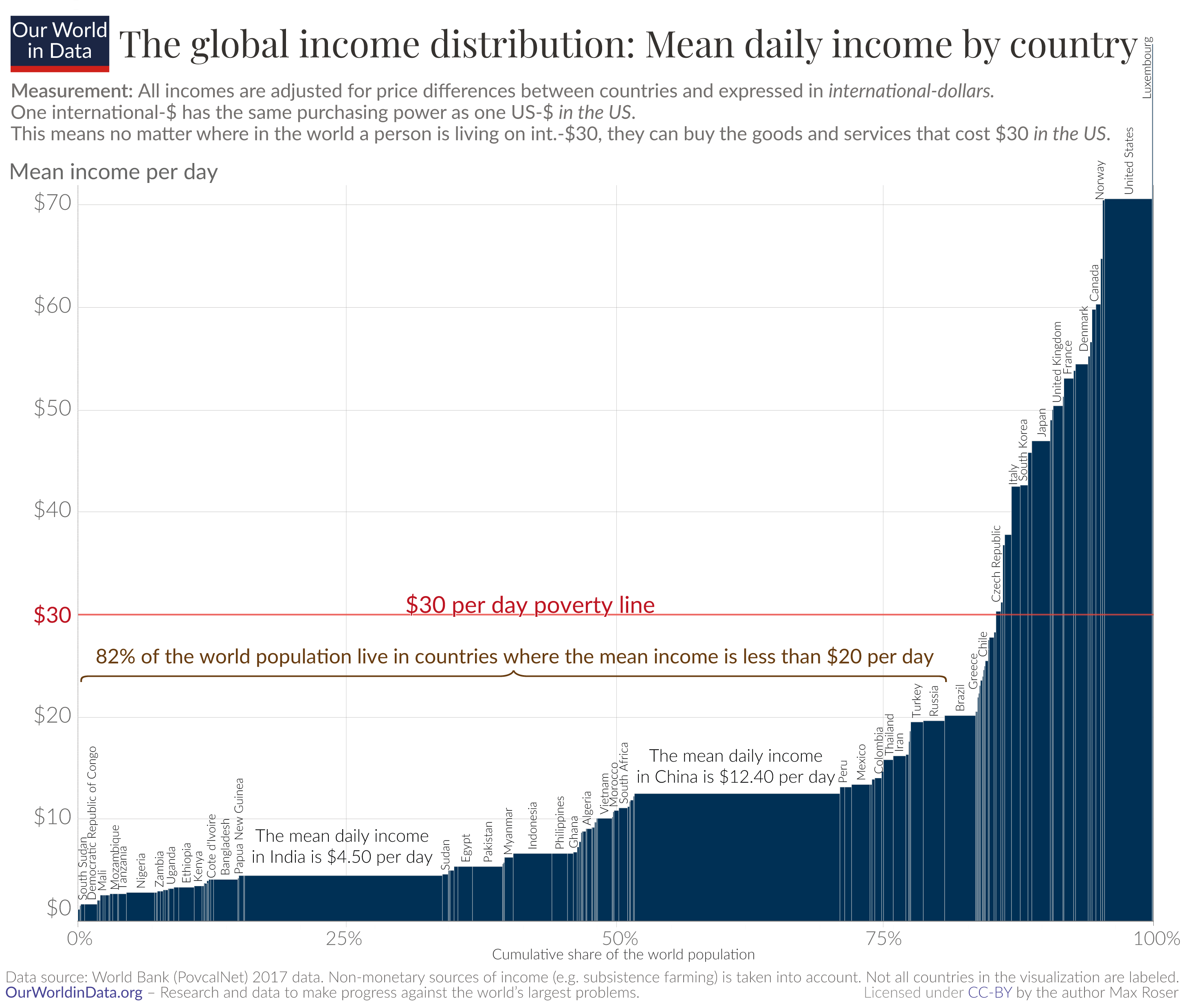
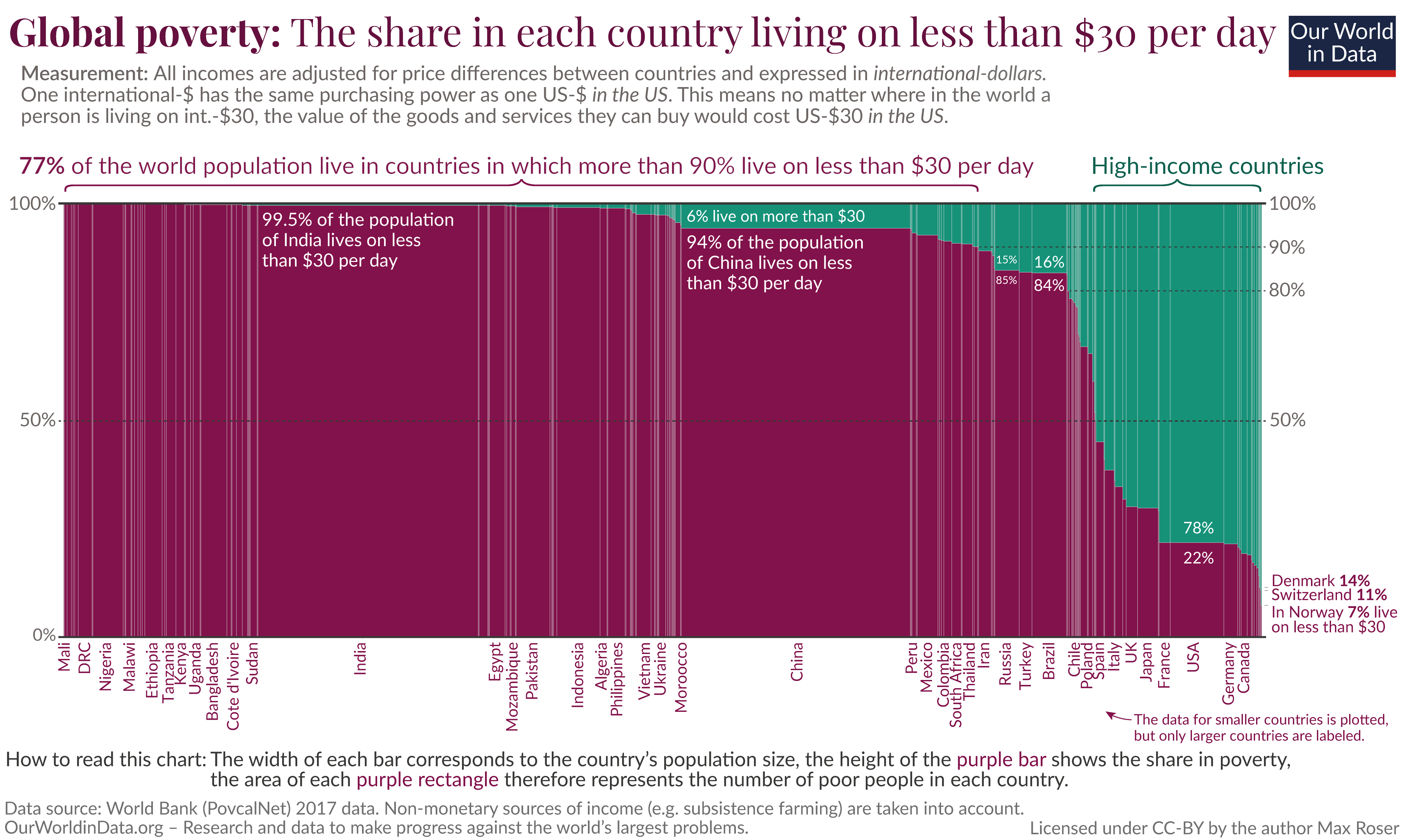
Another variation of the Marimekko chart uses percentage values for both horizontal and vertical axes. This is called a 100% Marimekko chart or a mosaic chart. Here, the segments that make up the columns as well as the horizontal axis add up to 100%. This means that the focus shifts from the actual values to the proportional contribution of each segment to the total. The chart below is an example of a mosaic chart, where global poverty is visualized by dividing the global population into people who live above or below $30 per day. Once again, the x-axis divides the global population into countries, with the width of each column in proportion to the country’s population. The segmentation of the columns then tells us what proportion of the population live on more than or less than $30 per day. We see, in fact, that most of the world’s population lives below this threshold, with high-income countries where a significant proportion of the population earns more than $30 a day making up only a small proportion of the total.

We can also represent the sales data from our first example above as a mosaic chart. Here, we do not see the relative performance of each product with respect to total sales but focus instead on the relative performance during each quarter for each product. The information on total units sold is also given as a percentage value.
In addition to all of the advantages discussed here, Marimekko charts make for an eye-catching and memorable visual representation of the big picture formed by our data. Their relative novelty can also contribute to catching the attention of your audience, creating an opening for further investigation.
Now that we have a grasp on the power of Marimekko charts, let us turn to the data structure that this chart can handle and thereby understand the potential uses of this chart type. We may take our example with the sales data once again to understand this. The chart along with a part of the data used is reproduced here.

As seen here, this chart visualizes two categorical variables (Quarter and Product) and two numerical variables (Sales in USD and Units sold). In our case, the units sold are aggregated by product to form the values that we use to size the widths of the bars, while the sales values are aggregated (by product once again) to form the values used for the heights of the bars. This is typical of the data structure that can be handled by a Mekko chart, and variations of the chart use a subset of these variables. For example, a variable width chart like the one below, uses one categorical variable (in this case, the country) and two numerical variables (population and daily median income).
The mosaic chart, which uses a 100% scale instead of a value scale also uses two categorical and two numerical variables, but treats them the latter proportions instead of absolute values.
Keeping this in mind, we see that Mekko charts can be used for the following purposes:
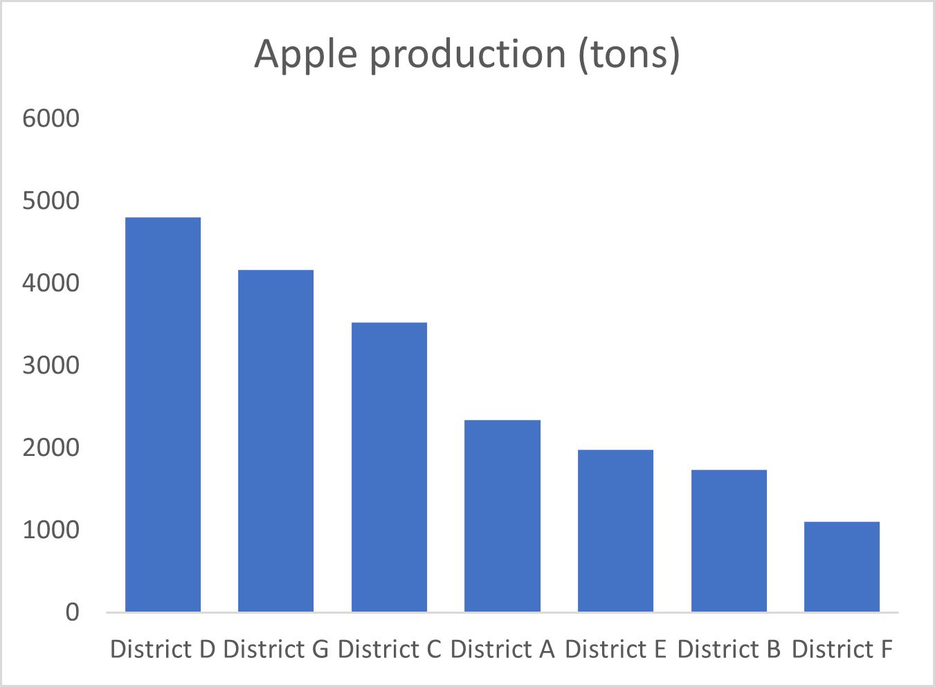
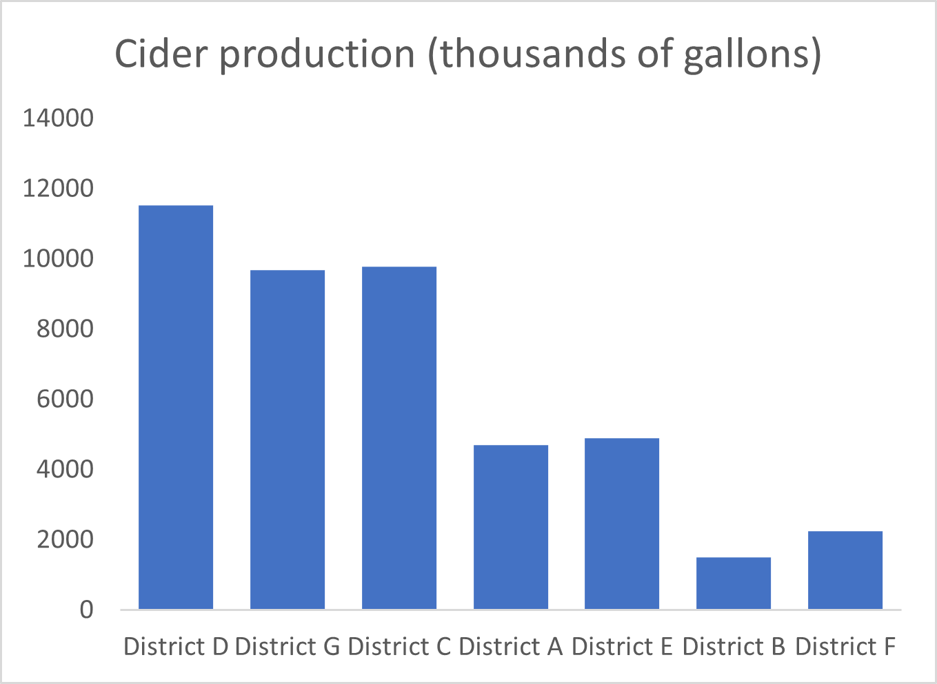
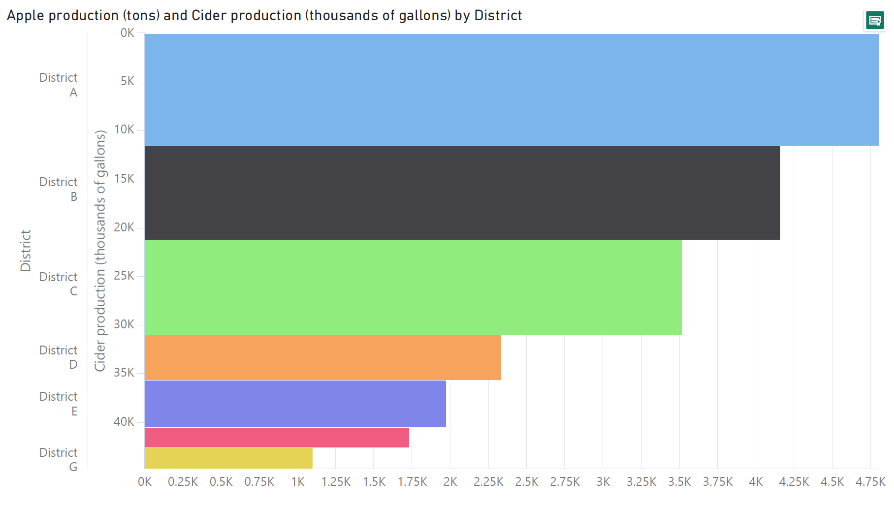
We may use Mekko charts to showcase the relationship between two numerical variables for a set of entities. For example, the following bar charts show the production of apples and the production of cider for a set of districts.
The relationship between these two variables is not as apparent in separate bar charts as it is in the Marimekko chart below. Here, the heights of the bars are scaled according to the production of apples, while their widths are scaled according to the production of cider. This makes the relationship between the two much clearer – broadly speaking, wider bars are also taller, indicating that areas with a high production of cider also have a high production of apples.
As with the closely tied stacked bar and treemap charts, Marimekko charts can also be used for parts-to-whole representations. This allows us to see the differences in the contributing series as well as the changes in the totals as in the chart below, where we can compare total sales for each product, while simultaneously understanding the contribution from each quarter.

The parts-to-whole representation can also come in the form of showing the relationship between one numerical variable and one percentage variable, as in a mosaic chart. We may take the same example from above that discusses the proportion of people living on less than $30 a day. Here, the numerical variable is given by the population of each country, as plotted on the horizontal axis, and the percentage variable is given by the proportion living above (or below) $30 a day, shown on the vertical axis.
Mekko charts are best suited to providing a birds’-eye overview of the broad patterns in our data, rather than precise estimations of the values involved. This happens because of the limitations of our visual perception in estimating areas as well as heights that are not measured from a common baseline. We will learn more about this in the next section on some of the drawbacks of Marimekko charts. In effect, however, this puts the spotlight on the major contributors to the total or the major segments that stand out above the rest of the values. This dioramic view is also evident from our apples and cider production example from above – instead of switching between two bar charts constantly to compare each piece of information, we see all of it in a single Mekko chart.

Despite their versatility in handling data and providing us an understanding of the overall picture, Marimekko charts also have several disadvantages. Many of these disadvantages stem from the limitations of our visual processing capabilities. In general, our brains tend to process area calculations poorly, and have difficulty interpreting heights that are not measured from a common baseline.
This translates to the following challenges:
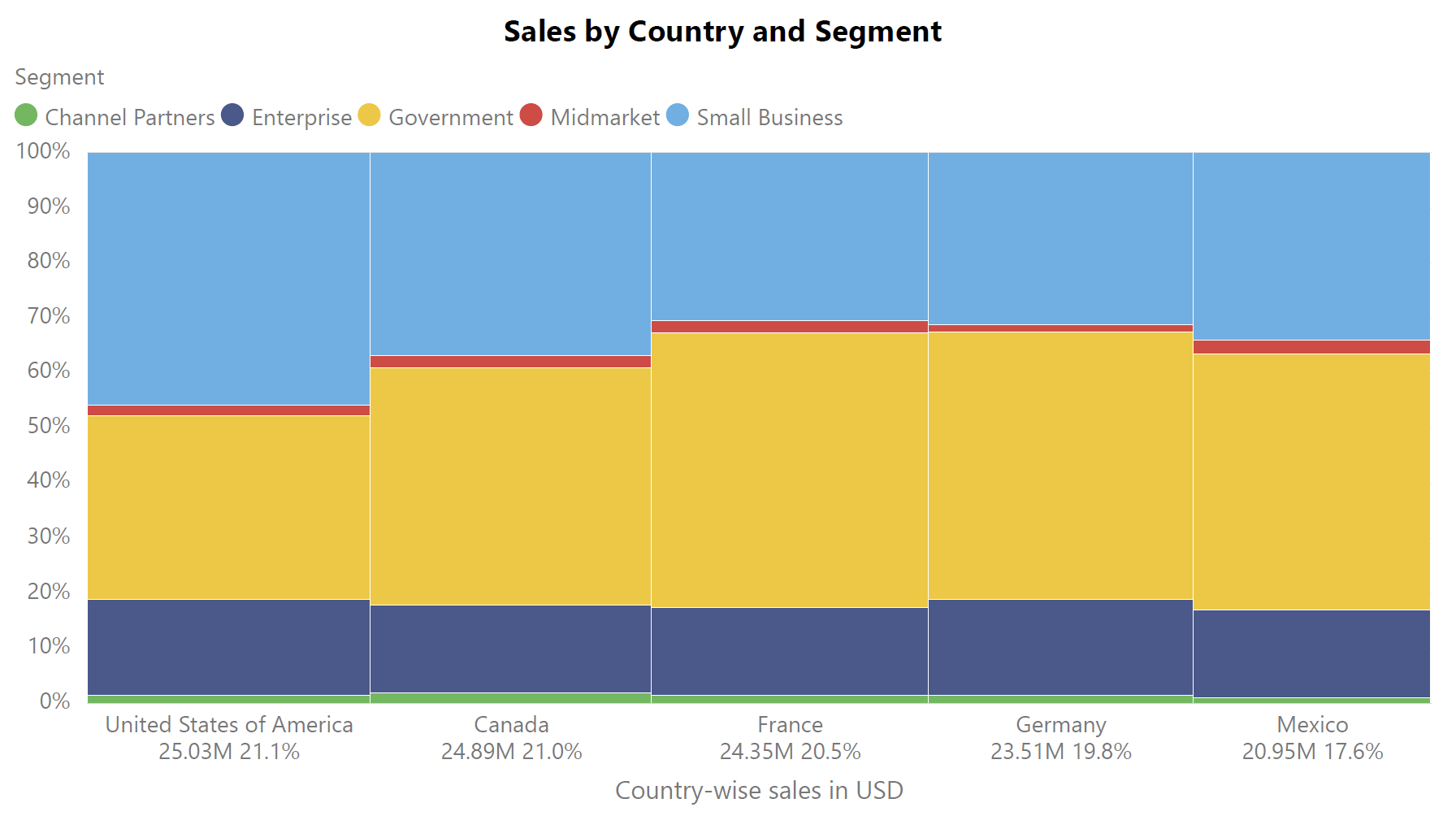
One of the main disadvantages of the Marimekko chart is that it is difficult to estimate the values represented by non-adjacent rectangles. The chart below divides sales by country and segment. The widths of the bars tell us the value of the sales made in that country, while the height of each rectangle tells us the proportion of sales for each segment. Try to compare the height values (i.e., the percentage contribution) of the rectangles representing the government segment for the US and the Small Business segment for Mexico. Which one is larger?
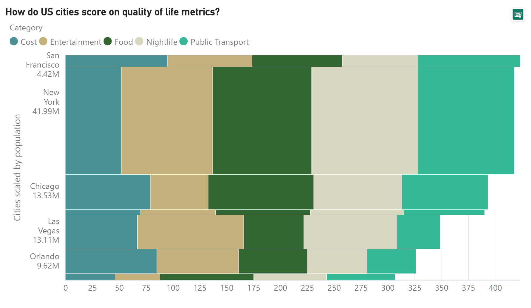
The chart below is a horizontal variant of the Marimekko chart that shows how different US cities score on various quality of life metrics. The scores sum up to a total by which the cities are ranked and ordered. Once again, the widths of the bars are in proportion to the population of the city. Notice how easy it is to compare the cost metric across different cities because of the common baseline, but not as easy to compare any of the other metrics across cities. For example, is the score for food higher in San Francisco or in New York? What about the score for entertainment? Notice also that this only covers one out of the two numerical variables, namely the score value. What about the population size that is encoded by the widths of the bars? It is also difficult to compare the populations of, say, Chicago and Las Vegas, to determine which city is larger using the widths of the bars. This is once again because these widths are not measured from a common baseline, but are instead stacked on top of each other.
As discussed earlier, our brains do not process area calculations well. This means that we have difficulty in estimating and comparing the areas of rectangles in mosaic charts, like the one below that divides sales by country and segment. Here, the area of each rectangle represents the volume of sales for the corresponding country and segment. For example, consider how difficult it is to compare the areas for the government segment in the US and the small business sector for Canada. Which one is larger?
Despite these disadvantages, Marimekko charts remain popular across domains for their compactness and eye-catching representation of data. We conclude with a final note on where these charts get their unusual name from.
Marimekko charts are named after the eponymous Finnish design company whose bright and bold prints were a favorite of Jackie Kennedy’s during the 1960 presidential election. Mekko charts are reminiscent of some of the early prints designed by Marimekko that featured colorful geometric patterns.
-By Hamsini Sukumar
To know more about marimekko charts and how to create them right inside Power BI, Dive into our new free ebook "The ultimate guide to marimekko charts in Power BI."
Also Explore Marimekko & Advanced Visuals in Inforiver Analytics+

Inforiver helps enterprises consolidate planning, reporting & analytics on a single platform (Power BI). The no-code, self-service award-winning platform has been recognized as the industry’s best and is adopted by many Fortune 100 firms.
Inforiver is a product of Lumel, the #1 Power BI AppSource Partner. The firm serves over 3,000 customers worldwide through its portfolio of products offered under the brands Inforiver, EDITable, ValQ, and xViz.