
Upcoming webinar on 'Inforiver Charts : The fastest way to deliver stories in Power BI', Aug 29th , Monday, 10.30 AM CST. Register Now
Upcoming webinar on 'Inforiver Charts : The fastest way to deliver stories in Power BI', Aug 29th , Monday, 10.30 AM CST. Register Now
A powerful new visualization has joined our suite of chart types: the network graph. Best suited for hierarchical datasets, this chart type can bring your data to life by highlighting links between entities and mapping inflows and outflows.
Discover more insights in your data with our upgraded interactivity that makes exploring multi-layered visuals effortless through powerful cross-highlighting and cross-filtering support. We’ve also rolled out enhancements across Gantt charts, tables, and data tables, making it easier than ever to visualize timelines and analyze granular data.
Experience our latest range of planning and analytics features that make Inforiver Analytics+ the best data visualization solution available in Power BI:
1. New visualization type: the network graph
2. Interactivity and data selection
2.1. Drilldown type for hierarchical visuals
2.2. Data selection for parent nodes
2.3. Data selection for small multiples
3.3. Expand/collapse parent nodes
Please refer to our release notes for a comprehensive list of requirements, features, and bug fixes.
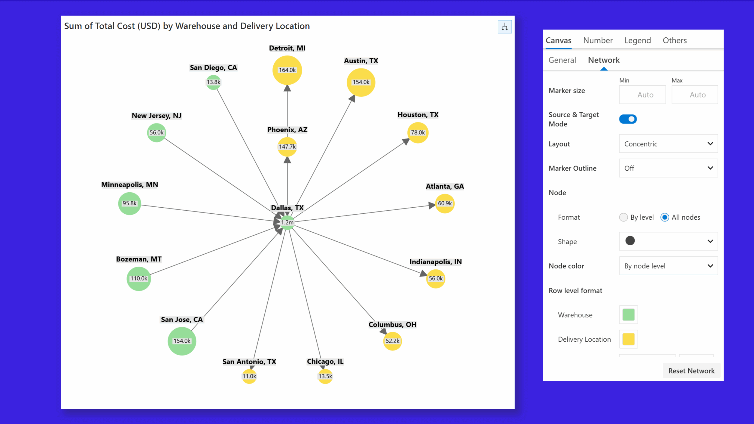
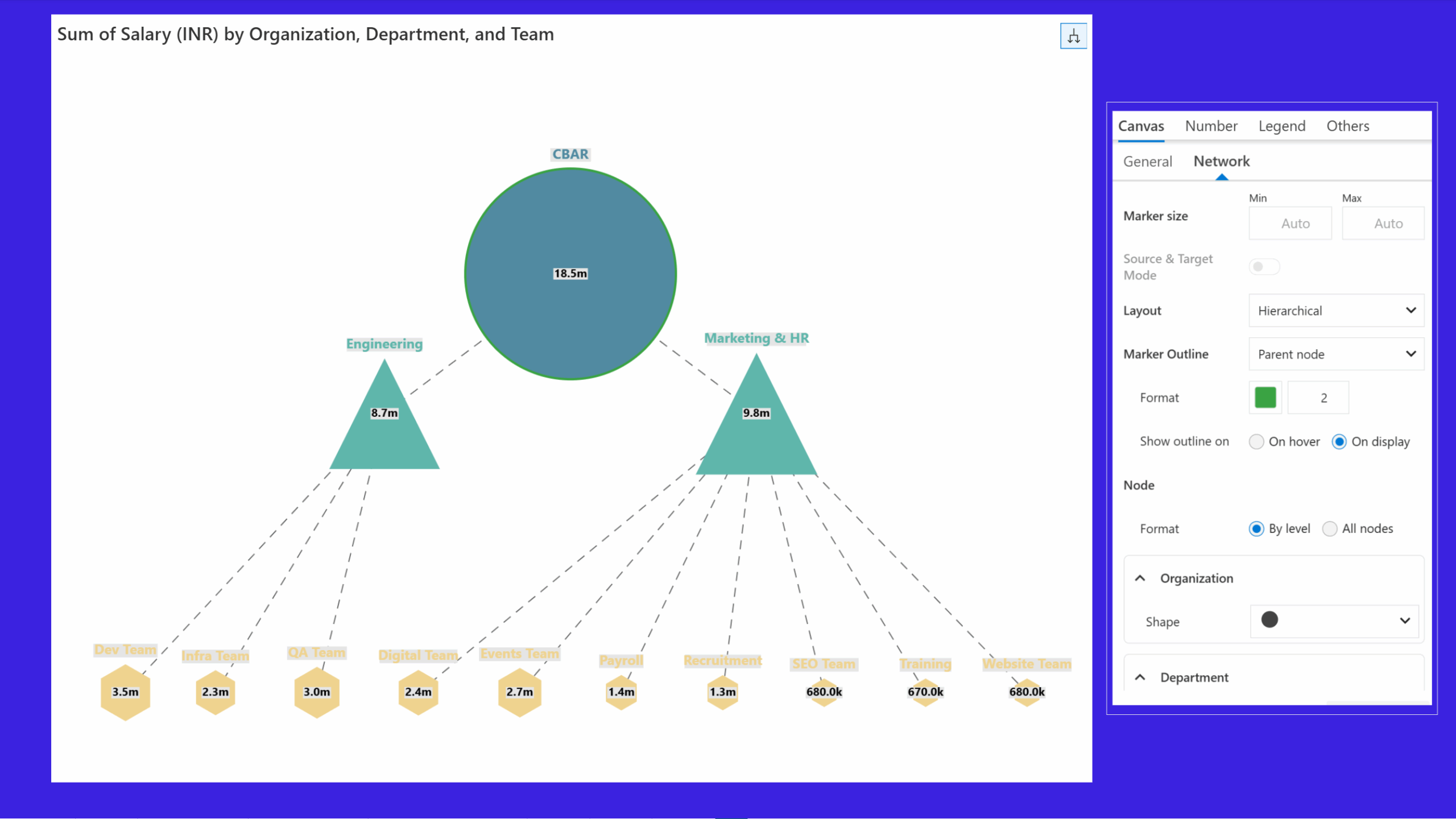
Network graphs are ideal for visualizing relationships between entities in organizational structures or in logistics for mapping relationships between vendors, warehouses, and delivery points. Leverage network graphs to easily identify in-flows and out-flows and uncover relationships in large hierarchical datasets. Packed with dedicated customization, layout, and conditional formatting capabilities, you can tailor the network graph to suit your specific data visualization needs.
Network graph to analyze inflows and outflows:
Network graph to visualize hierarchical relationships:
Your analytics and visuals can work together seamlessly. The new Drilldown Type option for hierarchical charts like treemap and sunburst gives you greater control over how users interact with your reports. Choose to enable cross-highlighting in other visuals, focus solely on drilldown, or combine both for a more dynamic data exploration experience.
Selection:
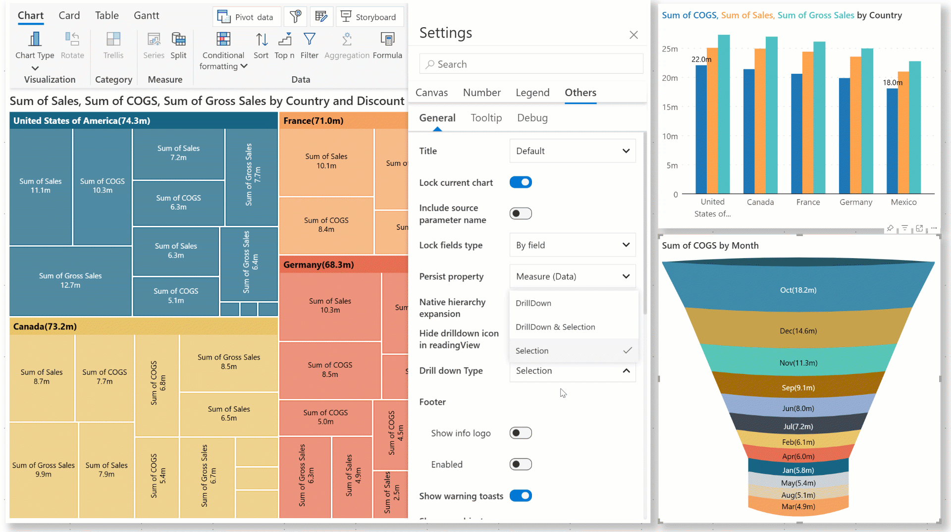
Drilldown:

Selection + drilldown:

We've expanded the data selection capabilities for visuals with hierarchical axis data. Analytics+ now supports cross-highlighting in other visuals when you select parent nodes. This is supported irrespective of whether category grouping is enabled or disabled. In earlier versions, cross-highlighting in other visuals was restricted to child nodes only.
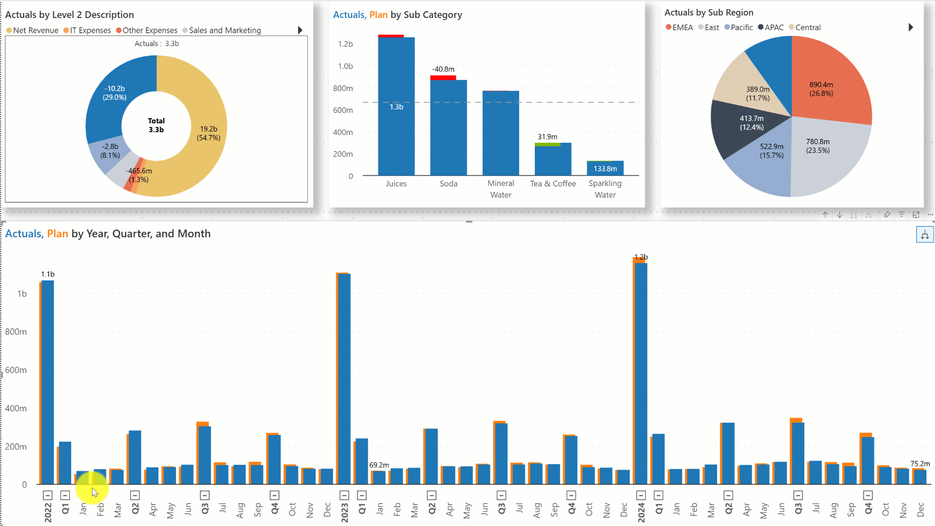
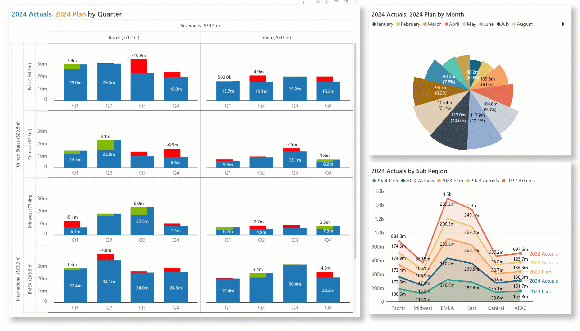
Selecting the trellis categories in rows or columns will now automatically cross-highlight data in other visuals on the same page.
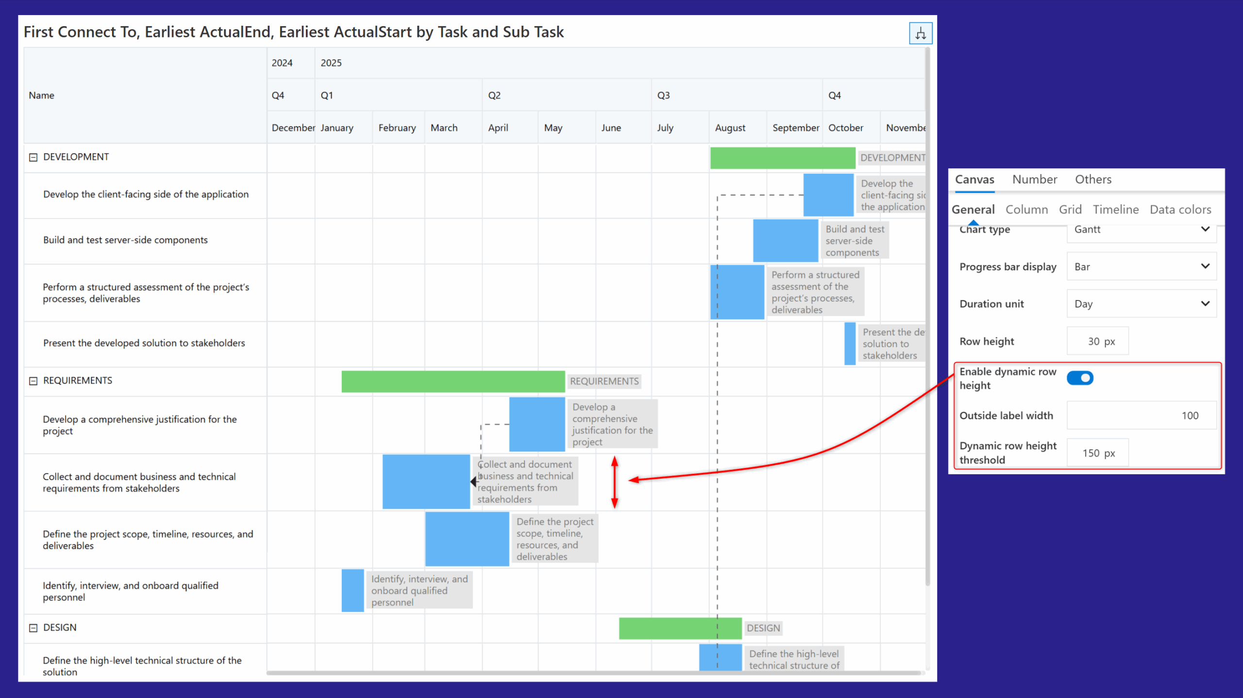
The dynamic row height option automatically adjusts cell height to wrap long data labels, making your Gantt charts more compact, readable, and easier to navigate with minimal scrolling.
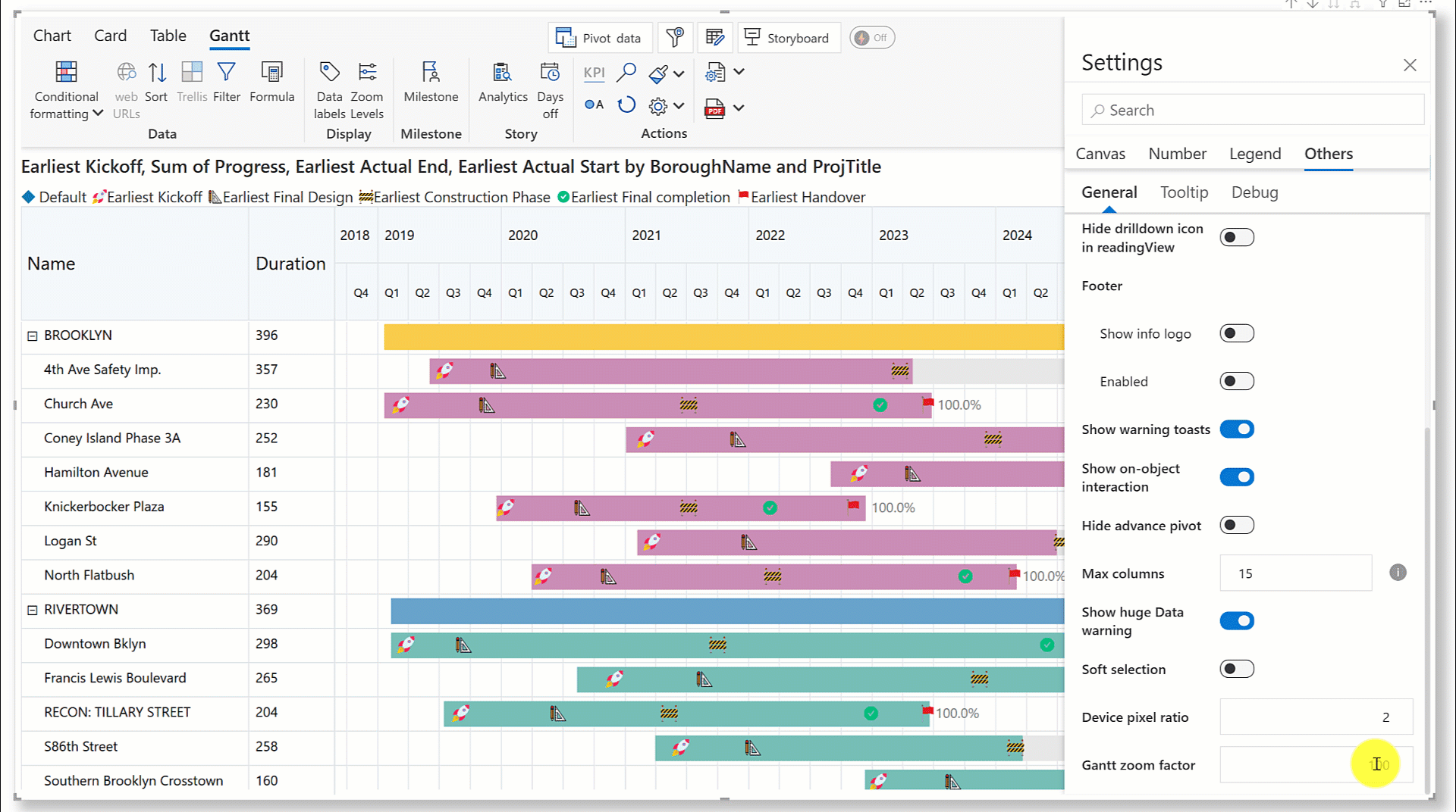
Adjust the size of your Gantt chart based on your data and target audience. Zoom in to view granular details and zoom out for a high-level picture.
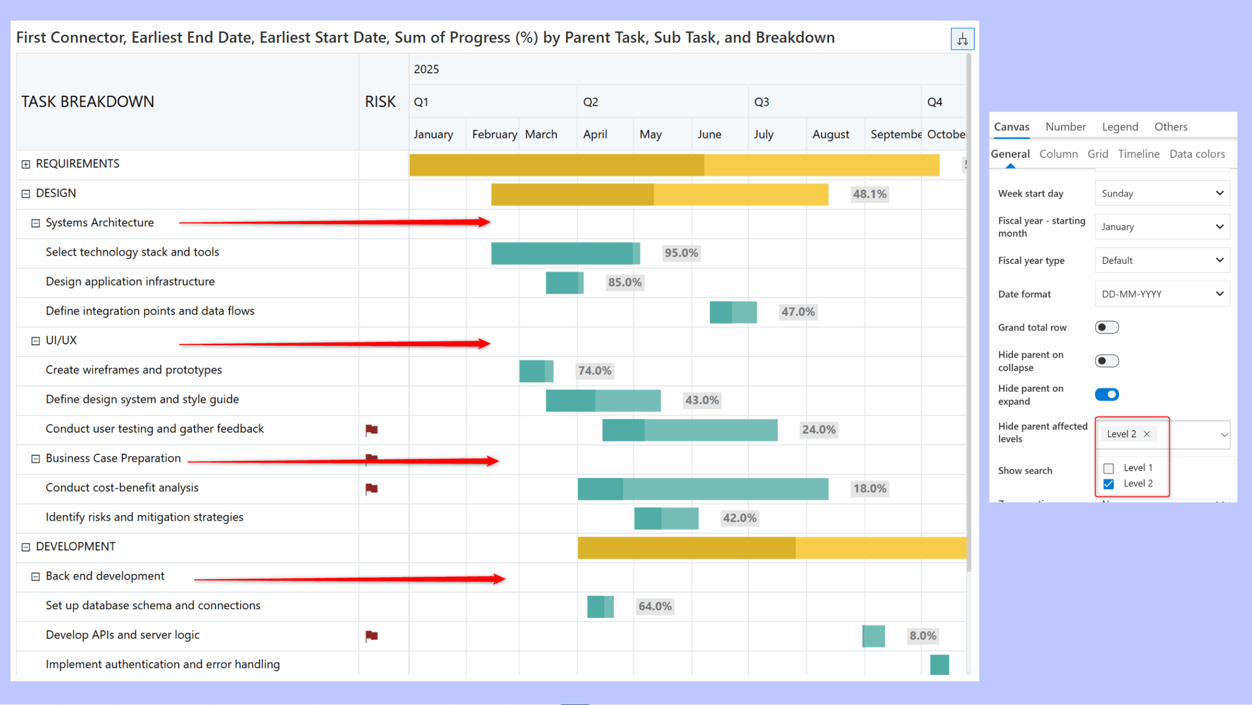
The Inforiver Analytics+ Gantt chart enables you to bring focus to the child progress bars when you expand/collapse a parent node. If your project has multiple tasks with subtasks and child tasks (multiple levels), you can control which levels to hide on expanding or collapsing the hierarchy.
In the sample report, notice how the progress bar for the ‘REQUIREMENTS’ level is hidden when the hierarchy is collapsed.
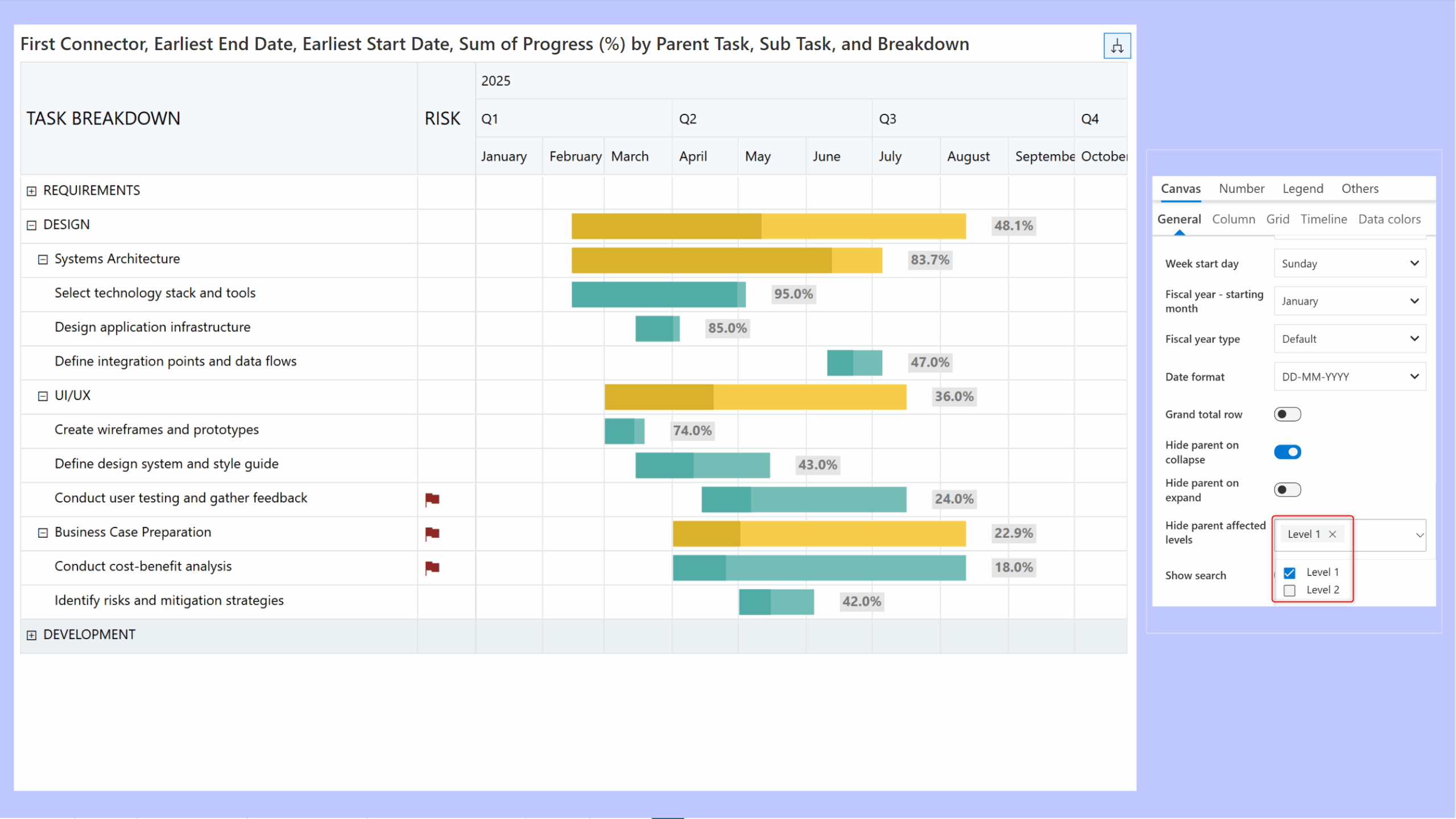
In this case, when the Hide parent on expand toggle is enabled, the level 2 progress bar is hidden when the hierarchy is expanded.
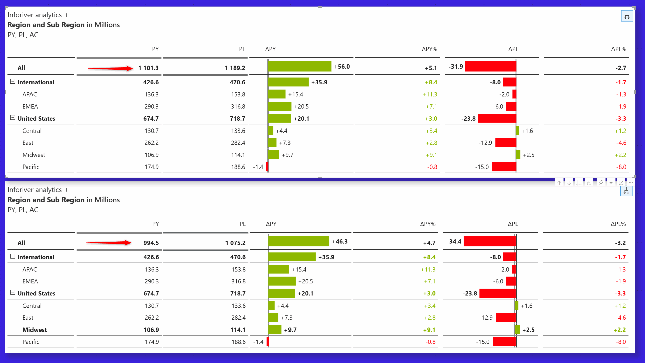
Converting child rows into result rows lets you analyze each child as a standalone record. Select the Result row option to convert any child row to a result row right from the row gripper. Notice how the grand total changes when the 'Midwest' row is converted into a result row.
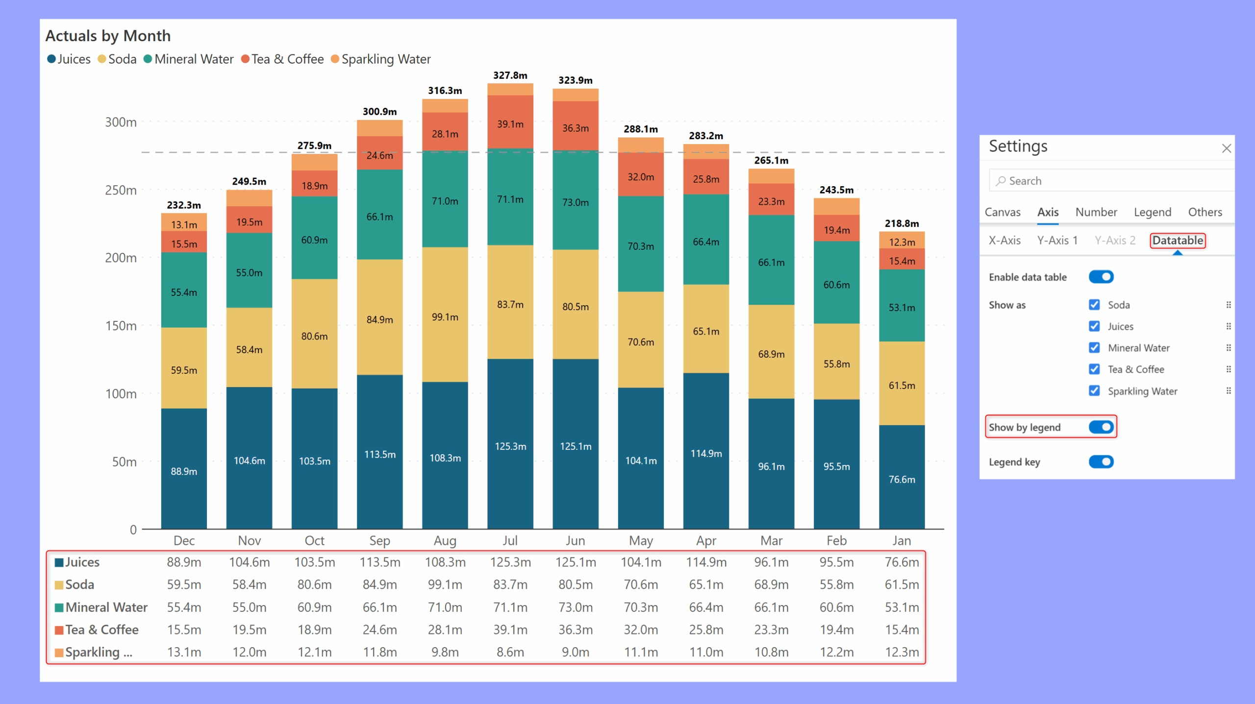
Data tables help users correlate the underlying data with the visualization. For stacked charts, you can enable the Show by legend option to display the stacked dimension categories in the data table.
Learn more about Inforiver
To learn more about the latest from Inforiver and why we are garnering recognition from industry experts, check out our newest brochure.
Inforiver and all our planning and analytics products continue to be updated to provide a diverse range of users with optimal performance. With continual improvements and innovations planned, we welcome your feedback.
If you’re ready to level up your planning, reporting, and analytics, try our products for free today.

Inforiver helps enterprises consolidate planning, reporting & analytics on a single platform (Power BI). The no-code, self-service award-winning platform has been recognized as the industry’s best and is adopted by many Fortune 100 firms.
Inforiver is a product of Lumel, the #1 Power BI AppSource Partner. The firm serves over 3,000 customers worldwide through its portfolio of products offered under the brands Inforiver, EDITable, ValQ, and xViz.
 Learn how to build advanced, insight-rich Power BI dashboards effortlessly with Inforiver Analytics+—no coding, no complex configurations, just smarter reporting in less time.