Upcoming webinar on 'Inforiver Charts : The fastest way to deliver stories in Power BI', Aug 29th , Monday, 10.30 AM CST. Register Now
Upcoming webinar on 'Inforiver Charts : The fastest way to deliver stories in Power BI', Aug 29th , Monday, 10.30 AM CST. Register Now
Your favourite data visualization tool just got better! Access a range of new visualization, collaboration, and analytics features when you upgrade to our latest version. The new Chart Wizard streamlines the process of chart selection, configuration, and setting up analytics, sorting, and ranking into just three simple steps. The latest version ships with exciting new charts like the Tornado, Histogram, Parallel Coordinates, and Ribbon charts to help you step up your multi-variate analysis and trend visualizations. Leverage the Flex feature and KPI customization options to effortlessly create captivating KPI dashboards with images, insight charts, text, and metrics.
Discover the new features and innovations in version 4.2 that make Analytics+ the most powerful data visualization platform in Power BI.
2. Chart wizard: Simplified chart selection and configuration
3.1 Advanced KPI customizations
3.2. New KPI templates and import/export capability
3.3. Flex container for KPI elements
3.4. Neutral variances and accent bars
7. Filter context – axis categories
8. Scenario-based chart selection
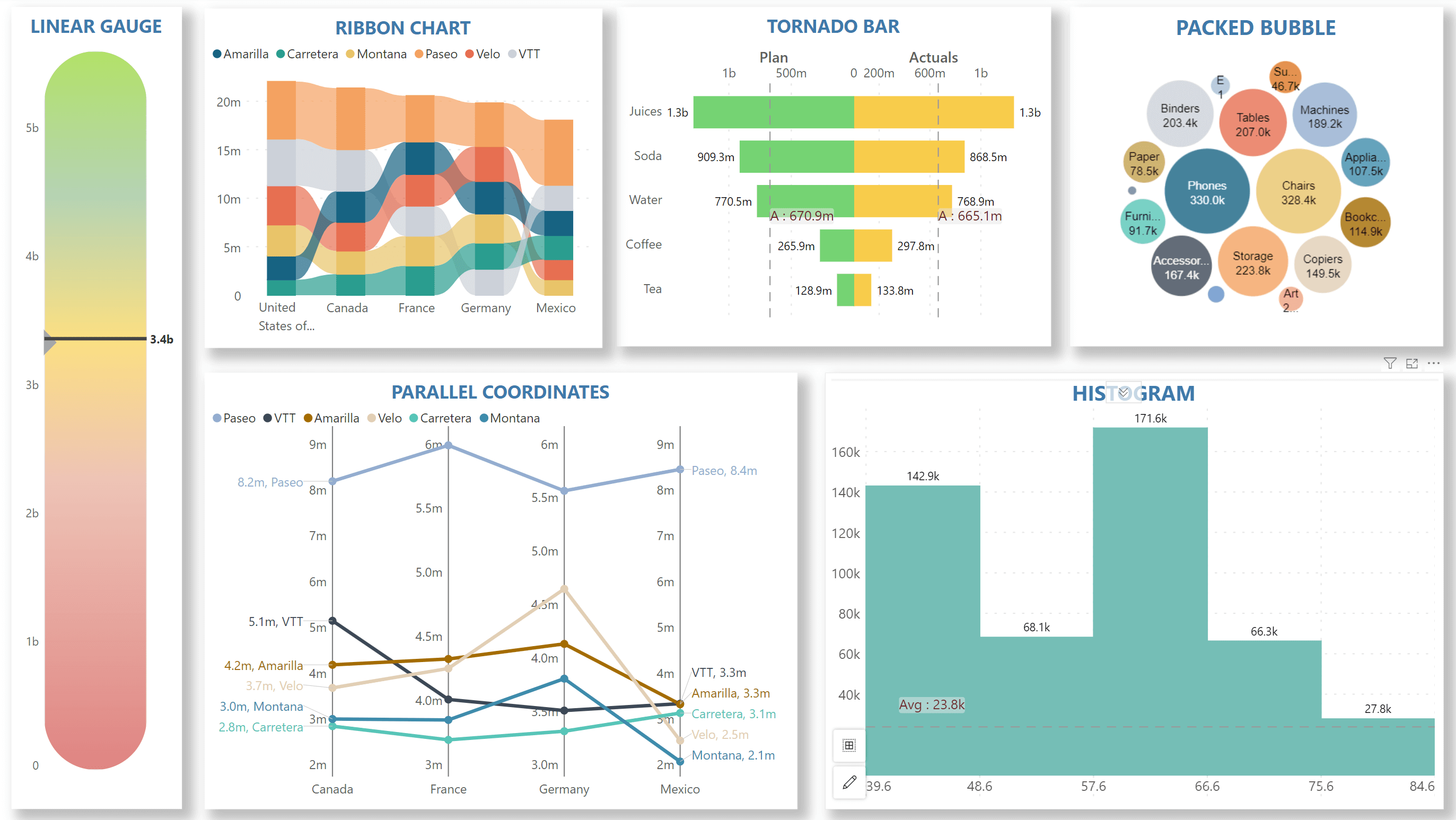
Analytics+ is loaded with a wide range of sophisticated and highly customizable visualization options. In the 4.2 release, we are broadening our diverse repository with fresh charting options:
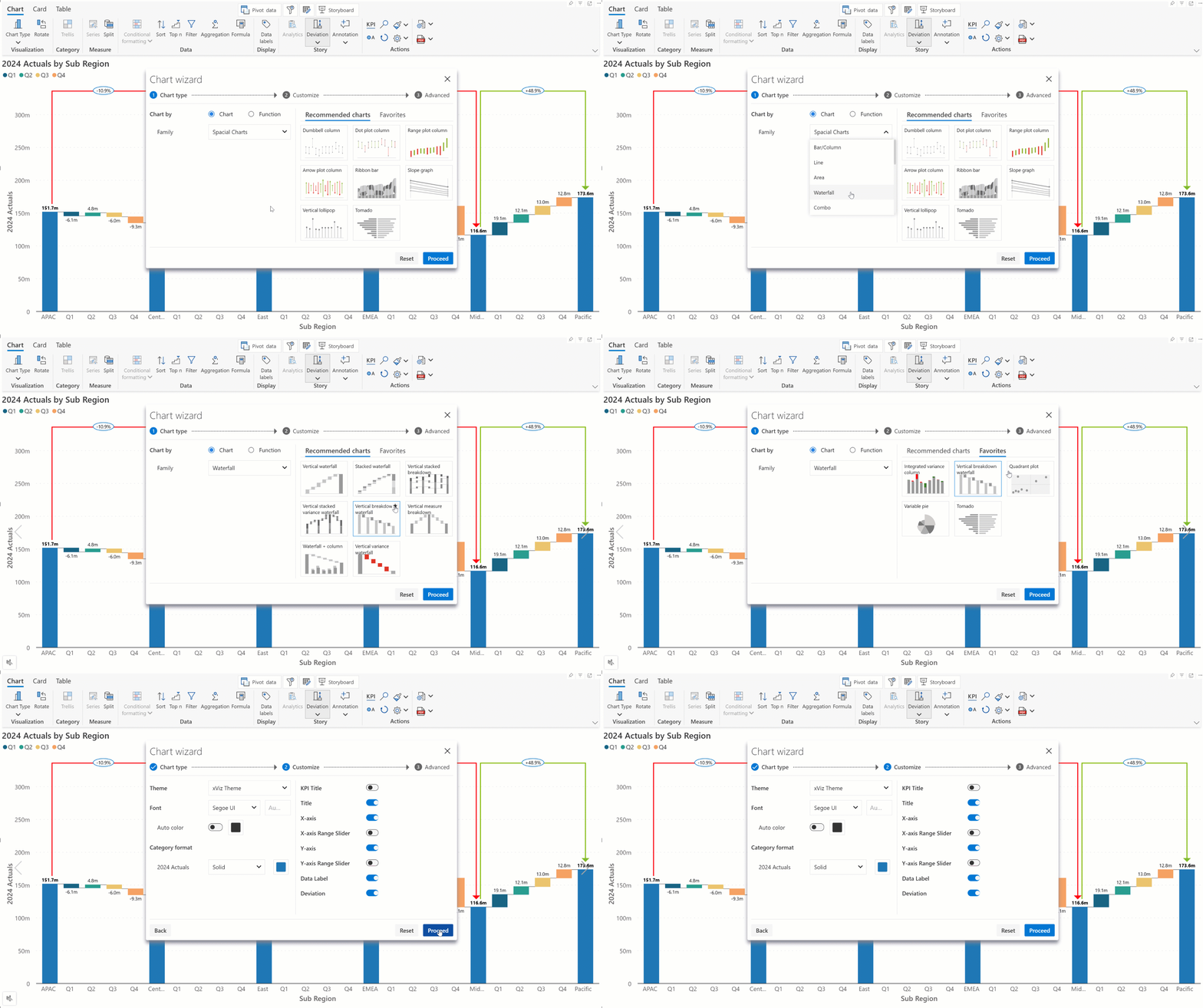
Looking for the right chart? The Chart Wizard is your all-in-one solution! It helps you find the right chart, configure display properties, and set ranking, sorting in one seamless onboarding screen.
Navigate to the Chart Type dropdown and select the last tab to open the Chart wizard.
Selection based on chart family
If you're familiar with different chart types and their use cases, use the Select Chart option to search by family. You can add your go-to chart types to the Favorites section for quick access.
Once you've selected a chart, you can toggle chart elements (KPIs, axes, data labels, deviation, etc) on or off. You can also adjust the theme, font, color, and fill style—all without navigating through separate settings.
Selection based on function
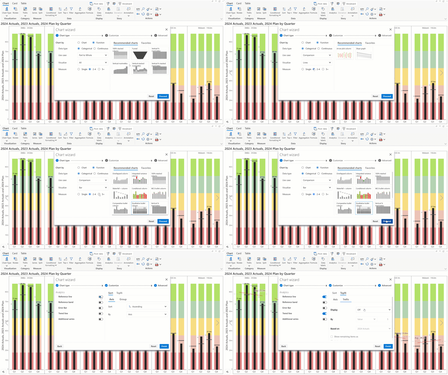
For more advanced recommendations, choose Function. This option helps you narrow down chart types based on the axis data (time series or categorical), use case (comparison, deviation, multivariate), visualization type (bars, points, lines) and number of measures.
Set up analytics, sorting, and ranking all at once from the advanced tab, without needing to configure each individually.
In card mode, you will see that the toolbar has been upgraded. The options to add KPI containers and choose images/text/insight charts are right at your fingertips.
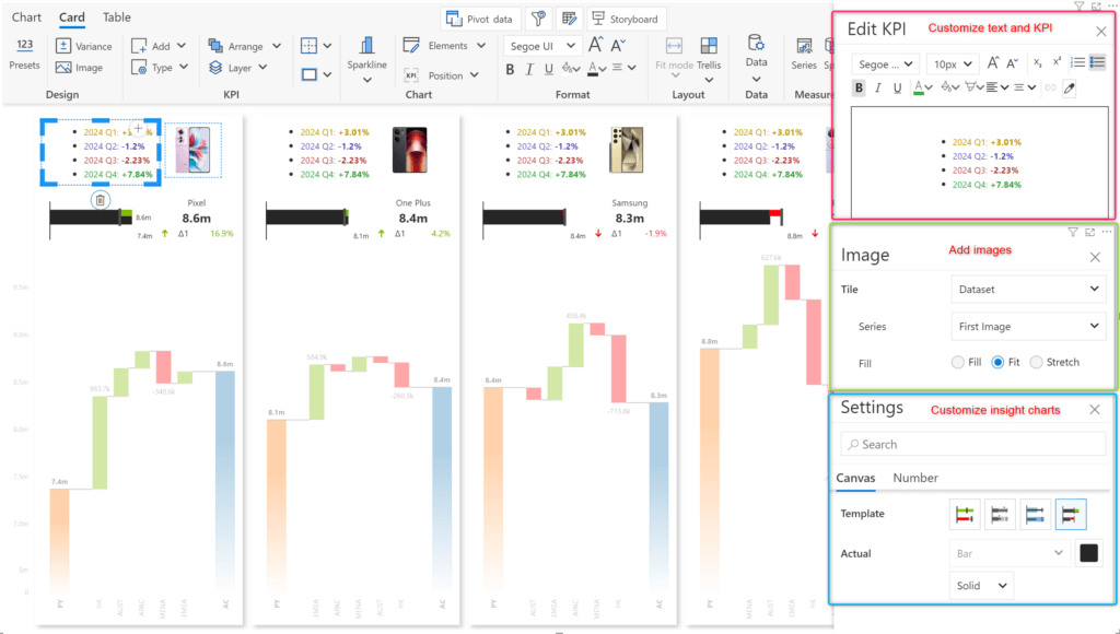
With Analytics+, you can create custom KPI card templates and reuse them across reports instead of building them from scratch.
Select the Export Card Preset option to create a JSON config file that can later be imported to use the same layout.
Note: Export card preset only persists the structure of KPI and not the chart properties. To restore layout + all properties use “Export Settings”.
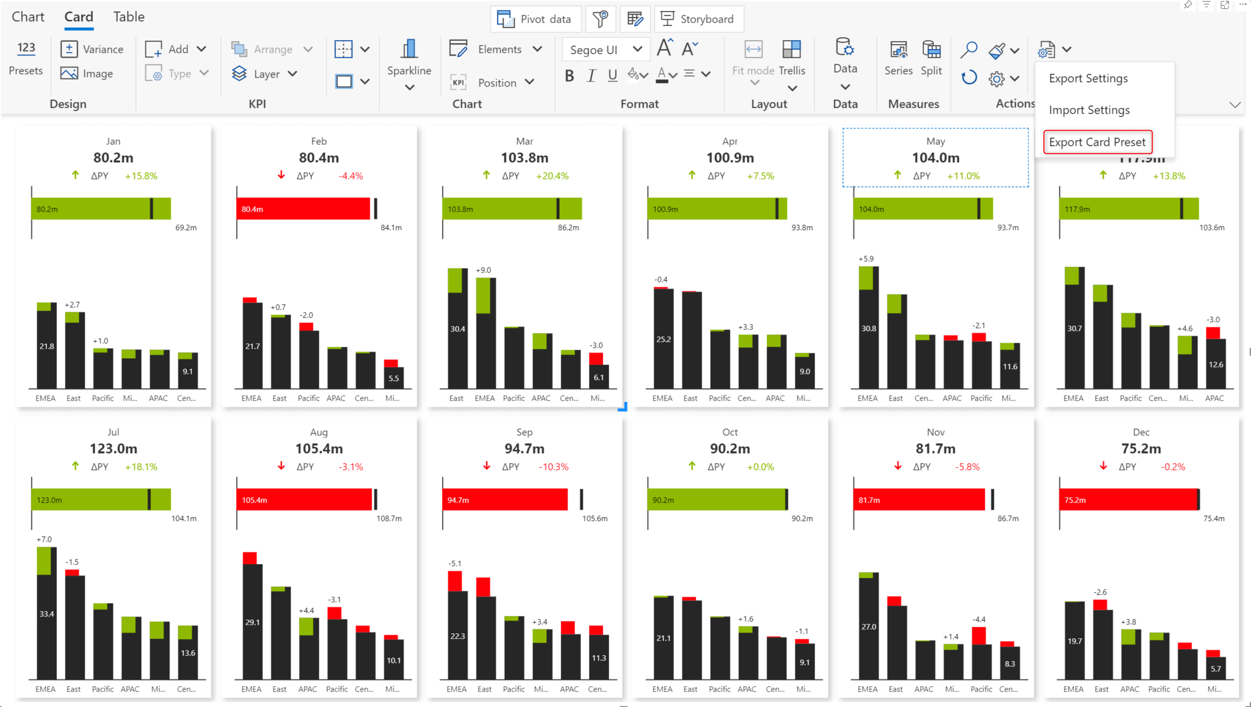
We have also added a range of single-click presets to capture simple and variance KPIs.

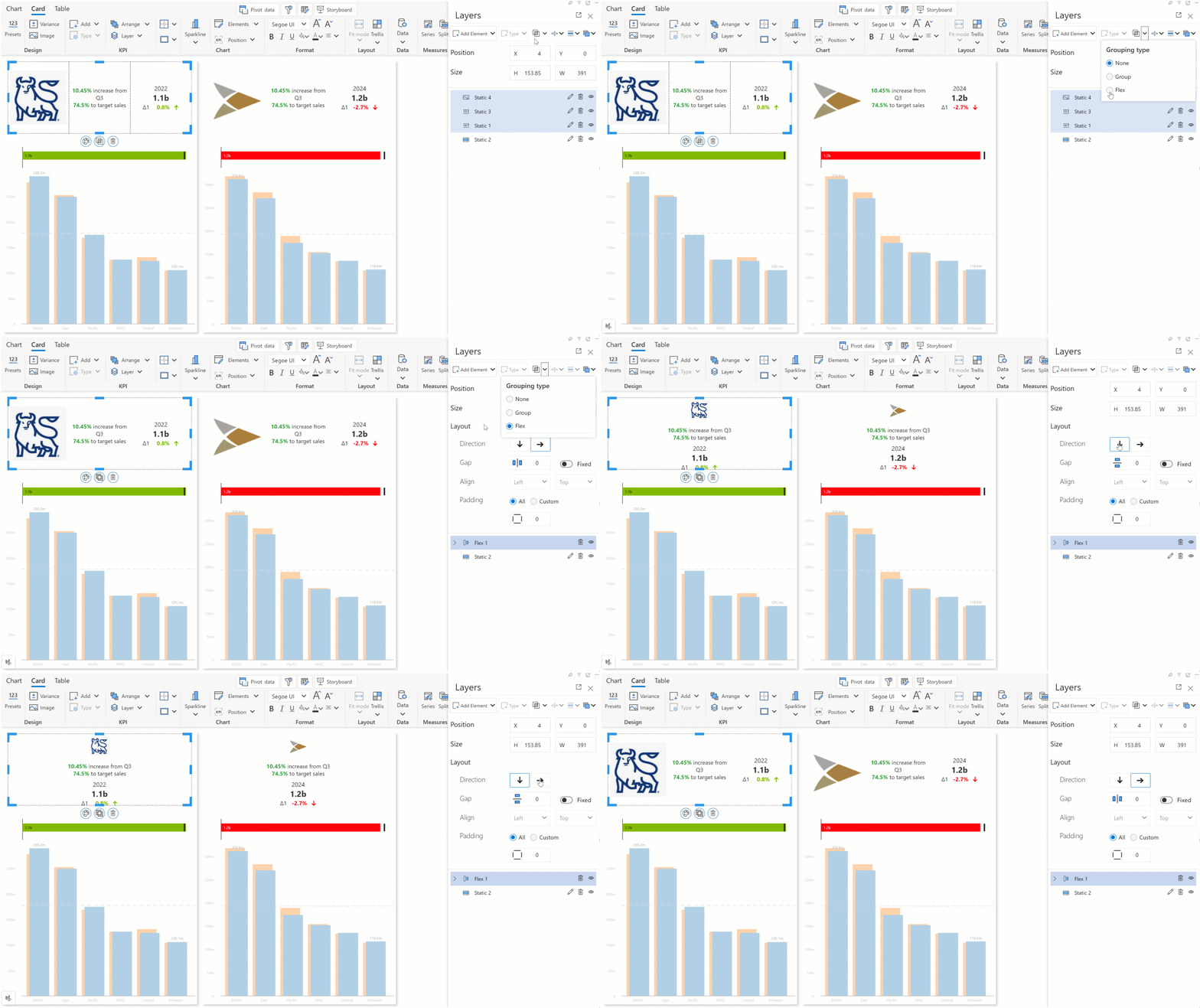
Creating composite multi-element KPI cards has never been easier. You can choose between the Flex and Group options to organize your images, inline charts, text data, and metrics. When you work with Flex positioning, you only need to choose the direction (horizontal or vertical), and Analytics+ will automatically handle the alignment and positioning with consistent gap and fill options.
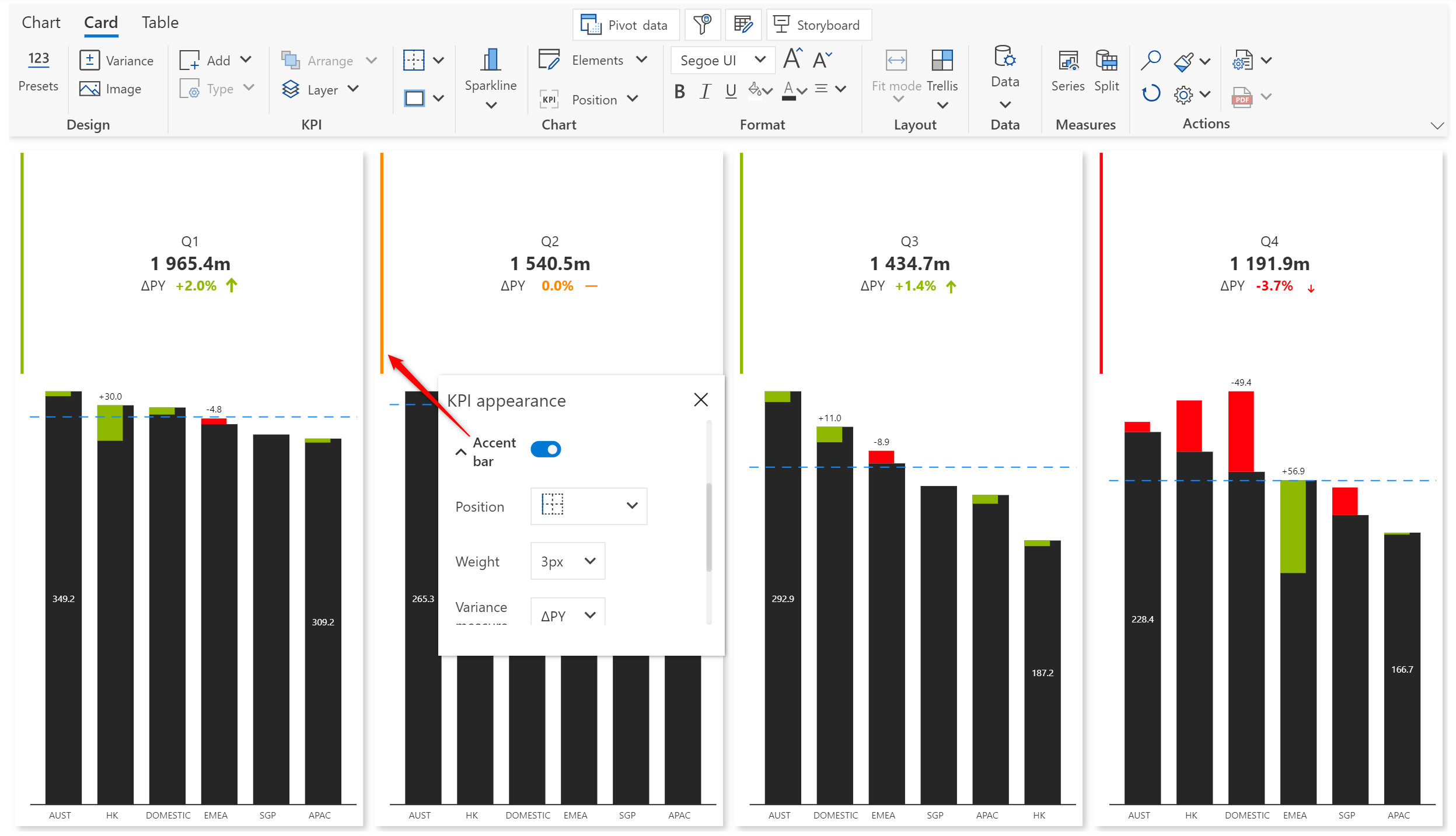
Accent bars help users assess metrics in an instant without having to analyze the numbers. You can enable accent bars from the KPI Appearance menu.
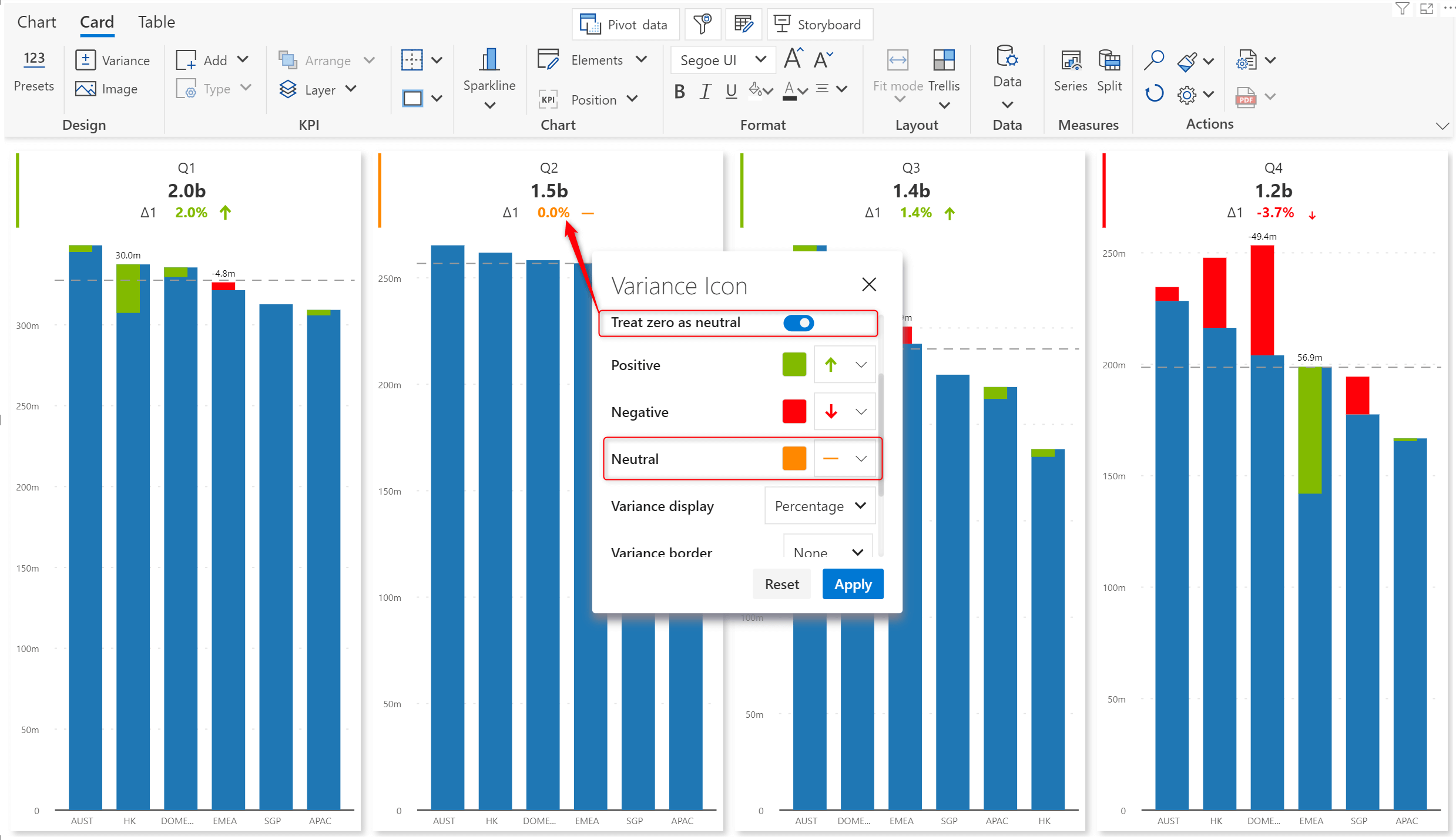
You can also choose to display neutral variances with a different icon and color. To customize variances, open the Variance icon menu.
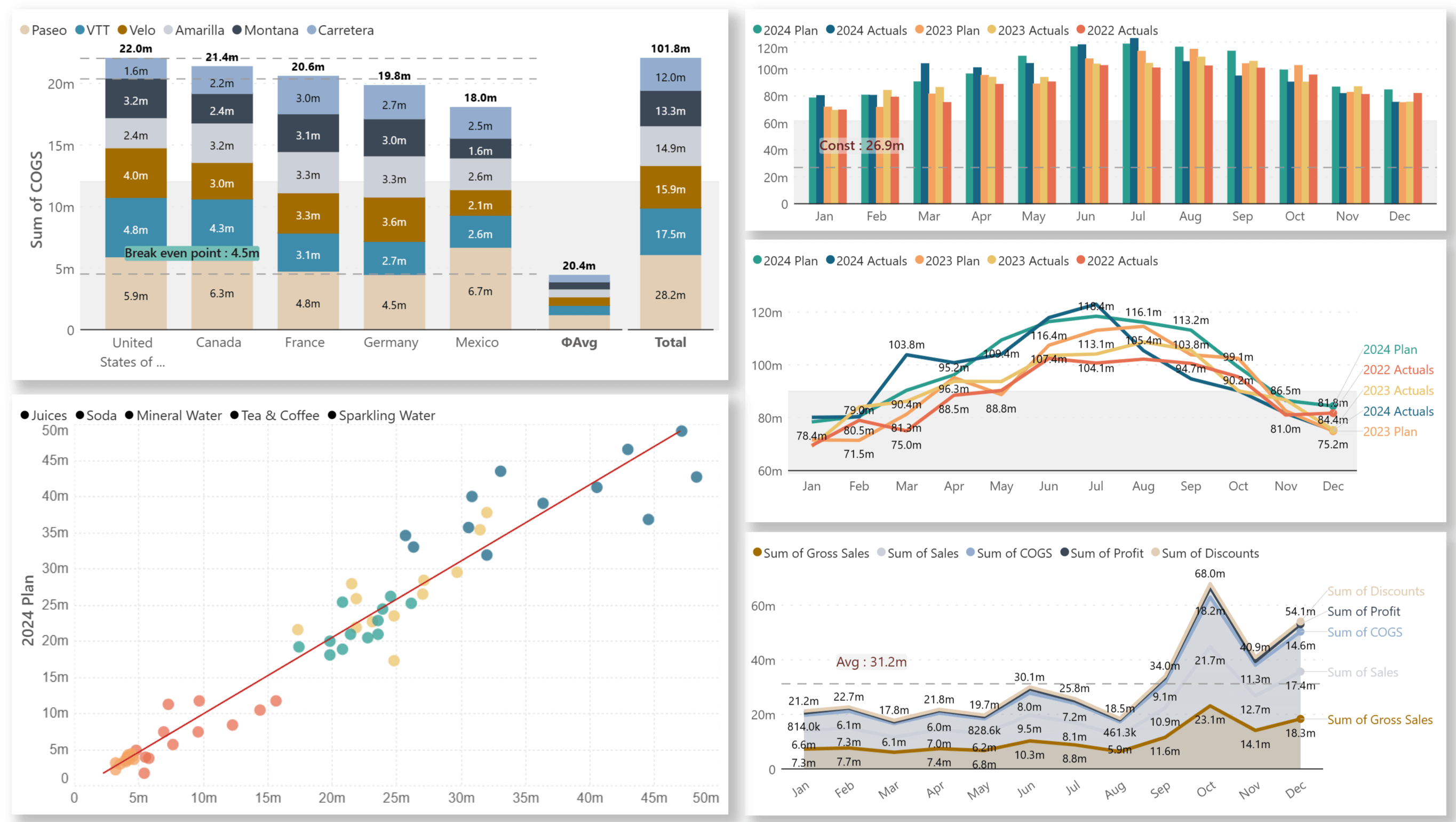
Draw more insights from stacked charts in the latest version. You can plot reference lines, reference bars, total and average bars, and trend lines based on the chart type.
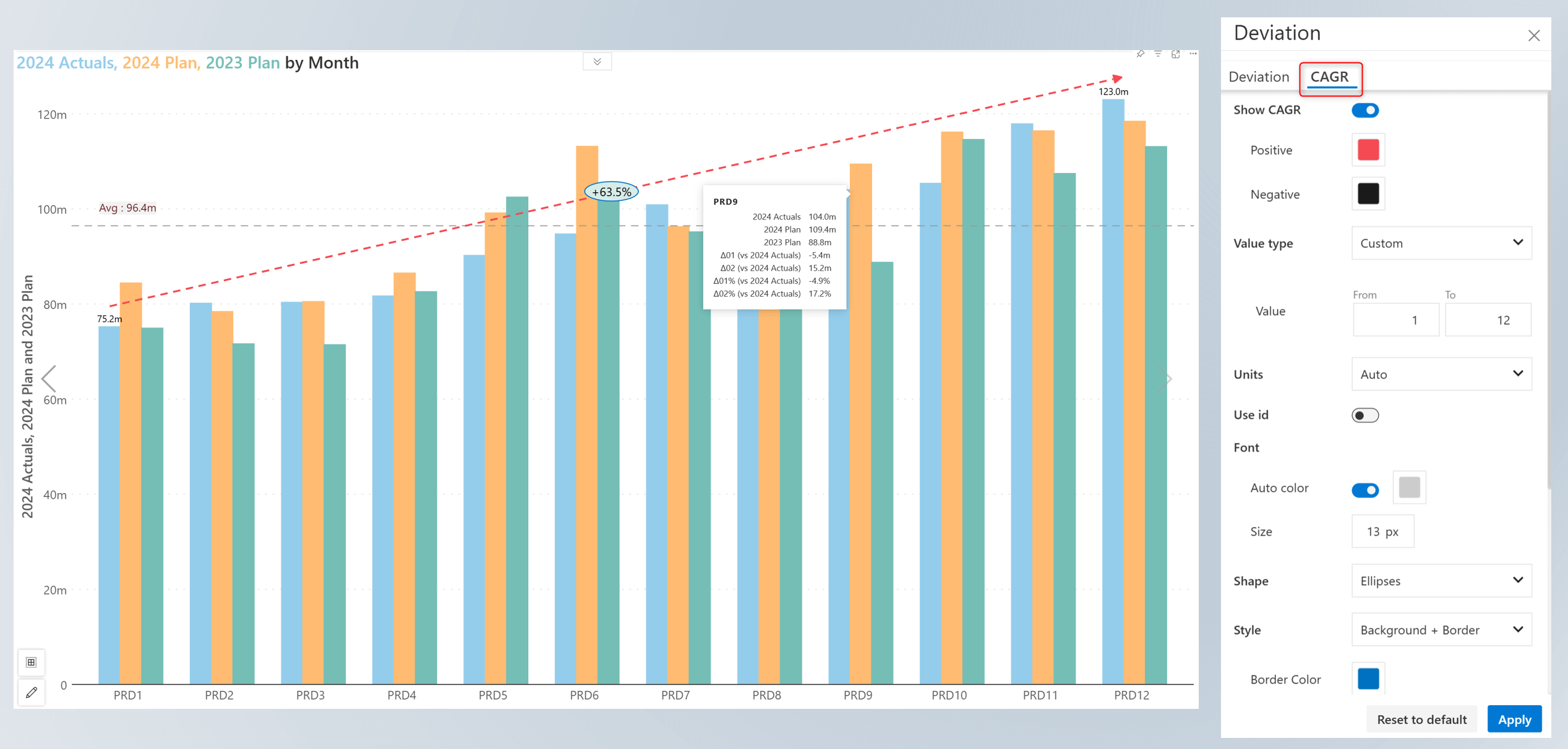
Plotting the CAGR in charts helps gauge the growth of an investment or business over a year or over a period of time without being distracted by individual fluctuations. You’ll notice a new dedicated tab for CAGR customizations in the Deviation side pane.
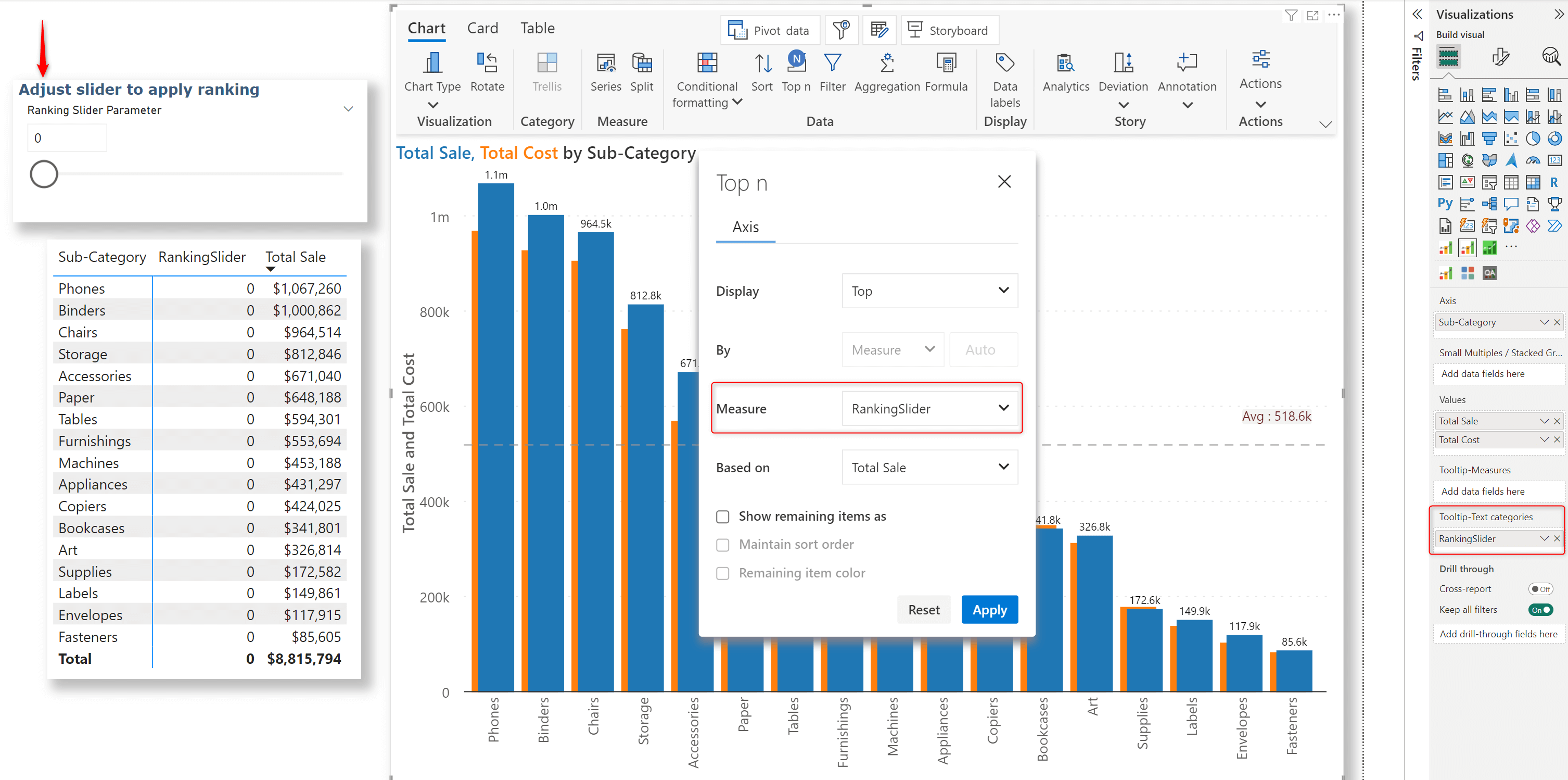
When your report has a numeric field parameter assigned to Tooltip-Text categories, users can quickly rank their data by adjusting the slider.
Select the numeric field parameter from the Measure dropdown in the TopN interface.
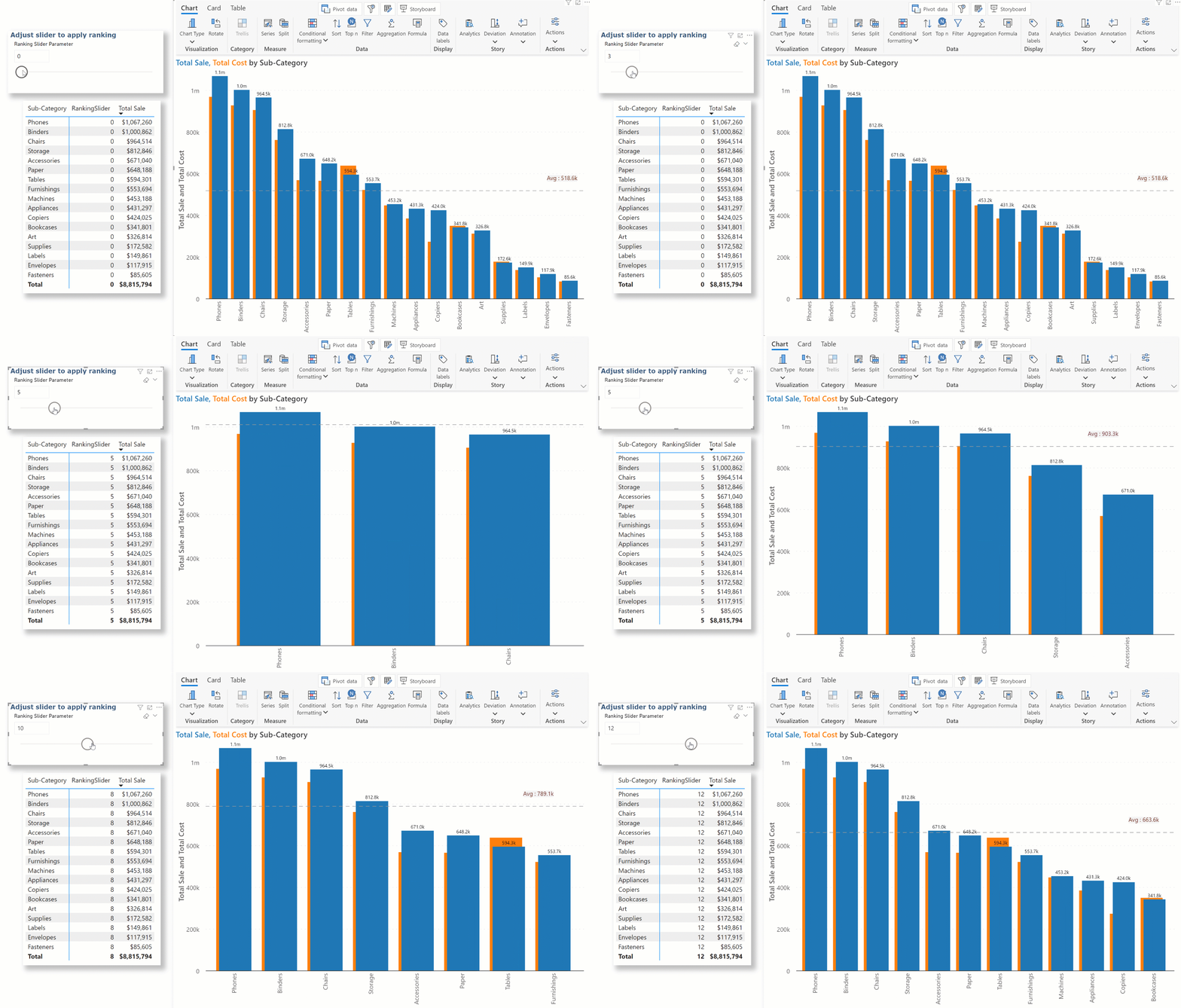
Dynamic ranking for axis categories in action:
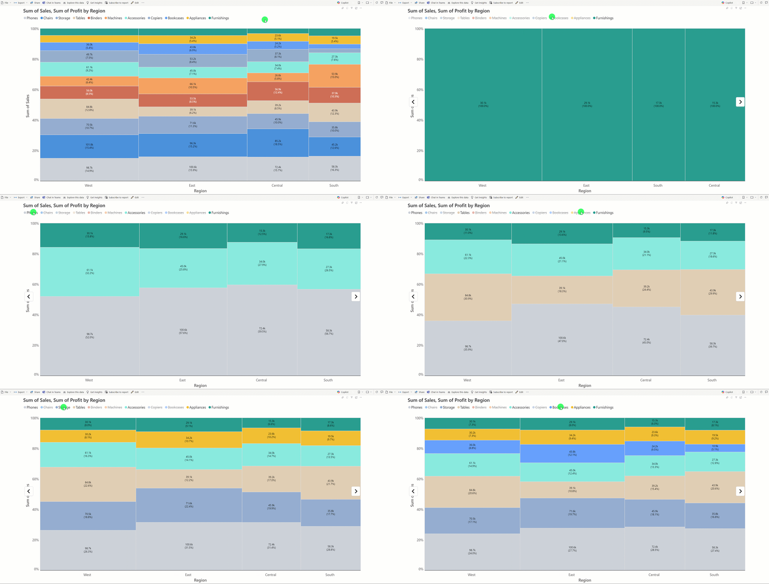
Legend-based data selection now provides options for including or excluding categories/measures. Navigate to Legend settings > Data selection to set the selection type. When you choose the Include option, Analytics+ plots only the selected data categories. The reverse happens when you choose Exclude.
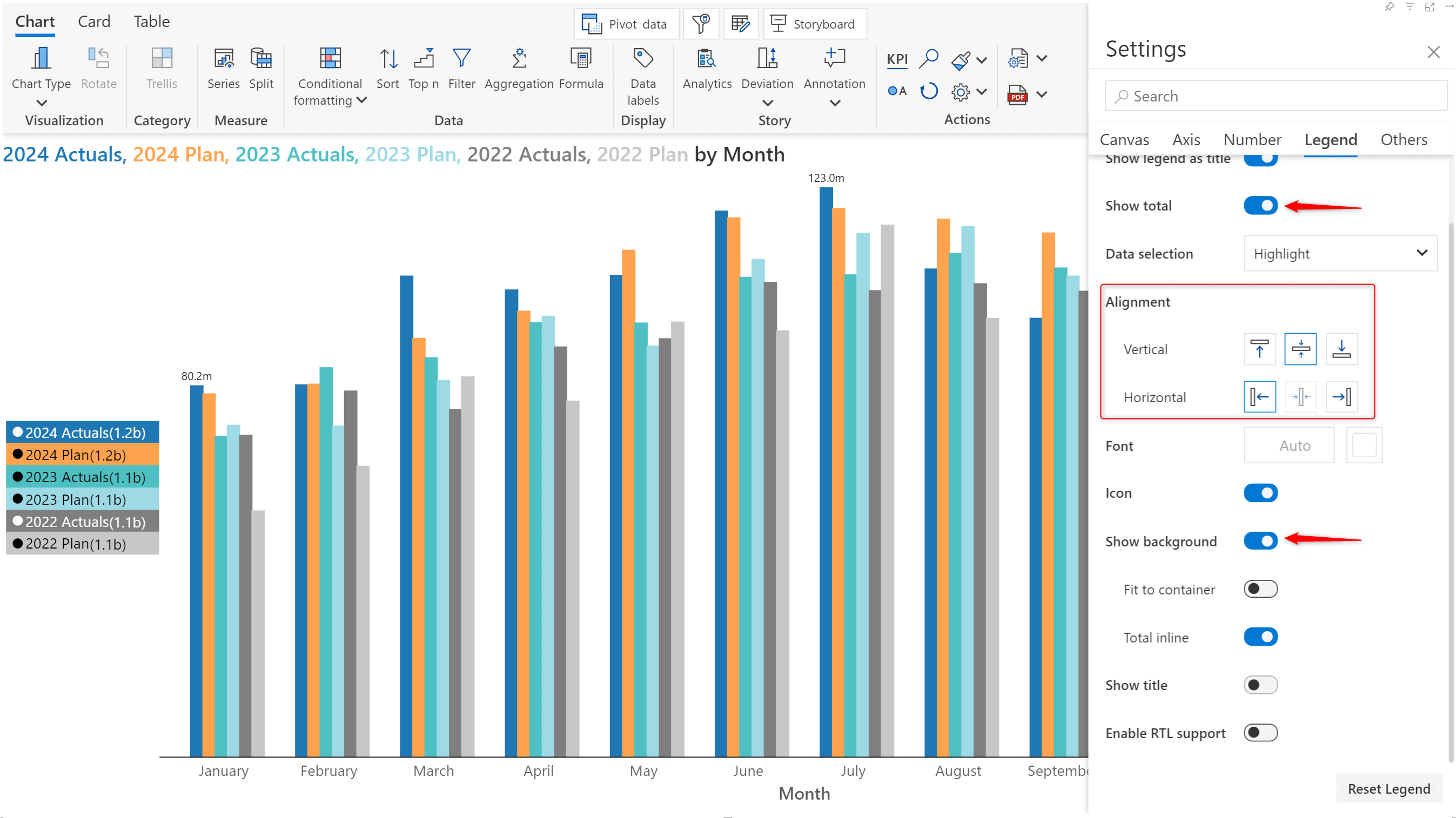
Show total: Display aggregated contribution in the legend.
Show background: Display category colors as background for legend. This gives a button view for legend.
Alignment: You will also notice that the vertical and horizontal alignment options have been changed from dropdowns to user-friendly icons.
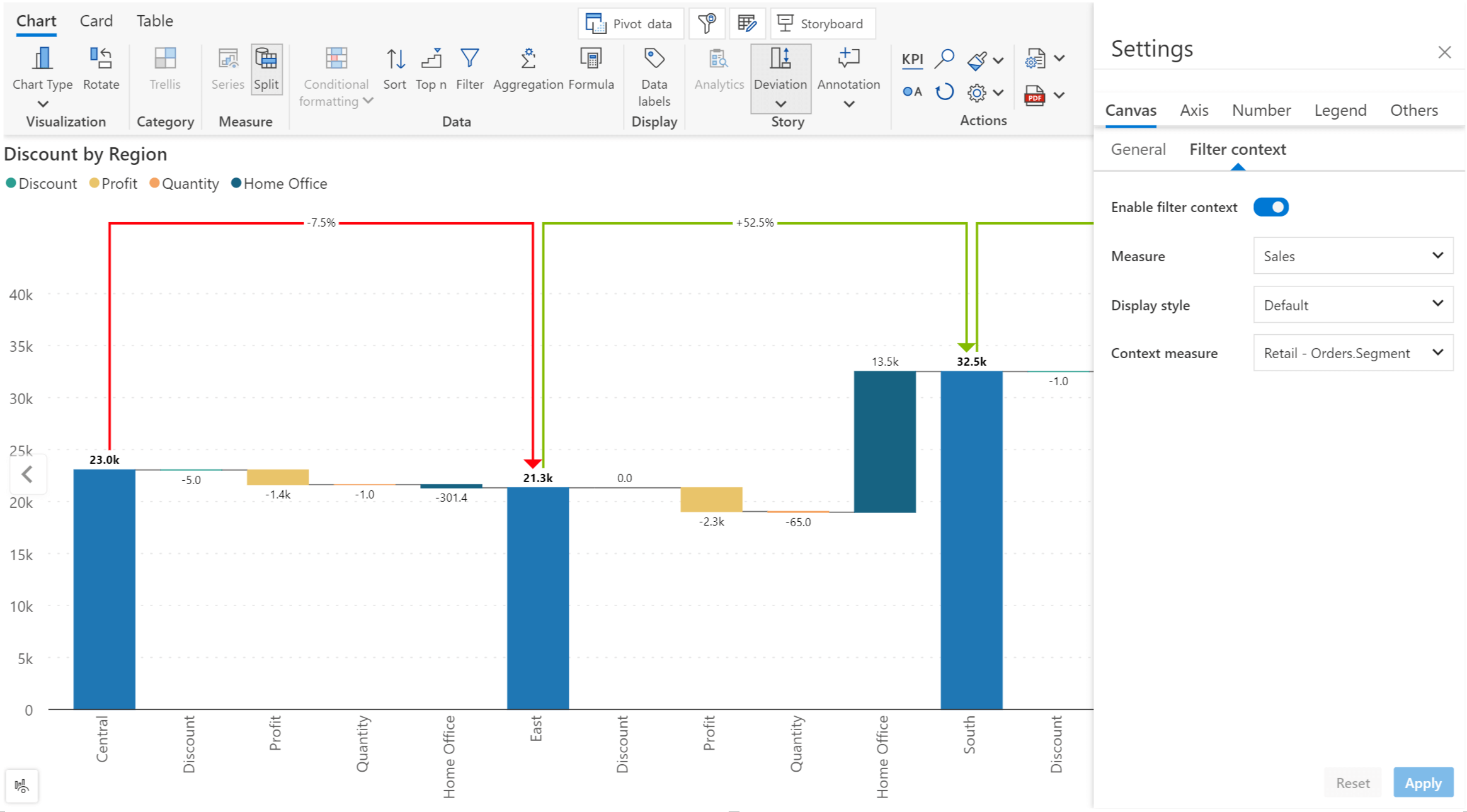
You can now display filter selections in your axis categories. Remember to enable the Axis label toggle while setting up context awareness.
In the example, we’ve used a measure breakdown waterfall. From the new Filter Context settings pane, you can select a particular measure and tag it to a filter context dimension. We’ve tagged the Sales measure to the Segment dimension.
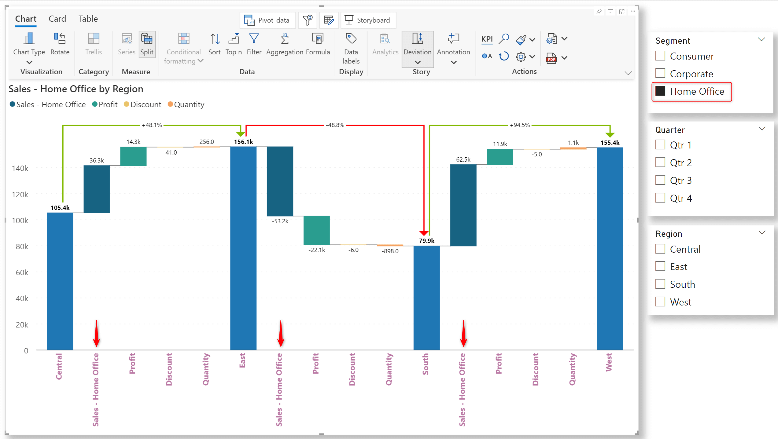
Notice how the Segment selection from the slicer is displayed along with the Sales measure in the axis label.
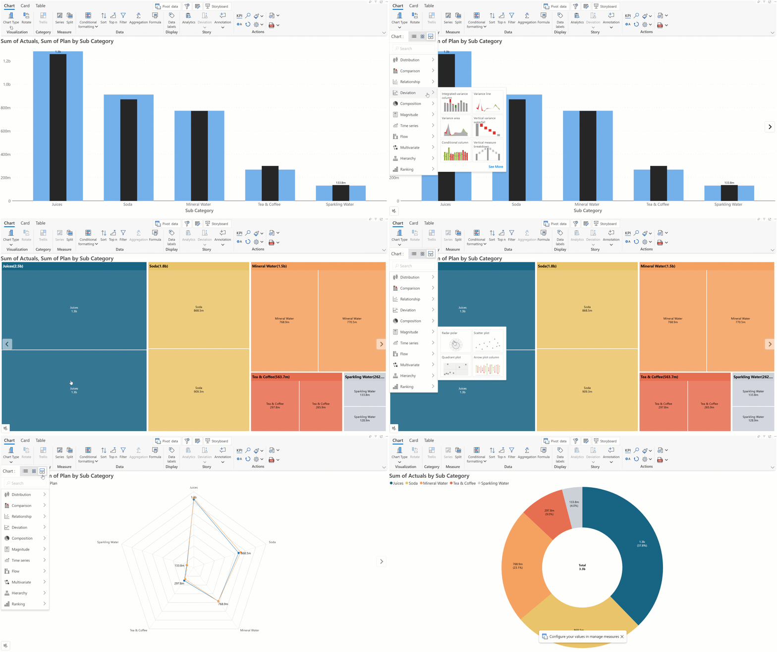
Exploring our vast repository of charts to find the one best suited for your business case can seem overwhelming. We've simplified navigability with scenario-based chart selection. Analytics+ can suggest the charts best aligned for specific scenarios like ranking, distribution, or comparison.
Please refer to the release notes for a comprehensive list of requirements, features, and bug fixes.
Learn more and get started with Inforiver
To learn more about the latest from Inforiver and why we are garnering recognition from industry experts, check out our newest brochure.
Inforiver and all our planning and analytics products continue to be updated to provide a diverse range of users with optimal performance. With continual improvements and innovations planned, we welcome your feedback.
Visit the Inforiver Community to share your ideas, vote on others’ submissions, and interact with other users.
If you’re ready to level up your planning, reporting, and analytics, try it for free today.
Inforiver helps enterprises consolidate planning, reporting & analytics on a single platform (Power BI). The no-code, self-service award-winning platform has been recognized as the industry’s best and is adopted by many Fortune 100 firms.
Inforiver is a product of Lumel, the #1 Power BI AppSource Partner. The firm serves over 3,000 customers worldwide through its portfolio of products offered under the brands Inforiver, EDITable, ValQ, and xViz.