
Upcoming webinar on 'Inforiver Charts : The fastest way to deliver stories in Power BI', Aug 29th , Monday, 10.30 AM CST. Register Now
Upcoming webinar on 'Inforiver Charts : The fastest way to deliver stories in Power BI', Aug 29th , Monday, 10.30 AM CST. Register Now
Creating compelling, insightful dashboards in Power BI often comes down to how much control you have over the design and data presentation. That’s where Inforiver Analytics+ stands out — offering unmatched customization options that let you fine-tune every element of your visualizations.
Step up your data storytelling with advanced legend configurations, data-driven analytics features, and new visual elements like cluster breakdown and arc gauge charts. We’ve also introduced a stepped layout in table mode for a cleaner, more intuitive display of hierarchical data. Plus, action dot–based conditional formatting now lets you extract insights at a glance.
Explore the latest updates that make Inforiver Analytics+ the most versatile planning and analytics solution available in Power BI.
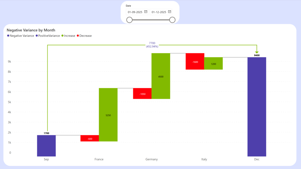
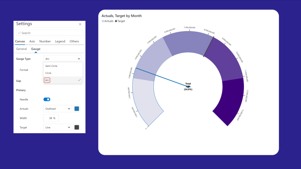
1.1. New chart types - Cluster breakdown waterfall, and Arc Gauge
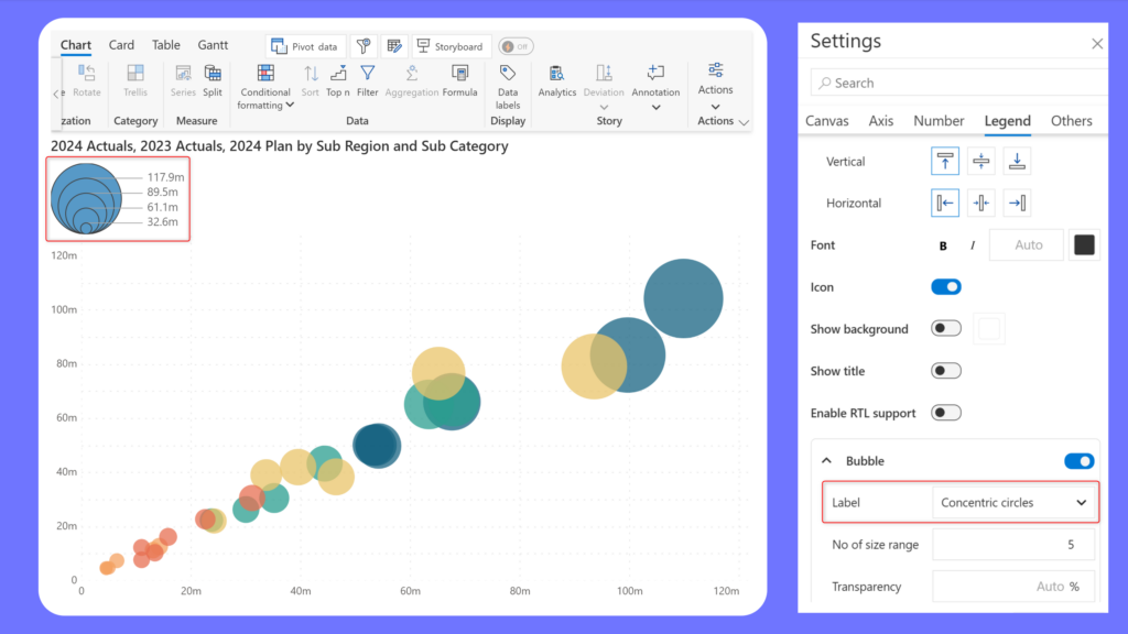
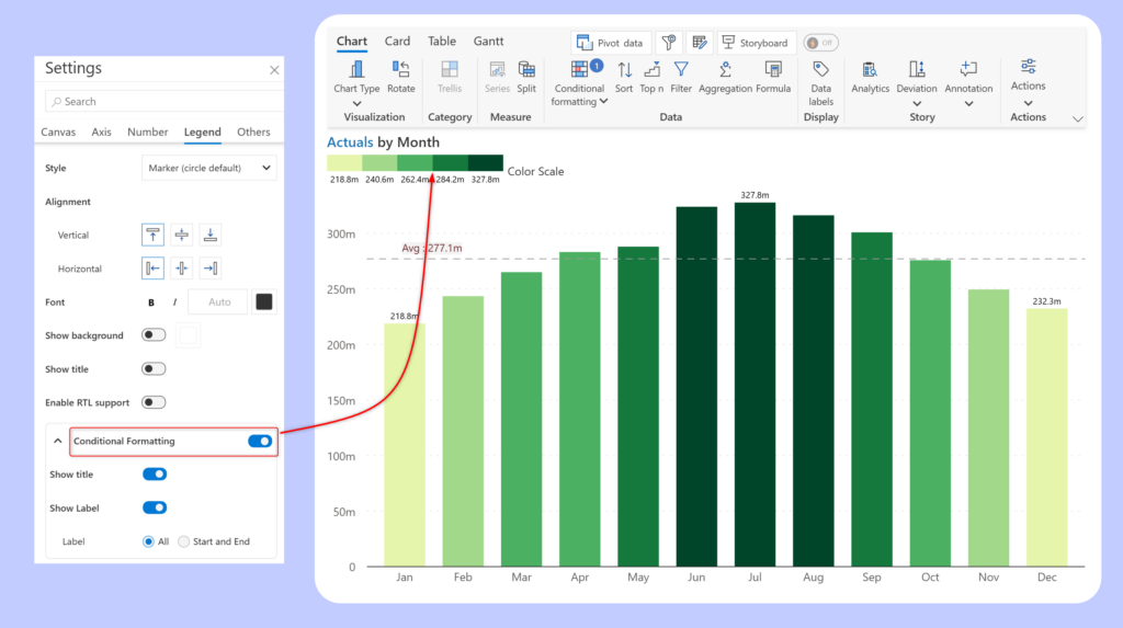
1.2. Feature enhancements – analytics and legend customizations
2.1. Pagination for KPI dashboards
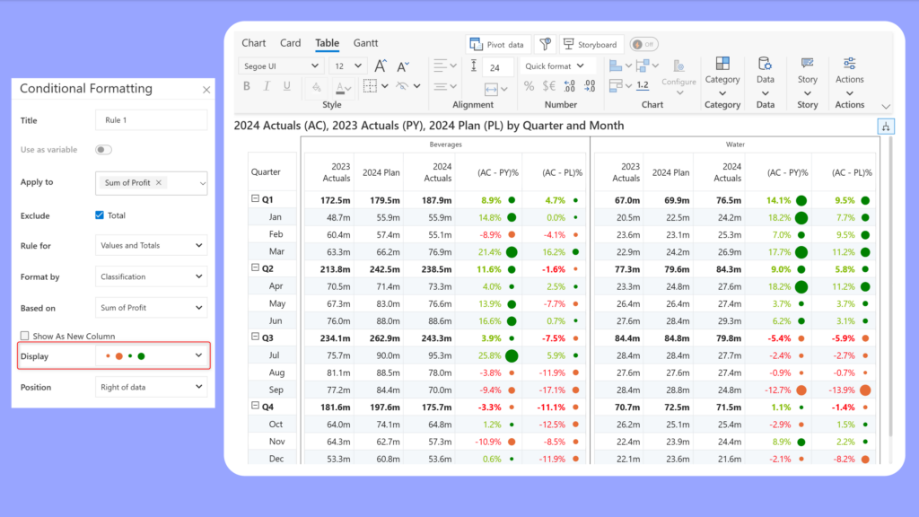
3.2. Conditional formatting - action dots
Have a look at our release notes for a comprehensive list of requirements, features, and bug fixes.
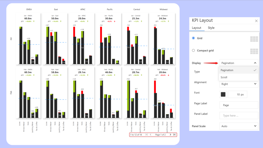
When you have a large number of KPI categories in your trellis, it can be tedious to scroll through the entire dataset. If scrolling is not your first preference, you can use the new pagination option in Trellis settings to browse your dashboard.
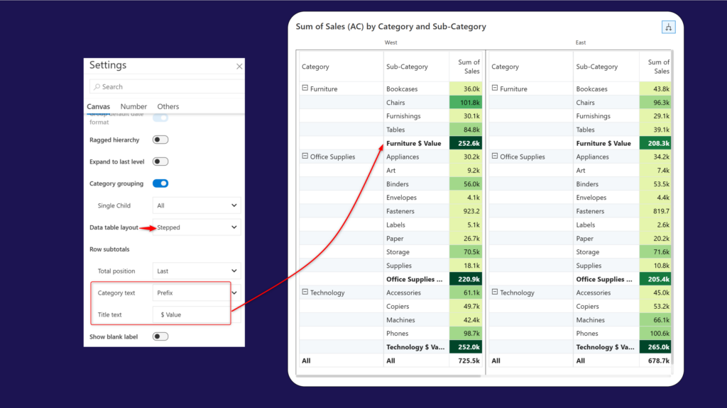
Analytics+ inherently provides advanced support for hierarchical data. The new stepped layout groups the child categories under the parent rows and makes it easier for report viewers to identify parent-child relationships.
Additionally, you can customize the sub-total row by adding the parent category as a prefix/suffix and enter a custom row header name in the Total text textbox.
Action dots help users quickly gauge the magnitude of the measure and spot deviations. Choose the Format by > Classification option to use action dots in your tables.
To learn more about the latest from Inforiver and why we are garnering recognition from industry experts, check out our newest brochure.
Inforiver and all our planning and analytics products continue to be updated to provide a diverse range of users with optimal performance. With continual improvements and innovations planned, we welcome your feedback.
If you’re ready to level up your planning, reporting, and analytics, try our products for free today.

Inforiver helps enterprises consolidate planning, reporting & analytics on a single platform (Power BI). The no-code, self-service award-winning platform has been recognized as the industry’s best and is adopted by many Fortune 100 firms.
Inforiver is a product of Lumel, the #1 Power BI AppSource Partner. The firm serves over 3,000 customers worldwide through its portfolio of products offered under the brands Inforiver, EDITable, ValQ, and xViz.