Upcoming webinar on 'Inforiver Charts : The fastest way to deliver stories in Power BI', Aug 29th , Monday, 10.30 AM CST. Register Now
Upcoming webinar on 'Inforiver Charts : The fastest way to deliver stories in Power BI', Aug 29th , Monday, 10.30 AM CST. Register Now
More new charts and even better insights have been packed into the latest version of Inforiver Analytics+! It includes Sankey charts, Multi-axis charts, and Multi-measure bullet charts to help you showcase your data and support your data storytelling. Achieve a new level of project timeline visualization with the powerful and immensely popular Gantt chart. In this release, we’ve stepped up the analytics feature with dynamic reference lines, error bands, and error bars for stacked/cluster charts.
Discover the newest features and innovations in version 4.5 that makes Inforiver Analytics+ the most powerful data visualization platform in Power BI!
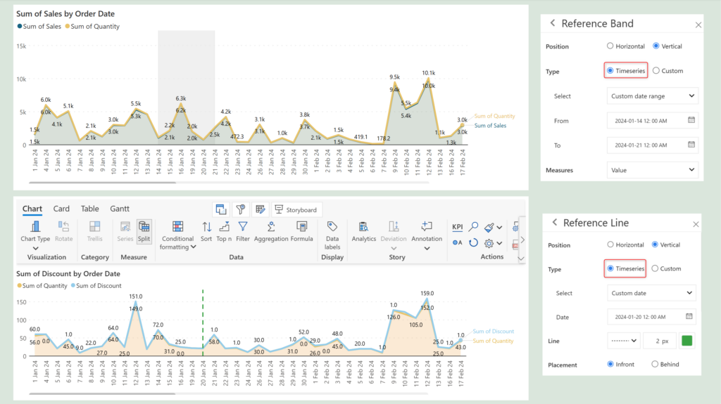
2.2. Dynamic reference lines for time series
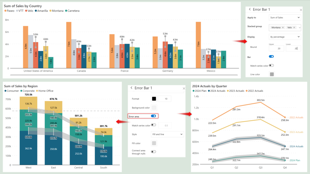
2.3. Error bars for stacked and cluster charts
4. Generic features and performance enhancements
4.1. Conditional formatting rules in the legend
4.3. UI/UX reference line settings reorganization
Please refer to our release notes for a comprehensive list of requirements, features, and bug fixes.
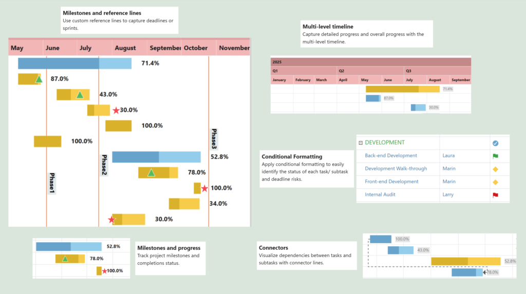
Inforiver Analytics+ 4.5 comes with the best-in-class Gantt chart for Power BI. With the fully customizable Gantt chart, you can visualize task schedules, identify dependencies, allocate resources, and track deadlines.
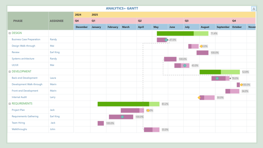
The multi-level timeline enables capturing progress at a detailed level. Use connectors to visualize project-level dependencies and apply conditional formatting to quickly identify status and risks. Track process completion with milestones and custom reference lines.
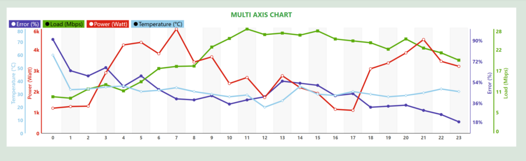
Multi-axes chart: To visualize measures with mixed scaling, Inforiver Analytics+ gives you the flexibility to render a dedicated y-axis for each measure. You can select a specific chart type for each measure from the series menu. The y-axis and charts have focused settings for each measure.
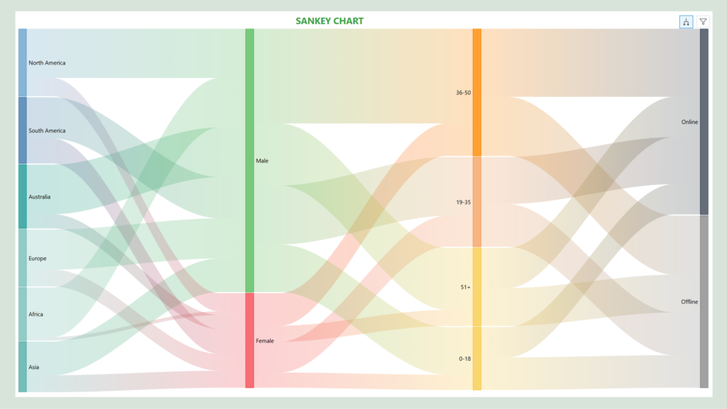
Sankey charts: Sankey charts are a great way to visualize cash flows, resource allocation, or revenue distribution between various dimension categories. The nodes represent the categories, the flows depict the connections between categories and the width of the flows shows the quantity.
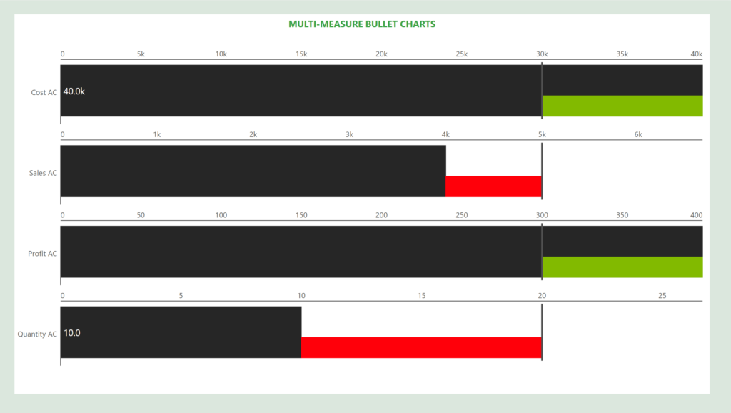
Multi-measure bullet chart: Ideal for side-by-side visualization of multiple measures with different scaling factors. You can track the actuals against the target simultaneously for all the measures.
Plot reference lines for specific dates or reference bands for date ranges when your axis dimension is time-based. Select the Timeseries radio button to plot week/month/year/today/today+-n days or a custom time frame.
The latest version of Inforiver Analytics+ allows you to determine the variability between groups by plotting error bars for cluster and stacked charts. You can select the stacked categories for which the bars should be rendered. You can also plot an error band across axis categories by enabling the Error area toggle.
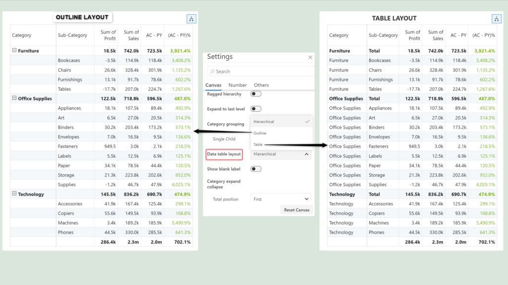
The latest version of Inforiver Analytics+ introduces two new layouts in addition to the existing Hierarchical layout: Table and Outline. Navigate to Canvas settings > Data table layout to select the layout.
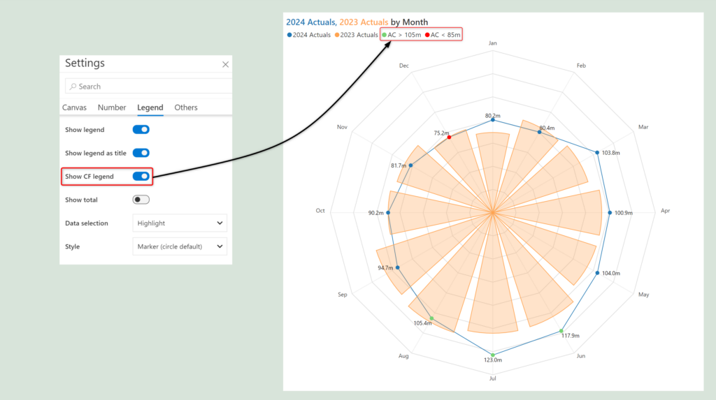
Users can now quickly understand what the conditional formatting in your chart signifies. Inforiver Analytics+ provides an option to display the conditional formatting rule and color in the legend, enhancing the report's clarity and making it easier to interpret.
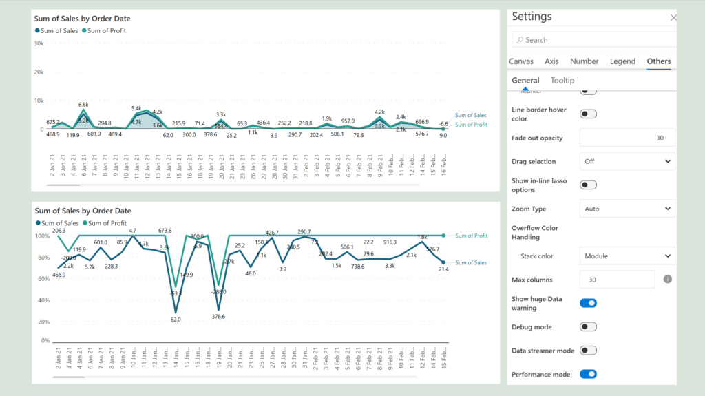
Line and area charts with high data volume and a large number of data points can be plotted significantly faster with the performance mode option. Enable the toggle from “Other” settings for faster rendering.
Performance is also supported for the scatter/bubble family with lasso and reverse lasso features.
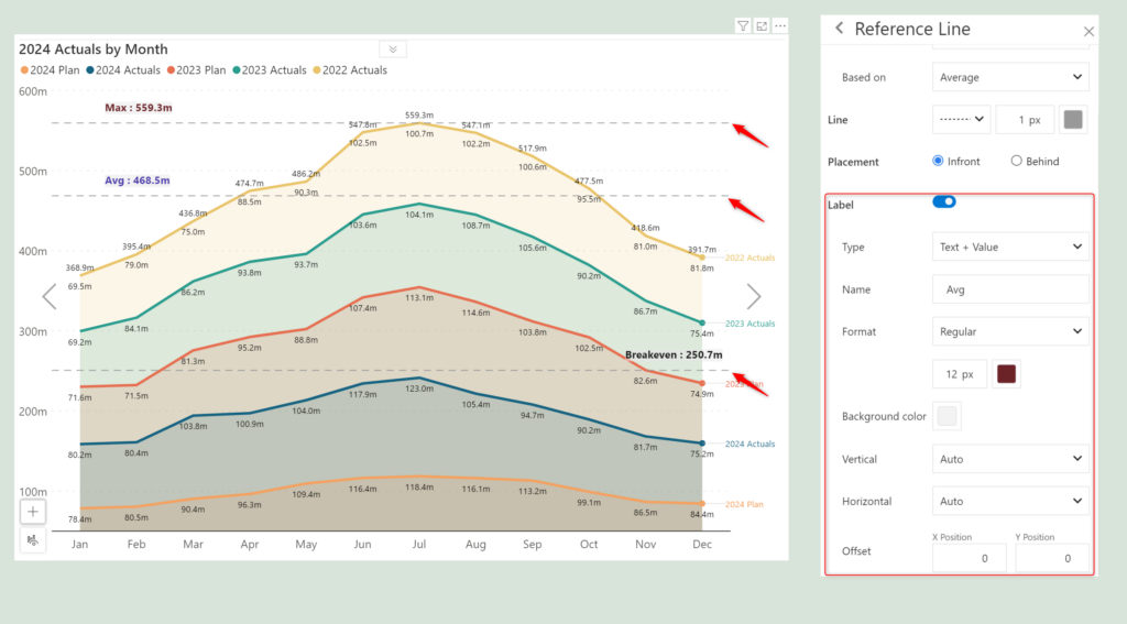
The reference line options have been restructured, and label settings have been grouped for better accessibility.
To learn more about the latest from Inforiver and why we are garnering recognition from industry experts, check out our newest brochure.
Inforiver and all our planning and analytics products continue to be updated to provide a diverse range of users with optimal performance. With continual improvements and innovations planned, we welcome your feedback.
If you’re ready to level up your planning, reporting, and analytics, try our products for free today.

Inforiver helps enterprises consolidate planning, reporting & analytics on a single platform (Power BI). The no-code, self-service award-winning platform has been recognized as the industry’s best and is adopted by many Fortune 100 firms.
Inforiver is a product of Lumel, the #1 Power BI AppSource Partner. The firm serves over 3,000 customers worldwide through its portfolio of products offered under the brands Inforiver, EDITable, ValQ, and xViz.