
Upcoming webinar on 'Inforiver Charts : The fastest way to deliver stories in Power BI', Aug 29th , Monday, 10.30 AM CST. Register Now
Upcoming webinar on 'Inforiver Charts : The fastest way to deliver stories in Power BI', Aug 29th , Monday, 10.30 AM CST. Register Now
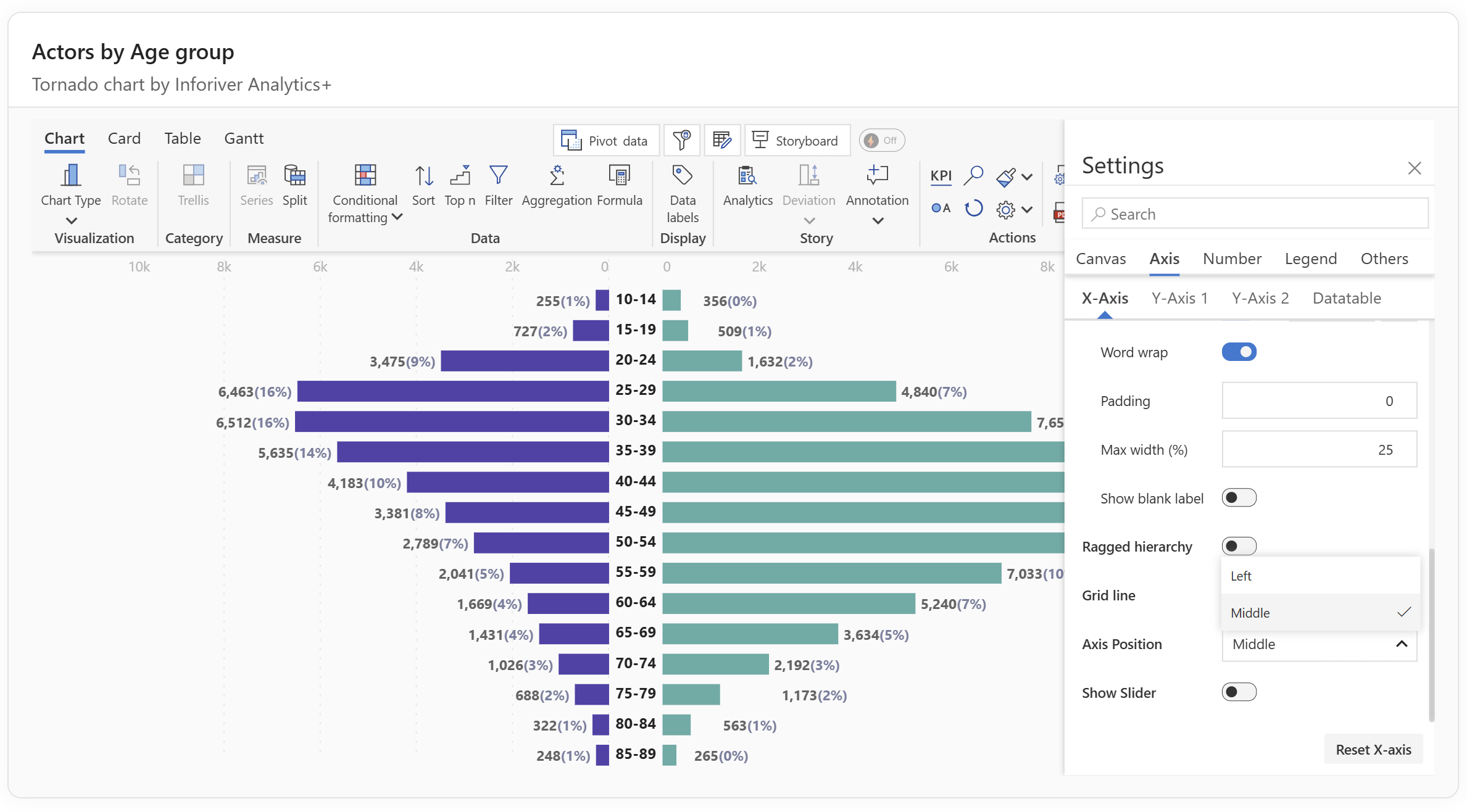
A tornado chart is a visualization used to compare the relative impact of different variables, making it especially useful for sensitivity analysis and side-by-side comparisons. Its horizontal bar layout highlights the largest effects at the top and the smallest at the bottom, creating a shape that resembles a tornado. This makes tornado charts effective for scenarios such as evaluating risk factors, comparing performance drivers, or prioritizing business inputs based on their influence.
In this post, we will explain how to interpret and apply tornado charts, share best practices for using them effectively, and show how Inforiver Analytics+ for Power BI extends their capabilities with advanced features for deeper analysis.
A Tornado chart is a specialized bar chart that visually compares two sets of values or the sensitivity of a result to changes in different variables. What makes it particularly powerful is its ability to facilitate the comparison of two distinct dimensions for various or specific sets of variables.
For instance, you could use it to evaluate the performance of 'Actual Sales' versus 'Target Sales' across different product categories or analyze the impact of 'Cost Factor A' versus 'Cost Factor B' on overall project profitability for a range of scenarios. The chart effectively displays two sets of horizontal bars on either side of a central axis, resembling a tornado, making it easy to identify which variables or factors have the most significant influence or difference.
Tornado Charts and Butterfly Charts are essentially the same type of data visualization. The terms are often used interchangeably due to their identical structure, purpose, and appearance. Both charts display two sets of data side-by-side, mirroring each other from a central vertical axis, using horizontal bars to represent values for each category. Their primary purpose is comparison – to quickly and effectively visualize the differences and relationships between two opposing or complementary data sets. When the bars are sorted, typically with the largest values at the top and decreasing downwards, they often create a shape that resembles a tornado (widest at the top, narrowing downwards. The "butterfly" resemblance comes from the two sets of bars extending outwards symmetrically from the central axis, forming what looks like two distinct "wings" on either side of the central line, with the vertical axis itself acting as the "body" of the butterfly. This symmetrical, wing-like extension is where the name "Butterfly Chart" originates.
Creating a Tornado chart involves a unique arrangement where values from two distinct dimensions or categories are plotted on opposite sides of a central, shared axis. Essentially, you take two sets of data (represented as horizontal bars) and extend them outwards in opposing directions from a vertical centreline. This effectively allows for a direct visual comparison of the magnitudes of each data set relative to one another.
Interpreting a Tornado chart involves observing the length and position of the bars. The bars extending furthest from the central axis represent the factors with the largest impact or difference between the two compared values. This visual hierarchy allows for quick identification of critical elements, enabling faster decision-making.
When it comes to visualizing comparative data, Inforiver Analytics+ elevates the presentation of Tornado charts in Microsoft Power BI. As a Power BI Certified Visual, it significantly enhances data visualization and storytelling. It offers an intuitive, no-code user experience, allowing professionals to build Tornado chart in minutes.
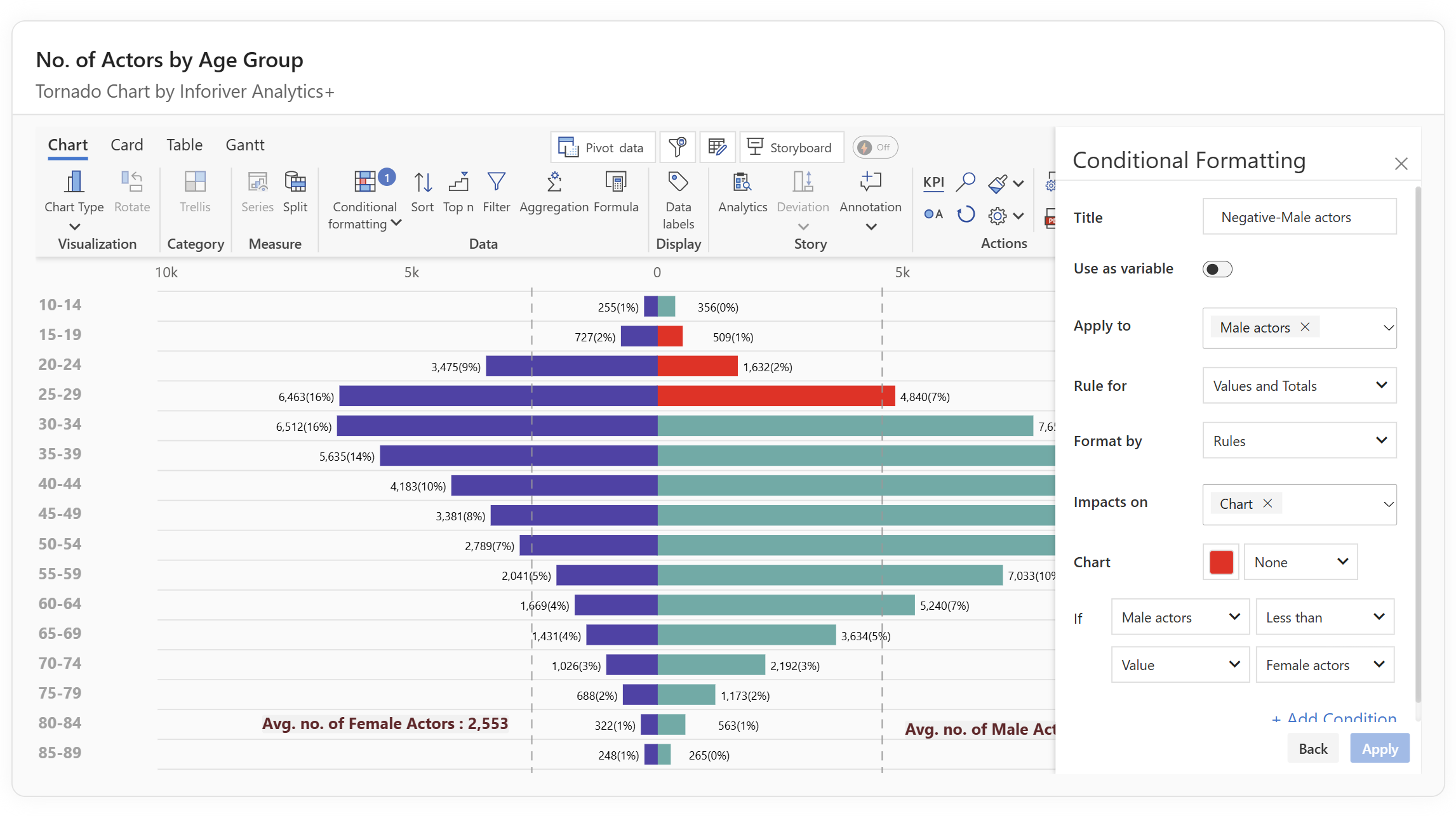
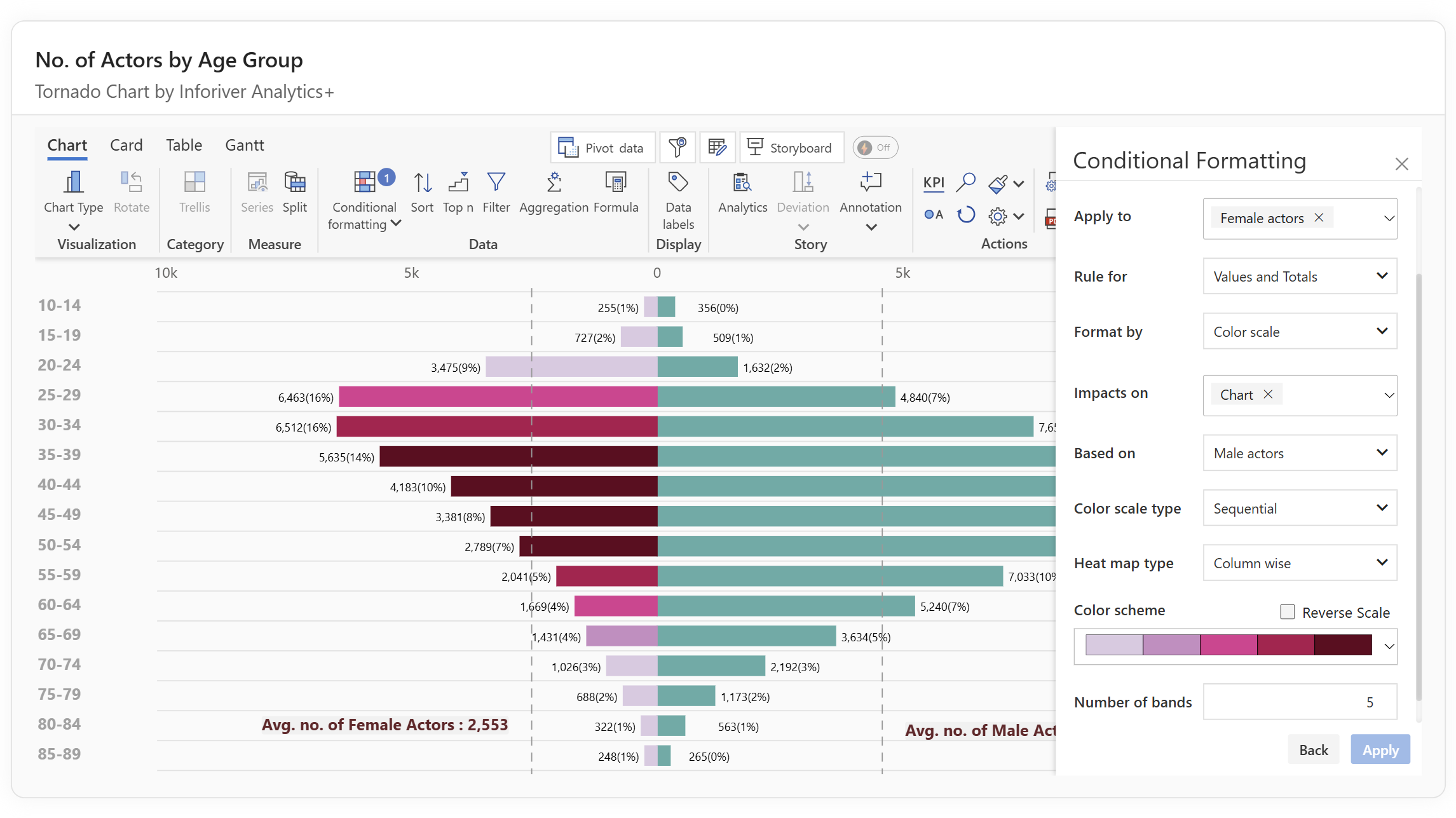

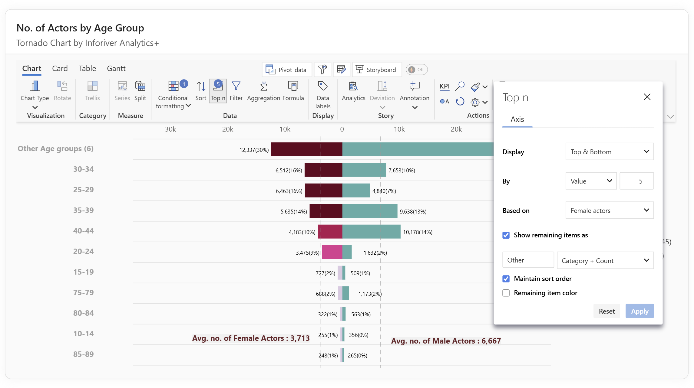
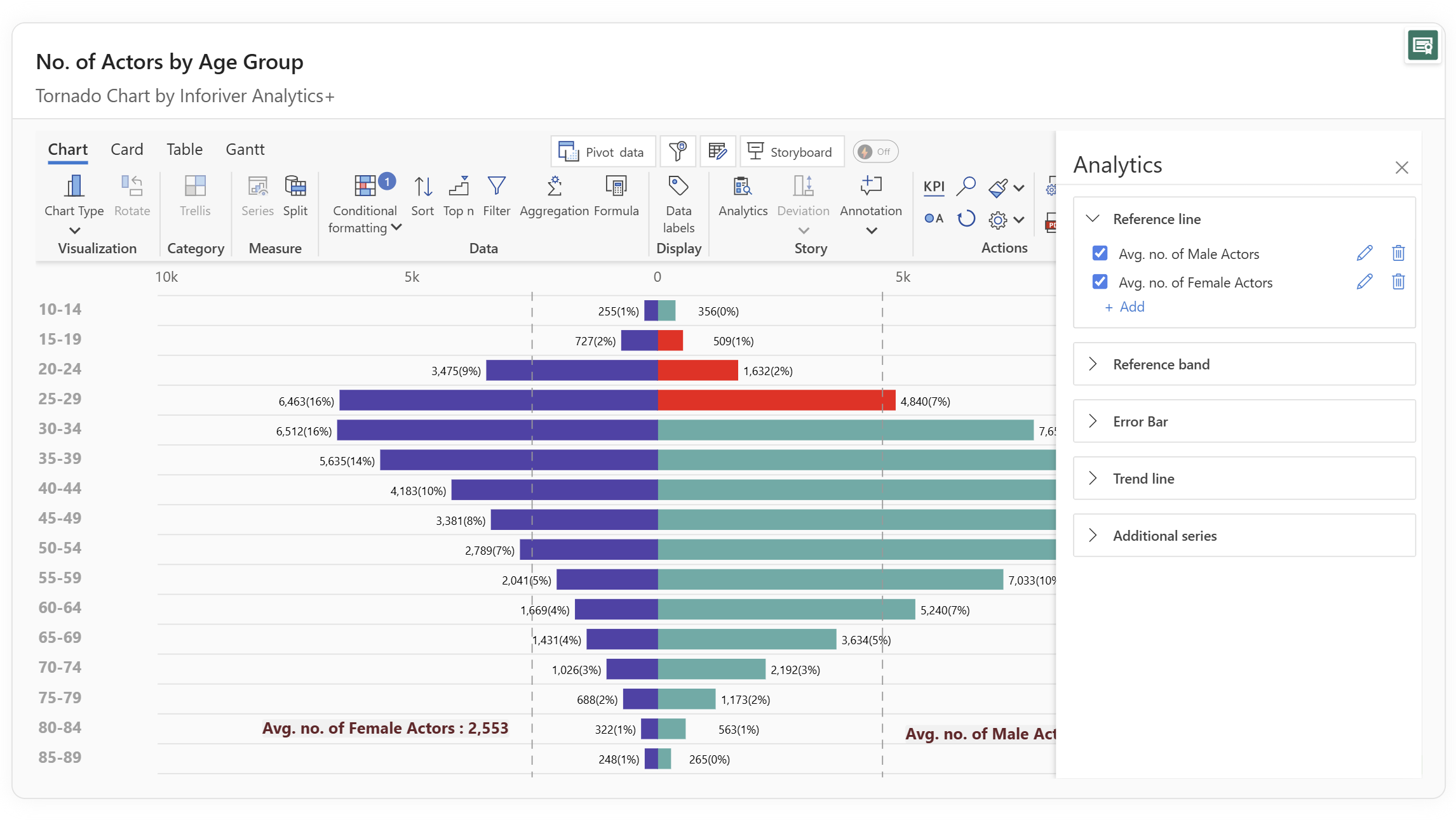
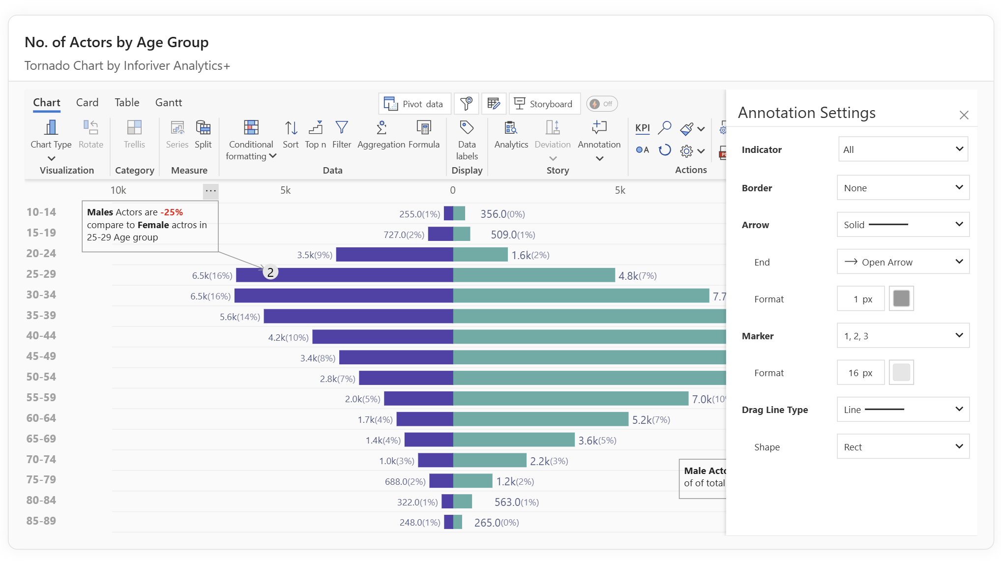
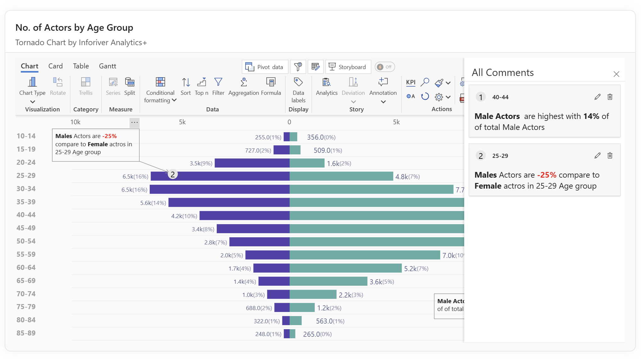

Tornado charts provide a clear view of how different variables influence an outcome, making them especially effective for sensitivity analysis and comparative studies. They highlight the factors with the greatest impact, helping analysts and decision-makers prioritize where to focus attention. With Inforiver Analytics+ for Power BI, tornado charts gain additional value through advanced features such as axis controls, conditional formatting, sorting, ranking, analytics lines, annotations, and Trellis support. These capabilities make it easier to customize the visual, uncover deeper insights, and communicate results with clarity.
Start your free trial to explore advanced tornado chart capabilities in Analytics+.
Experience the Power of Tornado with Inforiver Analytics+

Inforiver helps enterprises consolidate planning, reporting & analytics on a single platform (Power BI). The no-code, self-service award-winning platform has been recognized as the industry’s best and is adopted by many Fortune 100 firms.
Inforiver is a product of Lumel, the #1 Power BI AppSource Partner. The firm serves over 3,000 customers worldwide through its portfolio of products offered under the brands Inforiver, EDITable, ValQ, and xViz.