A sunburst chart is designed to display hierarchical data, showing how each level contributes to the whole. It arranges information in circular layers, where the center represents the top level of the hierarchy and each outer layer breaks it down further. The size of each segment reflects its proportion, making sunburst charts well suited for exploring organizational structures, multi-level product categories, or nested data systems where understanding relationships between parent and child elements is essential.
What is a Sunburst Chart and Why Do We Need It?
A sunburst chart, also known as a multi-level pie chart, is a circular chart that displays hierarchical data. Each level of the hierarchy is represented by a ring, with the innermost ring being the top of the hierarchy. As you move outwards, each ring is divided into segments, representing the sub-categories of the segment in the inner ring. The size of each segment typically represents a quantitative value, allowing you to see the part-to-whole contribution at every level.
Think of it like a pie chart, but with layers. Instead of just one slice, you get to see how that slice further breaks down into smaller components, and how those components themselves break down. This makes it incredibly intuitive for visualizing data where contributions roll up through different levels.
Why is this so crucial? For many businesses, understanding how different segments contribute to a larger whole, across multiple dimensions, is paramount. From sales performance by region and product line, to budget allocation across departments and sub-departments, hierarchical data is everywhere. The sunburst chart provides a clear and concise way to visualize these relationships, making it easier to identify trends, outliers, and areas for improvement.
How to Create and Interpret a Sunburst Chart
Creating a sunburst chart typically involves structuring your data with clear hierarchical levels. Each row would represent a data point, with columns for each level of the hierarchy (e.g., Region, Country, City) and a column for the quantitative value (e.g., Sales, Revenue).
Interpreting a Sunburst chart is straightforward:
Innermost Ring: Represents the top-level categories.
Outer Rings: Show the breakdown of the inner categories into sub-categories.
Segment Size: The larger the segment, the greater its contribution to its parent category.
Color: Often used to differentiate categories or levels, making it easier to follow the data.
By clicking on a segment, you can often "drill down" to see a more focused view of its sub-categories, providing an interactive way to explore your data in detail.
Key Features a Sunburst Chart Should Have
For a truly effective sunburst chart, look for the following key features:
Inner Radius Control: The ability to adjust the size of the innermost circle allows for better visualization of the outer rings and overall data distribution.
Individual Color Formatting: Customizing colors for different segments helps in distinguishing categories and making the chart more aesthetically pleasing and understandable.
Opacity Control by Level: Adjusting the transparency of different levels can enhance clarity, especially in charts with many layers.
Multi-level Drill Down: This interactive feature is essential for exploring the hierarchy in detail, allowing users to focus on specific segments and their children.
Advanced Features: Capabilities such as ranking, sorting, annotation, and summary table support significantly enhance the analytical power of the chart, allowing for deeper insights and custom presentations.
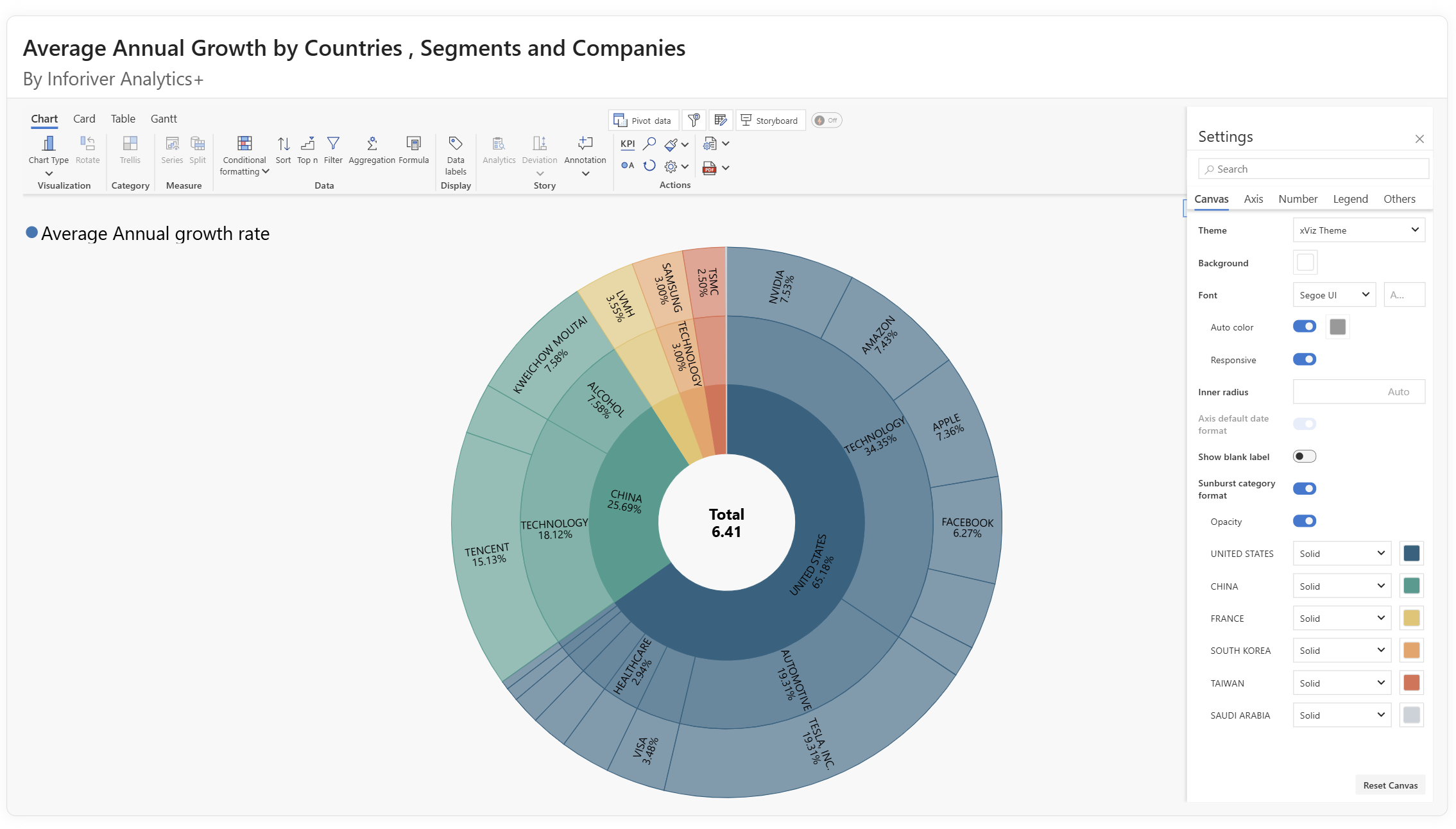
Key Features of Inforiver Analytics+ Sunburst Chart
Within its comprehensive suite of analytical tools, Inforiver Analytics+ offers a feature-rich sunburst chart. Recognized as a powerful multi-level pie chart, it is thoughtfully categorized for user convenience under both the Hierarchical Chartsfamily and the Pie & Donut Chartsfamily, making it easily accessible for visualizing your complex hierarchical data.
As seen in the image, the Inforiver Analytics+ sunburst chart provides a clear and intuitive way to display hierarchical data. It empowers you to compare part-to-whole contributions on each level, making complex data easily digestible.
What sets the Inforiver Analytics+ Sunburst chart apart?
Customizable Canvas & Visuals: Inforiver Analytics+ gives you complete command over the aesthetic and layout of your sunburst chart. Through the Canvas Options, you can effortlessly manage the inner radius to optimize the display of outer rings and overall data distribution. You also get unparalleled individual color formatting to clearly differentiate segments and enhance readability, along with opacity control by level to manage visual clutter in complex hierarchies. Its intuitive multi-level drill down capabilities enables interactive exploration, letting you easily dive into specific segments and their underlying components for focused analysis.
Intelligent Data Labels: Clarity is paramount when dealing with multi-layered data. The Data Labels options in Inforiver Analytics+ offer extensive flexibility. You can display value, percentage, or both, and precisely control their placement. A key feature is responsive orientation, where label orientation dynamically adjusts to fit optimally within each segment, ensuring readability even with varying node sizes and complex layouts. Furthermore, the ability to customize the centre circle label (e.g., displaying the "Total" with a specific font and size) means your core metric is always clearly visible and well-formatted.
Conditional Formatting: Highlight critical insights instantly with Inforiver Analytics+'s Conditional Formatting. Whether you're applying a color scale (like a sequential gradient based on a measure) or defining rule-based conditions (e.g., coloring segments red if "Revenue is less than average"), this feature automatically draws attention to anomalies, high-performers, or areas needing action, transforming your chart into a dynamic analytical tool.
Nested Sorting: Gain immediate perspective by organizing your hierarchical data with powerful sorting capabilities. Inforiver Analytics+ offers advanced sorting options, allowing you to arrange segments by measure (e.g., "Revenue") in ascending or descending order across different levels, ensuring your most critical data points are always presented clearly.
Intelligent Ranking (Top N + Others): Focus on the most impactful elements of your hierarchy with Inforiver Analytics+'s Nested ranking options. You can effortlessly identify and display the Top N (e.g., "Top 4 Retailer countries by Revenue").
This feature also allowes you to select Bottom N, or even a combination of Top & Bottom N rankings, providing versatile ways to declutter your chart and focus on specific performance drivers.
Inforiver Analytics+ provides the flexibility to group the remaining items as 'Others', consolidating less significant segments into a single, digestible category.
Insightful Annotations: Transform your visualizations into comprehensive narratives with built-in Annotations. Inforiver Analytics+ allows you to add contextual notes directly onto your sunburst chart. This means you can call out specific data points, explain trends, or highlight key findings with descriptive text and referenced values, making your reports more engaging and your insights immediately actionable for your audience.
Powerful Trellis for Multi-View Analysis: To further enhance your analytical capabilities, Inforiver Analytics+ incorporates Trellis (or small multiples) functionality. This allows you to break down a single sunburst chart by a selected categorical dimension (e.g., "Retailer type"), automatically generating multiple individual sSunburst charts, each representing a segment of that dimension.
You have extensive control over the Trellis layout, including precise grid options to define the number of rows and columns, ensure proportional scaling, and even lock panel sizes for consistent comparison.
Furthermore, style options enable you to customize each panel's title, background color, borders, and spacing, ensuring a clean and professional presentation of your multi-view insights. This feature is invaluable for comparing hierarchical data across different categories side-by-side.
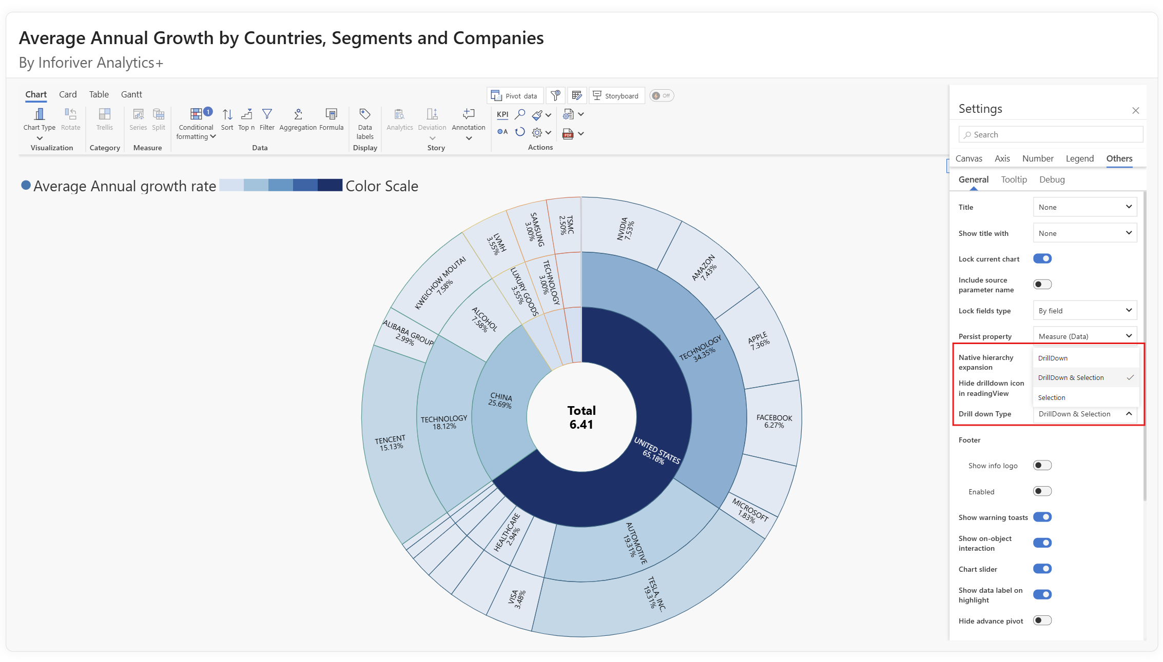
Support for Advanced Drilldown Modes: Understanding the nuances of hierarchical data often requires more than just a simple drilldown. Inforiver Analytics+ provides specialized drilldown modes to suit diverse analytical needs. Users can select from three distinct actions upon interacting with a segment:
Drilldown: This classic mode focuses the chart by expanding the selected segment and its children to occupy the full visualization space, offering an in-depth view of that specific branch of the hierarchy.
Drilldown and Selection: This combines the drilldown experience with the benefit of cross filtering, the selected segment within the newly focused view maintaining visual context.
Selection Only: Instead of changing the entire chart's focus, this mode simply highlights the chosen segment without altering the overall hierarchy. This is particularly useful for multi-selection, comparison across different branches, or when you need to retain the full context of the data while focusing on specific elements. These options provide unparalleled flexibility in exploring your hierarchical data precisely how you need to.
The ability of Inforiver Analytics+ to handle contribution data in a circular form, while offering these comprehensive and advanced features, makes it an indispensable tool for anyone working with hierarchical datasets.
Sunburst charts make it easier to explore hierarchical data by showing how each level relates to the whole. With careful use of categories, color, and hierarchy depth, they provide clarity on structures that might otherwise remain hidden in tables or lists. Enhanced functionality in Inforiver Analytics+ extends these benefits further, offering customization and flexibility to deliver insights tailored to business needs.
Start your free trial to see how sunburst charts can elevate your reporting and analysis.
Share this on:
Get Inforiver brochure
Maximize your business potential with Inforiver's paginated reporting, data entry, planning & budgeting capabilities
Inforiver helps enterprises consolidate planning, reporting & analytics on a single platform (Power BI). The no-code, self-service award-winning platform has been recognized as the industry’s best and is adopted by many Fortune 100 firms.
Inforiver is a product of Lumel, the #1 Power BI AppSource Partner. The firm serves over 3,000 customers worldwide through its portfolio of products offered under the brands Inforiver, EDITable, ValQ, and xViz.
Learn how to accelerate your migration from Tableau, Qlik, Cognos, Spotfire, and SAP to Power BI using Inforiver - featuring faster development, advanced visuals, and a live demo.