
Upcoming webinar on 'Inforiver Charts : The fastest way to deliver stories in Power BI', Aug 29th , Monday, 10.30 AM CST. Register Now
Upcoming webinar on 'Inforiver Charts : The fastest way to deliver stories in Power BI', Aug 29th , Monday, 10.30 AM CST. Register Now
Power BI dashboards can quickly become cluttered when presenting proportional data, especially with large numbers of categories or hierarchical datasets. Traditional chart types often struggle to convey relative magnitudes clearly, making it difficult for users to interpret complex data at a glance.
Packed Bubble Charts offer a clear, visually engaging way to represent proportions within both flat and hierarchical data structures. Inforiver Analytics+ for Power BI enhances this visualization with advanced features designed to simplify analysis, improve readability, and support better data-driven decisions.
A packed bubble chart displays data as a collection of circles, or "bubbles," where each bubble represents a data point or category. The fundamental principle is that the area of each bubble is directly proportional to its quantitative value. These bubbles are then tightly packed together without overlapping, efficiently utilizing space.
While pie and donut charts are often used for showing Part-to-Whole relationships, they can become cluttered and difficult to interpret with numerous categories, when precise proportional estimation is required, or when dealing with hierarchical data where parent-child relationships need to be visualized. In Power BI, Packed bubble charts (especially when used with Hierarchy) offer an eye-catching alternative that:
Imagine you're tracking sales performance across different product lines. A packed bubble chart would assign a bubble to each product line, with larger bubbles indicating higher sales. The bubbles would then arrange themselves efficiently within the chart area, giving you an immediate visual overview of which product lines are performing strongly and which need attention.
Let's consider another example to see how they work. In the digital marketing space, you could use a packed bubble chart to compare the performance of various keywords. Each bubble would represent a keyword, with its size indicating metrics like search volume or conversion rates. This allows you to quickly identify your top-performing keywords and see their relative importance immediately.
Inforiver Analytics+ enhances the packed bubble chart from a basic visualization to an effective analytical tool, offering a set of features that improve storytelling and visual clarity.
Let's explore these capabilities:
The core strength of the packed bubble chart lies in its size-based representation. Inforiver Analytics+ ensures that each bubble's size accurately reflects its quantitative value, allowing for quick visual comparison of magnitudes. This is fundamental to understanding the relative importance or contribution of each data point at a glance.

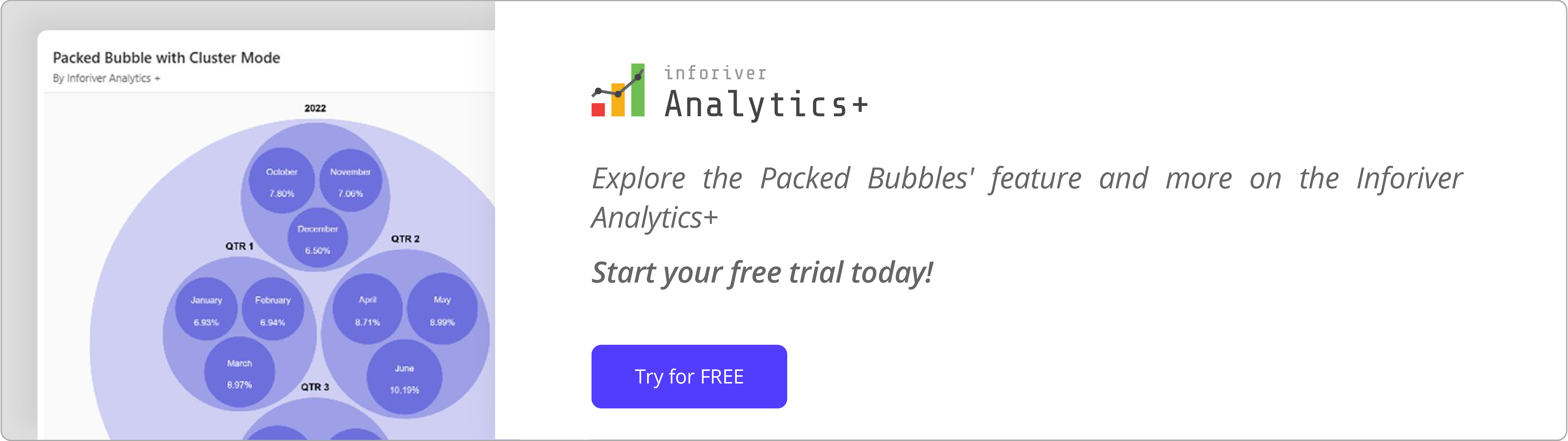
This is where Inforiver Analytics+ is particularly useful for data that includes a hierarchy. If your data has a parent-child structure (e.g., Countries and States, or Product Categories and Sub-Categories), the Cluster Mode feature is valuable. By simply enabling this option in the settings, Inforiver automatically groups child categories under their respective parent categories. This intelligent grouping makes it easy to compare proportions within and across different levels of your hierarchy.

Clarity is key in data visualization. Inforiver Analytics+ offers flexible options for Data Labels, allowing you to display critical information directly on each bubble. You can choose to show:
This ensures that users can quickly grasp both the identity and the precise value of each bubble without needing to hover or consult a legend constantly.

Highlighting outliers and drawing attention to key trends is straightforward with Inforiver Analytics+'s Conditional Formatting. You can apply rules-based formatting or color scales to your packed bubbles:

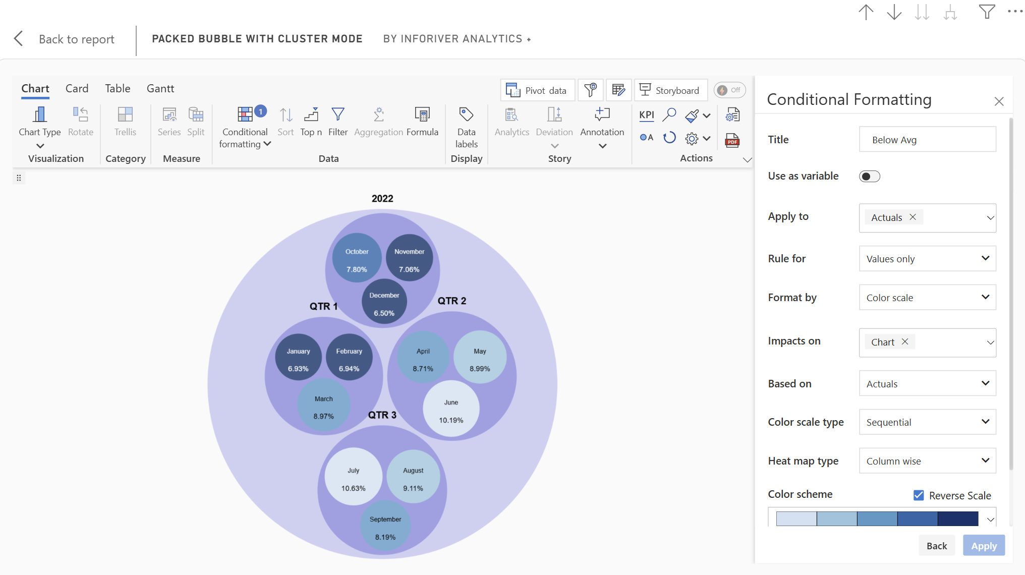
These capabilities help your packed bubbles act as a diagnostic tool, guiding the viewer's eye to important insights.
Focusing on the most significant data points is crucial for concise reporting. Inforiver Analytics+ includes a Ranking (Top N) feature that allows you to:

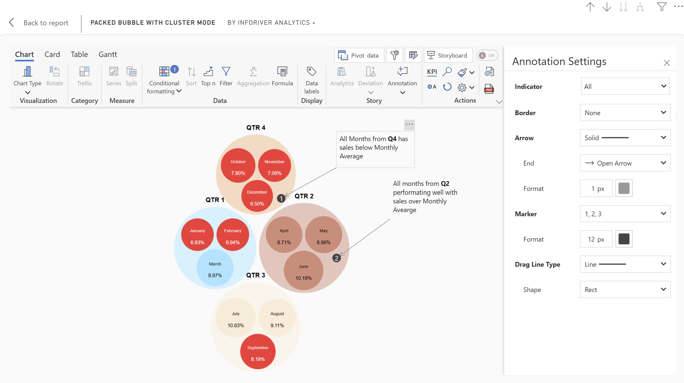
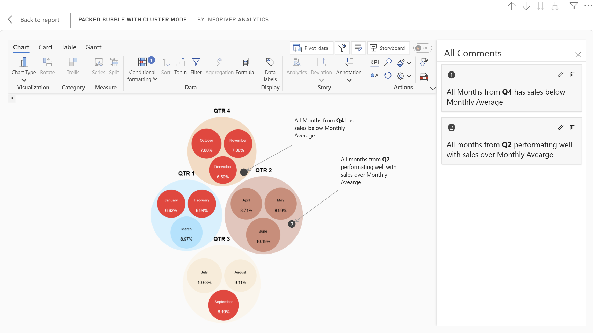
Data storytelling goes beyond just presenting numbers. Inforiver Analytics+ enables you to add context and commentary directly to your packed bubble charts through Annotations.
To analyze your packed bubble data across multiple dimensions, Inforiver Analytics+ offers Trellis (Small Multiples) support. This feature allows you to:

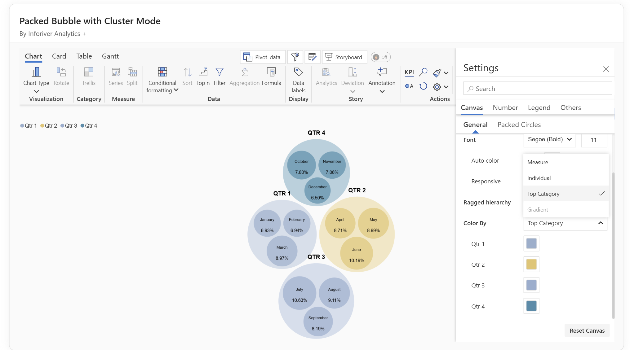
Inforiver Analytics+ offers flexible options to control the color of your packed bubbles, enhancing visual differentiation and insights. You can determine the color of the bubbles based on various criteria:
The Inforiver Packed Bubble Chart offers a fresh, engaging, and effective way to visualize proportional data, applicable to both flat and hierarchical datasets. Beyond its visual appeal, its features like clustered mode, data labels, conditional formatting, ranking, annotations, and trellis support make it a valuable analytical tool.
By choosing Inforiver Analytics+'s Packed Bubble Chart, you're not just presenting data; you're helping to tell a data story, empowering your audience to uncover insights and make informed decisions.

Inforiver helps enterprises consolidate planning, reporting & analytics on a single platform (Power BI). The no-code, self-service award-winning platform has been recognized as the industry’s best and is adopted by many Fortune 100 firms.
Inforiver is a product of Lumel, the #1 Power BI AppSource Partner. The firm serves over 3,000 customers worldwide through its portfolio of products offered under the brands Inforiver, EDITable, ValQ, and xViz.