Upcoming webinar on 'Inforiver Charts : The fastest way to deliver stories in Power BI', Aug 29th , Monday, 10.30 AM CST. Register Now
Upcoming webinar on 'Inforiver Charts : The fastest way to deliver stories in Power BI', Aug 29th , Monday, 10.30 AM CST. Register Now
The typical star-schema data model consists of a set of dimension tables, and a single fact table. The fact table holds measures such as Sales, Quantity, Units and more. Dimensions such as time (e.g., Year, Quarter and Month) and other categories (e.g., regions, products, and sales reps) are used to slice and dice these measures.
In standard data models, it is very uncommon to see measures such as Sales 2022 and Sales 2021.
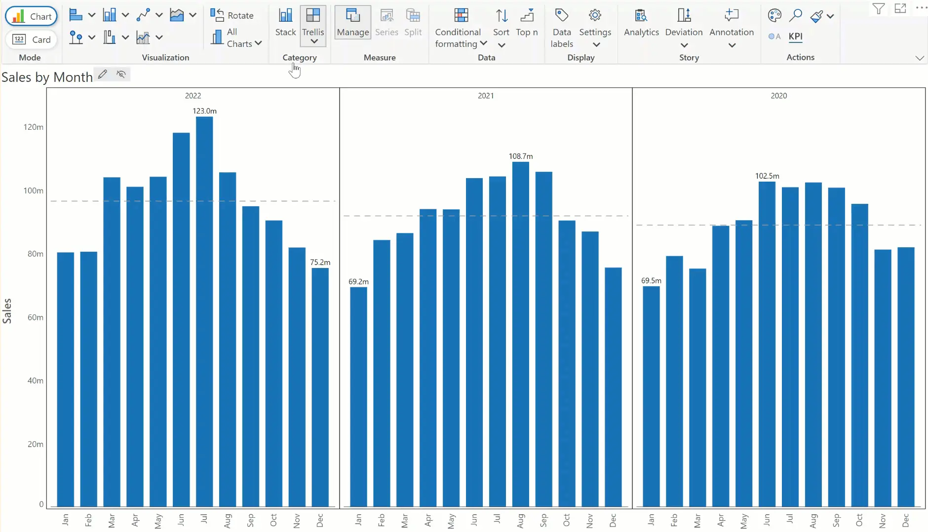
Let us take a sample dataset that tracks sales data for three years. Plotting them in a chart would look as follows. Note that we have assigned year and month fields on the x-axis, and sales on the y-axis.
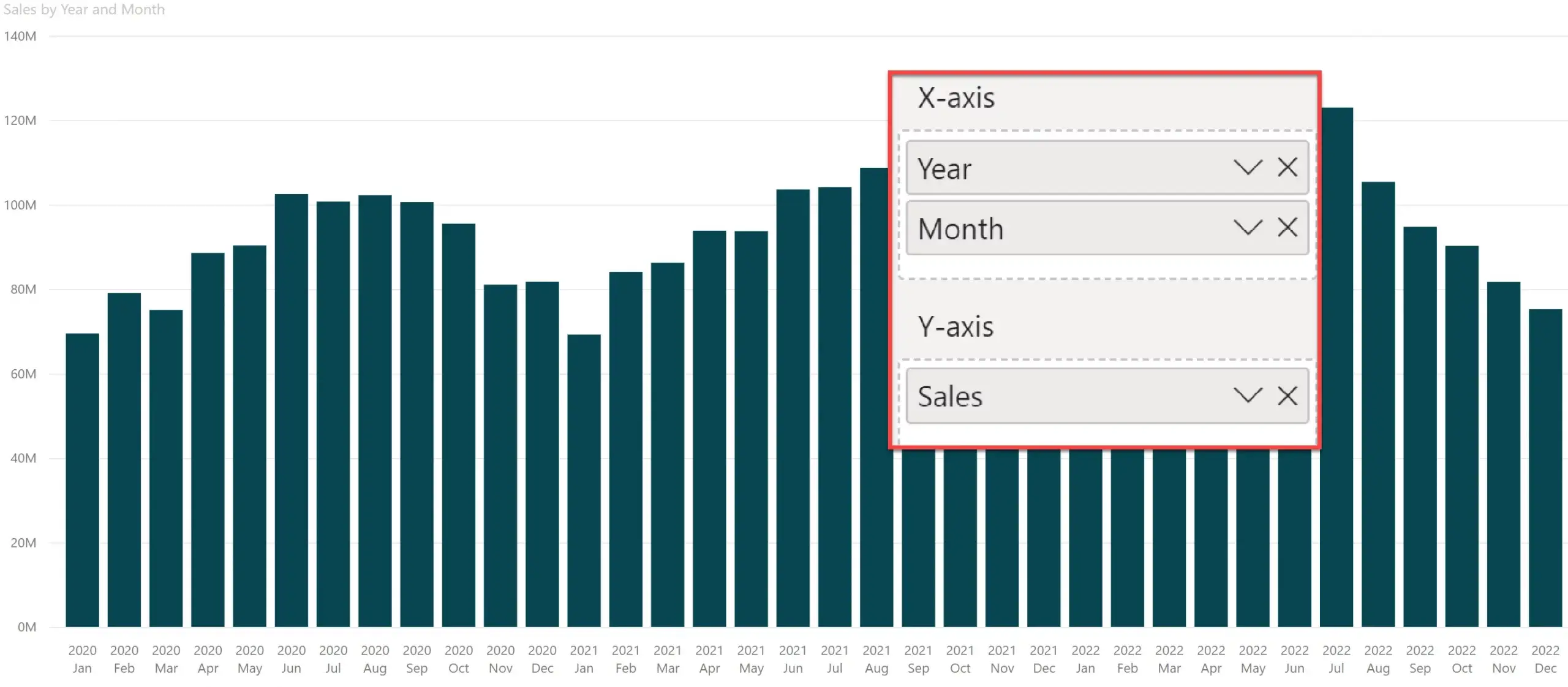
The above chart plots a nice trend. However, to deliver effective insights, I should do one or more of the following:
This type of analysis requires you to traverse through time, which requires some enhancements to the data model. One approach report developers take is to create a DAX measure that holds prior period value (e.g., a time shift of -12 months), and use it to further calculate variances (held in additional DAX measures). A second option is to utilize the quick measure feature provided in Power BI, provided you are not subject to some of its limitations.
Some report designers go a few steps further and create multiple derivative measures for each period of interest (e.g., 2022 Sales, 2021 Sales and 2020 Sales). Variances across any pair of such measures are also calculated through additional DAX measures, though the effort increases manifold.
However, these options have a few limitations.
(a) casual users who build reports only occasionally need to familiarize themselves with DAX
(b) report consumers with reading view access cannot edit/modify/create measures
(c) report developers working with DirectQuery connectivity will have their own limitations in creating DAX measures
(d) report developers working with cloud data sources such as Snowflake do not prefer to create and maintain local measures; they rather do it at the source, but this slows down their time-to-market
(e) finance users often have several versions of forecast & budget data, sometimes running into dozens. The efforts to create and manage these measures and their variances can add up very fast
Inforiver Analytics+* has introduced a capability to create visual measures on the fly. In other words, you can decompose a single measure (such as Sales) into multiple visual measures (2022 Sales, 2021 Sales, etc.) based on a category (such as Year).
Note that if you were do use a Product dimension instead of Year, you would build visual measures such as Product A Sales, Product B Sales, etc. Let us explore this in detail.
The process to calculate and plot, say, YoY variance from a standardized star-schema data model is very straightforward with Inforiver. These are the steps involved.
1. Drag Inforiver visual on to the canvas.
2. Assign field values as follows. Place the category based on which we want to split the measures (in this case, Year) in the ‘Small Multiples / Stacked Group’ field. This gives the chart the ability to create visual measures (Sales 2022, Sales 2021 and Sales 2020) on the fly.

Inforiver would create a small multiple visual by default, arranged by year in separate tiles. Internally, Inforiver creates these visual measures exclusively for use by this small multiple chart. These visual measures are not yet exposed to the report developer.
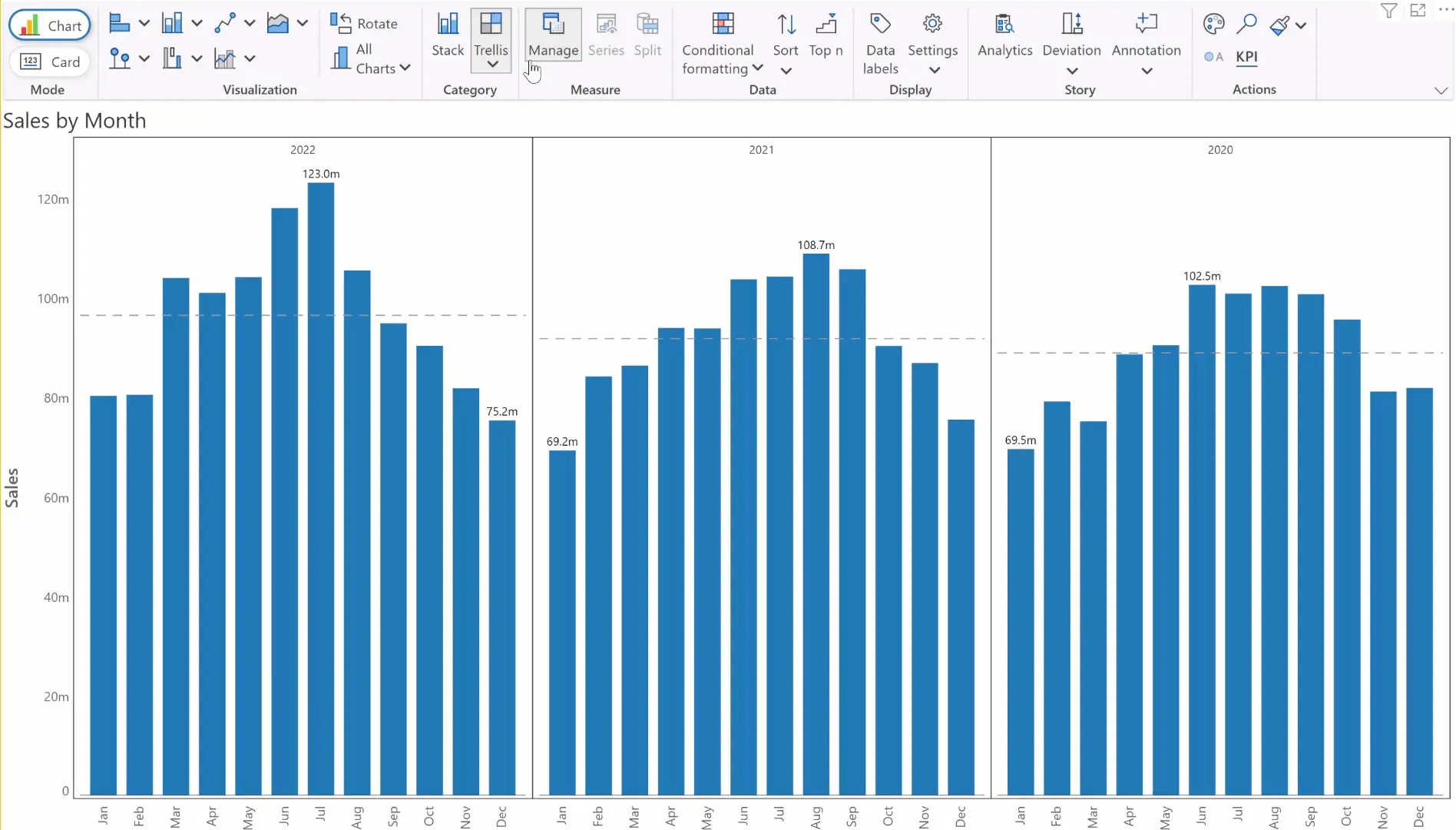
3. Toggle between small multiple and stacked chart
Note that the assignment of the Year field to the ‘Small Multiples/Stacked Group’ in Inforiver serves a dual purpose. You can use that field to display a small multiple or a stacked chart. Use the ‘Stack’ and ‘Trellis’ options from the toolbar to toggle between these charts.
Note that stacking data for 3 years does not make sense, but it is useful when you use another dimension such as a Product.
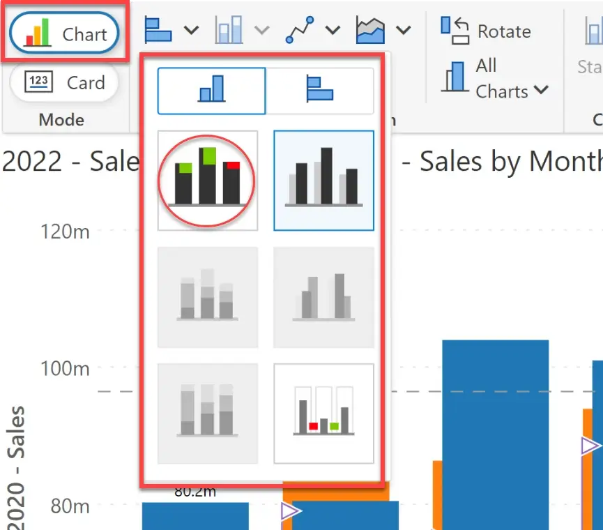
4. Create and manage visual measures
So far, Inforiver has been using visual measures internally to render these charts. To make these visual measures available to the report developer, Inforiver provides a measure management pane (accessible from the ‘Manage’ button in the toolbar)
Once you create these visual measures, you can selectively show/hide them. For example, show 2022 and 2021 data and ignore 2020 data). You can then continue to change the chart type and perform other operations. The visual works as if we have made available three DAX measures (2022 Sales, 2021 Sales and 2020 Sales) for its use.
The step-by-step instructions to create visual measures are given below.
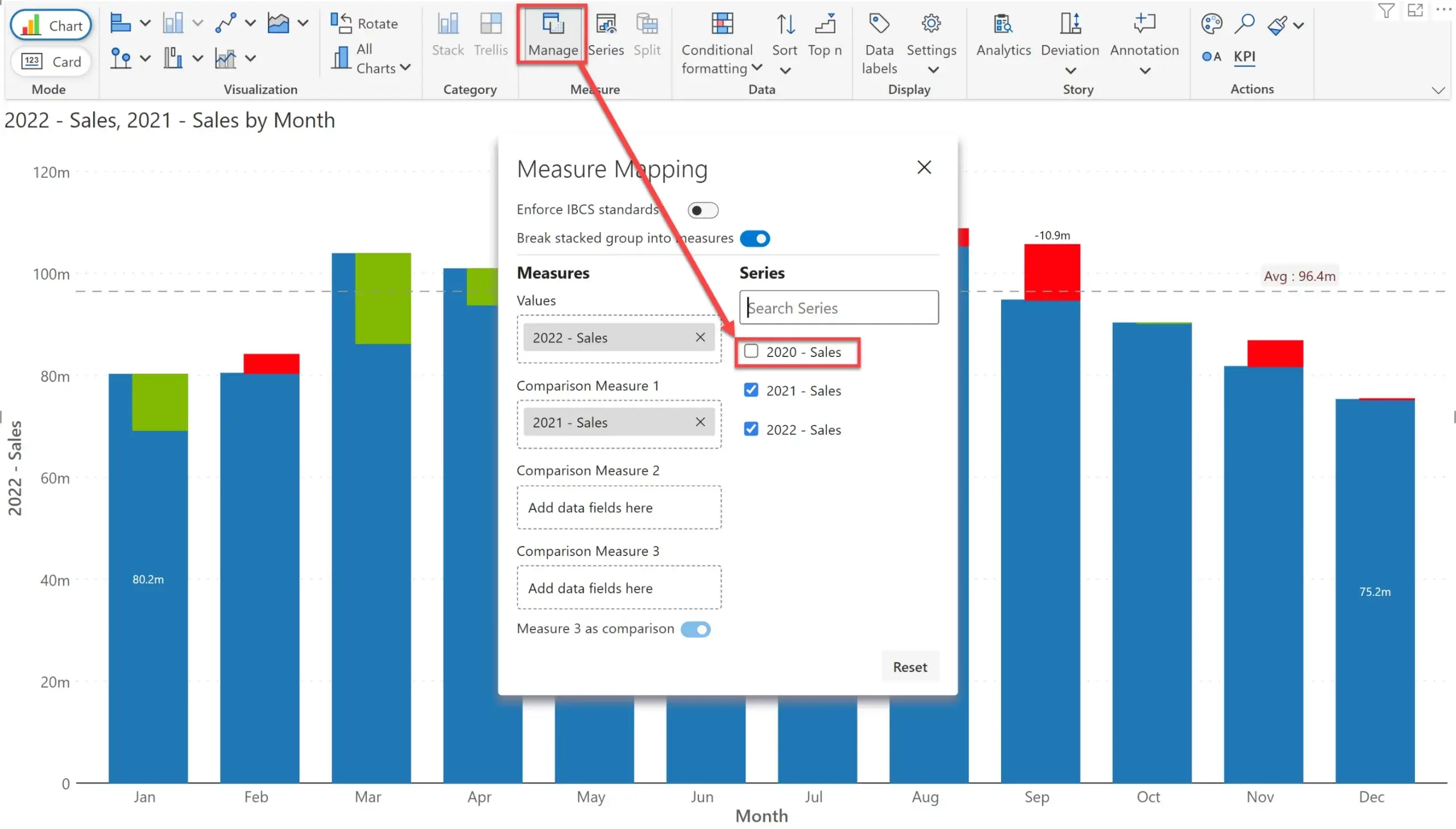
4a) At the end of step #3, you will have a small multiple chart. Click on Manage icon in the toolbar. A prompt will pop-up.
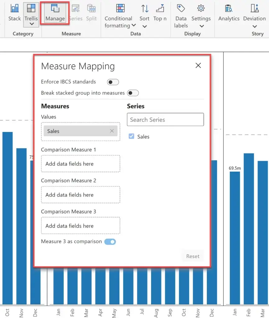
4b) Turn on the property ‘Break stacked group into measures’. This will create individual visual measures based on the field ‘Year’ (which we had mapped in the small multiples / stacked group field in step #2)
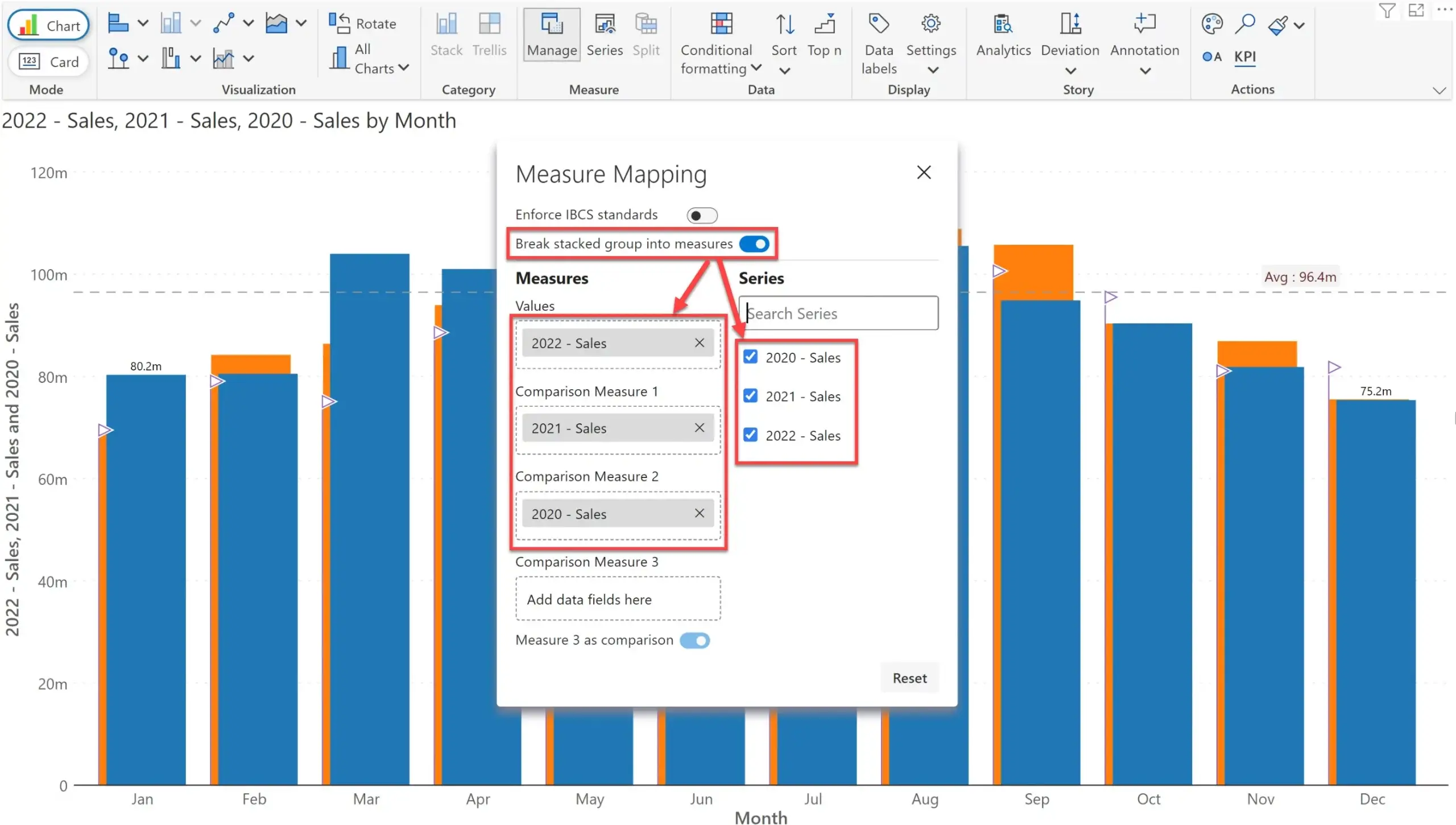
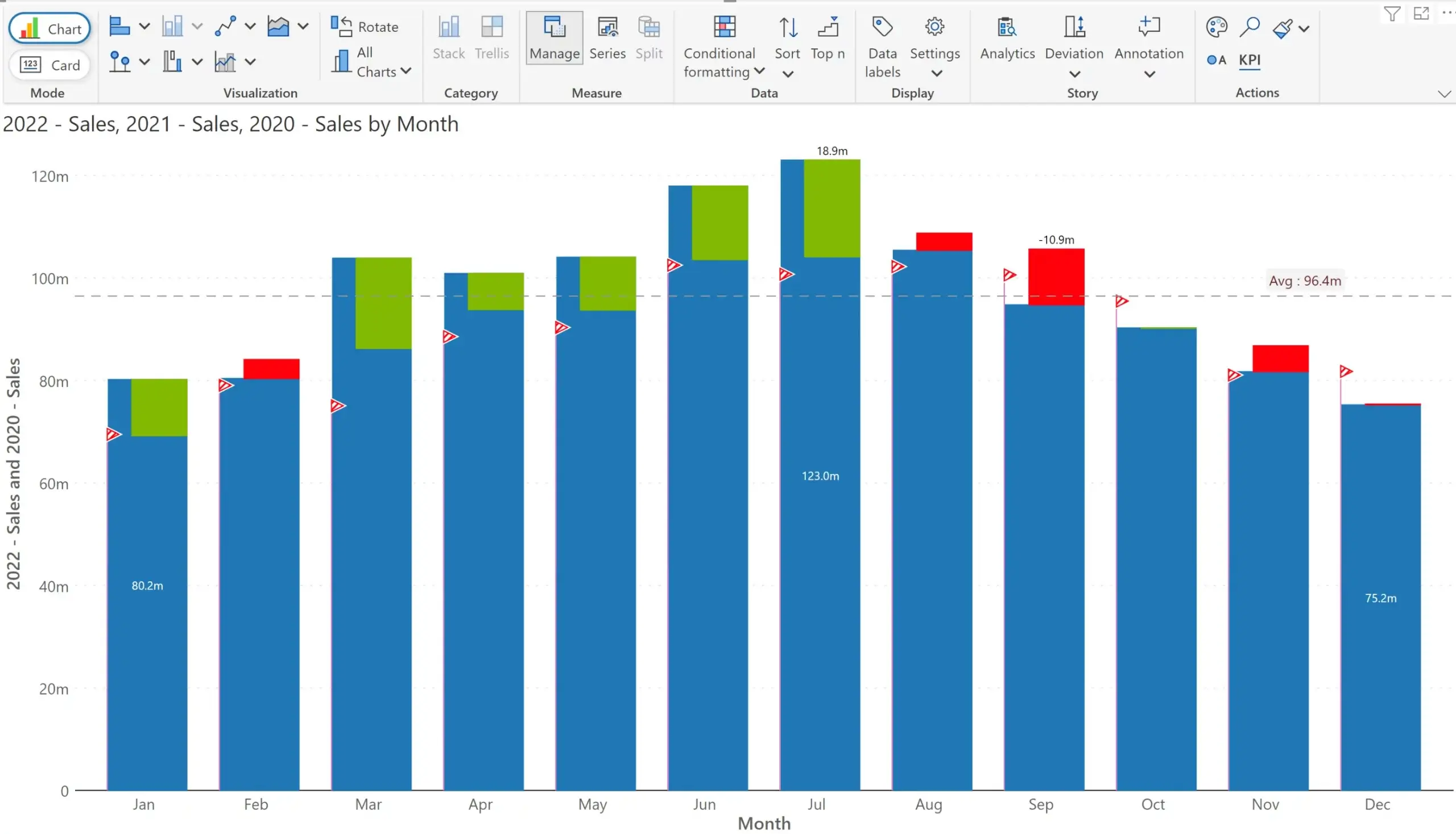
All three measures are now available to you and plotted separately in the above variance chart. Inforiver behaves is as if you created DAX measures for 2022 Sales, 2021 Sales and 2020 Sales and assigned all of them to the visual. This is automatically reflected on the chart title too (on the top left).
4c) You may now change the chart type by accessing the menu. For example, we are here changing the chart type to an integrated variance chart.
4d) You will notice the integrated variance chart with the same three measures.
4e) Go back to the Manage pane now. Deselect 2020 Sales as we do not need it.
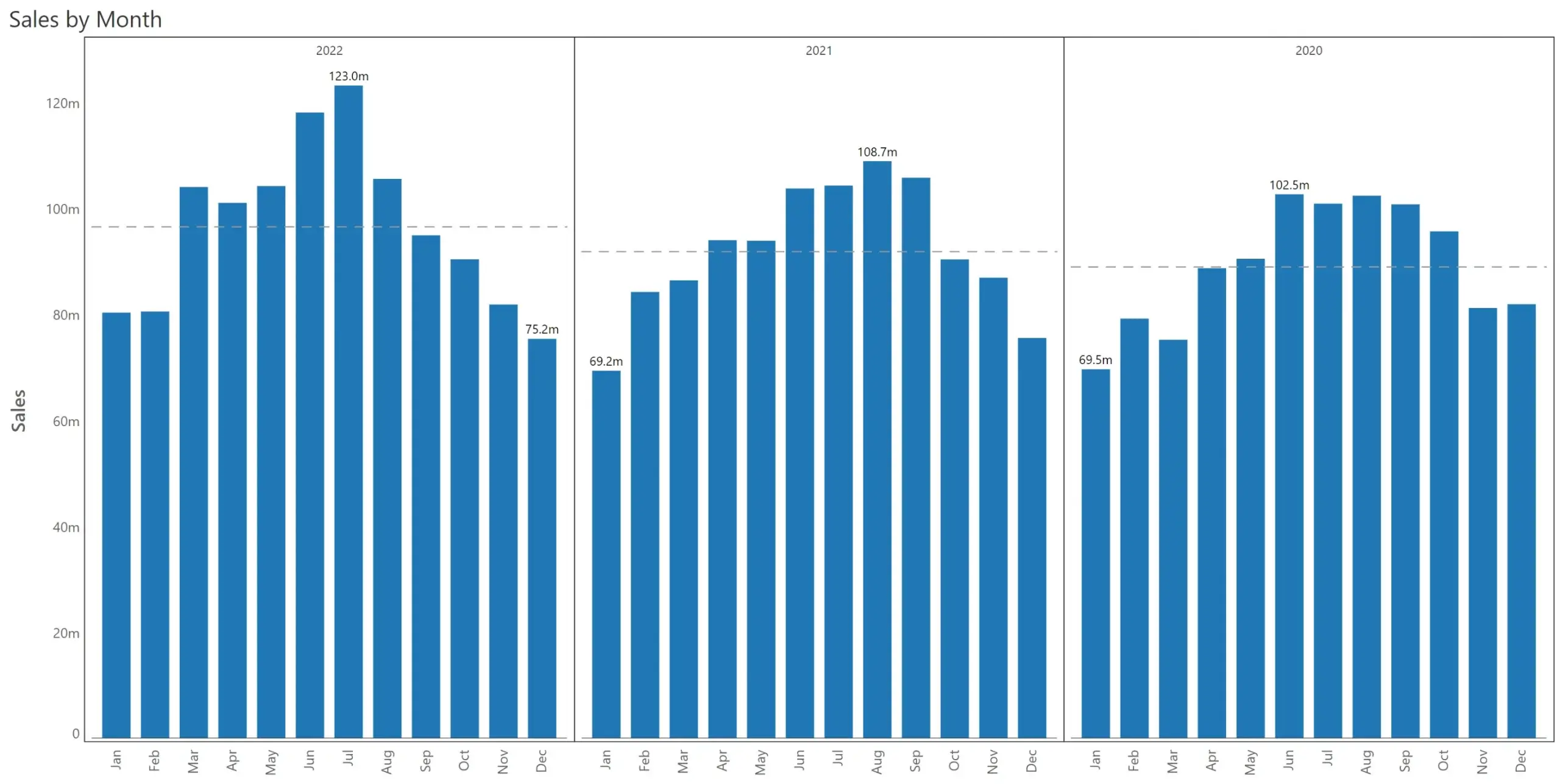
4f) The final chart is shown below.
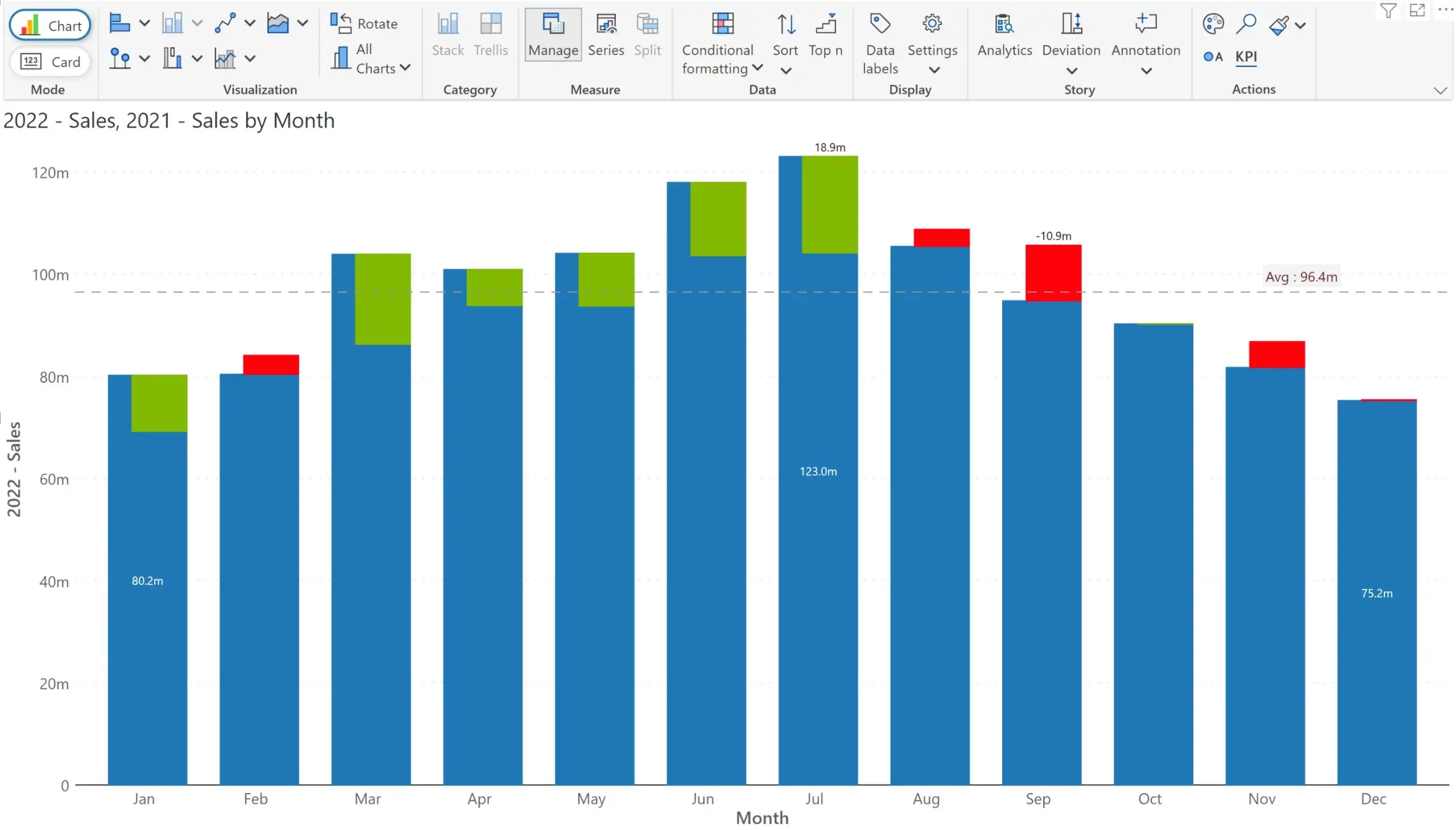
In a matter of seconds, we created a monthly chart with YoY variance details. We did this without resorting to DAX. The beauty of this approach is that we can visualize variances for any pair of visual measures. We could also create a waterfall chart that explicitly highlights absolute and percentage variances.
And there’s more - this powerful capability is also available to users in the reading view too.
And when we roll into a new year, the additional visual measure is automatically shown in the Manage Measure pane. You do not have to create DAX measures each year to keep your report updated.
This is what we achieved using Inforiver Chart and mapping the three fields – Year, Month and Sales – to the visual.
This revolutionary user experience is a must for everyday reporting, as well as for advanced used cases such as planning, forecasting and budgeting. We are glad to be the first one to deliver this market-leading innovation. Reach out to us to learn more about other cutting edge capabilities of Inforiver.
***
Download a free edition of Inforiver Analytics+* today and try visual measure management for free.
*Inforiver Charts has been renamed to Inforiver Analytics+, a 3-in-1 visual for dashboards and storyboards. It offers 50+ charts, cards, and tables.

Inforiver helps enterprises consolidate planning, reporting & analytics on a single platform (Power BI). The no-code, self-service award-winning platform has been recognized as the industry’s best and is adopted by many Fortune 100 firms.
Inforiver is a product of Lumel, the #1 Power BI AppSource Partner. The firm serves over 3,000 customers worldwide through its portfolio of products offered under the brands Inforiver, EDITable, ValQ, and xViz.