Upcoming webinar on 'Inforiver Charts : The fastest way to deliver stories in Power BI', Aug 29th , Monday, 10.30 AM CST. Register Now
Upcoming webinar on 'Inforiver Charts : The fastest way to deliver stories in Power BI', Aug 29th , Monday, 10.30 AM CST. Register Now
The team behind Inforiver has been a strong proponent of design advancements for both report development and end-user consumption experiences across BI tools such as Power BI, Tableau, and Qlik. To this effect, the Inforiver delivered a compelling tool-bar-driven, no-code user experience in Power BI.
We are glad to see Microsoft release on-object interaction capabilities in Power BI this month, which would offer a modern and seamless user experience for the Microsoft Office user base transitioning to Power BI. The new capability (available only as a preview feature in the March 2023 Power BI desktop release) is a big leap forward in contextually configuring various elements in the visual canvas itself.
Overall, we think it is a great start and it would only get better by the time it comes out of the opt-in preview period. Here is our quick take and first impressions:
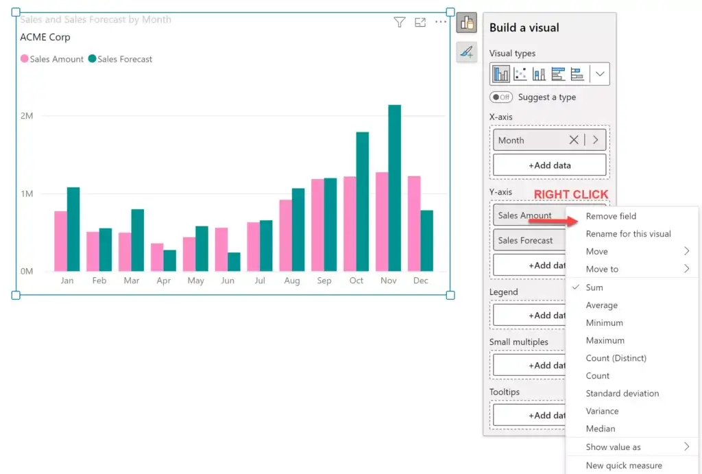
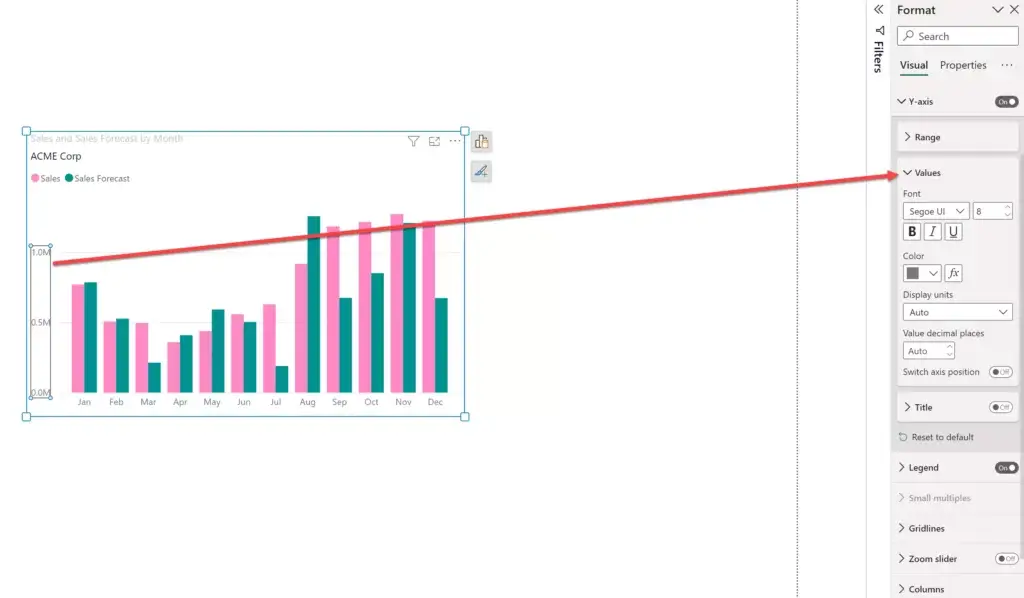
1. We love the fact that you can configure the axis, data series, gridlines, background, legend, and labels directly from the visual. It is not easy to search through the properties pane for various such actions, especially when you have multiple measures involved. Remember how you earlier had to choose each measure from a dropdown and set its properties?
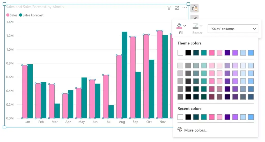
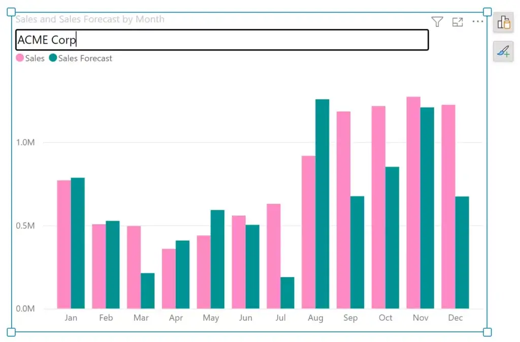
2. You can also edit titles and subtitles directly inline, something that we had released in Inforiver. Almost every user customizes the title in a visual and the new interaction makes it such a breeze.
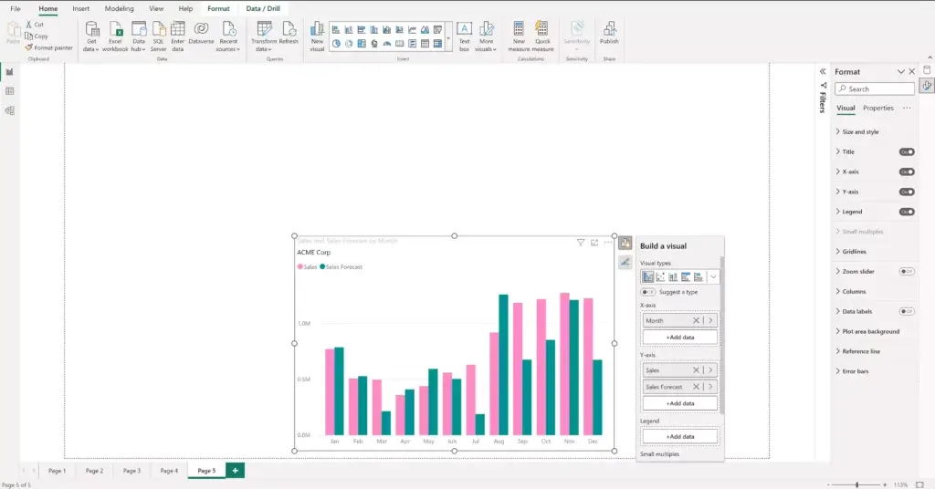
3. The visualization pane is no more available on the right, where we have the Filters, Data and Format panes. Instead, to add a visual, one needs to use the ‘Insert’ action from the toolbar. We personally like this setup a tad better.
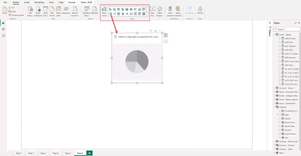
4. However, we have mixed feelings about the 'Build a visual' pane (image below). This was earlier available as part of the Visualization pane on the right along with Filters/Format/Data panes. The new design reveals the fields available for mapping on-demand as a popup.
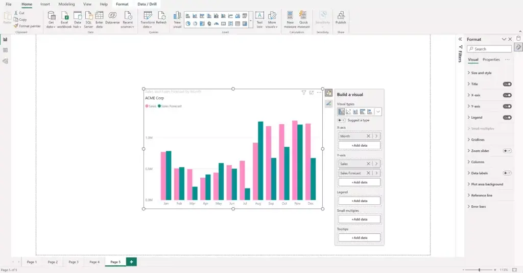
In this new design, you can use the ‘Add Data’ action to assign categories or measures. This is a nice touch as you need not have to drag and drop fields from the Data pane.
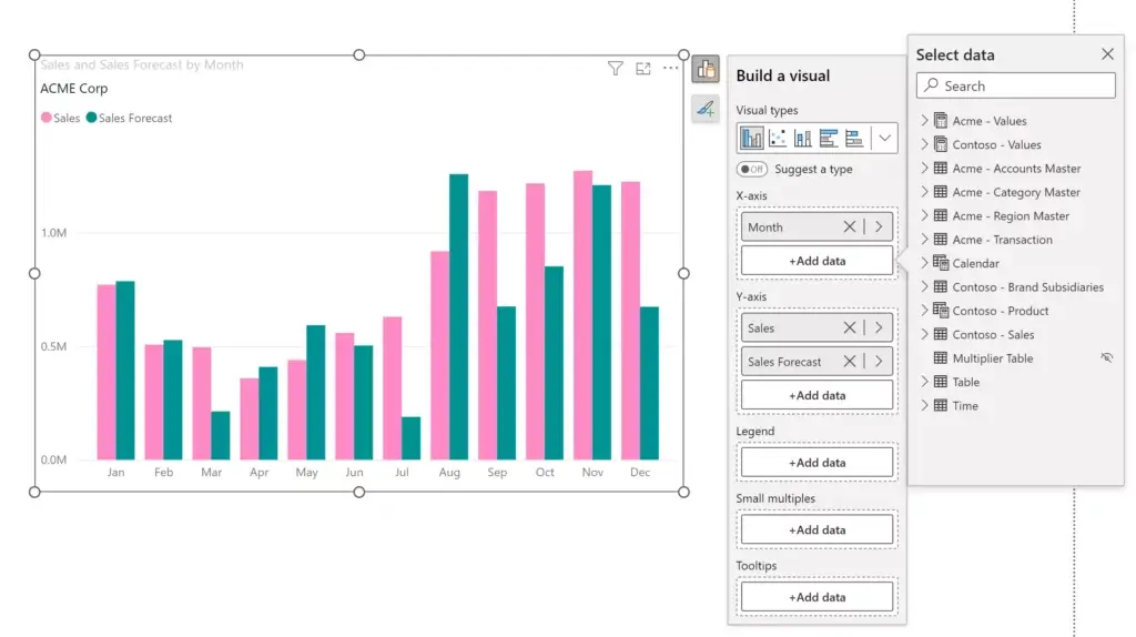
However, accessing the field context pane is not as intuitive, as you need to right-click on the specific field to have the popup show up.
In addition, the ‘Build a visual’ pane sometimes introduces a vertical scroll which does not lend to a great user experience. This tends to happen when the visual is at the bottom of the canvas. We hope these minor annoyances are addressed before this becomes part of the core release.
In addition, as seen above, the range of visuals available for changing the type is now limited. Earlier, we used to be able to change a visual type in a single click. With the new design, it may take an additional click or two, depending on the visual you need. (Note that you can only insert new visuals from the toolbar on the top – you won’t be able to change a visual that is already on the canvas from the toolbar).
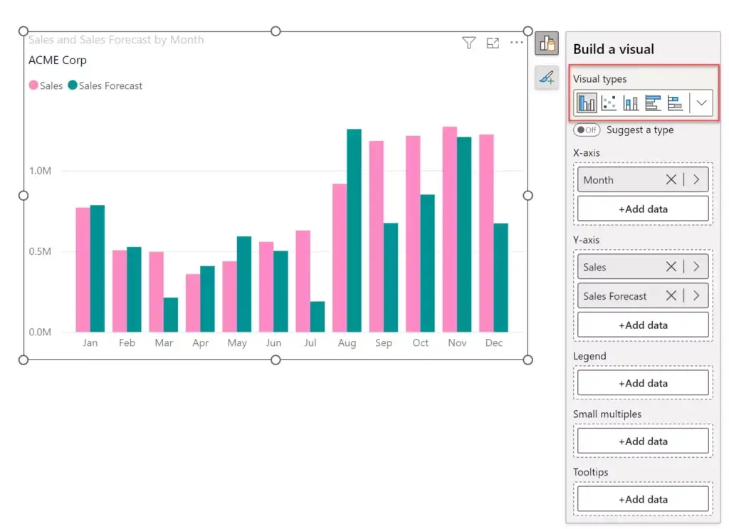
You will be able to see all the visuals once you expand it.
5. One feature that we liked is the ‘seek’ capability during on-object interaction. For example, if you have the Format pane open, double-clicking the Y-axis values automatically brings the Y-axis settings in focus in the Format pane, and it delivers this with a nice scrolling animation.
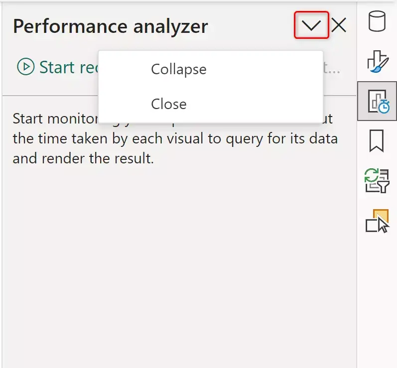
6. Collapsing and closing panes on the right however is a bit confusing. It might be more intuitive to just have the collapse option here.
It may also be better to pin more panes on the right by default instead of just the Data and Format panes. These additional panes can be added from the ‘ View’ menu.
***
While we may have nit-picked a few minor features, overall, the on-object interaction is a great step forward that enhances the report design user experience in Power BI. We at Inforiver believe that it will only enhance the appeal and usability of both Power BI and Inforiver as we both embrace and push contextual on-object interaction capabilities.
Visit Microsoft’s blog to learn more about Power BI on-object interaction capabilities.

Inforiver helps enterprises consolidate planning, reporting & analytics on a single platform (Power BI). The no-code, self-service award-winning platform has been recognized as the industry’s best and is adopted by many Fortune 100 firms.
Inforiver is a product of Lumel, the #1 Power BI AppSource Partner. The firm serves over 3,000 customers worldwide through its portfolio of products offered under the brands Inforiver, EDITable, ValQ, and xViz.