
Upcoming webinar on 'Inforiver Charts : The fastest way to deliver stories in Power BI', Aug 29th , Monday, 10.30 AM CST. Register Now
Upcoming webinar on 'Inforiver Charts : The fastest way to deliver stories in Power BI', Aug 29th , Monday, 10.30 AM CST. Register Now
Inforiver Charts is featured in the monthly Microsoft Power BI Blog of August 2022 and is chosen as the editor's pick for this quarter. Few excerpts from the blog :
Inforiver charts is the fastest way explore, visualize and share performance management insights in Power BI. Using 40+ advanced visualization options, users can build data stories in minutes and share actionable performance insights through an intuitive no-code user experience (UX).
View an interactive demo of Inforiver charts here .
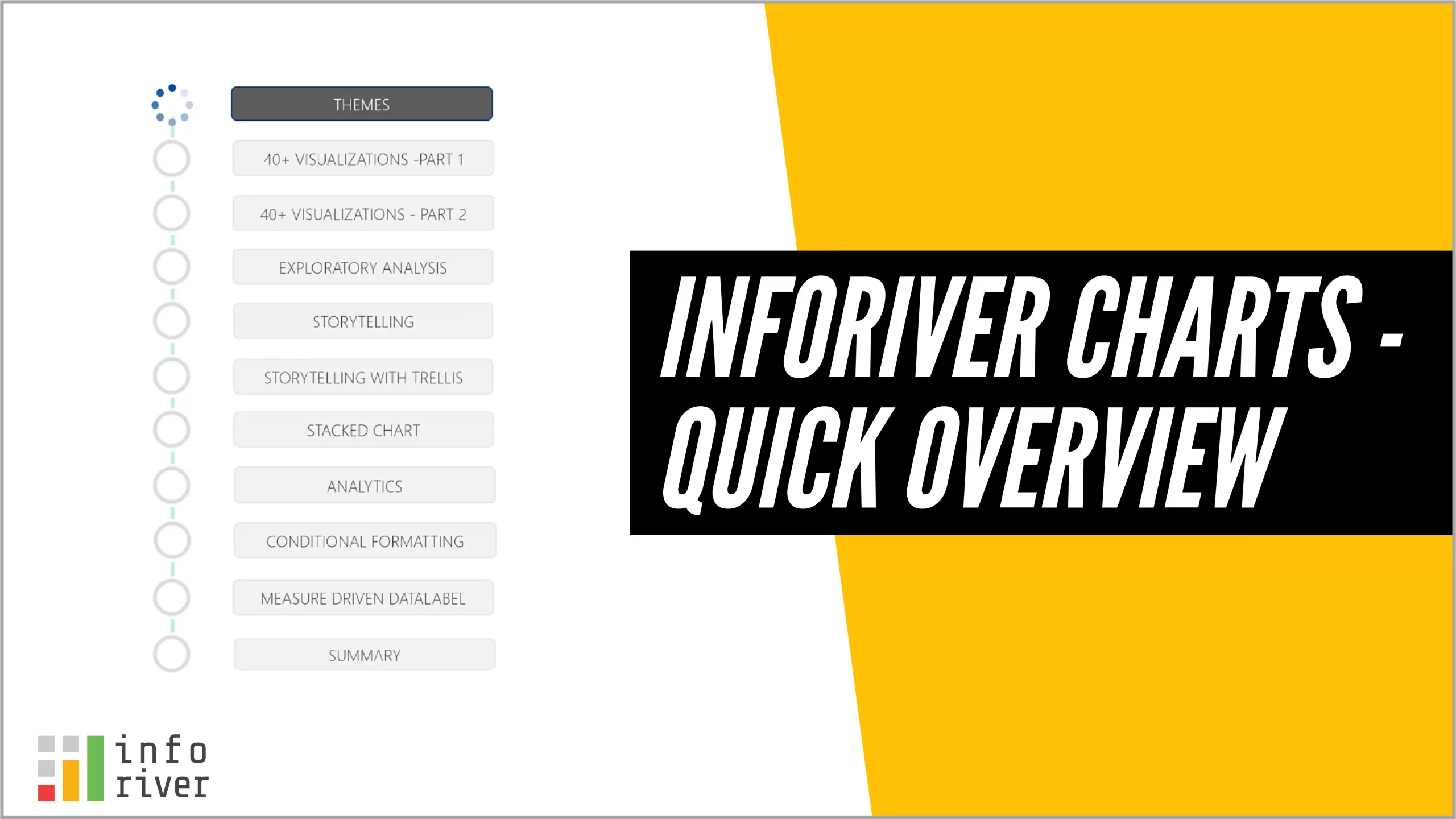
Watch this video for a quick run through :
Inforiver is certified by International Business Communication Standards (IBCS) and available in AppSource to try and buy.
Read this blog to learn more.
Note: Inforiver Charts is now Inforiver Analytics+
 In this webinar, learn how to leverage one-click IBCS report templates to deliver stunning and engaging visualizations in Power BI. Register today to learn more!