Upcoming webinar on 'Inforiver Charts : The fastest way to deliver stories in Power BI', Aug 29th , Monday, 10.30 AM CST. Register Now
Upcoming webinar on 'Inforiver Charts : The fastest way to deliver stories in Power BI', Aug 29th , Monday, 10.30 AM CST. Register Now
Financial statements, sales forecasts, budget plans, annual reports, investor presentations, and many other forms of everyday reporting have one thing in common – they contain a lot of numeric data presented in tabular form.
Presenting tabular data requires a slightly different approach than rendering a huge volume of text as seen in books and newspapers. A key ingredient that can make a lot of difference is the choice of typeface. Creating or choosing a typeface for tabular data can become quickly challenging even in this modern day & age.
When we built Inforiver, a fundamental question arose: which font should we use? We had limited awareness of this subject, but our understanding evolved significantly as we explored this topic further.
In the end, we had to build our own typeface for tabular reports.
Here are some interesting learnings from our journey - including why & how popular typefaces fall short, and how you can choose one that closely matches your needs.
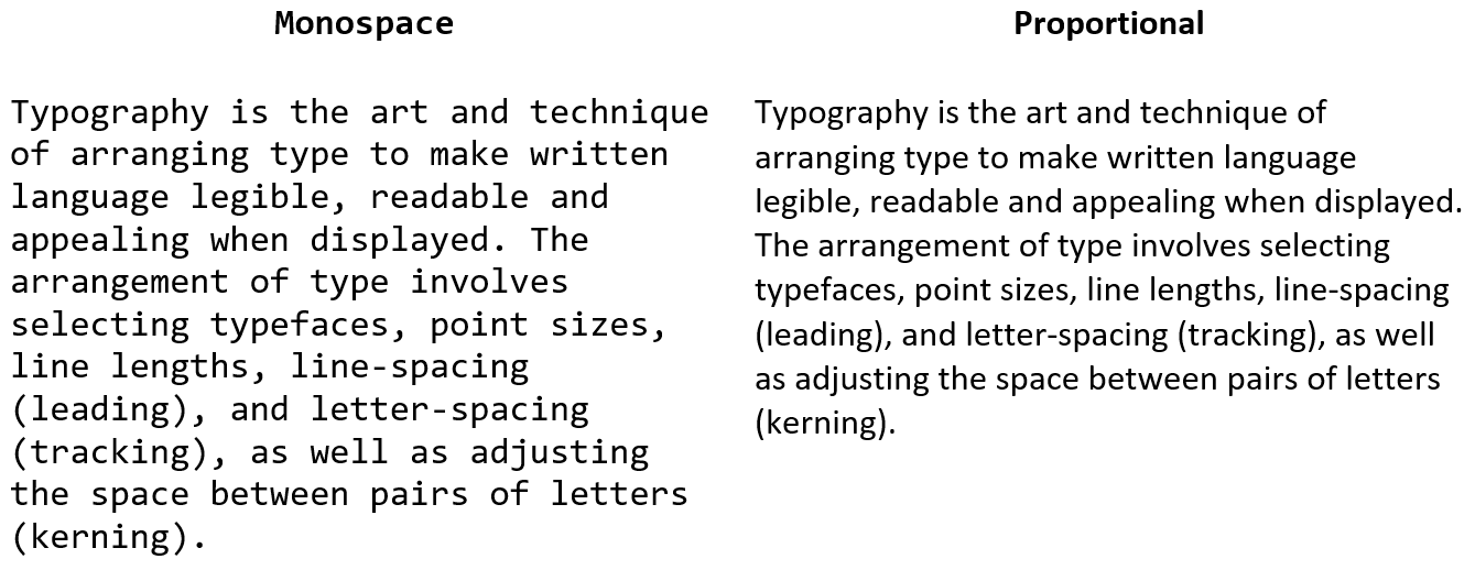
Overall, there are two types of fonts: Proportional (or variable-width) fonts, where the width varies by character, and Monospace fonts, where each character occupies an even width.
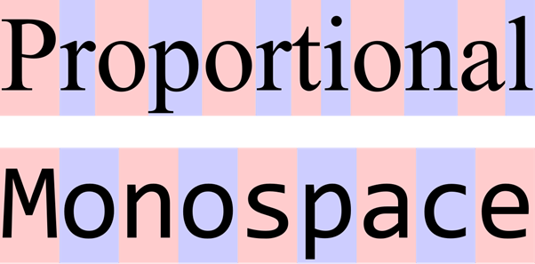
When it comes to numbers, it is obvious that you need to choose a monospace font with even width to ensure values align well vertically within a column.
Here is a quick comparison of two different fonts. You can see that the numbers in the second font are of equal width, ensuring that everything is aligned. This makes it easier to consume information.
However, this is only the first criteria. If you thought Calibri is a good font for financial reporting, read further.
Each typeface typically comes in multiple styles – Regular, Light, Thin, Semibold, Bold, Italics, etc. For the numbers to display well in a table, all the styles must use equal width for its digits.
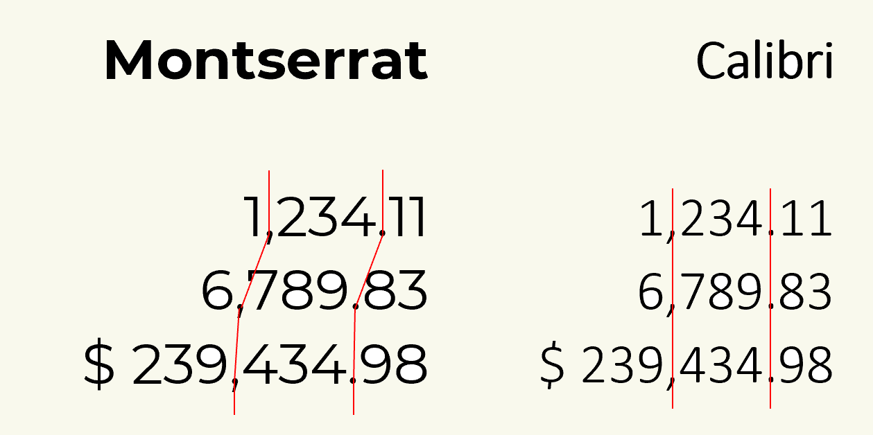
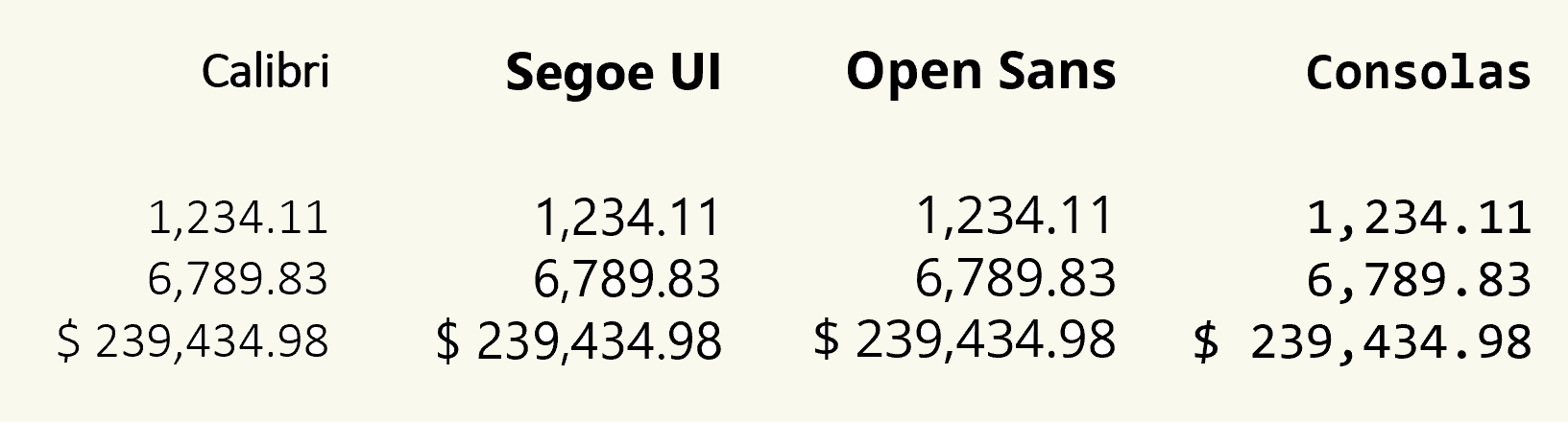
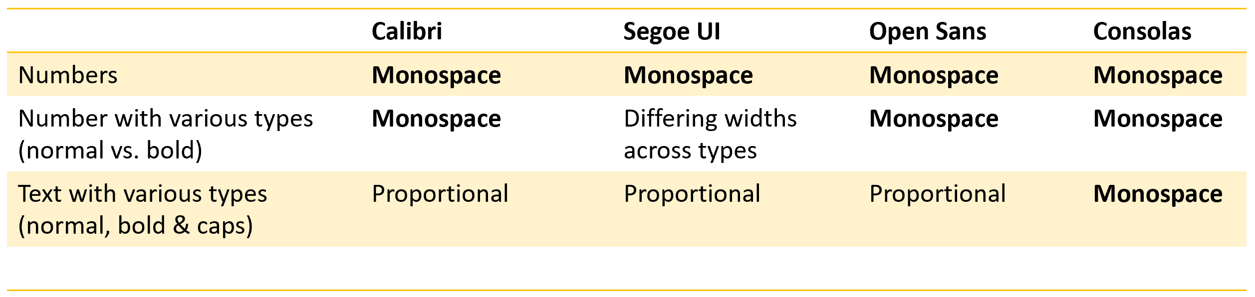
Take an example of the following four popular fonts – Calibri, Segoe UI, Open Sans and Consolas. They all seem to handle numbers quite well. All the digits are aligned vertically.
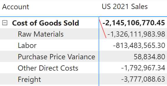
But when you start using font variants (e.g., normal and bold), you will notice that Segoe UI does not retain the same width.
You may have noticed this behavior in Power BI reports, which use Segoe UI as the default font (in the matrix visual). Both the Cost of Goods Sold and Raw Materials are of similar magnitude (in the lower billions) – however, the drastically larger width for COGS may influence a viewer to perceive a value that is 10x the magnitude of Raw Materials.
Fonts whose different weights (regular, bold, italic, etc.) occupy the same width are called multiplexed / duplexed / uniwidth fonts. We do not need to remember these confusing terms. We just need fonts whose numbers are monospaced across all their weight variants for the best consumption experience.
So far, we have explored the desired behavior only for numbers. But what about the text?
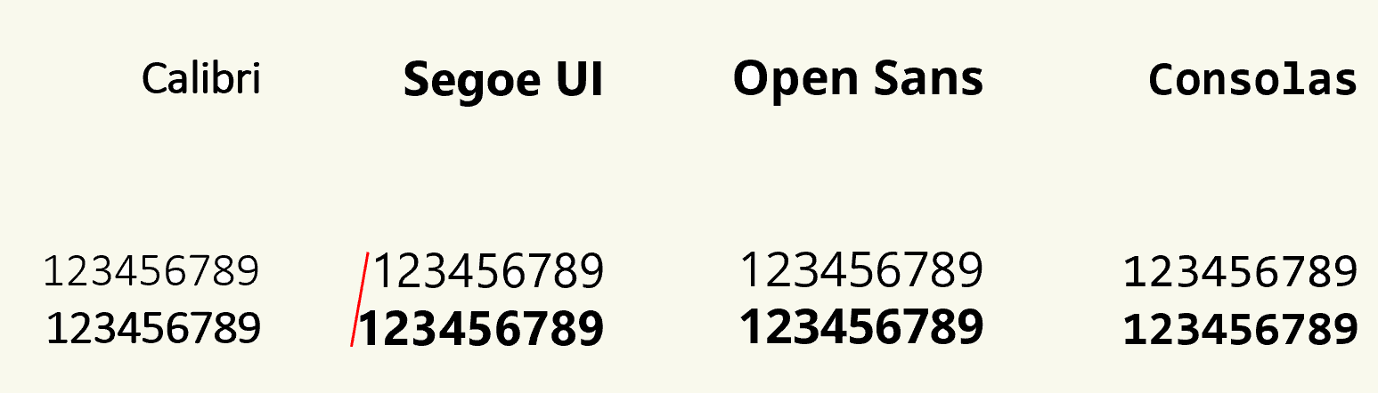
Let's revisit the four fonts we explored earlier. When you start comparing their behavior in handling text, things become a bit more interesting. In the example below, we have three lines of text – normal, bold, and normal CAPS. Notice that for the first three, the characters are proportional. Consolas continues to use monospace characters for text.
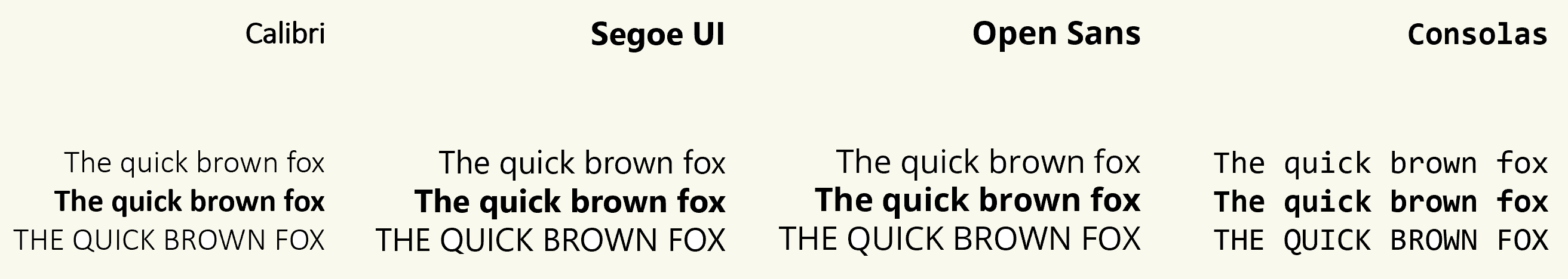
In fact, Consolas has a great consistency across both alphabets and numbers. Even their decimal character uses the same width as alphabets and numbers.
Consolas is a true monospace font. The other three are not.
The following sums up their behavior so far.
But why do popular fonts such as Calibri, Segoe UI and Open Sans display this mixed behavior for numbers (monospace) vs. text (proportional)?
The short answer - Proportional fonts are better for text.
When it comes to paragraphs, proportional fonts are much easier to read than monospace fonts. Compare the fonts in the paragraph below.
This is why newspapers use proportional fonts. The monospace fonts were popularized by typewriters, which used metal slug casts of even width for all letters and numbers.
Our analysis leads us to the following recommendations:
Unfortunately, it does not.
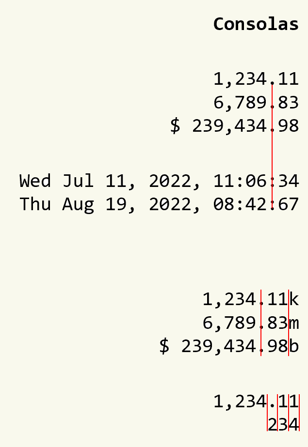
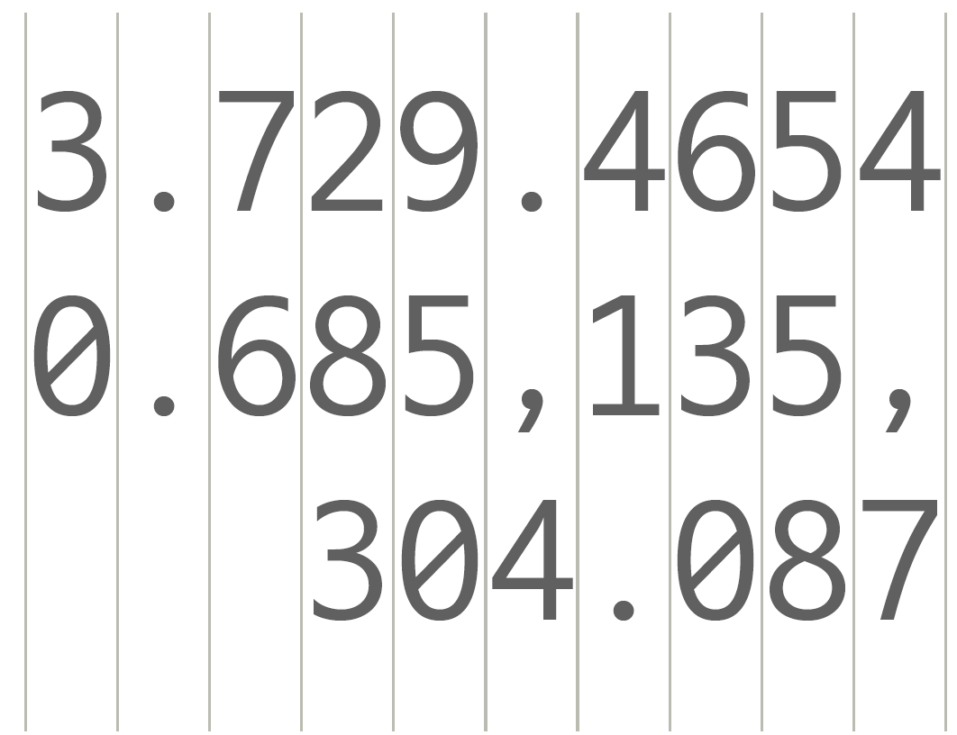
Consider this scenario where your numbers need to be scaled as shown in the table below.
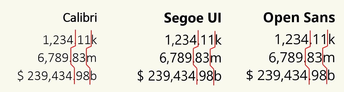
Because the scaling characters accompanying text values (k,m,b,t, etc.) have variable widths, your numeric values - despite being monospaced - are going to be out of alignment again.
Using a true monospace font will fix this issue, but the overall readability of the text will suffer. In addition, they would consume precious real estate more as compared to a proportional font.
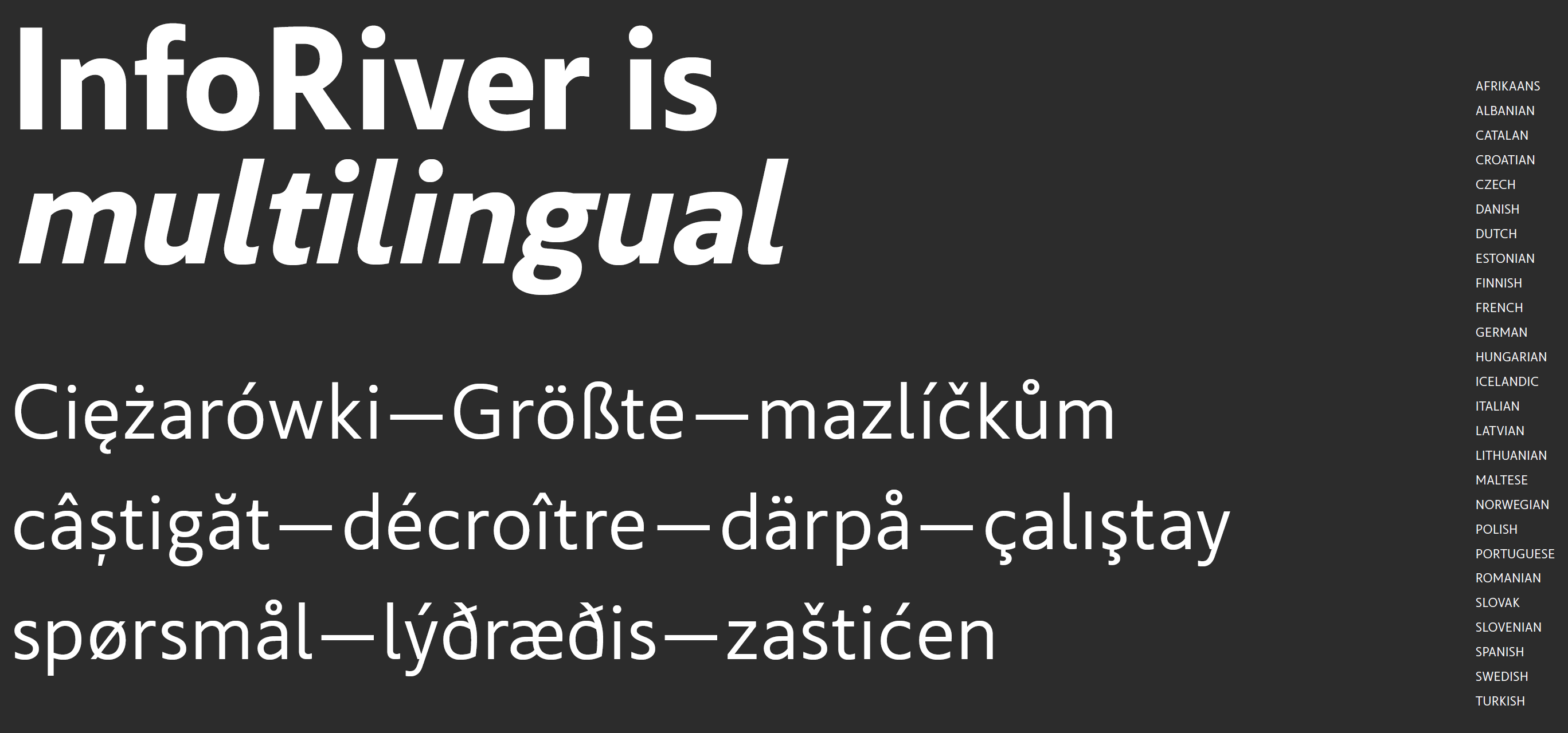
It is for this reason that we decided to commission our own font for Inforiver – and we named the typeface Inforiver Sans.
Inforiver Sans is a humanist typeface that is designed for financial and tabular reporting. The typeface is multilingual, supporting the following languages.
It has monospaced numerals across types (e.g., normal and bold), and all of the numbers are of equal width.
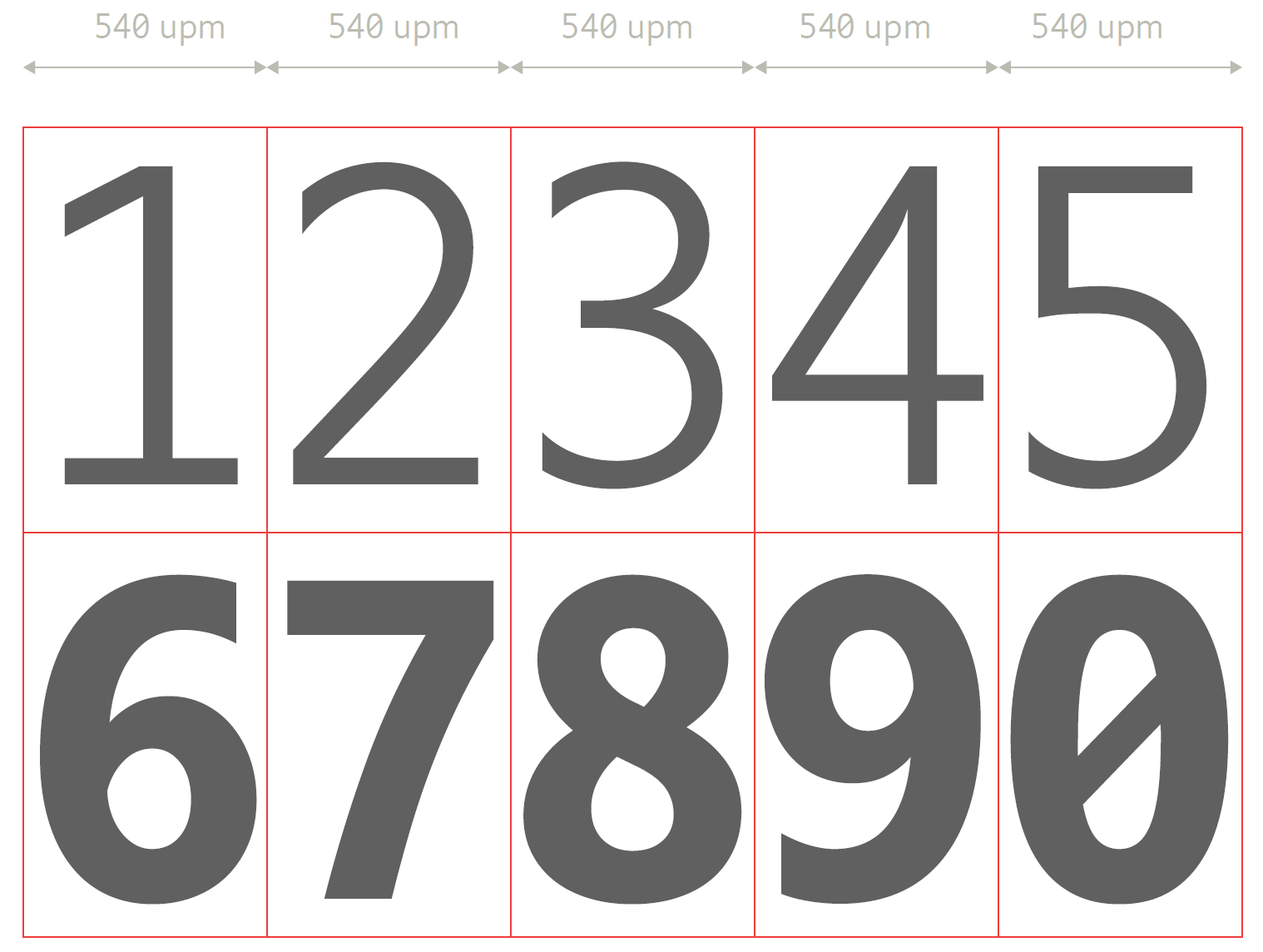
The decimals and thousand separators have the same width too.
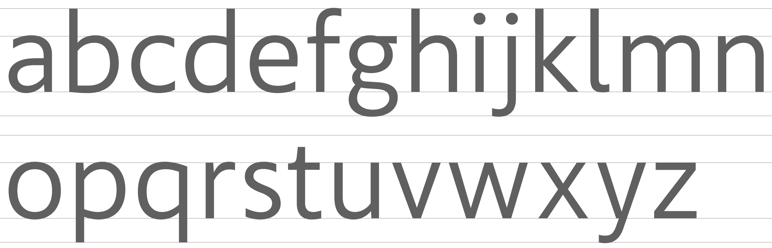
The typeface uses proportional alphabetical characters.
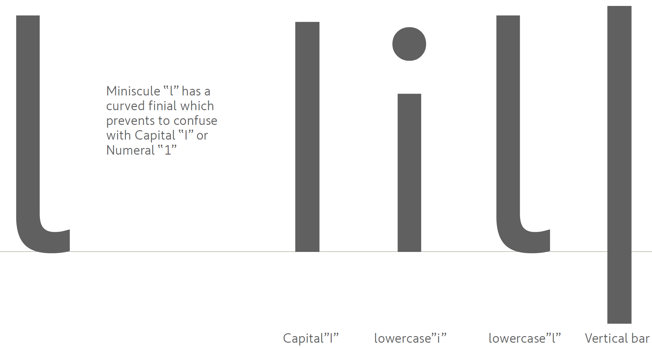
There has been a lot of attention to detail on this font, and it took about eight months to finalize finer details. For one, the capital L, lowercase l, lowercase i, etc., must be easily distinguishable.
The best part is that there are monospace alternates for scaling characters - k,m,b,t, etc. This ensures that while your words and sentences use proportional characters, the values in the tables use their monospace variants.
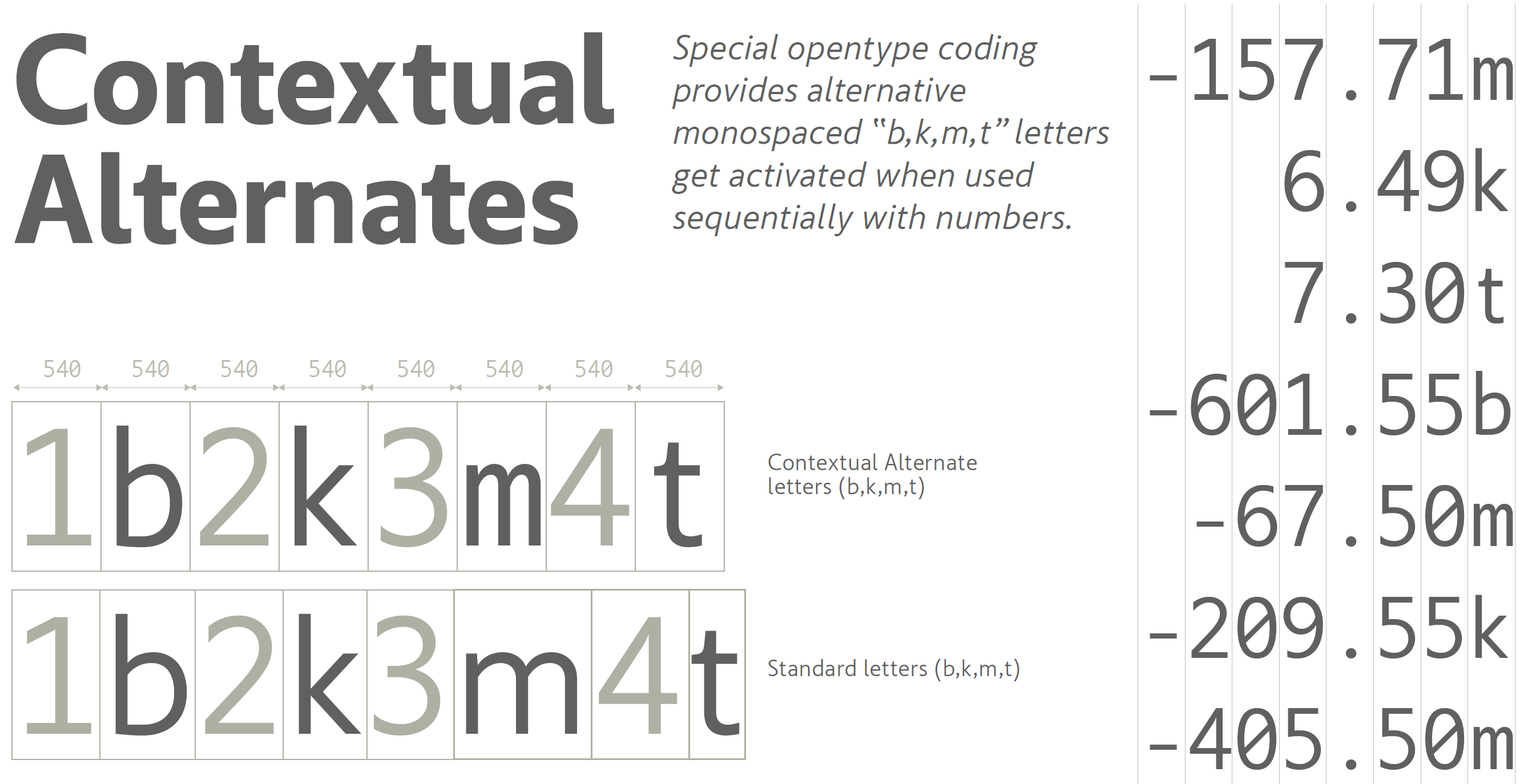
This ensures that you can build amazing tabular & financial reports using Inforiver Sans typeface in Power BI.
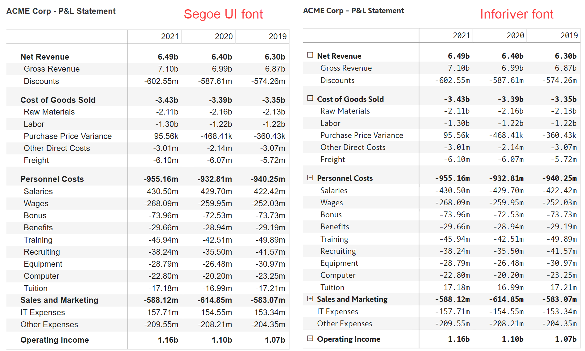
Take a look at this sample P&L report where we have used both Segoe UI and the Inforiver font. Which one is more easily readable?
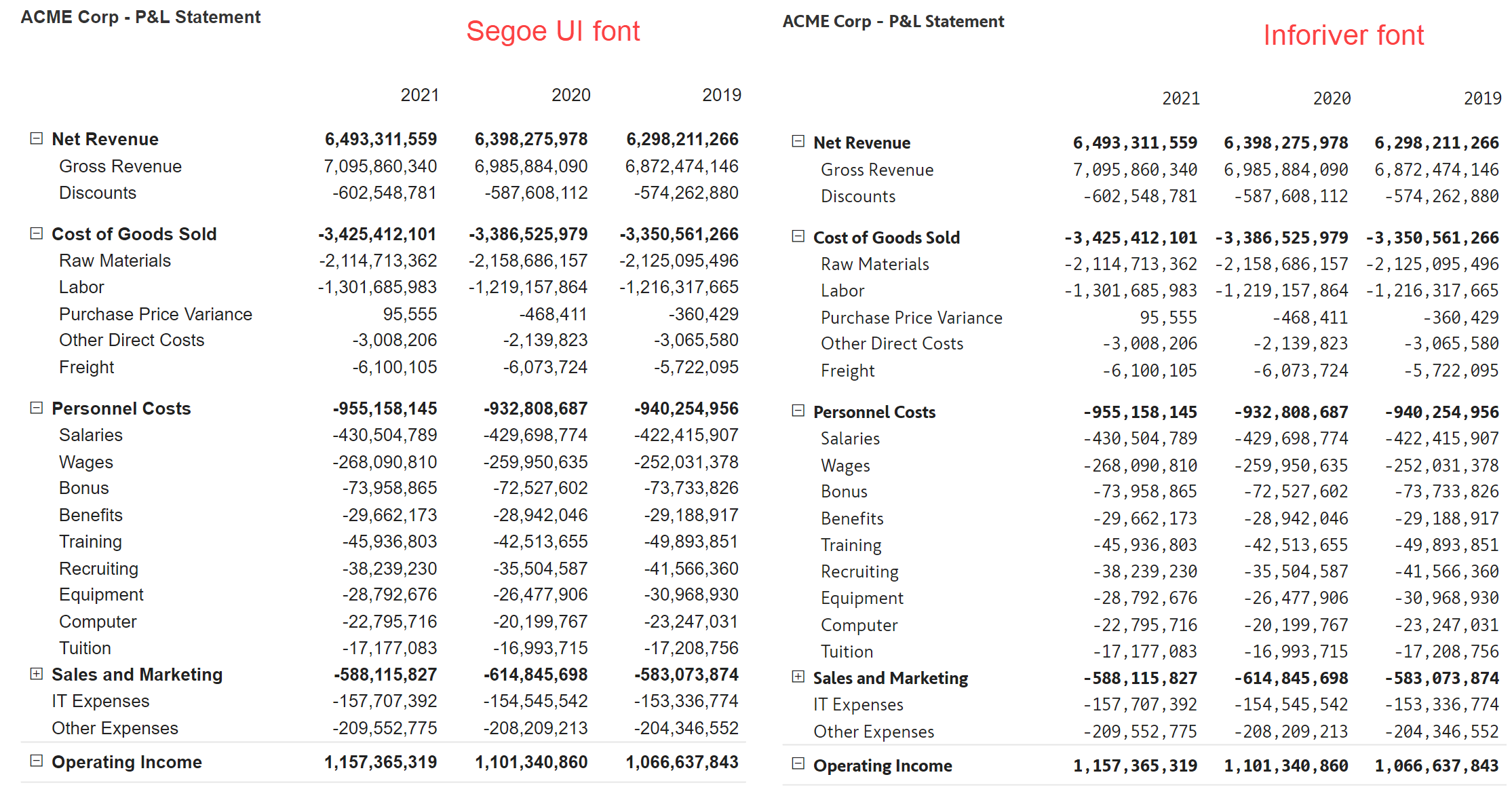
Here is another example, with fully expanded numbers. Which one is easier on the eyes and a pleasure to read?
***
Learn how Inforiver's awesome fonts for tabular reporting help enterprises support use cases such as forecasting and budgeting.

Inforiver helps enterprises consolidate planning, reporting & analytics on a single platform (Power BI). The no-code, self-service award-winning platform has been recognized as the industry’s best and is adopted by many Fortune 100 firms.
Inforiver is a product of Lumel, the #1 Power BI AppSource Partner. The firm serves over 3,000 customers worldwide through its portfolio of products offered under the brands Inforiver, EDITable, ValQ, and xViz.