
Upcoming webinar on 'Inforiver Charts : The fastest way to deliver stories in Power BI', Aug 29th , Monday, 10.30 AM CST. Register Now
Upcoming webinar on 'Inforiver Charts : The fastest way to deliver stories in Power BI', Aug 29th , Monday, 10.30 AM CST. Register Now
Accurately conveying change between two data points is a common but often overlooked challenge in business intelligence reporting. While Power BI offers a range of visuals for trend analysis, the slope graph provides a clear and efficient way to compare values across two periods or categories. It eliminates unnecessary visual noise, allowing analysts and decision-makers to quickly spot upward or downward shifts. For scenarios such as performance benchmarking, pre- and post-period analysis, or variance reporting, slope graphs can add immediate clarity and business value to your Power BI reports.
A slope graph is a specialized line chart designed to show changes between two points in time or two different conditions. For instance, when comparing inflation rates, sales figures, or rankings across two distinct periods in your Power BI dashboards, a slope graph elegantly connects the data points for each category, enabling immediate visual comprehension of increases, decreases, or stability.
Its effectiveness stems from:
Creating a slope graph typically involves selecting your categorical data and two distinct numerical points in time or conditions.
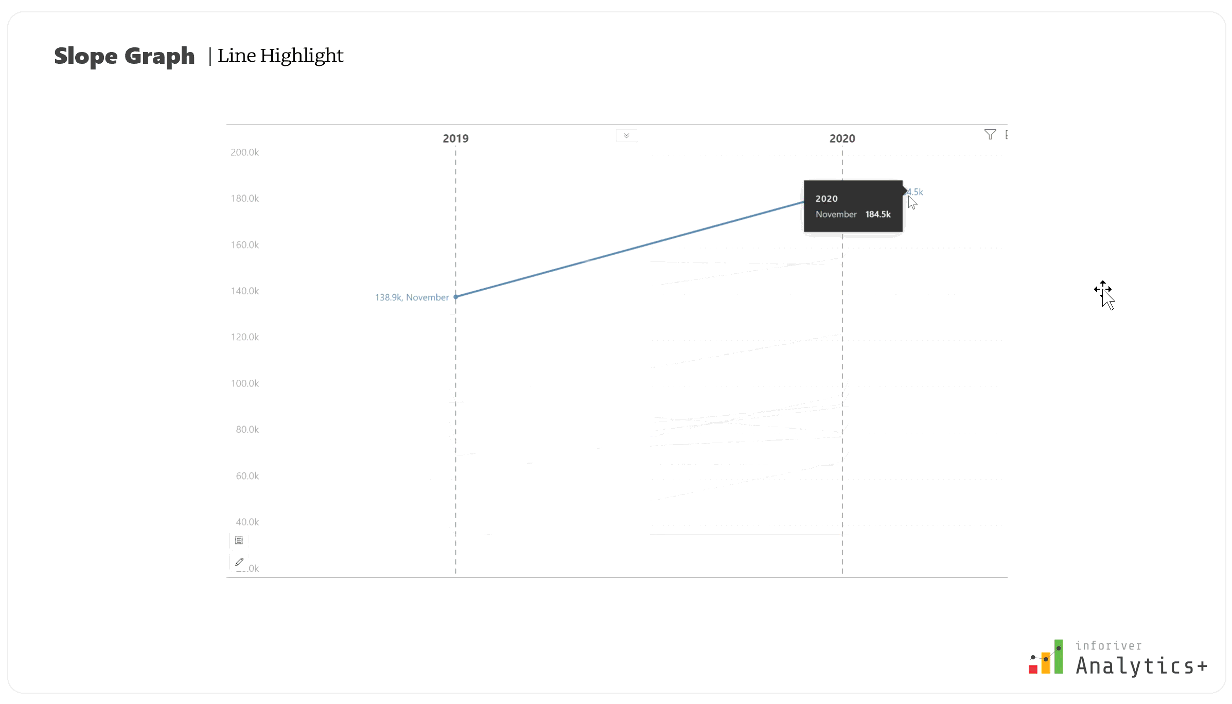
Interpreting a slope graph is straightforward:
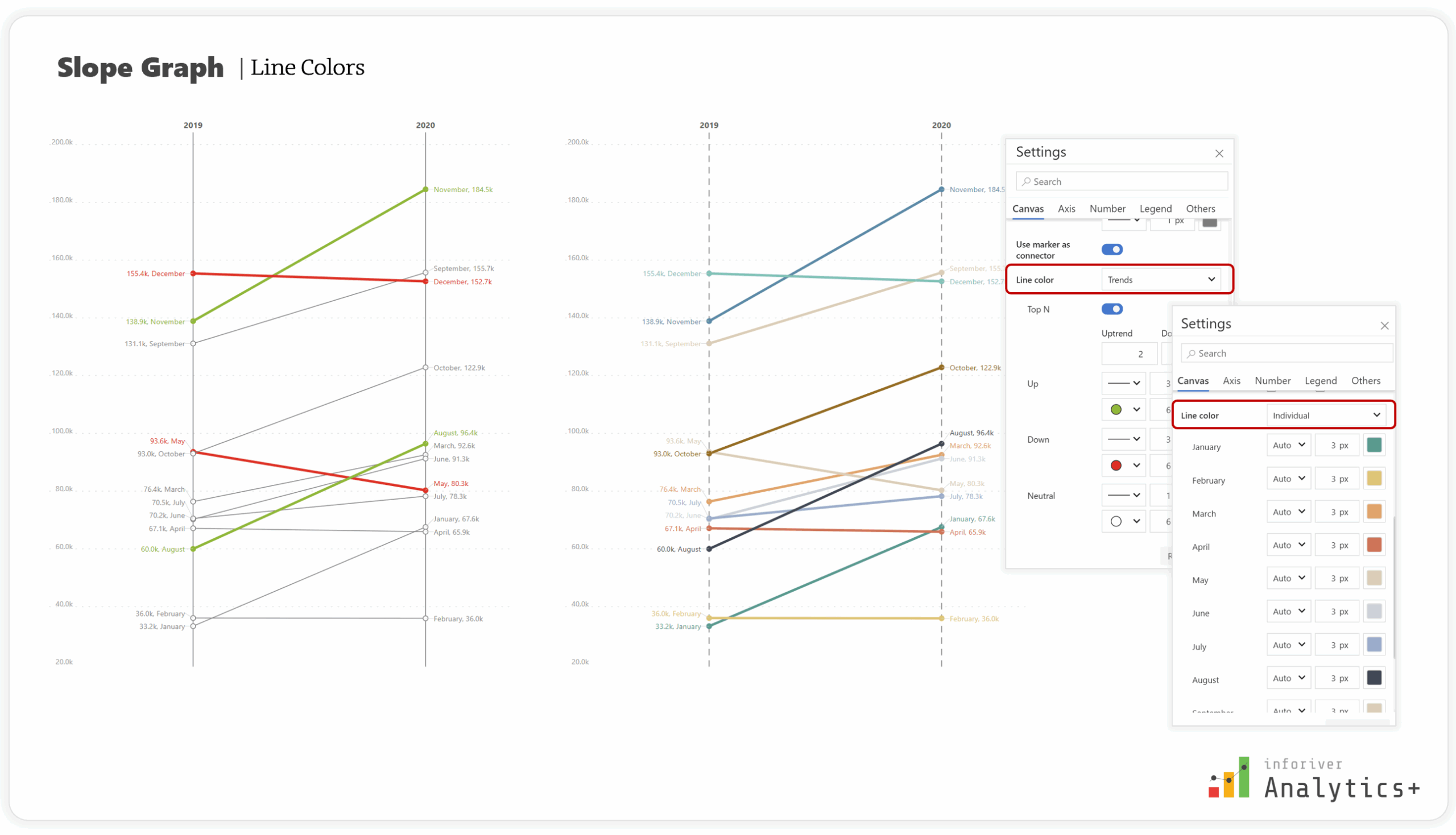
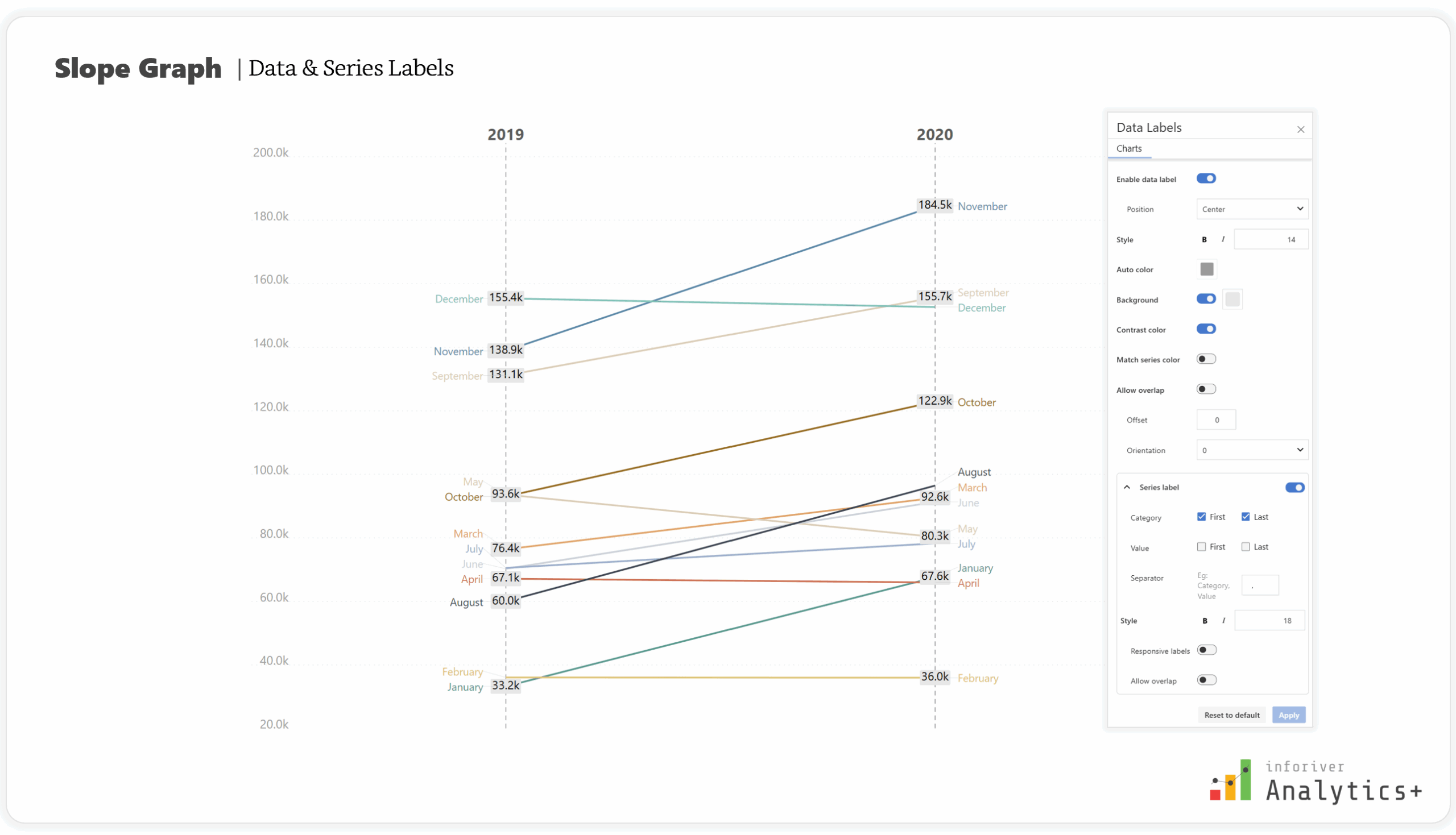
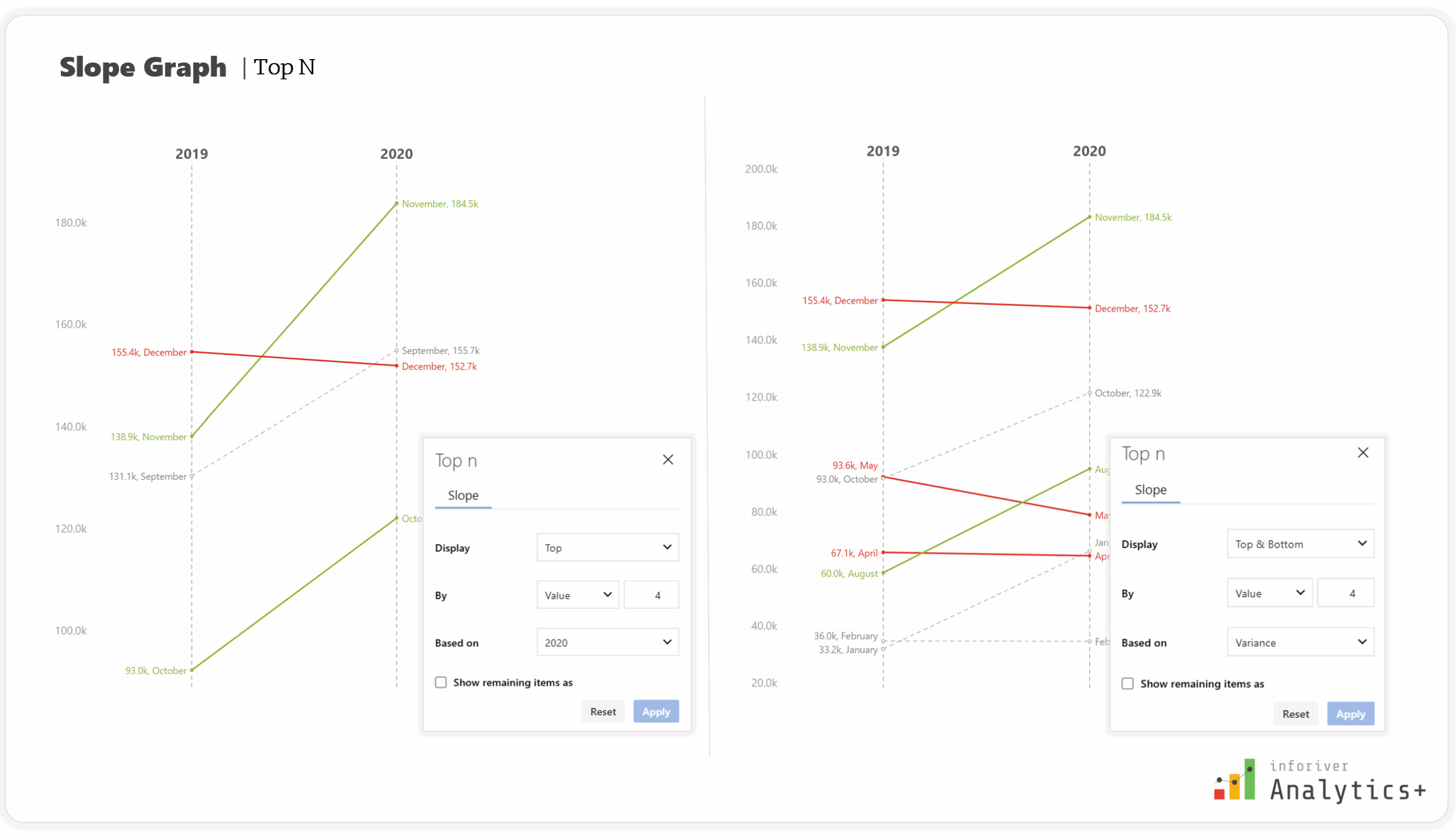
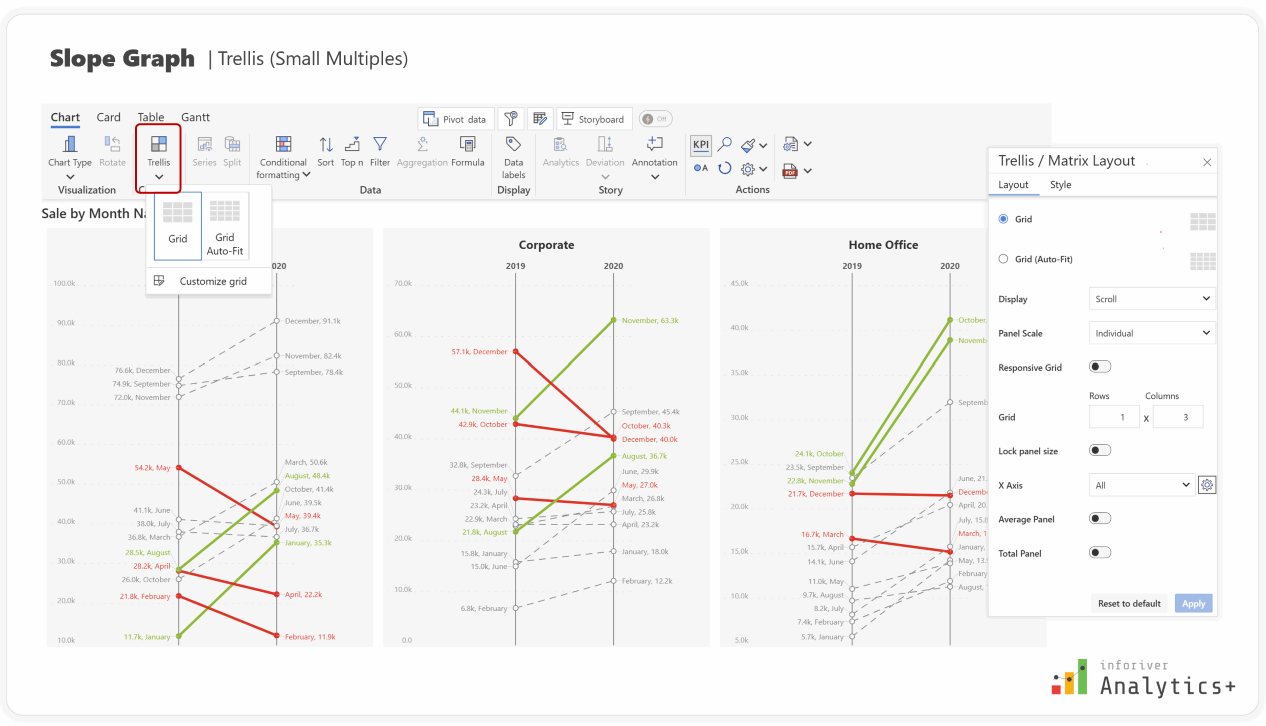
To truly leverage the potential of slope graphs, a robust visualization tool in Power BI should offer several key features that enhance clarity and interactivity. Based on best practices and advanced functionalities, here are important capabilities:
The Inforiver Analytics+ Slope Graphs for Power BI are designed with the features needed to create compelling data stories directly within your reports.
In addition to the fundamental features, Inforiver Analytics+ offers:


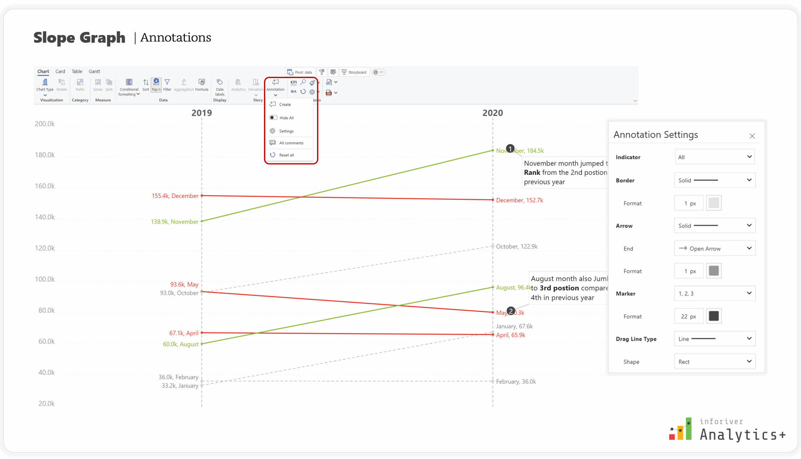


Inforiver Analytics+ empowers you to not just present data, but to narrate a compelling story that drives understanding and action within Power BI.
Slope graphs are an invaluable tool for vividly illustrating change and rank shifts between two data points. Their simplicity and clarity make complex trend analysis accessible. By leveraging the advanced features offered by Inforiver Analytics+ for Power BI—from flexible coloring and intelligent labels to powerful conditional formatting, annotations, comprehensive Top N filtering, and Trellis—you can elevate your data storytelling capabilities and provide deeper, actionable insights.
Try Inforiver Analytics+ for yourself with a free trial and explore how it can transform your reporting experience.

Inforiver helps enterprises consolidate planning, reporting & analytics on a single platform (Power BI). The no-code, self-service award-winning platform has been recognized as the industry’s best and is adopted by many Fortune 100 firms.
Inforiver is a product of Lumel, the #1 Power BI AppSource Partner. The firm serves over 3,000 customers worldwide through its portfolio of products offered under the brands Inforiver, EDITable, ValQ, and xViz.
 Learn how to build advanced, insight-rich Power BI dashboards effortlessly with Inforiver Analytics+—no coding, no complex configurations, just smarter reporting in less time.