In KPI-driven reporting, it’s not enough to show performance, you need to show how that performance measures up against defined goals. Gauge charts in Power BI offer a concise way to visualize progress against a target or threshold, making them especially effective in executive dashboards and performance monitoring. While often underused, they provide immediate context that bar and line charts may not capture as efficiently.
In this post, we’ll walk through what gauge charts are, when to use them, and the key design features that drive clarity. We’ll also highlight how Inforiver Analytics+ enhances gauge chart functionality in Power BI, enabling faster insight and greater control over your visual storytelling.
Imagine glancing at your car's speedometer to instantly know your speed. That’s the essence of a gauge chart. Gauge charts are visual tools designed to display key performance indicators (KPIs) and track progress against a target or a range. They provide an immediate, at-a-glance understanding of a single metric's performance, making them a valuable addition to your Power BI reports.
Why are they so effective?
Instant Comprehension: Their familiar, speedometer-like design makes them incredibly easy to interpret, allowing users to quickly assess metrics like speed, temperature, or fuel levels.
Target-Oriented: They excel at showing progress towards a goal, clearly indicating whether you're on track, falling behind, or exceeding expectations.
Space-Efficient: Especially with linear variations, they can present vital information without consuming excessive dashboard real estate, crucial for optimized Power BI layouts.
Gauge charts typically come in two main variations:
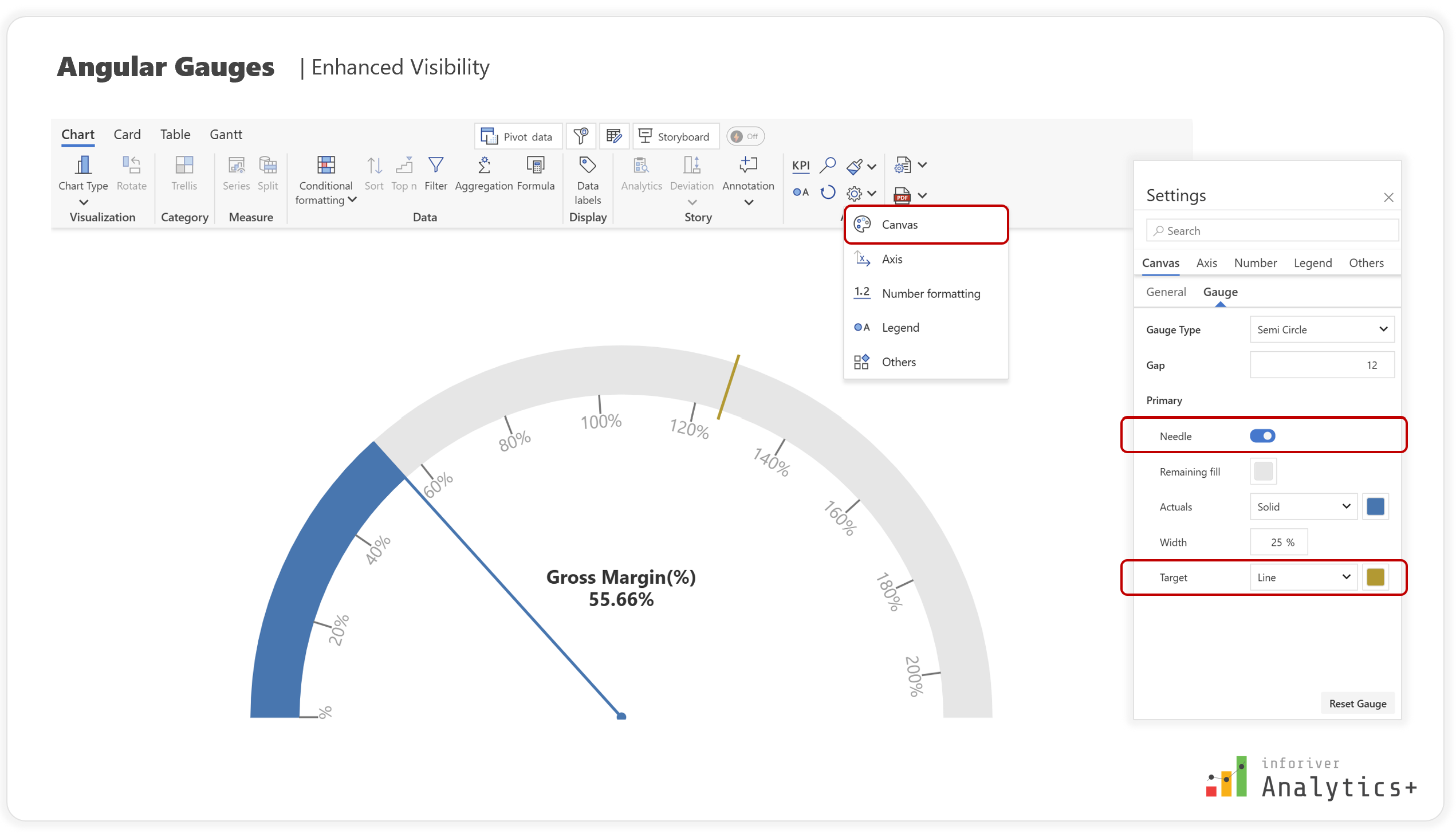
Angular Gauge: This is the classic "speedometer" style, featuring a needle that moves across a circular or semi-circular arc. They are ideal for highlighting critical data points and trends, aiding in better decision-making within your Power BI dashboards. Inforiver Analytics+ offers both circular and semi-circular angular gauges.
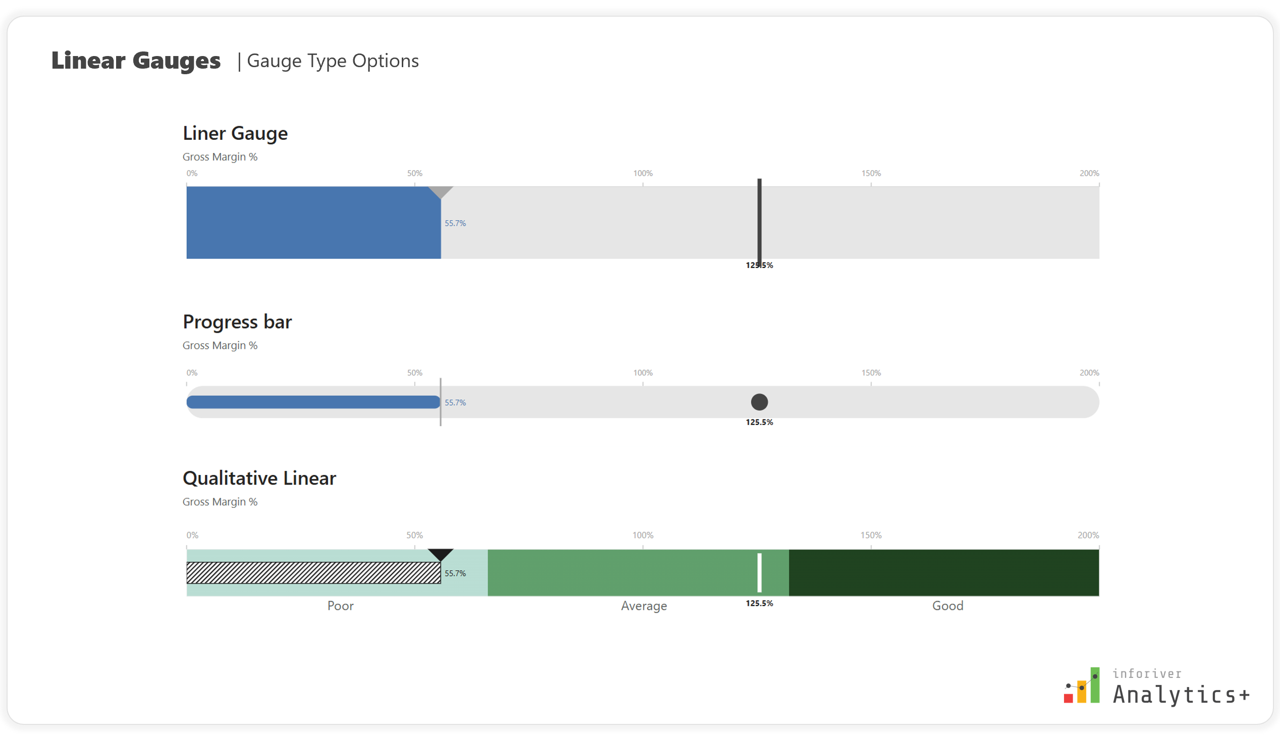
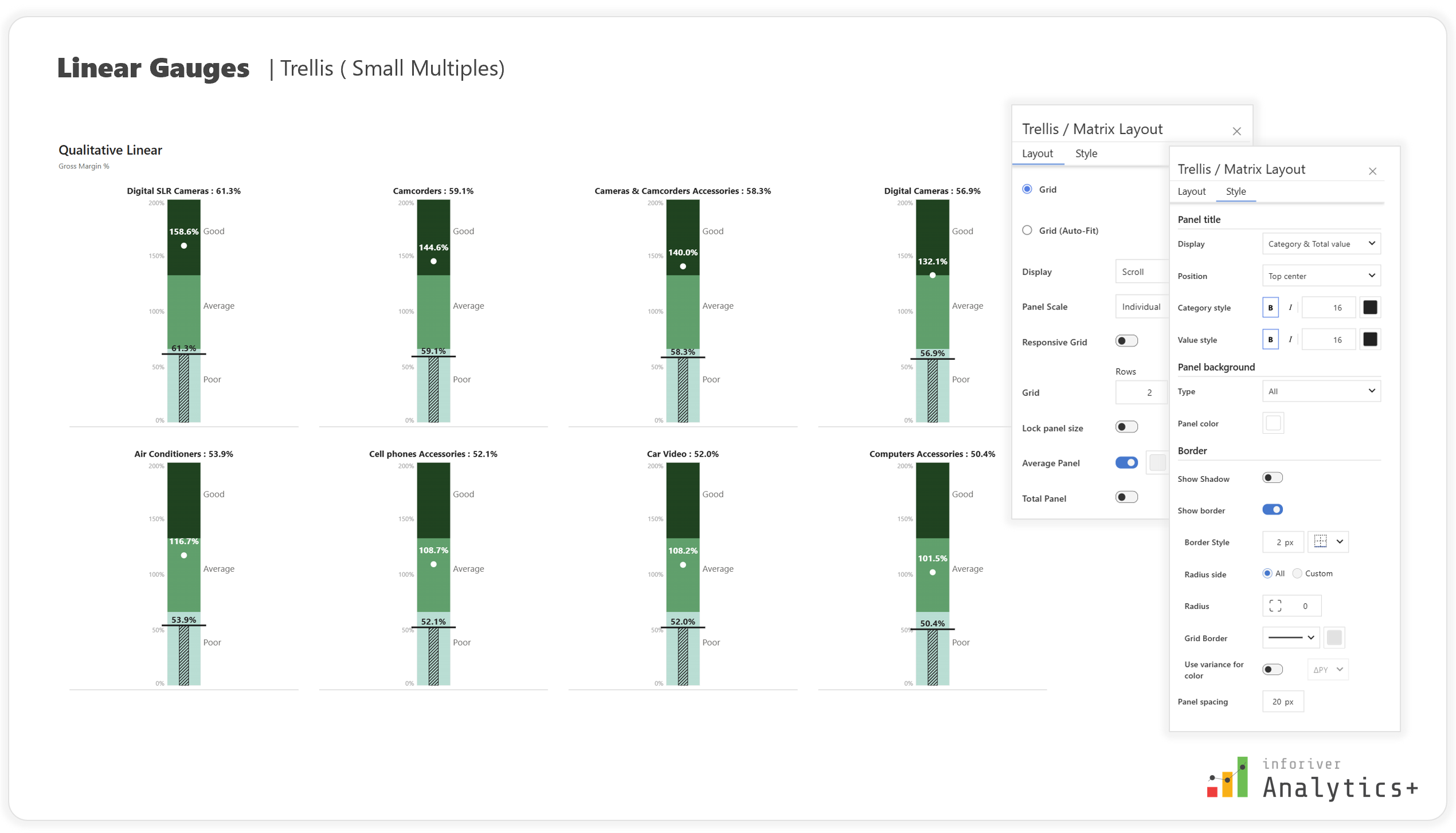
Linear Gauge: As the name suggests, this type uses a linear bar (horizontal or vertical) to show progress. They are sleek and minimalistic, perfect for monitoring KPIs or completion percentages in Power BI reports. Inforiver Analytics+ provides various linear gauge types, including qualitative linear gauges and progress bars.
How to Create and How to Interpret
Creating and interpreting gauge charts is straightforward, making them accessible to a wide range of users, especially within a Power BI environment.
How to Create:
Define Your Metric: Choose the single KPI you want to visualize (e.g., Sales Attainment, Project Completion, Customer Satisfaction).
Set Your Range: Determine the minimum and maximum values for your gauge.
Establish Targets/Thresholds: If applicable, set target values or define performance zones (e.g., "Good," "Average," "Bad").
Select Gauge Type: Decide between an angular or linear gauge based on your dashboard space and the nature of your data.
Map Your Data: Connect your actual metric value to the gauge.
How to Interpret:
Angular Gauge: The position of the needle instantly shows the current value relative to the overall range and any defined target or comparison bands. The color of the gauge itself or sections of it might change based on conditional formatting rules, indicating performance status (e.g., red for low, green for good).
Linear Gauge: The filled portion of the bar indicates progress. Similar to angular gauges, color changes or markers within the bar help in quick interpretation against targets or thresholds.
Key Features Any Gauge Chart Shall Have
To truly be effective in Power BI, gauge charts should come with a robust set of features that allow for customization and deeper insights. Here are some essential characteristics for both angular and linear variations:
For Both Angular and Linear Gauges:
Customizable Settings: The ability to tailor the gauge type, color schemes, and target representation is crucial for aligning with your Power BI report's theme.
Data Labels: Options to display actual values and percentages directly on the gauge for immediate understanding. Advanced data label customization includes font color, size, style (bold/italic), background, offset, and the ability to allow overlap.
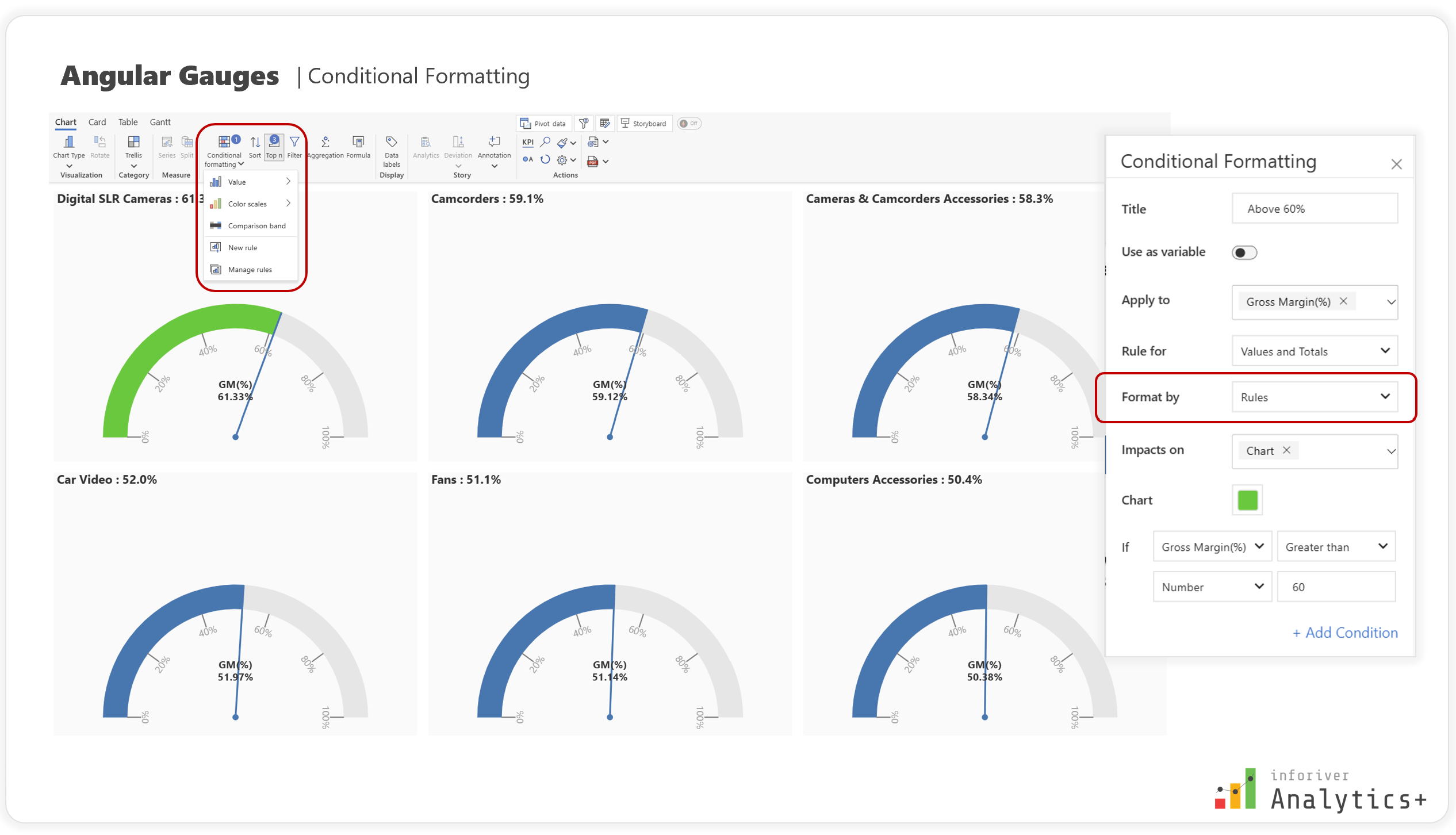
Conditional Formatting: This is a game-changer for Power BI users! Apply specific formatting rules (like color changes) based on values, comparison values, or color scales to highlight important data points and identify trends. This can include highlighting outliers and setting up custom rules based on your data.
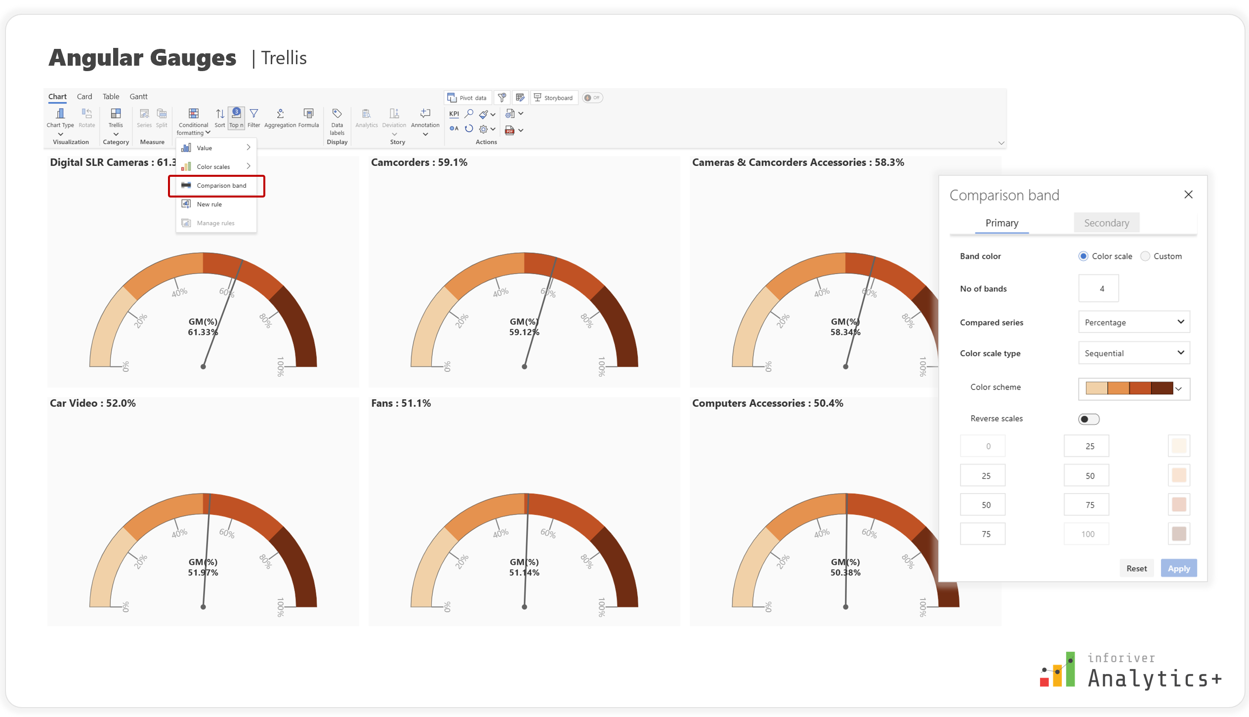
Comparison Bands: Visually compare values against predefined benchmarks or ranges, providing clear context within your Power BI visuals.
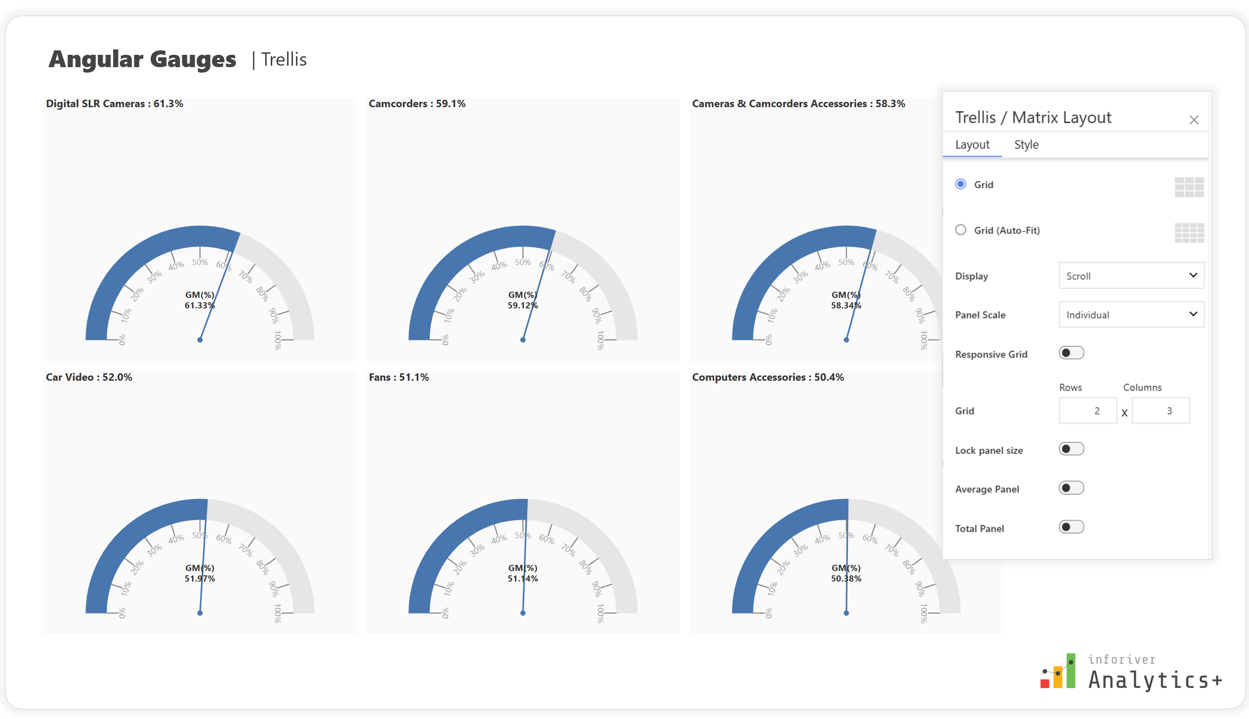
Small Multiples (Trellis): This feature allows you to visualize data for different categories or dimensions side-by-side, facilitating comparative analysis and trend identification across multiple gauges, a powerful feature for complex Power BI models.
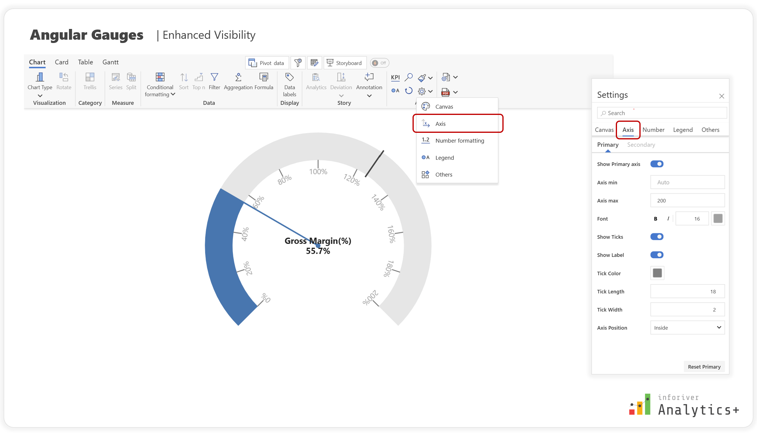
Axis Customization: Fine-tune the axis settings, including min/max values, tick marks, labels, and positioning, to ensure precise data representation and readability in Power BI.
Specific to Linear Gauges:
Orientation Options: Flexibility to display gauges vertically or horizontally to fit seamlessly into various Power BI dashboard layouts.
Target and Actual Values: Display primary and secondary targets, as well as actual values, for comprehensive insights.
Diverse Marker Types: The ability to choose from various marker types (e.g., line, circle, diamond, square, triangle, inverted triangle) for actual and target values to enhance visibility.
Specific to Angular Gauges:
Needle Customization: Adjust the needle style to accurately represent actual values.
What Inforiver Analytics+ Gauge Charts Offers
Inforiver Analytics+ goes beyond basic gauge charts, providing a comprehensive suite of features that empower business users to create insightful and visually stunning dashboards directly within Power BI. It offers both angular and linear gauge types, making them indispensable in any Power BI dashboard.
Here's how Inforiver Analytics+ enhances your Power BI gauge chart experience:
Linear Gauge Capabilities:
Multiple Gauge Types: Beyond standard linear gauges, Inforiver Analytics+ offers Qualitative Linear gauges and Progress Bars, providing diverse options for your Power BI data visualization needs.
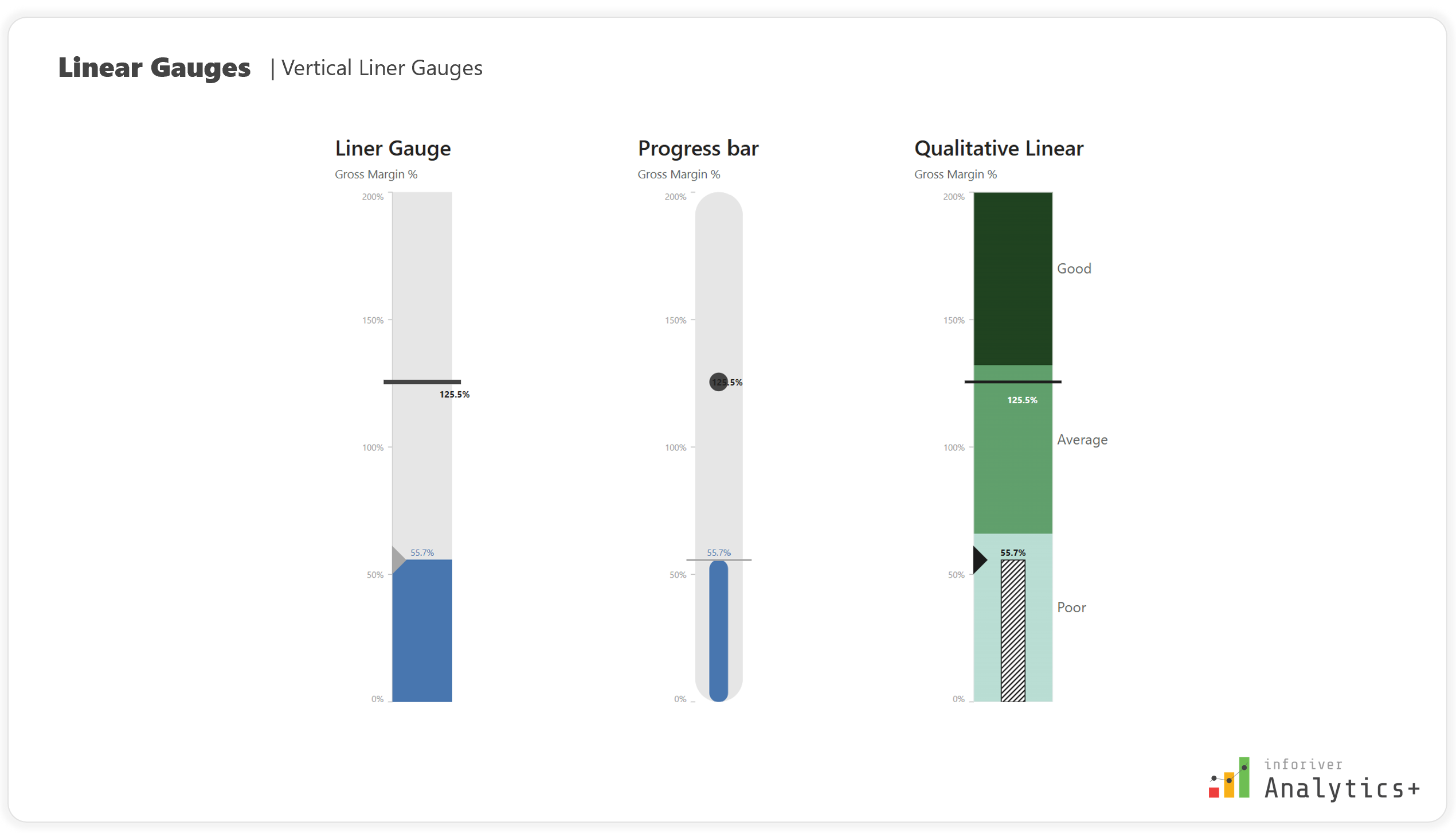
Orientation: Linear Gauges in inforiver Analytics+ supports both vertical and horizontal orientations, offers flexibility in designing you poser BI dashboards
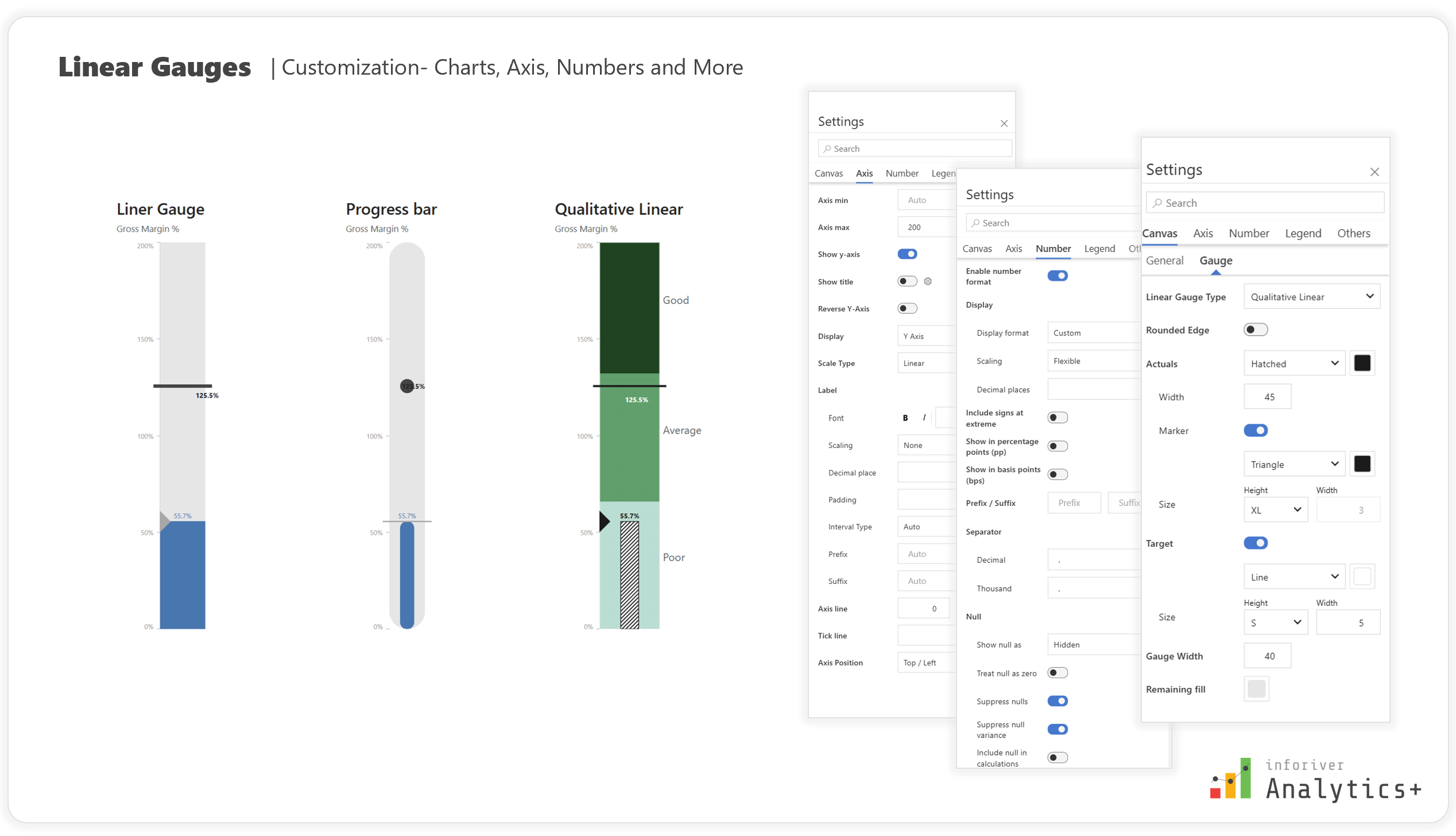
Extensive Customization: Adjust gauge type, rounded edges, actual values, target markers, gauge width, and fill color. Toggle Axis visibility, set custom min/max values, enable titles, reverse axis direction, and choose between linear or logarithmic scales.
Detailed Data Labels: Customize label position (inside, outside, auto), format (value, percentage), font, and background. You can even enable/disable separate labels for actual and target values.
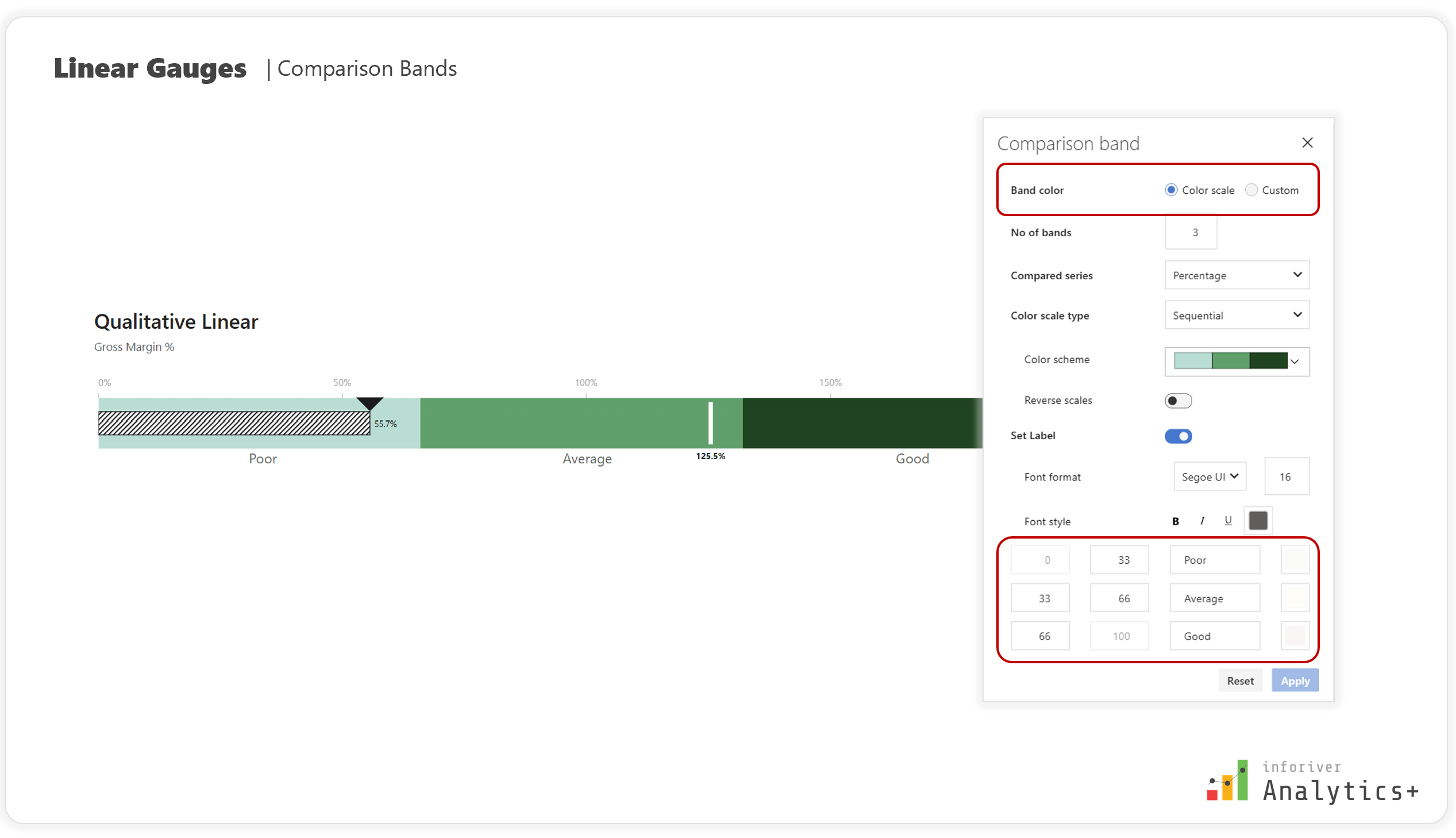
Advanced Comparison Bands: Create gradient bands, add clear labels, flip band directions, and choose from multiple palettes with various color scales.
Small Multiples for Comparative Analysis: Enhance data visualization by displaying multiple linear gauges side-by-side, enabling uniform or individual scaling for optimal comparison and trend analysis.
Conditional Formatting: Apply rules based on specific values, comparison values (e.g., less than/greater than benchmark), or various color scales (sequential, qualitative, diverging, custom).
Angular Gauge Capabilities:
Gauge Type: Choose the display type such as Circle, Semi-Circle or Arc, that best suits your Power BI dashboard design, and the level of detail required.
Enhanced Visibility & Highlighting: Customize the style, size, and color of target markers and adjust the appearance of targets to highlight key metrics effectively. Tun on needles for precise representation.
Advanced Axis Customization: Set custom min/max values for precise control over the data range and adjust tick length, color, and labels to improve readability.
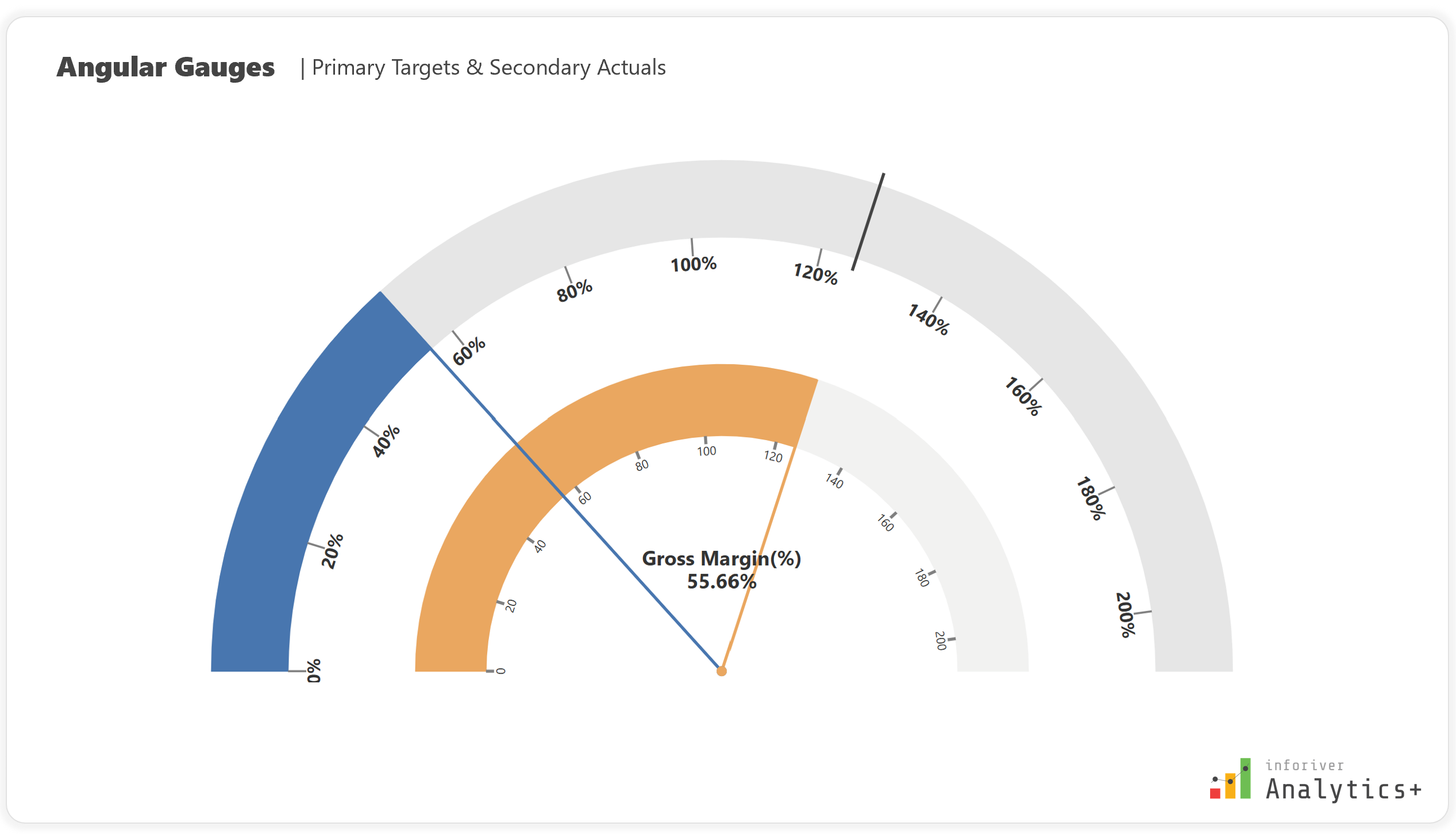
Secondary Actuals and Primary Targets: Provide a detailed view of your data by customizing both secondary actuals and primary targets.
Trellis (Small Multiples) for In-depth Analysis: Monitor KPIs, benchmark performance against targets, and integrate multiple angular gauges for a comprehensive and space-efficient overview in Power BI.
Conditional Formatting: Apply comparison bands, quick rules, color scales, and create custom rules using nested IF conditions and ranking to highlight outliers.
Customizable Comparison Bands: Define unique comparison bands for both primary and secondary axes, choose from sequential, diverging, and qualitative color scales, and customize the number and colors of bands.
Gauge charts, especially with the advanced features offered by Inforiver Analytics+, are invaluable for creating impactful dashboards that drive immediate understanding and better decision-making in Power BI. Don't let your crucial KPIs get lost in complex visuals.
Try Inforiver Analytics+ for yourself with a free trial and explore how it can transform your reporting experience.
Inforiver helps enterprises consolidate planning, reporting & analytics on a single platform (Power BI). The no-code, self-service award-winning platform has been recognized as the industry’s best and is adopted by many Fortune 100 firms.
Inforiver is a product of Lumel, the #1 Power BI AppSource Partner. The firm serves over 3,000 customers worldwide through its portfolio of products offered under the brands Inforiver, EDITable, ValQ, and xViz.