To uncover patterns in your data, it's often essential to go beyond individual values and explore how multiple variables interact. Bubble charts make it possible to visualize these multi-dimensional relationships in a single, intuitive view—showing not just the position of data points, but also their relative size and importance. For users working with Power BI, mastering the Power BI bubble chart can improve the clarity of analysis and enhance how trends, outliers, and correlations are communicated across datasets.
Deciphering Bubble Charts: What They Are, Why They Matter, and How to Use Them
At its core, a bubble chart is a variation of a scatter plot. It plots values along an X and Y axis, providing a fantastic way to show the relationships (correlation) between two sets of data. But what makes it a bubble chart? It's the addition of a third measure (one more dimension), which controls the size of the bubbles. This third dimension allows you to visualize an extra layer of information, providing richer context briefly.
Why use a bubble chart?
Reveal hidden relationships: They excel at showcasing correlations between three variables simultaneously.
Identify outliers: Larger or smaller bubbles, or those positioned unusually on the axes, can quickly draw your attention to data points that deviate from the norm.
Simplify complex data: Instead of juggling multiple charts, a single bubble chart can convey useful information in an easily digestible format.
Engage your audience: The visual nature of bubble charts makes them more engaging and memorable than raw data tables.
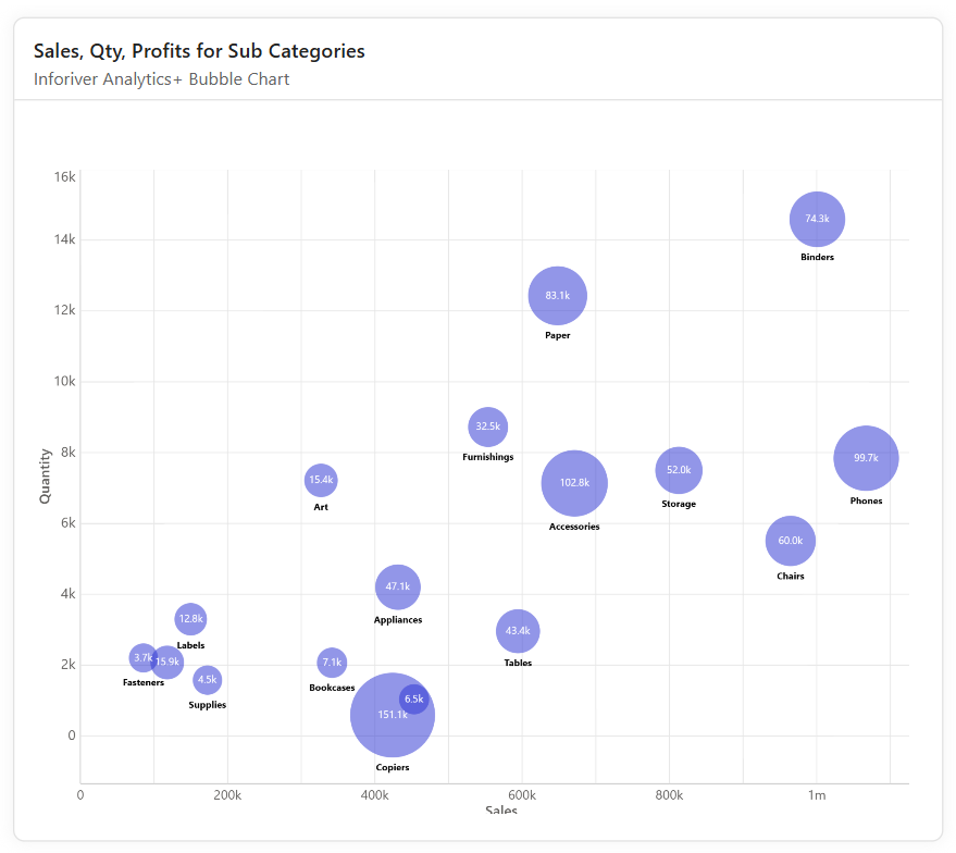
How they work: Imagine sales data: "Order Sales" on X, "Order Quantity" on Y. Make bubble size show "Profit." This quickly highlights, for instance, high-volume sales with low profits versus low-volume sales with high profits.
Enhance Your Insights: Advanced Bubble Charting with Inforiver Analytics+
While Power BI's native scatter and bubble charts offer a good starting point,Inforiver Analytics+ Bubble Charts takes your data visualization capabilities to the next level. It's designed to empower professionals with enhanced flexibility and advanced features that go beyond basic plotting.
Let's explore what Inforiver Analytics+ brings to the table for bubble charts:
IBCS Certified Chart Type: Inforiver Analytics+ adheres to IBCS (International Business Communication Standards), which means your bubble charts will be designed for maximum clarity and understandability, promoting effective communication of insights.
Quadrant Chart Capabilities: Inforiver Analytics+ offers powerful quadrant charts, a combination of bubble and scatter plots. These are widely used in areas like SWOT analysis, risk management, and performance analysis. You can even control the range and formatting of each quadrant from the Axis > Quadrant settings, allowing for highly customized analytical views, such as population by county based on GDP and Life Expectancy.
Dynamic Ranking: Inforiver Analytics+ allows you to filter categories by either a Top or Bottom N ranking, or both if desired. This ranking can be based on a value of your choice. You can also choose to show remaining items as other categories grouped with an "Others" bubble displayed, providing a clean summary of less significant categories. This is incredibly useful for focusing on your most impactful data points, as seen in sales performance with rankings by sales average per region.
Extensive Marker Customization: Inforiver Analytics+ provides comprehensive marker customization options. You can tailor the appearance of your bubbles in terms of shape, pattern, size, and color. The legend also supports the icon type, further enhancing readability and visual appeal.
Conditional Formatting for Emphasis: Highlight key insights effortlessly with color scale formatting. Inforiver Analytics+ enables you to apply conditional formatting to highlight a spectrum of values using a range of colors. The color scheme can be sequential, diverging, qualitative, or custom. The scale can be based on any field used in the visual and the number of colors can be configured.
Small Multiples (Trellis) for Granular Detail: All variations of scatter plot support small multiples where you can assign as many rows and columns to create a trellis. It also has individual scaling that allows to inspect each group in detail according to its individual values.
Advanced Analytics with Reference Lines & Bands: Inforiver Analytics+ goes beyond simple plotting by allowing you to add reference lines and bands. Reference bands can be added for vertical and horizontal orientation based on custom or dynamic range. Formatting and position options are available for each line. This feature is invaluable for setting benchmarks, highlighting thresholds, or indicating target zones.
Rich Formatting for Storytelling: Enhance your storytelling narrative options by adding comments.
Conclusion:
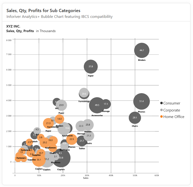
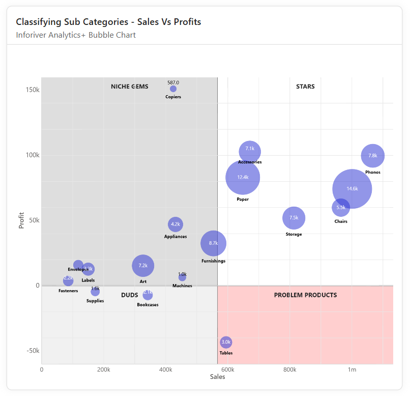
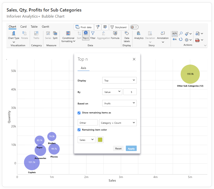
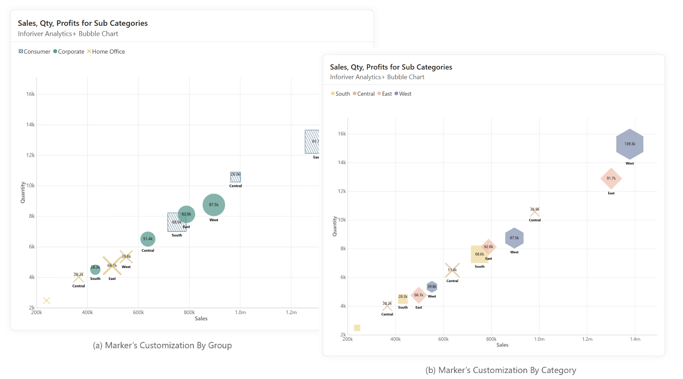
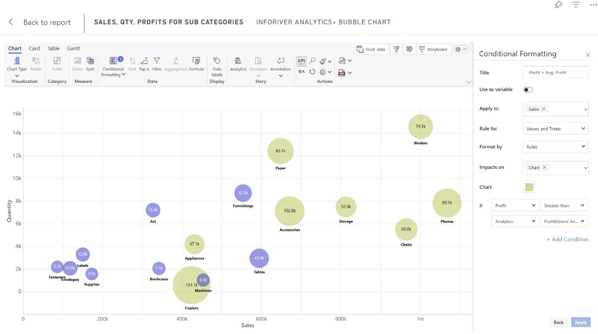
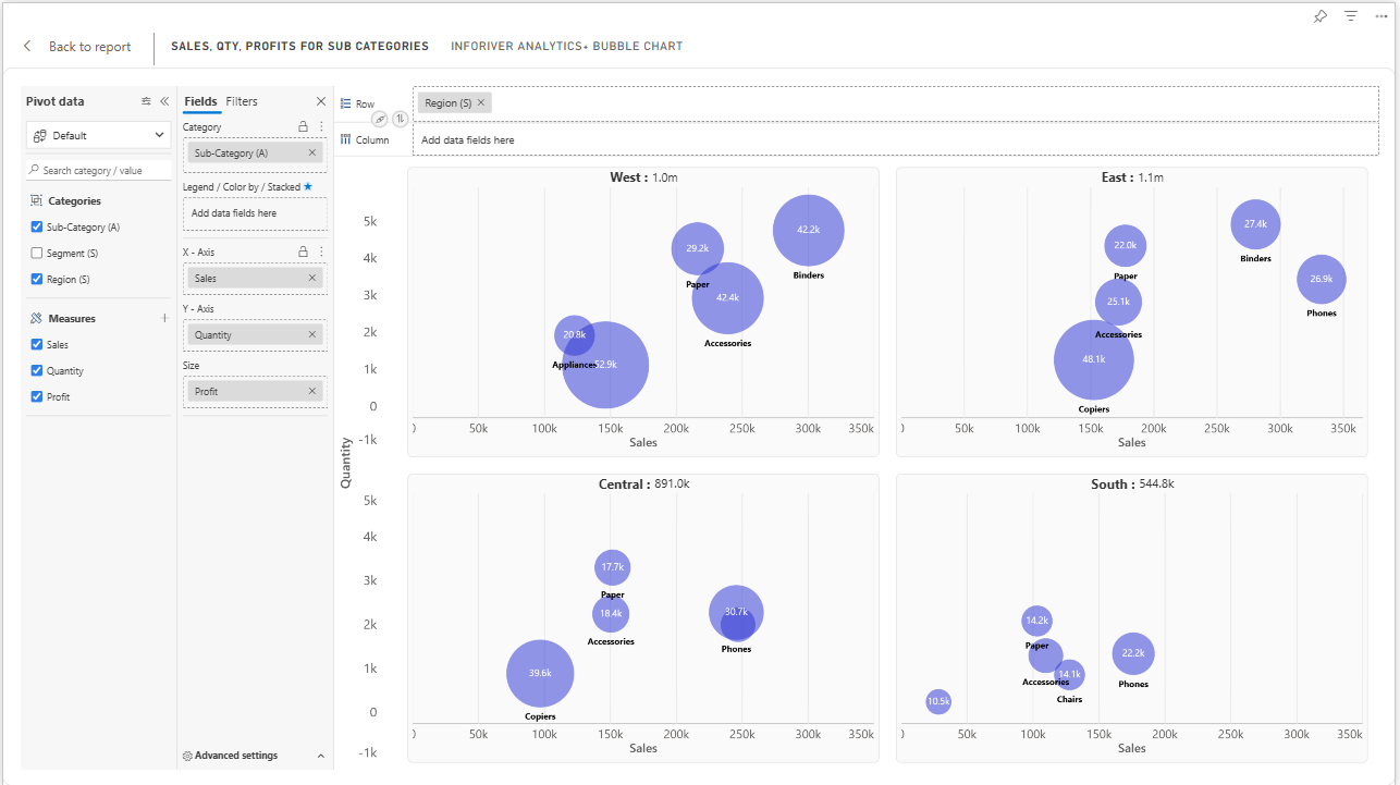
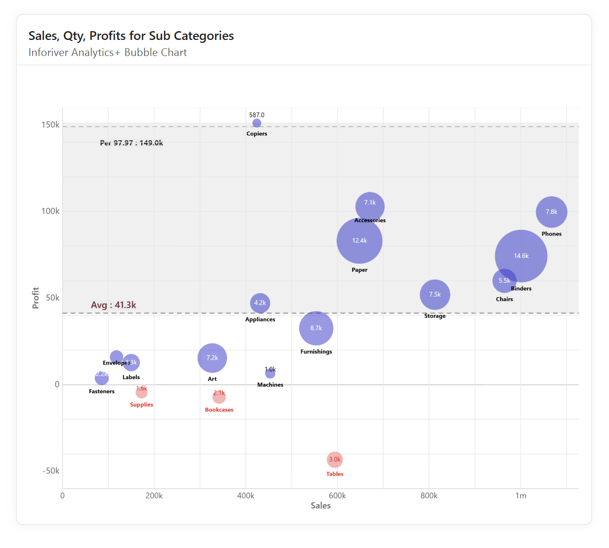
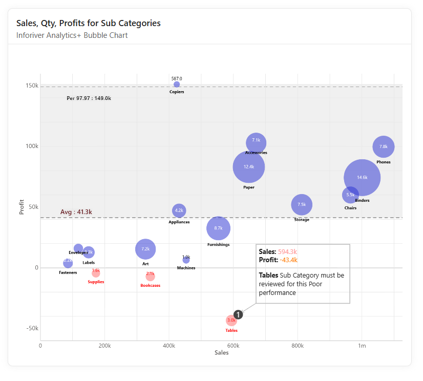
Advanced data visualization demands more than basic charting tools, and that’s where Inforiver Analytics+ stands out. Its powerful features for Power BI bubble charts provide the clarity, control, and depth needed to turn complex datasets into meaningful visual insights. With Inforiver, you can elevate your reports and dashboards to deliver clearer, more actionable narratives.
Share this on:
Get Inforiver brochure
Maximize your business potential with Inforiver's paginated reporting, data entry, planning & budgeting capabilities
Inforiver helps enterprises consolidate planning, reporting & analytics on a single platform (Power BI). The no-code, self-service award-winning platform has been recognized as the industry’s best and is adopted by many Fortune 100 firms.
Inforiver is a product of Lumel, the #1 Power BI AppSource Partner. The firm serves over 3,000 customers worldwide through its portfolio of products offered under the brands Inforiver, EDITable, ValQ, and xViz.
Learn how to build advanced, insight-rich Power BI dashboards effortlessly with Inforiver Analytics+—no coding, no complex configurations, just smarter reporting in less time.