
Upcoming webinar on 'Inforiver Charts : The fastest way to deliver stories in Power BI', Aug 29th , Monday, 10.30 AM CST. Register Now
Upcoming webinar on 'Inforiver Charts : The fastest way to deliver stories in Power BI', Aug 29th , Monday, 10.30 AM CST. Register Now
Inforiver is constantly evolving to empower business users with enhanced reporting, analytics, and data visualization capabilities. We're excited to introduce our latest features and performance upgrades, making Inforiver more powerful than ever.
In our latest updates, we have exciting new chart types including the histogram, linear gauge, and packed bubble for distribution analysis and progress tracking. Create insightful metrics dashboards with new features like advanced KPI customizations, dynamic ranking, and interactive legend-based data selection, just to name a few.
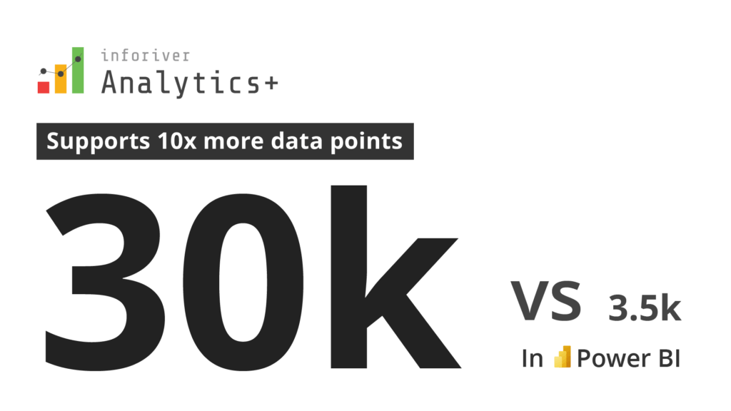
With Analytics+, you can render up to 10 times more data points than with Power BI native visuals.
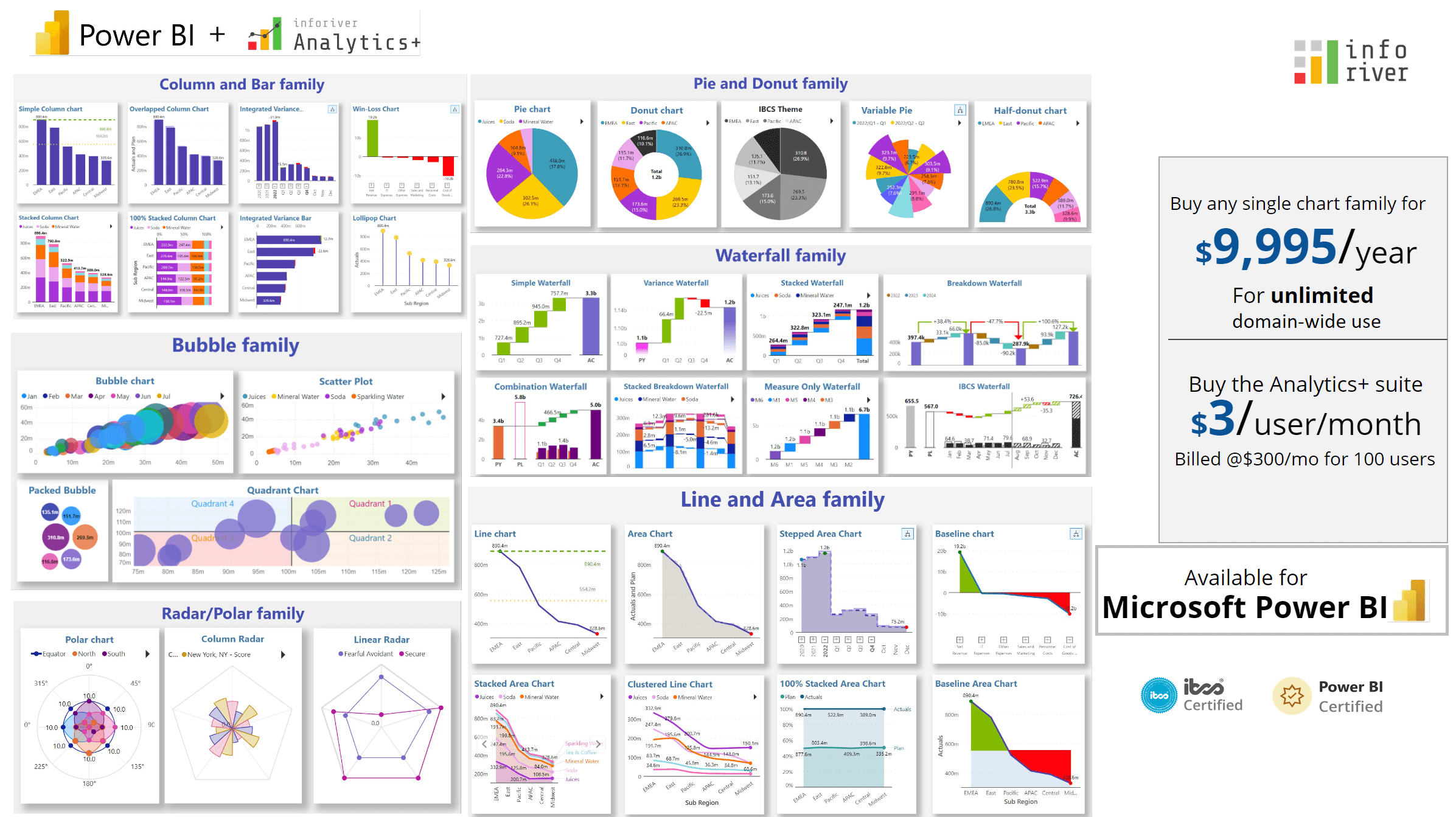
We have also added even more flexibility to our licensing model, and you can buy domain-wide licenses for single chart families as you need them. For instance, if your organization requires extensive use of waterfall charts for financial dashboards, you have the option to purchase our waterfall chart suite, which provides access to an unlimited number of users.
Explore the innovations that drive reporting, analytics, and data visualization across your organization in this release:
1.1. New chart types - Linear Gauge, Histogram, Packed Bubble
1.2. Line border hover color and Line hover cross highlight
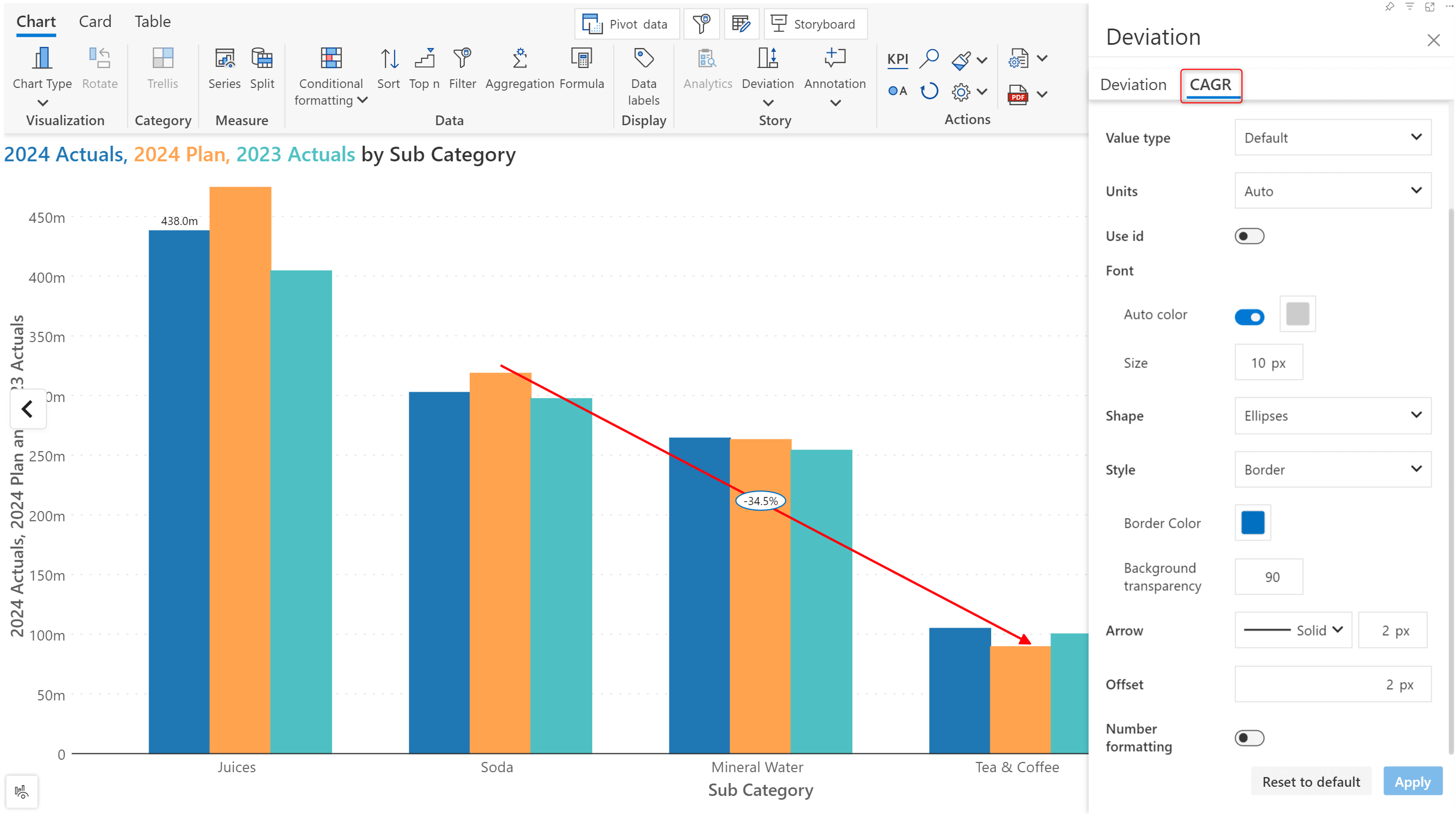
1.3. Deviation enhancements, CAGR and Analytics
2.1. Advanced KPI customizations
2.2. Export/Import KPI presets
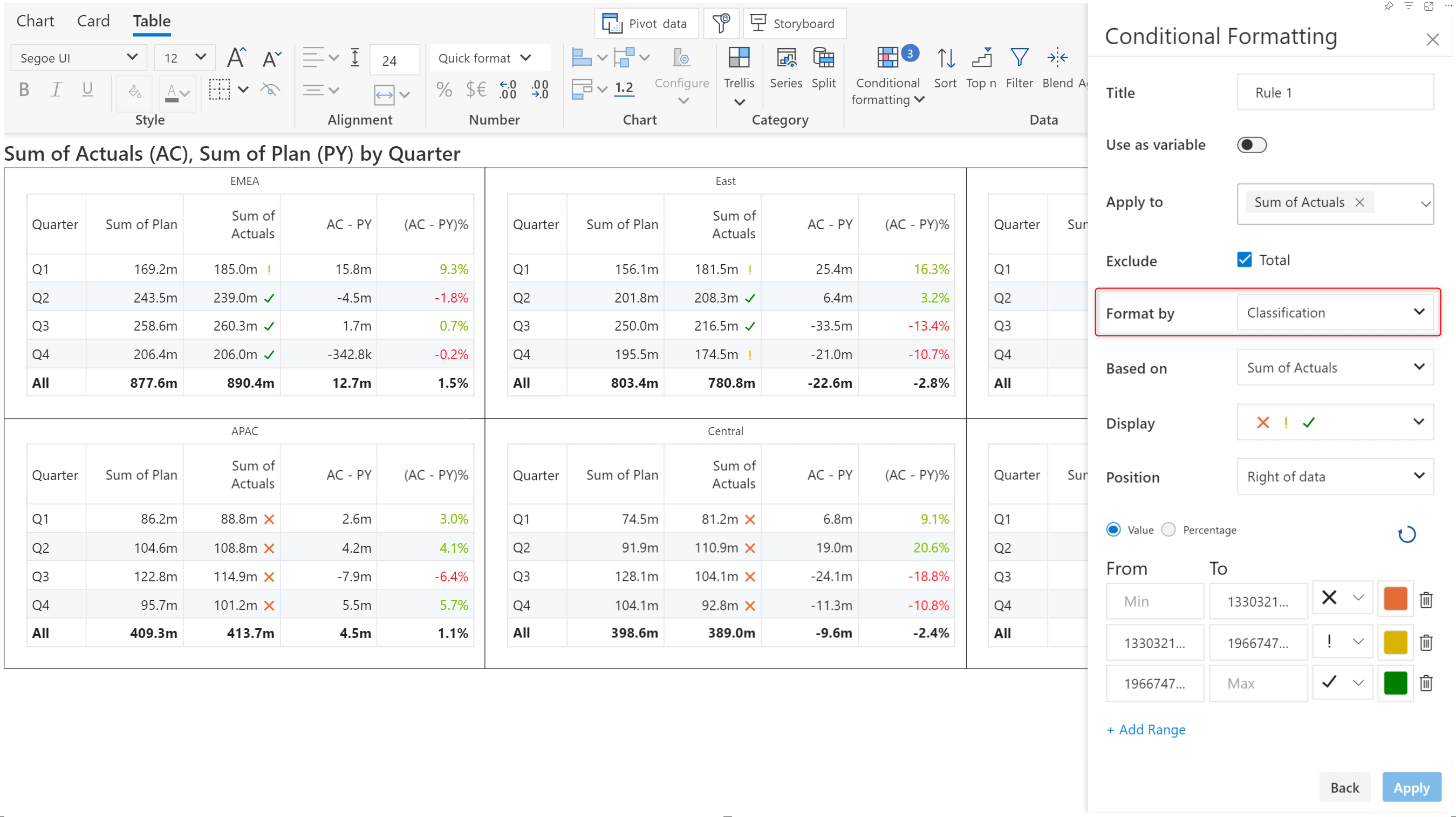
3.1. Conditional formatting – classification
4.5. Filter context – axis categories
5.2 Create, export, and import templates
Tip: In this example, we’ve used conditional formatting comparison bands/color scales to emphasize the range within which both the actual and target values lie.
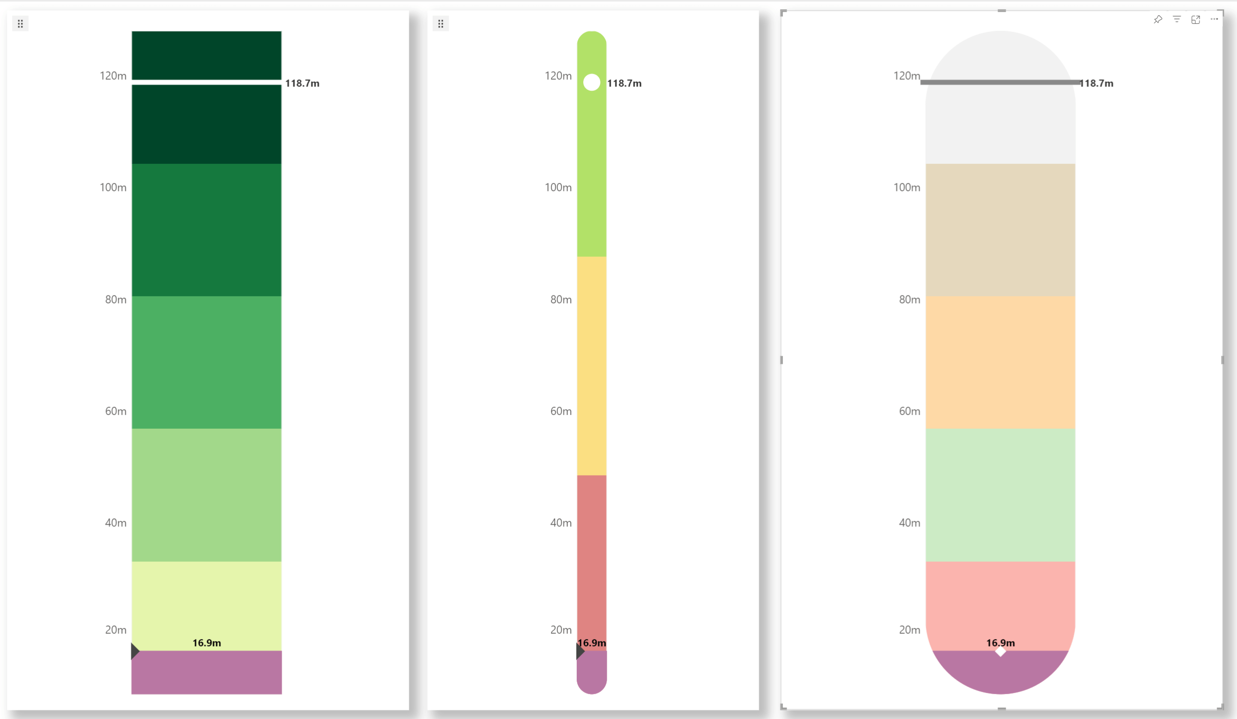
You can plot linear gauges and progress bars with Analytics+.
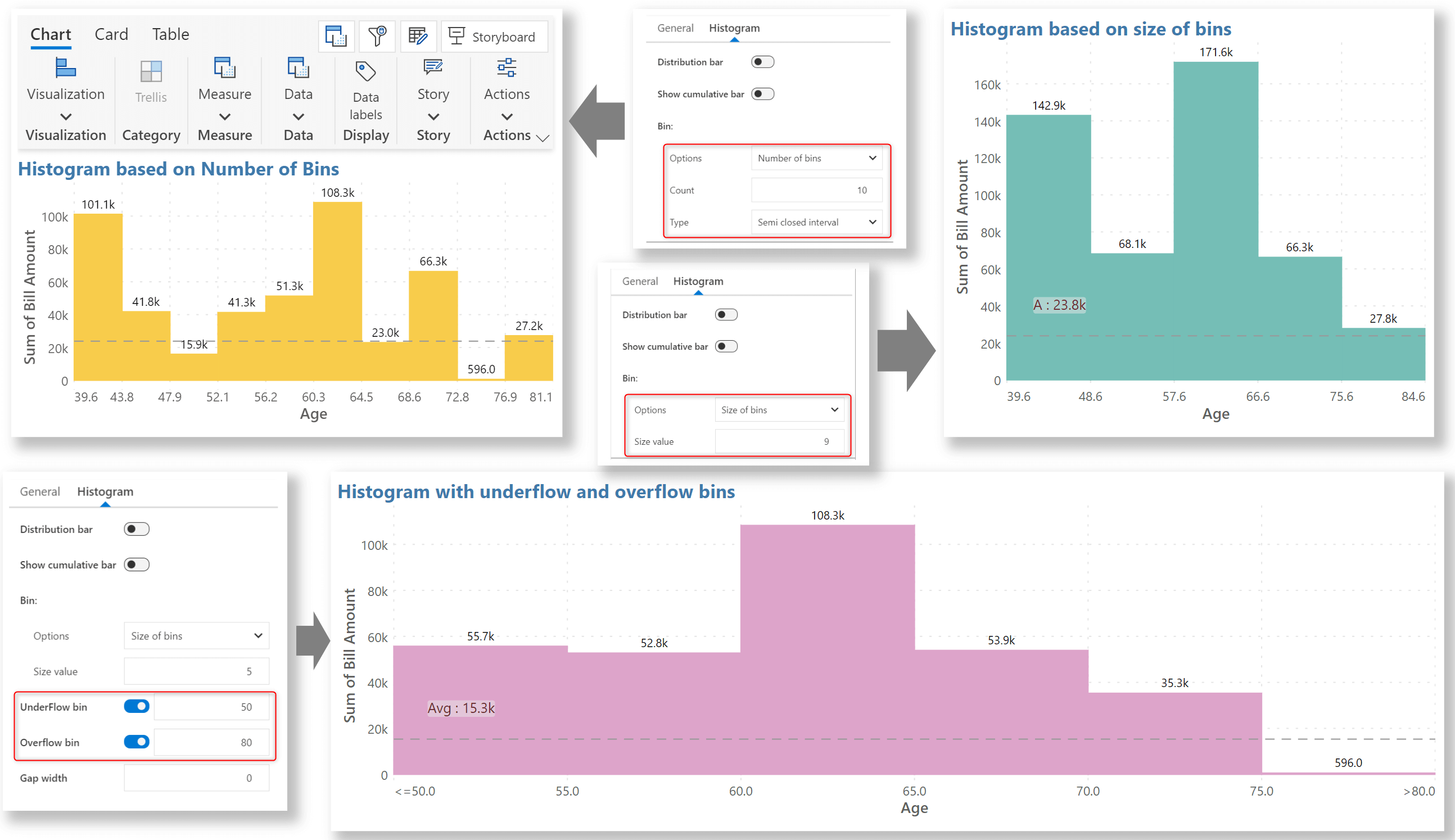
With Analytics+, you can configure the number of bins (intervals) to explore the data at different granularities, as shown in the example.
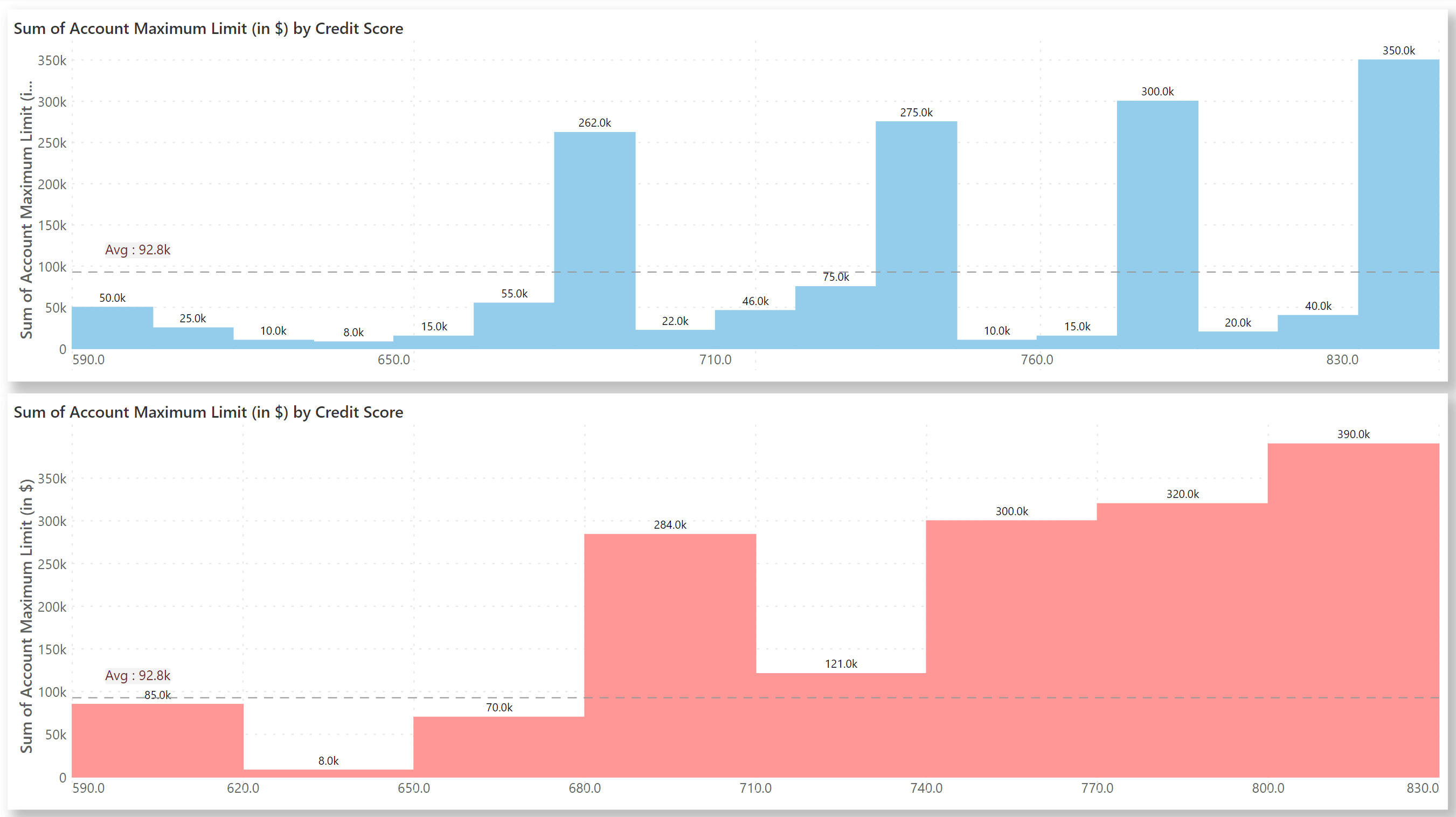
Analytics+ offers a range of options for configuring bins:
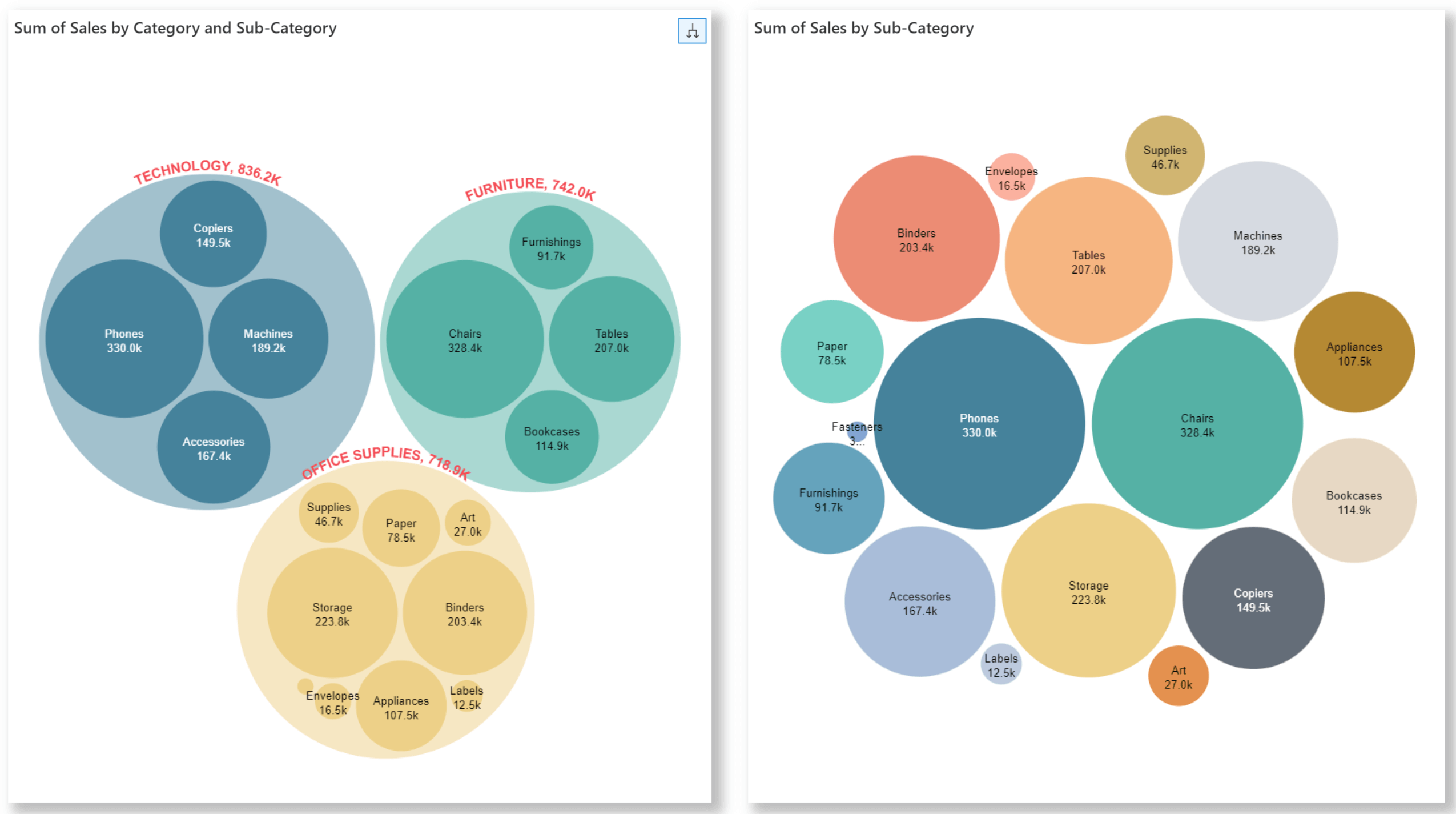
If your data is hierarchical, you can enable the cluster option to render the parent and child categories into different groups.
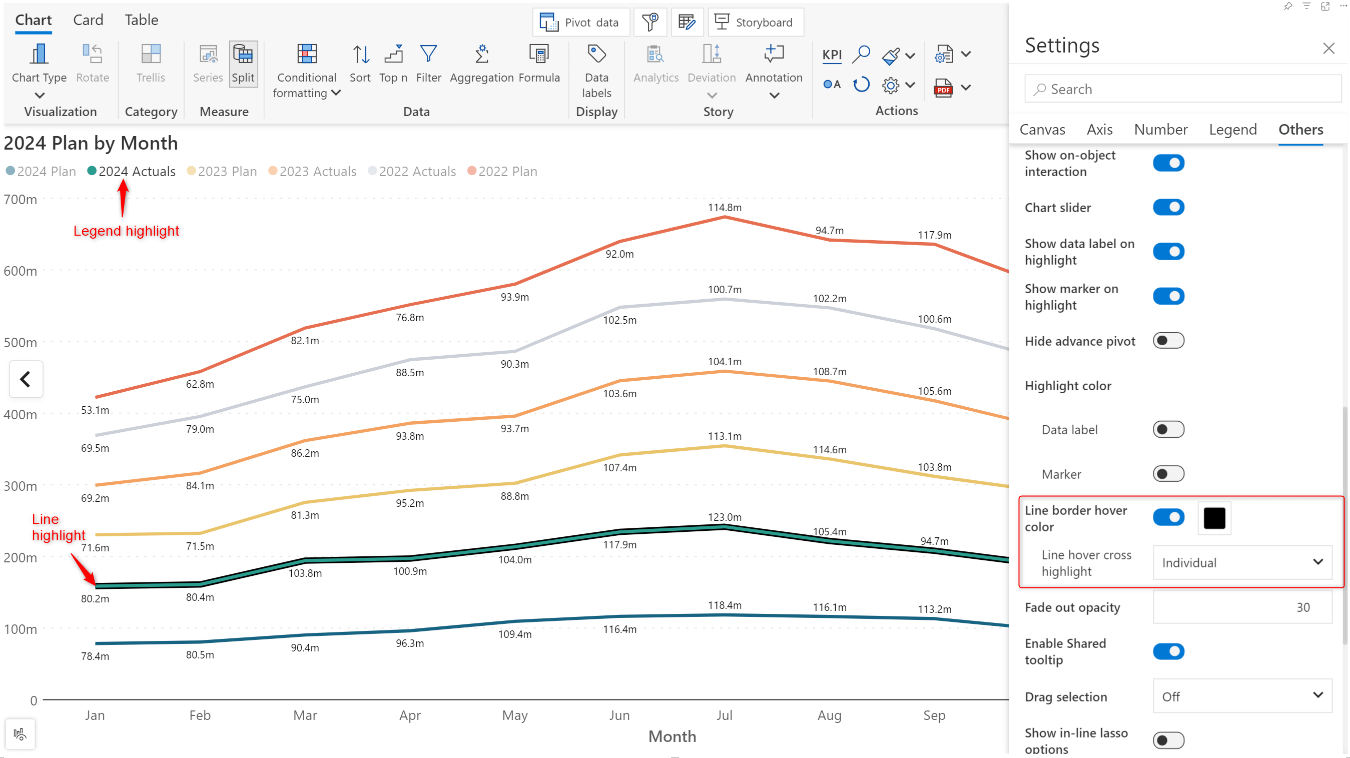
Analytics+ allows you to highlight the legend category when you hover over a line chart. You can also set a custom border color to highlight the line.
You have the flexibility to plot the deviation label on the side or at the top. Each deviation line has individual customization settings that can be accessed by hovering over the label. Global customizations that apply to all deviation lines in the report can be set from the Deviation side pane.
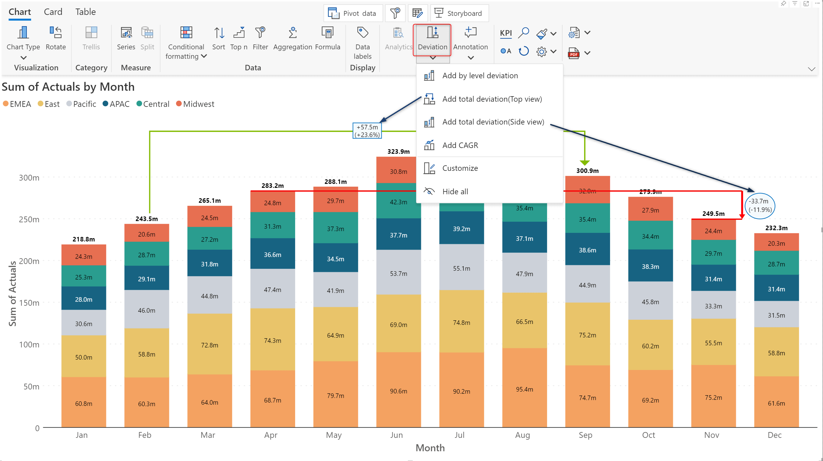
Plotting the CAGR in charts facilitates comparative analysis. It helps gauge the growth of an investment or business over a year or over a period of time without being distracted by individual fluctuations. You’ll notice a new dedicated tab for CAGR customizations in the Deviation side pane.
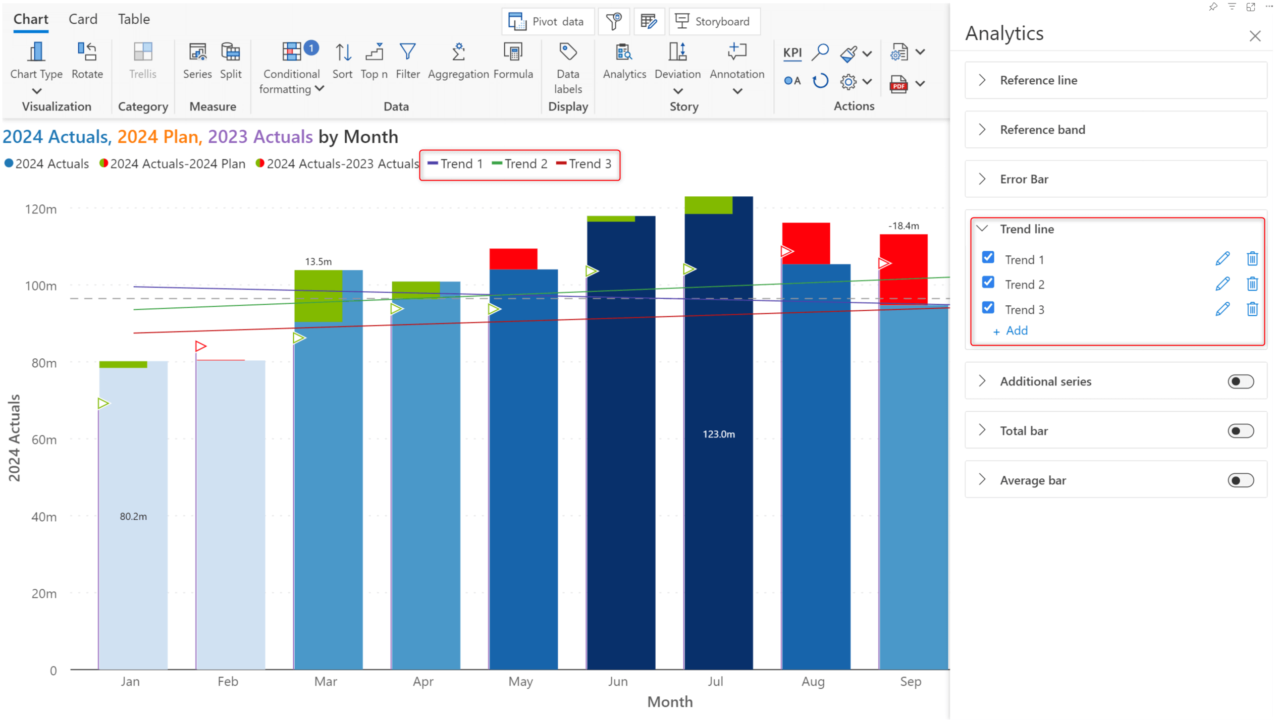
In the latest version, you can plot multiple trend lines in your reports, enabling you to visualize the trend for different measures/variances simultaneously.
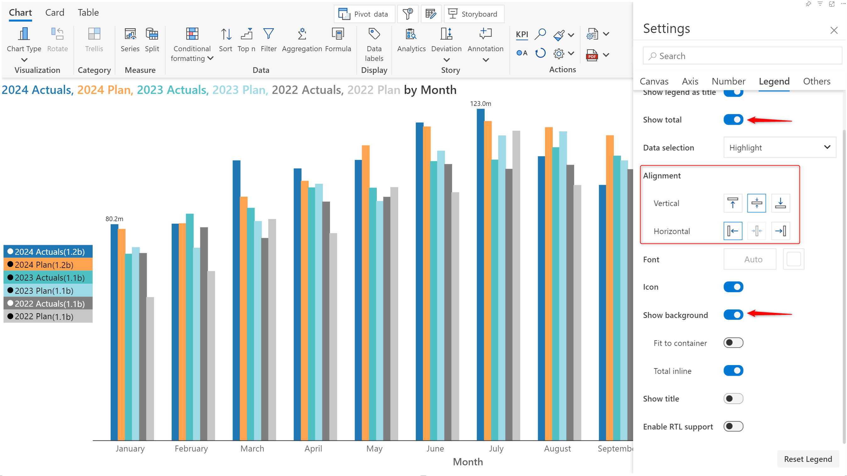
Legend-based data selection now provides options for including or excluding categories/measures.
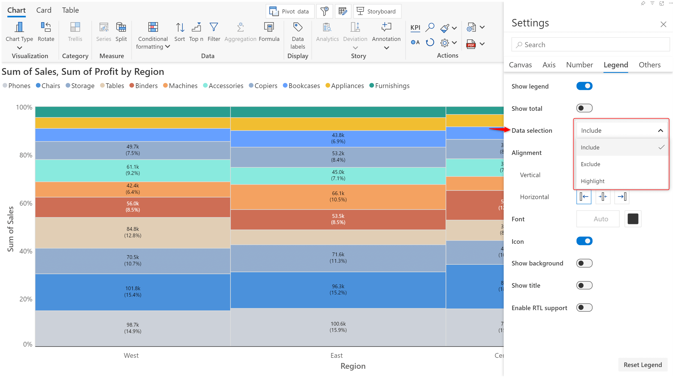
When you choose the Include option, Analytics+ plots only the selected data categories. The reverse happens when you choose Exclude.
You can choose to display the total contribution of a category or measure by enabling the Show total toggle.
Enabling the Show background toggle allows you to use the category color as the background for the legend label.
You will also notice that the vertical and horizontal alignment options have been changed from dropdowns to user-friendly icons.
In card mode, you will see that the toolbar has been upgraded. The latest release makes the options to add KPI containers and choose images/text/insight charts more accessible.
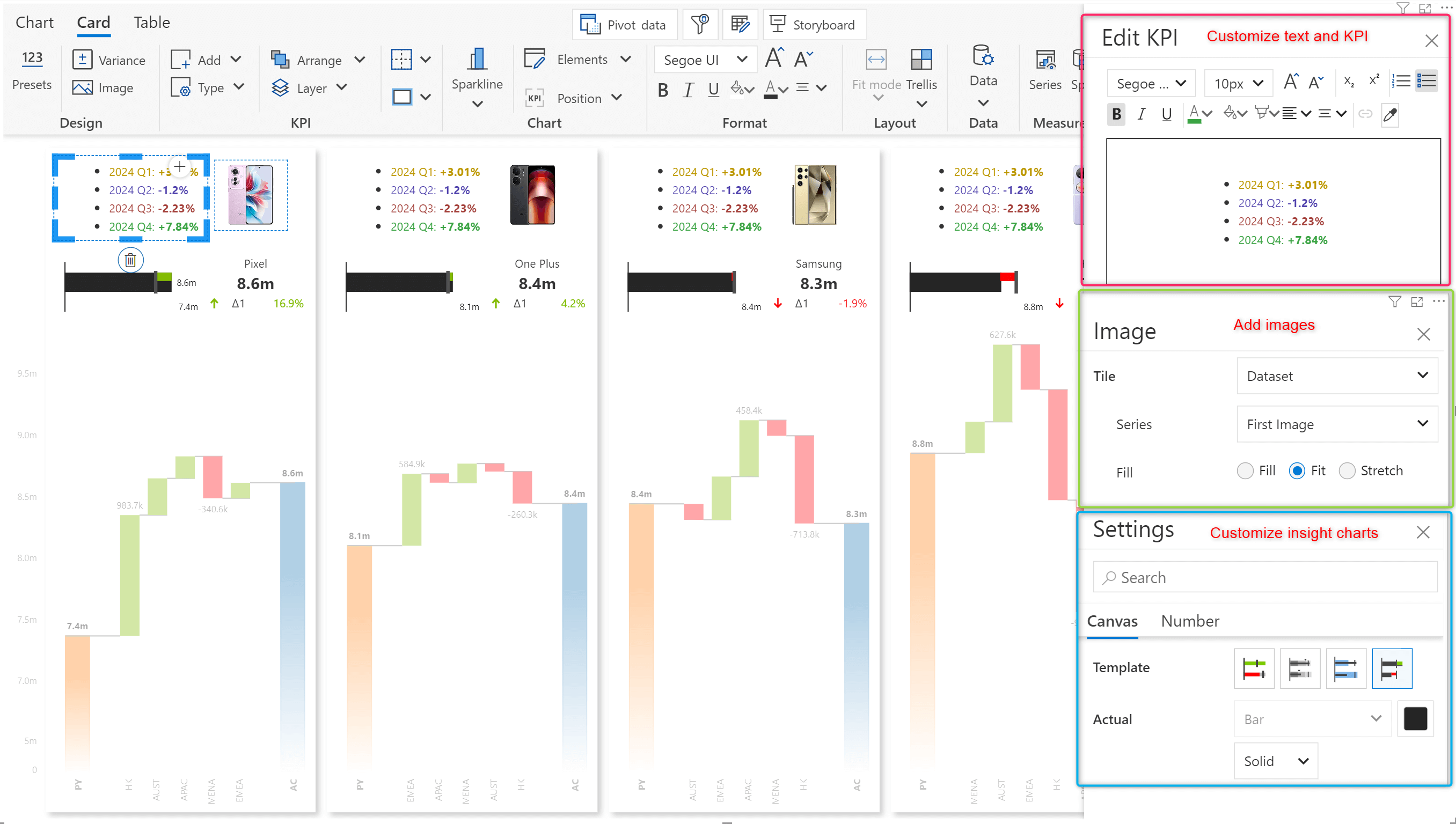
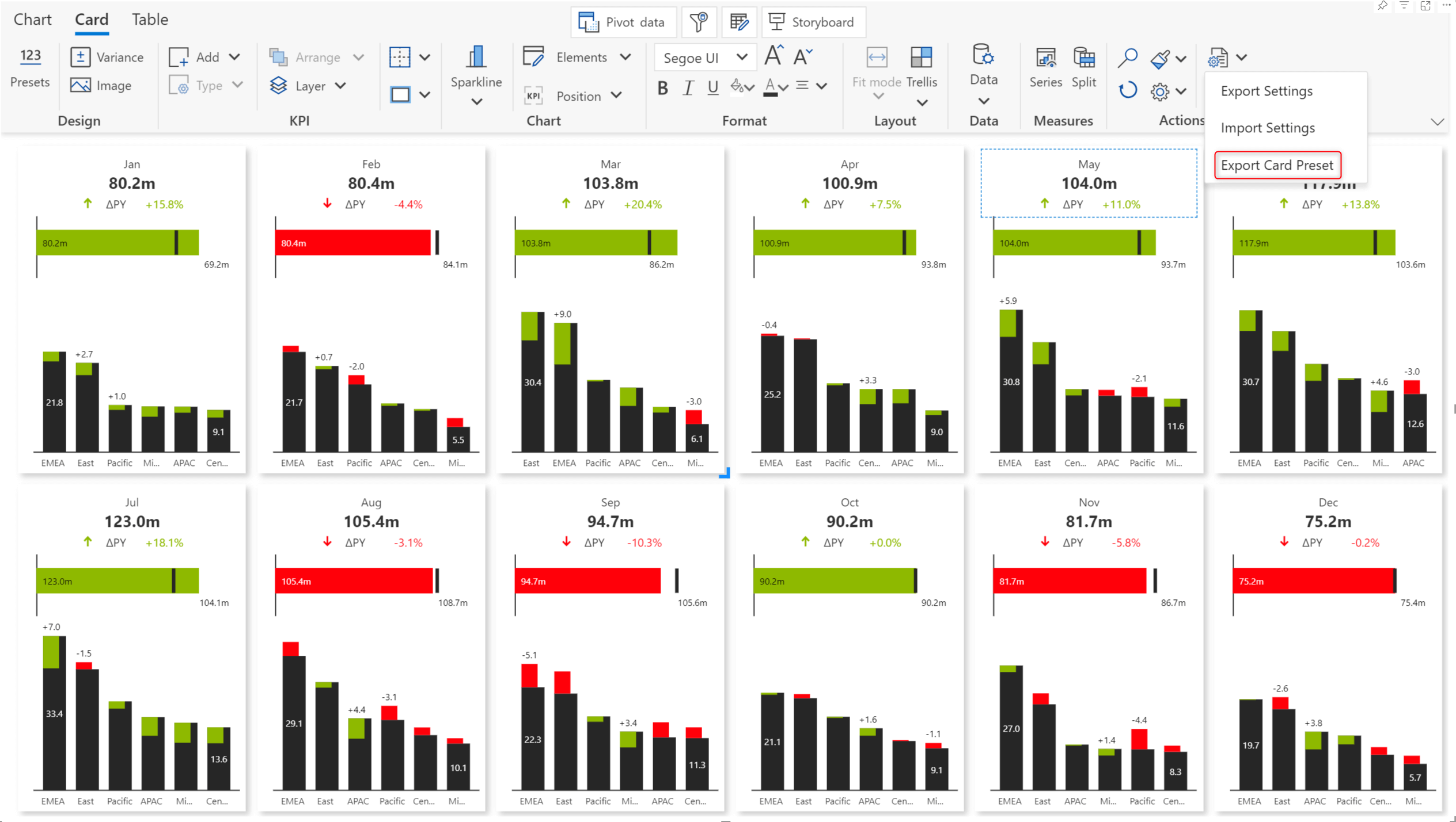
Certain organizations or lines of business may mandate a uniform template across all metrics dashboards. With Analytics+, you can create custom KPI card templates and reuse them across reports instead of building them from scratch.
Select the Export Card Preset option to create a JSON config file that can later be imported to use the same layout.
Analytics+ tables now support classification formatting. Classification allows you to group data into distinct categories (e.g., high, medium, low) and apply different formats to each group. This makes it easier to spot trends, patterns, or outliers at a glance, improving the overall readability of your data.
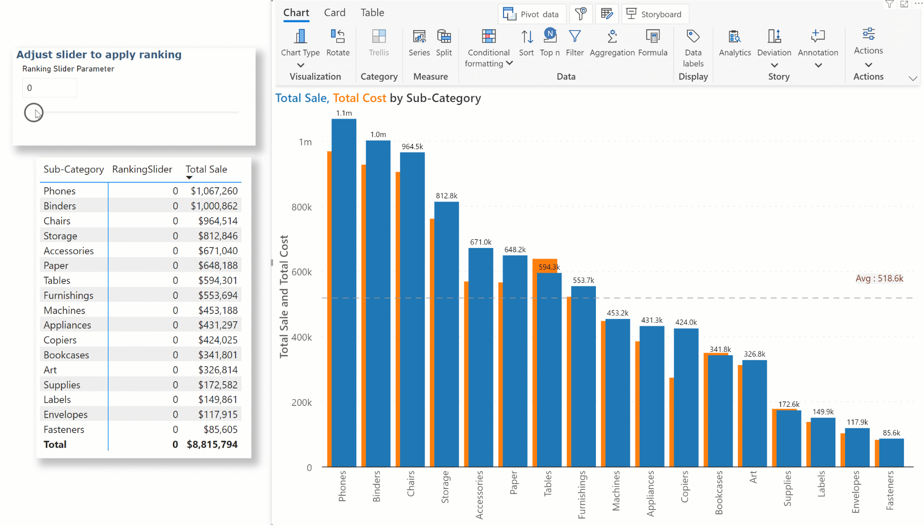
When your report has a numeric field parameter assigned to the Tooltip-Text categories parameter, users can quickly rank their data by adjusting the slider.
Select the numeric field parameter from the Measure dropdown in the TopN interface.
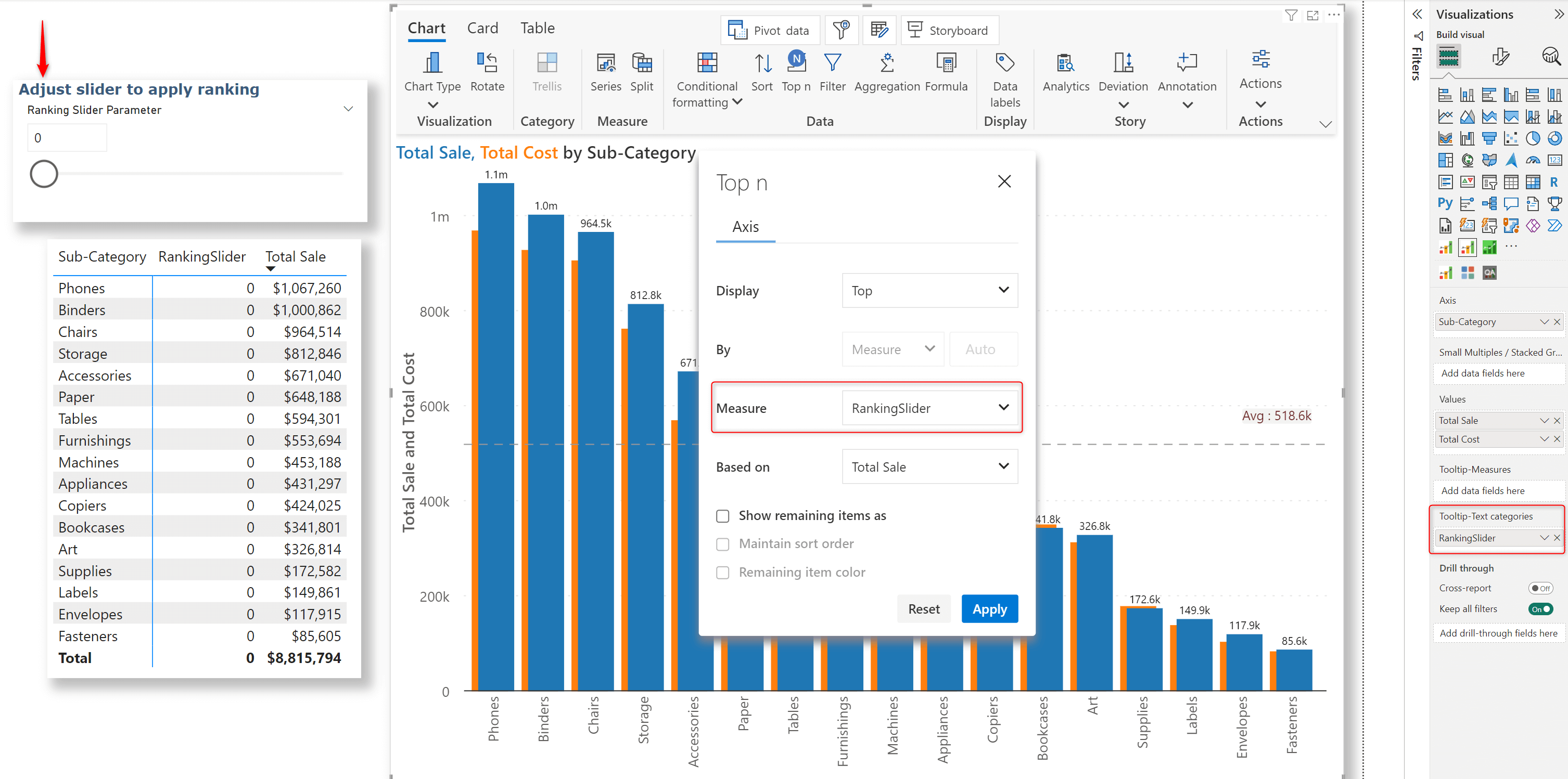
Dynamic ranking for axis categories in action:
You can also rank the trellis group in small multiples mode. Select the field parameter from the Trellis tab as we did for axis categories. The same applies to stacked charts as well.
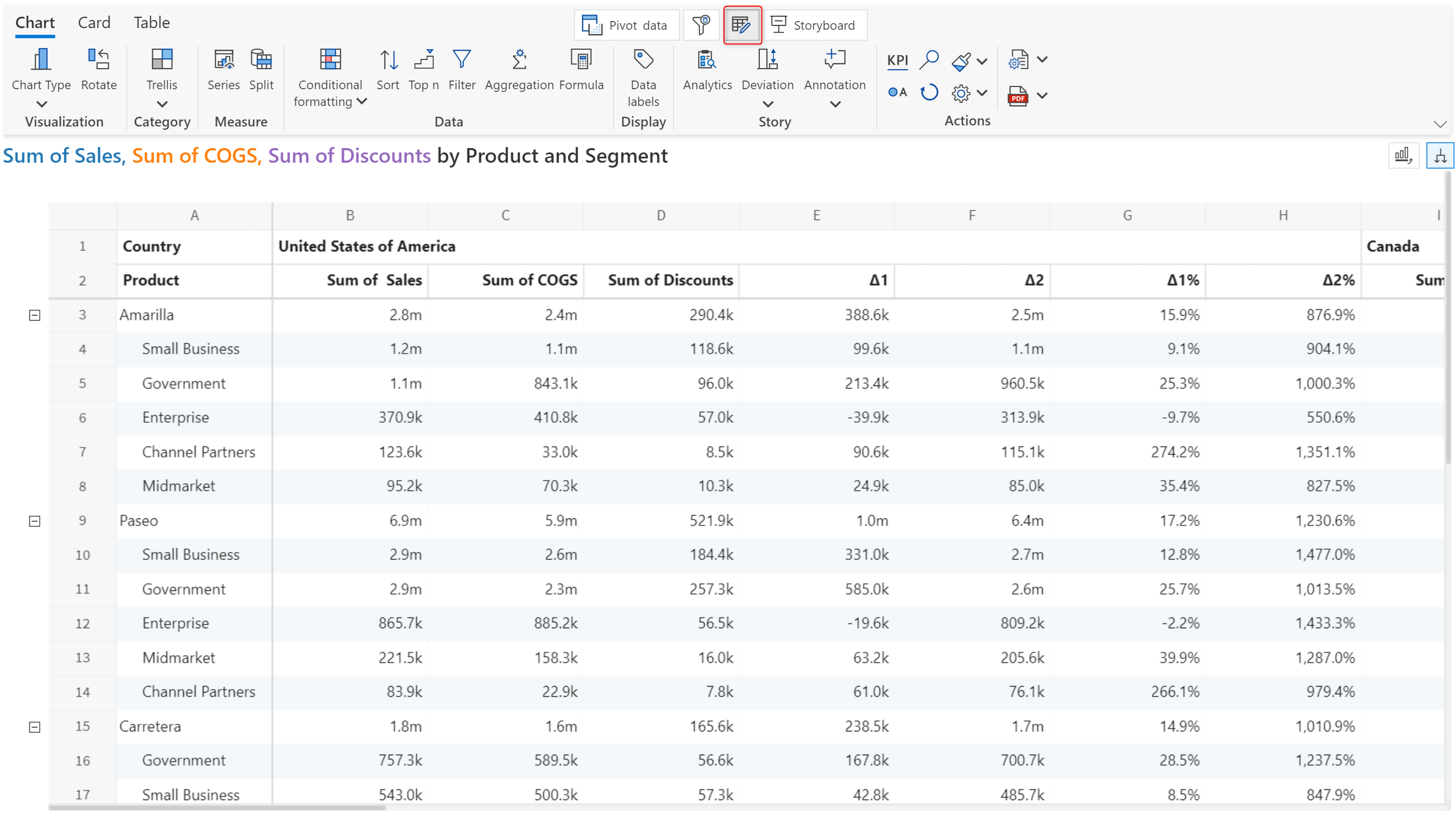
For avid Microsoft Excel users, we have good news! We have upgraded the summary table so that you can have an Excel-like experience.
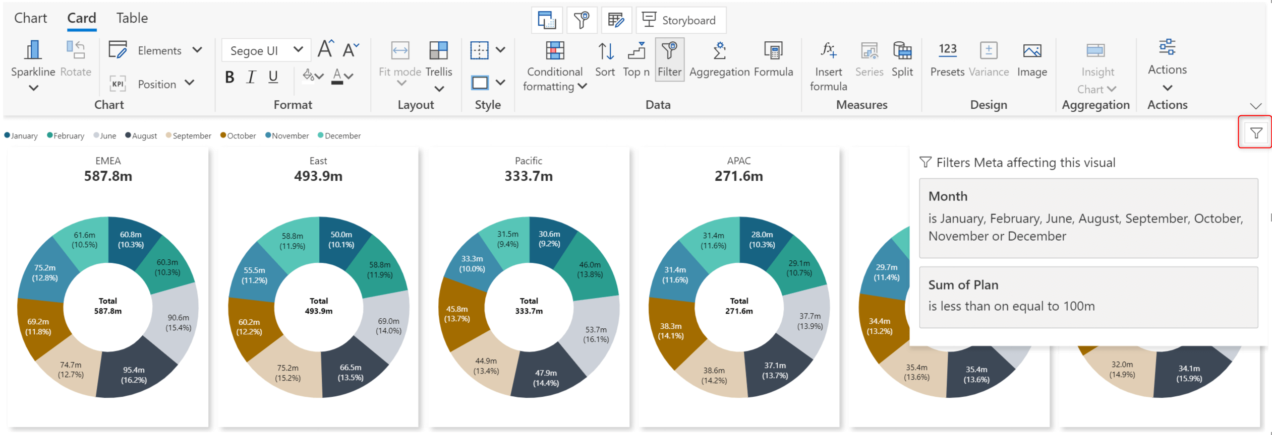
After assigning visual measures and dimensions, you can apply filters to your data from within the Analytics+ visual. In the latest version, you can easily identify applied filters by clicking the icon at the top-right corner of the visual.
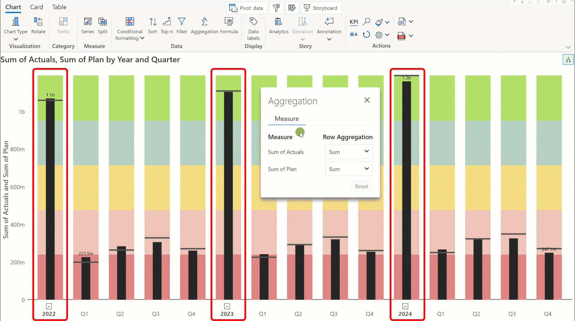
With the Aggregation option added to the Data section of the toolbar, you can now apply custom aggregation to your axis categories. In table mode, notice how the total value for the Actuals field changes as you change the aggregation method.
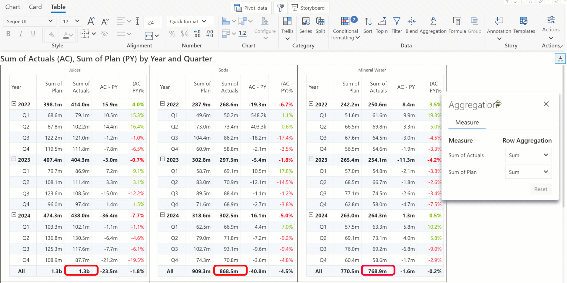
You can see how the total value for each year changes when we change the aggregation method.
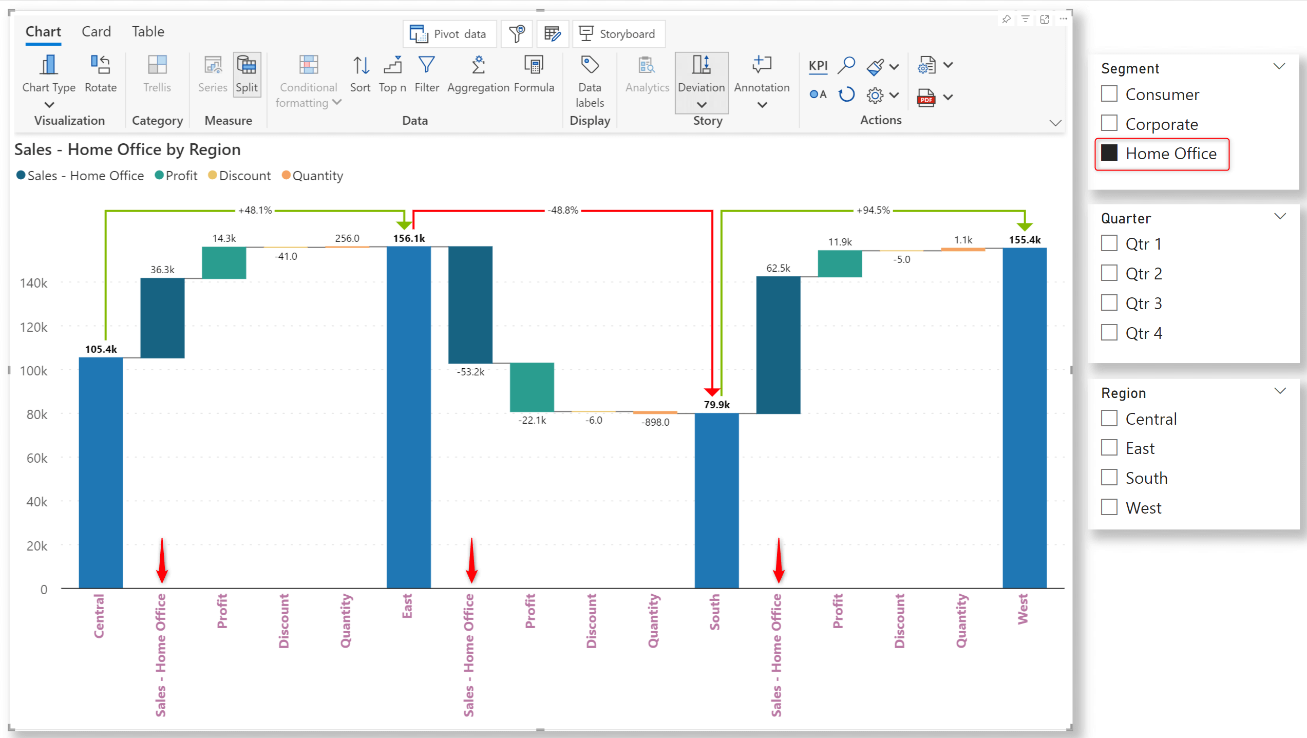
You can now display filter selections in your axis categories. Remember to enable the Axis label toggle while setting up context awareness. From the new Filter Context settings pane, you can also select the measure and assign the display style.
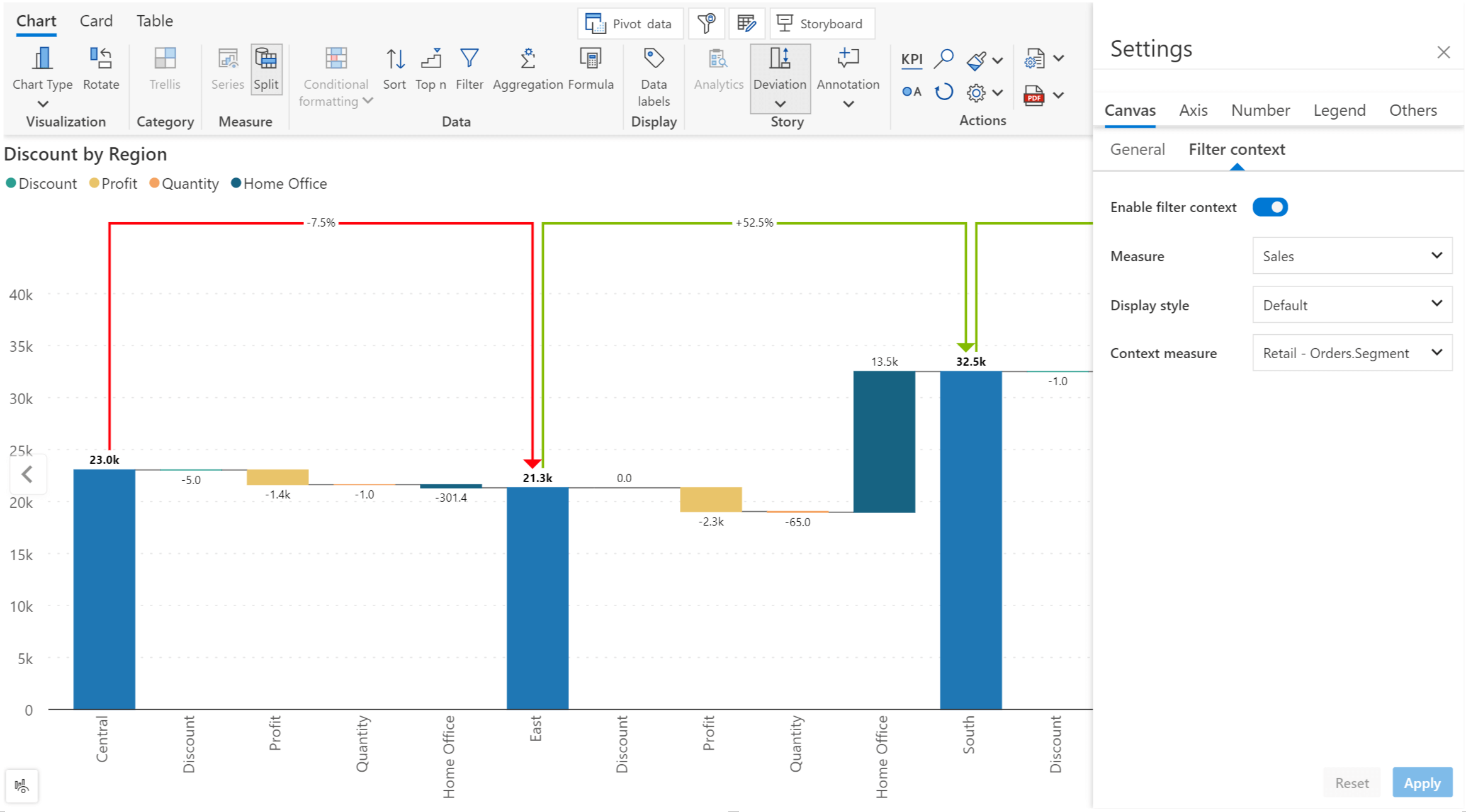
Notice how the Segment selection is displayed along with the Sales measure in the axis label.
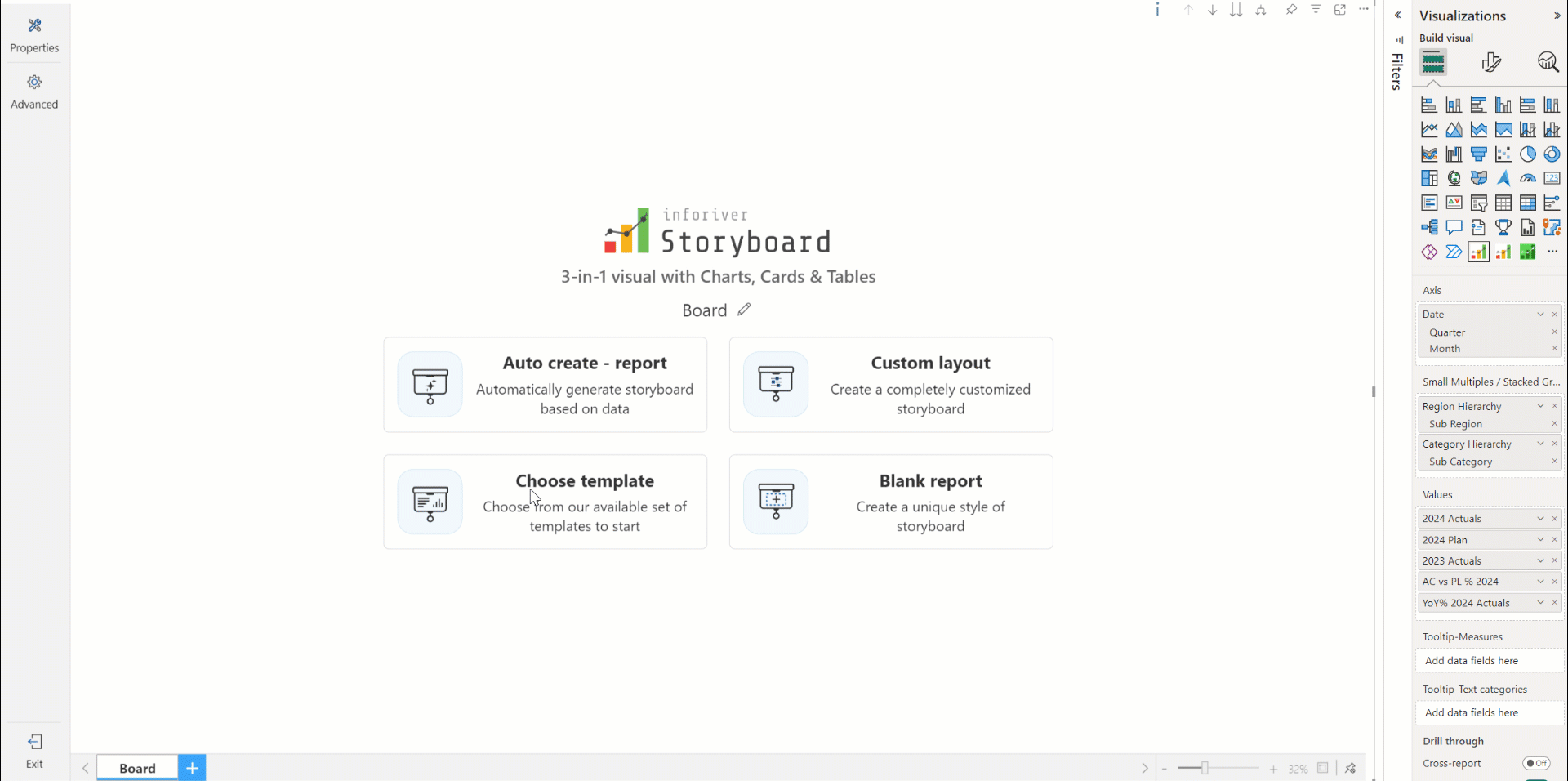
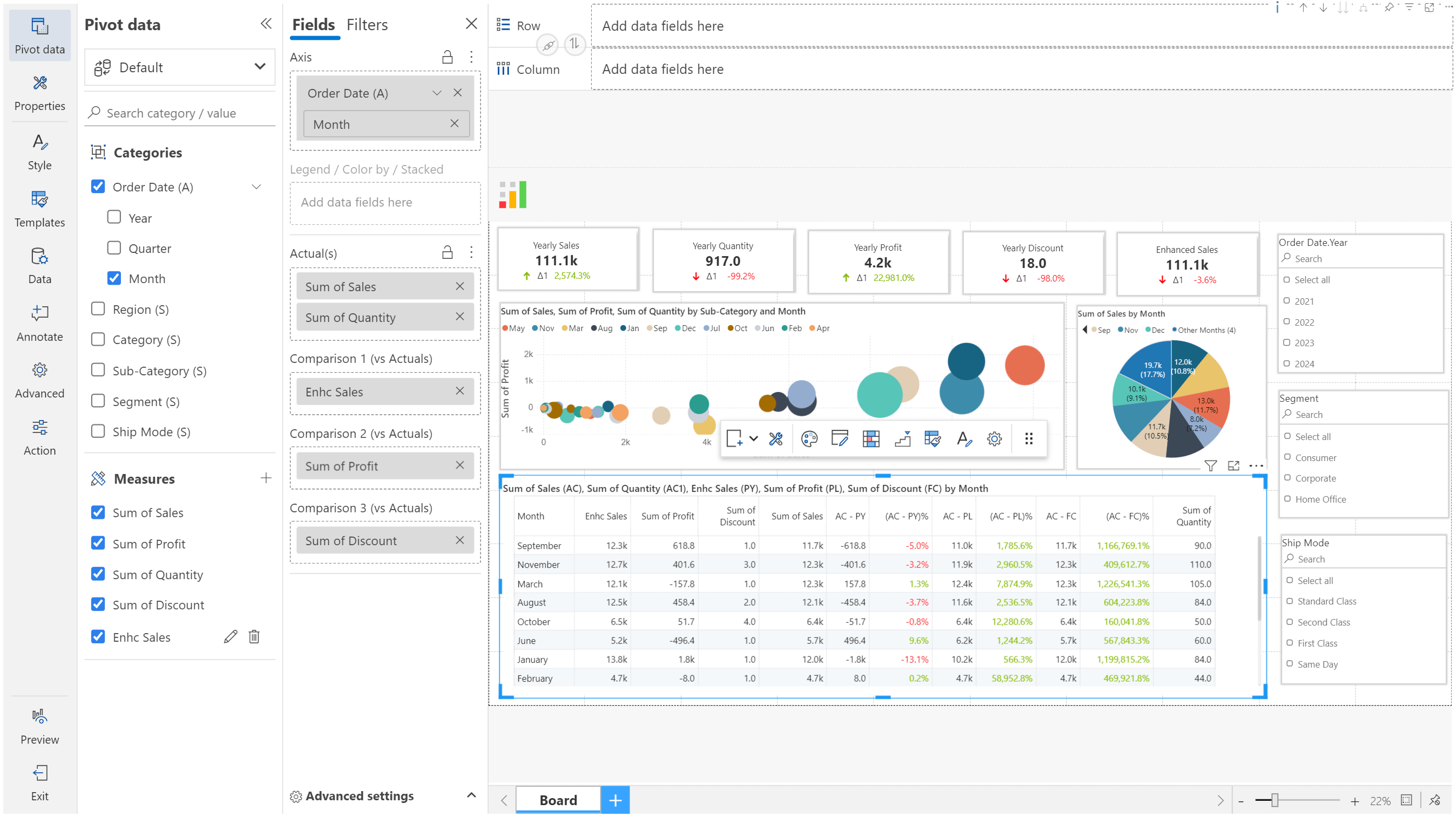
With the Storyboard, you can rapidly design captivating dashboards with a single visual and a single query. Effortlessly incorporate charts, text, images, slicers, KPI cards, and tables without importing separate visuals for each element type.
Analytics+ can auto-create dashboards and offers prebuilt templates that you can apply to create dashboards instantly.
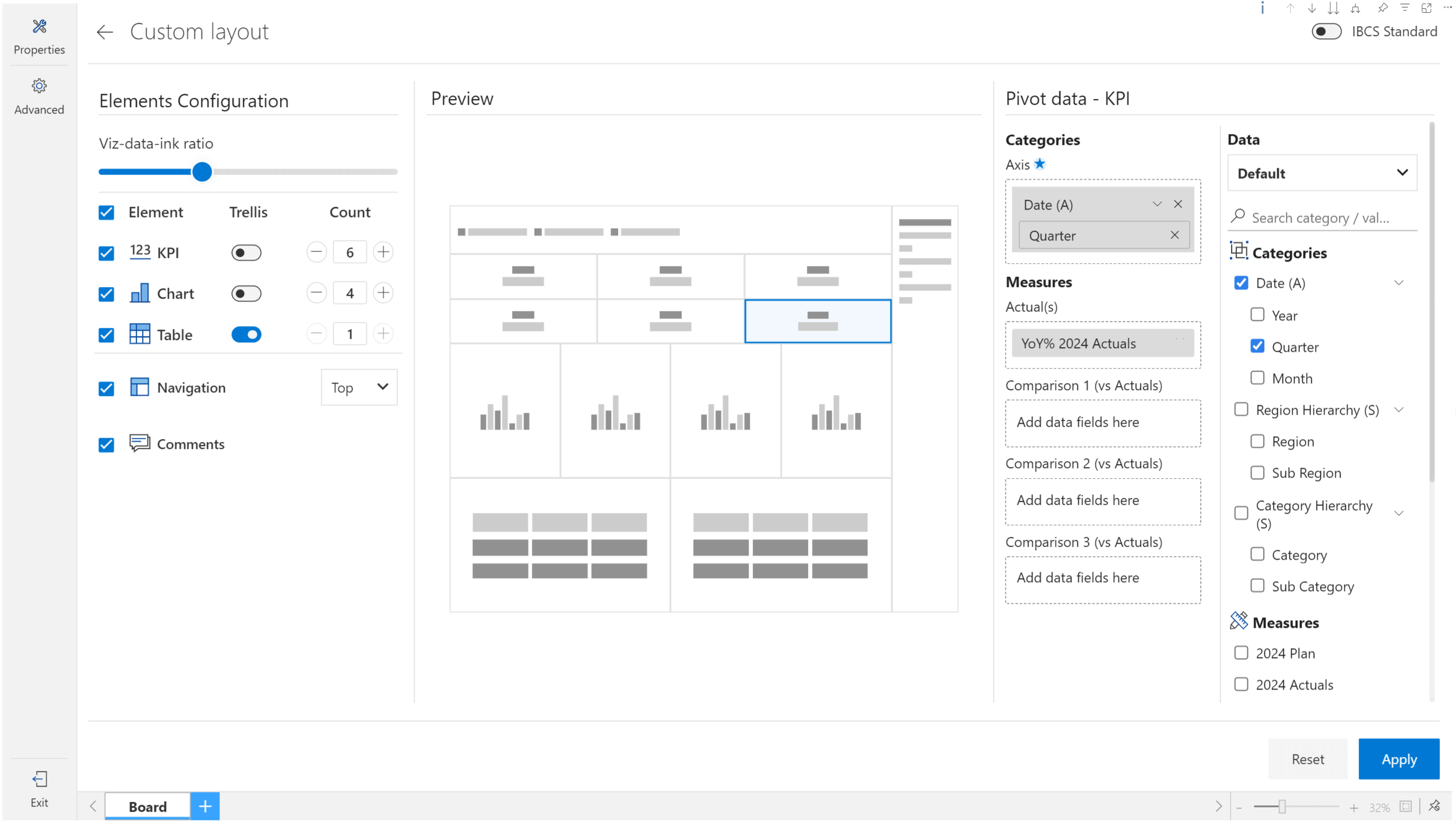
Specify the number of charts, cards, and tables to create custom layouts.
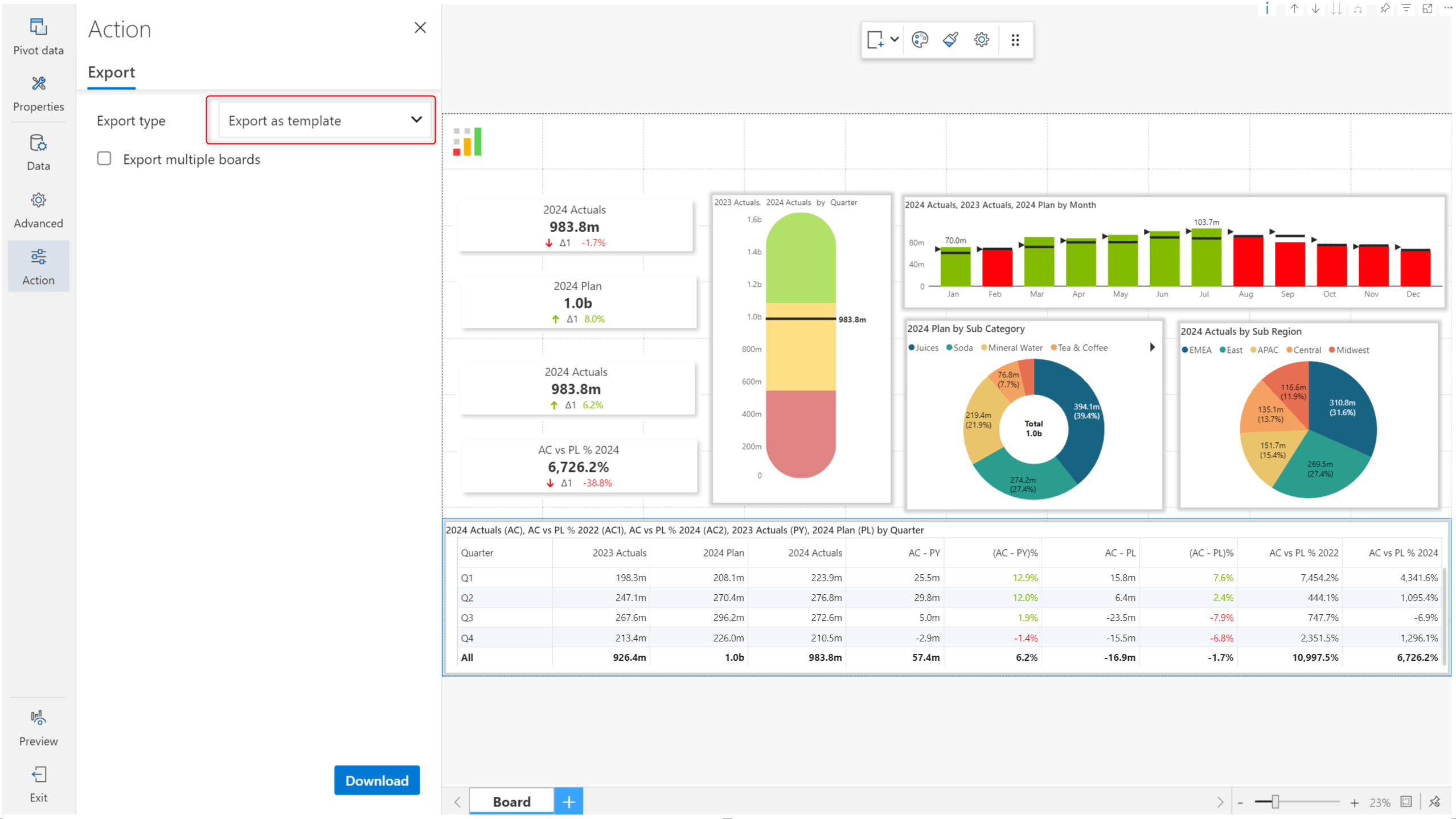
You can create dashboard templates and export them as JSON template files.
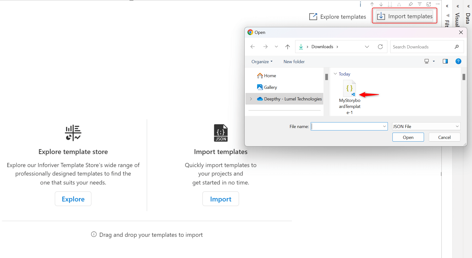
You can then reuse the template in multiple storyboards using the Import option.
You can also leverage pre-built templates for specific business cases.
After you assign visual measures and dimensions, you have many flexible options to re-assign them from within the visual. For instance, a dimension assigned to the Axis parameter can be assigned to the Legend bucket (or vice-versa) from the Pivot data interface. Similarly, a measure assigned to the Actuals parameter can be re-assigned to the Comparison bucket without changing any Power BI visual parameters.
Each dashboard element retains its measure and dimension allocation separately. You can select an element to view and change the data configurations from the pivot data interface.
Tip: You can create multiple storyboards with the same visual measure/dimension assignments using a single Analytics+ visual. Click the ‘+’ symbol at the bottom of the visual to create another storyboard.
The storyboard can coexist with other native visuals, but it is the full package, and we recommend that it be used as a stand-alone visual.
To learn more about the latest from Inforiver, and why we are garnering recognition from industry experts, check out our newest brochure.
Inforiver and all our planning and analytics products continue to be updated to provide a diverse range of users with optimal performance. With continual improvements and innovations planned, we welcome your feedback.
Visit the Inforiver Community to share your ideas, vote on others’ submissions, and interact with other users.
If you’re ready to level up your planning, reporting and analytics, try it for free today.

Inforiver helps enterprises consolidate planning, reporting & analytics on a single platform (Power BI). The no-code, self-service award-winning platform has been recognized as the industry’s best and is adopted by many Fortune 100 firms.
Inforiver is a product of Lumel, the #1 Power BI AppSource Partner. The firm serves over 3,000 customers worldwide through its portfolio of products offered under the brands Inforiver, EDITable, ValQ, and xViz.
 Join our webinar to learn key considerations for successfully migrating your reports from Tableau / Qlik / Spotfire to Power BI.