Upcoming webinar on 'Inforiver Charts : The fastest way to deliver stories in Power BI', Aug 29th , Monday, 10.30 AM CST. Register Now
Upcoming webinar on 'Inforiver Charts : The fastest way to deliver stories in Power BI', Aug 29th , Monday, 10.30 AM CST. Register Now
Dual and multi-axis charts offer a unique perspective, allowing us to represent complex data relationships and comparisons with clarity and precision. We'll delve into exploring their diverse applications and guide you on when and how to use them effectively to enhance your data analysis.

Single-axis charts, while commonly used for data visualization, can be seen as limited when compared to the versatility offered by dual and multi-axis charts. The constraint of plotting values on a single scale, typically the y-axis, restricts the ability to simultaneously represent and compare multiple variables or datasets within a single chart. This limitation hinders the depth of analysis and insights that can be derived from complex datasets, as the visual may not fully capture the relationships and interactions between different factors.
A dual axis chart is a type of data visualization that displays two related data series on a single chart, each with its own y-axis scale. The primary y-axis is typically positioned on the left side of the chart, while the secondary y-axis is on the right side. This charting technique allows for the comparison of data with different units of measurement or magnitudes, enabling users to analyze the relationship between the two data series more effectively.

In the example below, notice how the single axis chart on the left struggles to plot quantity sold due to the shared y-axis for both sales as well as quantity sold. This is because of the vastly different scale of measurement for these two quantities. The dual axis chart on the right, fares much better in comparison, reflecting one of the primary advantages of the dual axis chart.

A multi-axis chart extends this concept by incorporating more than two axes on a single chart, accommodating the visualization of multiple datasets or variables in a single graphical representation.
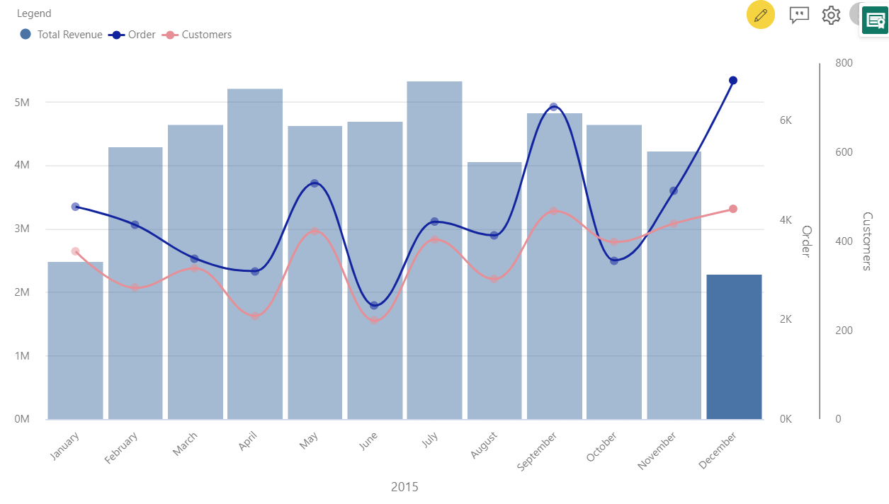
The chart below uses the y-axis on the left-hand side to plot revenue bars and two right-hand axis for orders and customer counts respectively. This arrangement allows for clear and detailed comparisons of varying data types over the same period, making it easier to identify trends and relationships within the data.
Dual and multi-axis charts offer a versatile approach to visualizing complex relationships between multiple variables. Understanding the different types of these charts is crucial for selecting the most appropriate format to effectively communicate insights from the data. Let us discuss some of these below.
This type of chart combines two line charts on the same visualization, each with its own y-axis scale. This allows for the comparison of two related but distinct variables that may have different units of measurement or ranges. This dual-axis chart is suitable for time series visualization with variables that show time-dependent correspondence between series, or for other continuous variables.
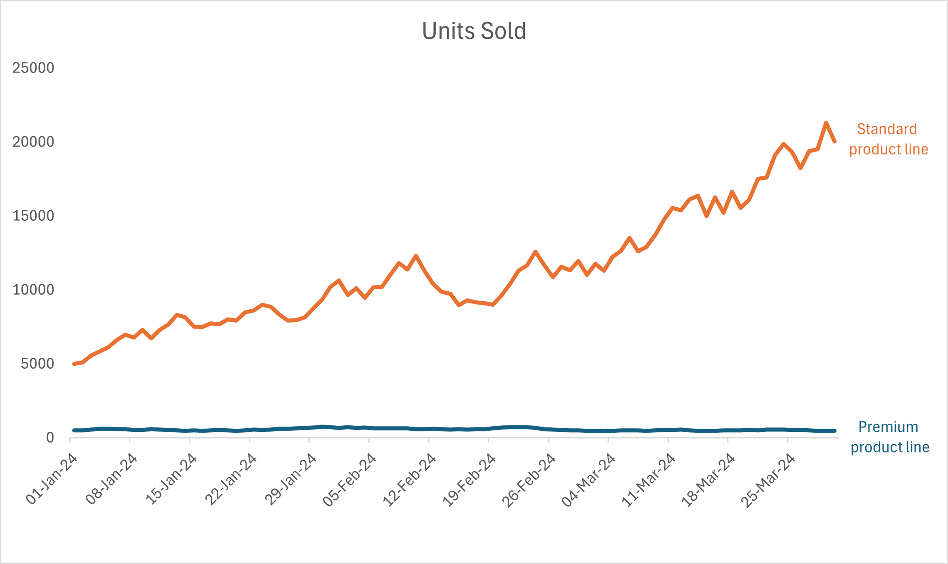
For example, the chart below shows the units sold in the standard product line compared to the premium product line from January to March. This dual-axis approach not only facilitates a clear understanding of which series changes first but also demonstrates the dynamic interplay between two variables within the same chart framework.
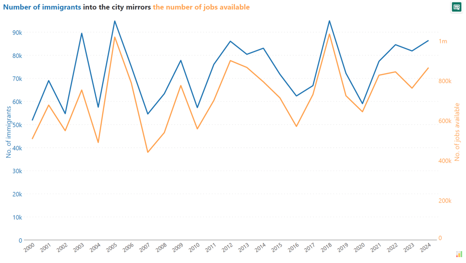
It can also be used to show possible correlations between different variables. The chart below illustrates the correlation between the number of immigrants and available jobs in a fictional city, with immigrants and jobs represented on separate axes in blue and orange, respectively. This visualization clearly shows how fluctuations in immigrant numbers align with job availability.
This chart combines a line chart with an area chart on the same visualization. This type of chart visually separates the two series, making it easier to distinguish between them. In this context, area charts also carry more visual weight than a line chart and are therefore often used to indicate a volume rather than just a value.
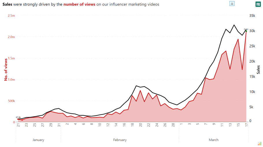
For instance, in a scenario comparing the sales and the number of views on influencer marketing videos, sales can be traced with a line chart, while views are depicted using an area chart, emphasizing the volume of engagement making the line and area combination chart a good choice when dealing with different units of measurement, such as views (count) versus sales (currency).
This dual-axis chart combines a line chart and a bar chart on the same visualization. This type of chart makes the visual distinction between the two axes clearer compared to other dual-axis configurations. This makes it easier for the viewer to differentiate and compare the trends depicted by the line and the categorical or discrete values represented by the bars.
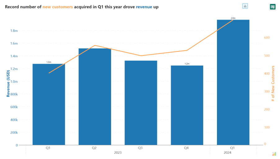
It's important to note that line charts are typically not used to represent category values. Instead, the line chart is used to display a continuous variable, such as a metric or measurement, over time or across categories.
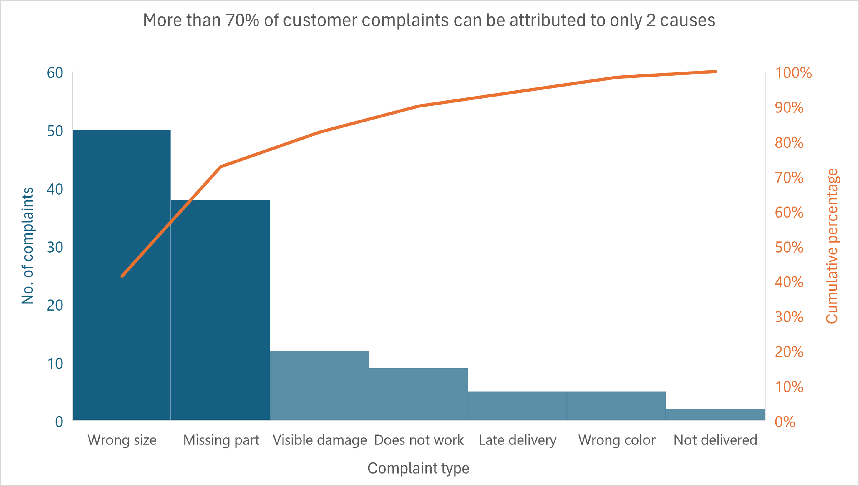
The Pareto chart shows values as bars and the cumulative percentage of the values as an overlaid line chart. In the example chart, customer complaints are categorized by type, with 'Wrong size' and 'Missing part' being the most significant issues, accounting for more than 70% of all complaints.
The bars represent the number of complaints per category, and the orange line graphically illustrates the cumulative percentage, emphasizing the principle that majority of effects come from a minority of causes.
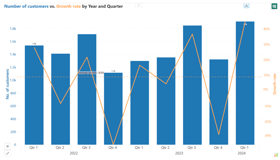
Line and bar dual-axis charts can also effectively display absolute and relative values within the same chart. The bar chart component is well-suited to showing absolute values, such as the actual quantities or counts of a variable, with the height of the bars representing the magnitude or scale of the data points, while the line chart component can be used to depict the relative values or percentages of the data, revealing the trends, patterns, or proportions of a variable over time or across categories.
By combining the strengths of both bar and line charts, this type of chart provides a comprehensive and insightful visualization of complex data, allowing for the analysis of both absolute and relative values within a single chart.
In the example below, the bar chart displays the total number of customers (absolute values) while the growth rate (relative change) is shown as a line chart, illustrating how changes in customer numbers correlate with growth over time.
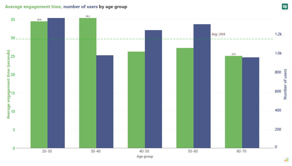
This type of dual-axis chart combines two separate bar charts on the same visualization, each with its own y-axis scale. This chart type is used to compare two data series, like profit and units sold, across the same categories, such as region, customer segment, or quarters. However, interpreting this chart can be challenging as readers tend to compare the heights of paired bars, which is often not a meaningful comparison to make, especially if the y-axes scales and units of measurements differ.
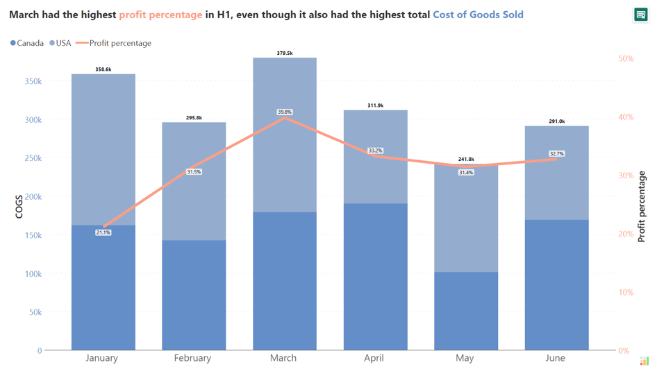
This dual-axis chart combines a line or area chart with a stacked bar chart on the same visualization. This dual-axis format enables the viewer to compare the overall trends or patterns (depicted by the line/area) against the compositional breakdown (shown by the stacked bars) of a particular variable or metric, this provides more detailed information and context compared to a standard bar chart.
For example, the visual below shows profit against the Cost of Goods Sold (COGS) by month, with total COGS divided between two countries as shown by the stacked bars. Here, we can understand that March has the highest profit percentage even though it also is the second highest in COGS.
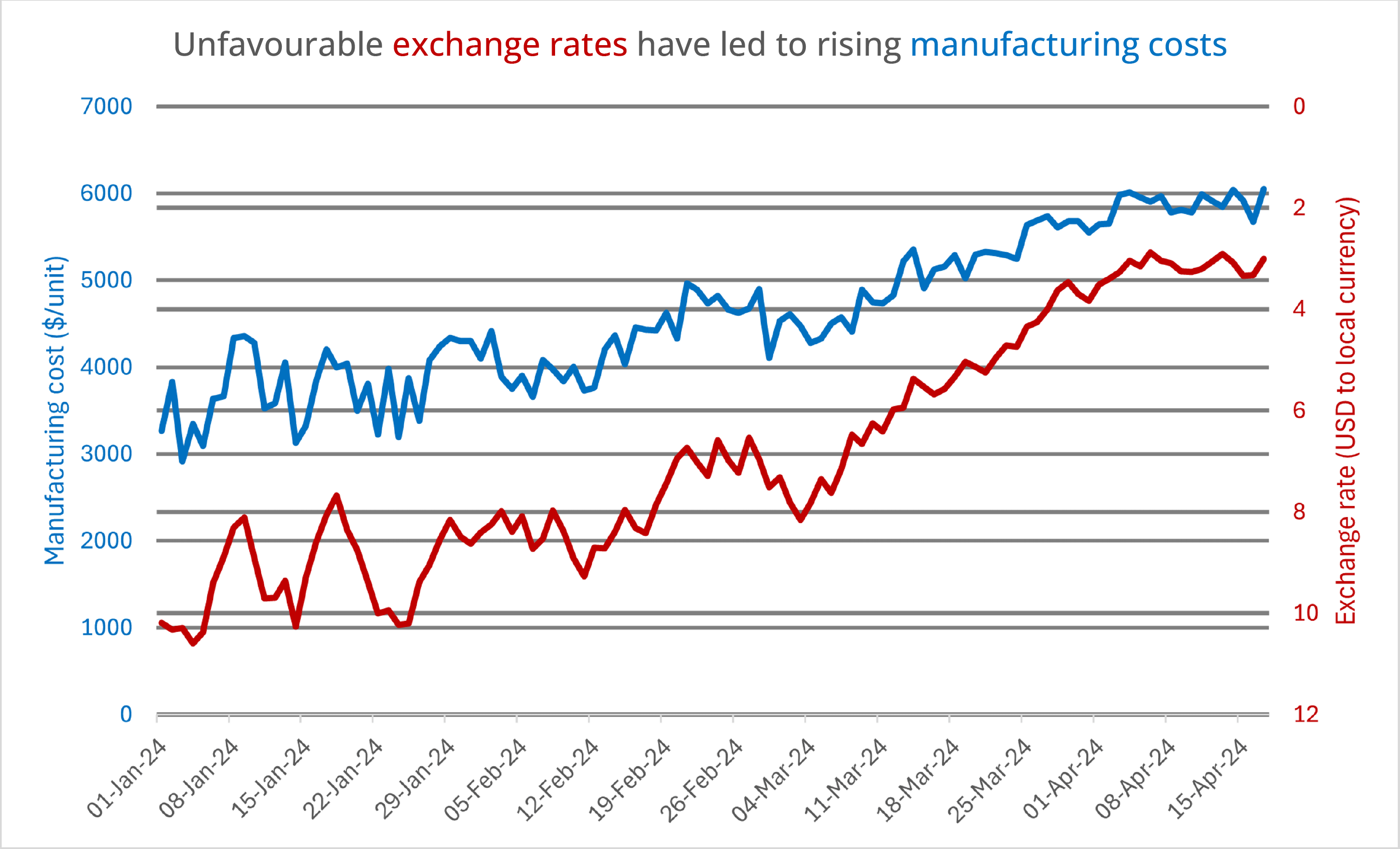
In this type of chart, one axis is in increasing order of value, while the other axis is in decreasing order of value. This unique configuration enables us to visualize data in a non-traditional manner, clearly showing changes in inversely proportional variables on a single chart.
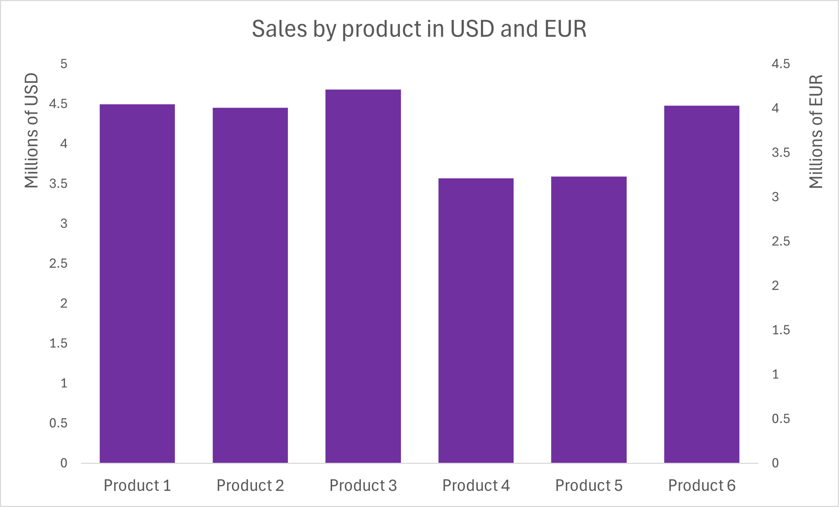
This type of dual axis chart shows the application of a unit conversion to a data series, allowing a single metric to be represented in different units on opposing axes. In the example below, the sales of products are depicted in both USD and EUR, showcasing this concept of presenting a single metric in two different units.
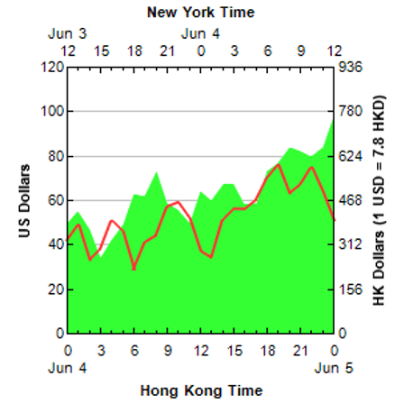
The dual x-axis variation is a type of dual-axis chart that involves having two x-axes on the same chart showing different variables. This configuration allows for the display of two different variables or data series that may have different units or scales along the horizontal axis.
For example, one x-axis could represent local time in Hong Kong, while the other x-axis could represent time in New York, as seen in the chart below.
While dual and multi-axis charts offer valuable insights, they are not without their drawbacks. It is crucial to consider the potential pitfalls and limitations of these chart types to ensure effective data visualization and communication.
The main issue is that when multiple axes are present, it can be challenging for the viewer to associate the correct data series quickly and accurately with the appropriate axis. This can lead to misinterpretations and incorrect conclusions being drawn from the visualization.
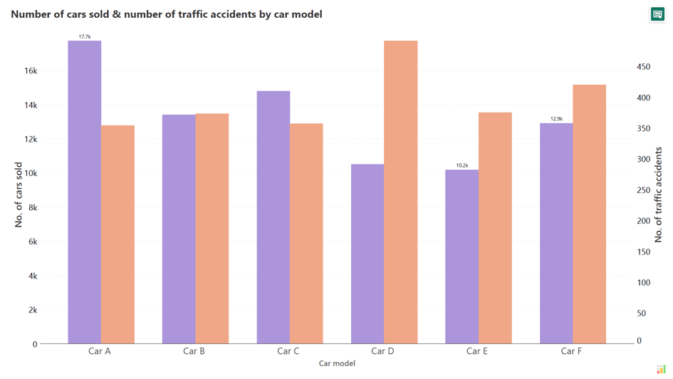
When the scales of the different axes vary significantly, it can be challenging for the viewer to understand the relative magnitudes and relationships between the data series.
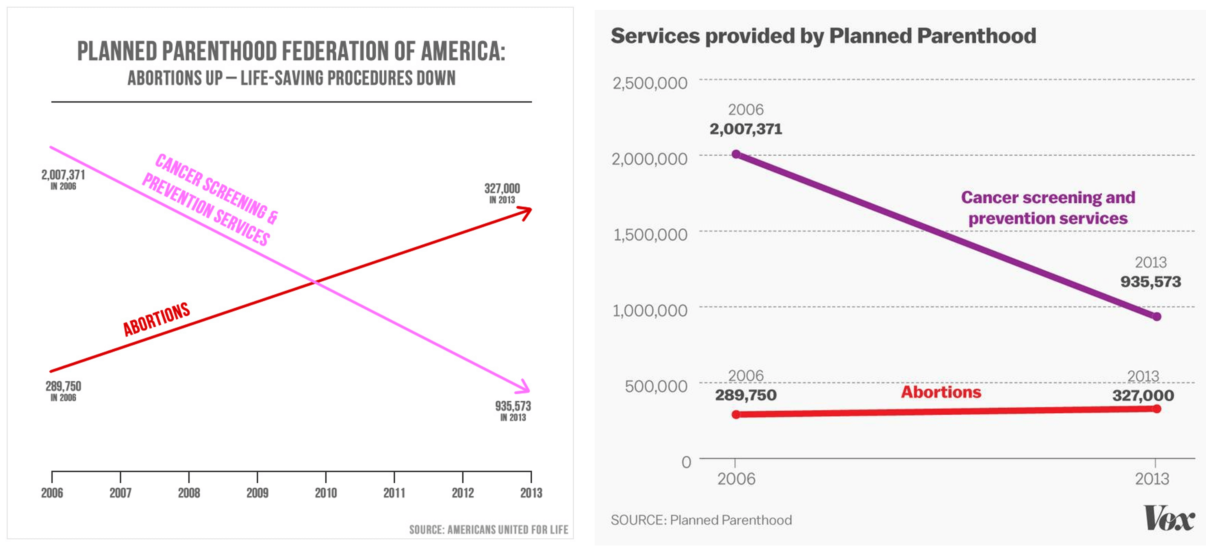
The example chart demonstrates a critical issue with dual-axis charts—axis scaling can lead to data misrepresentation. It shows data from two services offered by Planned Parenthood: "Cancer Screening & Prevention Services" and "Abortions" over the years 2006 to 2013. While the number of abortions shows an increase, the number of cancer screenings significantly decreases. At first glance, it may appear as if the number of abortions overtook cancer screenings, but plotting them correctly shows that this is not true as seen from the image on the right side below.
One of the key criticisms regarding dual and multi-axis charts is how the choice of scaling for the different axes can significantly influence the viewer's perception of variance between data series. The relative size and visual prominence of the data points can be heavily impacted by the axis scaling.
In the example below, a naive reader might look at the left chart and conclude that Series A has greater variance than Series B. However, by changing the axis scaling, it becomes easy to perceive the opposite.

In a dual-axis chart, where two different data series are plotted on separate y-axes, the points where the lines or bars intersect do not inherently hold any significance. These intersection points are merely the outcome of the scaling and positioning of the axes and do not necessarily signify a meaningful relationship between the data series, as it makes no sense to infer that one variable overtook another in a dual-axis chart like this.
The main problem with these intersection points is that they can be visually striking and may draw the viewer's attention, leading them to infer a connection or relationship that does not actually exist in the data. This can result in incorrect conclusions and interpretations being made about the data.
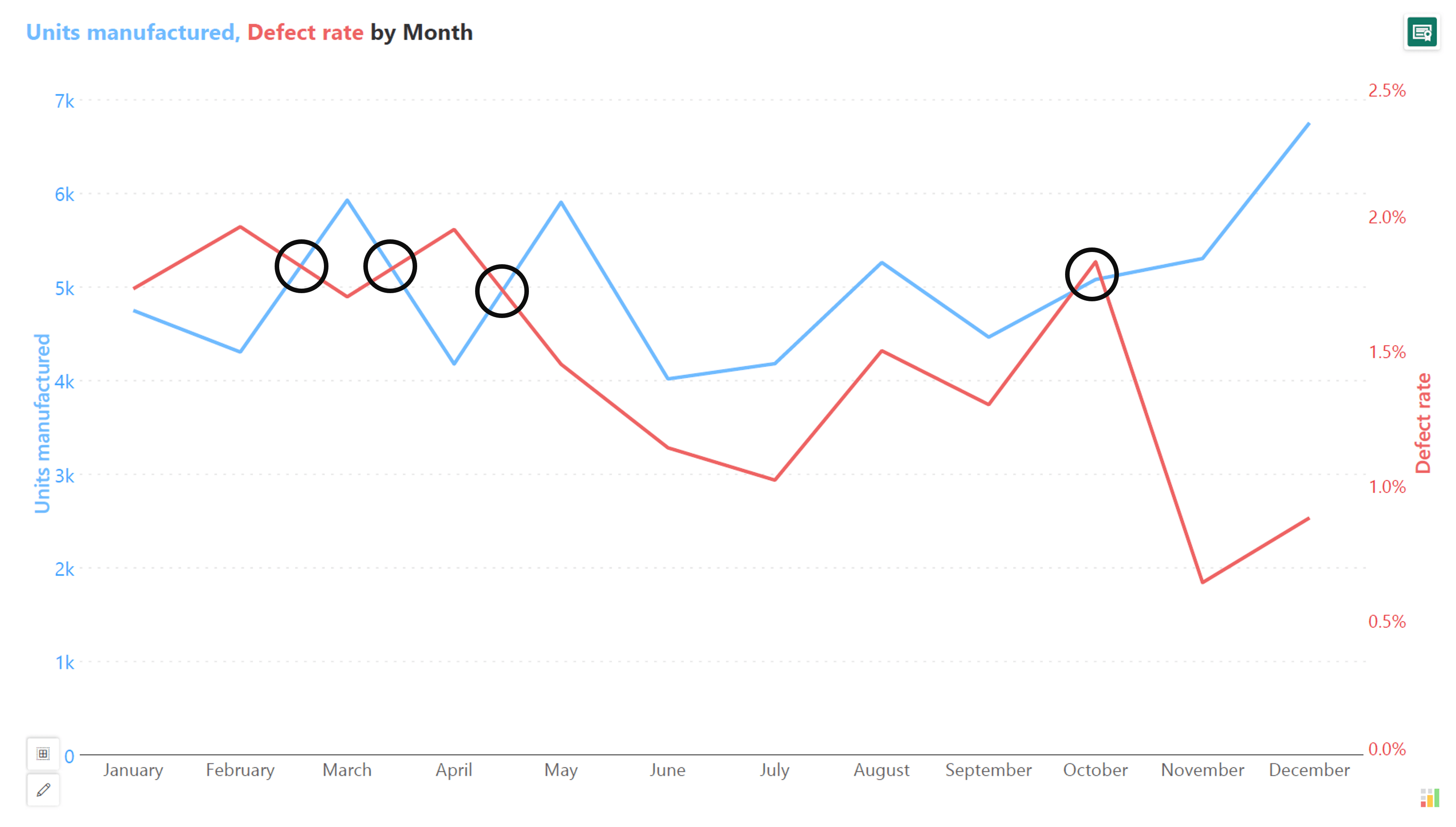
In fact, intersection points can be changed by changing the scaling.
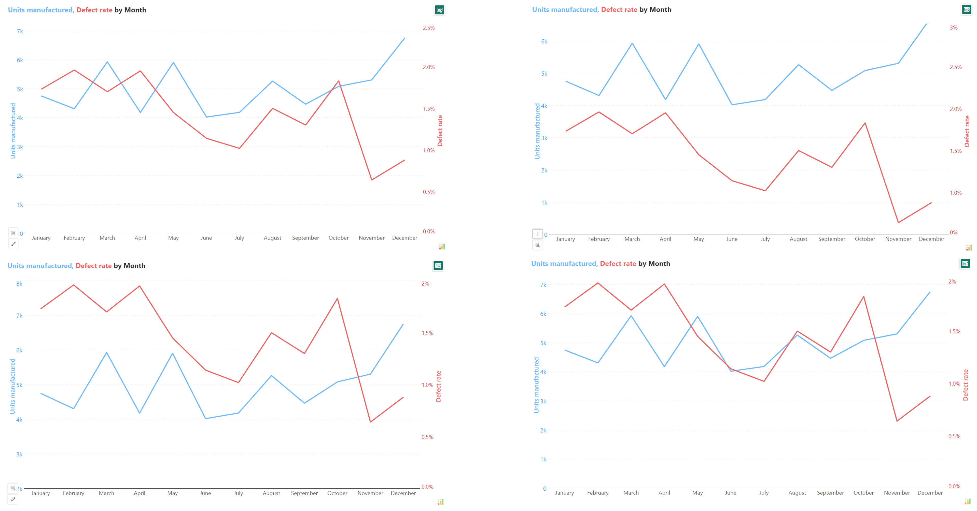
Critics often caution against misinterpreting or misunderstanding the rate of change in dual and multi-axis charts, highlighting it as a key issue and lesson to be learned from such visualizations.
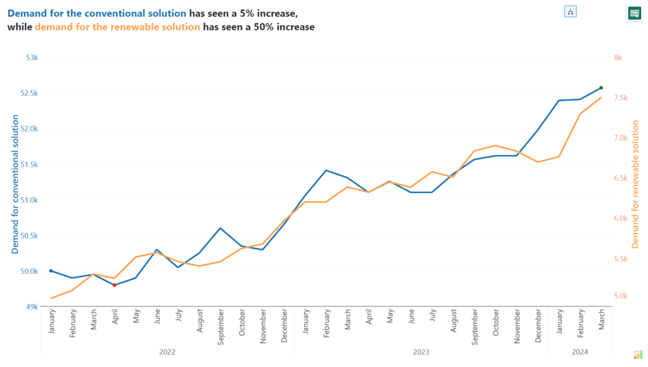
Even if the lines or curves in a dual-axis chart appear to have comparable slopes, it does not necessarily mean that the underlying data series are experiencing the same rate of change.
In the example below, it may initially appear that both data series are increasing at similar rates. However, closer inspection reveals that the demand for the conventional solution has increased by only 5%, whereas the demand for the renewable solution has surged by 50%. This significant difference in the rates of change highlights that the growth trajectories for these series are not as parallel as they may initially appear.
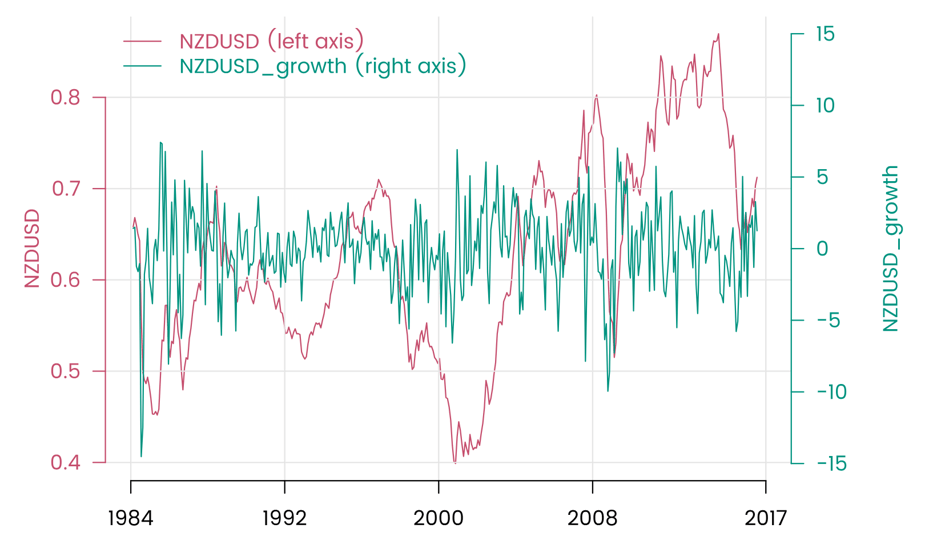
The correlation or relationship observed between two data series in a dual-axis chart does not inherently imply the presence of a causal relationship between them. This misconception is not unique to dual-axis charts but can occur with any type of chart. The visual representation of the data series on the same chart can create the impression of a causal link, even when the underlying relationship is more complex or indirect.
The main problem with this confusion is that it can lead to incorrect conclusions and potentially misguided decision-making. Viewers may make assumptions about the underlying drivers of the data based solely on the visual representation, without considering the broader context or other potential factors, as illustrated in the charts below.

When multiple data series are plotted on a single chart, each with its own axis, the resulting figure can become visually overwhelming due to multiple factors.
When dual and multi-axis charts face limitations, exploring alternative visualization methods becomes essential for effective data communication. Here are some good alternatives to dual & multi-axis charts:
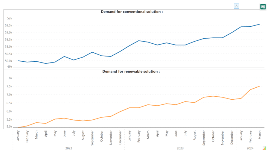
The vertical pull apart is an alternative to dual and multi-axis charts that separates the different data series vertically, rather than displaying them on a shared axis. In this format, each data series is presented in its own distinct panel or section, stacked vertically within the chart. This allows for the clear differentiation and independent scaling of the various metrics or variables being visualized.
However, one key limitation of the vertical pull-apart approach is that it can make direct comparisons between the data series more challenging. Since the series are separated vertically, the viewer must visually scan and mentally compare the different panels to identify relationships or differences between the metrics.
The scatterplot is an alternative to dual and multi-axis charts that can be used to visualize the relationship between two variables. In a scatterplot, each data point is plotted as a single dot on a two-dimensional grid, with the x-axis value representing one variable and the y-axis representing another.
However, the main limitation of the scatterplot is that it does not inherently provide a time series visualization. In a dual-axis chart, the x-axis is often used to represent time, allowing the viewer to see how the data series evolve over time. In a scatterplot, the x-axis is used to represent one of the variables, which means that the time-based aspect of the data is lost.
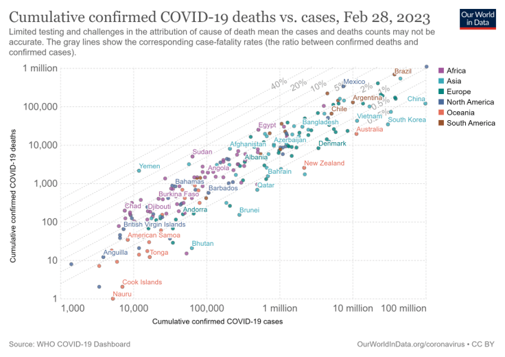
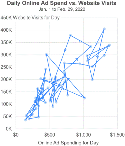
In a connected scatterplot, the individual data points are plotted on a two-dimensional grid, as with a standard scatter plot. However, the data points are then connected by lines or curves, creating a visual representation of the sequence or progression of the data over time.
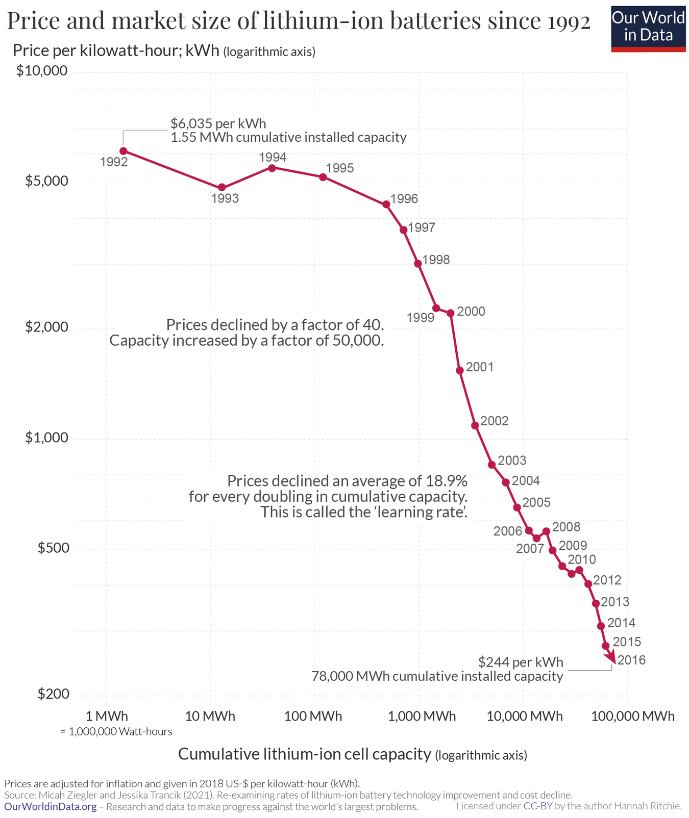
The connected scatter is also generally not well-suited for visualizing large or complex datasets, as the resulting chart can become cluttered and difficult to read. The intersecting lines and overlapping data points can obscure important information and make it harder for the viewer to extract meaningful insights.
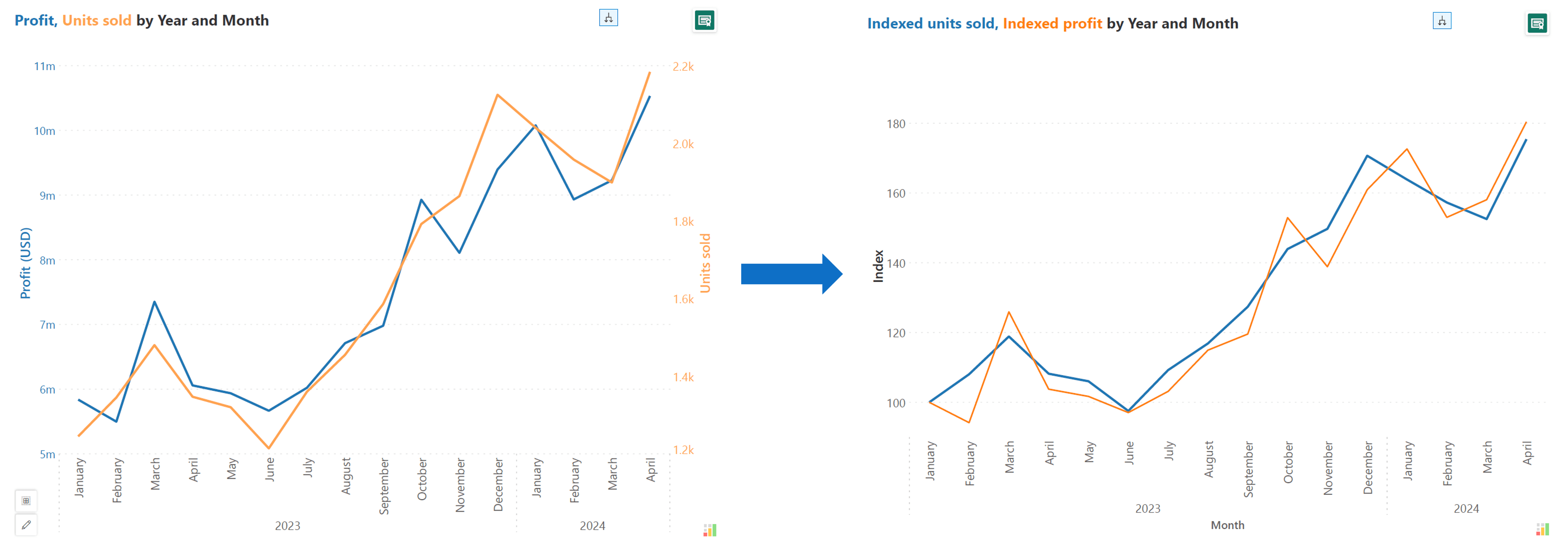
An indexed chart converts both variables in a dual-axis chart to a common index, allowing us to use a single y-axis for the visual. This approach simplifies the visualization by normalizing the variables to a common scale, making it easier to compare their relative movements. However, a drawback of using an indexed chart is that the actual numerical values are lost, as only the index values are visible. This limitation can hinder the viewer's ability to interpret the data accurately in terms of absolute values, potentially leading to a loss of precision in the analysis.
To ensure effective communication using dual and multi-axis charts, it is crucial to adhere to some best practices to maximize the impact and clarity of the visual.
Choosing appropriate axis scaling in dual and multi-axis charts is crucial for ensuring accurate and meaningful data visualization. By selecting suitable axis scaling, the chart can effectively represent the data without distorting the relationships between variables.
This practice involves setting axis scales that appropriately reflect the range and magnitude of the data being presented, ensuring that the visual representation is clear, accurate, and facilitates easy interpretation for viewers. Furthermore, the example below illustrates how inappropriate axis scaling can lead to confusion or misinterpretation.
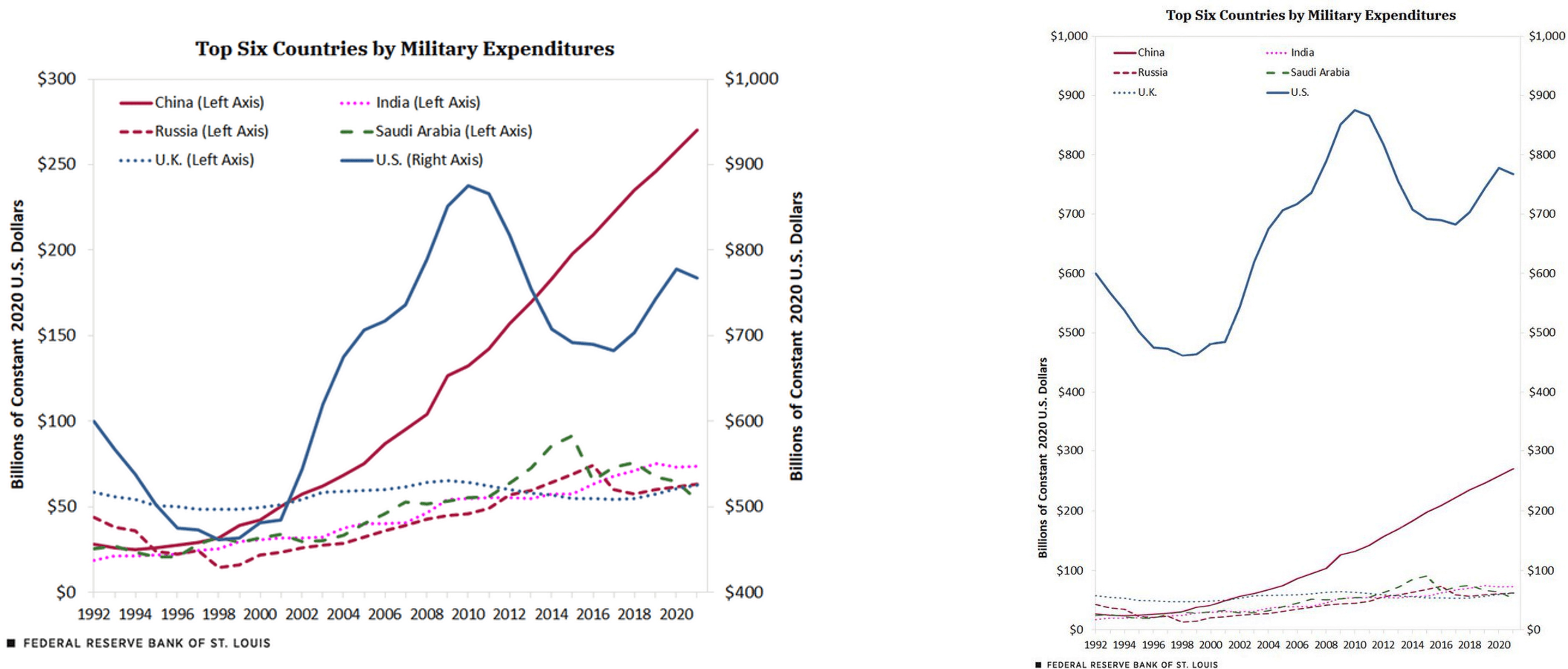
One of the key best practices for dual and multi-axis charts is to use color coding to improve the clarity and differentiation of the various axes and data series.
By assigning distinct colors to each axis and its corresponding data series, the viewer can more easily associate the visual elements on the chart with their respective scales and measurements. This color coding helps to reduce confusion and makes it simpler for the viewer to quickly identify which data is being represented by each axis.
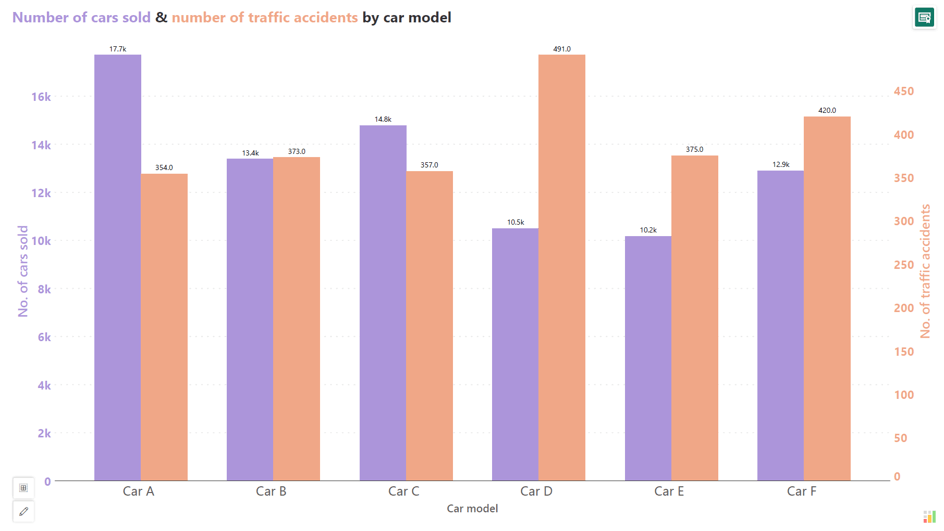
One of the recommended best practices for dual and multi-axis charts is to consider directly labelling the data points on the chart. This involves adding text annotations or labels to the individual data points, rather than relying solely on the axis scales and legends to convey the values. By placing the actual values next to the data points, the viewer can quickly and easily read the specific measurements without having to constantly refer to the axis scales.
Direct labelling can help eliminate any potential confusion or misinterpretation that may arise from relying on the axis scales alone.
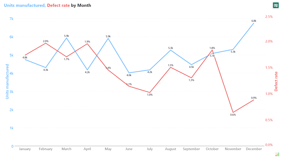
The best practice of not plotting more than 2 series in dual and multi-axis charts is recommended to maintain clarity and avoid overwhelming the viewer with excessive data. Crucially, it also addresses the challenge of quickly discerning which series corresponds to each axis. By limiting the number of plotted series to two, the visualization remains focused and allows for easier interpretation of the relationships between variables.
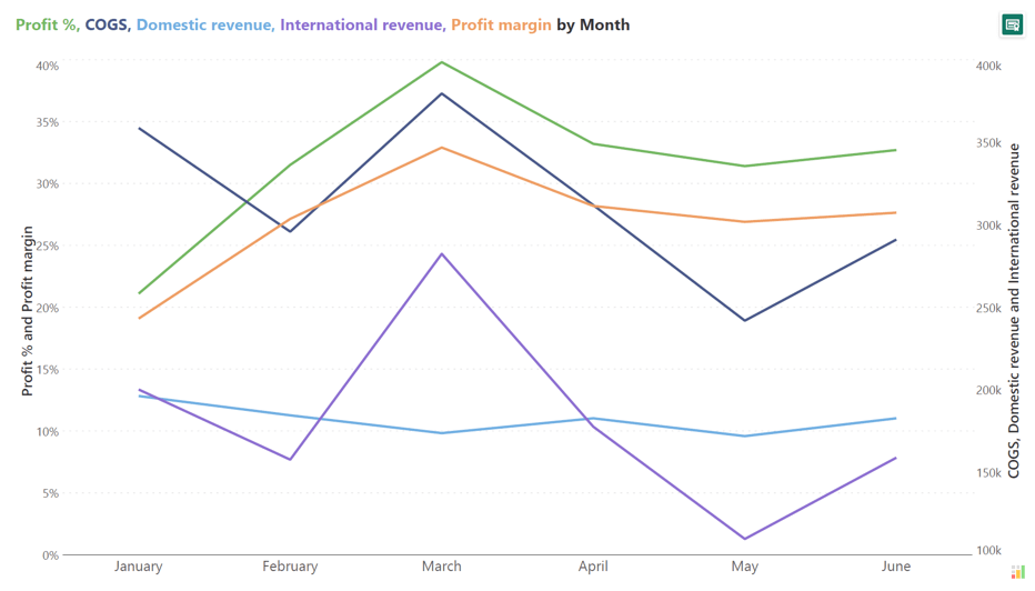
One of the key best practices for creating effective dual and multi-axis charts is to add contextual elements that enhance the clarity and interpretability of the visualization. These include:

Gridlines are the horizontal and vertical lines that divide the chart area into sections, aiding in reading values off the axes. Notably, the chart becomes even more cluttered when the gridlines for the two axes do not align, as demonstrated in the chart below.
By using gridlines sparingly, the chart can maintain a clean and uncluttered appearance, making it easier for viewers to focus on the data points and relationships without unnecessary distractions.

Another best practice for using dual and multi-axis charts involves ensuring that the comparisons made are meaningful and relevant by setting appropriate axis scaling, using consistent units of measurement, maintaining relevant timeframes, and considering the contextual relevance of the comparisons. By following these guidelines, dual and multi-axis charts can effectively facilitate valuable insights, support informed decision-making, and enable viewers to draw accurate conclusions based on the data presented.
The example below serves as a reminder of the importance of ensuring that comparisons made in dual and multi-axis charts are meaningful and relevant, highlighting the potential pitfalls of misleading interpretations. This is illustrated humorously by many images from the Spurious Correlations site, which show real data used to make absurd comparisons.
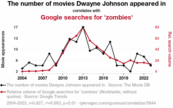
By leveraging the advanced charting features of Inforiver Analytics+ for Power BI, you can create visually compelling and informative dual and multi-axis charts that effectively communicate the relationships between multiple data series. This can be particularly useful for analyzing complex business data and supporting data-driven decision-making.
Here is a 3-step process of creating a dual & multi-axis chart right in Power BI with Inforiver.
Step 1: To create a combo chart, add 1 category in the Axis field and 2 values in the Values field. You can add up to 30 series under the Values field.
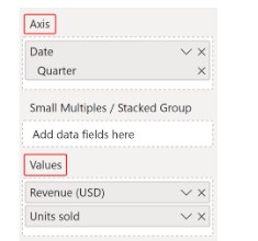
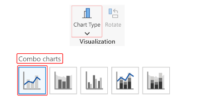
Step 2: Use the Chart Type dropdown menu from the toolbar to select the desired variation (in this case, Column + Line) from the Combo charts section.
Step 3: Use the Apply measure color toggle under Settings--->Y-axis 1 or Settings ---> Axis ---> Y-axis 2 to automatically color code the axis label by measure color.

Your chart is ready.
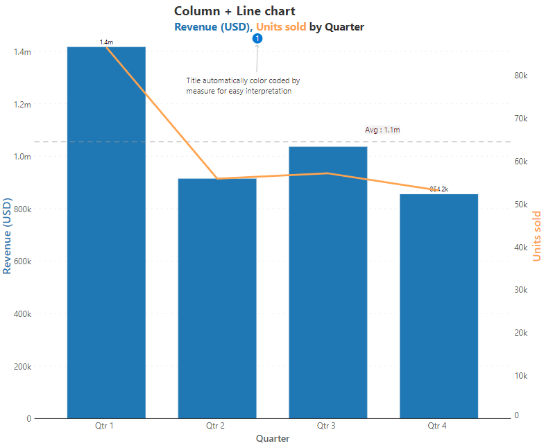
Check out this page to explore the best practices of Inforiver dual & multi-axis charts for powerful sales and financial analysis, which you can deliver each variation in less than a minute without any coding or scripting.
Watch the webinar replay on dual & multiple axis charts in Power BI here.
Elevate your data storytelling with visually stunning and informative charts by trying Inforiver Analytics+ here.
Inforiver helps enterprises consolidate planning, reporting & analytics on a single platform (Power BI). The no-code, self-service award-winning platform has been recognized as the industry’s best and is adopted by many Fortune 100 firms.
Inforiver is a product of Lumel, the #1 Power BI AppSource Partner. The firm serves over 3,000 customers worldwide through its portfolio of products offered under the brands Inforiver, EDITable, ValQ, and xViz.