Upcoming webinar on 'Inforiver Charts : The fastest way to deliver stories in Power BI', Aug 29th , Monday, 10.30 AM CST. Register Now
Upcoming webinar on 'Inforiver Charts : The fastest way to deliver stories in Power BI', Aug 29th , Monday, 10.30 AM CST. Register Now
Waterfall charts are a potent form of data visualization, capable of conveying the narrative of sequential changes leading to an outcome. They are underutilized despite their potential for providing profound insights and find diverse applications in fields such as Finance, Insurance, Human Resources, Manufacturing, and Healthcare.
Unlike traditional bar charts, waterfall charts utilize the cumulative total of preceding bars as a baseline for successive bars, allowing the representation of both positive and negative values in a single chart, while concurrently displaying their cumulative total. This unique functionality enables analysis across time and categorical dimensions, facilitating comparisons across various periods and segments.
Feel free to explore the sections that interest you:

A waterfall chart is a versatile data visualization tool that goes beyond illustrating the impact of intermediate values on a cumulative total. Apart from showcasing flows, variances, changes over time, deviations, and part-to-whole representations, waterfall charts offer a unique perspective on data by visually representing the sequential impact of positive and negative values on an initial figure, leading to a final cumulative value.
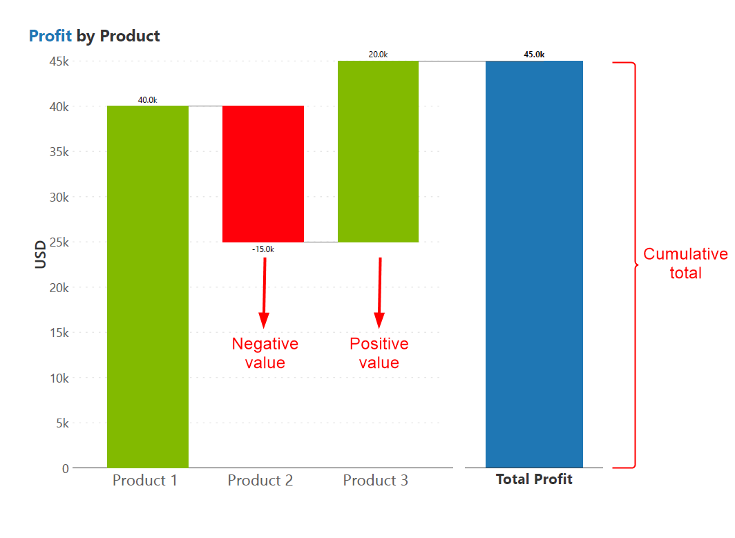
The waterfall chart can be better understood by comparing it to a bar chart. Initially, the bar chart displays quarterly profits, and adding a total column makes the sum of individual values clear. Color-coding links the individual values to the total, and transforming them into cumulative values shows us progress over time. Simplifying the visualization by focusing on individual values improves data clarity and ensures a smooth transition from a bar chart to waterfall chart.

This visualization method aids in dissecting the contribution of each intermediate value to the overall total, making it easier to analyze and understand complex data relationships and trends within different business contexts.
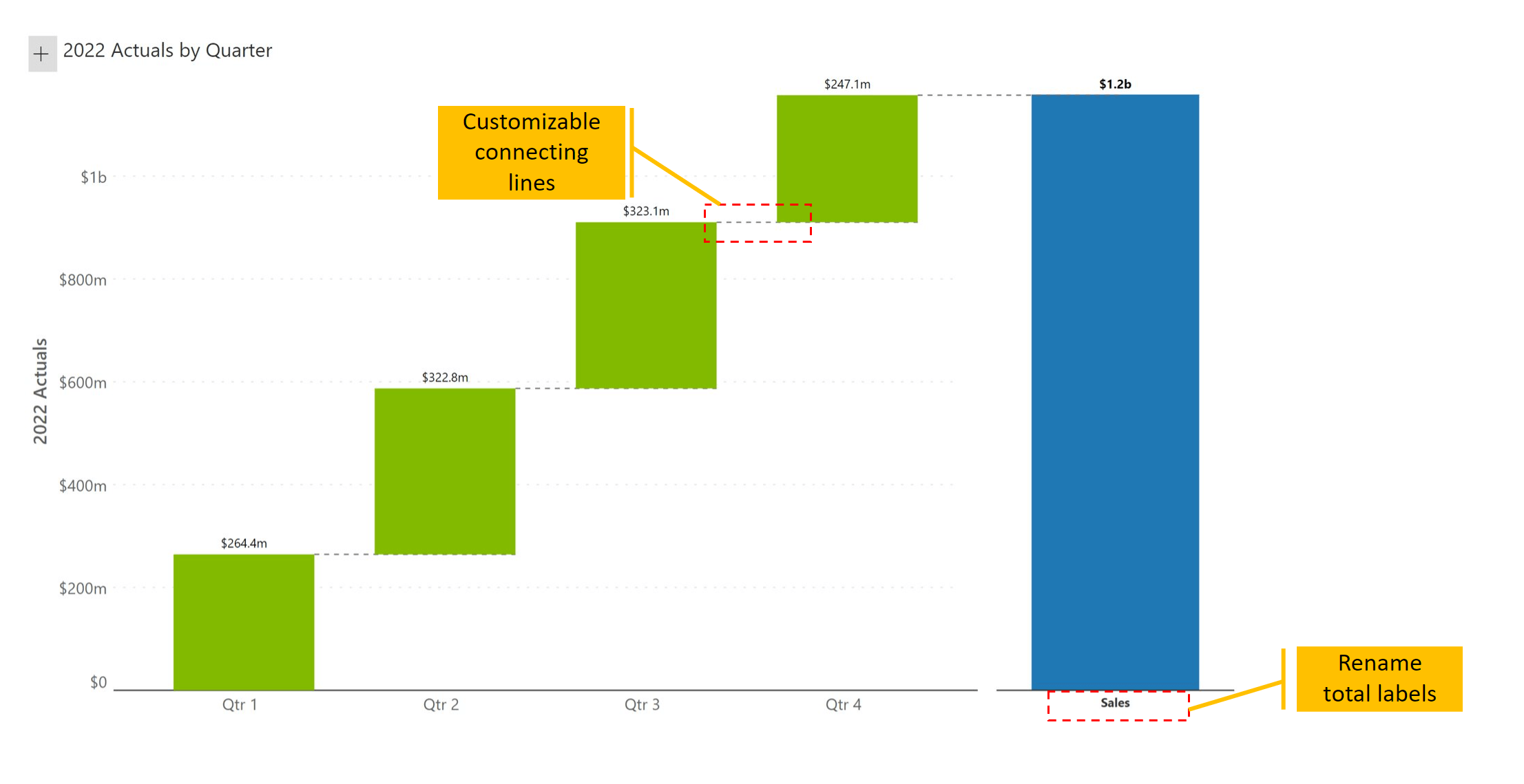
The simplest form of a waterfall chart shows individual contributions (green) along with the total (blue). The x-axis can hold a category or a time dimension. Here are three ways in which a waterfall is better than a column chart:
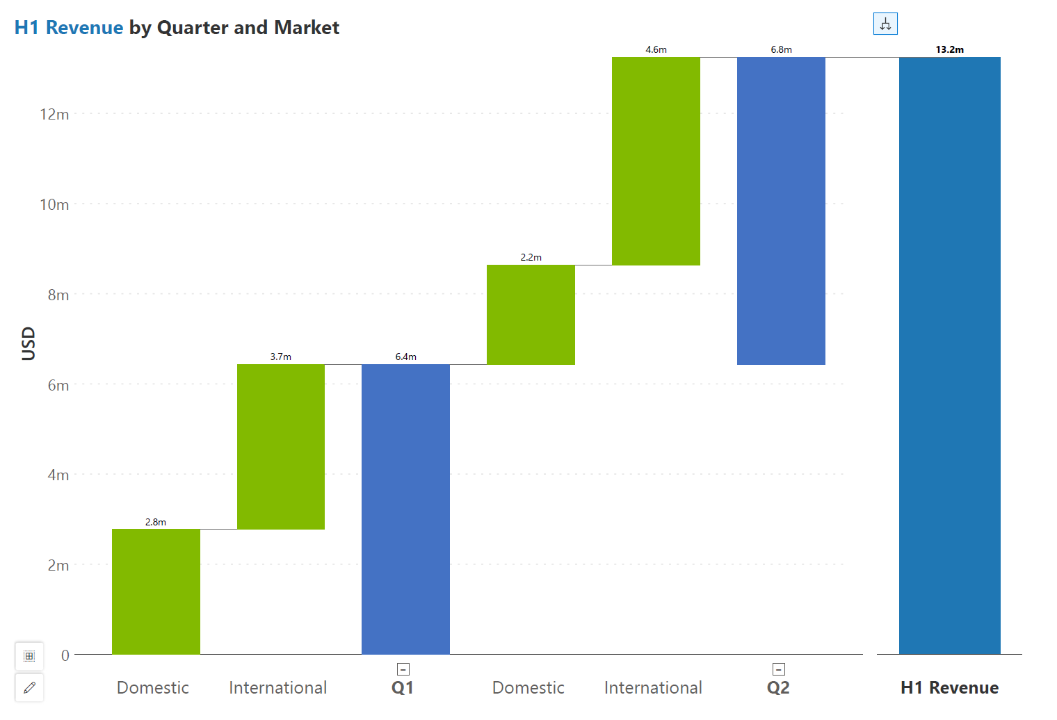
Another type of waterfall chart is the continuous waterfall, sometimes called the nested waterfall chart. This chart visualizes hierarchies with nested waterfall, where each hierarchy level forms a waterfall chart. It uses floating bars for the subtotals and displays contributing categories for each level.
In the example, revenue calculation for the first half of the year is divided into quarters. Each quarter shows revenue breakdown by domestic and international markets. You may observe the nesting effect the individual quarters have on the overall chart.
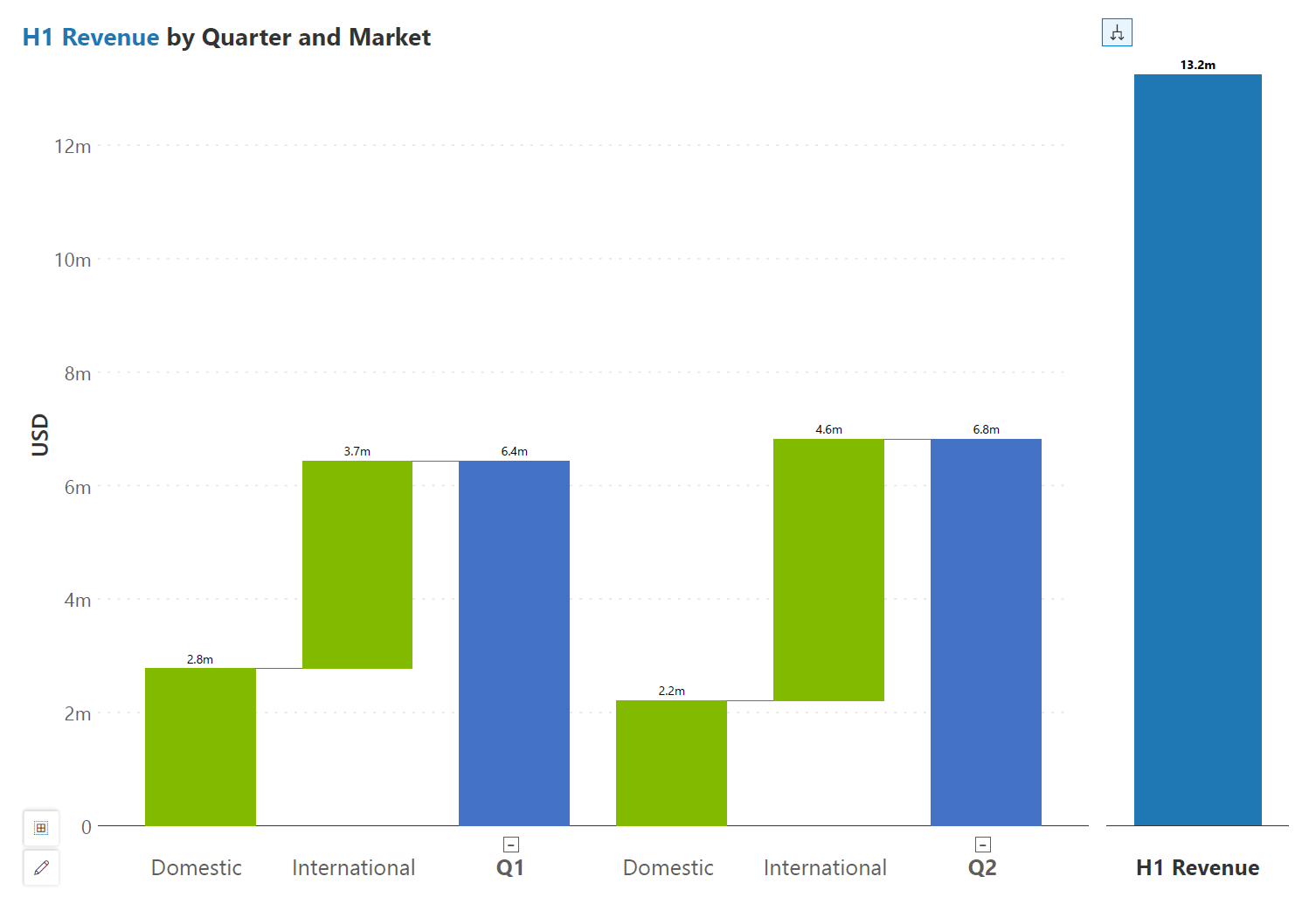
The regular waterfall is similar to the nested waterfall, but a single hierarchy level shares a common baseline. Here, every quarter is charted directly on top of the axis.
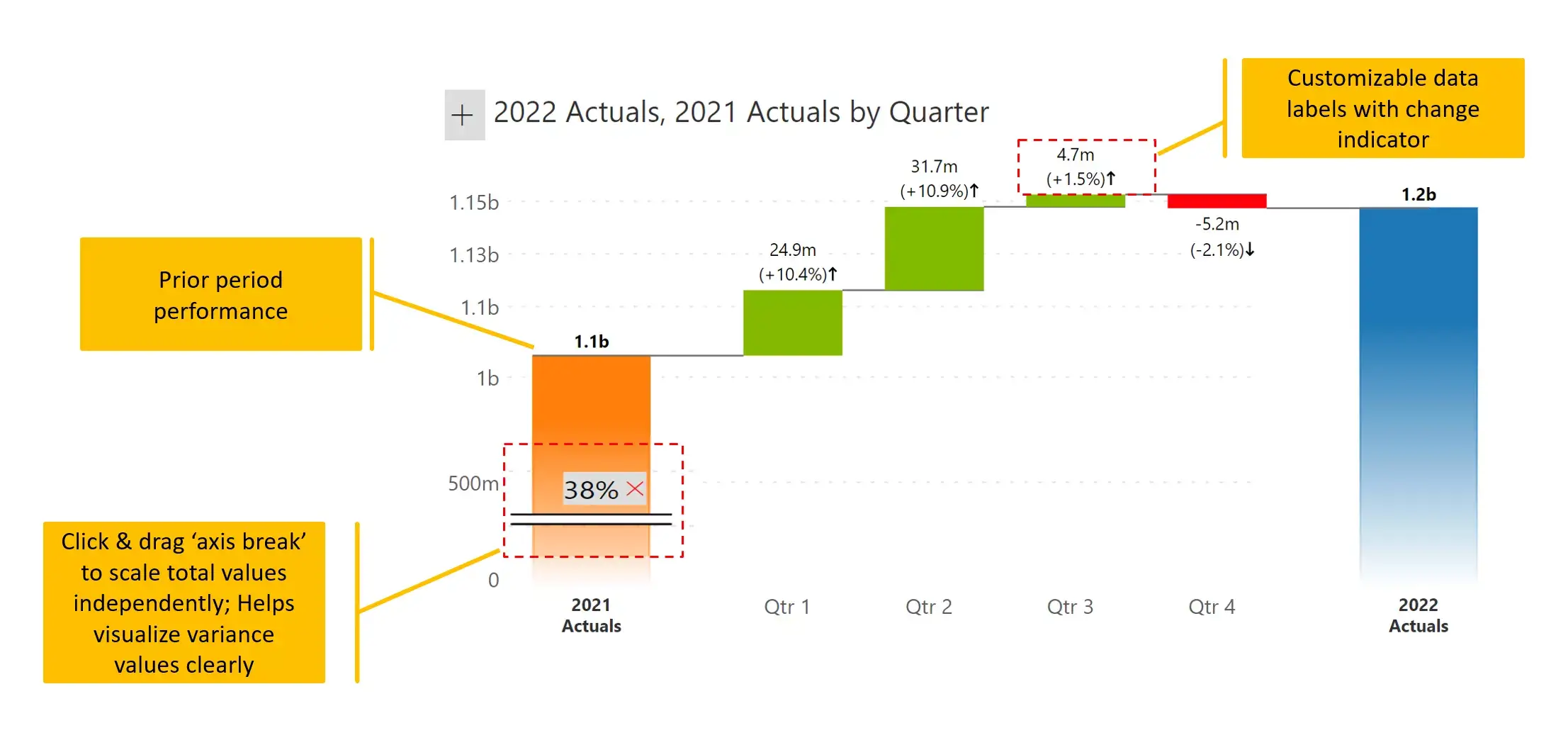
This waterfall type is different from all the ones seen earlier. In this example, we have an initial value and final value (depicting observations from 2021 and 2022). Each interim value (in our case, quarter) explains the reason for the gap between the initial and the final value. In other words, Q1 shows the variance between first quarter observations in 2022 and 2021, rather than the absolute value for 2022. This means that it captures the difference between the two and the sum of the variances for all quarters explains the net change between 2021 and 2022.
Variance waterfalls like this help analyze which quarters contributed most to the change. In addition to showing changes over time, we may also have categorical variables such as region or product on the x-axis. In this case, our variance values show the relative performance of every category across both years.
The combination waterfall goes a step beyond the variance waterfall in the following ways:
This chart shows quarterly contributions closer to the axis and the variances separately below.
One drawback of this type of visual is that the variance values may appear much smaller as the Y axis always starts at zero. We can zoom in on variances as shown in the previous chart (#4), but we will not be able to see absolute quarter values at the bottom.
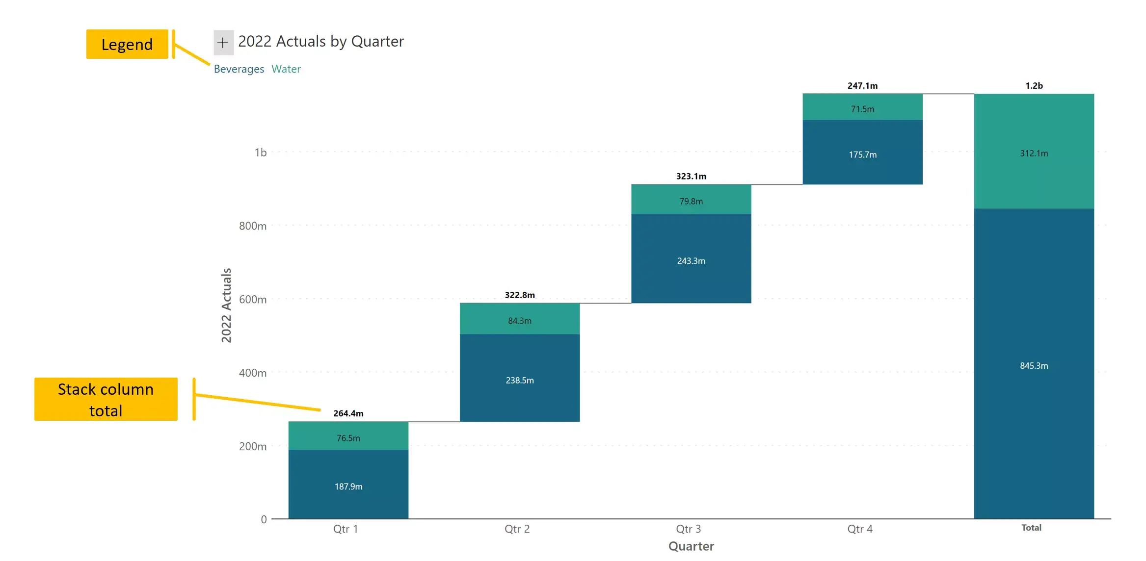
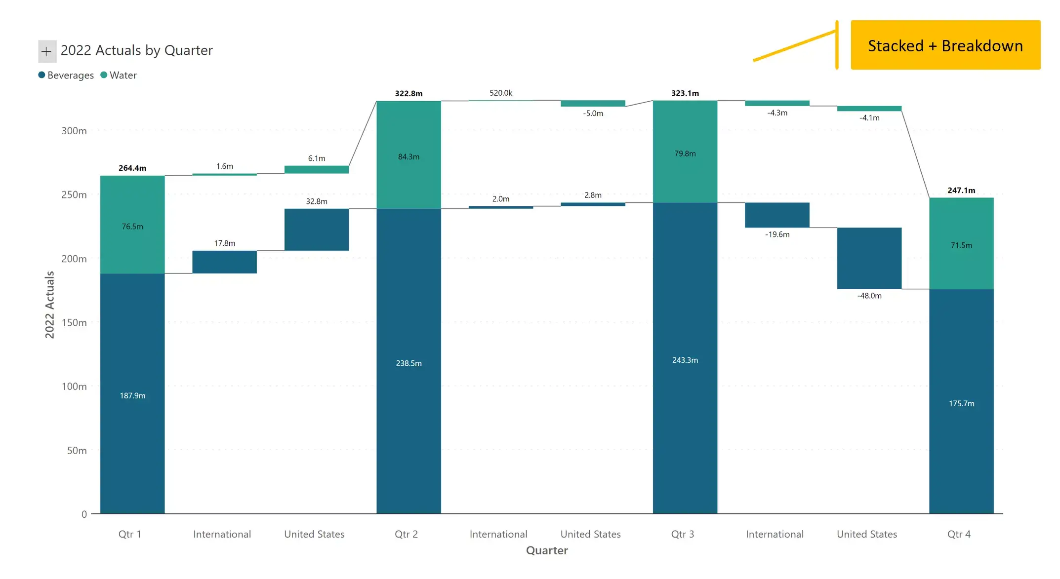
A waterfall chart can be built with stacked columns. In this example, sales from each quarter (and the total) are broken down into two categories (Beverages and Water). Stacked waterfall charts thus allow us to visualize our totals as a sum of contributing segments.
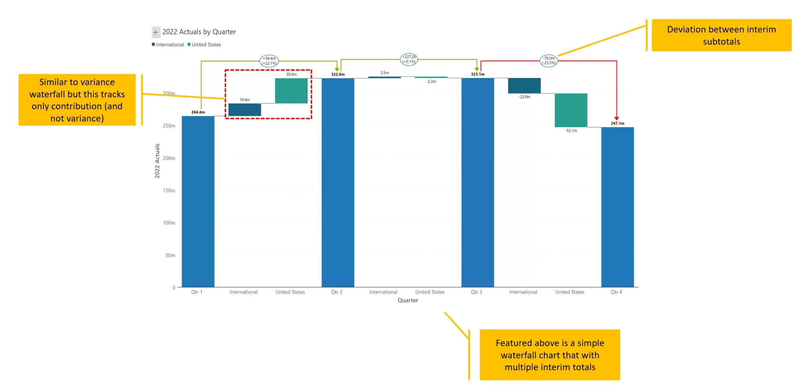
The breakdown waterfall takes a column chart (e.g., sales by quarter), and explains the differences between each category through variances.
In this case, we are showing which geography contributes the most to increase or decrease in sales between quarters. We may also think of this chart as a waterfall chart with a starting value (for example, revenue for H1), interim totals (revenues for Q3 and Q4) and a final total (revenue for H2).
Note that this type of chart does not handle negative values well, as we cannot show positive variances in green and negative variances in red as we do in a variance waterfall. It is better to color each category value (geography) consistently.
This is a combination of stacked (#6) and breakdown (#7) waterfall charts seen earlier. It displays sales by quarter, and all values including interim and final totals are further broken down into two categories (beverages and water).
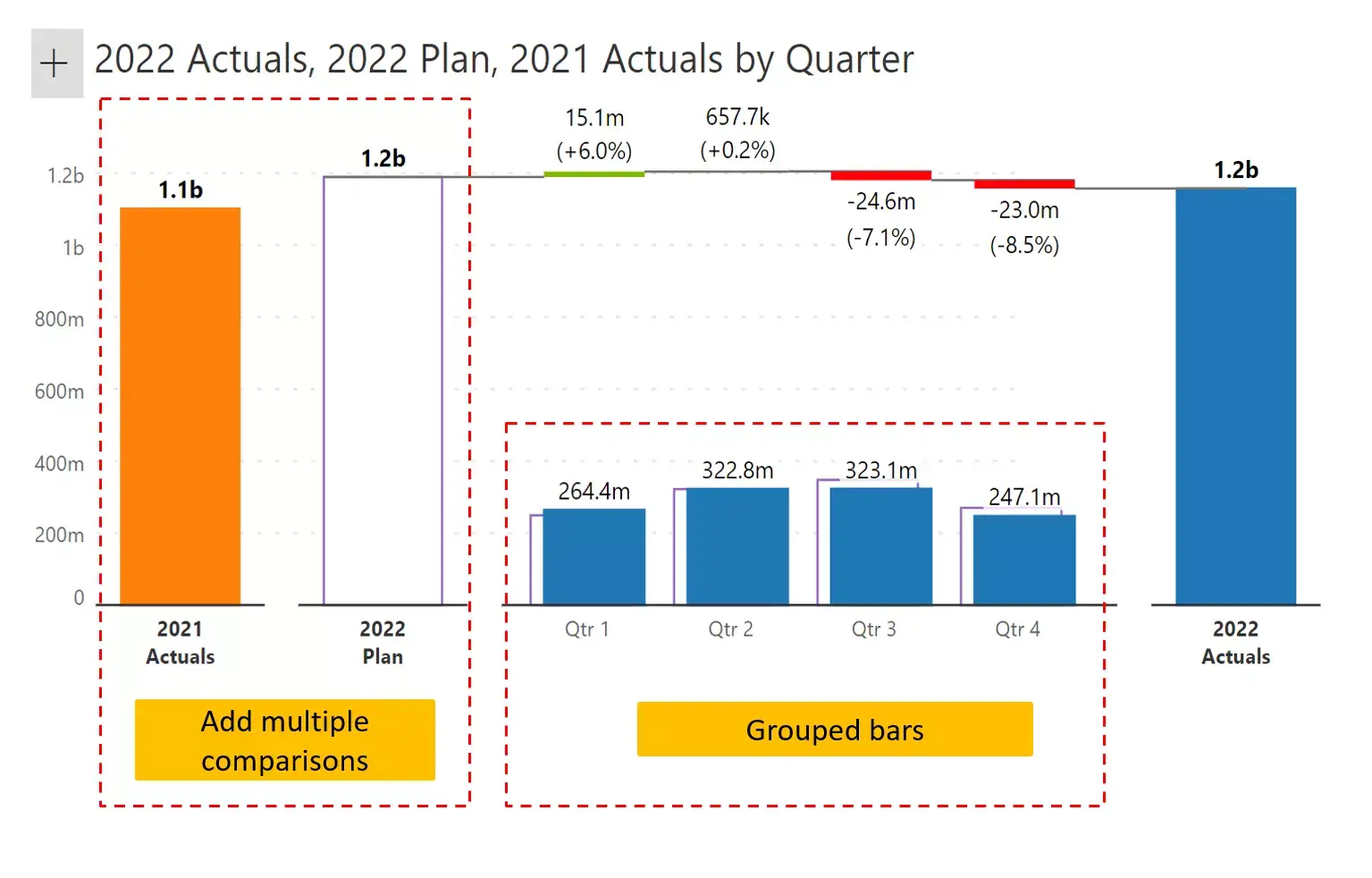
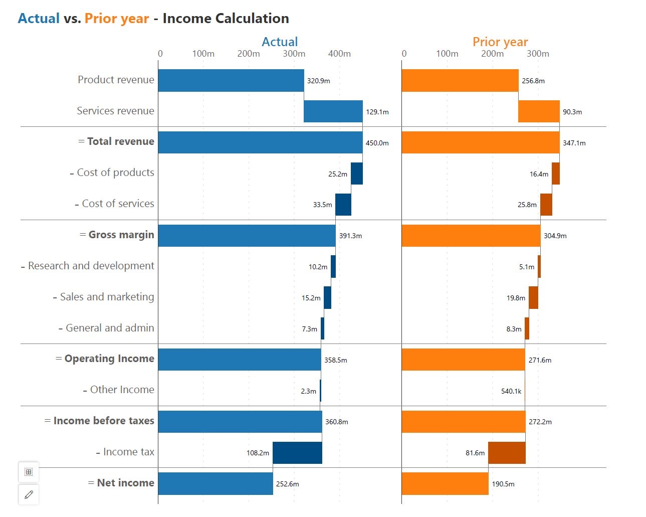
Side by side waterfalls enable comparison between two sets of observations for the same categories. In this case, we are comparing a Profit & Loss statement across two years.
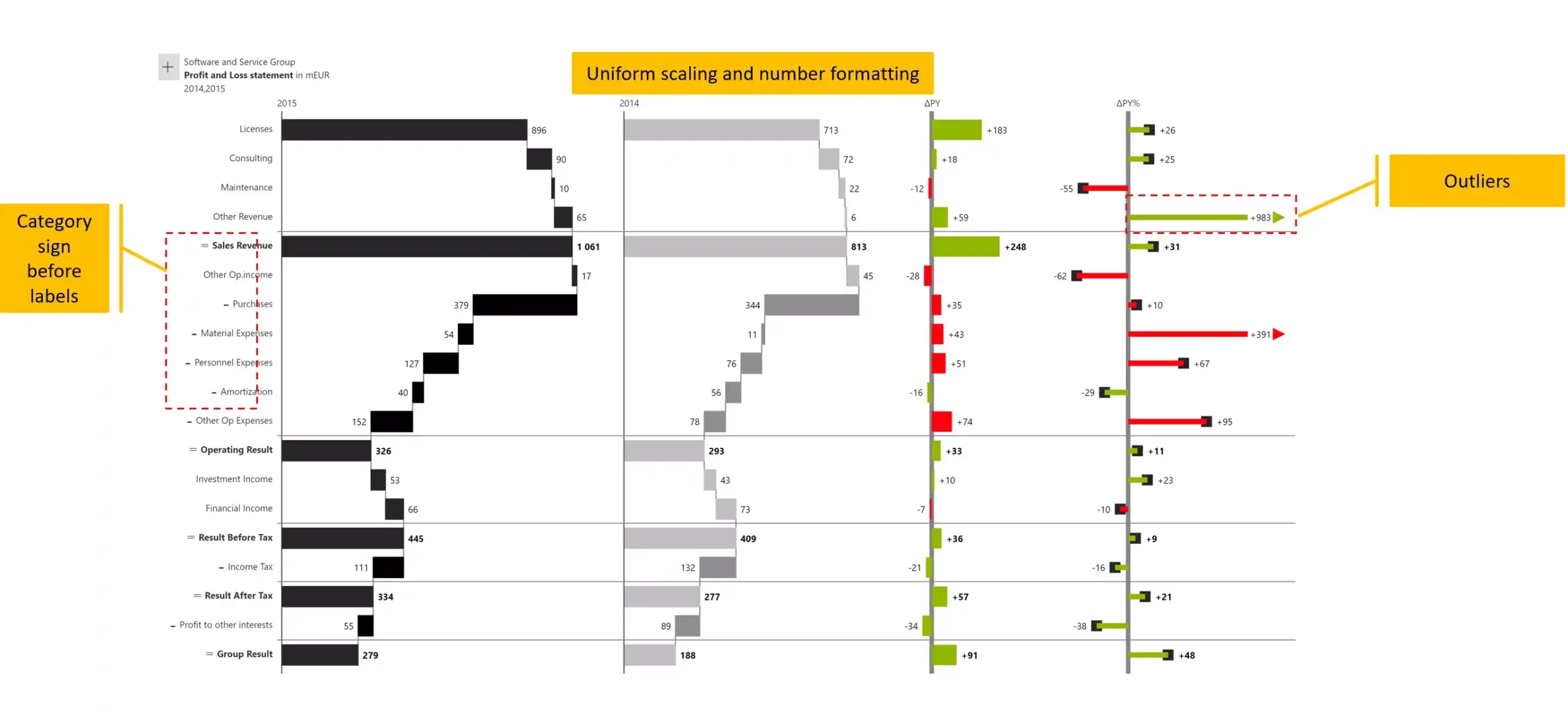
Similar to the side by side waterfall, the side by side variance chart shows the original values along with absolute and percentage variances.
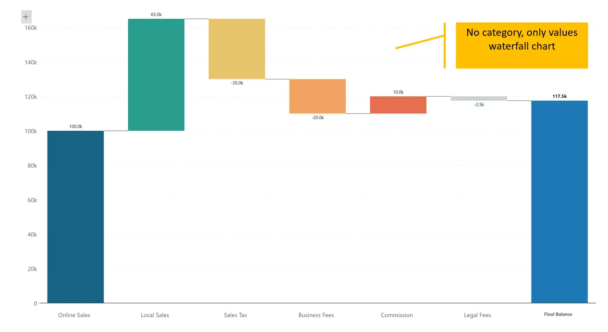
This is one of the most unusual but frequently used waterfall chart types. This chart is made entirely of individual measures or values. As a result, each series is encoded in a different color.
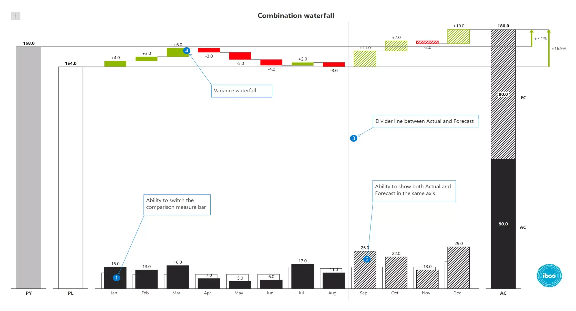
One of the most interesting use cases of a waterfall chart is in forecasting.
In the example shown below, the current (ongoing) month is September. We have actual sales data (highlighted in black) from Jan to Aug and sales projections (bars with stripes) from Sep to Dec. The projected sales for the entire year are shown as a stacked column at the end.
You can also observe variances between the plan and the actuals for the elapsed period (from Jan to Aug), and projected variances (for Sep to Dec) in red & green.
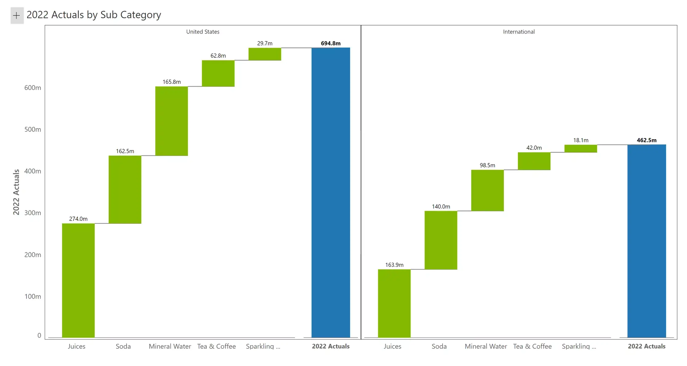
Small multiple waterfalls show one waterfall chart for each category value (in this case, geography). This is ideal for comparing performance across multiple entities – for example, across regions, products or time.
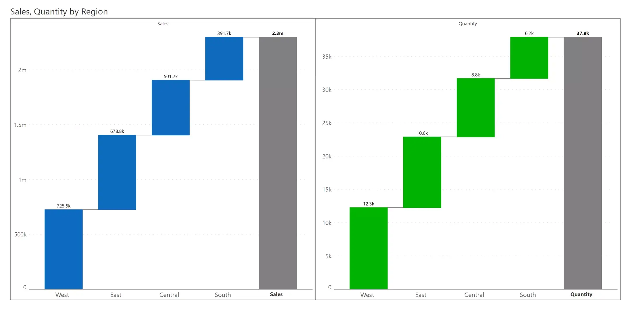
The previous chart visualizes the same measure (sales) across dimensions (e.g., geography). With the measure-based small multiple, we visualize two measures (sales and quantity) in separate charts. One characteristic of this chart is that each series gets its own color – blue for sales, and green for quantity.
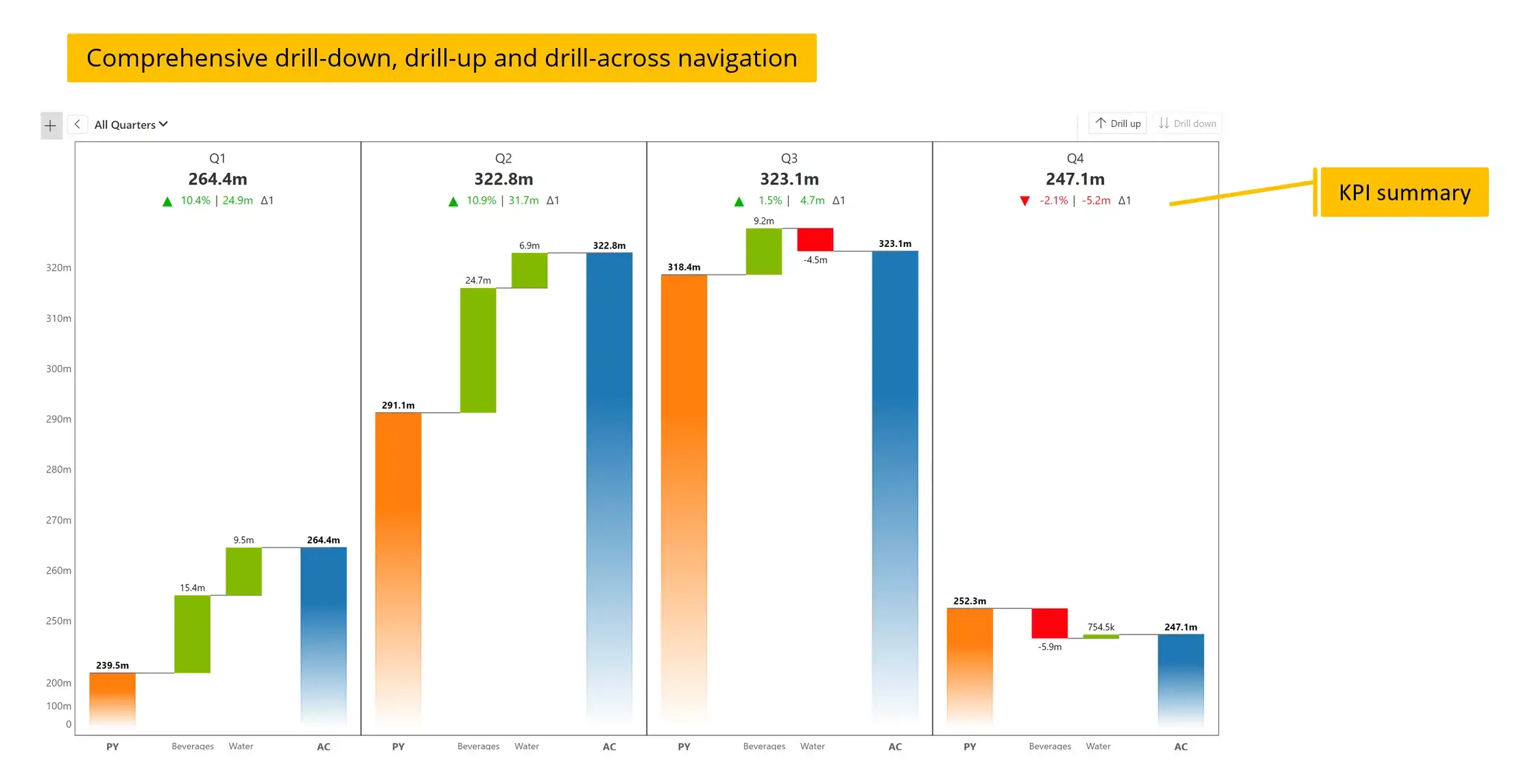
The small multiple can also be delivered with an integrated KPI summary that lists the final value, and the absolute and percentage increase over the starting value.
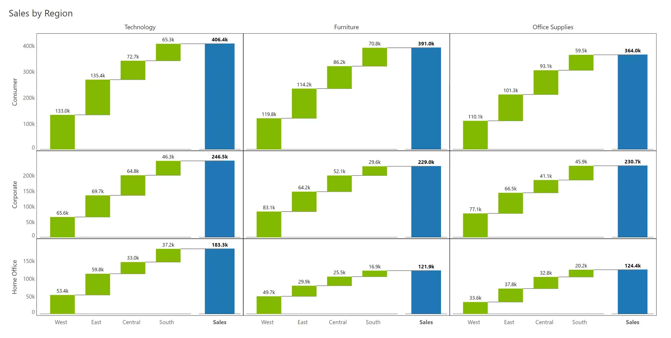
Waterfall charts become more insightful when used in small multiple formats with different dimensions on the x- and y- axes. In this example, we have the product category (Technology, Furniture & Office Supplies) along the columns and customer segment along the rows (Consumer, Corporate and Home Office).
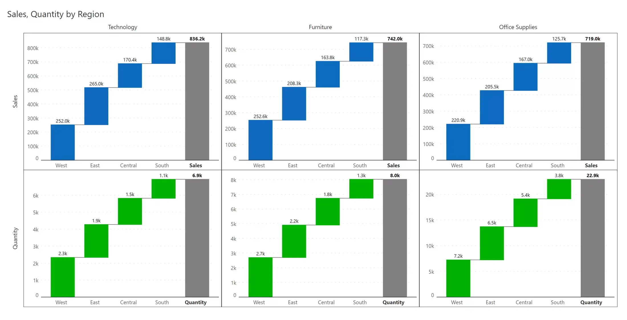
Combining examples #15 and #17 from the previous pages, we may also create a multi-dimensional measure-based small multiple. The small multiple shows sales (blue) in the first row and quantity (green) in the second row, while the columns depict the three categories (technology, furniture, and office supplies).
While creating your waterfall charts, consider a few best practices that can help you build clean, legible and engaging charts.
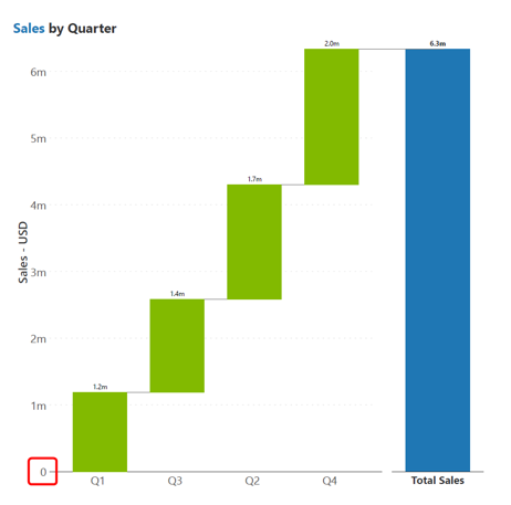
The baseline for most bar charts is taken to be zero, and in the case of waterfall charts, this typically applies to the first bar as well as the bar showing the total value. A zero baseline lets us accurately judge the values and their relative proportions.
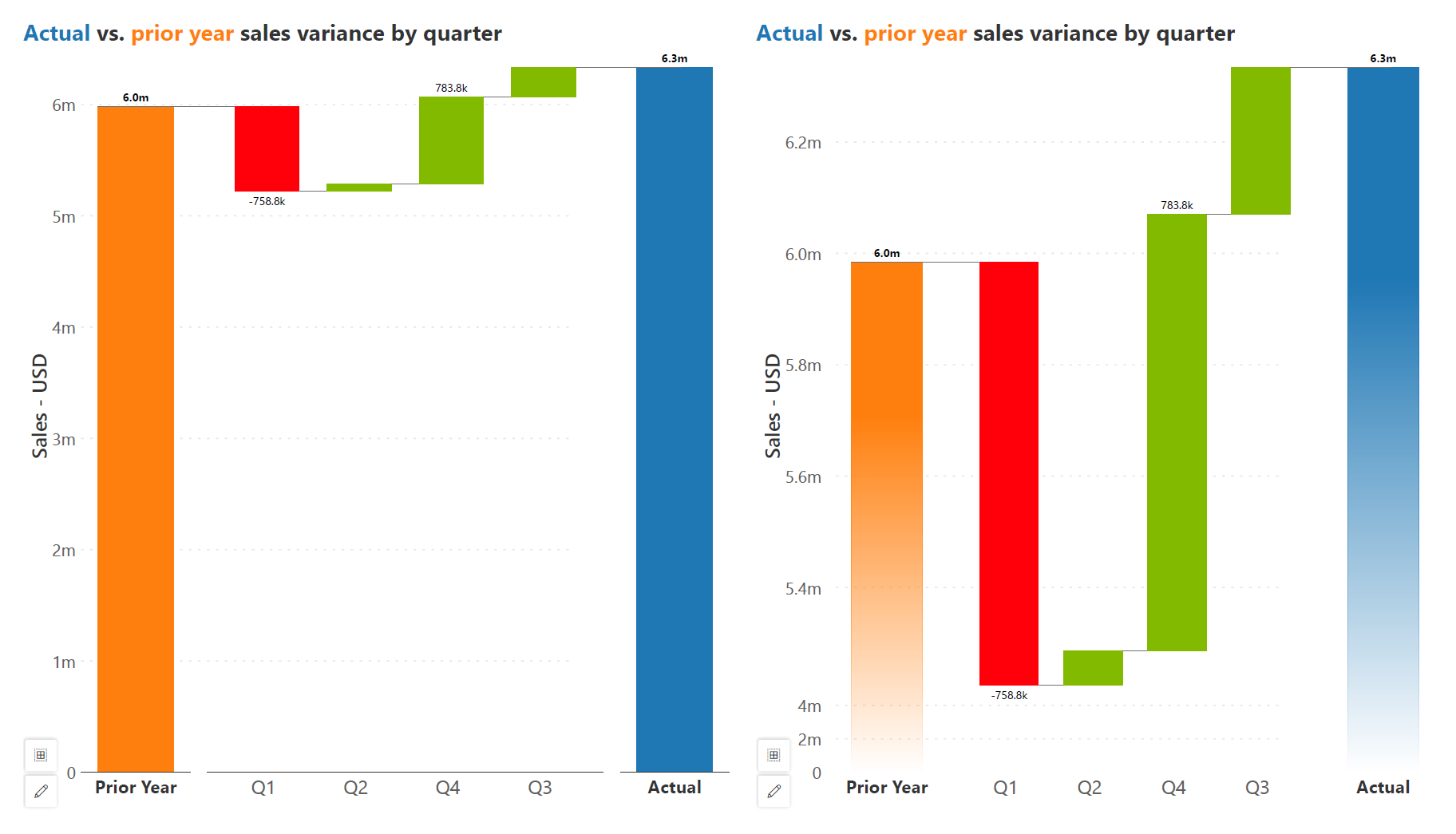
We may sometimes require an axis break, especially in the case of variance charts where our total bars dwarf the variance values, making it difficult to accurately read them. In this case, we may opt for an axis break with bars that fade out instead of meeting the horizontal axis, as seen in the chart on the right below.
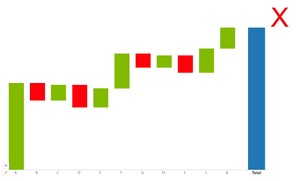
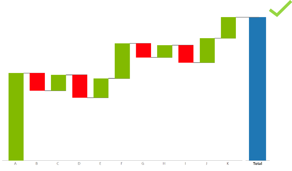
Gains and losses have different baselines (at the bottom or the top of the bar respectively), which can be confusing. Horizontal connecting lines guide the eye through the visual and help our reader understand the moving baseline for each bar.
Vertical waterfall charts often face constraints in accommodating category labels due to limited space. This limitation often necessitates strategies such as truncating, rotating, or staggering the labels to fit within the chart's confines. However, opting for a horizontal chart layout offers a solution by providing ample space for displaying complete category labels without any truncation or distortion, ensuring optimal readability and comprehension of the data.
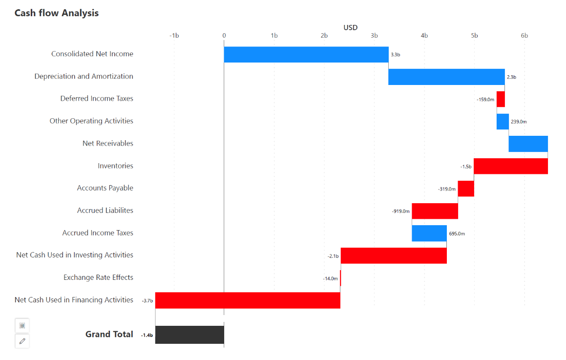
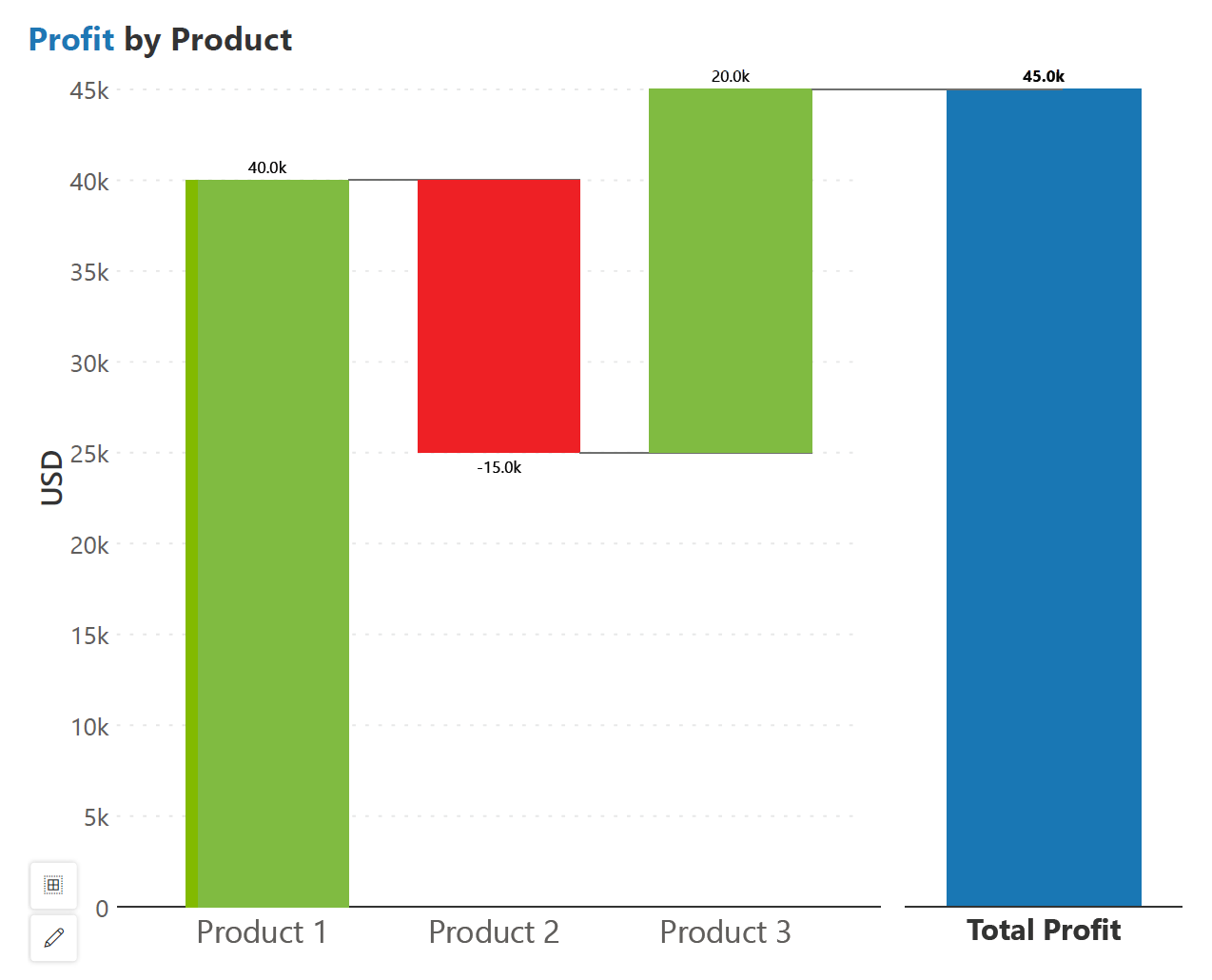
To ensure clarity, place the bar showing the total at one end of the chart. This allows us to group the contributing categories separately from the total for added clarity.
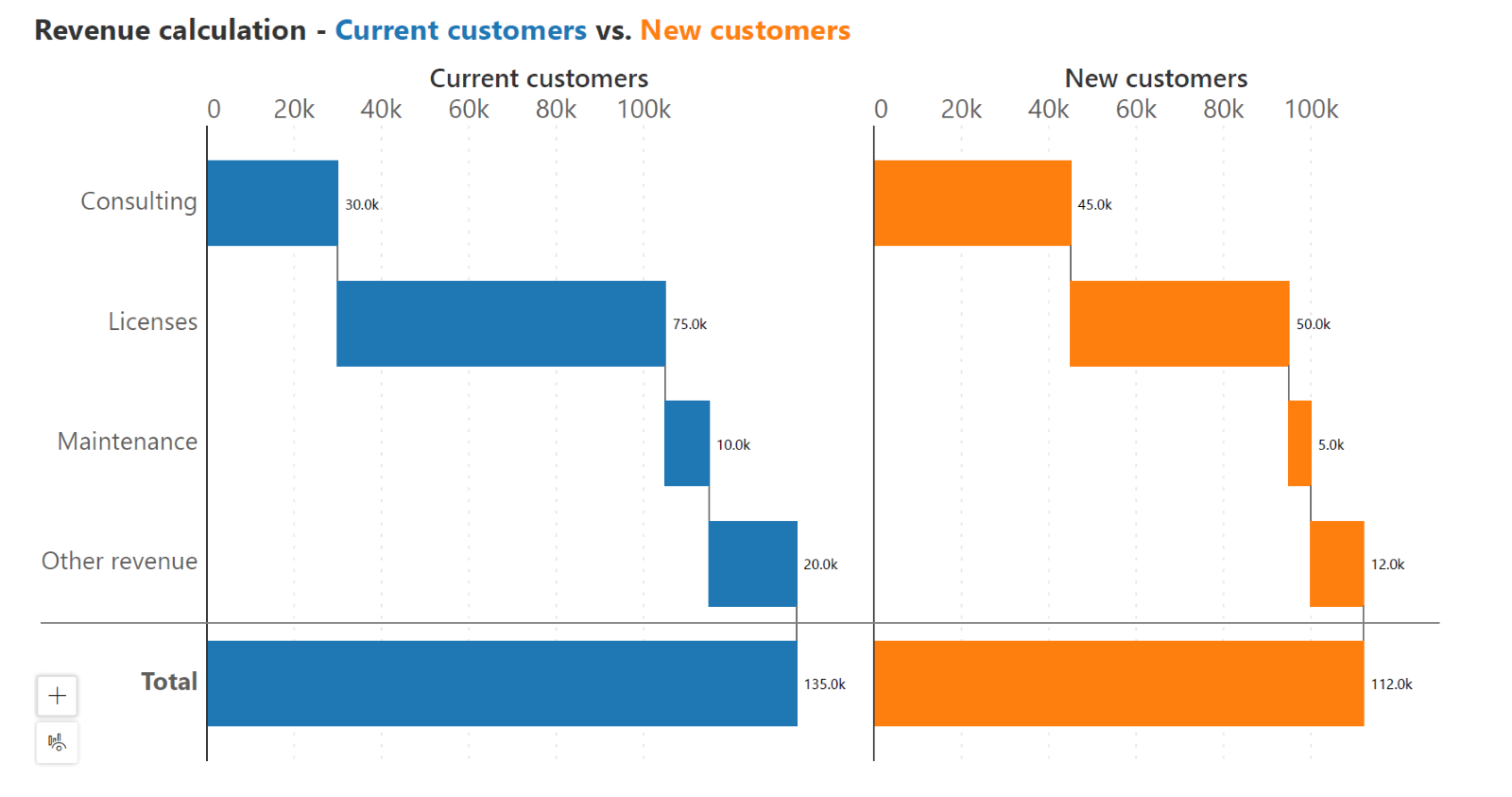
Side-by-side waterfall charts visually compare values across categories or time periods, highlighting positive and negative changes between these categories for quick analysis. Each bar represents a category or period, with segment lengths indicating change in magnitude. This chart aids in identifying trends, outliers, and relative performance in data sets with clarity and precision.
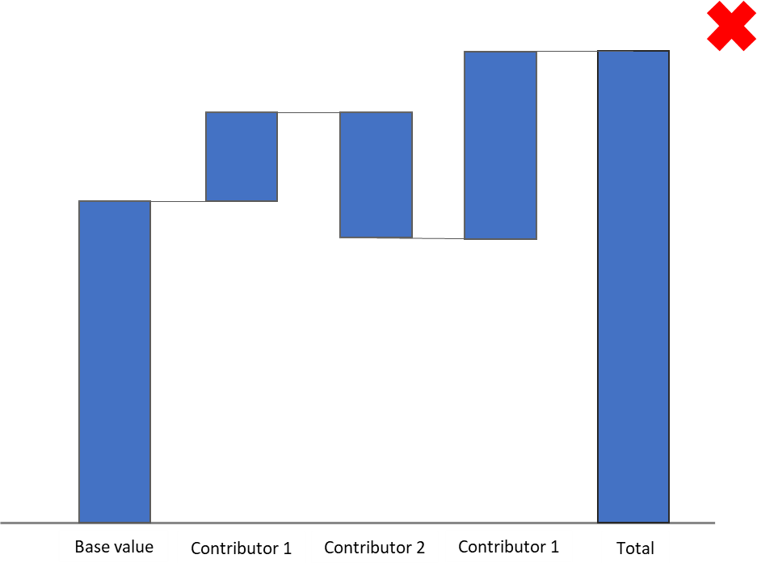
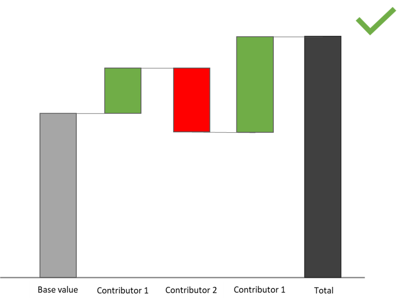
Visual differentiation enhances clarity and comprehension, allowing viewers to easily identify and interpret the various components of the chart. For example, using distinct colors for base values, totals, and contributors helps in highlighting their respective roles within the data, thereby facilitating better analysis and understanding of the information presented.
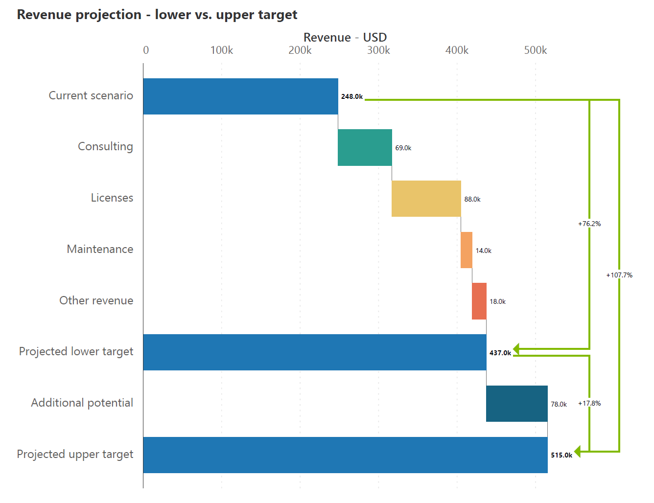
In a waterfall chart, incorporating deviations is essential for facilitating comparisons between data points. By visually representing the impact of each value on the total, deviations enhance the chart's ability to highlight trends, significant changes, and key insights. This practice not only improves visual clarity but also aids in making informed decisions based on a comprehensive analysis of the data.
Avoid using waterfall charts when addition and subtraction do not carry a logical interpretation for the categories chosen. This also renders their cumulative total meaningless.
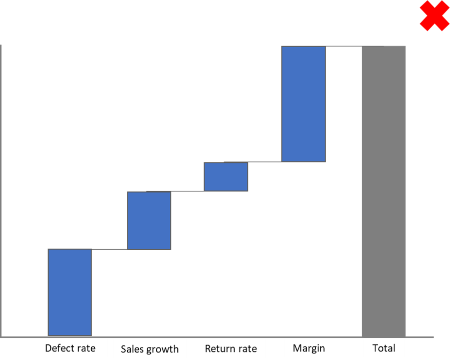
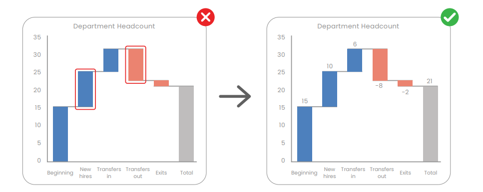
It can be difficult to compare the lengths of different bars that each start from a different baseline due to the limitation of our visual perception. Include data labels to make comparisons easier.
Waterfall charts, by their nature, may not be as compact as other types of charts. The visual representation of the cumulative effect of values may require more space, making it less suitable for situations where compact visualization is a priority.
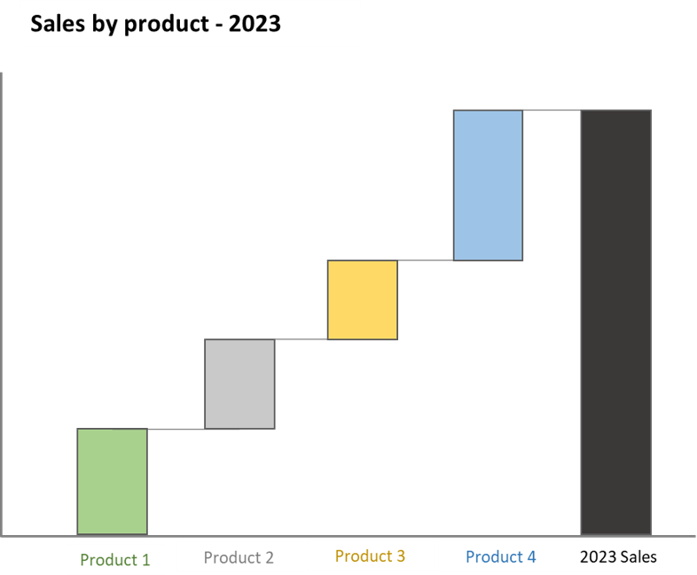
Exploring alternatives to the waterfall chart offers diverse visualization options for financial and performance data analysis. Selecting the most suitable chart type is essential for accurate and insightful analysis. By considering various alternatives, you can create visually compelling, clear, and accurate charts to convey your analytical findings.
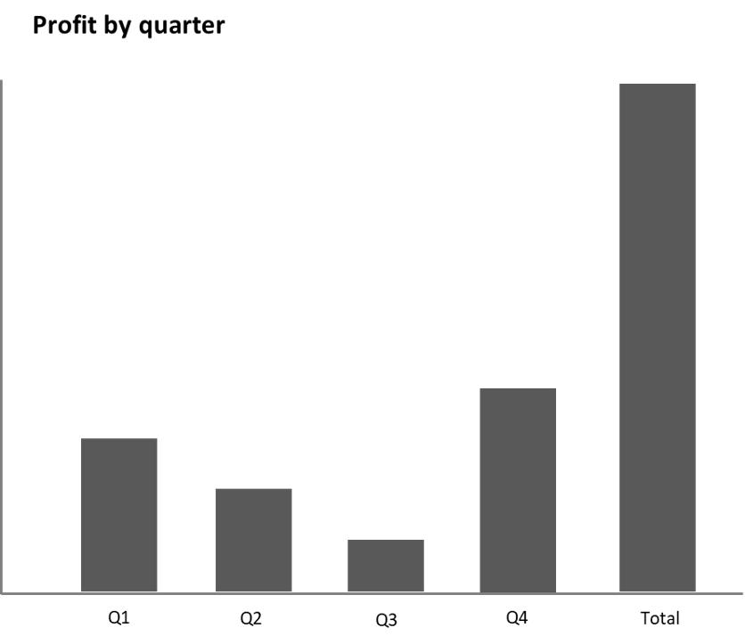
The bar chart is a versatile alternative to the waterfall chart as it provides a simple and effective way to represent data, allowing for easy comparison across categories. It is particularly useful for presenting data in a visually intuitive manner, making it a popular choice for various data visualization needs.
For instance, a bar chart illustrating profit by quarter along with the total bar can clearly display the quarterly performance and the total profitability of a business. While a waterfall chart shows us cumulative values, a bar chart is only capable of visualizing absolute values.
The stacked bar chart is a valuable alternative to the waterfall chart as it allows for the visualization of the total as well as the composition of each category. This makes it effective for comparing the parts to the whole and for showing changes over time.
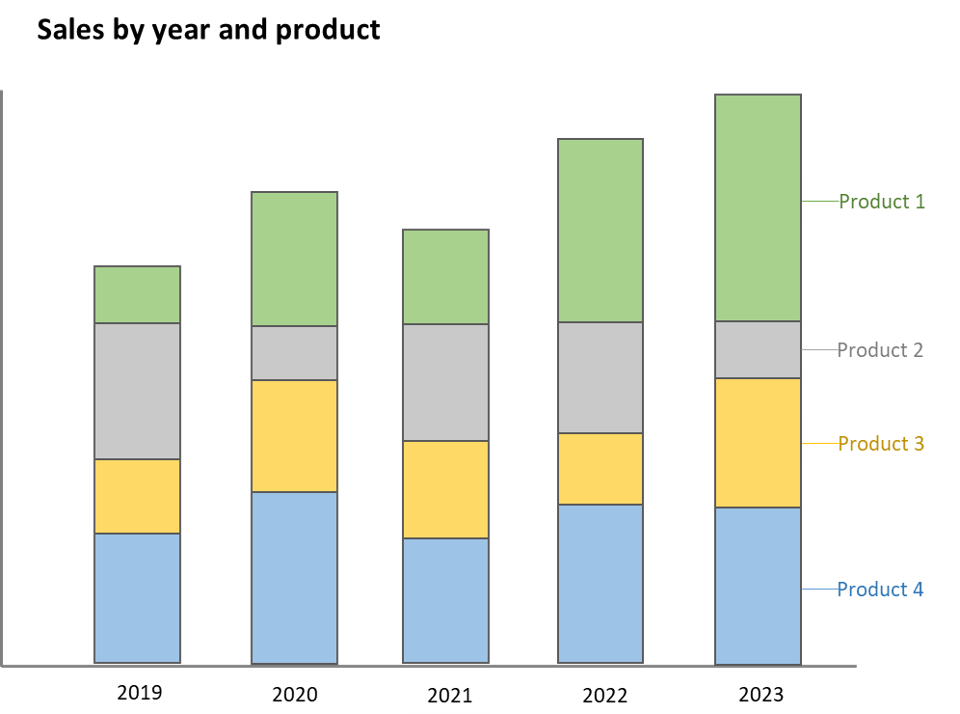
Its ability to display multiple categories and their relative proportions within a total makes it a powerful tool. For example, a stacked bar chart presenting sales by year and product (from year 2019 to 2023) and 4 products (product 1, 2, 3, and 4) can vividly illustrate the sales performance of each product over the years. However, we must note that stacked bar charts cannot show both positive and negative values in a single chart, unlike a waterfall chart.

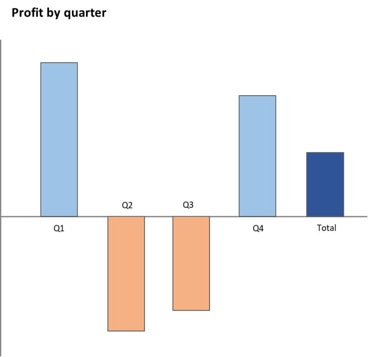
The diverging bar chart is a powerful alternative for comparing categories while also showing the positive and negative values measured from the baseline. It provides a clear visual representation making it particularly useful for highlighting contrasts and trends in data, which can be beneficial for certain analytical and presentation needs.
For instance, a diverging bar chart depicting profit by quarter where Q2 and Q3 are negative, along with the total bar, can effectively highlight the quarters with negative profitability and their impact on the overall performance. We must note, however, that diverging bar charts do not show cumulative values, unlike a waterfall chart.
Let us learn how to build a waterfall chart in Power BI. Download your free copy of Inforiver Analytics+ here, and then follow just 2 simple steps to create your waterfall chart.
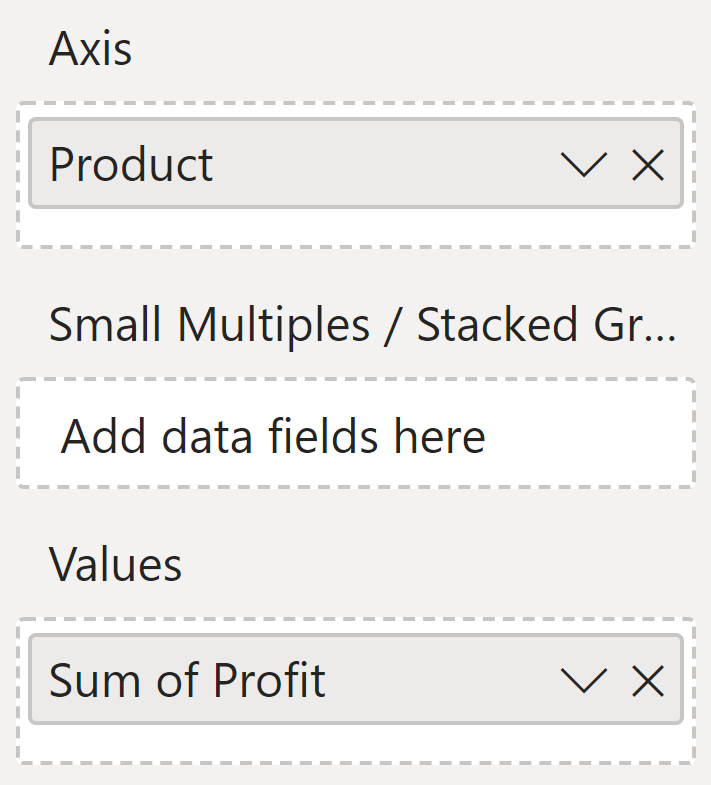
Step 1: Drag and drop your category into the “Axis” field and your values into the “Values” field.
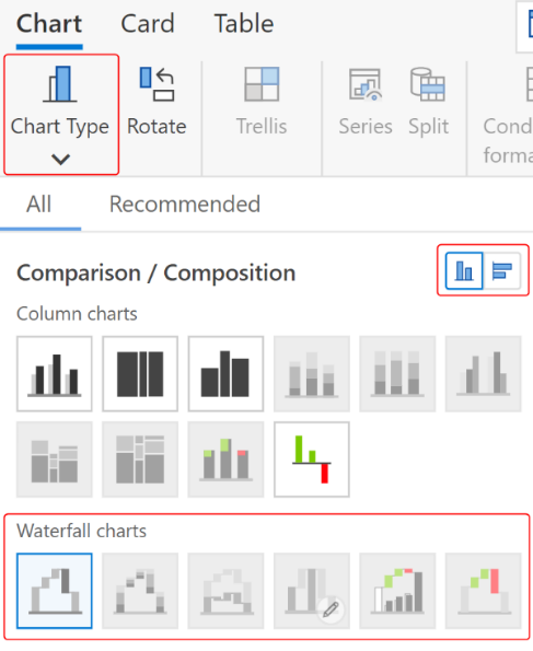
Step 2: Select the type of waterfall chart and the orientation that you prefer from the “Chart type” menu.
Your waterfall chart is ready!
Check out this demo to explore 20+ variations of Inforiver waterfall charts for powerful sales and financial analysis, which you can deliver each variation in less than a minute without any coding or scripting.
Watch the webinar replay on waterfall charts in Power BI here.
Elevate your data storytelling with visually stunning and informative charts by trying Inforiver Analytics+ here.