
Upcoming webinar on 'Inforiver Charts : The fastest way to deliver stories in Power BI', Aug 29th , Monday, 10.30 AM CST. Register Now
Upcoming webinar on 'Inforiver Charts : The fastest way to deliver stories in Power BI', Aug 29th , Monday, 10.30 AM CST. Register Now
Marimekko charts are powerful visuals that merge the functionality of several bar charts into one compelling visual. These charts are particularly effective for showing the relative size and composition of different categories across two variables. They allow for the comparison of the segment sizes within categories and the categories' overall impact on the total.
Commonly used in market analysis, financial reporting, and survey results, Marimekko charts provide a visually engaging way to convey complex information by displaying data in varying widths and heights, which represent different values.
Feel free to explore the sections that interest you:

A Marimekko chart, also known as a Mekko chart, is a visualization tool that combines the features of a bar chart and a stacked bar chart. It is used to compare multiple categories across two dimensions, typically displaying the data as rectangles with varying widths and heights.
Commonly used in market analysis, financial reporting, and survey results, Marimekko charts provide a visually engaging way to convey complex information by displaying data in varying widths and heights, which represent different values.
To understand the Marimekko chart better, let us explore this chart type in terms of a bar chart. The example below shows a bar chart that displays the 2022 revenue of the top 5 tech companies, highlighting that Amazon has the highest revenue. Bar charts show one category, in this case, the company, and one measure, in our case, the revenue. To transform this into a Marimekko chart, we introduce an additional measure — the number of employees. We then scale the width of each bar according to each company's employee count.

By analyzing both dimensions—height for revenue and width for employee count—it is evident that despite Amazon's vast company size, it has the lowest revenue per employee. Conversely, Apple's figures show it has the highest revenue per employee compared to its peers.
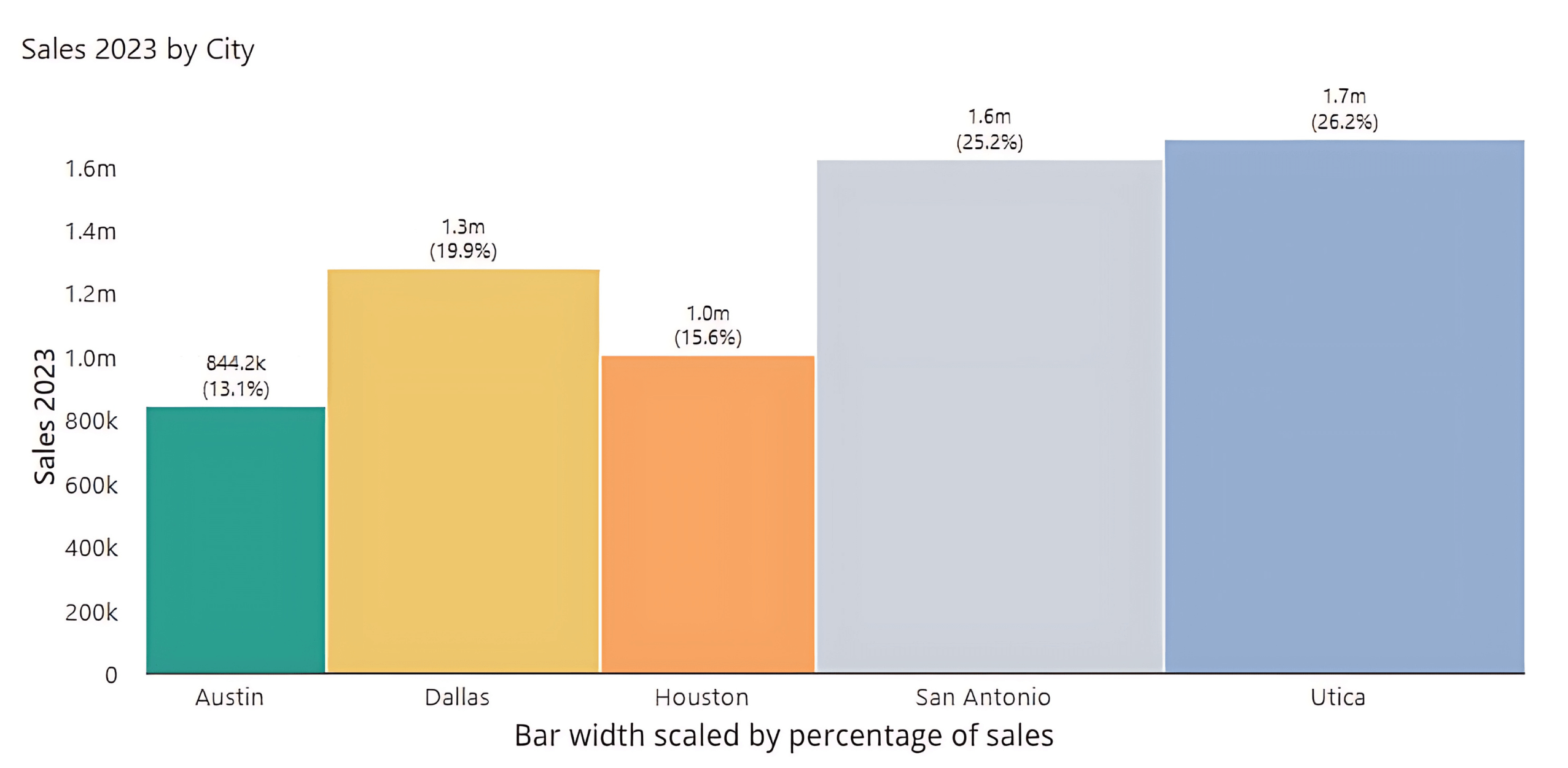
This chapter delves into different variations of the Marimekko chart. We begin with the variable width bar chart, where the bar widths and heights reveal data dimensions, allowing for an easy comparison of the importance and performance of categories.
A variable width bar chart, or variable width Marimekko chart, offers a two-dimensional view of data, showing proportions across categories by varying bar widths and heights according to data values. This visualization allows quick comparison of both category performance and its overall importance.
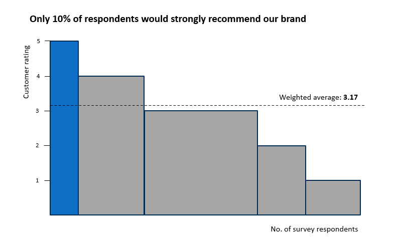
In the example below, the chart illustrates customer ratings versus the number of respondents, offering a clear visual representation of overall satisfaction and its distribution among survey participants.
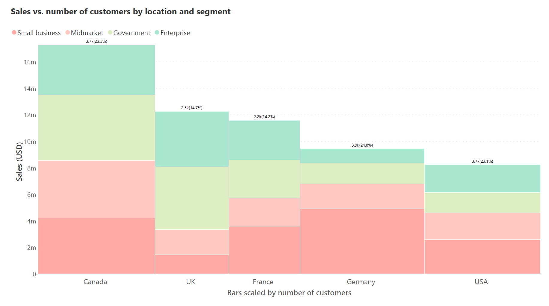
The stacked Marimekko chart is similar to the variable width bar chart, but each segment is divided further into sub-segments, allowing for an additional layer of comparison within the same category.
In the example below, the width of each vertical bar corresponds to the number of customers from each country, representing the market size or customer base in that region.
The height segments within each bar show the sales in USD, divided into sub-segments by customer type (Small business, Midmarket, Government, Enterprise), allowing a comparison of sales performance across customer types within each geographical market.
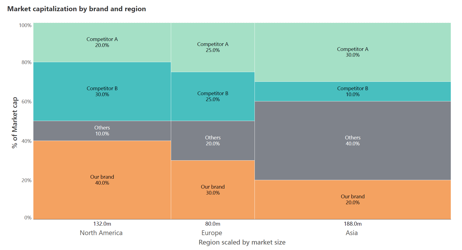
A 100% stacked Marimekko chart combines aspects of a 100% stacked bar chart and a Marimekko chart. It's used to show the distribution of segments across different categories, where each segment's size within a category is proportional to its contribution to the total for that category.
All segments in this variation sum up to 100%, making it easy to compare the relative proportions of each category's sub-segments to the whole.
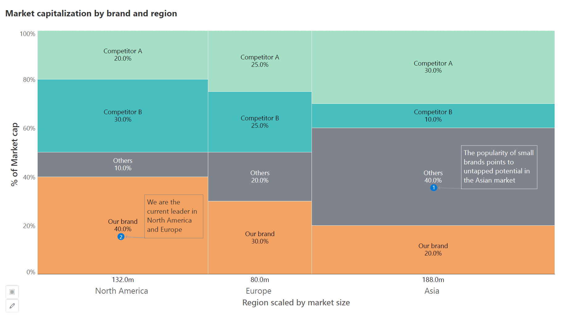
In the below example, the varying widths of the columns represent the market size of North America, Europe, and Asia, while the stacked segments within each column show the percentage of market capitalization held by ‘Our brand’ and competitors in each region.
The horizontal layout of the standard Marimekko is often used when category names are too long or when it’s more intuitive to read from left to right.
Marimekko charts are best utilized when you need to analyze and compare segments within categories, or categories within the whole. They are especially effective for visualizing complex data where both the size of each category and the proportion of segments within those categories are important.
They shine in situations where both relative and absolute comparisons are essential, such as market research for segment analysis or financial data to track revenue streams across different product lines.
Their visual layout makes it easier to understand complex interrelationships and proportions in your data, making them a go-to choice for insights that speak volumes at a glance.
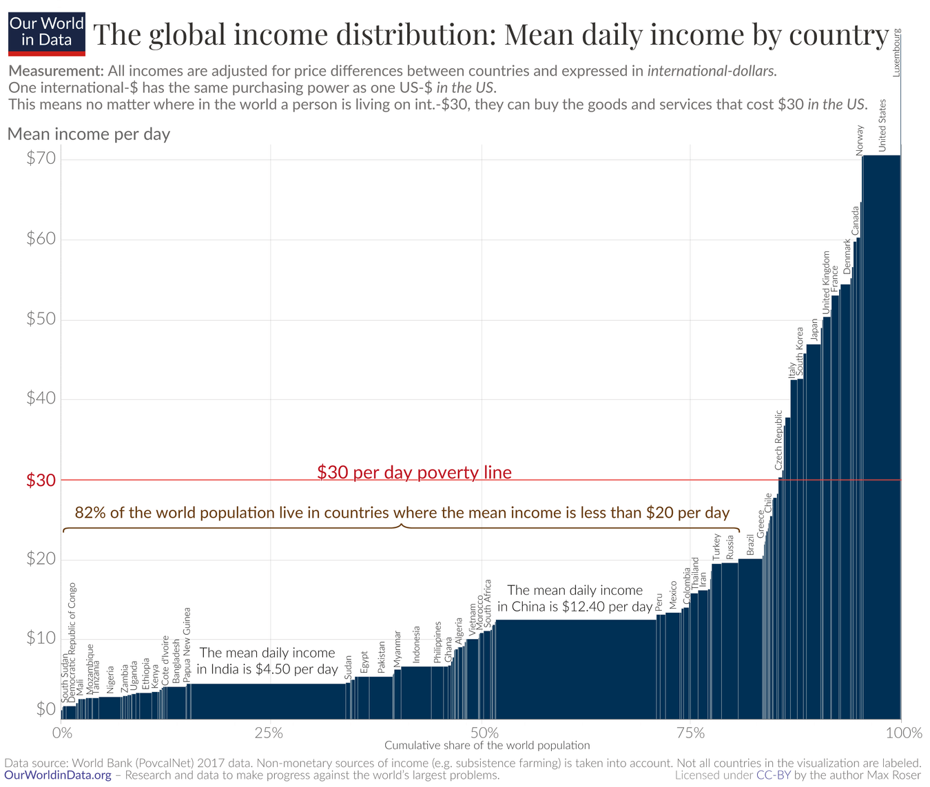
Use a Marimekko chart to compare categories across multiple measures. In the example below, the different countries are compared across daily income levels and population size, helping to visualize income distribution globally in relation to the poverty line.
These charts shine when it comes to showing how individual segments make up the whole, offering clear insights into the overall distribution within the data. This allows us to see the differences in the contributing series as well as the changes in the totals as in the chart below, where we can compare the market capitalization of 'Our brand' against that of Competitors A and B across North America, Europe, and Asia.
The chart's columns, scaled by the market size of each region, show 'Our brand' having the largest share in North America and a significant presence in Europe. In Asia, the 'Others' category dominates the market, with Competitor A being the second largest.
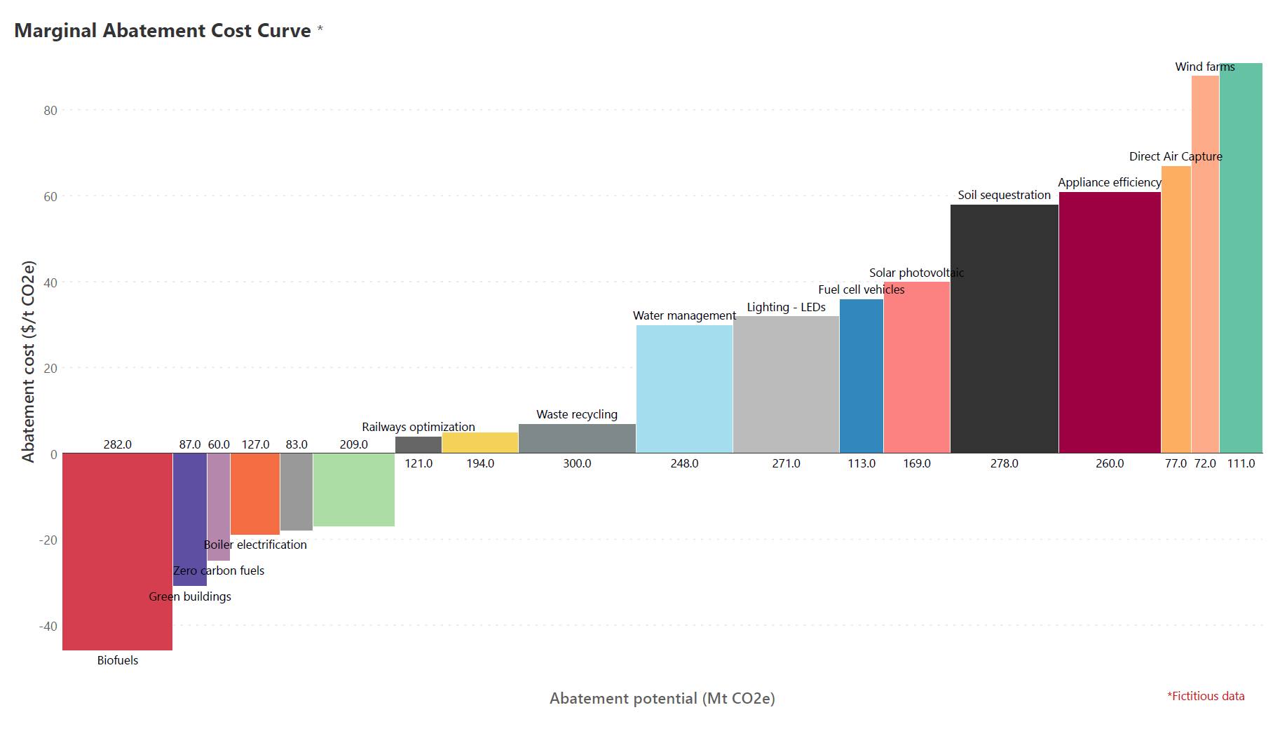
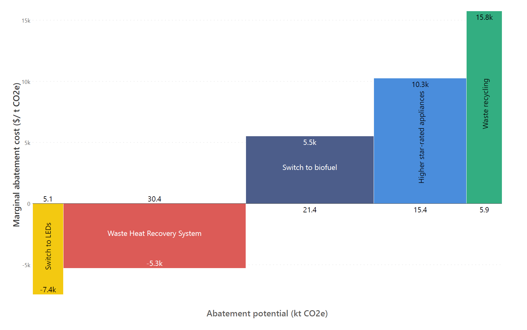
Variable width Marimekko charts can show both positive and negative values along one axis, allowing us to see gains and losses or costs and benefits in a single chart.
The chart below displays a Marginal Abatement Cost Curve, highlighting strategies with both negative and positive abatement costs along the vertical axis, indicating that some strategies may result in savings while others require investment. The horizontal axis shows the abatement potential, measuring the capacity of each strategy to reduce CO2 emissions.
Marimekko charts are also useful when showing how a group is composed of different parts. In the example below, a Marimekko chart is used to visualize how a group of survey respondents can be divided by score, allowing us to see the proportion of the group that voted for each rating score.

When displaying how different segments or customer groups are distributed across various attributes, Marimekko charts offer a clear visual representation, making it easy to grasp the market composition.
Marimekko charts are best used when both the relative size of segments and their distribution across multiple dimensions are important to understand.
For example, in the below image, the variations in color blocks demonstrate how sales are distributed among different customer segments across several regions, with the width of each column indicating the number of customers. This allows for an immediate visual comparison of market composition and size from one region to another.
While creating your Marimekko charts, consider a few best practices that can help you build clear, informative, and visually appealing charts:
Arrange categories in a Marimekko chart logically, whether by size, cost, or importance, to enhance clarity and aid in comparative analysis.
For instance, in the attached example, the bars are sorted by their abatement potential, measured in kilotonnes of CO2 equivalent, which simplifies the analysis of each strategy’s environmental impact.
In the chart, both 'Switch to LEDs' and 'Waste Heat Recovery System' show negative values, signifying cost savings, while 'Switch to biofuel', 'Higher star-rated appliances', and 'Waste recycling' have positive values, indicating implementation costs. This sorting distinctly emphasizes the economic and environmental benefits of the cost-saving strategies.
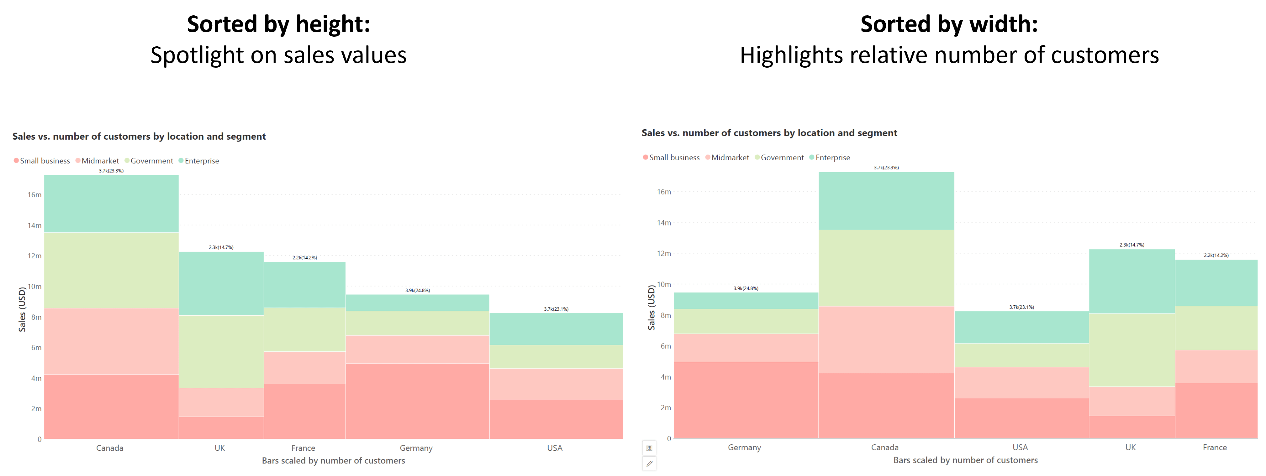
Sorting bars in a Marimekko chart can clarify data presentation and put the spotlight on different aspects of the chart.
The chart below shows sales vs. the number of customers (height and width values respectively) by location and customer segment. When sorted by height, we focus on sales values, while sorting by width emphasizes the relative number of customers. We can thus tailor our sorting according to our analysis needs.
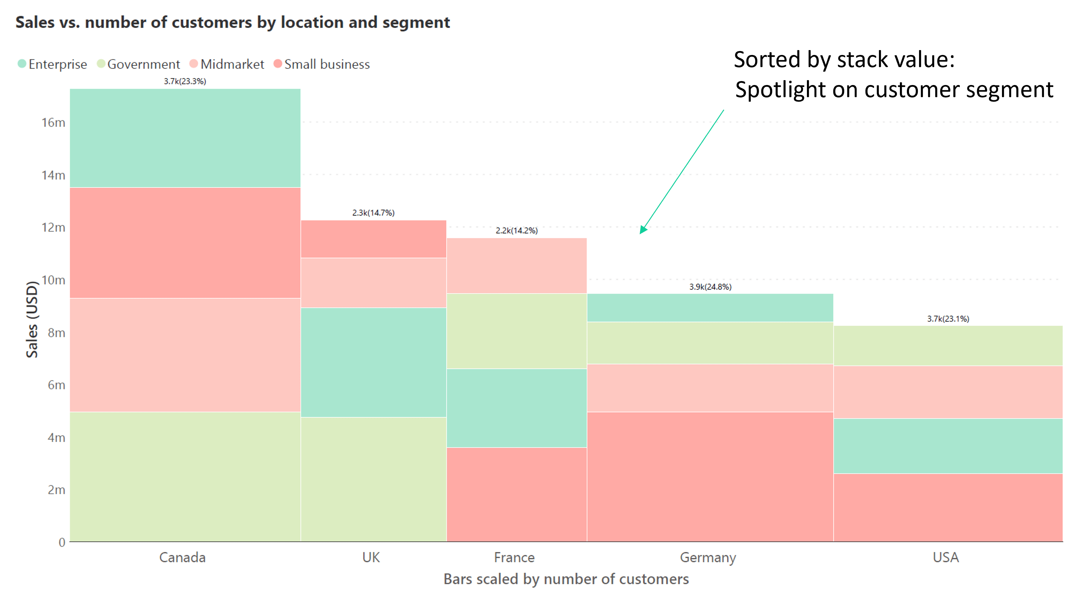
We may also choose an appropriate stacking order for our data series that reflects the message of the chart. Sorting can be done by an inherent logical order in our data – for example, by increasing the order of age class or frame, but we may also sort individual bars by stack value in a Marimekko chart, as shown below.
Here, sorting by stack value puts the spotlight on the customer segment, highlighting the sales distribution among different business types within each country.
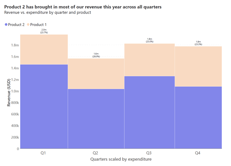
Our visual perception works better at accurately estimating heights measured from a common baseline (as with the lowest series that is placed on the axis) when compared to estimating heights measured from different baselines (as with the stacked series).
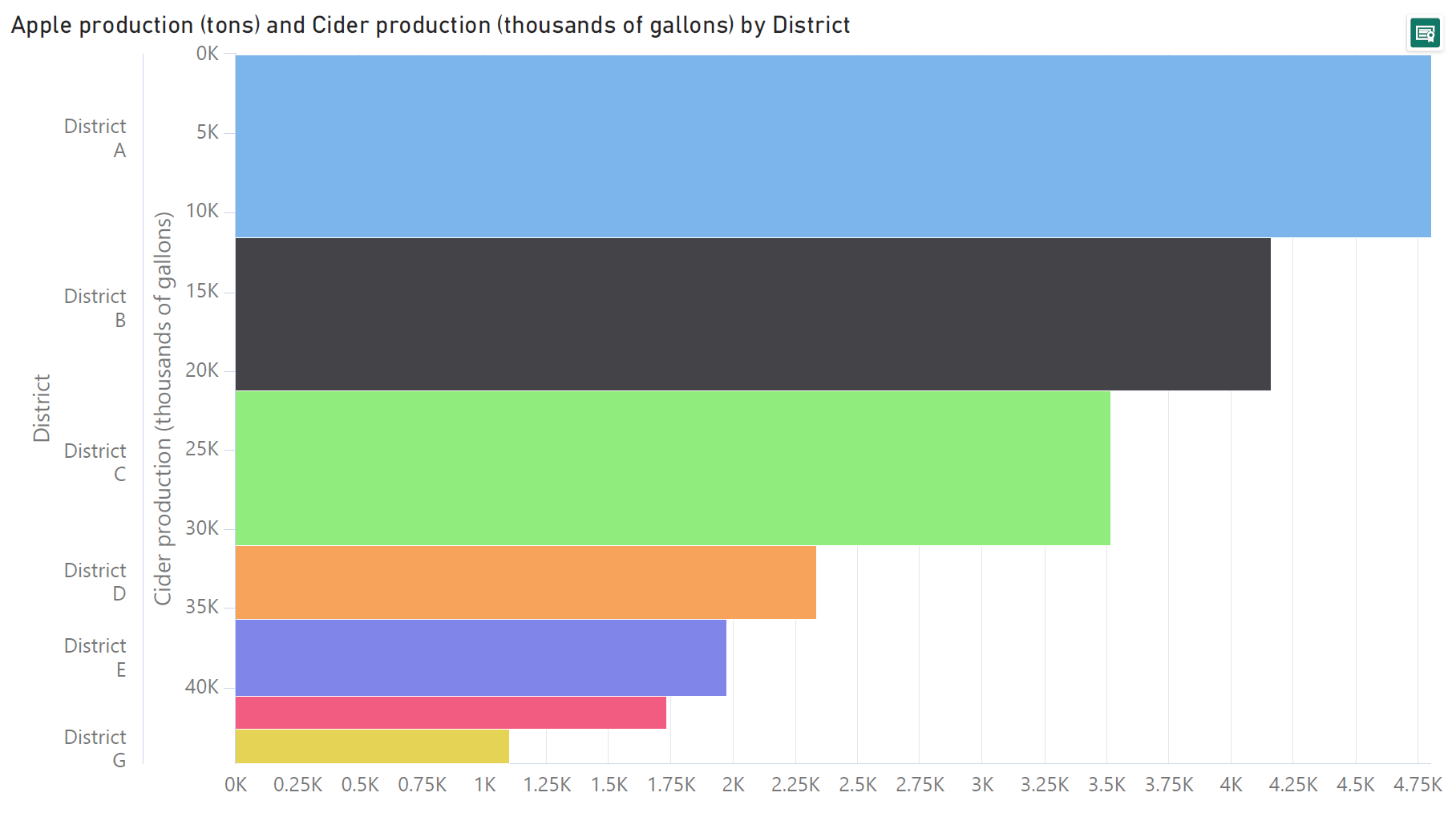
To ensure a clear understanding of the most significant series, we may place it directly on the baseline. The Marimekko chart below places the key revenue driver (Product 2) directly on the axis allowing accurate revenue comparison across quarters for this product.
Marimekko charts can be an unfamiliar chart type, and labels and annotations provide essential context to understand the chart. This approach can help highlight key data points, like market leadership or potential growth areas, ensuring that the message behind the data is immediately clear to the viewer.
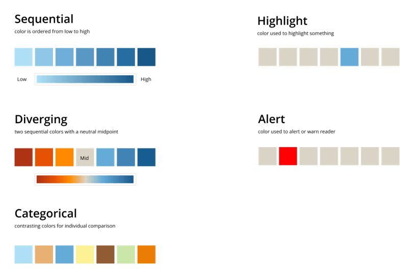
Choosing the right color palette is key to making any chart type clear and impactful. Use sequential colors to show a range from low to high values, diverging colors to highlight data that spans from a neutral midpoint out to extremes, or categorical colors for distinct comparisons.
Highlights and alerts in specific colors can draw the viewer’s attention to key information or warnings.
In this chapter, we address when Marimekko charts fall short. Marimekko chart can challenge our perception with area-based values and hinder accurate comparisons of non-adjacent categories. We'll explore these challenges to help you recognize situations where Marimekko charts might not be the best choice for your data visualization needs.
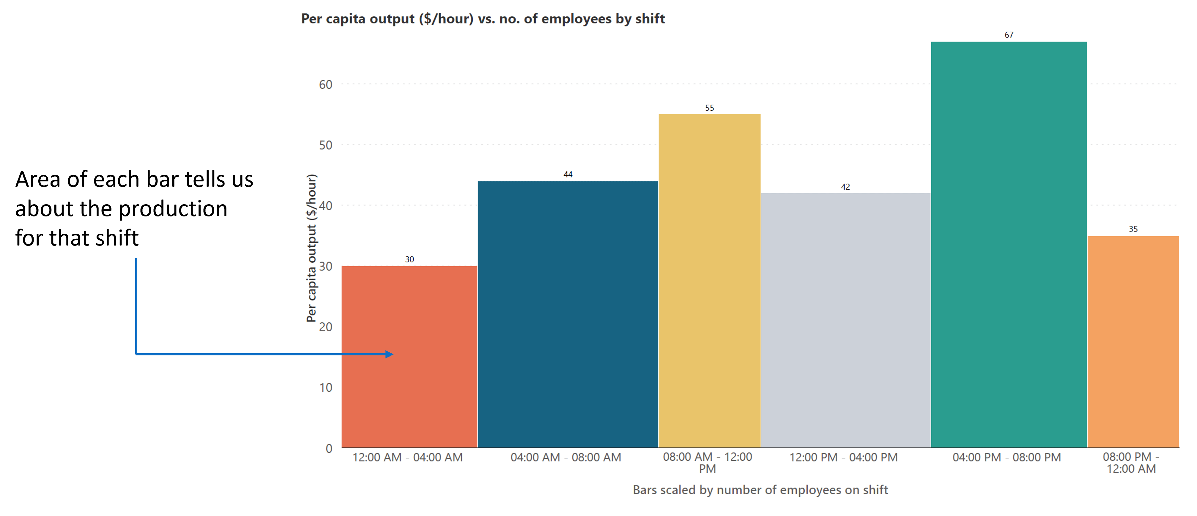
Some Marimekko charts rely on the area of the bars to convey information. For example, the variable width Marimekko chart below shows per capita labor productivity and number of workers by shift, which means that the area of each bar tells us about the total production for that shift.
Using areas to denote values like this can be challenging to interpret accurately because of the limitation of our visual perception.
Avoid using Marimekko charts when precise value comparisons of areas are needed and use them instead for general estimates and comparisons.
Another shortfall of a Marimekko chart is that comparing segments that are not next to each other can be difficult. This is because the values are measured from different baselines since multiple series are stacked on top of each other. This can potentially lead to misinterpretation of the data.
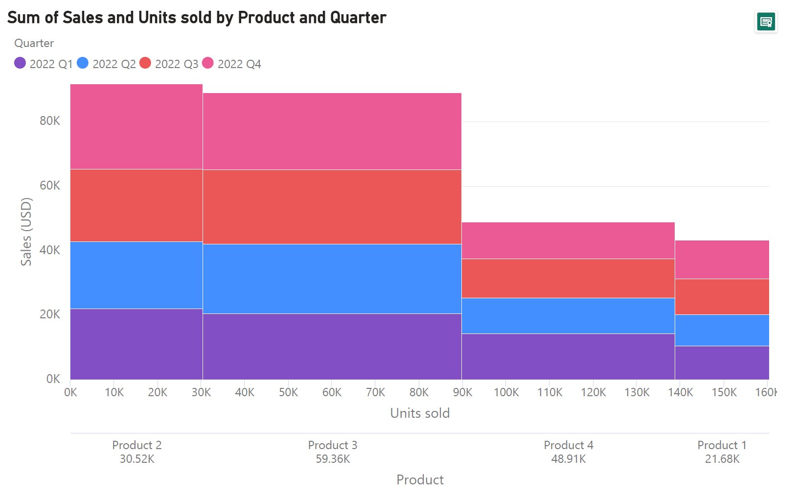
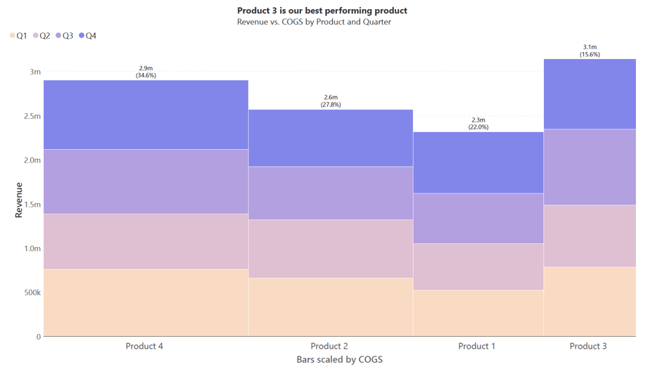
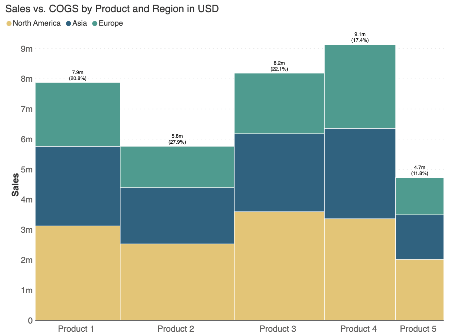
In the example below, comparing the revenue and cost of goods sold (COGS) for different products across quarters can be challenging.
The chart shows both the revenue and COGS for Products 1 through 4 over four quarters (Q1-Q4), but due to the segments being non-adjacent and based on different baselines, it can be difficult to accurately assess the performance of one product against another. This could lead to a misinterpretation of which products are truly performing better.
A third shortfall of Marimekko charts is that they can make it difficult to read any series other than the lowest one accurately, since it is the only series with a constant baseline. The stacked series instead have a changing baseline given by the cumulative total of the series below. This can skew perception and comparison.
When Marimekko charts might not suit your data visualization needs due to their complexity or the specific nuances of your dataset, consider these alternatives:
Column charts serve as an excellent alternative to Marimekko charts for depicting individual measures clearly. Though they take up more space compared to a Marimekko chart, they are sometimes the better choice because they allow us to make accurate comparisons within each of the series.
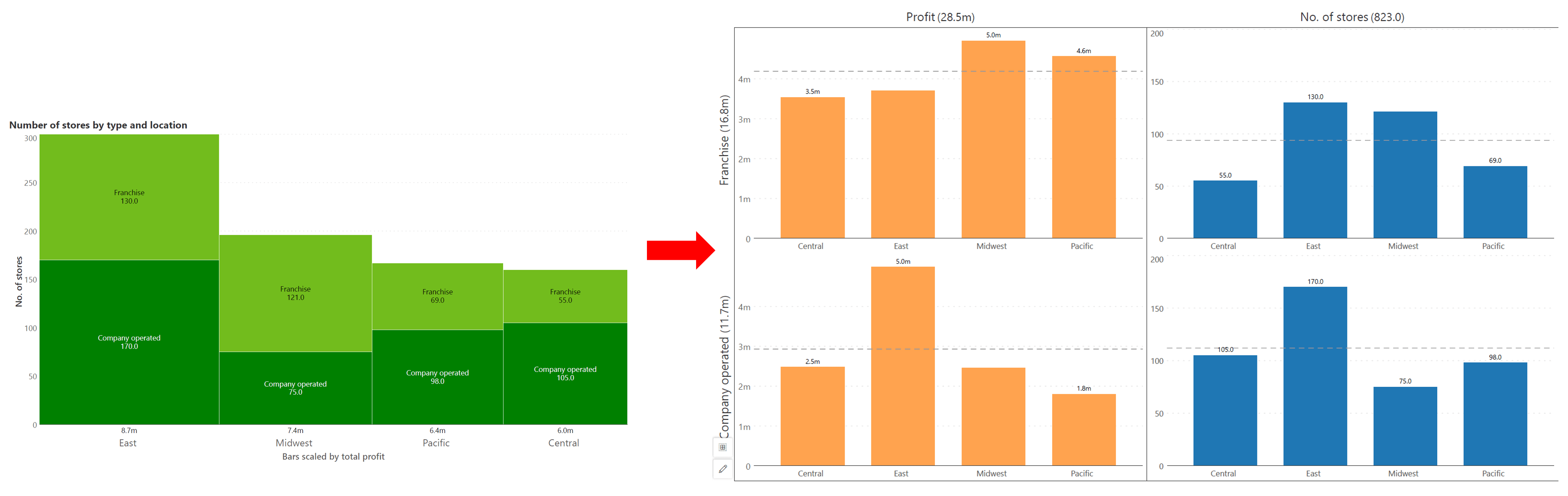
The Marimekko chart below shows number of stores and profit by store type and location, but it may be a better choice to split the data into four separate charts for a more accurate reading of the values. A column chart is a good alternative when precise, uncomplicated data comparison is of importance.
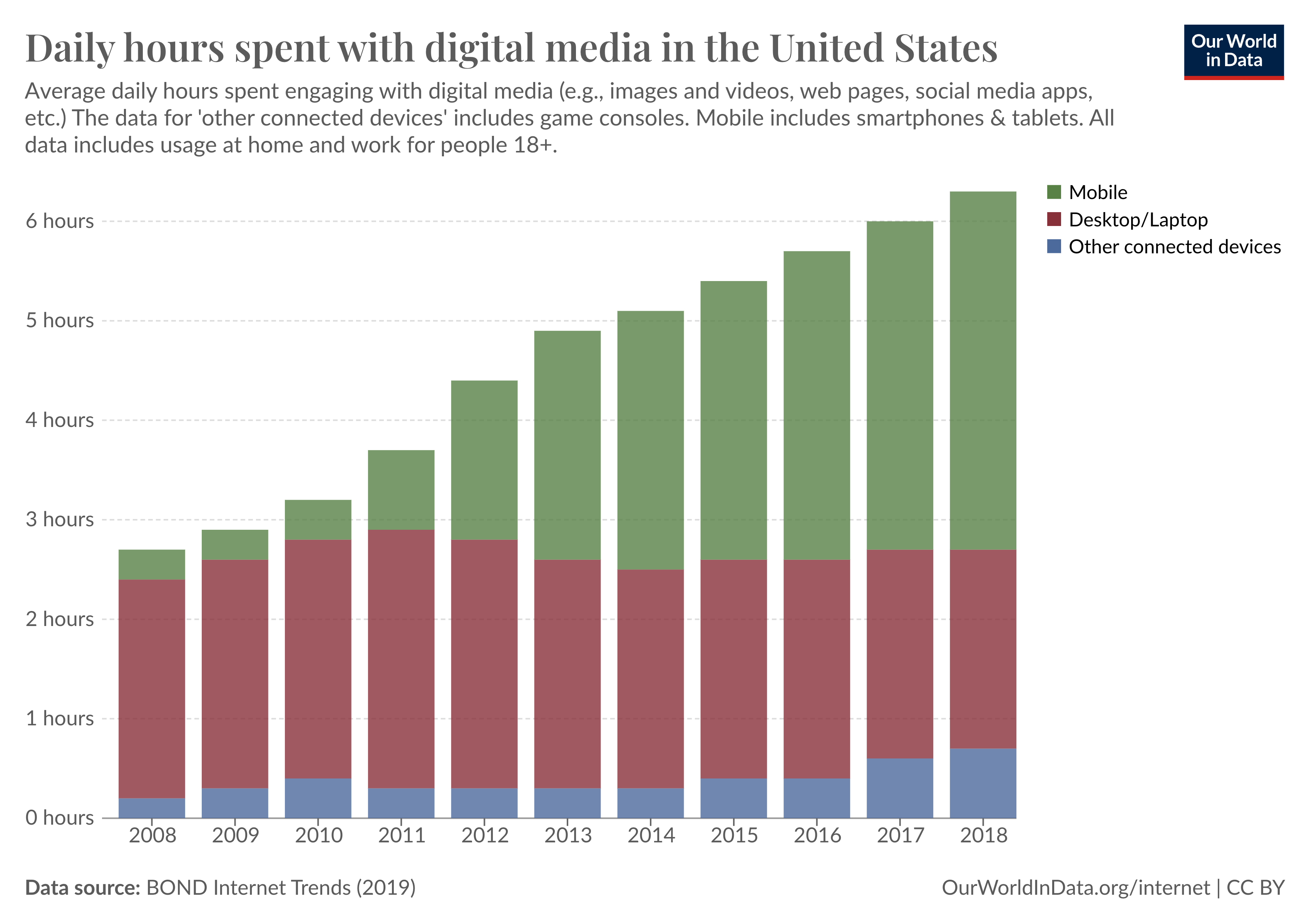
Stacked column charts are another alternative to Marimekko charts, particularly effective for displaying the contribution of each part to the whole overtime.
They allow for the comparison of individual segments, as well as the combined total within each column, offering a clear picture of how each category contributes to overall trends, as seen in the chart below showing the hours spent on digital media using different devices over the years.
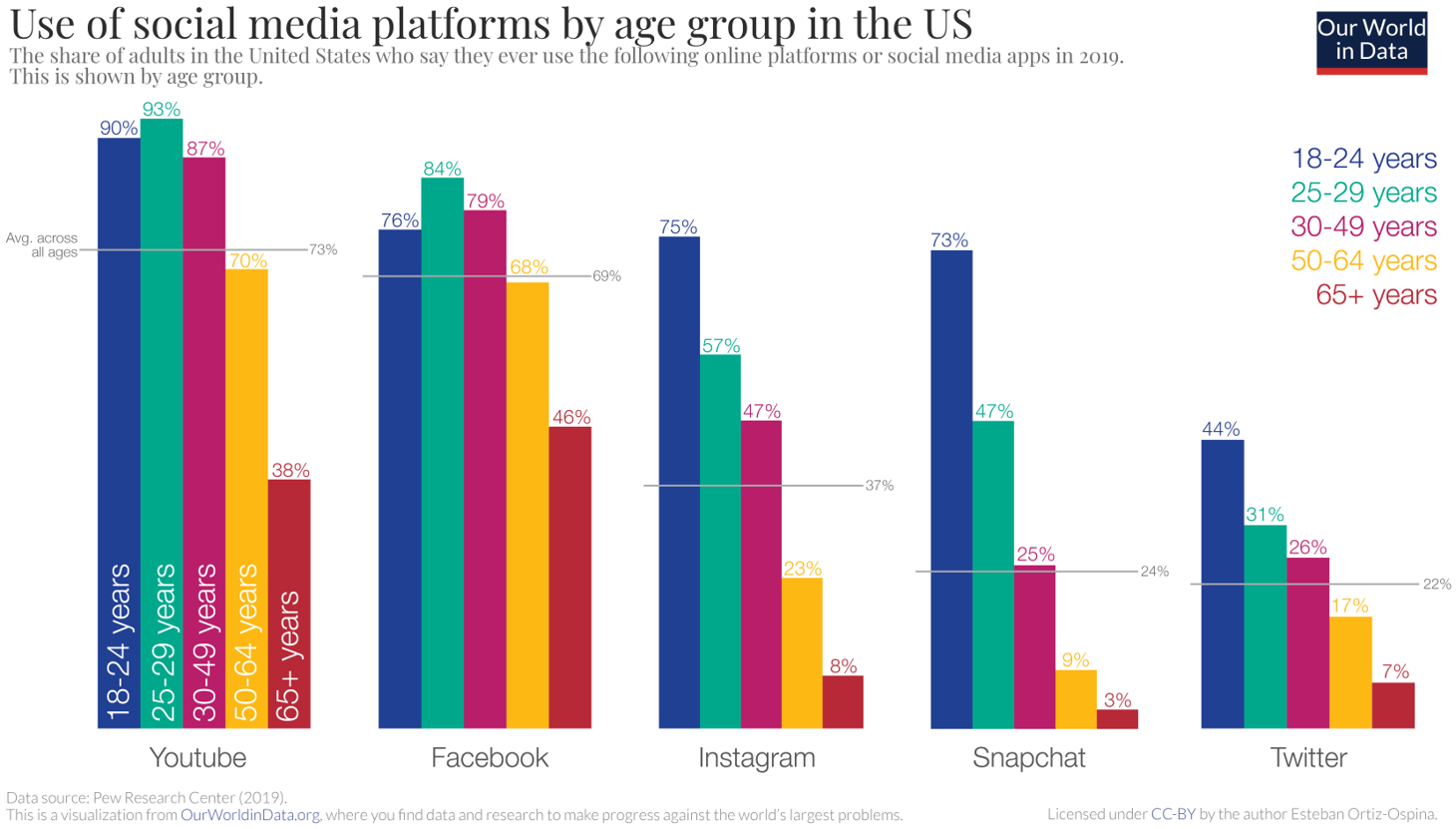
Paired column charts offer a means to directly compare categories side by side, making it an effective alternative to Marimekko charts. These charts allow for the grouping and comparison of categories across different variables, as seen below in this chart that analyzes social media platform usage across various age groups.
This type of visualization facilitates clear comparisons between related categories, providing an immediate sense of differences and similarities.
Treemaps are a solid alternative to Marimekko charts, particularly for showing hierarchical data and parts of a whole. They display data as a set of nested rectangles whose areas are proportional to their value, making it possible to see patterns and outliers at a glance.
The color-coding can also represent different categories or metrics, providing a visual summary of complex information in a compact space.
Pie charts are a classic choice for displaying parts of a whole, making them a simple yet effective alternative to Marimekko charts for certain datasets.
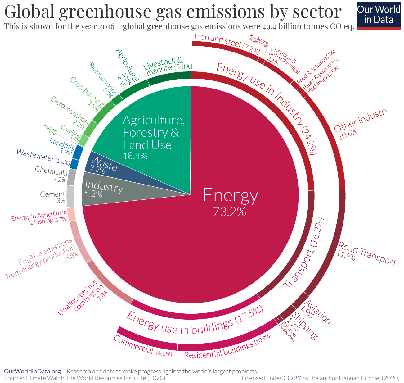
They are particularly useful for illustrating proportional contributions within a single total figure, like the example here that shows the distribution of global greenhouse gas emissions by sector. Each sector's share is easily understood, making pie charts a go-to for clear and immediate data comparison.
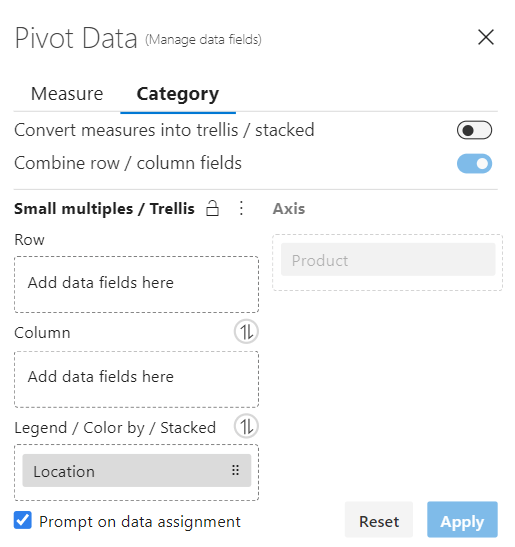
Let us learn how to build a Marimekko chart in Power BI. Download your free copy of Inforiver Analytics+ from AppSource, and then follow these three simple steps to create your Marimekko chart.
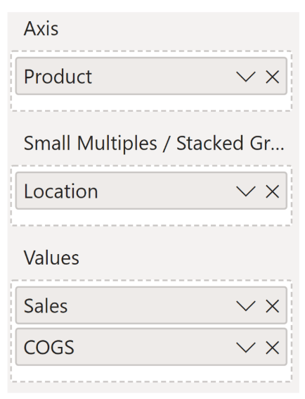
Step 1: In the data fields setup: Add one category under Axis (Products in the example below). Add one category under Small Multiples/Stacked Group (Location or Region below). Add two values under the Values field (‘Sales’ and ‘COGS' (Cost of Goods Sold) in the example below).
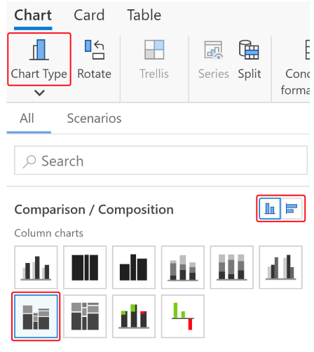
Step 2: Use the Chart Type menu to choose your desired chart orientation; select the Stacked Marimekko chart type from the options available.
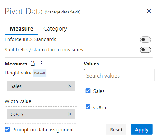
Step 3: Open the 'Pivot Data' configuration and select the 'Measure' tab to set up your data metrics:
Your Marimekko chart is ready!
Inforiver Analytics+ delivers advanced and strategic charts in Microsoft Power BI enabling you to share insightful storyboards and dashboards. The intuitive no-code user experience (UX) helps even casual users build dashboards and storyboards in minutes offering you 50+ charts, table and cards all integrated into a single visual.
Watch the webinar replay on Marimekko charts in Power BI here.
Inforiver Analytics+ offers Marimekko chart for Power BI to visualize categorical data over multiple variables on an absolute or 100% scale. These charts are also designed to support small multiples for Power BI, enabling users to explore intricate relationships and patterns within their data with ease.
 Join us for our launch webinar on EDITable, a pioneering no-code live writeback product that empowers business users to create and manage reference data, dimensions, and flat tables.