Upcoming webinar on 'Inforiver Charts : The fastest way to deliver stories in Power BI', Aug 29th , Monday, 10.30 AM CST. Register Now
Upcoming webinar on 'Inforiver Charts : The fastest way to deliver stories in Power BI', Aug 29th , Monday, 10.30 AM CST. Register Now
Key Performance Indicators (KPIs) are measurable values that help organizations track progress toward achieving their goals. They act as critical metrics to assess the success of various business activities and provide insights into areas that need improvement. By focusing on these key metrics, businesses can make informed, data-driven decisions that align with their long-term objectives.
KPIs are essentially a way to measure the performance of an organization, department, or individual against specific targets. These indicators help business leaders identify trends, track success, and understand where changes may be needed to stay on course.
KPIs provide a clear picture that enables businesses to make decisions. Here are some reasons on its importance.
Alignment of Goals: When businesses create KPIs, they set specific targets. Tracking these KPIs ensures that teams stay focused on achieving those goals and are aligned with the company’s vision.
Performance Improvement: By monitoring KPIs, organizations can quickly identify areas where they are falling short. This allows teams to take corrective actions and improve performance.
Employee Motivation: KPIs give employees a clear understanding of what is expected of them. When employees know exactly what they are working toward, they are more motivated to achieve those targets.
Example: Finance KPIs for a Software-As-A-Service (SaaS) Business
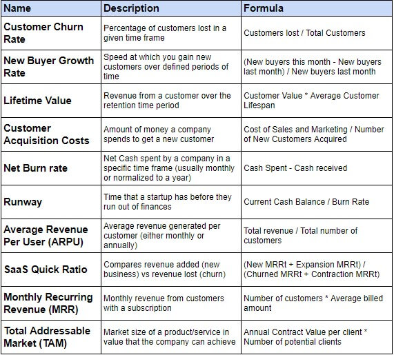
Let’s take a look at an example of Finance KPIs for a SaaS (Software as a Service) Business. In this example, you'll find various KPIs, each with its own description and calculation formula. When you examine them closely, you'll notice that each KPI serves a specific purpose, helping to track different goals. For instance, the Lifetime Value KPI can be used to track the total revenue from a customer. This can support financial decisions on how to maximize value, such as offering add-on services, and increasing the retention period.
Not all KPIs serve the same purpose, and they can be categorized into four primary types: Quantitative KPIs, Qualitative KPIs, Leading KPIs and Lagging KPIs. Each serves a different function and provides insights that help businesses track and improve their performance.
Quantitative KPIs are measurable in numbers and are based on statistical calculations. They are used to track performance in a clear, data-driven manner, allowing businesses to make decisions based on solid metrics.
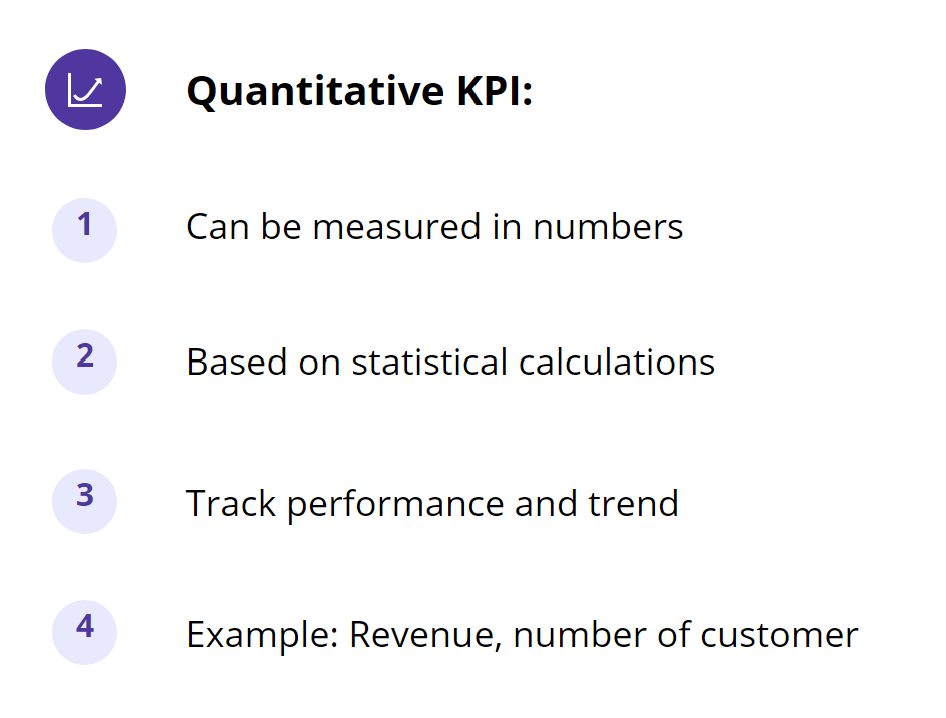
Examples of Quantitative KPIs:
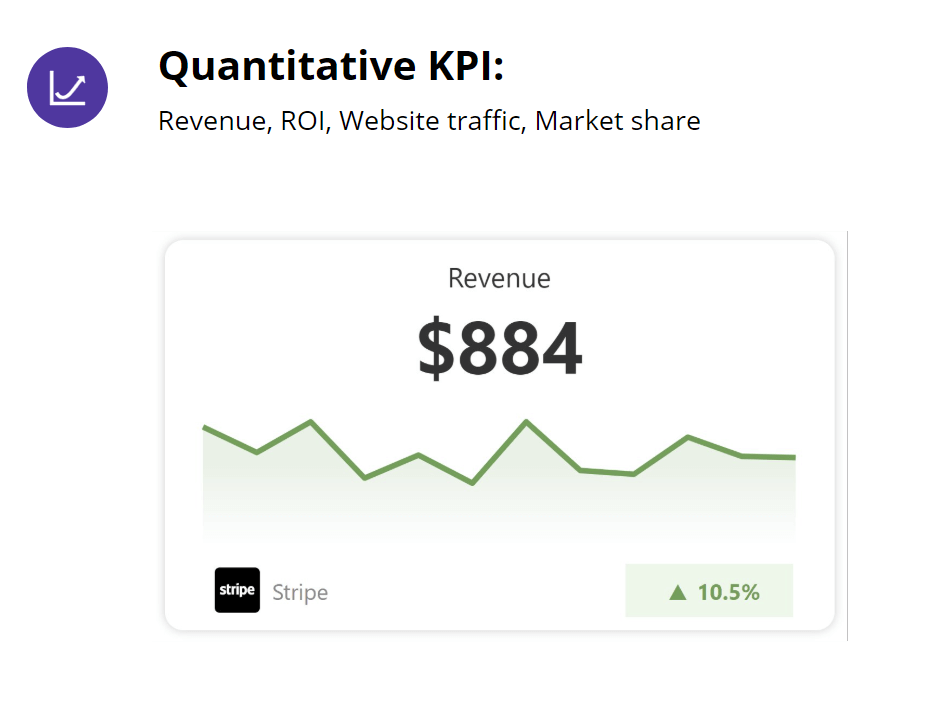
Example: For instance, a Revenue KPI show the total revenue and a month-over-month breakdown. It can be used to track trend and performance of the company.
Qualitative KPIs are more subjective in nature. They are based on feedback, reviews, and interviews, providing valuable insights into customer opinions and experiences. These KPIs help businesses understand the factors that drive customer satisfaction and loyalty.
Examples of Qualitative KPIs:
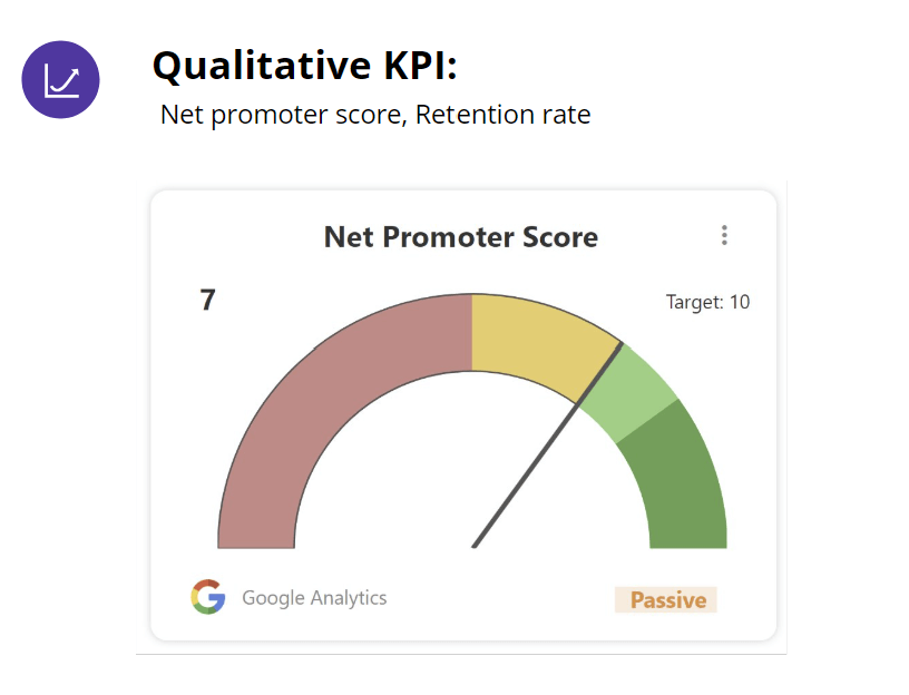
Example: An example of a Net Promoter Score (NPS) KPI might involve asking customers to rate, on a scale from 0 to 10, how likely they are to recommend the business to others. If the majority of customers rate the company 7, it indicates they are passive customers, providing valuable feedback that helps improve customer relationships.
Leading KPIs are designed to assess future performance. These metrics are available immediately and are used to forecast what might happen. They help in making informed decisions and plans based on anticipated future scenarios.
Example:
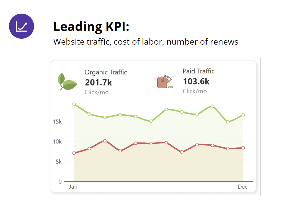
One common example of a leading KPI is the split of website traffic between organic and paid traffic. An increase in website traffic is a leading KPI because it indicates growing customer interest and engagement, which can lead to higher sales and revenue in the future.
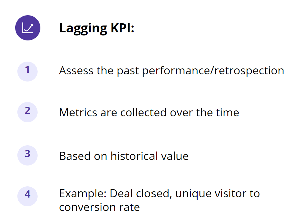
Lagging KPIs are used to assess past performance. These metrics are collected over time and are based on historical data. They help in understanding past results and taking corrective actions for future performance improvements.
Example:
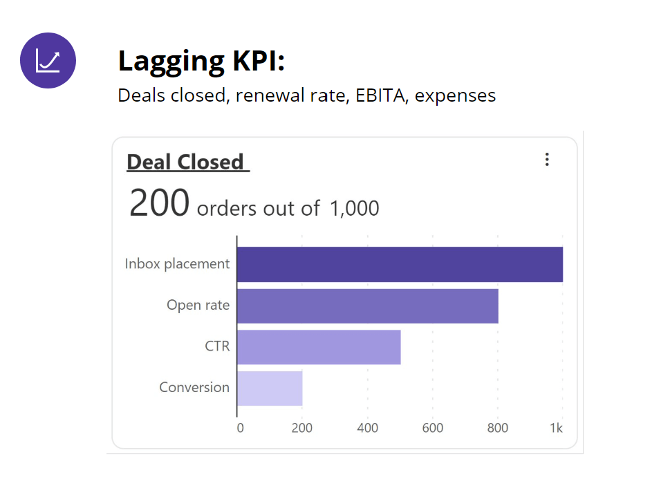
An example of a lagging KPI is the number of deals closed. If 200 orders were closed out of 1,000 total orders, this metric reflects past performance. By examining this data, an organization can understand why the conversion rate was only 20% and adjust strategies for the next round of sales efforts.
Leading and Lagging KPIs
Leading KPIs are used for forecasting and planning future outcomes based on current data. Lagging KPIs help in controlling and evaluating past performance.
By understanding the distinction between these two types of KPIs, organizations can better structure their monitoring and analysis strategies to effectively manage their operations and achieve their goals.
As part of creating the right plan, we recommend using 4-5 KPIs in any report, mixing both leading and lagging KPIs. This enables you to look at future outcomes and past performances simultaneously, giving you a holistic view of what actions need to be taken to achieve the business goal.
A well-designed KPI (Key Performance Indicator) card not only convey the metric but also provides actionable insights.
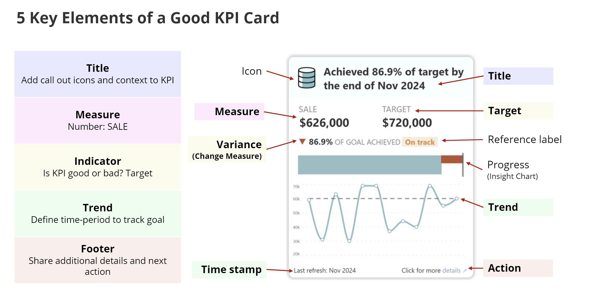
A good KPI card not only informs you but helps you to make the right decisions. To build an effective KPI, you should consider these elements. The major components are as below:
1. Title
The title describes the names of the measure. It provides clear context for what the KPI measures stands for. Title can be generic or with messaging. Use generic titles when it automatically summarizes the context for example Lifetime value, ROI, EBITA.
2. Measure
This is the most critical component in KPI. Without an actual metric you cannot track a KPI, which is where the value of the KPI is communicated to stakeholders.
3. Target
The target represents the benchmark or goal that the measure is compared against. It provides a point of reference for performance evaluation.
4. Indicator
Another important KPI component is Indicator. It helps determine whether a KPI is positive or negative impact. Variance leads to taking corrective action item. Variance shows the difference between the actual measure and the target, highlighting progress or gaps in performance. This helps stakeholders quickly interpret whether the KPI is on track or requires attention.
5. Trend
KPIs cannot be defined without a specific period. This time-period is used to track the KPI performance over a period. KPIs can be tracked over a period or at a specific point of time.
Effective data visualization requires tailoring information to different user groups based on their roles and decision-making needs. A well-structured KPI (Key Performance Indicator) card should serve users at varying organizational levels by presenting data in an appropriate format—aggregated for executives and detailed for managers.
In an illustration shared by Helen Wall on LinkedIn, she highlights a three-tiered data model for KPI cards, designed to cater to the distinct analytical needs of CEOs, CFOs, and Product managers
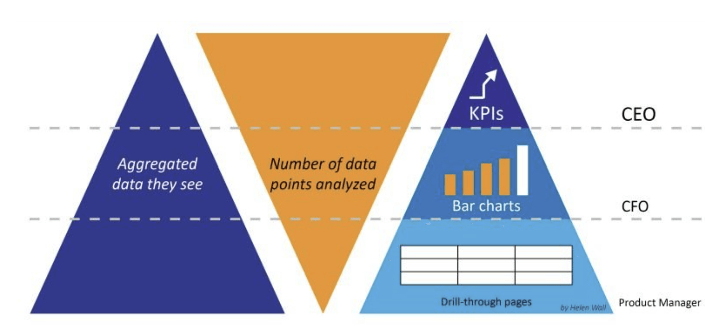
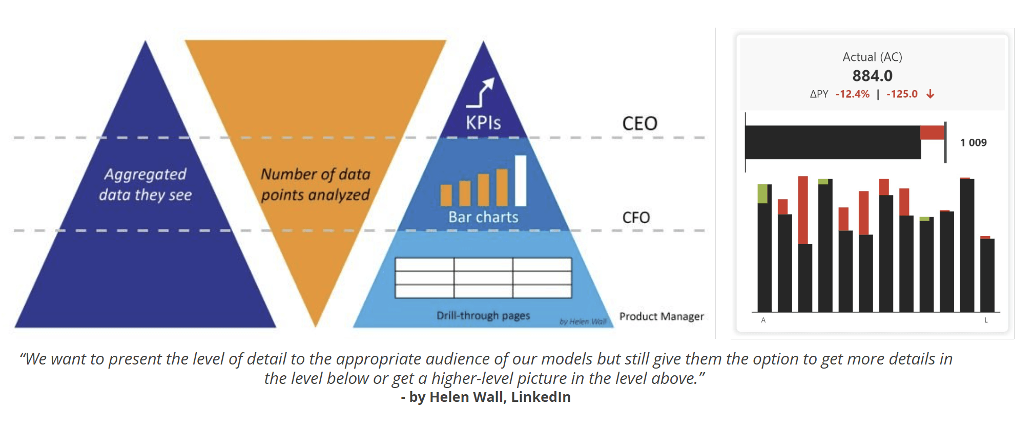
KPI cards designed using this model include the following structural components:
This structured approach to KPI card design ensures the needs of various user groups are met effectively. By incorporating aggregated values, progress insights, and granular details, the card delivers tailored insights for executives, financial analysts, and operational managers alike.
Inforiver Analytics plus is the only KPI card available in the market which offers this 3-level structure KPI without any coding.
Understanding the different types of KPI card designs is essential to create visually appealing and functional reports. Each design serves a unique purpose, depending on the context and the type of analysis required. Here are some common KPI card designs:
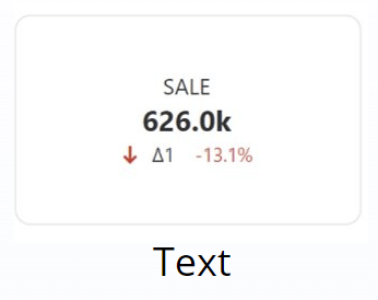
This is the simplest type of KPI card, featuring:
Example: A card displaying total revenue with an arrow indicating a 13.1% decrease.
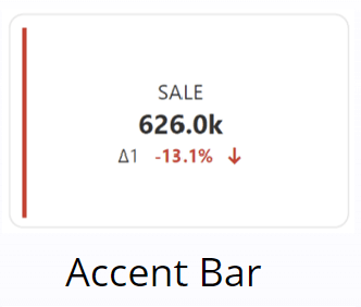
Accent bars emphasize trends or directional changes.
Example: A KPI card showing monthly sales with a colored bar indicating growth or decline.
Learn more about Building Effective KPI Cards, Common Mistakes to Avoid, and step-by-step guidance on creating and managing KPI Cards in Power BI with Inforiver Analytics Plus in our ebook.
In summary, KPI cards are an essential tool for displaying key performance indicators in a visually concise and informative manner, offering users quick insights into business performance. By leveraging features such as target comparisons, variance indicators, small multiples, and trend tracking, KPI cards provide a powerful way to monitor progress and assess performance across different metrics and time periods.
However, to ensure the effectiveness of KPI cards, it's crucial to customize and refine their design based on the specific needs of your business and data. From adding conditional formatting and reference labels to utilizing templates for faster setup, careful attention to detail in the design process can significantly enhance the clarity and impact of KPI visualizations.
With the flexibility and high performance of Inforiver Analytics in Power BI, users can build dynamic and insightful KPI dashboards that drive actionable decision-making and improve overall data analysis. Explore the full potential of KPI cards and take your reporting to the next level today with Inforiver Analytics Plus.
Inforiver helps enterprises consolidate planning, reporting & analytics on a single platform (Power BI). The no-code, self-service award-winning platform has been recognized as the industry’s best and is adopted by many Fortune 100 firms.
Inforiver is a product of Lumel, the #1 Power BI AppSource Partner. The firm serves over 3,000 customers worldwide through its portfolio of products offered under the brands Inforiver, EDITable, ValQ, and xViz.