
Upcoming webinar on 'Inforiver Charts : The fastest way to deliver stories in Power BI', Aug 29th , Monday, 10.30 AM CST. Register Now
Upcoming webinar on 'Inforiver Charts : The fastest way to deliver stories in Power BI', Aug 29th , Monday, 10.30 AM CST. Register Now
Waterfall charts are a great choice for visualizing sales data.
Take for example, a simple column chart breaks down sales by quarters (or regions or products).
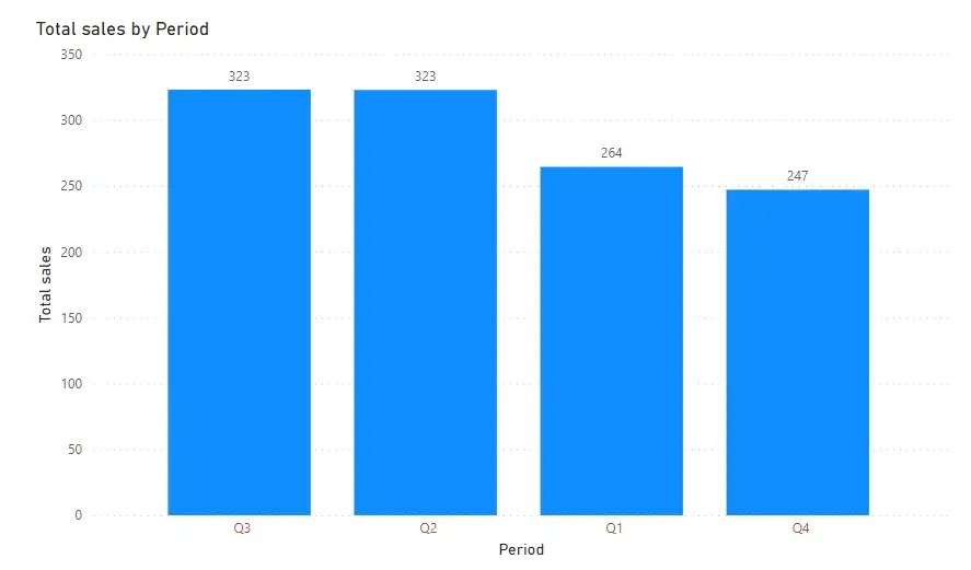
When you map the same data to a waterfall chart, you will realize that the waterfall chart gives you something extra. It not only highlights contributions from the different quarters, but also overall sales for the entire year.
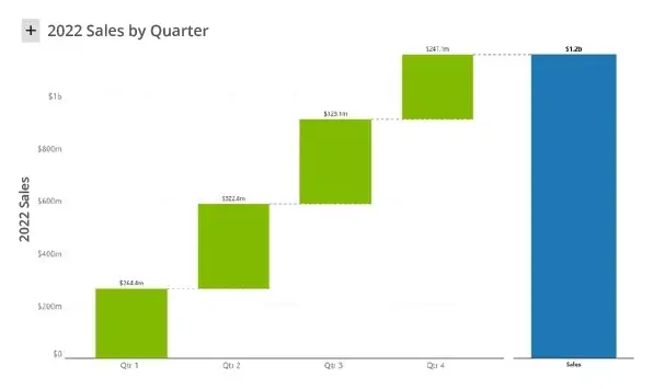
Waterfall charts help you track values in a cumulative manner. For example, you can infer that revenue in the first half of the year (Q1+Q2) is about 600M.
Waterfall charts can do a lot more for sales analysis. Let us explore some of them in detail.
***
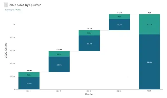
1. Highlight sales contribution from multiple categories
Just as the column chart has a stacked column counterpart, a waterfall chart can be built with stacked columns. In this example below, sales from each quarter (and the total) is broken down into two categories (Beverages and Water).
2. Highlight sales variances
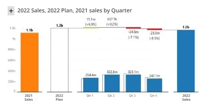
Consider a scenario where a firm achieved revenue of 1.1B in 2021, and 1.2B in 2022 as shown below. The waterfall chart can help you analyse which quarters in 2022 contributed to the increase the most in 2022.
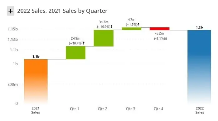
In the example above, Q1 2022 registered a 10.4% increase (or an increase of 24.9M) over Q1 2021. But the absolute values of Q1 2021 sales or Q2 2021 sales are not plotted here. We can observe that most of the increase in revenue came from the firm’s performance in the first two quarters, and the last quarter witnessed a dip in YoY performance.
In other words, we are tracking variances for each quarter compared to the prior year – and hence this visual is also known as the variance waterfall chart. Note that instead of 2021 Sales, you may also use any other benchmark like Forecast 2022, and the chart will tell you which quarters (regions, or products) experienced the most deviation.
3. Track sales performance (and variance) against multiple benchmarks
Let’s assume that we have three measures – sales, plan and prior year sales. The waterfall chart below explains sales deviations from the plan by quarter. It also plots prior year sales (in orange) as a reference.
In addition, unlike the chart shown earlier in #2, the visual also shows sales and plan for each quarter (while the previous chart showed only variances).
4. Breakdown changes over multiple periods
In the above two examples, we showed how a waterfall chart can explain variances / deviations between a set of initial and final value.
You can stretch the waterfall chart further to include several interim observations. In this example below, we are plotting increase/decrease in sales across multiple categories between any two quarters.
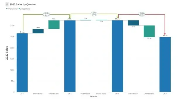
Note that ideally variances are highlighted in green and red. However, it would not work in this visual as it would be harder to distinguish US and International values (as they would both be green between Q1 and Q2). As a result, it is a better to use a consistent color for each region, irrespective of whether they register an increase or decrease.
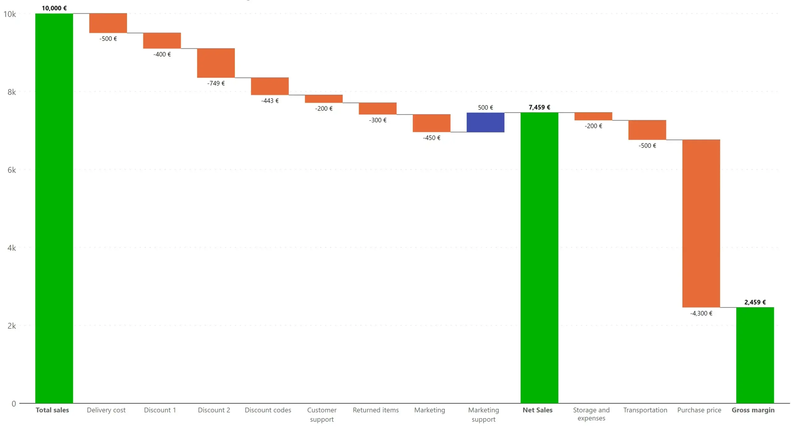
5. Track relationship between sales and margins
You can easily visualize a simple sales and margin equation using a waterfall chart. The chart below shows the relationship between sales and multiple expenses leading to the final profit. By analyzing this data, you can quickly identify and address any non-essential or excess costs in the sales process.
6. Forecast current period performance
Let’s assume we are in September, and we would like to visualize projected sales performance for the full year – including actuals from Jan to Aug, and forecast from Sep to Dec. This can be done easily with waterfall charts.
The solid, black-filled bars indicate actuals, while the bars with stripes indicate projections. The final total at the right stacks the totals for both.
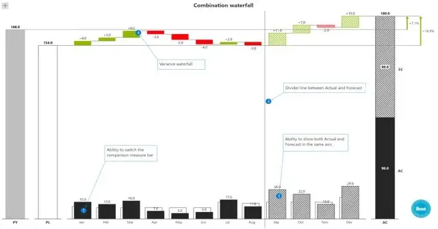
You can also observe actual variances (for elapsed period Jan to Aug), and projected variances for Sep to Dec in red and green.
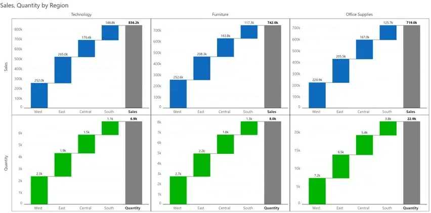
7. Track performance across categories using small multiple
Waterfall charts get interesting when we start using them in small multiples.
In this example below, the chart visualizes sales (blue) and quantity (green) across three segments (Technology, Furniture and Office supplies) by region.
***
Next time when you try to visualize sales data, go beyond the traditional bar and column charts and see whether waterfall charts suit your needs.
Get your free edition of Inforiver charts today and try our waterfall charts on your own.

Inforiver helps enterprises consolidate planning, reporting & analytics on a single platform (Power BI). The no-code, self-service award-winning platform has been recognized as the industry’s best and is adopted by many Fortune 100 firms.
Inforiver is a product of Lumel, the #1 Power BI AppSource Partner. The firm serves over 3,000 customers worldwide through its portfolio of products offered under the brands Inforiver, EDITable, ValQ, and xViz.