
Upcoming webinar on 'Inforiver Charts : The fastest way to deliver stories in Power BI', Aug 29th , Monday, 10.30 AM CST. Register Now
Upcoming webinar on 'Inforiver Charts : The fastest way to deliver stories in Power BI', Aug 29th , Monday, 10.30 AM CST. Register Now
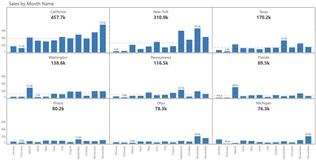
Small multiple charts, also referred to as trellis or lattice charts, are a useful tool for analyzing and comparing multiple sets of observations simultaneously. Here is a snapshot of a sample small multiple below.
Given the presence of multiple charts in a small multiple, a critical question arises: How do we scale the charts? Let us look at a few options.
1. Scale charts uniformly
Visualization best practices dictate that we maintain uniform scaling across all charts (as shown above). This improves readability by making it easier to compare trends or distribution across charts.
However, this approach works only when there are fewer observations, or when the observations fall within a specific range. In the example above, California has consistently higher values than Ohio or Michigan, because of which it is harder to interpret the charts at the bottom.
2. Scale charts individually
In situations where uniform scaling does not work, it is better to scale the charts individually. The same chart shown above is reproduced below with individual scaling. You can notice that the readability is much better here for Ohio and Michigan.
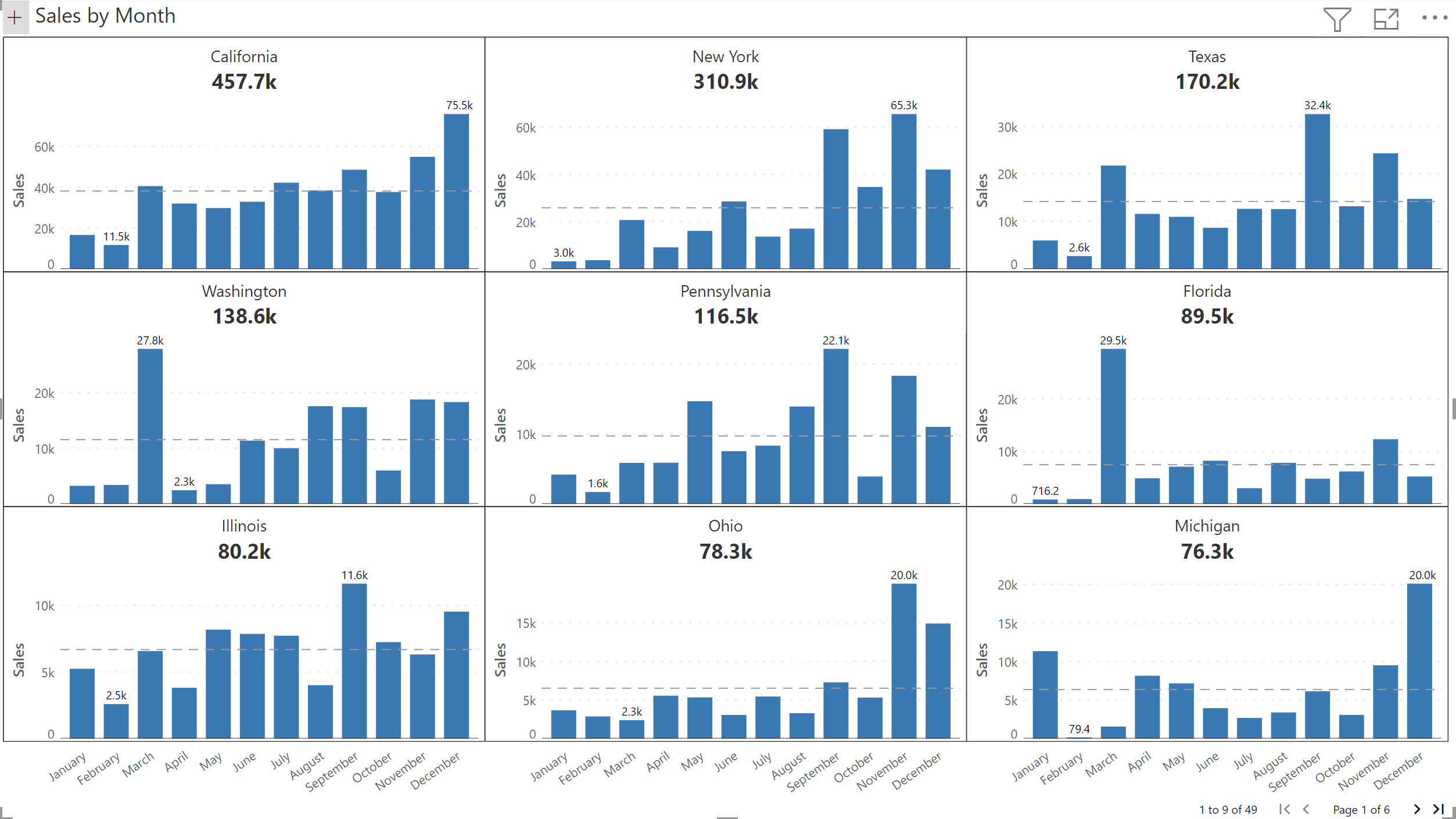
A potential issue with individual scaling is that it can lead to misleading comparisons between charts due to varying axis scales. For example, in the first row, the max value for California and Texas are of similar height though there is a 2x difference between them.
To overcome this, let us look at another axis scaling technique.
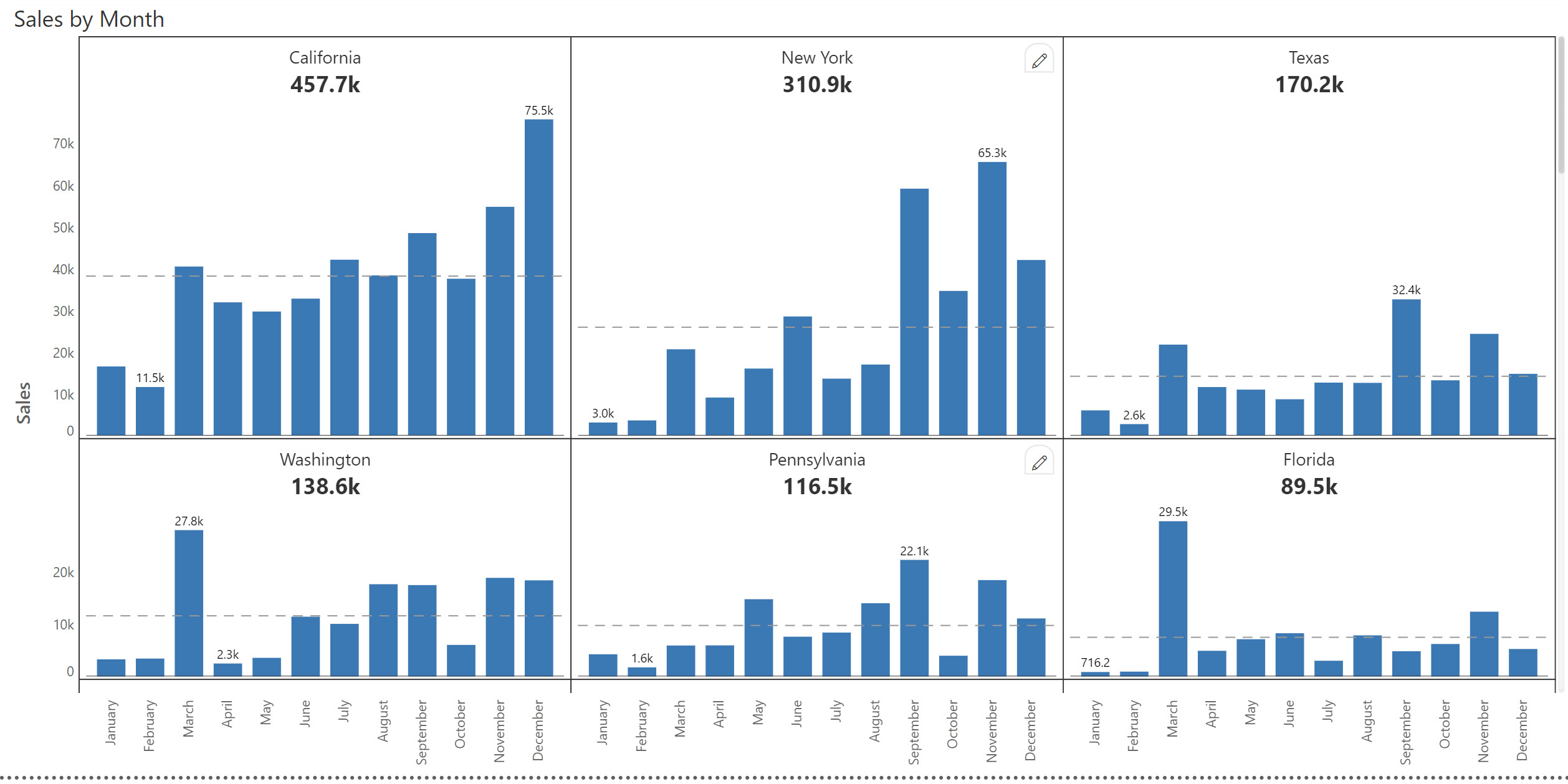
3. Row-level scaling
Row-level scaling combines the best of uniform & individual scaling methods. In this approach, we define a common scale for each row in the small multiple. This ensures that charts next to each other horizontally do not cause misinterpretations, while ensuring that the smaller charts are easily readable.
Which scaling method should I use?
Ultimately, the type of scaling used depends on the number of observations, value ranges and what you think is the best representation of your data for your users.
Inforiver supports all three types of scaling when it comes to small multiples. Download Inforiver Analytics+ for free today to try all the scaling options listed above.
*Inforiver Charts has been renamed to Inforiver Analytics+, and today it is a 3-in-1 visual for dashboards and storyboards that offers 50+ charts, cards, and tables.