
Upcoming webinar on 'Inforiver Charts : The fastest way to deliver stories in Power BI', Aug 29th , Monday, 10.30 AM CST. Register Now
Upcoming webinar on 'Inforiver Charts : The fastest way to deliver stories in Power BI', Aug 29th , Monday, 10.30 AM CST. Register Now
This eBook ‘100 Charts Explained: Choosing the Right Visual for Your Data’ brings together a wide range of visualization options used in analysis, reporting, and storytelling. It covers familiar forms such as line charts, bar charts, and pie charts, as well as more specialized visuals including waterfalls, funnels, Marimekko, and statistical plots. Alongside each chart, you will find a concise explanation of its purpose, what it highlights best, and when it is most effective.
A multi-axis line & area chart allows multiple measures with different scales to be visualized in a single view. By combining lines and shaded areas across separate axes, it helps reveal relationships between interdependent metrics.
This chart is useful when analyzing complex systems where multiple variables influence one another and need to be observed simultaneously without losing scale accuracy.

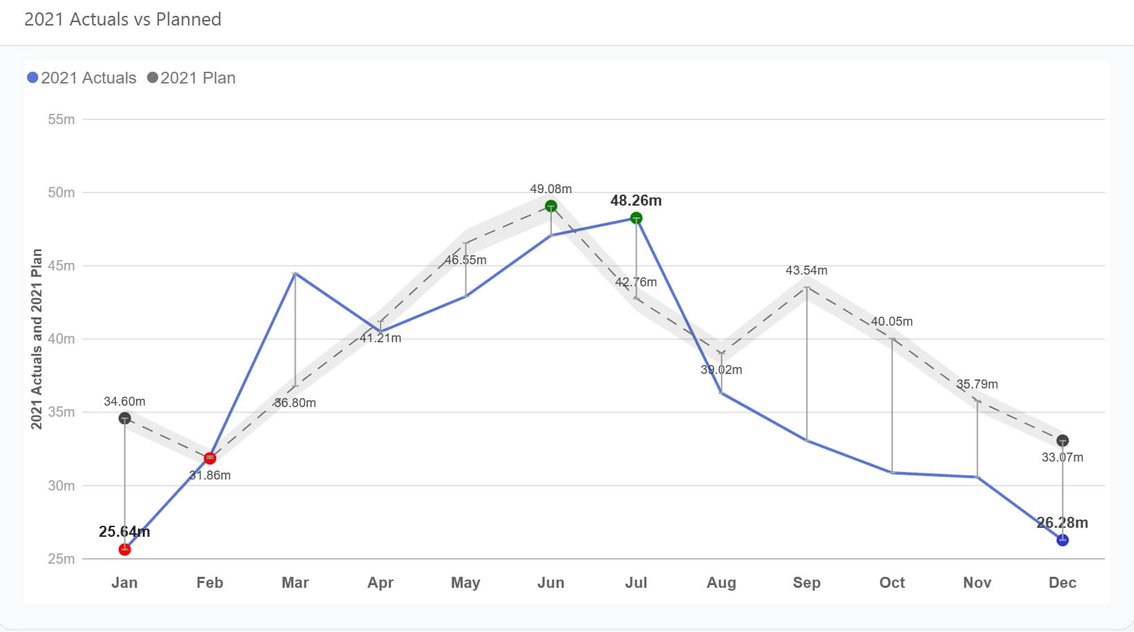
A line chart is designed to show how values evolve over a continuous period. It emphasizes direction, rate of change, and overall trends rather than individual data points.
Line charts are ideal for monitoring performance over time, identifying seasonality, and comparing actuals against targets or plans when time is a key dimension.
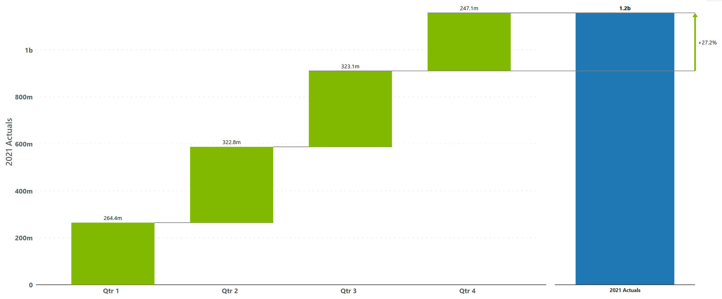
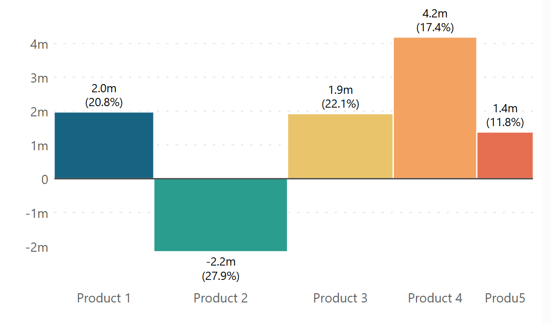
A simple waterfall chart visualizes how incremental positive and negative values contribute to a final total. Each step explains part of the overall change.
This chart works best when the goal is to explain why a number changed rather than just how much it changed, such as in financial or variance analysis.
A pyramid chart displays values in a top-down structure, commonly used to represent stages of attrition or hierarchy. Each level narrows as values decrease.
This chart is effective for illustrating funnels, conversion stages, or stepwise reduction in a process.

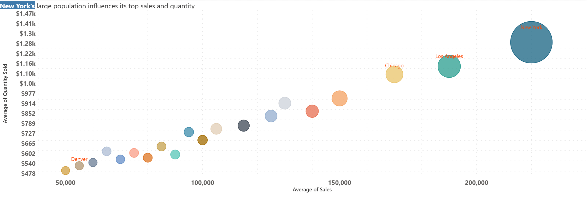
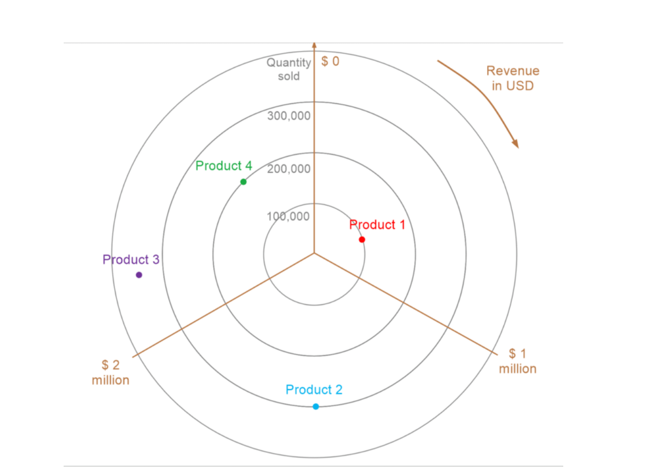
A bubble chart extends a scatter plot by adding size as a third variable. Position shows the relationship between two measures, while bubble size encodes an additional dimension such as volume or impact.
Bubble charts are effective for comparative analysis when understanding correlation, clustering, or outliers across three variables is important.
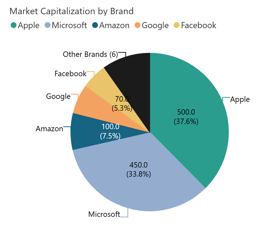
A pie chart shows how individual categories contribute to a whole. Each slice represents a proportion of the total.
This chart is most effective when there are only a few categories and the objective is to communicate composition rather than precise comparison.
A network graph chart visualizes connections between entities using nodes and links. The structure highlights relationships, flow paths, and interdependencies.
This chart is useful for analyzing systems such as logistics networks, organizational structures, or interconnected processes where relationships are as important as values.

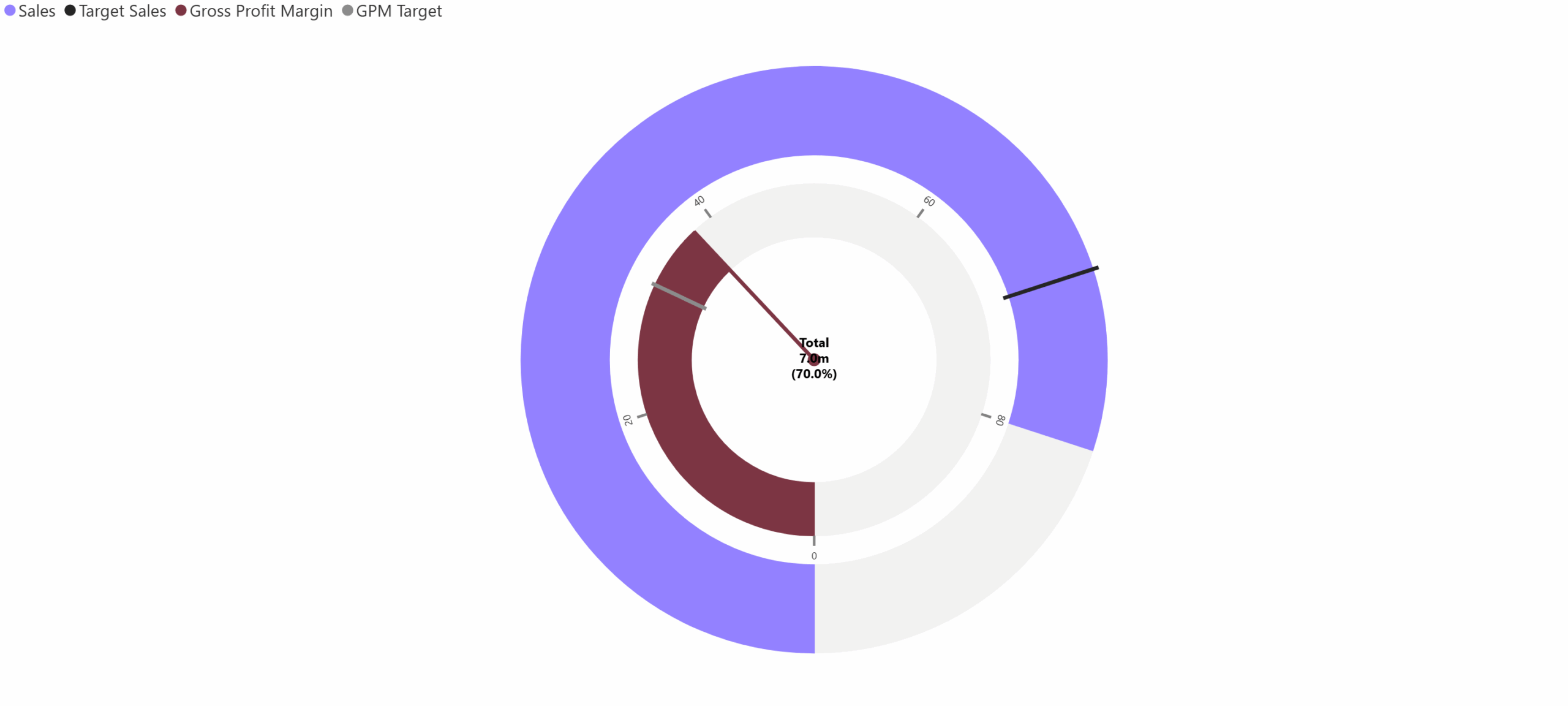
This chart uses concentric circular arcs to compare multiple related KPIs or actuals against targets on a shared angular scale.
It is best applied when multiple performance indicators need to be monitored together while preserving individual benchmarks.
A polar area chart arranges categories around a circular axis, using area (radius) to represent magnitude. Unlike radar charts, values are not connected.
It is useful for emphasizing dominant categories and relative magnitude in a visually distinctive radial layout.
This combined chart overlays a line chart on top of box plots to show both statistical distribution and trend movement together. Box plots summarize spread, median, and variability, while the line adds directional insight.
It is particularly useful when performance trends need to be evaluated alongside consistency, volatility, or risk.
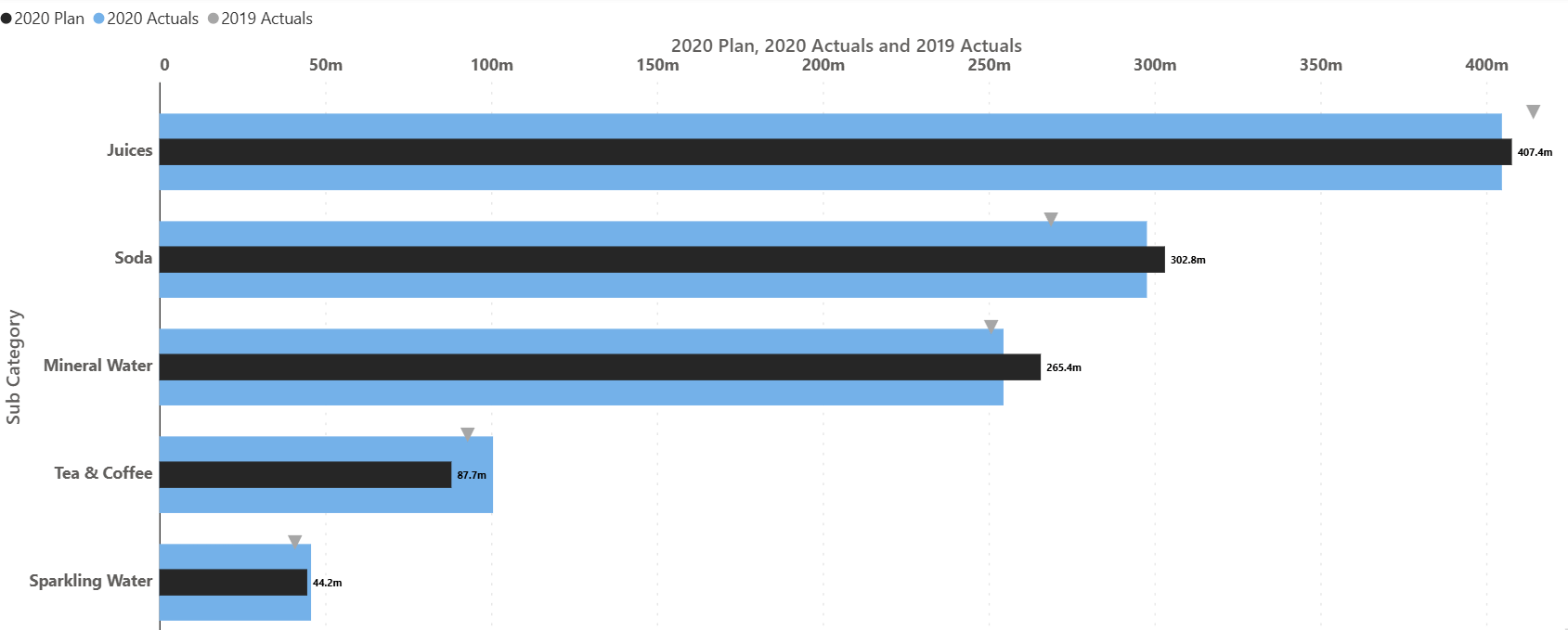
A comparative bullet chart provides a compact way to compare actual performance against targets and benchmarks. It replaces decorative gauges with a precise, information-dense structure.
This chart is commonly used in dashboards and performance reviews where clarity, scale, and context matter more than visual embellishment.
A vertical Marimekko chart encodes total magnitude through bar width and composition through stacked height. This allows comparison of both size and structure at the same time.
It is particularly effective for portfolio analysis, market share studies, and scenarios where categories differ significantly in scale.
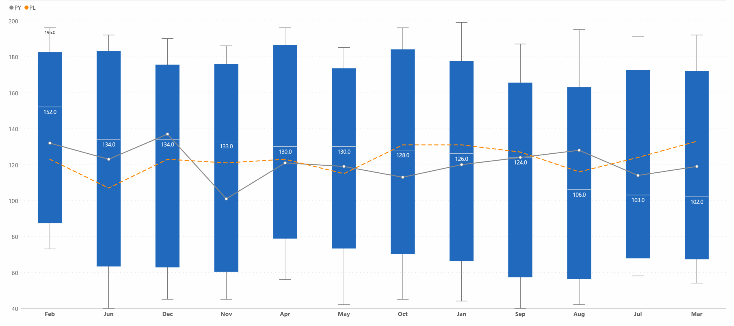
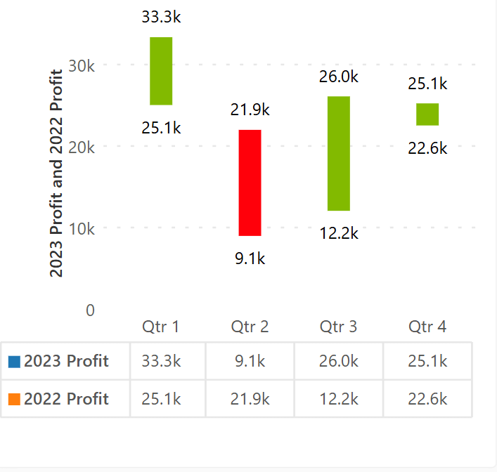
A range bar chart displays the difference between a start and end value using a single bar. The length and direction immediately communicate the magnitude of change.
It is well suited for before–after comparisons, period-over-period analysis, or highlighting improvement and decline across categories.
Each chart type discussed above represents a broader chart family, with multiple variations designed to address different analytical questions, data structures, and levels of complexity. Understanding when and why to use a particular chart is far more valuable than simply knowing how to create one. The right visual helps reduce cognitive load, guides interpretation, and enables clearer decision-making.
For a deeper exploration of chart variations, selection guidance, and practical use cases across all chart families, you can download and continue learning through the full eBook, which expands on each chart type in detail.
If you’re looking to see how these charts are applied in real-world scenarios, the gallery page also includes industry-level examples across domains such as finance, sales, operations, and marketing.
This eBook ‘100 Charts Explained: Choosing the Right Visual for Your Data’ brings together a wide range of visualization options used in analysis, reporting, and storytelling. It covers familiar forms such as line charts, bar charts, and pie charts, as well as more specialized visuals including waterfalls, funnels, Marimekko, and statistical plots. Alongside each chart, you will find a concise explanation of its purpose, what it highlights best, and when it is most effective.
A multi-axis line & area chart allows multiple measures with different scales to be visualized in a single view. By combining lines and shaded areas across separate axes, it helps reveal relationships between interdependent metrics.
This chart is useful when analyzing complex systems where multiple variables influence one another and need to be observed simultaneously without losing scale accuracy.
A line chart is designed to show how values evolve over a continuous period. It emphasizes direction, rate of change, and overall trends rather than individual data points.
Line charts are ideal for monitoring performance over time, identifying seasonality, and comparing actuals against targets or plans when time is a key dimension.
A simple waterfall chart visualizes how incremental positive and negative values contribute to a final total. Each step explains part of the overall change.
This chart works best when the goal is to explain why a number changed rather than just how much it changed, such as in financial or variance analysis.
A pyramid chart displays values in a top-down structure, commonly used to represent stages of attrition or hierarchy. Each level narrows as values decrease.
This chart is effective for illustrating funnels, conversion stages, or stepwise reduction in a process.
A bubble chart extends a scatter plot by adding size as a third variable. Position shows the relationship between two measures, while bubble size encodes an additional dimension such as volume or impact.
Bubble charts are effective for comparative analysis when understanding correlation, clustering, or outliers across three variables is important.
A pie chart shows how individual categories contribute to a whole. Each slice represents a proportion of the total.
This chart is most effective when there are only a few categories and the objective is to communicate composition rather than precise comparison.
A network graph chart visualizes connections between entities using nodes and links. The structure highlights relationships, flow paths, and interdependencies.
This chart is useful for analyzing systems such as logistics networks, organizational structures, or interconnected processes where relationships are as important as values.
This chart uses concentric circular arcs to compare multiple related KPIs or actuals against targets on a shared angular scale.
It is best applied when multiple performance indicators need to be monitored together while preserving individual benchmarks.
A polar area chart arranges categories around a circular axis, using area (radius) to represent magnitude. Unlike radar charts, values are not connected.
It is useful for emphasizing dominant categories and relative magnitude in a visually distinctive radial layout.
This combined chart overlays a line chart on top of box plots to show both statistical distribution and trend movement together. Box plots summarize spread, median, and variability, while the line adds directional insight.
It is particularly useful when performance trends need to be evaluated alongside consistency, volatility, or risk.
A comparative bullet chart provides a compact way to compare actual performance against targets and benchmarks. It replaces decorative gauges with a precise, information-dense structure.
This chart is commonly used in dashboards and performance reviews where clarity, scale, and context matter more than visual embellishment.
A vertical Marimekko chart encodes total magnitude through bar width and composition through stacked height. This allows comparison of both size and structure at the same time.
It is particularly effective for portfolio analysis, market share studies, and scenarios where categories differ significantly in scale.
A range bar chart displays the difference between a start and end value using a single bar. The length and direction immediately communicate the magnitude of change.
It is well suited for before–after comparisons, period-over-period analysis, or highlighting improvement and decline across categories.
Each chart type discussed above represents a broader chart family, with multiple variations designed to address different analytical questions, data structures, and levels of complexity. Understanding when and why to use a particular chart is far more valuable than simply knowing how to create one. The right visual helps reduce cognitive load, guides interpretation, and enables clearer decision-making.
For a deeper exploration of chart variations, selection guidance, and practical use cases across all chart families, you can download and continue learning through the full eBook, which expands on each chart type in detail.
If you’re looking to see how these charts are applied in real-world scenarios, the gallery page also includes industry-level examples across domains such as finance, sales, operations, and marketing.

Inforiver helps enterprises consolidate planning, reporting & analytics on a single platform (Power BI). The no-code, self-service award-winning platform has been recognized as the industry’s best and is adopted by many Fortune 100 firms.
Inforiver is a product of Lumel, the #1 Power BI AppSource Partner. The firm serves over 3,000 customers worldwide through its portfolio of products offered under the brands Inforiver, EDITable, ValQ, and xViz.