Upcoming webinar on 'Inforiver Charts : The fastest way to deliver stories in Power BI', Aug 29th , Monday, 10.30 AM CST. Register Now
Upcoming webinar on 'Inforiver Charts : The fastest way to deliver stories in Power BI', Aug 29th , Monday, 10.30 AM CST. Register Now
Visualizing time-based data in Power BI often reveals valuable patterns—like sales peaks, employee absences, or shifts in web traffic—but spotting these trends quickly can be challenging with default tools. One format that helps is the calendar heatmap: it displays data across days, months, or years, using color to show intensity, making it easier to identify high and low-activity periods at a glance.
However, Power BI doesn’t offer a native calendar heatmap visual. To create one, many users resort to piecing together Power BI Matrix visuals, filters, and calculated tables. This approach is time-consuming, hard to maintain, and can slow down reports—especially when working with large datasets or multiple years.
Inforiver Super Filter streamlines this process. It introduces an interactive calendar mode with built-in heatmaps, dynamic filtering, and support for multi-year navigation—all without the need for custom DAX or duplicate visuals. In this blog, we’ll walk through the limitations of the common workaround and show how Super Filter offers a faster, more intuitive way to analyze time-based data in Power BI.
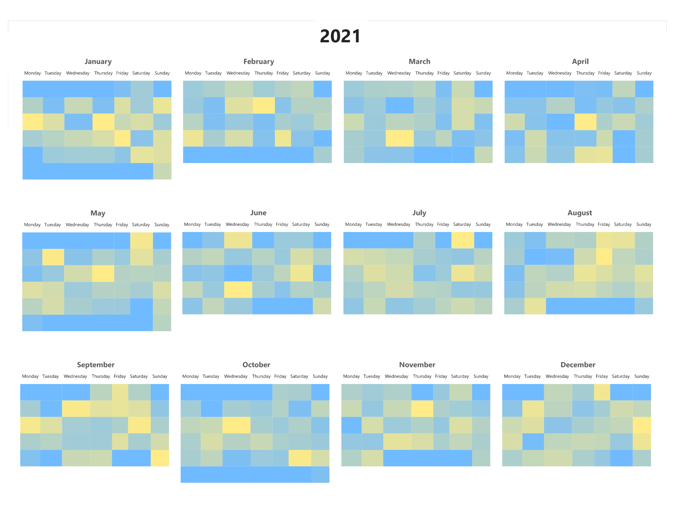
Annual Calendar Heatmap using Matrix visual with workarounds
Power BI’s Matrix visual can be adapted to create calendar heatmaps, but the process is manual and lacks the flexibility needed for dynamic reporting. Here are the main limitations of this work around.
This sample dashboard showcases sales performance using Inforiver visuals like Analytics Plus and Super Filter. It helps users explore key metrics over time, spot trends in revenue, and quickly identify periods of strong or weak performance—supporting faster, more informed decisions.
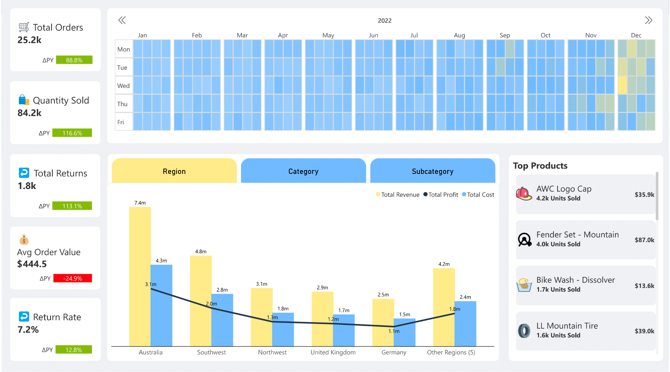
Whole Year Calendar Heatmap using Super Filter in Sales Analysis Dashboard
Unlike Power BI’s Matrix visual, Inforiver’s Super Filter allows users to configure a fully functional calendar heatmap with just a few clicks—no DAX or manual duplication required.
Follow these steps to configure it:
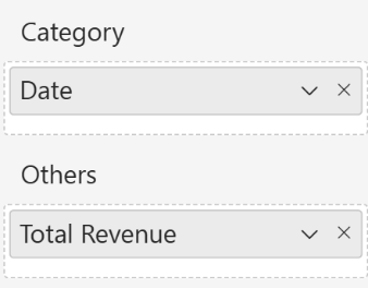
Populated Data Fields for Calendar heatmap
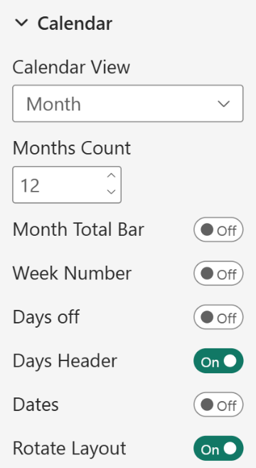
Configured Format pane options for achieving the specific calendar view in the dashboard
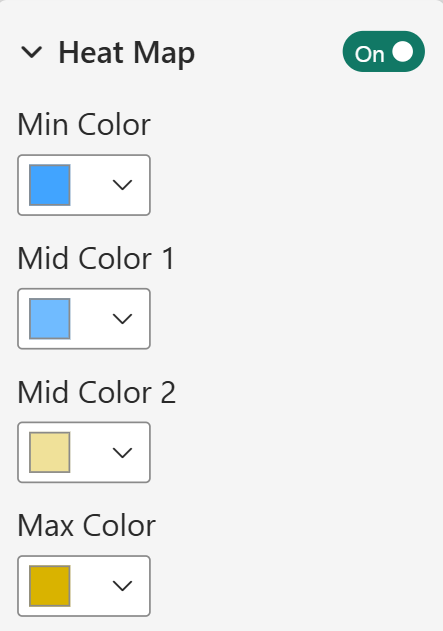
Heatmap enabled and custom color gradient applied for calendar heatmap
For a detailed guide on advanced calendar customizations, check the official Inforiver Super Filter documentation.
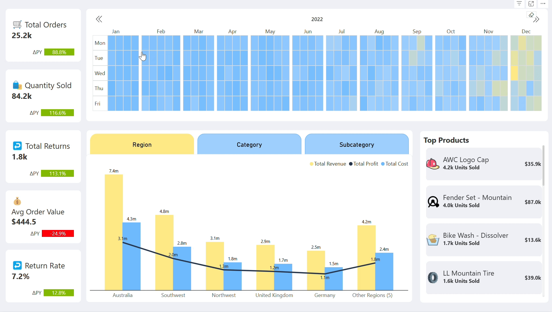
Using a calendar heatmap to filter each day or week to analyse sales by region, product, and KPIs.
Inforiver’s Super Filter offers several advantages that make it a superior choice for calendar heatmaps in Power BI:
Unlike Power BI’s native visuals that require complex DAX calculations, Super Filter allows users to configure a calendar heatmap in just a few clicks—no formulas needed.
Super Filter provides a pre-configured calendar layout, eliminating the need for workarounds. Report developers can choose between vertical and horizontal views for better dashboard alignment.
Super Filter acts as a global slicer, meaning any date selection dynamically filters all connected visuals without requiring additional slicers or interactions.
Unlike native visuals, which offer limited conditional formatting, Super Filter allows users to apply heatmap colors based on Min, Mid, and Max values, making data interpretation more intuitive.
Super Filter enables users to view all 12 months in one visual or navigate between multiple years effortlessly. In contrast, native visuals require separate visuals or workarounds to achieve this. Users can switch between years seamlessly by clicking an arrow, eliminating the need to create separate visuals for each year.
Since Super Filter is designed for efficiency, it significantly reduces load time by eliminating unnecessary visuals and DAX calculations, ensuring smooth interactions even with large datasets.
While Power BI’s native Matrix visual can be repurposed as a calendar heatmap, it comes with significant limitations like manual duplication, poor performance, and lack of interactivity. Inforiver’s Super Filter eliminates these challenges by offering a true calendar-based visualization, with seamless filtering, effortless customization, and multi-year support.
If you're looking for an efficient, scalable, and interactive way to visualize calendar heatmaps in Power BI, Super Filter is the ultimate solution. Click here to get started with Inforiver Super Filter (Microsoft Certified & Free Forever) today!

Inforiver helps enterprises consolidate planning, reporting & analytics on a single platform (Power BI). The no-code, self-service award-winning platform has been recognized as the industry’s best and is adopted by many Fortune 100 firms.
Inforiver is a product of Lumel, the #1 Power BI AppSource Partner. The firm serves over 3,000 customers worldwide through its portfolio of products offered under the brands Inforiver, EDITable, ValQ, and xViz.